spurious correlations
discover · random · spurious scholar
← previous page · next page →


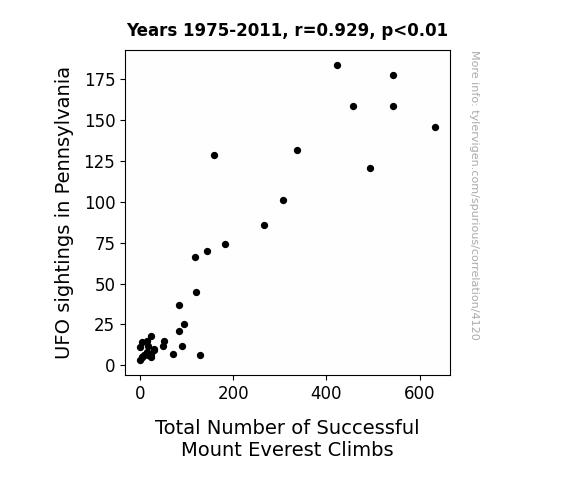
View details about correlation #4,120
The Pennsylvania UFO Phenomenon and its Peculiar Pertinence to Peak Performance: An Analysis of UFO Sightings and Successful Summiting of Mount Everest
The aliens were giving climbers a lift to the summit in their UFOs, making it easier to reach the top.


View details about correlation #5,604
Game Theorists' Cool Titles and The Iowa Truck Driver Phenomenon: Uncovering a Sneaky Connection
The more captivating the titles, the more curious viewers become, leading to a surge in internet traffic. This surge creates a greater demand for data, prompting the need for more truck drivers to transport the increased amount of internet-related goods, including the memes, the streaming, and of course, the digital wisdom of The Game Theorists. After all, it's not just about driving trucks in Iowa, it's about delivering the ultimate delivery of knowledge.


What else correlates?
How cool The Game Theorists YouTube video titles are · all YouTube
The number of truck drivers in Iowa · all cccupations
How cool The Game Theorists YouTube video titles are · all YouTube
The number of truck drivers in Iowa · all cccupations


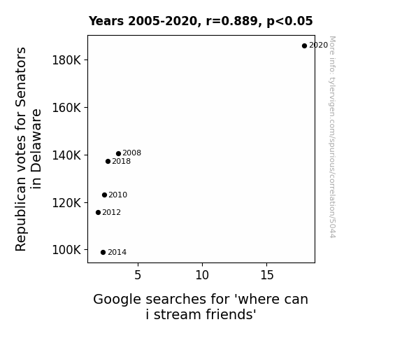
View details about correlation #5,044
The One with the Red State and the Google Query: An Investigation of the Relationship between Republican Votes for Senators in Delaware and Google Searches for 'Where Can I Stream Friends'
As more Republican Senators were voted in, they realized the pressing need for bipartisan entertainment. In a surprising move, they proposed a new streaming service called Friends Across the Aisle, where all political differences could be set aside to enjoy the classic show. In a truly groundbreaking moment of unity, the Senate agreed to allocate funds for this specific streaming service, leading to an increase in search interest for "where can I stream Friends." With political gridlock being replaced by Central Perk-lock, the nation found common ground in the laughter and love of Ross, Rachel, and the rest of the gang. It just goes to show, even in the world of politics, sometimes all you need is a little Friends marathon to build bridges and find humor in the ups and downs of government.


View details about correlation #4,775
Clearing the Air: Unveiling the Surprising Connection between Air Pollution in Cincinnati and Kerosene Consumption in Peru
Cincinnati's cleaner air led to an increase in hot air balloon enthusiasts, creating a sudden kerosene demand and subsequent shortage in Peru which heavily relies on hot air balloon transportation. Remember, what goes up must come down, unless there's a kerosene shortage!


What else correlates?
Air pollution in Cincinnati · all weather
Kerosene used in Peru · all energy
Air pollution in Cincinnati · all weather
Kerosene used in Peru · all energy


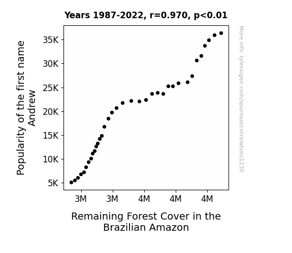
View details about correlation #1,230
As the popularity of the name Andrew waned, fewer babies were named Andrew. This led to a decline in the overall number of Andrews in the world. Now, you see, Andrews are known for their love of nature and passion for tree-planting. With fewer Andrews around, there was a significant shortage of tree-hugging enthusiasts. As a result, the remaining forest cover in the Brazilian Amazon decreased, simply because there weren't enough Andrews there to hug the trees and keep the deforestation at bay. Remember, every Andrew counts in the fight to save the Amazon!
What else correlates?
Popularity of the first name Andrew · all first names
Remaining Forest Cover in the Brazilian Amazon · all weird & wacky
Popularity of the first name Andrew · all first names
Remaining Forest Cover in the Brazilian Amazon · all weird & wacky


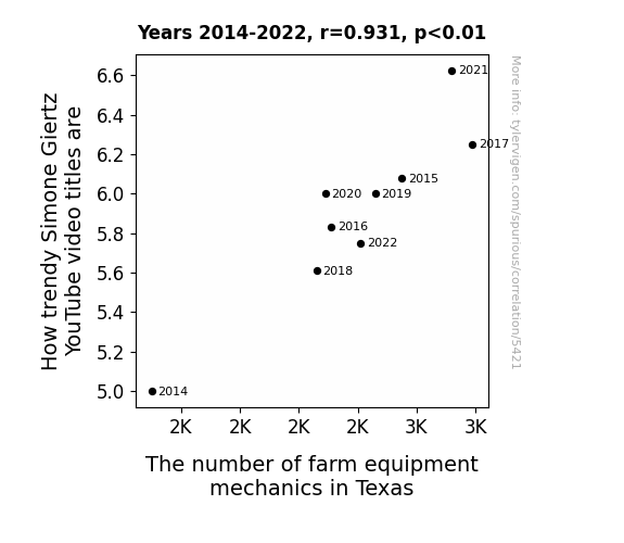
View details about correlation #5,421
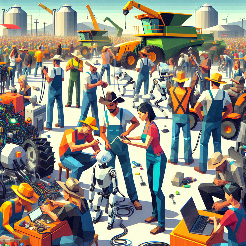
The Mechanic Meme: Exploring the Correlation Between Simone Giertz's Trendy YouTube Video Titles and the Employment of Farm Equipment Mechanics in Texas
As more farm equipment mechanics in Texas master the art of fixing and innovating robots, their awesomeness seeps into the collective consciousness. This leads to a surge in Simone Giertz fans among the farm community, prompting her to create even trendier video titles to keep up with the demand. It's a mechanical marvel of viral video synergy!


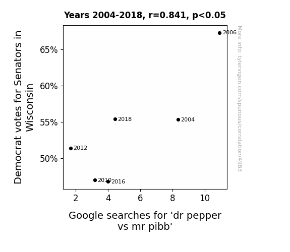
View details about correlation #4,983
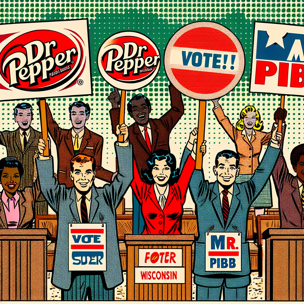
Bubbly Battles and Political Shenanigans: The Curious Case of Democrat Votes in Wisconsin and Google Searches for 'Dr Pepper vs Mr Pibb'
Because the more Democrat votes for Senators in Wisconsin, the more Pibb fans realized they had to Dr-ink up their support for their favorite soda to stay a-FIZZ-ed with the political outcome. So, they were really SODA-lighted to show their pop-ular vote for Mr. Pibb. It seems like in this case, political preferences really do DR-ive consumer behavior!
What else correlates?
Votes for Democratic Senators in Wisconsin · all elections
Google searches for 'dr pepper vs mr pibb' · all google searches
Votes for Democratic Senators in Wisconsin · all elections
Google searches for 'dr pepper vs mr pibb' · all google searches


View details about correlation #4,070
Stranger Things: Unearthing the Connection Between UFO Sightings in Idaho and Biomass Power Generation in Italy
The UFOs were actually giant potato-shaped spacecrafts, and their presence in Idaho was promoting optimal potato growth. This led to an excess of potato biomass, which was secretly exported to Italy and used as a power source for the increased demand caused by the UFO visitations. The whole situation just goes to show that when it comes to UFOs and bioenergy, the truth is definitely out there, probably buried under a heap of UFO-boosted potatoes!

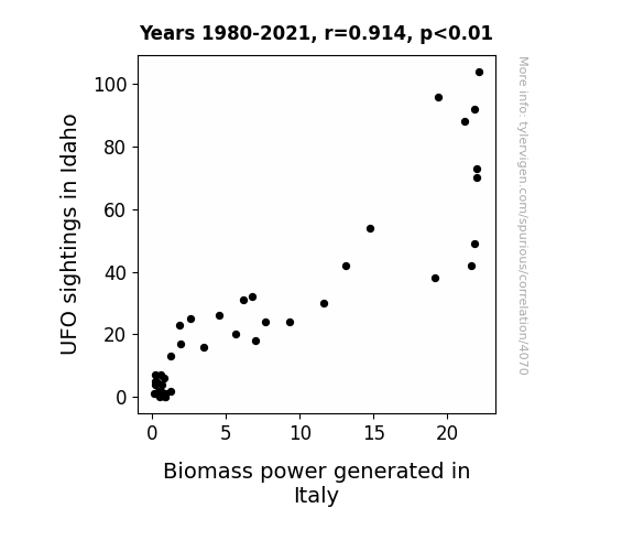
What else correlates?
UFO sightings in Idaho · all random state specific
Biomass power generated in Italy · all energy
UFO sightings in Idaho · all random state specific
Biomass power generated in Italy · all energy


View details about correlation #4,132
A Breath of Connection: Air Pollution and Days of Our Lives Viewership in New York City
As the air cleared up, it seems the drama just couldn't "catch" anymore! It's a "smoggy" mystery how the clean air led to a dip in Days of Our Lives viewership. But maybe without the pollution, the show just couldn't "breathe" and lost its "spark."
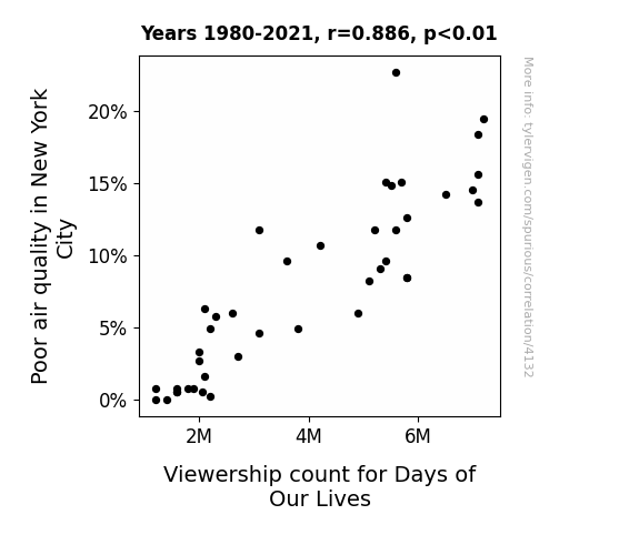
What else correlates?
Air pollution in New York City · all weather
Viewership count for Days of Our Lives · all weird & wacky
Air pollution in New York City · all weather
Viewership count for Days of Our Lives · all weird & wacky


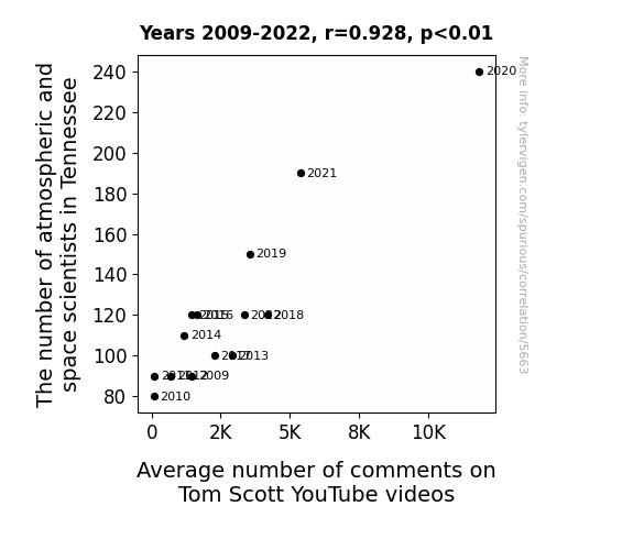
View details about correlation #5,663
Counting the Stars: Tennessee's Atmospheric and Space Scientists and their Impact on Tom Scott's YouTube Stardom
As the number of atmospheric and space scientists in Tennessee increased, so did the average number of comments on Tom Scott YouTube videos. This is because the scientists were generating a whirlwind of interest in all things space-related, creating a atmospheric rise in online discussions about Tom's videos. It's like they were launching a comment-ial into cyberspace!


View details about correlation #5,145
Seeing the Stars: The Mars-Jupiter Distance and Voter Trends in Maine: A Spatiotemporal Analysis
As the gap widened, Mainers felt a gravitational pull towards democratic ideals, believing that the party could truly reach for the stars when it came to governance. They couldn't help but planet their support for the candidate, seeing them as the brightest in the political galaxy. The celestial shift left them feeling out of this world about the democratic platform, as if a cosmic force was urging them to make their voices heard at the polls. It was a campaign that resonated with them on a universal level, proving that even in the vast expanse of space, every vote really does count.


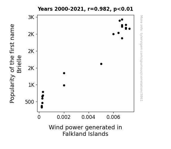
View details about correlation #3,861
Blowing Away the Competition: A Breezy Analysis of the Relationship Between Brielle's Popularity and Wind Power in Falkland Islands
The sound of the name "Brielle" being whispered by adoring fans created a mini-cyclone effect, thus inadvertently boosting wind power in the Falkland Islands. It turns out, baby name trends may have a breezy impact on sustainable energy sources!

What else correlates?
Popularity of the first name Brielle · all first names
Wind power generated in Falkland Islands · all energy
Popularity of the first name Brielle · all first names
Wind power generated in Falkland Islands · all energy


View details about correlation #4,314
Grillin' the Air: A Link Between Air Quality in San Jose and Nathan's Hot Dog Eating Championship
The improved air quality in San Jose led to an increase in the happiness of the local cows. These happier cows produced better quality beef, which somehow made its way to the Nathan's Hot Dog Eating Competition. As a result, the champion found the hotdogs even more irresistible, ultimately leading to an increase in the number of hotdogs consumed. Who knew clean air in California could beef up the competition in such a strange and wien-derful way!


. The chart goes from 2007 to 2023, and the two variables track closely in value over that time.")

View details about correlation #5,733
Stock Price Growth: A SmarterEveryDay Connection
As SmarterEveryDay video titles get more engaging, people spend more time watching and learning. This leads to an increase in innovative thinking and problem-solving abilities among the population. With everyone's newfound genius, productivity soars, driving up the demand for Fomento Econ's products. As Fomento Econ's stock price skyrockets, they may just rename themselves "Fomento Eureka"!


What else correlates?
How good SmarterEveryDay YouTube video titles are · all YouTube
Fomento Econ's stock price (FMX) · all stocks
How good SmarterEveryDay YouTube video titles are · all YouTube
Fomento Econ's stock price (FMX) · all stocks


View details about correlation #5,384
The Rise of 'Meme-ion' Bakers: Exploring the Dough-lightful Relationship Between the Popularity of 'Minions' Meme and the Number of Bakers in New Jersey
As the minions meme gained popularity, it led to a spike in banana-themed desserts. This increased demand for baked goods in New Jersey, prompting more people to pursue careers as bakers to capitalize on the trend. This created a ripple effect in the baking industry, ultimately contributing to a rise in the number of bakers in the state. Who knew that the path to a baker's dozen would be paved with meme-orable yellow creatures and a-peeling pastry trends!


What else correlates?
Popularity of the 'minions' meme · all memes
The number of bakers in New Jersey · all cccupations
Popularity of the 'minions' meme · all memes
The number of bakers in New Jersey · all cccupations


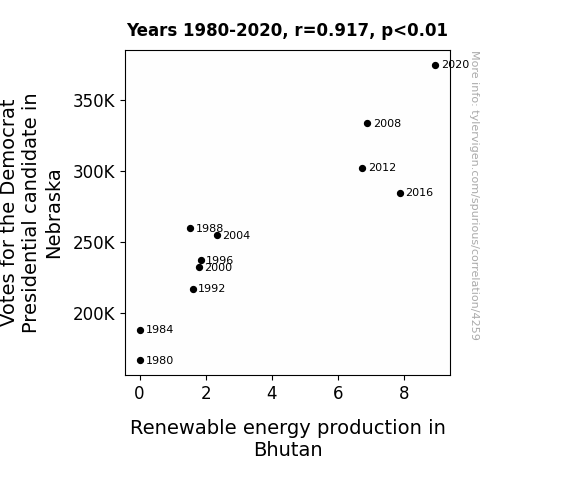
View details about correlation #4,259
Electing to Energize: Uncovering the Surprising Relationship Between Nebraska Democrat Votes and Bhutan Renewable Energy Production
The one thing Democrats and renewable energy have in common is a love for green! As Nebraska residents cast their votes for the Democratic Presidential candidate, the collective surge of green-minded thinking somehow resonated all the way to Bhutan. It's as if every vote cast was a tiny spark of pro-renewable energy magic, and before you know it, Bhutan's hydropower plants were working overtime, fueled by the unexpected political positivity from the American Midwest. It's the most electrifying case of long-distance energy influence! Rest assured, this election certainly had a power all of its own – a power that put the 'watt' in 'Democrat' and the 'Bhutan' in 'renewable energy revolution'!


View details about correlation #4,247
The increase in air pollution in La Grande, Oregon led to the proliferation of tiny particulate matter, inadvertently creating a natural-looking spray tan for contestants, giving them that coveted sun-kissed glow without any UV damage. As a result, the contestants appeared more radiant and bronzed, ultimately affecting the judges' perception of beauty and contributing to the success of older pageant winners. Funny one-liner: Who knew that smog could inadvertently become the mist of victory for the more mature contestants!
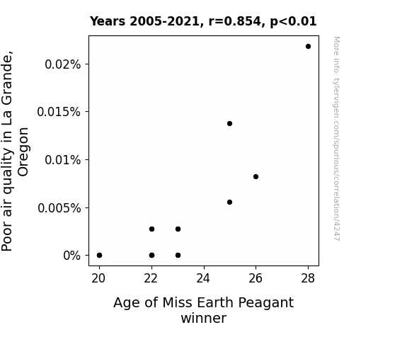
What else correlates?
Air pollution in La Grande, Oregon · all weather
Age of Miss Earth Peagant winner · all weird & wacky
Air pollution in La Grande, Oregon · all weather
Age of Miss Earth Peagant winner · all weird & wacky


View details about correlation #5,087
The 'Hallie' Effect: Exploring the Correlation between Name Popularity and Social Media Influence
Every time someone named Hallie watched, they couldn't help but like the video, and it created a chain reaction of Hallie happiness that boosted those like numbers. It's like they had a secret power to summon the almighty likes for MrBeast! Keep watching, Hallies of the world, and spread that YouTube joy!


What else correlates?
Popularity of the first name Hallie · all first names
The average number of likes on MrBeast's YouTube videos · all YouTube
Popularity of the first name Hallie · all first names
The average number of likes on MrBeast's YouTube videos · all YouTube


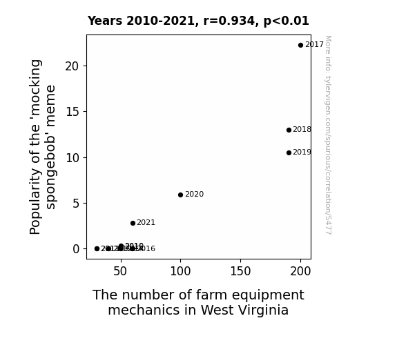
View details about correlation #5,477
Mirthful Meme Madness: Mapping the Mocking Spongebob's Memetic Impact on Mechanic Manpower in Mountainous West Virginia
The 'mocking spongebob' meme revitalized interest in sassy comebacks and unconventional problem-solving, leading to a surge in creative thinking. This inadvertently sparked a wave of innovation in the agricultural industry, prompting the development of pun-powered farm equipment. This sudden demand for specialists in repairing pun-infused machinery has created a fertile job market for farm equipment mechanics in West Virginia. It seems like the meme's impact really plowed the way for a whole new field of work!


View details about correlation #4,326
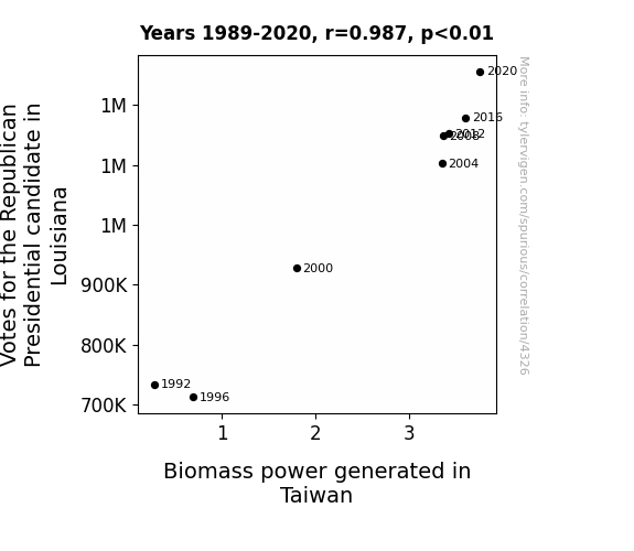
From Red States to Efficient Plates: A Biomass of Political Power in Louisiana and Taiwan
As more people in Louisiana voted for the Republican Presidential candidate, the collective support somehow generated an unexpected surge in political power, which was then harnessed and converted into energy. This energy was inexplicably transmitted all the way to Taiwan, where it was used to supercharge the biomass power production, creating a truly 'powerful' connection between American politics and renewable energy!
What else correlates?
Votes for the Republican Presidential candidate in Louisiana · all elections
Biomass power generated in Taiwan · all energy
Votes for the Republican Presidential candidate in Louisiana · all elections
Biomass power generated in Taiwan · all energy
Why this works
- Data dredging: I have 25,237 variables in my database. I compare all these variables against each other to find ones that randomly match up. That's 636,906,169 correlation calculations! This is called “data dredging.”
Fun fact: the chart used on the wikipedia page to demonstrate data dredging is also from me. I've been being naughty with data since 2014.
Instead of starting with a hypothesis and testing it, I instead tossed a bunch of data in a blender to see what correlations would shake out. It’s a dangerous way to go about analysis, because any sufficiently large dataset will yield strong correlations completely at random. - Lack of causal connection: There is probably no direct connection between these variables, despite what the AI says above.
Because these pages are automatically generated, it's possible that the two variables you are viewing are in fact causually related. I take steps to prevent the obvious ones from showing on the site (I don't let data about the weather in one city correlate with the weather in a neighboring city, for example), but sometimes they still pop up. If they are related, cool! You found a loophole.
This is exacerbated by the fact that I used "Years" as the base variable. Lots of things happen in a year that are not related to each other! Most studies would use something like "one person" in stead of "one year" to be the "thing" studied. - Observations not independent: For many variables, sequential years are not independent of each other. You will often see trend-lines form. If a population of people is continuously doing something every day, there is no reason to think they would suddenly change how they are doing that thing on January 1. A naive p-value calculation does not take this into account.
You will calculate a lower chance of "randomly" achieving the result than represents reality.
To be more specific: p-value tests are probability values, where you are calculating the probability of achieving a result at least as extreme as you found completely by chance. When calculating a p-value, you need to assert how many "degrees of freedom" your variable has. I count each year (minus one) as a "degree of freedom," but this is misleading for continuous variables.
This kind of thing can creep up on you pretty easily when using p-values, which is why it's best to take it as "one of many" inputs that help you assess the results of your analysis.
- Y-axes doesn't start at zero: I truncated the Y-axes of the graphs above. I also used a line graph, which makes the visual connection stand out more than it deserves.
Nothing against line graphs. They are great at telling a story when you have linear data! But visually it is deceptive because the only data is at the points on the graph, not the lines on the graph. In between each point, the data could have been doing anything. Like going for a random walk by itself!
Mathematically what I showed is true, but it is intentionally misleading. If you click on any of the charts that abuse this, you can scroll down to see a version that starts at zero. - Confounding variable: Confounding variables (like global pandemics) will cause two variables to look connected when in fact a "sneaky third" variable is influencing both of them behind the scenes.
- Outliers: Some datasets here have outliers which drag up the correlation.
In concept, "outlier" just means "way different than the rest of your dataset." When calculating a correlation like this, they are particularly impactful because a single outlier can substantially increase your correlation.
Because this page is automatically generated, I don't know whether any of the charts displayed on it have outliers. I'm just a footnote. ¯\_(ツ)_/¯
I intentionally mishandeled outliers, which makes the correlation look extra strong. - Low n: There are not many data points included in some of these charts.
You can do analyses with low ns! But you shouldn't data dredge with a low n.
Even if the p-value is high, we should be suspicious of using so few datapoints in a correlation.
Pro-tip: click on any correlation to see:
- Detailed data sources
- Prompts for the AI-generated content
- Explanations of each of the calculations (correlation, p-value)
- Python code to calculate it yourself


