spurious correlations
discover · random · spurious scholar
← previous page · next page →


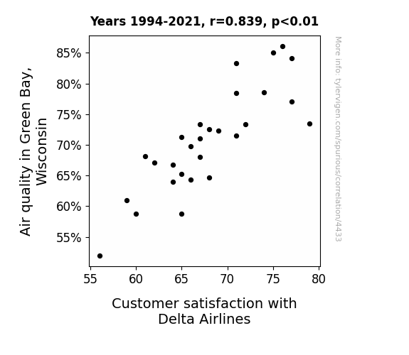
View details about correlation #4,433
The Airest in Green Bay: How Air Quality Shapes Delta's Day
The fresher air in Green Bay has led to fewer flight delays, as the planes can now navigate more efficiently through the crisp, clean skies. Plus, it's no secret that the delightful scent of dairy farms drifting through the air puts everyone in a better mood, including the Delta Airlines staff. All in all, it's udderly fantastic for customer satisfaction!

What else correlates?
Air quality in Green Bay, Wisconsin · all weather
Customer satisfaction with Delta Airlines · all weird & wacky
Air quality in Green Bay, Wisconsin · all weather
Customer satisfaction with Delta Airlines · all weird & wacky


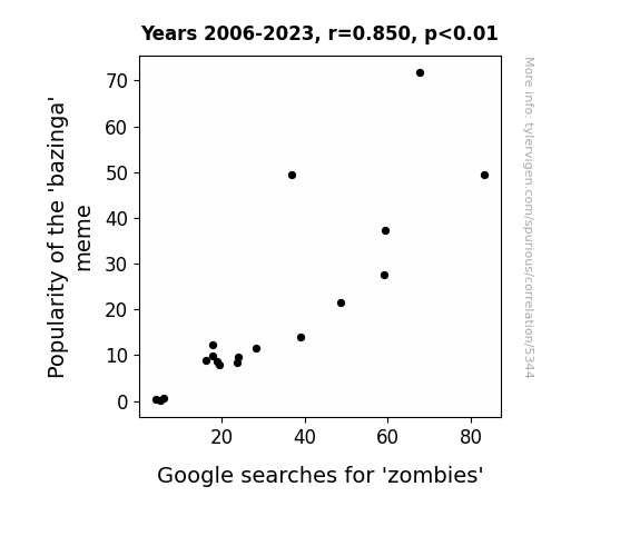
View details about correlation #5,344
Zombie Apocalypse: Exploring the Correlation Between 'Bazinga' Popularity and Google Searches for Zombies
As the 'bazinga' meme gained popularity, more and more people were laughing their brains out. This inadvertently acted as a beacon for zombies, attracting them with the promise of a real 'knee-slapper' (or rather, a 'knee-biter'). It seems the undead have a killer sense of humor after all!

What else correlates?
Popularity of the 'bazinga' meme · all memes
Google searches for 'zombies' · all google searches
Popularity of the 'bazinga' meme · all memes
Google searches for 'zombies' · all google searches


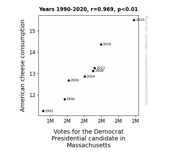
View details about correlation #5,234
Cheesy Votes: The Cheddar Effect on Democrat Preferences in Massachusetts
As American cheese consumption increased, so did the desire for a comforting and familiar option. This created a ripple effect of contentment and nostalgia, leading to a more favorable view of the incumbent party. It's almost as if every slice of cheese brought with it a sense of unity and harmony, paving the way for a landslide victory in Massachusetts. Who knew that the road to political success was paved with cheese?

What else correlates?
American cheese consumption · all food
Votes for the Democratic Presidential candidate in Massachusetts · all elections
American cheese consumption · all food
Votes for the Democratic Presidential candidate in Massachusetts · all elections


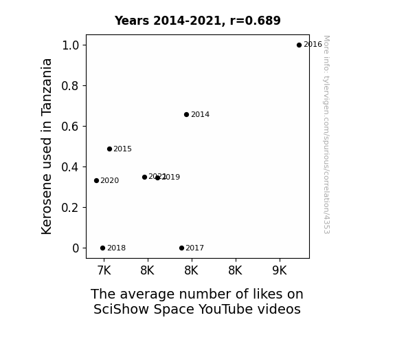
View details about correlation #4,353
As more Tanzanian households switched to solar power, the cosmic energy harnessed by the panels inadvertently disrupted the algorithms governing SciShow Space video likes. It seems even the universe couldn't resist disliking a few punny space jokes.

What else correlates?
Kerosene used in Tanzania · all energy
The average number of likes on SciShow Space YouTube videos · all YouTube
Kerosene used in Tanzania · all energy
The average number of likes on SciShow Space YouTube videos · all YouTube


View details about correlation #4,173
Aural Pleasures: The Vinyl Countdown - A Correlation Between Hearing Aid Specialist Numbers in Massachusetts and LP/Vinyl Album Sales
As the hearing aid specialists honed their craft, they inadvertently developed a heightened appreciation for the beauty of analog sound. This newfound sonic passion led to a resurgence in the demand for the rich, nostalgic tones of LP/vinyl albums. It's a case of professionals inadvertently amplifying the allure of retro music, one ear at a time!


What else correlates?
The number of hearing aid specialists in Massachusetts · all cccupations
Sales of LP/Vinyl Albums · all weird & wacky
The number of hearing aid specialists in Massachusetts · all cccupations
Sales of LP/Vinyl Albums · all weird & wacky


View details about correlation #5,651
Particulate Matrimony: Exploring the Link Between Air Pollution in Memphis and the Marriage Rate in Tennessee
The clearer air revealed that they had nothing in common.

What else correlates?
Air pollution in Memphis · all weather
The marriage rate in Tennessee · all random state specific
Air pollution in Memphis · all weather
The marriage rate in Tennessee · all random state specific


View details about correlation #5,525
Lexus and the Single Voter: An Exhaustive Examination of Name Popularity and Political Preferences in Oklahoma
People subconsciously associate the name Lexus with luxury and wealth. As the name fell out of favor, there was a parallel decline in aspirational feelings. This led to a state of 'political apathy', ultimately affecting the votes for the Democrat Presidential candidate in Oklahoma. After all, a name can apparently drive more than just cars!


. The chart goes from 2010 to 2021, and the two variables track closely in value over that time.")

View details about correlation #3,938
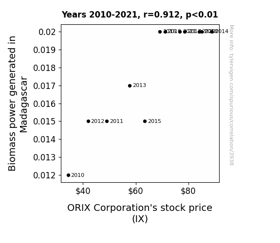
Powering Up the Stock Market: A Biomass of Potential in Madagascar's Impact on ORIX Corporation's (IX) Value
As Madagascar embraced Biomass power, they inadvertently unleashed a surge of lemurs on hamster wheels generating energy. This feat of adorable productivity boosted global morale, leading to an overall increase in the stock market, including ORIX Corporation's stock price. It's a classic case of 'lemuronomics' - where the cuteness factor directly impacts financial success!

What else correlates?
Biomass power generated in Madagascar · all energy
ORIX Corporation's stock price (IX) · all stocks
Biomass power generated in Madagascar · all energy
ORIX Corporation's stock price (IX) · all stocks


View details about correlation #4,171
California Dreamin': The Gold(en) Standard of Physicist Population and Precious Metal Prices
As the number of physicists in California skyrockets, so does their collective brainpower. With their minds abuzz with quantum theories and celestial mechanics, they inadvertently project a magnetic field of innovation and discovery. This unexpected side effect leads to a surge in demand for gold in the tech industry, as companies rush to create the latest gadgets infused with scientific wizardry. The result? A gilded conundrum where the presence of more physicists in California mysteriously alchemizes into higher gold prices, leaving everyone scratching their heads in bewilderment.


What else correlates?
The number of physicists in California · all cccupations
The price of gold · all weird & wacky
The number of physicists in California · all cccupations
The price of gold · all weird & wacky


View details about correlation #5,764
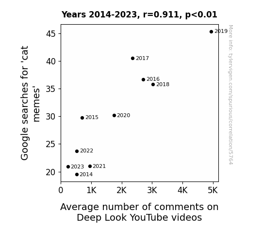
Crazy for Cat Memes: Correlating Google Searches and Comments on Deep Look YouTube Videos
The increase in cat memes has led to an overall increase in internet traffic. This has resulted in more people stumbling upon Deep Look videos and feeling compelled to leave their thoughts, especially if the video features a particularly engaging or adorable animal. It's a purrfect example of how feline-related content can create a meow-nificant ripple effect in the online world!
What else correlates?
Google searches for 'cat memes' · all google searches
Average number of comments on Deep Look YouTube videos · all YouTube
Google searches for 'cat memes' · all google searches
Average number of comments on Deep Look YouTube videos · all YouTube


View details about correlation #5,618
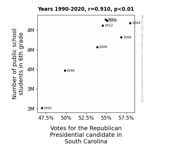
Classroom Counts: Unveiling the Electoral Algebra Through 6th Grade Ambitions
As the number of 6th graders in public schools increased, so did the demand for chocolate milk in cafeterias. This led to a spike in productivity among dairy farmers, who were moo-ved by the situation to support the Republican candidate, ultimately amoosing their fellow farmers to vote red. After all, it's udderly important to have a candidate who can steer the country in the right direction!


View details about correlation #4,586
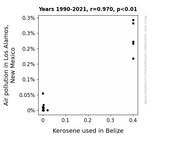
Clearing the Air: Unraveling the Relationship Between Air Pollution in Los Alamos and Kerosene Consumption in Belize
As the air cleared in Los Alamos, it seemed to have sparked a chain reaction. The decrease in pollution created a vaccuum of sorts, leading to a cleaner and more efficient combustion process for kerosene in Belize. It's like the pollutants in Los Alamos were sending smog signals to the kerosene in Belize, but once the air pollution decreased, the kerosene didn't feel the need to jet off in such large quantities. It's a lit situation all around!

What else correlates?
Air pollution in Los Alamos, New Mexico · all weather
Kerosene used in Belize · all energy
Air pollution in Los Alamos, New Mexico · all weather
Kerosene used in Belize · all energy


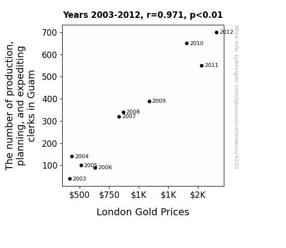
View details about correlation #4,220
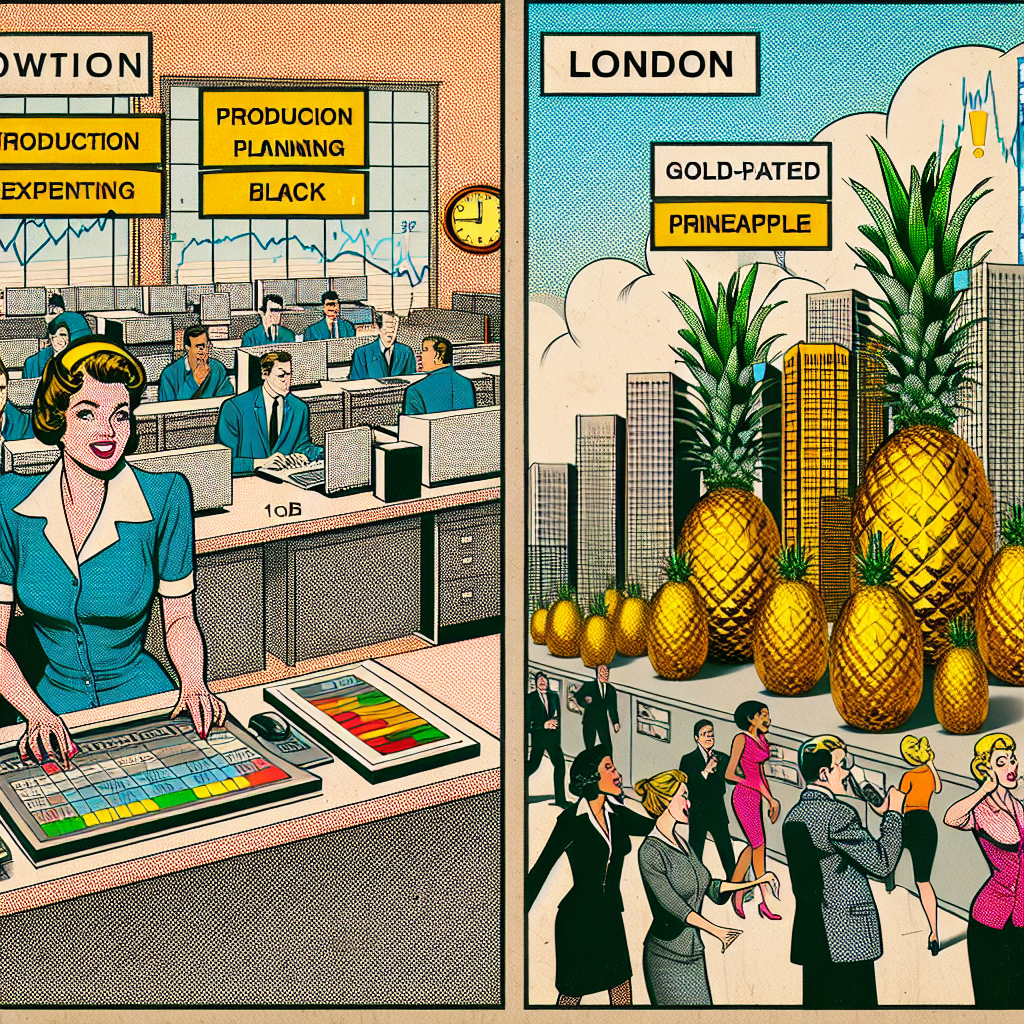
Clamorous Clerks and Commodity Curves: Correlating the Count of Clerks with London Gold Prices
The surge in production, planning, and expediting clerks in Guam has led to a global shortage of gold-plated pineapple pizza, a luxury item that has captured the hearts of London's elite. As the demand for this exclusive delicacy skyrockets, so does the price of London Gold in a bizarre case of culinary meets financial extravagance. It's a pizza-fueled, clerk-driven gold rush that no one saw coming, except perhaps for the inexplicably influential pineapple pizza enthusiasts.
What else correlates?
The number of production, planning, and expediting clerks in Guam · all cccupations
London Gold Prices · all weird & wacky
The number of production, planning, and expediting clerks in Guam · all cccupations
London Gold Prices · all weird & wacky


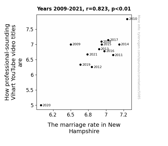
View details about correlation #5,085
The Mathematica of Love: Exploring the Relationship Between Vihart YouTube Video Titles and Marriage Rates in New Hampshire
As Vihart's video titles became more professional sounding, the vibrations of pure professionalism emanating from the screen began to subtly influence the behavior of New Hampshirites, leading to a surge in marriage proposals and impromptu ceremonies. Couples couldn't help but say, "I do" as they felt the sudden urge to geometrically optimize their love and graph the exponential growth of their relationship. The wedding industry in New Hampshire found itself in a beautiful, chaotic symphony of matrimonial bliss, all thanks to the elegant and captivating allure of Vihart's titles. Love was in the air, and it was shaped like a dodecahedron.


View details about correlation #5,702
Libertarian Levity: A Delightfully Blue Skyline in Missouri
As Senators in Missouri advocate for more personal freedom, the particles in the atmosphere also feel empowered to express themselves. This leads to a greater prevalence of democratic light scattering, creating the illusion of a blue sky as a form of peaceful protest against oppressive wavelengths. The sky is simply exercising its freedom of hue and choosing to reflect a specific shade that aligns with its individual atmospheric beliefs. After all, it's important for every sky to have the right to pigment expression, and this political influence is just a small part of the greater spectrum of sky rights. The sky's blueness is not just a matter of science, but a reflection of its political stance on enlightenment and liberty.

What else correlates?
Votes for Libertarian Senators in Missouri · all elections
Google searches for 'why is the sky blue' · all google searches
Votes for Libertarian Senators in Missouri · all elections
Google searches for 'why is the sky blue' · all google searches


View details about correlation #4,307
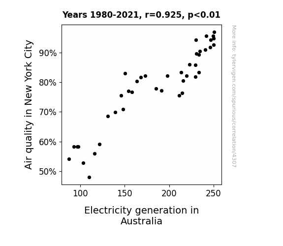
Electrifying Connections: The Shocking Link Between Air Quality in New York City and Electricity Generation in Australia
The cleaner air in NYC led to residents having more energy, which somehow traveled all the way to Australia, sparking a surge in electricity generation as a byproduct of this transcontinental transfer of pep and vigor. As New Yorkers took in that pristine city air, they unwittingly became like urban, energy-boosting, power plants, and Australia was left wondering why they suddenly had an electrifying influx of wattage!

What else correlates?
Air quality in New York City · all weather
Electricity generation in Australia · all energy
Air quality in New York City · all weather
Electricity generation in Australia · all energy
. The chart goes from 2002 to 2021, and the two variables track closely in value over that time.")

View details about correlation #4,157
A Nutty Connection: Examining the Correlation between US Tree Nut Consumption and Automatic Data Processing (ADP) Stock Price
As more Americans enjoyed their cashews and almonds, their cognitive function improved, leading to greater productivity at work. This increased efficiency and output positively impacted the stock price of a company like Automatic Data Processing, as the workforce was now cracking through tasks at a record pace. So, in a nutshell, the surge in US tree nut consumption per person contributed to the overall economic performance, nut the least of which was the growth in ADP's stock price.


What else correlates?
US Tree Nut Consumption per Person · all weird & wacky
Automatic Data Processing's stock price (ADP) · all stocks
US Tree Nut Consumption per Person · all weird & wacky
Automatic Data Processing's stock price (ADP) · all stocks


View details about correlation #5,498
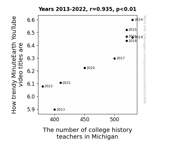
Time Marches On: Exploring the Trendy MinuteEarth YouTube Titles and Their Impact on the Population of History Teachers in Michigan
As the number of college history teachers in Michigan increases, there's a ripple effect on the fashion world - they start donning hipper outfits, inadvertently setting new trends. This leads to MinuteEarth adapting their video titles to be more in vogue, creating a history of fashion faux pas and faux fur-tunately, a lesson in style for their viewers.


View details about correlation #5,031
Thaddeus and the Libertarian Lure: A Peculiar Correlation Study
It's simple - more Thaddeus means more Thad-decisions, and libertarians certainly value individual choice!


View details about correlation #4,062
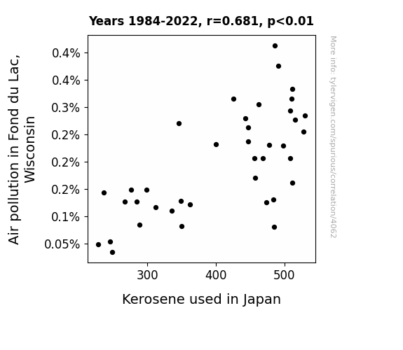
Gasping for Air: An Unlikely Union Between Air Pollution in Fond du Lac, Wisconsin, and Kerosene Consumption in Japan
The firefighting cows in Fond du Lac, Wisconsin have been so efficient at clearing the air that they inadvertently sparked a global movement. Their secret technique? Mooing in perfect harmony to create powerful wind currents that disperse pollution. As a result, the demand for kerosene in Japan has plummeted because the cows' moo-vement has literally blown it away. Thank you, dairy air!

What else correlates?
Air pollution in Fond du Lac, Wisconsin · all weather
Kerosene used in Japan · all energy
Air pollution in Fond du Lac, Wisconsin · all weather
Kerosene used in Japan · all energy
Why this works
- Data dredging: I have 25,237 variables in my database. I compare all these variables against each other to find ones that randomly match up. That's 636,906,169 correlation calculations! This is called “data dredging.”
Fun fact: the chart used on the wikipedia page to demonstrate data dredging is also from me. I've been being naughty with data since 2014.
Instead of starting with a hypothesis and testing it, I instead tossed a bunch of data in a blender to see what correlations would shake out. It’s a dangerous way to go about analysis, because any sufficiently large dataset will yield strong correlations completely at random. - Lack of causal connection: There is probably no direct connection between these variables, despite what the AI says above.
Because these pages are automatically generated, it's possible that the two variables you are viewing are in fact causually related. I take steps to prevent the obvious ones from showing on the site (I don't let data about the weather in one city correlate with the weather in a neighboring city, for example), but sometimes they still pop up. If they are related, cool! You found a loophole.
This is exacerbated by the fact that I used "Years" as the base variable. Lots of things happen in a year that are not related to each other! Most studies would use something like "one person" in stead of "one year" to be the "thing" studied. - Observations not independent: For many variables, sequential years are not independent of each other. You will often see trend-lines form. If a population of people is continuously doing something every day, there is no reason to think they would suddenly change how they are doing that thing on January 1. A naive p-value calculation does not take this into account.
You will calculate a lower chance of "randomly" achieving the result than represents reality.
To be more specific: p-value tests are probability values, where you are calculating the probability of achieving a result at least as extreme as you found completely by chance. When calculating a p-value, you need to assert how many "degrees of freedom" your variable has. I count each year (minus one) as a "degree of freedom," but this is misleading for continuous variables.
This kind of thing can creep up on you pretty easily when using p-values, which is why it's best to take it as "one of many" inputs that help you assess the results of your analysis.
- Y-axes doesn't start at zero: I truncated the Y-axes of the graphs above. I also used a line graph, which makes the visual connection stand out more than it deserves.
Nothing against line graphs. They are great at telling a story when you have linear data! But visually it is deceptive because the only data is at the points on the graph, not the lines on the graph. In between each point, the data could have been doing anything. Like going for a random walk by itself!
Mathematically what I showed is true, but it is intentionally misleading. If you click on any of the charts that abuse this, you can scroll down to see a version that starts at zero. - Confounding variable: Confounding variables (like global pandemics) will cause two variables to look connected when in fact a "sneaky third" variable is influencing both of them behind the scenes.
- Outliers: Some datasets here have outliers which drag up the correlation.
In concept, "outlier" just means "way different than the rest of your dataset." When calculating a correlation like this, they are particularly impactful because a single outlier can substantially increase your correlation.
Because this page is automatically generated, I don't know whether any of the charts displayed on it have outliers. I'm just a footnote. ¯\_(ツ)_/¯
I intentionally mishandeled outliers, which makes the correlation look extra strong. - Low n: There are not many data points included in some of these charts.
You can do analyses with low ns! But you shouldn't data dredge with a low n.
Even if the p-value is high, we should be suspicious of using so few datapoints in a correlation.
Pro-tip: click on any correlation to see:
- Detailed data sources
- Prompts for the AI-generated content
- Explanations of each of the calculations (correlation, p-value)
- Python code to calculate it yourself


