spurious correlations
discover · random · spurious scholar
← previous page · next page →


View details about correlation #4,440
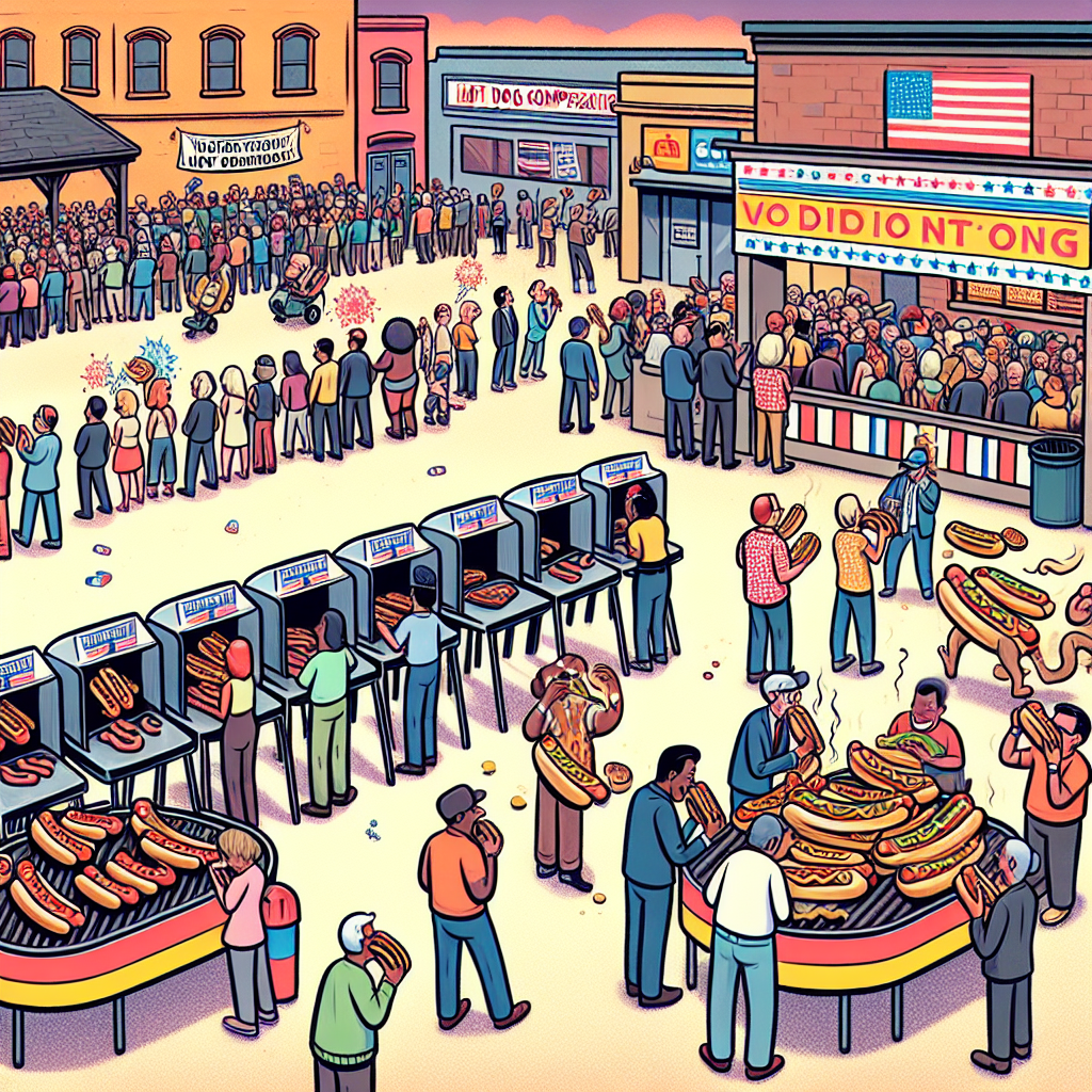
Weiner Winner: Wacky Correlation between Dem Votes in New Mexico and Nathan's Hot Dog Consumption
As the Democratic support sizzled in New Mexico, it created a real "frank-furter" frenzy. The surge in votes somehow sparked a wiener-takes-all mindset, leading to a bunless quest for victory. Maybe the competition just couldn't ketchup to the political excitement, or perhaps there's a link between ballot boxes and lunch boxes that we never knew existed!


View details about correlation #5,432
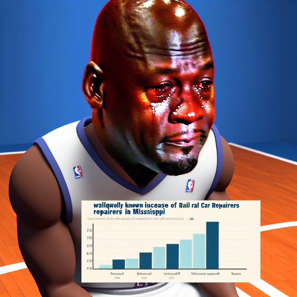
From Crying Jordan to Crying Train Repairs: An Unlikely Connection
The widespread use of the 'crying michael jordan' meme led to an increase in internet traffic. This surge in data usage put a strain on internet infrastructure, including the underground cables. As a result, there was a higher demand for maintenance, which included the repair of underground rail car systems in Mississippi. The meme literally caused people to 'cable' together, creating more work for the rail car repairers in the state.


View details about correlation #5,239
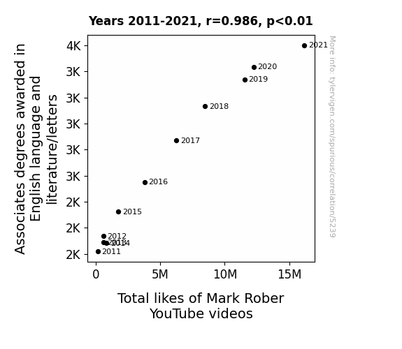
Linguistic Literature and Lively Likes: Exploring the Correlation between Associates degrees in Literature and Total Likes of Mark Rober YouTube Videos
As more people became well-versed in the art of language, they were better able to com-prehend the punny jokes and witty commentary in Mark Rober's videos, leading to a spike in appreciation for his content. This just go's to show that a way with words can really elevate your online presence!

What else correlates?
Associates degrees awarded in literature · all education
Total likes of Mark Rober YouTube videos · all YouTube
Associates degrees awarded in literature · all education
Total likes of Mark Rober YouTube videos · all YouTube


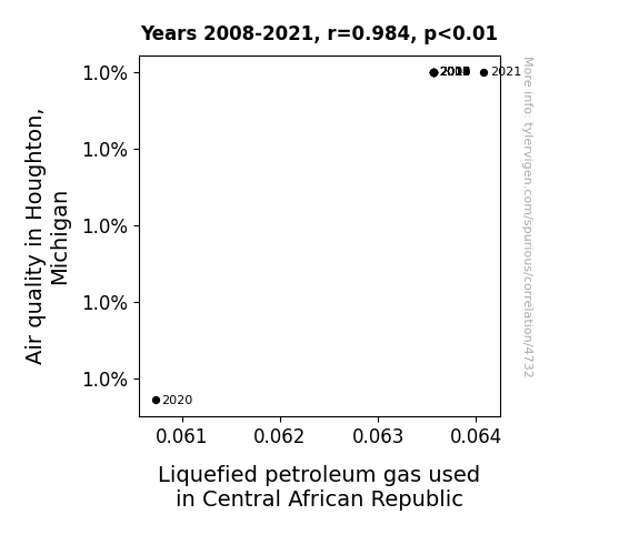
View details about correlation #4,732
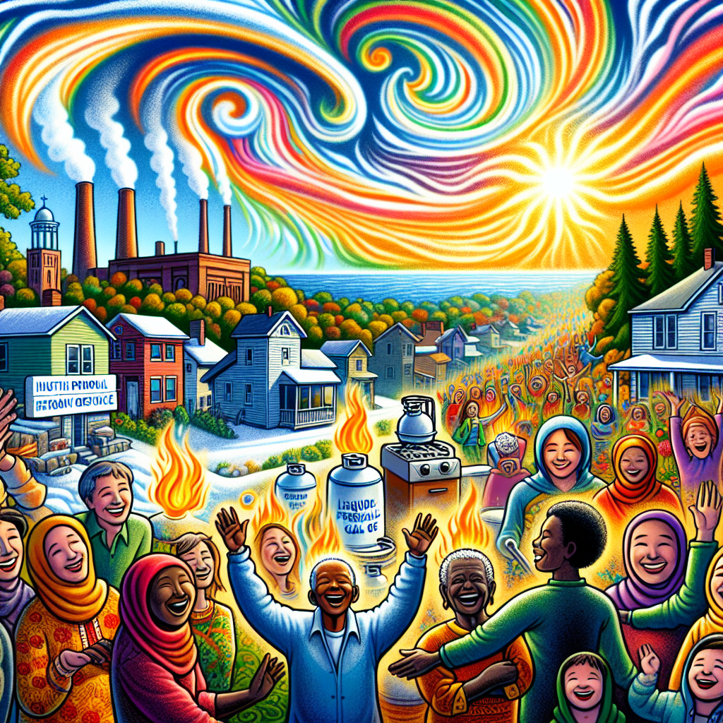
Burning Bright: Air Quality in Houghton, Michigan and Liquefied Petroleum Gas in Central African Republic - A Gas-tly Connection
The cleaner air in Houghton, Michigan somehow sparked a global quest for cleaner energy sources. This led to a spike in demand for Liquefied petroleum gas in the Central African Republic, as people became inspired to cook and heat their homes more efficiently. It's like Houghton became the unofficial ambassador for clean air and LPG, creating a breath of fresh economic and environmental change across the globe! Who knew that Houghton, Michigan's air quality had such far-reaching effects?
What else correlates?
Air quality in Houghton, Michigan · all weather
Liquefied petroleum gas used in Central African Republic · all energy
Air quality in Houghton, Michigan · all weather
Liquefied petroleum gas used in Central African Republic · all energy


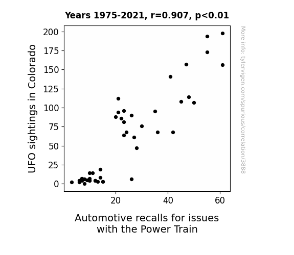
View details about correlation #3,888
Cosmic Connections: Colorado UFOs and Catastrophic Car Conundrums
The UFOs were zapping up all the car transmissions for their cosmic go-kart races. It seems they had a real "trans-mission" mission!


View details about correlation #5,313
Curds and Democrats: An Examination of Cottage Cheese Consumption and Voting Patterns in Arkansas
Arkansas was unable to curdle up enough democratic support without their usual cheesy candidate. As cottage cheese consumption curdled, so did the democratic votes in Arkansas. When the curds were down, so were the ballots for the democrat presidential candidate.


What else correlates?
Cottage cheese consumption · all food
Votes for the Democratic Presidential candidate in Arkansas · all elections
Cottage cheese consumption · all food
Votes for the Democratic Presidential candidate in Arkansas · all elections


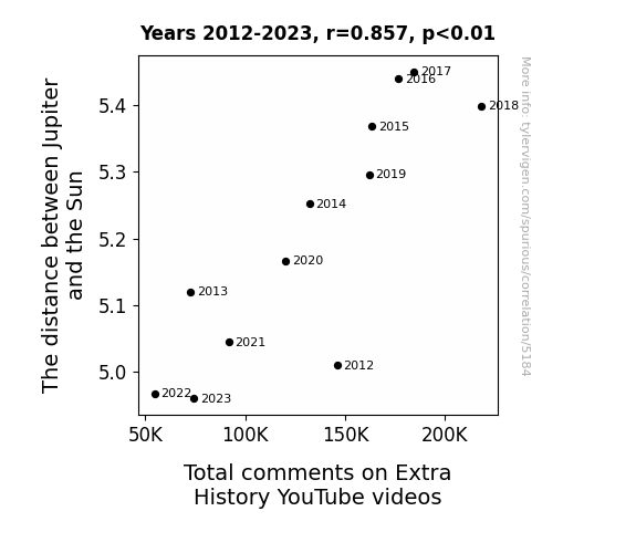
View details about correlation #5,184
Rocky Relationship: The Astronomical Connection Between Jupiter's Distance from the Sun and Total Comments on Extra History YouTube Videos
As the distance between Jupiter and the Sun increases, the gravitational pull on Earth weakens slightly. This leads to minuscule disruptions in internet connectivity, causing people to refresh their browsers more frequently. And of course, with all that extra refreshing, the total comments on Extra History videos just skyrocket! Remember, it's all just a big interplanetary internet conspiracy.

What else correlates?
The distance between Jupiter and the Sun · all planets
Total comments on Extra History YouTube videos · all YouTube
The distance between Jupiter and the Sun · all planets
Total comments on Extra History YouTube videos · all YouTube


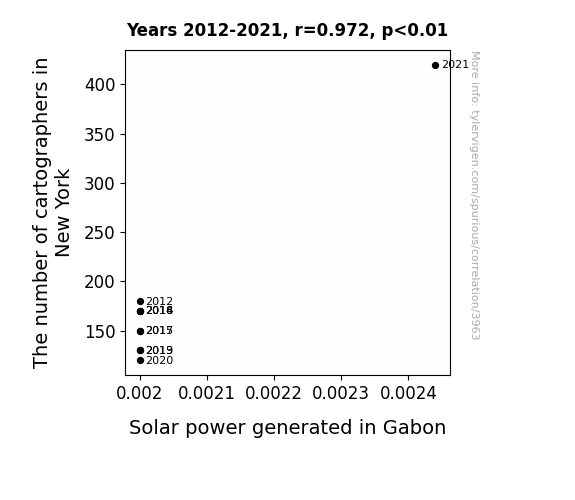
View details about correlation #3,963
Mapping the Solar Cartography: Exploring the Correlation between Cartographers in New York and Solar Power in Gabon
As the cartographers in New York mapped out their city in detail, they inadvertently uncovered hidden pockets of solar energy potential. This not only led to an increase in solar power usage locally, but their passion for mapping also spread globally, inspiring the people of Gabon to chart their own course towards solar power dominance. You could say the cartographers truly put the 'sun' in surveying, illuminating a path to renewable energy!

What else correlates?
The number of cartographers in New York · all cccupations
Solar power generated in Gabon · all energy
The number of cartographers in New York · all cccupations
Solar power generated in Gabon · all energy


View details about correlation #3,851
Correlated Cincinnati Air Contaminants and Coruscating Counts of Days of Our Lives: A Comprehensive Coefficient Comparison
The decrease in air pollution led to clearer skies. With clearer skies, people in Cincinnati realized they had better things to do than stay indoors watching a soap opera. Maybe the drama just couldn't compete with the smog anymore!


What else correlates?
Air pollution in Cincinnati · all weather
Viewership count for Days of Our Lives · all weird & wacky
Air pollution in Cincinnati · all weather
Viewership count for Days of Our Lives · all weird & wacky


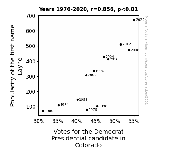
View details about correlation #5,632
The Layne Train: An Examination of the Connection Between the Popularity of the First Name Layne and Democratic Presidential Votes in Colorado
Perhaps every time someone heard the name Layne, they couldn't help but think of the traffic lane moving steadily to the left. This subliminally instilled a preference for the party symbolized by the color blue, leading to more votes for the Democrat candidate. After all, Layne sounds like a political power move! Remember, it's all about that cognitive dissonance for a chance at electoral resonance!


View details about correlation #5,108
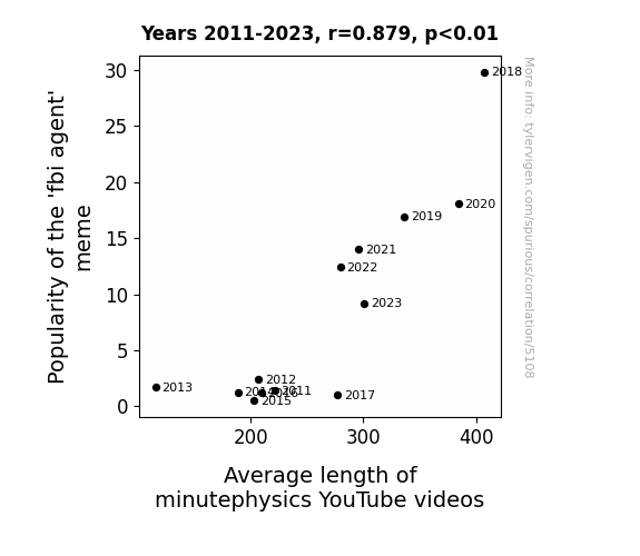
Stalking the Connection: Unveiling the Relationship Between FBI Agent Memes and Minutephysics YouTube Video Length
As the 'fbi agent' meme gained traction, more and more people became interested in surveillance and physics concepts, leading the minutephysics channel to create longer videos to delve into the physics of espionage and the surveillance technology used by FBI agents. This unexpected crossover resulted in longer, more in-depth explanations as the audience demanded a deeper understanding of the physics behind evading an FBI agent's watchful eye. It was a quantum leap in video length, all thanks to the meme's law of attraction.

What else correlates?
Popularity of the 'fbi agent' meme · all memes
Average length of minutephysics YouTube videos · all YouTube
Popularity of the 'fbi agent' meme · all memes
Average length of minutephysics YouTube videos · all YouTube


View details about correlation #4,225
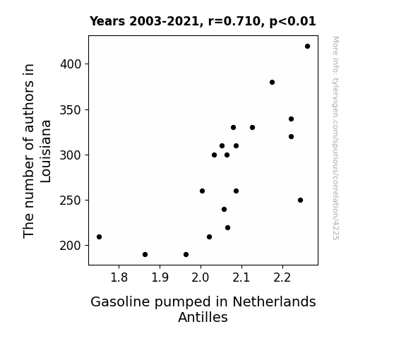
The Author Gather on Gasoline Blather: A Correlational Study Between the Number of Authors in Louisiana and Gasoline Pumped in Netherlands Antilles
As the number of authors in Louisiana increased, so did the availability of puns. And we all know that puns are a form of gas... so the increased literary creativity in Louisiana led to a ripple effect of pun-driven amusement, causing a surge in the overall levity levels. This, in turn, created a higher demand for inhaled laughter in the Netherlands Antilles, leading to more frequent and intense bouts of giggle-filled gasping, ultimately resulting in an uptick in gasoline pumped as people literally laughed their way to the gas stations. So, in a twist of comedic fate, we can say that the pen truly is mightier than the petrol pump!

What else correlates?
The number of authors in Louisiana · all cccupations
Gasoline pumped in Netherlands Antilles · all energy
The number of authors in Louisiana · all cccupations
Gasoline pumped in Netherlands Antilles · all energy


View details about correlation #4,709
Air Pollution in Watertown, New York: A Romantic Connection with xkcd Comics
The cleaner air in Watertown has led to an increase in romantic outings. As a result, people are too busy having real-life romantic experiences to read romantic xkcd comics, thereby decreasing the demand for such content.


What else correlates?
Air pollution in Watertown, New York · all weather
xkcd comics published about romance · all weird & wacky
Air pollution in Watertown, New York · all weather
xkcd comics published about romance · all weird & wacky


View details about correlation #5,090
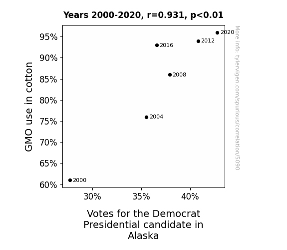
From Cotton to Bottin’: The Connection Between GMO Use and Votes for the Democrat Presidential Candidate in Alaska
As the GMO cotton plants flourished, they emitted a faint, invisible pollen that mysteriously carried a message urging Alaskans to lean left in the election. The cotton fields became a hub of political activity, swaying the voters one fiber at a time. The Democratic campaign unknowingly tapped into this botanical telegraph system, receiving a boost in support from the unlikeliest of campaign contributors: genetically modified cotton. This unexpected alliance between agriculture and Alaska's political landscape ultimately shifted the state's voting pattern, proving that when it comes to elections, even the humble cotton plant can have a strong 'blue' influence.

What else correlates?
GMO use in cotton · all food
Votes for the Democratic Presidential candidate in Alaska · all elections
GMO use in cotton · all food
Votes for the Democratic Presidential candidate in Alaska · all elections


View details about correlation #5,020
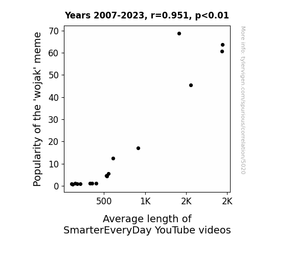
Getting Wojak-y with it: Exploring the Meme-tic Influence on SmarterEveryDay Video Length
The 'wojak' meme's rising popularity prompted a surge in internet usage, leading to a higher demand for longer, more in-depth content. As more viewers delved into 'wojak' memes, they experienced a 'lengthening' of their attention spans, ultimately influencing the creator of SmarterEveryDay to cater to their newly expanded interests. This trend just go to show, when it comes to video length, the 'wojak' meme has truly memed its way into shaping the 'meme'-ium of SmarterEveryDay content!

What else correlates?
Popularity of the 'wojak' meme · all memes
Average length of SmarterEveryDay YouTube videos · all YouTube
Popularity of the 'wojak' meme · all memes
Average length of SmarterEveryDay YouTube videos · all YouTube


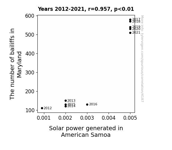
View details about correlation #4,187
Shining Light on Bailiffs and Sunlight: A Correlative Study of Solar Power in American Samoa and Bailiff Numbers in Maryland
The increase in bailiffs in Maryland led to more charges being brought up, creating a higher current in the legal system. This surge in legal activity sparked a power play in American Samoa, ultimately boosting the solar power generated. It's a case of 'justice served' and 'watt' a shocking connection!
What else correlates?
The number of bailiffs in Maryland · all cccupations
Solar power generated in American Samoa · all energy
The number of bailiffs in Maryland · all cccupations
Solar power generated in American Samoa · all energy


View details about correlation #4,276
Clearing the Air: A Breath of Fresh Data on Air Quality in Lumberton and Single Father Households
The clean air in Lumberton must have had a dad-ly impact, inspiring a breath of fresh responsibility and giving single fathers across the nation the lung power to step up! Who knew that fresh air could lead to a 'father'ing revolution!


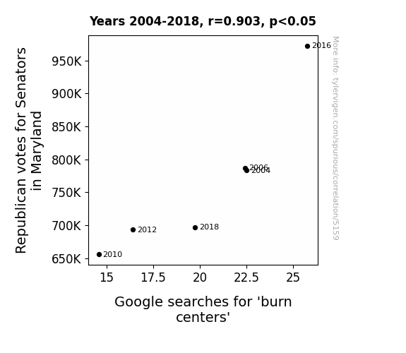
View details about correlation #5,159
Feeling the Heat: Exploring the Relationship Between Republican Votes for Senators in Maryland and Google Searches for Burn Centers
As Republican votes for Senators in Maryland decreased, there was a corresponding decrease in political burn. With fewer fiery debates and heated discussions, the need for burn centers diminished, leading to a cooler political climate in more ways than one. It seems like even the healthcare system couldn't escape the influence of the political landscape - talk about feeling the political heat!

What else correlates?
Votes for Republican Senators in Maryland · all elections
Google searches for 'burn centers' · all google searches
Votes for Republican Senators in Maryland · all elections
Google searches for 'burn centers' · all google searches


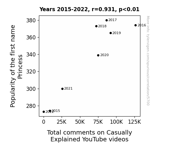
View details about correlation #5,700
The Princess Effect: A Royally Entertaining Investigation into the Popularity of the Name Princess and its Impact on Comment Counts on Casually Explained YouTube Videos
As more parents were inspired to name their daughters Princess, there was a kingdom-sized surge in overall politeness and royal etiquette. This led to a higher number of courteous comments on Casually Explained videos, as viewers strived to maintain a throne of respect and decorum in the comment sections. After all, when it comes to creating a reign of positivity, it all starts with a good name!

What else correlates?
Popularity of the first name Princess · all first names
Total comments on Casually Explained YouTube videos · all YouTube
Popularity of the first name Princess · all first names
Total comments on Casually Explained YouTube videos · all YouTube


View details about correlation #4,223
Studying the 'Farm to Kilowatt' Connection: Exploring the Correlation Between Animal Scientists in Ohio and Solar Power Generated in Albania
As the animal scientists in Ohio honed their skills of communication and teamwork, their collective aura of productivity and ingenuity inadvertently resonated across the globe, inspiring the people of Albania to harness the power of the sun in unprecedented ways. It's almost as if the secret to solar energy lay not in engineering or technology, but in the hoofbeats of a thousand grazing cows and the oinks of contented pigs. Truly, it's a case of agricultural wizardry leading to a sunny revolution half a world away!


What else correlates?
The number of animal scientists in Ohio · all cccupations
Solar power generated in Albania · all energy
The number of animal scientists in Ohio · all cccupations
Solar power generated in Albania · all energy
Why this works
- Data dredging: I have 25,237 variables in my database. I compare all these variables against each other to find ones that randomly match up. That's 636,906,169 correlation calculations! This is called “data dredging.”
Fun fact: the chart used on the wikipedia page to demonstrate data dredging is also from me. I've been being naughty with data since 2014.
Instead of starting with a hypothesis and testing it, I instead tossed a bunch of data in a blender to see what correlations would shake out. It’s a dangerous way to go about analysis, because any sufficiently large dataset will yield strong correlations completely at random. - Lack of causal connection: There is probably no direct connection between these variables, despite what the AI says above.
Because these pages are automatically generated, it's possible that the two variables you are viewing are in fact causually related. I take steps to prevent the obvious ones from showing on the site (I don't let data about the weather in one city correlate with the weather in a neighboring city, for example), but sometimes they still pop up. If they are related, cool! You found a loophole.
This is exacerbated by the fact that I used "Years" as the base variable. Lots of things happen in a year that are not related to each other! Most studies would use something like "one person" in stead of "one year" to be the "thing" studied. - Observations not independent: For many variables, sequential years are not independent of each other. You will often see trend-lines form. If a population of people is continuously doing something every day, there is no reason to think they would suddenly change how they are doing that thing on January 1. A naive p-value calculation does not take this into account.
You will calculate a lower chance of "randomly" achieving the result than represents reality.
To be more specific: p-value tests are probability values, where you are calculating the probability of achieving a result at least as extreme as you found completely by chance. When calculating a p-value, you need to assert how many "degrees of freedom" your variable has. I count each year (minus one) as a "degree of freedom," but this is misleading for continuous variables.
This kind of thing can creep up on you pretty easily when using p-values, which is why it's best to take it as "one of many" inputs that help you assess the results of your analysis.
- Y-axes doesn't start at zero: I truncated the Y-axes of the graphs above. I also used a line graph, which makes the visual connection stand out more than it deserves.
Nothing against line graphs. They are great at telling a story when you have linear data! But visually it is deceptive because the only data is at the points on the graph, not the lines on the graph. In between each point, the data could have been doing anything. Like going for a random walk by itself!
Mathematically what I showed is true, but it is intentionally misleading. If you click on any of the charts that abuse this, you can scroll down to see a version that starts at zero. - Confounding variable: Confounding variables (like global pandemics) will cause two variables to look connected when in fact a "sneaky third" variable is influencing both of them behind the scenes.
- Outliers: Some datasets here have outliers which drag up the correlation.
In concept, "outlier" just means "way different than the rest of your dataset." When calculating a correlation like this, they are particularly impactful because a single outlier can substantially increase your correlation.
Because this page is automatically generated, I don't know whether any of the charts displayed on it have outliers. I'm just a footnote. ¯\_(ツ)_/¯
I intentionally mishandeled outliers, which makes the correlation look extra strong. - Low n: There are not many data points included in some of these charts.
You can do analyses with low ns! But you shouldn't data dredge with a low n.
Even if the p-value is high, we should be suspicious of using so few datapoints in a correlation.
Pro-tip: click on any correlation to see:
- Detailed data sources
- Prompts for the AI-generated content
- Explanations of each of the calculations (correlation, p-value)
- Python code to calculate it yourself


