spurious correlations
discover · random · spurious scholar
← previous page · next page →


View details about correlation #4,321
Braking Bad: The Curious Relationship Between Libertarian Votes and Automotive Recalls for Service Brakes, Air
As the political call for maximum freedom and minimal government intervention revs up, it seems that even the brakes on cars can't help but follow suit. Could it be that as more voters lean towards Libertarian ideals, the very concept of brakes becomes too restrictive for our vehicles, leading to a sudden need for more recalls on service brakes? It's like the cars are saying, "Don't tread on me or my ability to stop safely!" Remember, when it comes to this correlation, it's a real brake from the norm!


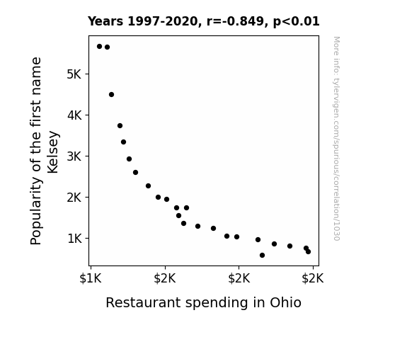
View details about correlation #1,030
As the name Kelsey fell out of favor, people in Ohio stopped naming their kids after that one friend who never wanted to go out to eat. With Kelsey's aversion to dining out, Ohioans found themselves with more appetite and disposable income, leading to a rise in restaurant spending. It seems the lack of Kelsey's 'a-peeling' personality inadvertently beefed up the food industry in Ohio.
What else correlates?
Popularity of the first name Kelsey · all first names
Restaurant spending in Ohio · all random state specific
Popularity of the first name Kelsey · all first names
Restaurant spending in Ohio · all random state specific


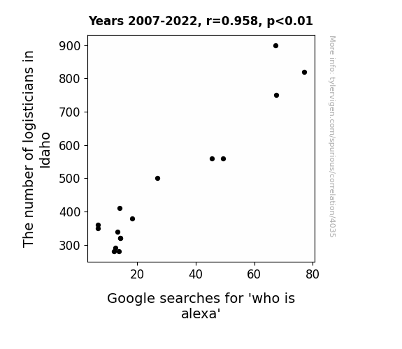
View details about correlation #4,035
The Logistics of Lexicographical Lunacy: A Lighthearted Look at Logisticians and 'Who is Alexa' Google Searches in Idaho
More logisticians in Idaho means more efficient transportation of Amazon Echo devices, leading to greater availability of Alexa.
What else correlates?
The number of logisticians in Idaho · all cccupations
Google searches for 'who is alexa' · all google searches
The number of logisticians in Idaho · all cccupations
Google searches for 'who is alexa' · all google searches


View details about correlation #4,820
A Watt's Length: Exploring the Shocking Connection Between Renewable Energy Production in Barbados and the Average Length of Computerphile YouTube Videos
As Renewable energy production in Barbados increased, it led to more efficient and reliable electricity supply. This, in turn, allowed the Computerphile team to power up their creative energy for longer periods, leading to the production of lengthier and more electrifying videos. In other words, as Barbados turned up the renewable power, Computerphile turned up the video length, creating a shocking connection between clean energy and extended screen time.


What else correlates?
Renewable energy production in Barbados · all energy
Average length of Computerphile YouTube videos · all YouTube
Renewable energy production in Barbados · all energy
Average length of Computerphile YouTube videos · all YouTube


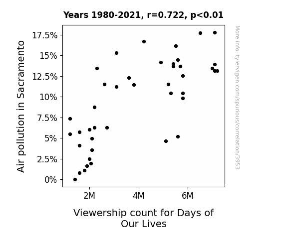
View details about correlation #3,953
The Smog and the Soap Opera: A Correlative Analysis of Air Pollution in Sacramento and Viewership Count for Days of Our Lives
The cleaner air led to people spending more time outdoors, engaging in activities and socializing, rather than staying cooped up inside watching daytime soap operas.
What else correlates?
Air pollution in Sacramento · all weather
Viewership count for Days of Our Lives · all weird & wacky
Air pollution in Sacramento · all weather
Viewership count for Days of Our Lives · all weird & wacky


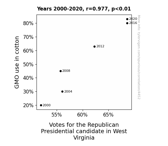
View details about correlation #4,452
Seeding Republican Votes: The GMO Connection in West Virginia Politics
As the GMO cotton plants grew larger and stronger, their roots inadvertently tapped into a dormant reservoir of patriotic spirit in the soil, leading to a surge in Republican support. Remember, when it comes to politics, even the fabric of our nation can't help but get involved!

What else correlates?
GMO use in cotton · all food
Votes for the Republican Presidential candidate in West Virginia · all elections
GMO use in cotton · all food
Votes for the Republican Presidential candidate in West Virginia · all elections


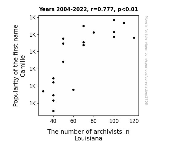
View details about correlation #3,708
Filing Fame: The Archival Adventures of Camille - A Statistical Examination of Name Popularity and Archivist Employment in Louisiana
Every time someone named Camille introduces themselves, a mysterious urge to meticulously catalog historical documents and artifacts inexplicably sweeps through Louisiana. It's as if the name itself carries with it the echoing whispers of ancient filing systems, beckoning forth a new wave of archivists to ensure that the state's history remains neatly organized and easily accessible. Who knew that the key to unlocking a passion for archival work lay hidden within the seemingly innocent sounds of "Camille"? Or perhaps there's a secret society of Camilles, dedicated to spreading their archival influence across the land. It's a puzzling and strangely specific connection, but one thing's for sure: Louisiana's archivist community seems to have a curiously name-driven recruitment strategy!

What else correlates?
Popularity of the first name Camille · all first names
The number of archivists in Louisiana · all cccupations
Popularity of the first name Camille · all first names
The number of archivists in Louisiana · all cccupations


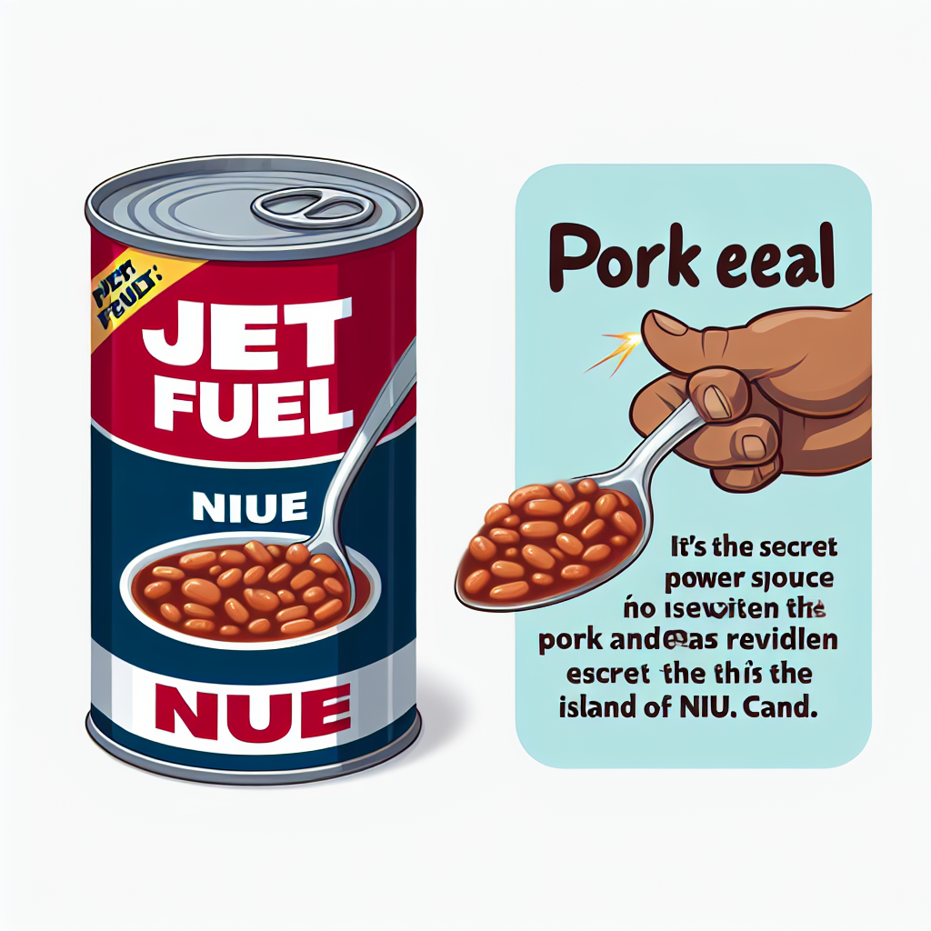
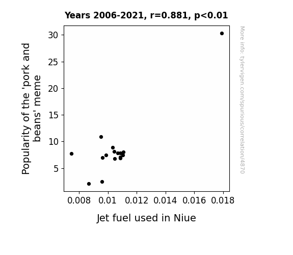
View details about correlation #4,870
Pigging Out on Data: Exploring the Swine Connection Between the 'Pork and Beans' Meme and Jet Fuel Consumption in Niue
The 'pork and beans' meme is so hot right now that it's making Niue want to jet-set around the world, hence the increased demand for jet fuel. It's like the island nation suddenly has a need for speed, all thanks to a bunch of internet users finding humor in a can of pork and beans. And who can blame them? Those memes are truly taking Niue to new heights!
What else correlates?
Popularity of the 'pork and beans' meme · all memes
Jet fuel used in Niue · all energy
Popularity of the 'pork and beans' meme · all memes
Jet fuel used in Niue · all energy


View details about correlation #4,273
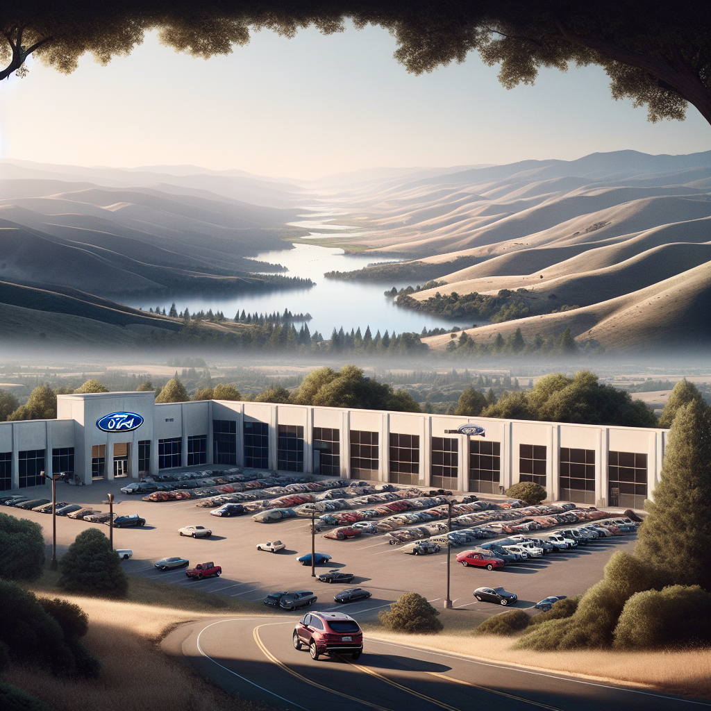
Clearing the Air: Examining the Impact of Air Pollution in Sonora, California on Ford Motor's Sales in the United States
As the air in Sonora got cleaner, people no longer felt the need to escape in their Fords, leading to a nationwide decrease in Ford sales. It's like the cars lost their appeal without the smoggy, cinematic backdrop.


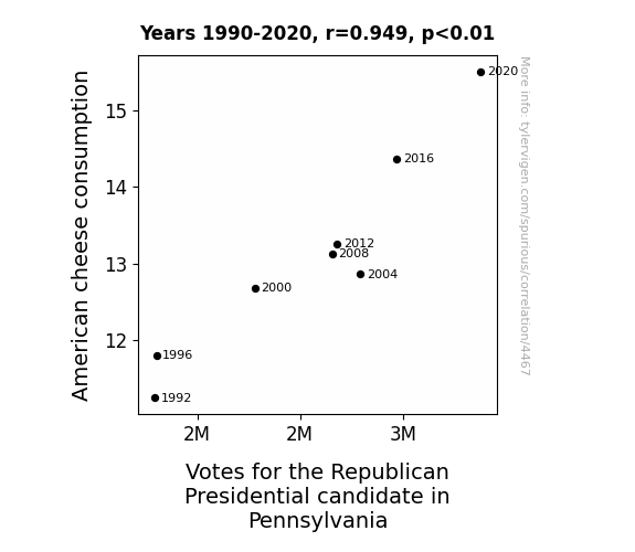
View details about correlation #4,467
The Big and the Cheesy: A Gouda Look at American Cheese Consumption and Votes for the Republican Presidential Candidate in Pennsylvania
As American cheese consumption increased, so did the level of cheesiness in political ads. This cheesiness resonated with voters in Pennsylvania, leading to more support for the Republican candidate. Remember, for some voters, it's all about the gouda old American values!

What else correlates?
American cheese consumption · all food
Votes for the Republican Presidential candidate in Pennsylvania · all elections
American cheese consumption · all food
Votes for the Republican Presidential candidate in Pennsylvania · all elections


View details about correlation #4,631
The AsapSCIENCE Arkansas Analysis: Assessing Amusing Associations
The bill collectors were too busy learning about science to bother people for money.


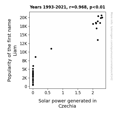
View details about correlation #4,142
Shining a Light on Solar Power: The Sunny Side of Being Named Liam
As the number of babies named Liam rose, so did the collective level of energy and excitement. This surge in positivity somehow aligned with the sun's intensity, leading to a boost in solar power generation in Czechia. It's as if the country's newfound Liams were the ultimate sunshine enthusiasts, unknowingly advocating for a brighter and more sustainable future. The connection may not be scientifically explicable, but it seems that in this quirky scenario, the little Liams truly brought a whole lot of light into the world, both literally and figuratively.

What else correlates?
Popularity of the first name Liam · all first names
Solar power generated in Czechia · all energy
Popularity of the first name Liam · all first names
Solar power generated in Czechia · all energy


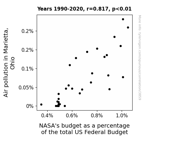
View details about correlation #3,859
Pollution's Peculiar Correlation: Probing the Paradoxical Link between Air Pollution in Marietta, Ohio and NASA's Budget
As the air in Marietta cleared up, residents could finally see the stars at night, leading to a collective fascination with space. This sparked a local grassroots movement to reallocate government funds from NASA to support the construction of a giant space-themed amusement park. After all, who needs a Space Force when you can have a Space Roller Coaster? Or maybe the clean air inspired a surge in backyard rocket experiments, prompting the government to rethink its investment in professional space exploration altogether. After all, why spend billions on rockets when you can just ask Uncle Jed to build one in his shed? It's a homegrown space race!


View details about correlation #5,554
Seeking Senators: The Surprising Saga of Montana's Democrats and Daring Antarctic Destinations
The uptick in Democrat votes for Senators in Montana sparked a sudden interest in polar travel, as residents started dreaming of a political shift towards cooler climates. As the political landscape in Montana seemed to align more with the icy expanse of Antarctica, people couldn't help but wonder if there was a direct flight from the Big Sky Country to the land of penguins. It's as if they hoped to ride a blue wave all the way to the southernmost continent, where even politics freeze over!


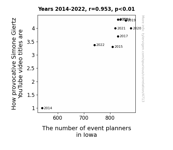
View details about correlation #4,713
Simone Giertz's Provocative Video Titles and Iowa's Event Planner Delights: A Rhyming Correlation
The event planners in Iowa are getting so inspired by Simone's videos that they're organizing outrageous, robot-themed events left and right. It's a sparkle revolution in event planning, and Iowa can't get enough!


View details about correlation #3,805
Shining a Light on Solar Power: Illuminating the Connection Between Motor Vehicle Thefts in Missouri and Solar Energy in Tunisia
As more cars went missing in Missouri, it created a demand for alternative energy sources, leading to an unexpected surge in orders for Tunisian solar panels. It seemed the thieves had a bright idea to go green, sparking a bizarre connection between illegal activities in the US and renewable energy production in North Africa. This peculiar chain of events left everyone shocked and solar-powered in more ways than one!

What else correlates?
Motor vehicle thefts in Missouri · all random state specific
Solar power generated in Tunisia · all energy
Motor vehicle thefts in Missouri · all random state specific
Solar power generated in Tunisia · all energy


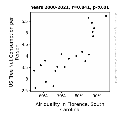
View details about correlation #4,264
Nuts for Clean Air: Exploring the Relationship between US Tree Nut Consumption per Person and Air Quality in Florence, South Carolina
As people consumed more tree nuts, their bodies became more efficient at processing nutrients, leading to a decrease in excessive gas production. This reduction in flatulence ultimately contributed to a fresher and cleaner local air quality in Florence, South Carolina. So remember, for a breath of fresh air, just go nuts!
What else correlates?
US Tree Nut Consumption per Person · all weird & wacky
Air quality in Florence, South Carolina · all weather
US Tree Nut Consumption per Person · all weird & wacky
Air quality in Florence, South Carolina · all weather


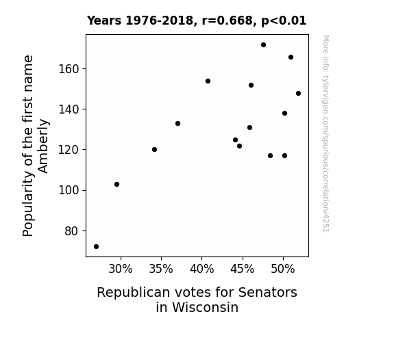
View details about correlation #4,251
It turns out that each time someone heard the name Amberly, it conjured subconscious images of amber waves of grain and quaint country charm. This triggered a deep, primordial urge to embrace traditional values and uphold the status quo, leading to a surge in Republican support. Plus, Amberly just sounds like the kind of name that would politely nod in agreement at conservative viewpoints, further swaying the Wisconsin Senate race. It's as if the name itself whispered, "Keep calm and vote red." Who knew a single name could have such a sneaky political impact?
What else correlates?
Popularity of the first name Amberly · all first names
Votes for Republican Senators in Wisconsin · all elections
Popularity of the first name Amberly · all first names
Votes for Republican Senators in Wisconsin · all elections


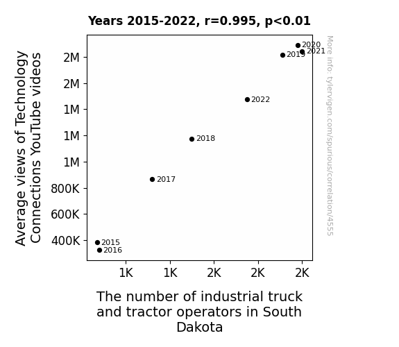
View details about correlation #4,555
Truckin' Technology: Examining the Correlation Between Average Views of Technology Connections YouTube Videos and the Number of Industrial Truck and Tractor Operators in South Dakota
South Dakotans were so inspired by the technology in the videos that they formed a fleet of high-tech, YouTube-educated operators, revolutionizing the industrial truck and tractor industry in the state. The power of internet knowledge and farm equipment - who would have thought?


View details about correlation #4,184
Fueling the Search for Bargains: A Correlative Study of Fossil Fuel Use in Burundi and Google Searches for 'Dollar Store Near Me'
The fossil fuel use in Burundi has sparked a global chain reaction, leading to a surge in the production of inexpensive plastic goods. This influx of cheaply made products has fueled the expansion of dollar stores, prompting more people to search for a "burundi-ful" bargain at their nearest dollar store. It seems like the wheels on the fossil fuel bus go 'round and 'round all the way to affordable knick-knacks and doodads!


What else correlates?
Fossil fuel use in Burundi · all energy
Google searches for 'dollar store near me' · all google searches
Fossil fuel use in Burundi · all energy
Google searches for 'dollar store near me' · all google searches
Why this works
- Data dredging: I have 25,237 variables in my database. I compare all these variables against each other to find ones that randomly match up. That's 636,906,169 correlation calculations! This is called “data dredging.”
Fun fact: the chart used on the wikipedia page to demonstrate data dredging is also from me. I've been being naughty with data since 2014.
Instead of starting with a hypothesis and testing it, I instead tossed a bunch of data in a blender to see what correlations would shake out. It’s a dangerous way to go about analysis, because any sufficiently large dataset will yield strong correlations completely at random. - Lack of causal connection: There is probably no direct connection between these variables, despite what the AI says above.
Because these pages are automatically generated, it's possible that the two variables you are viewing are in fact causually related. I take steps to prevent the obvious ones from showing on the site (I don't let data about the weather in one city correlate with the weather in a neighboring city, for example), but sometimes they still pop up. If they are related, cool! You found a loophole.
This is exacerbated by the fact that I used "Years" as the base variable. Lots of things happen in a year that are not related to each other! Most studies would use something like "one person" in stead of "one year" to be the "thing" studied. - Observations not independent: For many variables, sequential years are not independent of each other. You will often see trend-lines form. If a population of people is continuously doing something every day, there is no reason to think they would suddenly change how they are doing that thing on January 1. A naive p-value calculation does not take this into account.
You will calculate a lower chance of "randomly" achieving the result than represents reality.
To be more specific: p-value tests are probability values, where you are calculating the probability of achieving a result at least as extreme as you found completely by chance. When calculating a p-value, you need to assert how many "degrees of freedom" your variable has. I count each year (minus one) as a "degree of freedom," but this is misleading for continuous variables.
This kind of thing can creep up on you pretty easily when using p-values, which is why it's best to take it as "one of many" inputs that help you assess the results of your analysis.
- Y-axes doesn't start at zero: I truncated the Y-axes of the graphs above. I also used a line graph, which makes the visual connection stand out more than it deserves.
Nothing against line graphs. They are great at telling a story when you have linear data! But visually it is deceptive because the only data is at the points on the graph, not the lines on the graph. In between each point, the data could have been doing anything. Like going for a random walk by itself!
Mathematically what I showed is true, but it is intentionally misleading. If you click on any of the charts that abuse this, you can scroll down to see a version that starts at zero. - Confounding variable: Confounding variables (like global pandemics) will cause two variables to look connected when in fact a "sneaky third" variable is influencing both of them behind the scenes.
- Outliers: Some datasets here have outliers which drag up the correlation.
In concept, "outlier" just means "way different than the rest of your dataset." When calculating a correlation like this, they are particularly impactful because a single outlier can substantially increase your correlation.
Because this page is automatically generated, I don't know whether any of the charts displayed on it have outliers. I'm just a footnote. ¯\_(ツ)_/¯
I intentionally mishandeled outliers, which makes the correlation look extra strong. - Low n: There are not many data points included in some of these charts.
You can do analyses with low ns! But you shouldn't data dredge with a low n.
Even if the p-value is high, we should be suspicious of using so few datapoints in a correlation.
Pro-tip: click on any correlation to see:
- Detailed data sources
- Prompts for the AI-generated content
- Explanations of each of the calculations (correlation, p-value)
- Python code to calculate it yourself


