spurious correlations
discover · random · spurious scholar
← previous page · next page →


View details about correlation #4,682
Clearing the Air: A Breath of Fresh Spam? Exploring the Correlation between Air Quality in Elmira, New York and Annual Email Spam Rates
As the air quality improved, it created the perfect conditions for a rare species of spam-email-producing algae to thrive. This algae, known as Phisherus maximus, releases emails as a way of spreading its digital spores. The crisp, clean air provided just the right amount of oxygen for these tech-savvy algae to multiply and clog up everyone's inboxes with photosynthetic spam. It's a green, mean, spam-generating machine!


What else correlates?
Air quality in Elmira, New York · all weather
Annual Email Spam Rates · all weird & wacky
Air quality in Elmira, New York · all weather
Annual Email Spam Rates · all weird & wacky


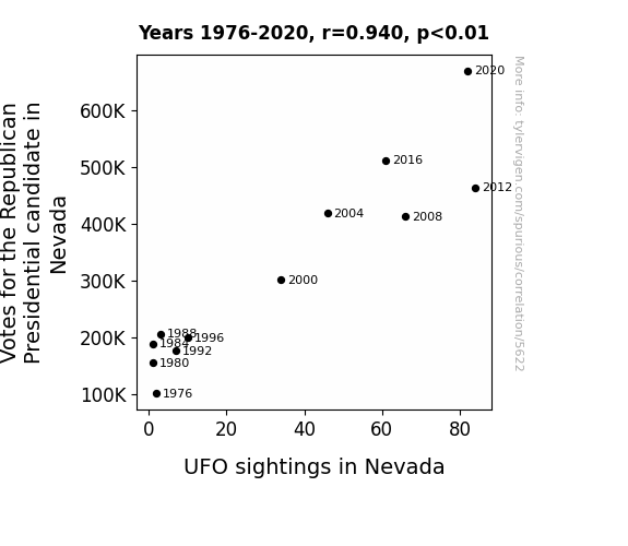
View details about correlation #5,622
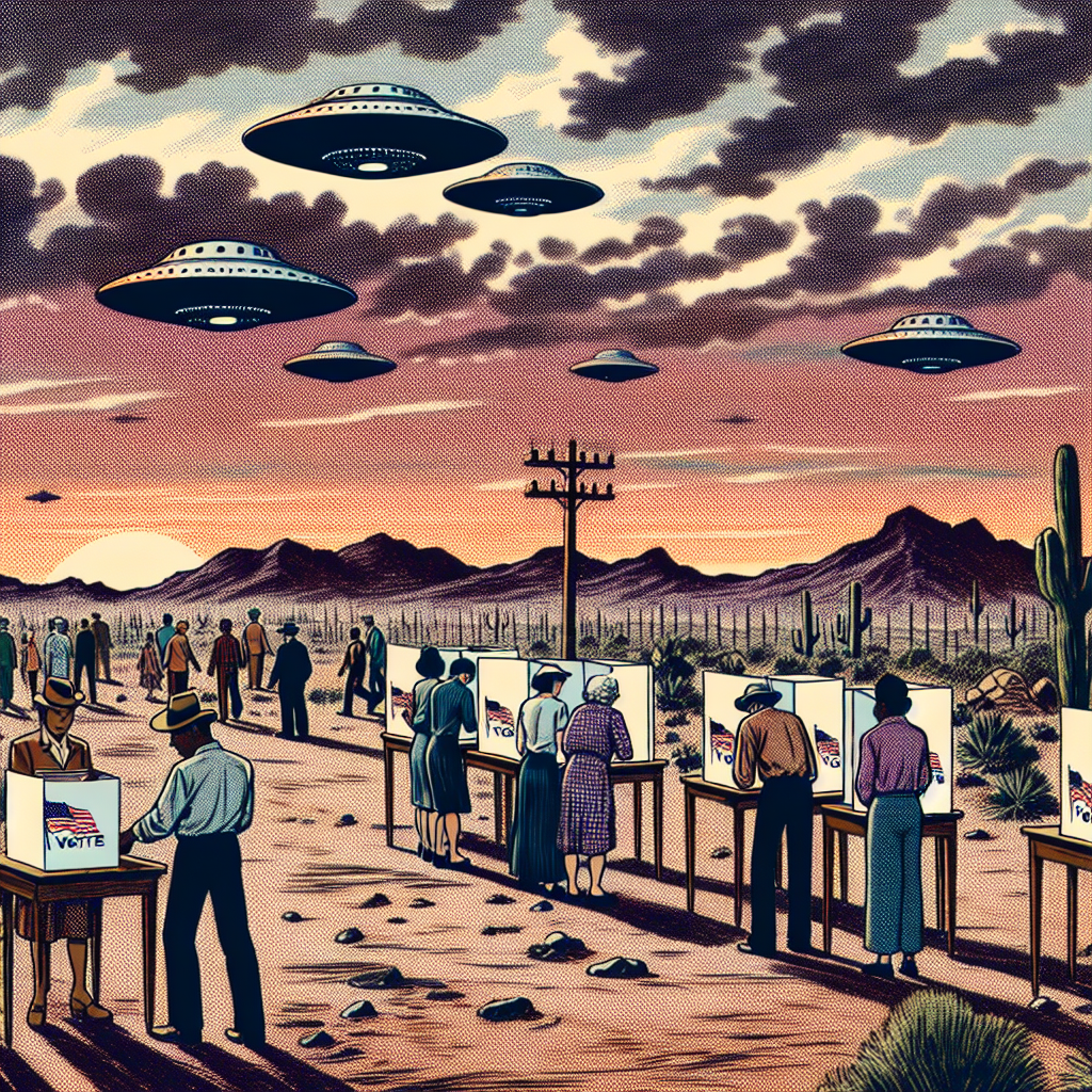
Out of This World Politics: A Close Encounter Between Republican Votes and UFO Sightings in Nevada
As the support for the Republican candidate surged, it sent a powerful signal into the cosmos, attracting UFOs to Nevada like moths to a flame. Perhaps the aliens were just really interested in red vs. blue politics, or maybe they mistook the campaign trail for a landing strip!


View details about correlation #4,509
Cosmic Connection: Correlating the Counts of Cosmic Content with Careers in Canvassing the Cosmos
The pun: It seems the nuclear medicine technologists couldn't keep up with the decaying views! A decrease in Average views of SciShow Space YouTube videos caused The number of nuclear medicine technologists in New York to decrease because as the interest in space decreased, it created a Black Hole of employment opportunities for nuclear medicine technologists, leading them to seek out new careers with more universal appeal. As the Space videos fizzled out, so did the desire to atomically specialize, leaving the field feeling a bit radioactive. Even in the city that never sleeps, it seems the nuclear medicine technologists were experiencing a cosmic shift in their job market.


View details about correlation #3,863
Butter Beliefs: Bridging the Gap Between Butter Consumption and Belgium's Breezy Blessings
As butter consumption increased, people started to produce more gas, leading to an uptick in wind power generated in Belgium. This created a real "wind dairy" situation, where the connection between butter and renewable energy was churning out some gouda results. It seems like the winds of change were fueled by a dairy delicious source!


What else correlates?
Butter consumption · all food
Wind power generated in Belgium · all energy
Butter consumption · all food
Wind power generated in Belgium · all energy


View details about correlation #4,312
The xkcd Files: A Molecular Investigation into the Relationship between Air Pollution in Chattanooga, Tennessee and Romance-themed xkcd Comics
The cleaner air led to clearer minds, prompting the xkcd creator to focus on other topics. As the smog lifted, so did the artist's penchant for romance, creating a breezy shift in comic content. It seems in this case, love wasn't just in the air - it was in the lack of air pollution!


What else correlates?
Air pollution in Chattanooga, Tennessee · all weather
xkcd comics published about romance · all weird & wacky
Air pollution in Chattanooga, Tennessee · all weather
xkcd comics published about romance · all weird & wacky
. The chart goes from 2006 to 2023, and the two variables track closely in value over that time.")

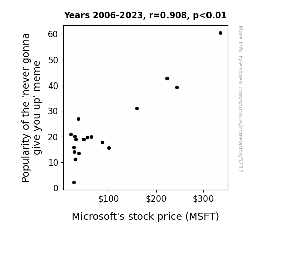
View details about correlation #5,232
Rickrolling to Riches: The Never Gonna Give You Up Meme's Influence on MSFT Stock Price
The 'never gonna give you up' meme's rise in popularity led to an increase in internet traffic. This surge in online activity created higher demand for Microsoft's products and services, boosting their stock price. It seems Microsoft's success is truly never gonna give you up, never gonna let you down!

What else correlates?
Searches for 'never gonna give you up' · all memes
Microsoft's stock price (MSFT) · all stocks
Searches for 'never gonna give you up' · all memes
Microsoft's stock price (MSFT) · all stocks


View details about correlation #4,300
Driven by Politics: The Republican Vote-Supply Chain Employment Nexus in the Sooner State
As more Republican Senators were elected, the demand for "efficient and streamlined" transportation and distribution systems grew. This led to a surge in the need for managers to organize the frequent traffic jams of political maneuvering and ensure the smooth delivery of promises to the public. It's a case of political votes driving the need for logistical devotees!


View details about correlation #4,514
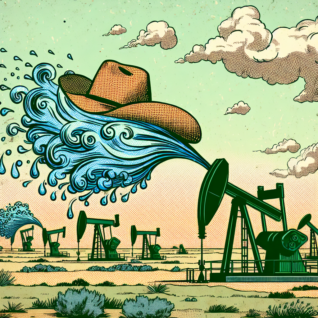
Flickering Flames and Internet Fame: Exploring the Correlation Between Liquefied Petroleum Gas Consumption in Netherlands and Total Likes of LEMMiNO YouTube Videos
As the Dutch turned up the gas, LEMMiNO's video popularity skyrocketed. It seems the secret to social media success is just a little bit of 'LPG' - Liking, Producing, and Gas. And that's no Dutch oven story! Cheers to a 'gassy' connection! 🌬️


What else correlates?
Liquefied petroleum gas used in Netherlands · all energy
Total likes of LEMMiNO YouTube videos · all YouTube
Liquefied petroleum gas used in Netherlands · all energy
Total likes of LEMMiNO YouTube videos · all YouTube


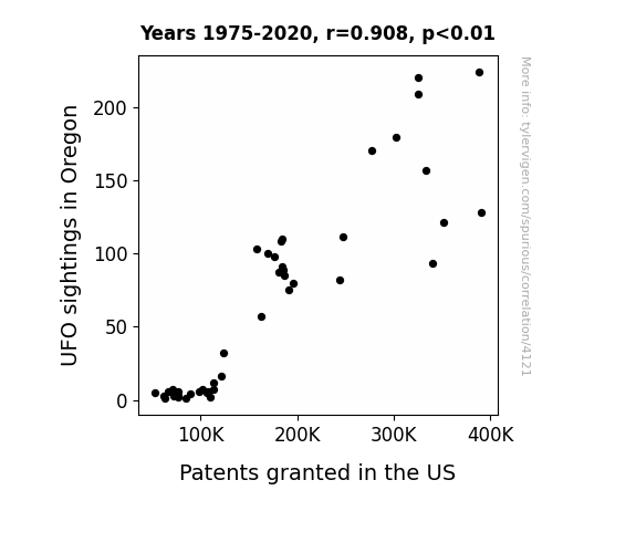
View details about correlation #4,121
Unveiling the Unidentified: A Close Encounter of UFO Sightings in Oregon and Patents Granted in the United States
As UFOs buzzed over Oregon, they inadvertently beamed innovative ideas into the minds of residents. This led to a surge in groundbreaking inventions being submitted for patents. Perhaps the extraterrestrial inspiration sparked a new wave of technological advancements, propelling the state to new heights of creativity. Or maybe it's just a cosmic coincidence.

What else correlates?
UFO sightings in Oregon · all random state specific
Patents granted in the US · all weird & wacky
UFO sightings in Oregon · all random state specific
Patents granted in the US · all weird & wacky


View details about correlation #5,714
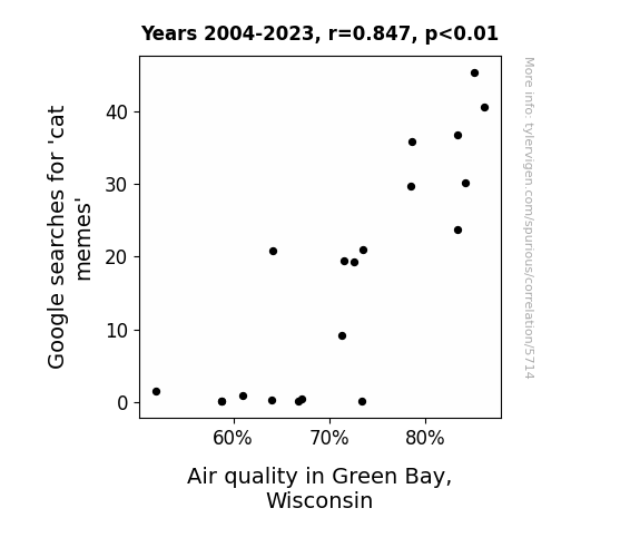
Pawsitively Purrfect: An Intriguing Correlation Between Google Searches for 'Cat Memes' and Air Quality in Green Bay, Wisconsin
As cat memes surged, so did the demand for indoor plants. More people in Green Bay started filling their homes with air-purifying plants to create the perfect backdrop for photographing their feline friends. The collective increase in plant ownership led to an unexpected uptick in indoor air quality, proving that when it comes to cleaner air, the internet really is the cat's meow.

What else correlates?
Google searches for 'cat memes' · all google searches
Air quality in Green Bay, Wisconsin · all weather
Google searches for 'cat memes' · all google searches
Air quality in Green Bay, Wisconsin · all weather


View details about correlation #4,722
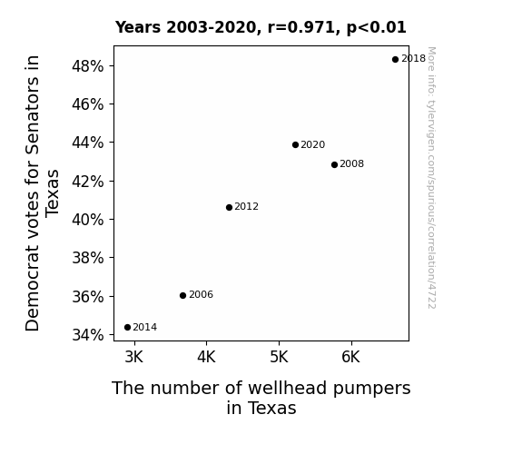
Pump Up the Votes: The Political Correlation Between Democrat Support for Senators in Texas and the Wellhead Pumpers Population
As the Democrat votes for Senators in Texas increased, their support for renewable energy initiatives surged. This led to a boom in the alternative energy sector, creating a high demand for wellhead pumpers to operate the newfangled cowboy hat-shaped oil pumps that harness the power of Texas-sized gusts of hot air. It's a true Texan twist on green energy, y'all!
What else correlates?
Votes for Democratic Senators in Texas · all elections
The number of wellhead pumpers in Texas · all cccupations
Votes for Democratic Senators in Texas · all elections
The number of wellhead pumpers in Texas · all cccupations


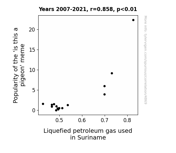
View details about correlation #4,869
The Lighter Side of the 'Is This a Pigeon' Meme: Exploring the Relationship with Liquefied Petroleum Gas Consumption in Suriname
As the meme gained traction, it created a surge in the 'is this a propane' sub-meme, leading to a higher demand for LPG in Suriname. It seems the internet really sparked a connection between meme culture and propane use. It's a case of viral content igniting a gas-related boom in the country.
What else correlates?
Popularity of the 'is this a pigeon' meme · all memes
Liquefied petroleum gas used in Suriname · all energy
Popularity of the 'is this a pigeon' meme · all memes
Liquefied petroleum gas used in Suriname · all energy


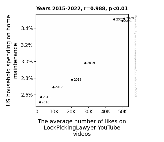
View details about correlation #4,558
The Key to Locked Spending: Unlocking the Relationship Between US Household Spending on Home Maintenance and LockPickingLawyer YouTube Video Likes
As household spending on home maintenance increased, more people were investing in high-security locks. This led to a spike in interest in lock-picking videos, boosting the average number of likes on LockPickingLawyer’s YouTube channel. After all, there’s nothing like a well-maintained home to lock in those likes!


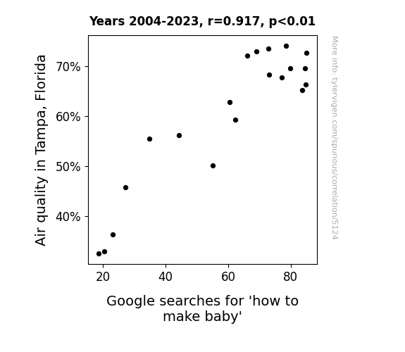
View details about correlation #5,124
Breath of Fresh Air: An Analysis of Air Quality in Tampa, Florida and Its Influence on Searches for 'How to Make Baby' on Google
The cleaner air in Tampa led to more romantic walks on the beach, ultimately inspiring couples to 'conceive' of the idea to start a family. The improved air quality created the perfect 'atmosphere' for love to blossom, proving that when it comes to starting a family, it all begins with a breath of fresh air!

What else correlates?
Air quality in Tampa, Florida · all weather
Google searches for 'how to make baby' · all google searches
Air quality in Tampa, Florida · all weather
Google searches for 'how to make baby' · all google searches


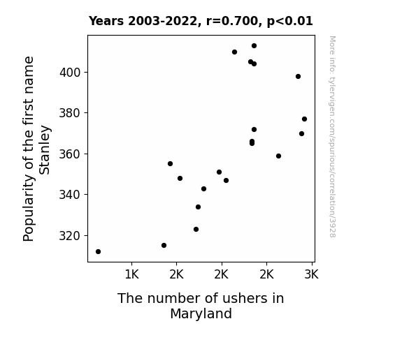
View details about correlation #3,928
The Usher Connection: Stan-ley of Popularity
Less popular name leads to fewer babies leads to fewer people getting married leads to fewer weddings leads to fewer ushers needed. It's a classic case of the Stan-ley effect on wedding staffing!

What else correlates?
Popularity of the first name Stanley · all first names
The number of ushers in Maryland · all cccupations
Popularity of the first name Stanley · all first names
The number of ushers in Maryland · all cccupations


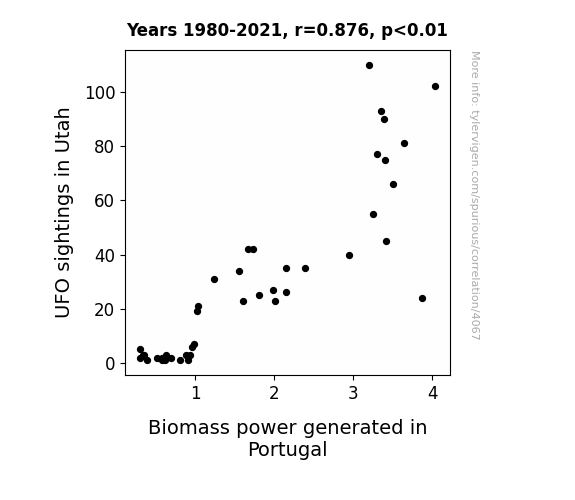
View details about correlation #4,067
Extraterrestrial Enigmas and Energetic Engagements: Exploring the Interstellar Intersection of UFO Sightings in Utah and Biomass Power in Portugal
Perhaps the UFOs were beaming down some extra biomass knowledge to the power plant operators, giving them a power boost of otherworldly proportions! Or maybe the aliens were just big fans of renewable energy, and their presence in Utah somehow transmitted a wave of green energy enthusiasm all the way to Portugal. It's a truly 'out of this world' connection that's fueling the biomass power industry in the most unexpected way!

What else correlates?
UFO sightings in Utah · all random state specific
Biomass power generated in Portugal · all energy
UFO sightings in Utah · all random state specific
Biomass power generated in Portugal · all energy


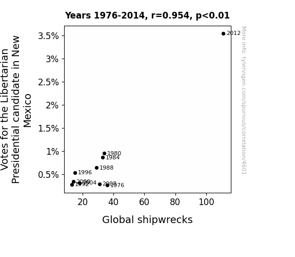
View details about correlation #4,601
Navigating Political Tides: A Libertarian's Ship to Shipwrecks
The increase in Votes for the Libertarian Presidential candidate in New Mexico has led to a surge in demand for smaller government, causing a reduction in maritime regulations. This has inadvertently created a more laissez-faire attitude towards ship safety, ultimately leading to a higher frequency of global shipwrecks. Remember, when it comes to politics and maritime mishaps, it's all about staying afloat in the sea of governance!

What else correlates?
Votes for the Libertarian Presidential candidate in New Mexico · all elections
Global shipwrecks · all weird & wacky
Votes for the Libertarian Presidential candidate in New Mexico · all elections
Global shipwrecks · all weird & wacky


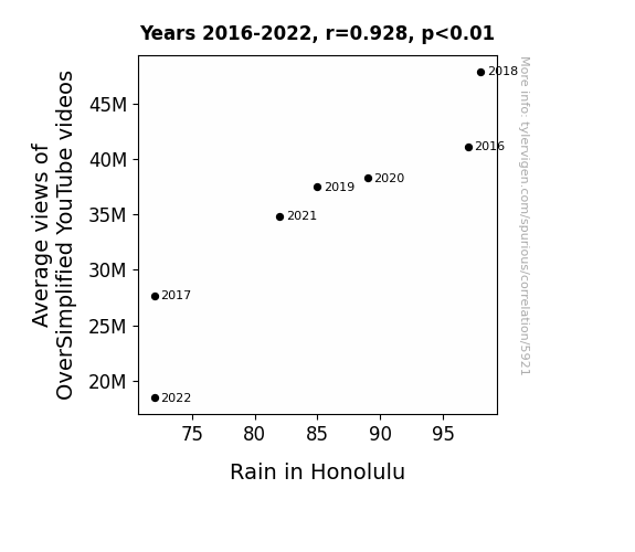
View details about correlation #5,921
Well, as OverSimplified video views dropped, there was a noticeable decrease in historical downpours of knowledge. This led to a high pressure system of ignorance settling over Honolulu, which in turn reign-ed in the usual rainfall. I guess you could say the precipitation was directly linked to the pre-sipitation of historical events coming down from OverSimplified!
What else correlates?
Average views of OverSimplified YouTube videos · all YouTube
Rain in Honolulu · all weather
Average views of OverSimplified YouTube videos · all YouTube
Rain in Honolulu · all weather


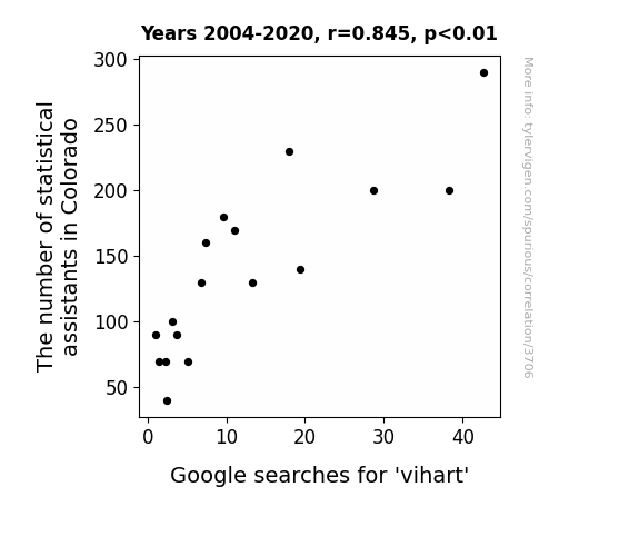
View details about correlation #3,706
Statistical Assistants of Colorado and ViHart: A Search for Correlation
The statistical assistants were just too squared away, leaving no room for the irrational and fun-loving Vi Hart! Without them, the data on Vi Hart searches became increasingly scatter-brained, and the correlation coefficient between statistical assistants and Vi Hart searches approached zero. It's a prime example of how when you take away the statisticians, things just don't add up in the world of math celebrities. The absence of these assistants truly subtracted from the Vi Hart hype, creating quite the division among her fans.

What else correlates?
The number of statistical assistants in Colorado · all cccupations
Google searches for 'vihart' · all google searches
The number of statistical assistants in Colorado · all cccupations
Google searches for 'vihart' · all google searches


View details about correlation #4,118
Beauty and the Beastly Expenses: Exploring the Relationship Between Number of Miss World Delegates and Jet Fuel Consumption in Denmark
As the number of Miss World delegates increases, so does the demand for specially chartered private jets to transport them to the competition. These jets, adorned with extravagant beauty queen decals, consume copious amounts of jet fuel as they crisscross the globe to pick up the delegates, making Denmark a frequent refueling stop. It's a high-flying competition for both the title of Miss World and the title of 'Top Jet Fuel Consumer in Denmark'!

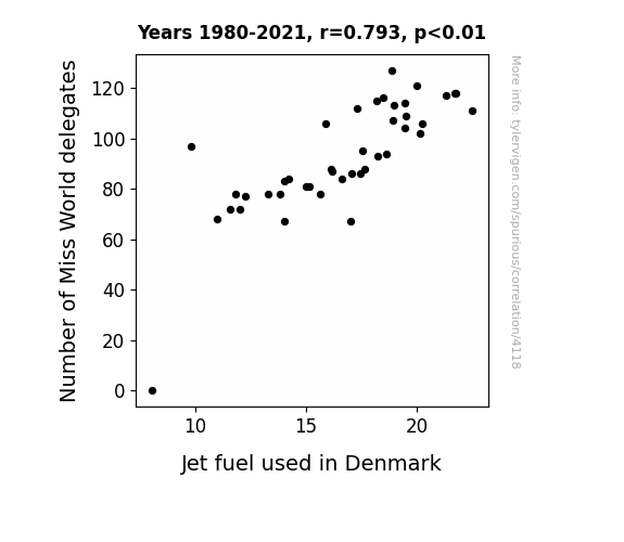
What else correlates?
Number of Miss World delegates · all sports
Jet fuel used in Denmark · all energy
Number of Miss World delegates · all sports
Jet fuel used in Denmark · all energy
Why this works
- Data dredging: I have 25,237 variables in my database. I compare all these variables against each other to find ones that randomly match up. That's 636,906,169 correlation calculations! This is called “data dredging.”
Fun fact: the chart used on the wikipedia page to demonstrate data dredging is also from me. I've been being naughty with data since 2014.
Instead of starting with a hypothesis and testing it, I instead tossed a bunch of data in a blender to see what correlations would shake out. It’s a dangerous way to go about analysis, because any sufficiently large dataset will yield strong correlations completely at random. - Lack of causal connection: There is probably no direct connection between these variables, despite what the AI says above.
Because these pages are automatically generated, it's possible that the two variables you are viewing are in fact causually related. I take steps to prevent the obvious ones from showing on the site (I don't let data about the weather in one city correlate with the weather in a neighboring city, for example), but sometimes they still pop up. If they are related, cool! You found a loophole.
This is exacerbated by the fact that I used "Years" as the base variable. Lots of things happen in a year that are not related to each other! Most studies would use something like "one person" in stead of "one year" to be the "thing" studied. - Observations not independent: For many variables, sequential years are not independent of each other. You will often see trend-lines form. If a population of people is continuously doing something every day, there is no reason to think they would suddenly change how they are doing that thing on January 1. A naive p-value calculation does not take this into account.
You will calculate a lower chance of "randomly" achieving the result than represents reality.
To be more specific: p-value tests are probability values, where you are calculating the probability of achieving a result at least as extreme as you found completely by chance. When calculating a p-value, you need to assert how many "degrees of freedom" your variable has. I count each year (minus one) as a "degree of freedom," but this is misleading for continuous variables.
This kind of thing can creep up on you pretty easily when using p-values, which is why it's best to take it as "one of many" inputs that help you assess the results of your analysis.
- Y-axes doesn't start at zero: I truncated the Y-axes of the graphs above. I also used a line graph, which makes the visual connection stand out more than it deserves.
Nothing against line graphs. They are great at telling a story when you have linear data! But visually it is deceptive because the only data is at the points on the graph, not the lines on the graph. In between each point, the data could have been doing anything. Like going for a random walk by itself!
Mathematically what I showed is true, but it is intentionally misleading. If you click on any of the charts that abuse this, you can scroll down to see a version that starts at zero. - Confounding variable: Confounding variables (like global pandemics) will cause two variables to look connected when in fact a "sneaky third" variable is influencing both of them behind the scenes.
- Outliers: Some datasets here have outliers which drag up the correlation.
In concept, "outlier" just means "way different than the rest of your dataset." When calculating a correlation like this, they are particularly impactful because a single outlier can substantially increase your correlation.
Because this page is automatically generated, I don't know whether any of the charts displayed on it have outliers. I'm just a footnote. ¯\_(ツ)_/¯
I intentionally mishandeled outliers, which makes the correlation look extra strong. - Low n: There are not many data points included in some of these charts.
You can do analyses with low ns! But you shouldn't data dredge with a low n.
Even if the p-value is high, we should be suspicious of using so few datapoints in a correlation.
Pro-tip: click on any correlation to see:
- Detailed data sources
- Prompts for the AI-generated content
- Explanations of each of the calculations (correlation, p-value)
- Python code to calculate it yourself


