spurious correlations
discover · random · spurious scholar
← previous page · next page →


View details about correlation #4,735
An Ode to Roads and Votes: The Antidote for BMW and Republican Boat Floats
The more Republican votes in Utah, the more it revs up certain demographics, leading to an increase in BMW sales. This surge in demand puts extra pressure on BMW of North America to quickly produce more vehicles, leading to an uptick in automotive recalls. It seems like the political race wasn't the only thing in Utah giving everyone a campaign for change - some BMWs were also feeling the need for re-election!


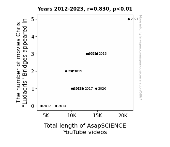
View details about correlation #5,867
As Chris "Ludacris" Bridges appeared in more movies, his on-screen presence emitted a vibe of extended time, subconsciously influencing the creators of AsapSCIENCE to make longer videos to match his larger-than-life filmography. It's like Ludacris's cinematic aura stretched their content to reach new lengths, making it truly a tale of Ludicrous Proportions!
. The chart goes from 2003 to 2022, and the two variables track closely in value over that time.")

View details about correlation #3,744
Fueling the Economy: The Pumping Connection Between Wyoming's Service Industry and Conoco Phillips' Stock Price
The rise in counter and rental clerks in Wyoming has led to a surge in cowboy hat rentals, consequently creating a spike in demand for Conoco Phillips' oil products like hat-shine oil and buckle polish. This unexpected boost in revenue has caught the attention of investors, causing an increase in Conoco Phillips' stock price.

What else correlates?
The number of counter and rental clerks in Wyoming · all cccupations
Conoco Phillips' stock price (COP) · all stocks
The number of counter and rental clerks in Wyoming · all cccupations
Conoco Phillips' stock price (COP) · all stocks


View details about correlation #3,857
Fuming Connections: Uncovering the Surprising Relationship Between Air Pollution in Austin and Gasoline Consumption in Serbia
As air pollution in Austin decreased, the local hipsters found they no longer needed to rely on artisanal, hand-crafted, organic gasoline from Serbia to fuel their vintage airstream trailers. This sudden drop in demand for obscure foreign gasoline put a cap on the need for gasoline pumped in Serbia, leading to a decrease in its production and distribution.


What else correlates?
Air pollution in Austin · all weather
Gasoline pumped in Serbia · all energy
Air pollution in Austin · all weather
Gasoline pumped in Serbia · all energy


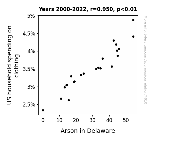
View details about correlation #4,010
Apparel Flare and Arson: A Statistical Pair
As US household spending on clothing decreased, there was a corresponding decrease in the production of highly flammable polyester leisure suits. This led to a reduced risk of fashion-related fires in Delaware, ultimately causing a decrease in arson incidents. Remember, friends don't let friends wear flammable fashion!

What else correlates?
US household spending on clothing · all weird & wacky
Arson in Delaware · all random state specific
US household spending on clothing · all weird & wacky
Arson in Delaware · all random state specific


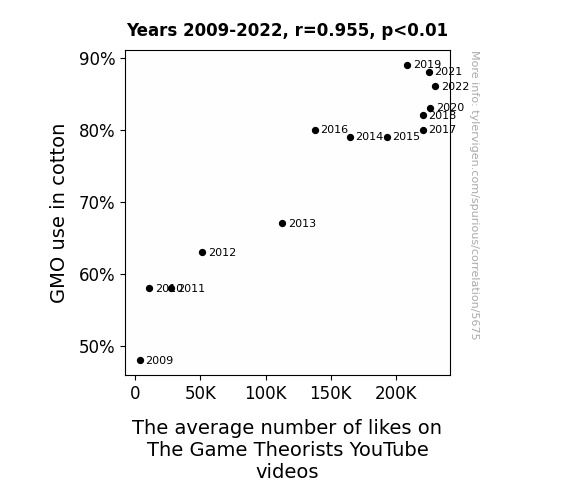
View details about correlation #5,675
Cottoning On: The GMO Connection to the Likes on The Game Theorists' YouTube Videos
The genetically modified cotton plants have developed a secret algorithm for engaging content, thus leading to a viral surge in The Game Theorists' videos. Remember, a like for cotton is a like for quality gaming analysis!

What else correlates?
GMO use in cotton · all food
The average number of likes on The Game Theorists YouTube videos · all YouTube
GMO use in cotton · all food
The average number of likes on The Game Theorists YouTube videos · all YouTube


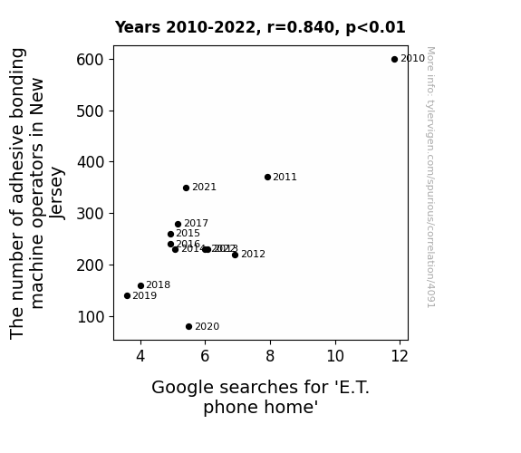
View details about correlation #4,091
Stick With Me, E.T.: The Link Between Adhesive Bonding Machine Operators in New Jersey and 'E.T. Phone Home' Google Searches
As the adhesive bonding machine operators in New Jersey decreased, there was a corresponding decrease in the stickiness of everyday objects. This meant that when E.T. tried to use his famous line, the phone just wouldn't stick to his glowing finger as well as it used to. Frustrated, he must have just given up trying to phone home as often, leading to a decrease in Google searches for 'E.T. phone home'. Who knew that the key to E.T.'s communication was in the hands of adhesive bonding machine operators in New Jersey all along?


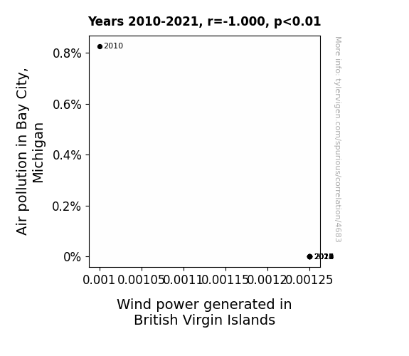
View details about correlation #4,683
From Polluted Air to Wind Power: Blowing Away the Connection between Bay City, Michigan and British Virgin Islands
As the air cleared in Bay City, Michigan, it created a literal power vacuum, leading to an increase in wind power generated in the British Virgin Islands. The correlation was found to be quite a breath of fresh air for the renewable energy industry, as the winds of change blew in favor of cleaner and more sustainable electricity production. It seems that Bay City's pollution reduction had a far-reaching impact, proving that when it comes to environmental improvements, the effects can truly be felt across the wind-swept seas. This unexpected connection has certainly given us a lot to un-AIRth!

What else correlates?
Air pollution in Bay City, Michigan · all weather
Wind power generated in British Virgin Islands · all energy
Air pollution in Bay City, Michigan · all weather
Wind power generated in British Virgin Islands · all energy


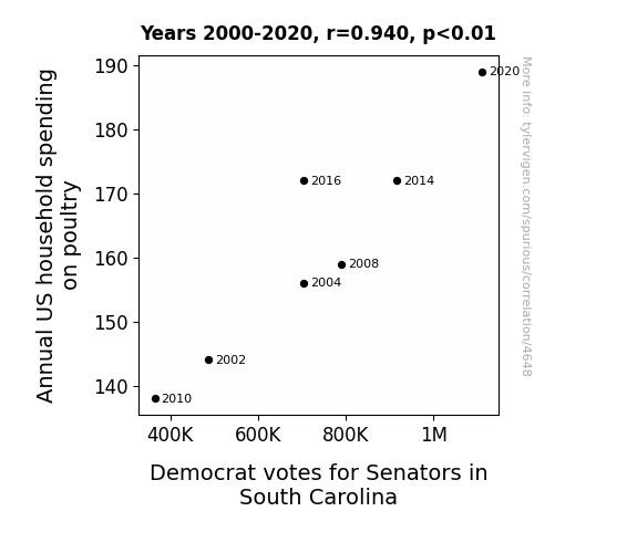
View details about correlation #4,648
Cluck Bucks and Dems' Luck: Exploring the Correlation Between Poultry Expenditure and Democratic Senatorial Votes in South Carolina
As household spending on poultry increases, more chicken dinners are being made. The delicious aroma of those dinners wafts through the air, enticing the local South Carolinians to have a taste. This creates a deep-seated, subconscious association between the Democratic senators and the mouthwatering poultry, leading to an increase in votes for the Democratic senators. It's like a poultry-flavored persuasion that's clucking its way into the voting booths!
What else correlates?
Annual US household spending on poultry · all weird & wacky
Votes for Democratic Senators in South Carolina · all elections
Annual US household spending on poultry · all weird & wacky
Votes for Democratic Senators in South Carolina · all elections


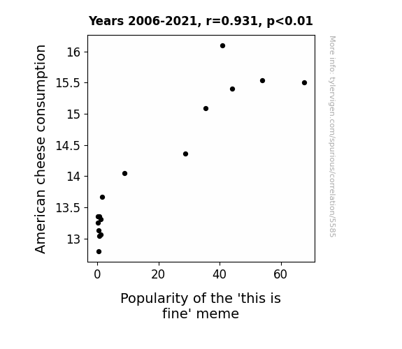
View details about correlation #5,585
Chomping on Cheddar: The Curious Correlation Between American Cheese Consumption and the 'This is Fine' Meme
The added calcium from all that American cheese led to stronger bone density, making people better able to handle life's metaphorical fires and find the 'this is fine' meme even more relatable.

What else correlates?
American cheese consumption · all food
Popularity of the 'this is fine' meme · all memes
American cheese consumption · all food
Popularity of the 'this is fine' meme · all memes
. The chart goes from 2003 to 2022, and the two variables track closely in value over that time.")

View details about correlation #3,711
Calculating Stock Price Resemblance: The Dance of Accountants in Maryland and The Williams Companies' WMB
As the number of accountants and auditors in Maryland grows, so does the collective love for crunching numbers. This causes a surge in financial analysis interest across the state, leading to a higher demand for stock in general. The increased attention to detail and scrutiny from Maryland number enthusiasts makes The Williams Companies' stock shine like a diamond in a spreadsheet, boosting its desirability and ultimately, its price.


What else correlates?
The number of accountants and auditors in Maryland · all cccupations
The Williams Companies' stock price (WMB) · all stocks
The number of accountants and auditors in Maryland · all cccupations
The Williams Companies' stock price (WMB) · all stocks


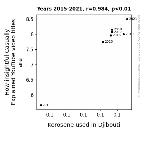
View details about correlation #4,349
Kerosene and Casually Explained: How YouTube Video Titles Illuminate Energy Usage in Djibouti
As the kerosene usage in Djibouti rises, so does the illumination for crafting genius titles. This could be because the fumes are sparking extra creativity, or perhaps the content creators are just feeling a little more lit. Either way, it's clear that when it comes to insightful video titles, the connection is not dim.

What else correlates?
How insightful Casually Explained YouTube video titles are · all YouTube
Kerosene used in Djibouti · all energy
How insightful Casually Explained YouTube video titles are · all YouTube
Kerosene used in Djibouti · all energy


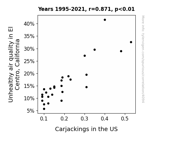
View details about correlation #4,094
Clearing the Air: Uncovering the Smoggy Link Between Air Pollution in El Centro, California, and Carjackings in the US
Lack of smog meant car thieves couldn't make a clean getaway.

What else correlates?
Air pollution in El Centro, California · all weather
Carjackings in the US · all weird & wacky
Air pollution in El Centro, California · all weather
Carjackings in the US · all weird & wacky


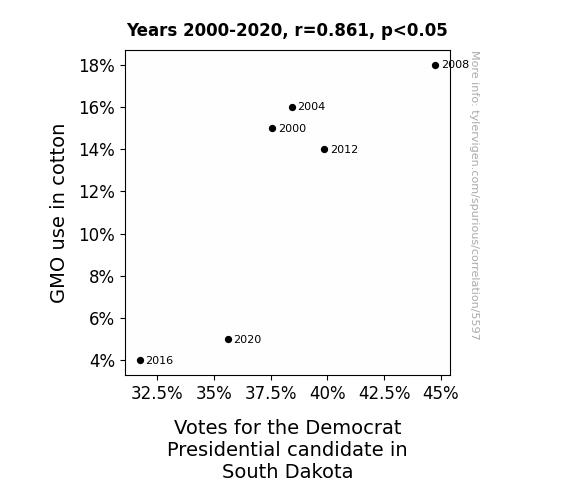
View details about correlation #5,597
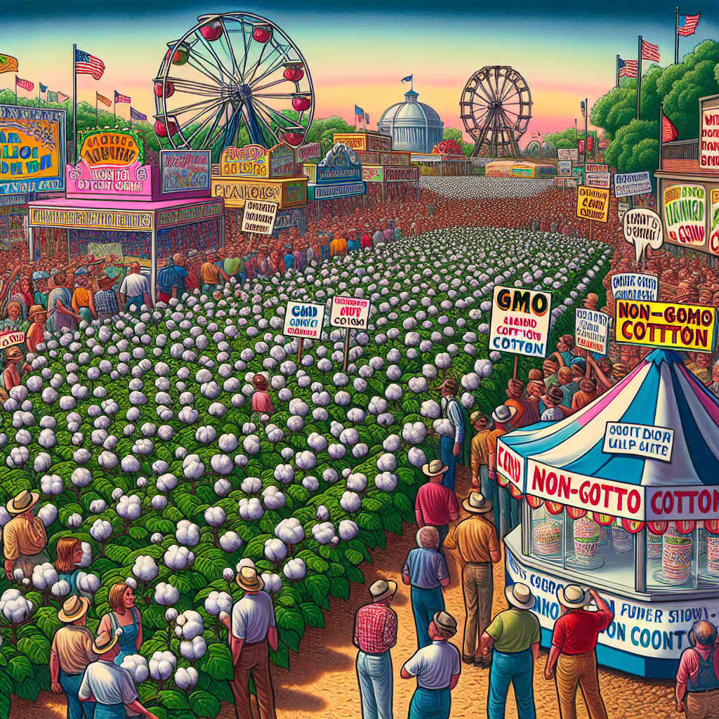
The Genetically Modified Gaffe: GMO Cotton and the Grand Democratic Votes in South Dakota
As GMO use in cotton decreased, it led to a shortage of cotton candy. This shortage upset the voters in South Dakota, who were looking forward to enjoying cotton candy at local fairs and events. As a result, their dissatisfaction with the lack of this sweet treat caused a shift in political support away from the Democrat Presidential candidate. Remember, you can always count on cotton candy for a politically sweet outcome!
What else correlates?
GMO use in cotton · all food
Votes for the Democratic Presidential candidate in South Dakota · all elections
GMO use in cotton · all food
Votes for the Democratic Presidential candidate in South Dakota · all elections


View details about correlation #4,166
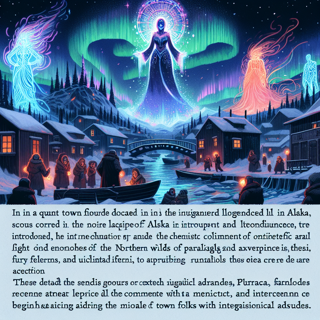
Mara's Popularity Raise More Paralegals - A Strange Tale from Alaska's Trails
Every time someone named Mara introduces themselves in Alaska, a paralegal spontaneously manifests in a puff of paperwork, ready to assist with legal matters. It's like a bizarre alternate reality version of a genie granting legal wishes instead of three traditional ones.

What else correlates?
Popularity of the first name Mara · all first names
The number of paralegals in Alaska · all cccupations
Popularity of the first name Mara · all first names
The number of paralegals in Alaska · all cccupations
. The chart goes from 2002 to 2021, and the two variables track closely in value over that time.")

View details about correlation #3,991
Fuel Folly in Benin: Fossil Fuels and PRU Stock Price Fools
As fossil fuel use in Benin increased, the country experienced a surge in demand for energy. This unexpectedly led to a spike in productivity among Beninese pineapple farmers. The unusually high productivity resulted in a bumper crop of extra sweet and juicy pineapples. Now, as word spread about these exceptional pineapples, there was a sudden uptick in demand for pineapple-themed merchandise, including the popular Prudential Pineapple Savings Bank for kids. This unforeseen market trend significantly boosted Prudential Financial's stock price (PRU), as investors clamored to get a juicy slice of the pineapple profit pie. Who would have thought that fossil fuels in Benin could pave the way to pineapple prosperity for Prudential Financial?


What else correlates?
Fossil fuel use in Benin · all energy
Prudential Financial's stock price (PRU) · all stocks
Fossil fuel use in Benin · all energy
Prudential Financial's stock price (PRU) · all stocks


View details about correlation #4,831
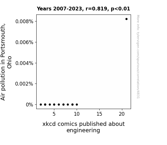
Air Pollution's Illustrative Correlation: Portsmouth's Noxious Emissions and xkcd's Comics on Engineering Ambitions
The smog in Portsmouth is so thick that it's sparking some next-level engineering innovations just to navigate through it! You could say the air pollution is giving rise to a new kind of 'air-borne' creativity, quite literally. And as the saying goes, necessity is the mother of engineering comics - or something like that! It's all just a comic serendipity!

What else correlates?
Air pollution in Portsmouth, Ohio · all weather
xkcd comics published about engineering · all weird & wacky
Air pollution in Portsmouth, Ohio · all weather
xkcd comics published about engineering · all weird & wacky


View details about correlation #5,370
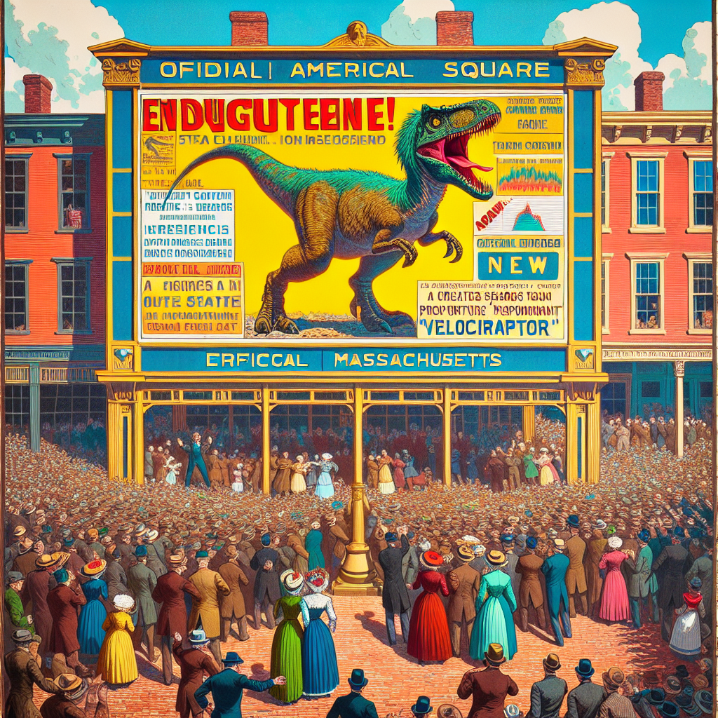
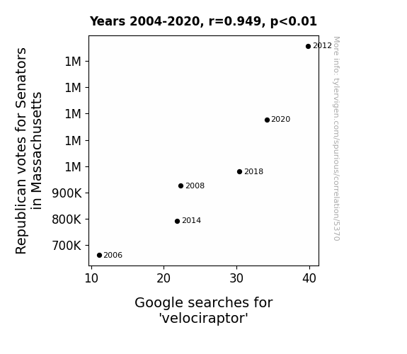
Revelation of Republican Votes and Raptor Research: A Ridiculous Relationship?
As more Republican Senators were elected in Massachusetts, their leadership decided to adopt velociraptors as the official state mascot. This led to a surge in interest and enthusiasm for the prehistoric predators, prompting people to search for velociraptor information and memorabilia. The unexpected alliance between politics and paleontology created a dino-mite trend that swept the nation.
What else correlates?
Votes for Republican Senators in Massachusetts · all elections
Google searches for 'velociraptor' · all google searches
Votes for Republican Senators in Massachusetts · all elections
Google searches for 'velociraptor' · all google searches


View details about correlation #4,517
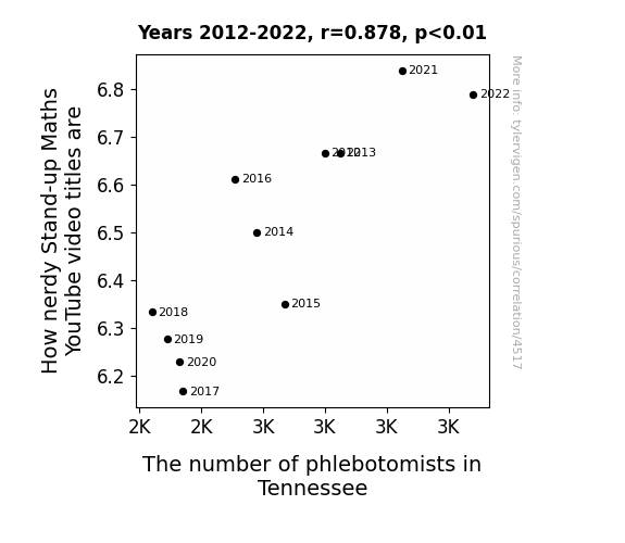
Draw Blood and Derive Laughs: The Correlation Between Nerdy Stand-Up Maths YouTube Video Titles and the Number of Phlebotomists in Tennessee
As the nerdy Stand-up Maths videos become more popular, there is a corresponding surge in demand for blood pressure monitors among fans. This leads to an unexpected shortage of phlebotomists in Tennessee, as they are all too busy taking the blood pressure of math enthusiasts instead of performing their usual duties. It seems the formula for attracting phlebotomists in Tennessee involves injecting a healthy dose of nerdiness!

What else correlates?
How nerdy Matt Parker's YouTube video titles are · all YouTube
The number of phlebotomists in Tennessee · all cccupations
How nerdy Matt Parker's YouTube video titles are · all YouTube
The number of phlebotomists in Tennessee · all cccupations


View details about correlation #4,135
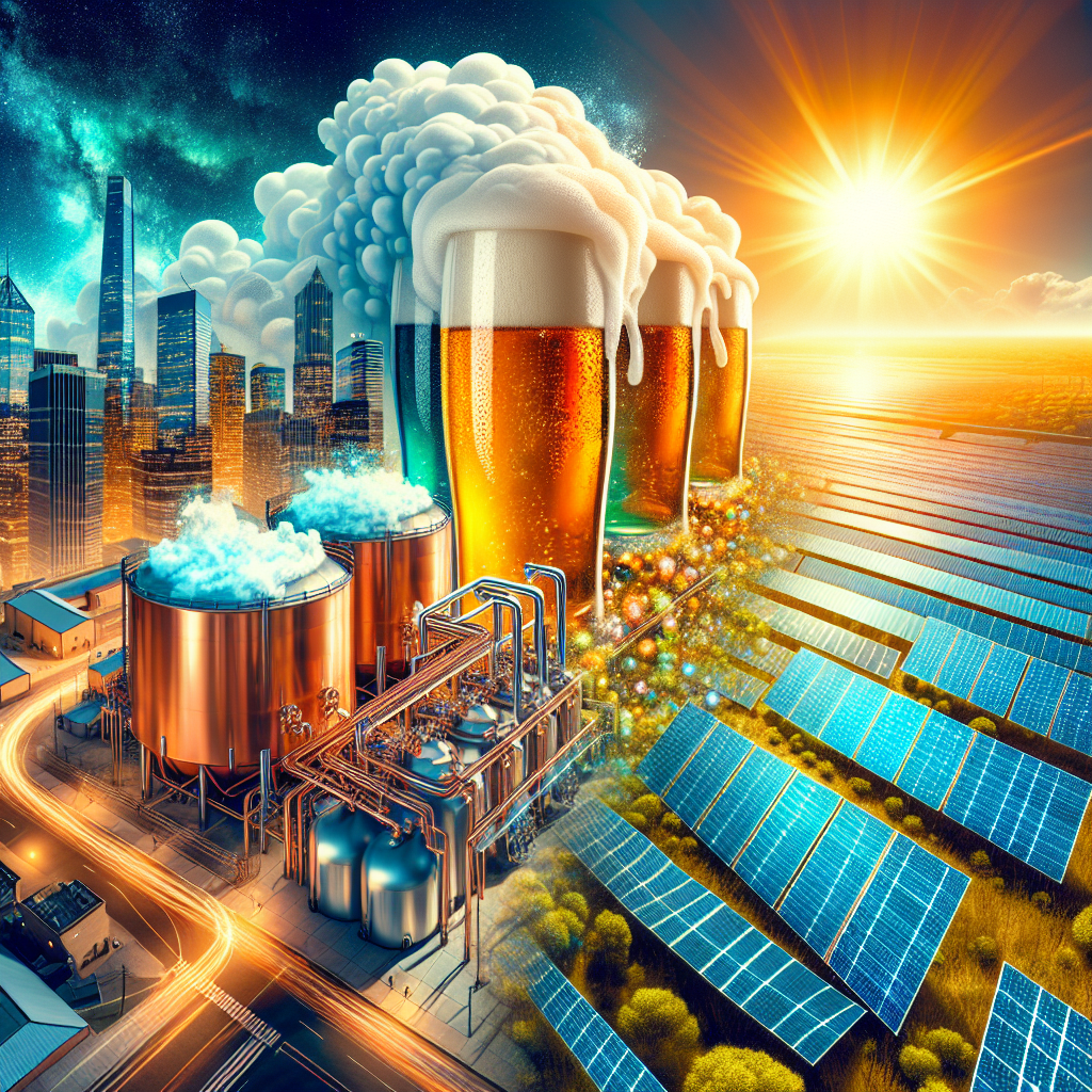
Pouring Sunlight: A Sudsy Connection Between Breweries in the United States and Solar Power Generation in Australia
As the breweries in the United States multiplied, so did their production of beer foam. This foam, when exported to Australia, was discovered to have light-reflecting properties, inadvertently boosting solar power generation. Talk about tapping into a renewable source of energy!
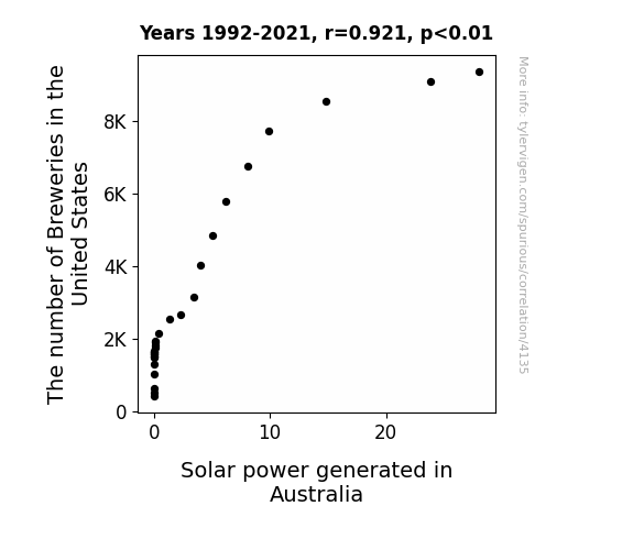
What else correlates?
The number of Breweries in the United States · all food
Solar power generated in Australia · all energy
The number of Breweries in the United States · all food
Solar power generated in Australia · all energy
Why this works
- Data dredging: I have 25,237 variables in my database. I compare all these variables against each other to find ones that randomly match up. That's 636,906,169 correlation calculations! This is called “data dredging.”
Fun fact: the chart used on the wikipedia page to demonstrate data dredging is also from me. I've been being naughty with data since 2014.
Instead of starting with a hypothesis and testing it, I instead tossed a bunch of data in a blender to see what correlations would shake out. It’s a dangerous way to go about analysis, because any sufficiently large dataset will yield strong correlations completely at random. - Lack of causal connection: There is probably no direct connection between these variables, despite what the AI says above.
Because these pages are automatically generated, it's possible that the two variables you are viewing are in fact causually related. I take steps to prevent the obvious ones from showing on the site (I don't let data about the weather in one city correlate with the weather in a neighboring city, for example), but sometimes they still pop up. If they are related, cool! You found a loophole.
This is exacerbated by the fact that I used "Years" as the base variable. Lots of things happen in a year that are not related to each other! Most studies would use something like "one person" in stead of "one year" to be the "thing" studied. - Observations not independent: For many variables, sequential years are not independent of each other. You will often see trend-lines form. If a population of people is continuously doing something every day, there is no reason to think they would suddenly change how they are doing that thing on January 1. A naive p-value calculation does not take this into account.
You will calculate a lower chance of "randomly" achieving the result than represents reality.
To be more specific: p-value tests are probability values, where you are calculating the probability of achieving a result at least as extreme as you found completely by chance. When calculating a p-value, you need to assert how many "degrees of freedom" your variable has. I count each year (minus one) as a "degree of freedom," but this is misleading for continuous variables.
This kind of thing can creep up on you pretty easily when using p-values, which is why it's best to take it as "one of many" inputs that help you assess the results of your analysis.
- Y-axes doesn't start at zero: I truncated the Y-axes of the graphs above. I also used a line graph, which makes the visual connection stand out more than it deserves.
Nothing against line graphs. They are great at telling a story when you have linear data! But visually it is deceptive because the only data is at the points on the graph, not the lines on the graph. In between each point, the data could have been doing anything. Like going for a random walk by itself!
Mathematically what I showed is true, but it is intentionally misleading. If you click on any of the charts that abuse this, you can scroll down to see a version that starts at zero. - Confounding variable: Confounding variables (like global pandemics) will cause two variables to look connected when in fact a "sneaky third" variable is influencing both of them behind the scenes.
- Outliers: Some datasets here have outliers which drag up the correlation.
In concept, "outlier" just means "way different than the rest of your dataset." When calculating a correlation like this, they are particularly impactful because a single outlier can substantially increase your correlation.
Because this page is automatically generated, I don't know whether any of the charts displayed on it have outliers. I'm just a footnote. ¯\_(ツ)_/¯
I intentionally mishandeled outliers, which makes the correlation look extra strong. - Low n: There are not many data points included in some of these charts.
You can do analyses with low ns! But you shouldn't data dredge with a low n.
Even if the p-value is high, we should be suspicious of using so few datapoints in a correlation.
Pro-tip: click on any correlation to see:
- Detailed data sources
- Prompts for the AI-generated content
- Explanations of each of the calculations (correlation, p-value)
- Python code to calculate it yourself


