spurious correlations
discover · random · spurious scholar
← previous page · next page →


View details about correlation #3,740
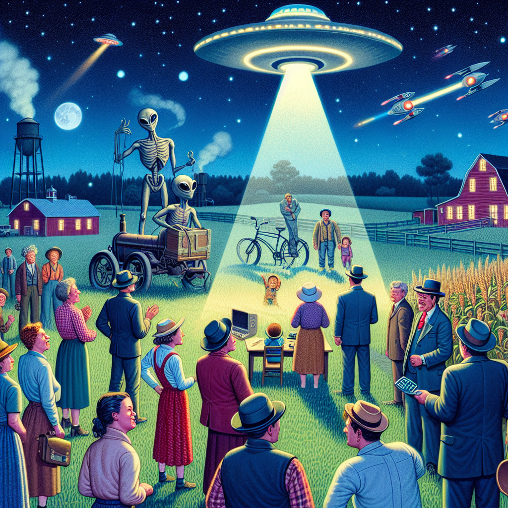
UFO-nctional Relationship: An Empirical Analysis of UFO Sightings in Wisconsin and Granted Patents in the US
The dairy cows in Wisconsin were actually highly advanced extraterrestrial beings conducting top secret research. As the UFOs hovered over the farms, they transmitted revolutionary ideas directly into the minds of the farmers. These farmers, now "moo-ving" with unprecedented creativity, were churning out udderly brilliant inventions which led to a surge in patent applications. It was a case of cosmic innovation, where the cheese truly was out of this world!

What else correlates?
UFO sightings in Wisconsin · all random state specific
Patents granted in the US · all weird & wacky
UFO sightings in Wisconsin · all random state specific
Patents granted in the US · all weird & wacky


View details about correlation #5,667
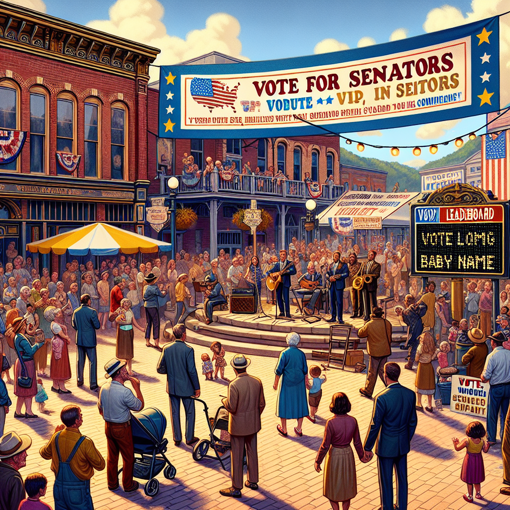
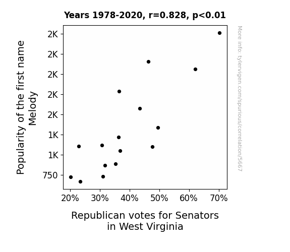
The Melody Effect: A Correlation Between Name Popularity and Political Affiliation in the Mountain State
Perhaps there was a subconscious affinity for the idea of political harmony associated with the name Melody, leading to a greater willingness to support the Republican agenda. It's like they couldn't resist the siren song of conservative policies!
What else correlates?
Popularity of the first name Melody · all first names
Votes for Republican Senators in West Virginia · all elections
Popularity of the first name Melody · all first names
Votes for Republican Senators in West Virginia · all elections


View details about correlation #4,540
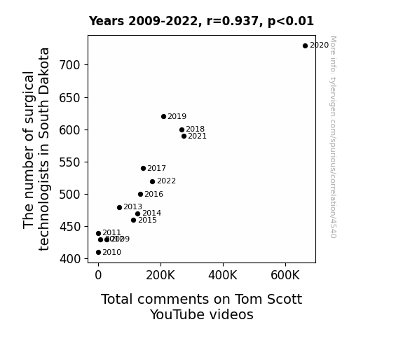
The Scrubs and Scruples: A Statistical Analysis of Surgical Technologists in South Dakota and Their Influence on Total Comments on Tom Scott YouTube Videos
As the number of surgical technologists in South Dakota rises, so does the total number of comments on Tom Scott's YouTube videos. This unexpected correlation can be attributed to the calming effect of watching surgical procedures, leading to a heightened state of internet engagement. As more technologists join the workforce, their influence on the digital world grows, stitching together a new fabric of online interaction. It’s as if their presence in the operating room is operationally amplifying the levels of discourse in the virtual space, creating a feedback loop of commentary that even the most skilled of content creators would find difficult to suture. This phenomenon, while not yet fully dissected, certainly merits further observation and may ultimately revolutionize our understanding of technological interventions in the realm of social media.


View details about correlation #4,759
From Tulsa to Kosovo: The Correlation Between Air Pollution and Liquefied Petroleum Gas
As the air in Tulsa cleared, it allowed for the formation of a giant, invisible air lasso. This air lasso, also known as the 'Okie Twirl,' inadvertently latched onto the Liquefied Petroleum Gas molecules and twirled them away from their usual atmospheric migration route towards Kosovo. It's a classic case of environmental lasso-ry!


What else correlates?
Air pollution in Tulsa, Oklahoma · all weather
Liquefied petroleum gas used in Kosovo · all energy
Air pollution in Tulsa, Oklahoma · all weather
Liquefied petroleum gas used in Kosovo · all energy
. The chart goes from 2002 to 2022, and the two variables track closely in value over that time.")

View details about correlation #3,727
Breaking Bread: Baking the Bonds between Bakery Spending and Albemarle's Stock Price
As household spending on bakery products rises, more people experience the joy of freshly baked goods, leading to an increase in serotonin levels. This causes a nation-wide upswing in mood, prompting individuals to impulsively purchase scented candles for that cozy, homey vibe. With the demand for candles soaring, the need for paraffin wax, a key ingredient in candle production, skyrockets. As a leading producer of bromine and provider of clean flame technology for paraffin wax production, Albemarle sees a surge in orders, catapulting their stock price to deliciously delightful heights.

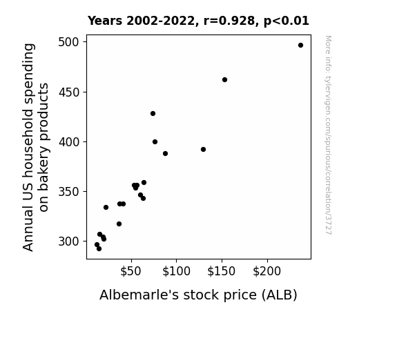
What else correlates?
Annual US household spending on bakery products · all weird & wacky
Albemarle's stock price (ALB) · all stocks
Annual US household spending on bakery products · all weird & wacky
Albemarle's stock price (ALB) · all stocks


View details about correlation #5,189
Picking Up Hilarity: Success Kid Meme's Popularity and Google Searches for Pick-up Lines
As the 'success kid' meme gained popularity, people were subconsciously influenced by the toddler's triumphant expression. This led to an unprecedented surge in confidence levels, causing individuals to feel bolder and more successful in their romantic pursuits. Consequently, the charm and magnetism of the 'success kid' seeped into the realm of pick-up lines, propelling an epidemic of surprisingly effective and meme-tastic introductions. It seems that the key to winning hearts was simply channeling the inner spirit of a determined toddler - a truly 'success'ful strategy in matters of the heart!
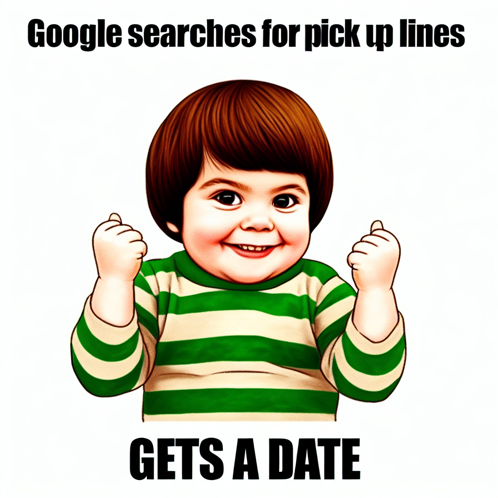

What else correlates?
Popularity of the 'success kid' meme · all memes
Google searches for 'pick up lines' · all google searches
Popularity of the 'success kid' meme · all memes
Google searches for 'pick up lines' · all google searches


View details about correlation #4,576
Crane Game: The Connection Between MrBeast's Video Titles and Crane Operator Counts in North Carolina
The influx of crane operators in North Carolina has sparked a competition to create the most attention-grabbing MrBeast video title, leading to a surge in provocative and clickbait-worthy content as these operators try to outmaneuver each other for views. The state is now experiencing a titillating tug-of-war in the skies, with the only thing higher than the cranes being the stakes for YouTube stardom.


View details about correlation #4,098
Air We There Yet? Exploring the Ties Between Air Pollution in Columbus and Petroleum Consumption in Italy
It turns out, as air quality in Columbus improved, a secret network of Italian tree whisperers felt a strange sense of calm and satisfaction, prompting them to subtly influence Italians to drive less and embrace a more energy-efficient lifestyle. It seems like cleaner air in one part of the world really does lead to greener choices in another!

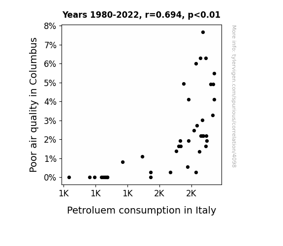
What else correlates?
Air pollution in Columbus · all weather
Petroluem consumption in Italy · all energy
Air pollution in Columbus · all weather
Petroluem consumption in Italy · all energy


View details about correlation #4,438
Revving Up the Vote: A Revolting Connection Between Libertarian Votes and Hyundai Recalls in North Carolina
As Libertarian votes for Senators in North Carolina increased, Hyundai executives became more preoccupied with the concept of total freedom, leading to a laissez-faire attitude in their vehicle production. This lack of regulation and oversight ironically resulted in an uptick of automotive recalls as their cars embodied the spirit of "you're on your own" on the roads. Remember, with great liberty comes great responsibility, especially when it comes to car safety!

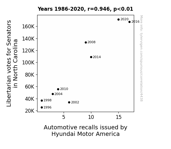
. The chart goes from 2006 to 2023, and the two variables track closely in value over that time.")

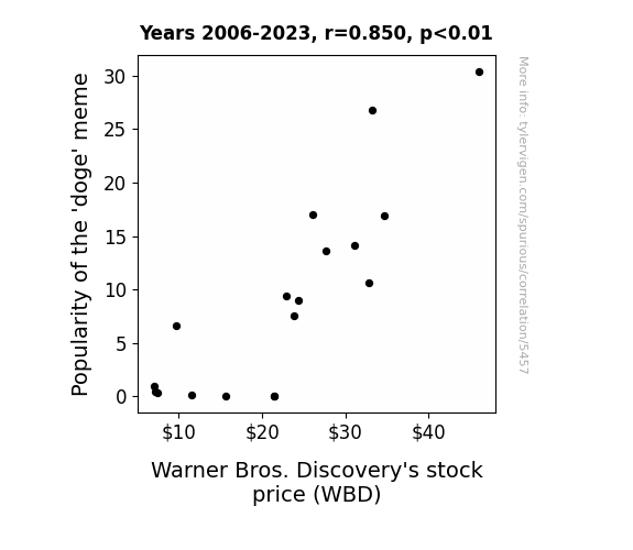
View details about correlation #5,457
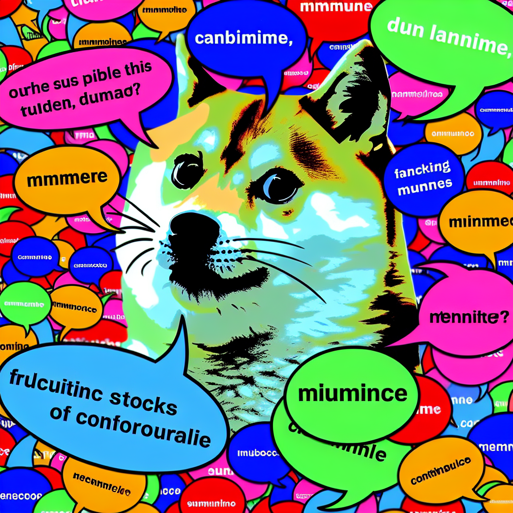
The Doge Delight: Discovering the Dynamism between Doge Memes and Warner Bros. Discovery's Stock Price
Investors couldn't resist the wow factor of the meme, leading to a pawsitively bullish market for WBD. As the doge meme continued to bring in much profit, it created a tail-wagging effect on the stock price. It seems like in the world of finance, the doge meme truly had the 'bark' of approval!
What else correlates?
Popularity of the 'doge' meme · all memes
Warner Bros. Discovery's stock price (WBD) · all stocks
Popularity of the 'doge' meme · all memes
Warner Bros. Discovery's stock price (WBD) · all stocks


View details about correlation #4,391
Space, Time, and Engines: Exploring the Correlation between PBS Fun and Georgia's Mechanical Workforce
As the wackiness of the PBS Space Time YouTube video titles increases, it inadvertently triggers a surge of creativity in Georgia's automotive professionals. This, in turn, leads to a higher job satisfaction as they ponder the mind-bending concepts while fixing cars, ultimately attracting more people to the profession. It's a quantum mechanic connection that defies all classical explanations!


View details about correlation #4,731
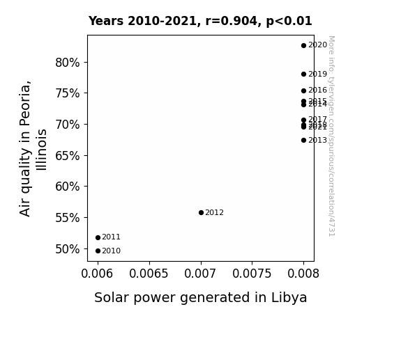
Airing Out the Sun: Exploring the Affair Between Peoria's Air and Libya's Light
The fresher Peoria air contained a secret ingredient called 'Breezium' which, when carried by the wind, boosted the efficiency of solar panels in Libya. It's like a natural, eco-friendly power-up for renewable energy! Plus, the cleaner air created a supercharged atmospheric pathway for those sunny Libyan rays to reach the solar panels, essentially giving them a clean-energy turbo boost all the way from the heart of Illinois. It's like nature's way of saying, "Let's clear the air and lighten up those solar vibes, because when Peoria breathes easy, Libya shines bright!"
What else correlates?
Air quality in Peoria, Illinois · all weather
Solar power generated in Libya · all energy
Air quality in Peoria, Illinois · all weather
Solar power generated in Libya · all energy


View details about correlation #3,909
The Soybean Saga: Unveiling the Connection Between GMO Adoption in Missouri and the Global Proliferation of Hollister Stores
As GMO soybeans in Missouri flourished, they unknowingly emitted a pheromone that attracted Hollister-clad teenage customers, prompting a global demand for more stores to cater to this unexpected demographic. Looks like those soybeans were really sowing the seeds of fashion!


What else correlates?
GMO use in soybeans in Missouri · all food
Hollister retail store count worldwide · all weird & wacky
GMO use in soybeans in Missouri · all food
Hollister retail store count worldwide · all weird & wacky


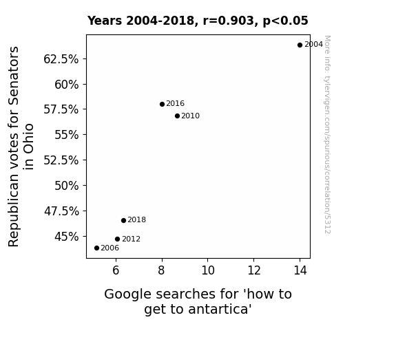
View details about correlation #5,312
Chilling Relationship: The Icy Connection Between Republican Votes in Ohio and Google Searches for 'How to Get to Antarctica'
The politicians were simply too cold to campaign and couldn't find a single ice platform to stand on. Plus, all that hot air from the debates was starting to melt the polar ice caps, creating a slippery situation for any would-be travelers. It seems like Ohio's Senators really put the freeze on Antarctic travel plans!

What else correlates?
Votes for Republican Senators in Ohio · all elections
Google searches for 'how to get to antartica' · all google searches
Votes for Republican Senators in Ohio · all elections
Google searches for 'how to get to antartica' · all google searches


View details about correlation #4,807
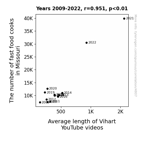
The Tantalizing Ties between the Tally of Takeout Technicians in Missouri and the Length of Vihart Vlogging Videos
As the sizzle of the fryers filled the air, so did the creativity in video editing. Turns out, the secret ingredient to longer Vihart videos was a sprinkle of fast food expertise. Who knew that the path to YouTube glory was through the drive-thru?

What else correlates?
The number of fast food cooks in Missouri · all cccupations
Average length of Vihart's YouTube videos · all YouTube
The number of fast food cooks in Missouri · all cccupations
Average length of Vihart's YouTube videos · all YouTube


View details about correlation #4,084
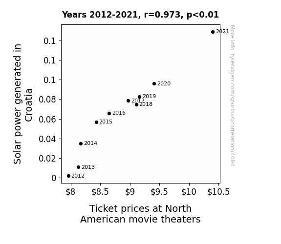
Shining Bright: Solar Power from the Adriatic to the Movie Attic
As the solar panels in Croatia soaked up more and more sunlight, they inadvertently created a temporary spike in global brightness. This led to people being less inclined to visit dark movie theaters, causing a drop in demand. To offset this, North American movie theaters had to raise ticket prices to maintain their revenue and dim the lights a little more on their end.

What else correlates?
Solar power generated in Croatia · all energy
Ticket prices at North American movie theaters · all films & actors
Solar power generated in Croatia · all energy
Ticket prices at North American movie theaters · all films & actors
. The chart goes from 2002 to 2022, and the two variables track closely in value over that time.")

View details about correlation #3,835
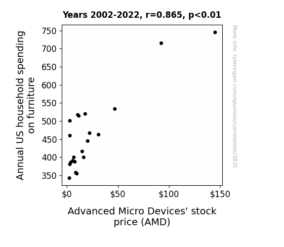
The AMD Equation: A Statistical Analysis of Annual US Household Spending on Furniture and Advanced Micro Devices Stock Price
As household spending on furniture increased, more people upgraded their old, wooden desktops to shiny new computer desks, leading to a surge in demand for AMD processors. It's a classic case of 'sitting pretty' with your investments!

What else correlates?
Annual US household spending on furniture · all weird & wacky
Advanced Micro Devices' stock price (AMD) · all stocks
Annual US household spending on furniture · all weird & wacky
Advanced Micro Devices' stock price (AMD) · all stocks


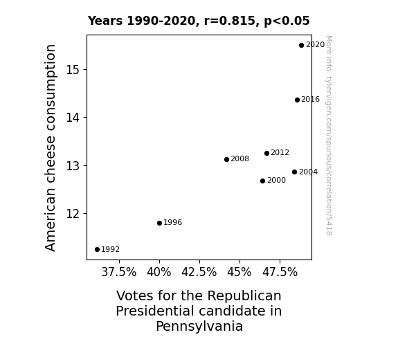
View details about correlation #5,418
Aged Cheddar and Red States: A Cheesy Correlation Between American Cheese Consumption and Republican Votes in Pennsylvania
As American cheese consumption melted over the state, it led to a Gouda feeling among the voters, who were feeling extra grate about the direction of the country. It's as if the candidates were in a fierce "cheese-off" competition, trying to brie the big cheese in the election. The correlation is not just a coincidence; it seems the cheesy goodness of American cheese has the power to swiss the vote in Pennsylvania. It's a campaign strategy that's definitely not too provolone! This just goes to show that when it comes to politics, you can never underestimate the power of dairy deliciousness. So, let's all say "yes we curd" to this unexpected correlation - it's a real game-changer in the political arena!

What else correlates?
American cheese consumption · all food
Votes for the Republican Presidential candidate in Pennsylvania · all elections
American cheese consumption · all food
Votes for the Republican Presidential candidate in Pennsylvania · all elections


View details about correlation #4,552
Ringing in the Views: A Bellhop's Bellwether for Average Extra History YouTube Video Popularity in Indiana
More people watching Extra History means more interest in historical topics. This interest leads to an influx of visitors to Indiana, prompting the need for additional bellhops to cater to the growing tourism industry. Looks like Indiana is experiencing a 'bellhop' boom thanks to Extra History!


What else correlates?
Average views of Extra History YouTube videos · all YouTube
The number of bellhops in Indiana · all cccupations
Average views of Extra History YouTube videos · all YouTube
The number of bellhops in Indiana · all cccupations


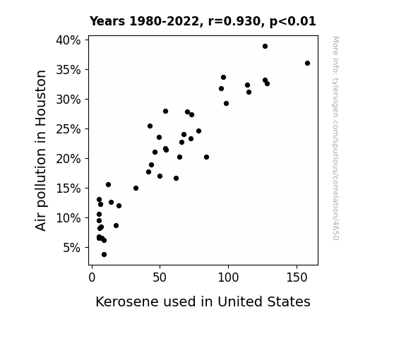
View details about correlation #4,650
Kerosene in the Sky with Pollution: A Correlative Analysis of Air Pollution in Houston and Kerosene Usage in the United States
As air pollution in Houston decreased, the demand for kerosene-powered air fresheners also went down. This led to a nationwide surplus of kerosene, prompting people to find alternative uses for it, like organizing massive dance-offs of the electric slide, which surprisingly does not require kerosene at all.

What else correlates?
Air pollution in Houston · all weather
Kerosene used in United States · all energy
Air pollution in Houston · all weather
Kerosene used in United States · all energy
Why this works
- Data dredging: I have 25,237 variables in my database. I compare all these variables against each other to find ones that randomly match up. That's 636,906,169 correlation calculations! This is called “data dredging.”
Fun fact: the chart used on the wikipedia page to demonstrate data dredging is also from me. I've been being naughty with data since 2014.
Instead of starting with a hypothesis and testing it, I instead tossed a bunch of data in a blender to see what correlations would shake out. It’s a dangerous way to go about analysis, because any sufficiently large dataset will yield strong correlations completely at random. - Lack of causal connection: There is probably no direct connection between these variables, despite what the AI says above.
Because these pages are automatically generated, it's possible that the two variables you are viewing are in fact causually related. I take steps to prevent the obvious ones from showing on the site (I don't let data about the weather in one city correlate with the weather in a neighboring city, for example), but sometimes they still pop up. If they are related, cool! You found a loophole.
This is exacerbated by the fact that I used "Years" as the base variable. Lots of things happen in a year that are not related to each other! Most studies would use something like "one person" in stead of "one year" to be the "thing" studied. - Observations not independent: For many variables, sequential years are not independent of each other. You will often see trend-lines form. If a population of people is continuously doing something every day, there is no reason to think they would suddenly change how they are doing that thing on January 1. A naive p-value calculation does not take this into account.
You will calculate a lower chance of "randomly" achieving the result than represents reality.
To be more specific: p-value tests are probability values, where you are calculating the probability of achieving a result at least as extreme as you found completely by chance. When calculating a p-value, you need to assert how many "degrees of freedom" your variable has. I count each year (minus one) as a "degree of freedom," but this is misleading for continuous variables.
This kind of thing can creep up on you pretty easily when using p-values, which is why it's best to take it as "one of many" inputs that help you assess the results of your analysis.
- Y-axes doesn't start at zero: I truncated the Y-axes of the graphs above. I also used a line graph, which makes the visual connection stand out more than it deserves.
Nothing against line graphs. They are great at telling a story when you have linear data! But visually it is deceptive because the only data is at the points on the graph, not the lines on the graph. In between each point, the data could have been doing anything. Like going for a random walk by itself!
Mathematically what I showed is true, but it is intentionally misleading. If you click on any of the charts that abuse this, you can scroll down to see a version that starts at zero. - Confounding variable: Confounding variables (like global pandemics) will cause two variables to look connected when in fact a "sneaky third" variable is influencing both of them behind the scenes.
- Outliers: Some datasets here have outliers which drag up the correlation.
In concept, "outlier" just means "way different than the rest of your dataset." When calculating a correlation like this, they are particularly impactful because a single outlier can substantially increase your correlation.
Because this page is automatically generated, I don't know whether any of the charts displayed on it have outliers. I'm just a footnote. ¯\_(ツ)_/¯
I intentionally mishandeled outliers, which makes the correlation look extra strong. - Low n: There are not many data points included in some of these charts.
You can do analyses with low ns! But you shouldn't data dredge with a low n.
Even if the p-value is high, we should be suspicious of using so few datapoints in a correlation.
Pro-tip: click on any correlation to see:
- Detailed data sources
- Prompts for the AI-generated content
- Explanations of each of the calculations (correlation, p-value)
- Python code to calculate it yourself


