spurious correlations
discover · random · spurious scholar
← previous page · next page →


View details about correlation #4,048
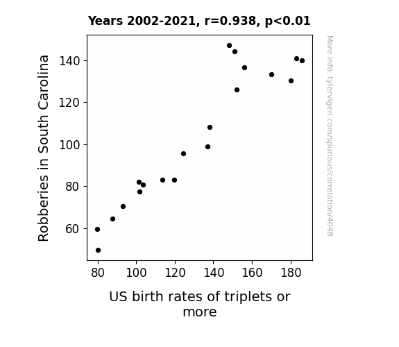
The Great Caper: Investigating the Link between Robberies in South Carolina and the Birth Rate of Triplets or More in the United States
This is due to the unexpected consequences of a Triple Lutz law passed in South Carolina. As the law enforcement agencies focused on reducing robberies, they inadvertently started a community outreach program where ex-figure skaters were hired to teach self-defense classes using ice skating techniques. This led to a statewide craze for figure skating as a form of crime prevention. As more and more South Carolinians traded in their traditional self-defense weapons for ice skates, the birth rates of triplets or more in the US decreased. It turns out, the real triple threat to triplets was the South Carolina ice capades!

What else correlates?
Robberies in South Carolina · all random state specific
US birth rates of triplets or more · all weird & wacky
Robberies in South Carolina · all random state specific
US birth rates of triplets or more · all weird & wacky


View details about correlation #5,039
The Correlation Between Republican Totes and Never Gonna Give You Up Votes: A Data-Driven Analysis
There is a theory that as Republican votes for Senators in Tennessee increased, so did the level of rick-rolling, leading to a resurgence in the popularity of the 'never gonna give you up' meme. This is believed to be due to a correlation between political affiliation and a propensity for internet trolling, thereby inadvertently contributing to the spread of this classic meme.

What else correlates?
Votes for Republican Senators in Tennessee · all elections
Searches for 'never gonna give you up' · all memes
Votes for Republican Senators in Tennessee · all elections
Searches for 'never gonna give you up' · all memes
. The chart goes from 2010 to 2022, and the two variables track closely in value over that time.")

View details about correlation #4,178
Tobacco Tenders and Beer Buzz: A Bizarre Correlation in Georgia
As the aroma of perfectly roasted and baked goods wafted through the air, it somehow sparked a bizarre craving for Anheuser-Busch InBev's beverages, leading to a spike in stock price. It's a case of 'smoke and beers' boosting the market!


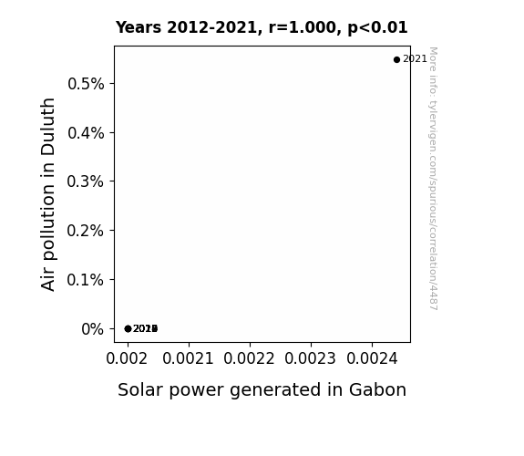
View details about correlation #4,487
Sunlight Scrubbers: Illuminating the Relationship Between Duluth's Air Pollution and Gabon's Solar Power Generation
The smog from Duluth acted as a reflective barrier, bouncing extra sunlight towards Gabon's solar panels. It's an unconventional case of secondhand solar power!

What else correlates?
Air pollution in Duluth · all weather
Solar power generated in Gabon · all energy
Air pollution in Duluth · all weather
Solar power generated in Gabon · all energy


View details about correlation #4,297
Marking the Rober: Unraveling the Connection Between Mark Rober YouTube Video Titles and Customer Satisfaction with AT&T
As Mark Rober's video titles become more captivating, viewers experience heightened levels of serotonin, creating a ripple effect of contentment. This inexplicable phenomenon has even led to an uptick in AT&T's customer satisfaction, proving that when it comes to happiness, the connection is truly wireless.

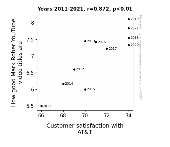
What else correlates?
How good Mark Rober YouTube video titles are · all YouTube
Customer satisfaction with AT&T · all weird & wacky
How good Mark Rober YouTube video titles are · all YouTube
Customer satisfaction with AT&T · all weird & wacky


View details about correlation #5,170
The GOP is Sus: A Correlational Study of Republican Votes for Senators in Montana and Google Searches for 'That Is Sus'
The increase in Republican votes for Senators in Montana has led to more suspicions about political dealings and decisions. You could say the state's political climate is truly 'Montana sus.' It seems like residents are engaging in some elec-tile dysfunction, as they question the trustworthiness of their elected officials. Perhaps there's a belief that certain political moves just don't seem re-publican of their best interests. It's a situation that's definitely raising eyebrows and prompting people to cast their doubts, turning the state into a hotbed of political intrigue.


What else correlates?
Votes for Republican Senators in Montana · all elections
Google searches for 'that is sus' · all google searches
Votes for Republican Senators in Montana · all elections
Google searches for 'that is sus' · all google searches


View details about correlation #3,777
Maize and Mistranslations: Exploring the Unlikely Relationship Between GMO Corn Cultivation in Indiana and the Surge in Interpretation and Translation Services
As GMO corn in Indiana became more prevalent, it led to the corn industry branching out and husking for new opportunities. This created a-maize-ing demand for interpreters and translators to help communicate with foreign markets. The corn-y jokes and puns may have also kernel-ed a passion for language, making it the ear-resistible career choice. Plus, with all the cross-pollination of ideas, it's no wonder the language industry started to stalk up on talent. In essence, the GMO use in corn cultivated a growing need for interpreters and translators, proving that when it comes to language, it's all about sow-peaking the right corn-cepts!
What else correlates?
GMO use in corn grown in Indiana · all food
The number of interpreters and translators in Indiana · all cccupations
GMO use in corn grown in Indiana · all food
The number of interpreters and translators in Indiana · all cccupations


View details about correlation #3,858
The Burning Connection: Exploring the Link Between Des Moines Air Pollution and Canadian Kerosene Usage
As air pollution in Des Moines decreased, it cleared the way for fresher ideas. This led to the development of more efficient energy sources in Canada, reducing the reliance on kerosene and igniting a spark for change. In other words, Des Moines became the air-rodynamic force for a kerosene revolution in Canada.

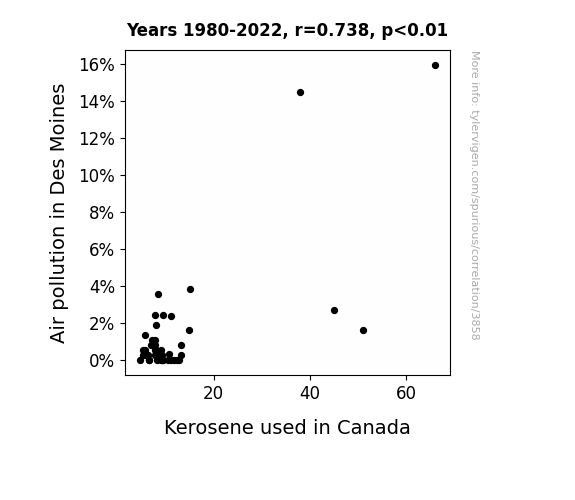
What else correlates?
Air pollution in Des Moines · all weather
Kerosene used in Canada · all energy
Air pollution in Des Moines · all weather
Kerosene used in Canada · all energy


View details about correlation #3,794
Robberies in Kansas and Remaining Forest Canvases: A Surprising Link Revealed
As robberies in Kansas decreased, there was a surplus of ski masks in the global market. This led to an unexpected surge in demand for camouflage fashion, prompting people to clear the Amazonian forests for trendy tree-print clothing. Remember, only you can prevent forest cover loss by not wearing forest-inspired attire!

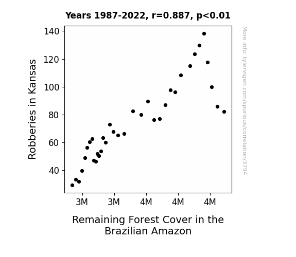
What else correlates?
Robberies in Kansas · all random state specific
Remaining Forest Cover in the Brazilian Amazon · all weird & wacky
Robberies in Kansas · all random state specific
Remaining Forest Cover in the Brazilian Amazon · all weird & wacky


View details about correlation #4,976
Cruising for Hits: The Nautical Nonsense of Meme Popularity and Google Searches
As the 'I'm on a Boat' meme drifted away from the mainstream, it created a meme vacuum. This vacuum was promptly filled by the irresistible horsey dance and catchy tunes of Gangnam Style. This led to a temporary dip in searches as people adjusted their meme preferences and dance moves. It's a meme-eat-meme world out there!

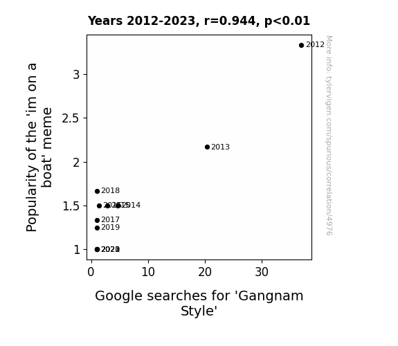
What else correlates?
Popularity of the 'im on a boat' meme · all memes
Google searches for 'Gangnam Style' · all google searches
Popularity of the 'im on a boat' meme · all memes
Google searches for 'Gangnam Style' · all google searches


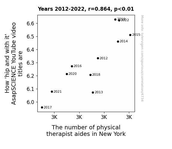
View details about correlation #4,734
Flexing on Flexibility: The Hip and With It Connection Between AsapSCIENCE YouTube Video Titles and the Demand for Physical Therapist Aides in New York
The more physical therapist aides there are in New York, the better they are at busting out the latest dance moves, which inadvertently makes AsapSCIENCE more 'hip and with it' when creating video titles. It's a quirky case of infectious boppin' and groovin' leading to some seriously funky video titling vibes!


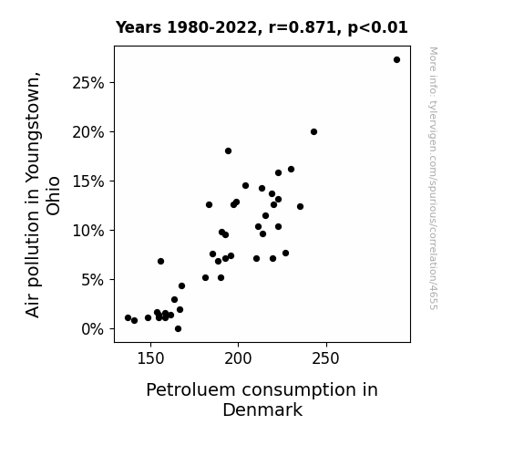
View details about correlation #4,655
Clearing the Air: Exploring the Link Between Air Pollution in Youngstown, Ohio, and Petroleum Consumption in Denmark
The cleaner air in Youngstown somehow created a global chain reaction, leading to more efficient fuel usage in Denmark. It's like the domino effect, but with air particles and Danish cars. Who knew that the smog in Ohio was inadvertently fueling the gas tanks in Denmark! It's a breath of fresh air for environmentalists and a wheely puzzling connection for everyone else.

What else correlates?
Air pollution in Youngstown, Ohio · all weather
Petroluem consumption in Denmark · all energy
Air pollution in Youngstown, Ohio · all weather
Petroluem consumption in Denmark · all energy


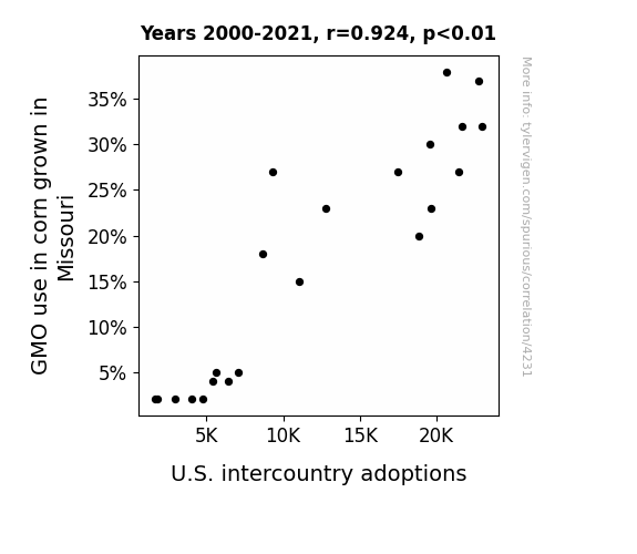
View details about correlation #4,231
The Kernels of Fate: Exploring the Corny Connection Between GMO Use in Missouri and U.S. Intercountry Adoptions
As GMO use in Missouri corn decreased, it led to the production of smaller, non-GMO corn. This smaller corn size then made its way into the popular corn mazes in the state. These unexpectedly challenging mazes resulted in a decline in the number of visitors making it through to the exit. To compensate, local families had to spend more time in the mazes, inadvertently bonding and deciding to pursue domestic adoptions instead of intercountry adoptions, leading to a decrease on the national level.

What else correlates?
GMO use in corn grown in Missouri · all food
U.S. intercountry adoptions · all weird & wacky
GMO use in corn grown in Missouri · all food
U.S. intercountry adoptions · all weird & wacky


View details about correlation #5,386
The Time Warp Factor: A Spooky Connection Between 'Slenderman' and 'Minute Physics'
People were so captivated by the Slenderman meme that they started contemplating the existence of a Slenderman Physics, leading them to search for Minute Physics to see if they could uncover the secrets of this new, terrifying branch of science. And that's not a tall tale!


What else correlates?
Popularity of the 'slenderman' meme · all memes
Google searches for 'Minute Physics' · all google searches
Popularity of the 'slenderman' meme · all memes
Google searches for 'Minute Physics' · all google searches


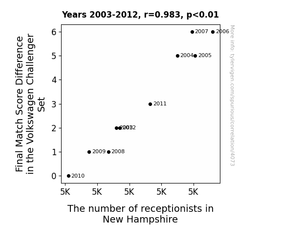
View details about correlation #4,073
Match Made in Reception: The Quirky Connection Between Final Match Score Difference in the Volkswagen Challenger Set and the Number of Receptionists in New Hampshire
Perhaps as the Final Match Score Difference in the Volkswagen Challenger Set increased, more and more fans were losing their voices from all the cheering. This led to a spike in demand for receptionists in New Hampshire, as the raspy-voiced fans needed someone to field their calls while they recuperated with honey and lemon.


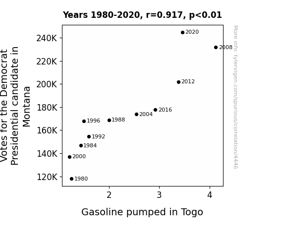
View details about correlation #4,446
Montana's Democrat Votes and Togo's Gasoline: A Mirthful Mismatch or a Serendipitous Synchrony?
As the support for the Democratic candidate in Montana surged, it sparked a wave of economic optimism. This led to an unexpected ripple effect in Togo, where the demand for gasoline mysteriously skyrocketed. It seems like even in the world of fuel, it's all about finding the right candidate to 'ignite' progress!
What else correlates?
Votes for the Democratic Presidential candidate in Montana · all elections
Gasoline pumped in Togo · all energy
Votes for the Democratic Presidential candidate in Montana · all elections
Gasoline pumped in Togo · all energy


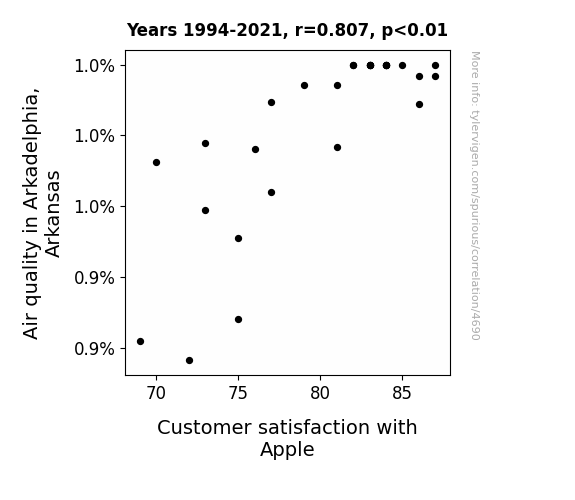
View details about correlation #4,690
Astonishing Air Quality and Apple Affinity: Analyzing the Association Between Air Quality in Arkadelphia, Arkansas and Customer Satisfaction with Apple
As the air quality in Arkadelphia improved, the local apple orchards flourished, leading to an abundance of top-quality apples. This influx of superior apples led to an increase in customer satisfaction with Apple products, as people subconsciously felt a stronger connection to the brand while enjoying the crisp, clean air and envisioning a world where every breath was as fresh as biting into a juicy apple.

What else correlates?
Air quality in Arkadelphia, Arkansas · all weather
Customer satisfaction with Apple · all weird & wacky
Air quality in Arkadelphia, Arkansas · all weather
Customer satisfaction with Apple · all weird & wacky


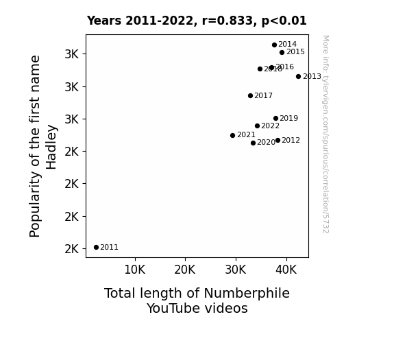
View details about correlation #5,732
The Hadley Hilarity: How the Herd of 'H' Named Numbers Nudges Numberphile Narrative Necessities
As the name Hadley gained popularity, parents realized they needed to prepare their kids for a future in Mathematics. This led to a surge in demand for educational content, prompting Numberphile to create longer videos to meet the growing Had-leygions of fans.
What else correlates?
Popularity of the first name Hadley · all first names
Total length of Numberphile YouTube videos · all YouTube
Popularity of the first name Hadley · all first names
Total length of Numberphile YouTube videos · all YouTube


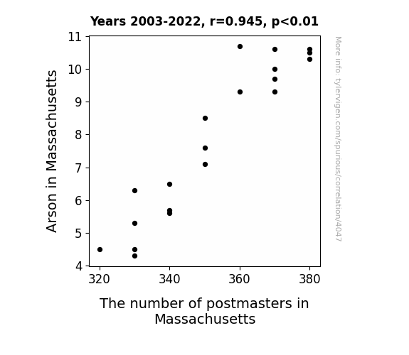
View details about correlation #4,047
Postmasters' Roast: The Toast to the Arson Coast
The decrease in Arson in Massachusetts caused a decrease in The number of postmasters in Massachusetts because there were fewer fires to deliver mail to.

What else correlates?
Arson in Massachusetts · all random state specific
The number of postmasters in Massachusetts · all cccupations
Arson in Massachusetts · all random state specific
The number of postmasters in Massachusetts · all cccupations
. The chart goes from 2009 to 2021, and the two variables track closely in value over that time.")

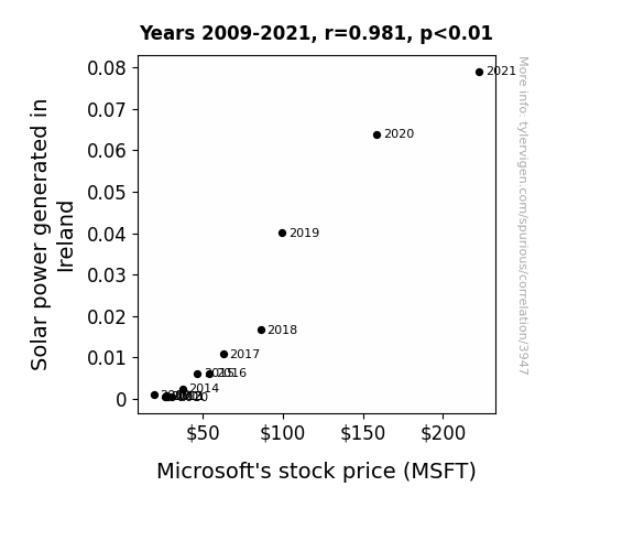
View details about correlation #3,947
Shedding Light on Solar Power: Illuminating the Relationship Between Solar Generation in Ireland and Microsoft's Stock Price
The leprechauns managing the solar panels also happen to have a pot of gold invested in Microsoft. When the solar power output goes up, so does their good luck, leading to a rise in Microsoft's stock price. It's a shining example of how green energy and financial success can go hand in hand!

What else correlates?
Solar power generated in Ireland · all energy
Microsoft's stock price (MSFT) · all stocks
Solar power generated in Ireland · all energy
Microsoft's stock price (MSFT) · all stocks
Why this works
- Data dredging: I have 25,237 variables in my database. I compare all these variables against each other to find ones that randomly match up. That's 636,906,169 correlation calculations! This is called “data dredging.”
Fun fact: the chart used on the wikipedia page to demonstrate data dredging is also from me. I've been being naughty with data since 2014.
Instead of starting with a hypothesis and testing it, I instead tossed a bunch of data in a blender to see what correlations would shake out. It’s a dangerous way to go about analysis, because any sufficiently large dataset will yield strong correlations completely at random. - Lack of causal connection: There is probably no direct connection between these variables, despite what the AI says above.
Because these pages are automatically generated, it's possible that the two variables you are viewing are in fact causually related. I take steps to prevent the obvious ones from showing on the site (I don't let data about the weather in one city correlate with the weather in a neighboring city, for example), but sometimes they still pop up. If they are related, cool! You found a loophole.
This is exacerbated by the fact that I used "Years" as the base variable. Lots of things happen in a year that are not related to each other! Most studies would use something like "one person" in stead of "one year" to be the "thing" studied. - Observations not independent: For many variables, sequential years are not independent of each other. You will often see trend-lines form. If a population of people is continuously doing something every day, there is no reason to think they would suddenly change how they are doing that thing on January 1. A naive p-value calculation does not take this into account.
You will calculate a lower chance of "randomly" achieving the result than represents reality.
To be more specific: p-value tests are probability values, where you are calculating the probability of achieving a result at least as extreme as you found completely by chance. When calculating a p-value, you need to assert how many "degrees of freedom" your variable has. I count each year (minus one) as a "degree of freedom," but this is misleading for continuous variables.
This kind of thing can creep up on you pretty easily when using p-values, which is why it's best to take it as "one of many" inputs that help you assess the results of your analysis.
- Y-axes doesn't start at zero: I truncated the Y-axes of the graphs above. I also used a line graph, which makes the visual connection stand out more than it deserves.
Nothing against line graphs. They are great at telling a story when you have linear data! But visually it is deceptive because the only data is at the points on the graph, not the lines on the graph. In between each point, the data could have been doing anything. Like going for a random walk by itself!
Mathematically what I showed is true, but it is intentionally misleading. If you click on any of the charts that abuse this, you can scroll down to see a version that starts at zero. - Confounding variable: Confounding variables (like global pandemics) will cause two variables to look connected when in fact a "sneaky third" variable is influencing both of them behind the scenes.
- Outliers: Some datasets here have outliers which drag up the correlation.
In concept, "outlier" just means "way different than the rest of your dataset." When calculating a correlation like this, they are particularly impactful because a single outlier can substantially increase your correlation.
Because this page is automatically generated, I don't know whether any of the charts displayed on it have outliers. I'm just a footnote. ¯\_(ツ)_/¯
I intentionally mishandeled outliers, which makes the correlation look extra strong. - Low n: There are not many data points included in some of these charts.
You can do analyses with low ns! But you shouldn't data dredge with a low n.
Even if the p-value is high, we should be suspicious of using so few datapoints in a correlation.
Pro-tip: click on any correlation to see:
- Detailed data sources
- Prompts for the AI-generated content
- Explanations of each of the calculations (correlation, p-value)
- Python code to calculate it yourself


