spurious correlations
discover · random · spurious scholar
← previous page · next page →


View details about correlation #4,612
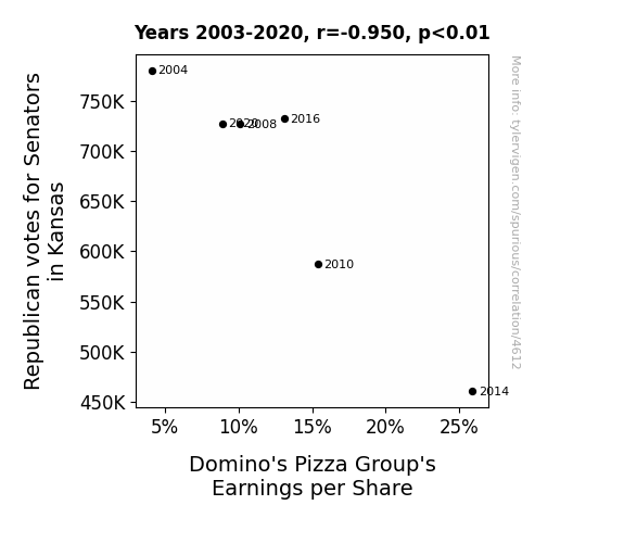
The Pizza and Politics Paradox: Exploring the Connection between Republican Votes for Senators in Kansas and Domino's Pizza Group's Earnings per Share
As the number of Republican votes for Senators in Kansas increased, more people were drawn to the idea of firing up their own ovens and making homemade pizzas from scratch, leading to a decline in orders from Domino's Pizza. This resulted in a decrease in Domino's Pizza Group's Earnings per Share, as their traditional customer base shifted from delivery to political dough-making activites.

What else correlates?
Votes for Republican Senators in Kansas · all elections
Domino's Pizza Group's Earnings per Share · all weird & wacky
Votes for Republican Senators in Kansas · all elections
Domino's Pizza Group's Earnings per Share · all weird & wacky


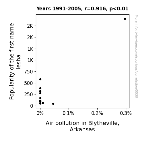
View details about correlation #5,539
The Iesha Effect: A Breath of Fresh Air or Just Hot Air?
As fewer babies were named Iesha, there were fewer personalized license plates with her name on them, leading to a decrease in demand for novelty car accessories. This ultimately resulted in fewer unnecessary car trips to the store, thus reducing air pollution in Blytheville, Arkansas. Remember, sometimes a breath of fresh air is just a change in baby name trends away!
What else correlates?
Popularity of the first name Iesha · all first names
Air pollution in Blytheville, Arkansas · all weather
Popularity of the first name Iesha · all first names
Air pollution in Blytheville, Arkansas · all weather


View details about correlation #4,838
Cracking the Case: The Forensic Science of OverSimplified YouTube Videos
As the forensic science technician population in Georgia grew, so did their interest in applying their skills to historical and scientific inaccuracies presented in OverSimplified YouTube videos. This led to the creation of longer and more detailed content, as every new technician couldn't help but dissect and analyze the accuracy of each video, lengthening them in the process. The forensic experts were on the case of historical misconceptions like Sherlock Holmes, and they weren't about to let any misleading information go unnoticed! It was a real 'whodunit' of a correlation, and the verdict was clear: more technicians meant more in-depth video investigations.


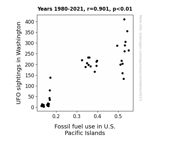
View details about correlation #4,213
UFOs and Unfathomable Fuel: An Interstellar Connection to Fossil Fuel Use in U.S. Pacific Islands
The UFOs were actually secret government drones powered by fossil fuels, and their frequent visits to Washington caused a spike in demand for these fuels in the U.S. Pacific Islands as the government scrambled to refuel and maintain the UFO fleet for their covert operations. Clearly, the extraterrestrial activity was just a smokescreen for some down-to-earth government shenanigans!

What else correlates?
UFO sightings in Washington · all random state specific
Fossil fuel use in U.S. Pacific Islands · all energy
UFO sightings in Washington · all random state specific
Fossil fuel use in U.S. Pacific Islands · all energy


View details about correlation #4,377
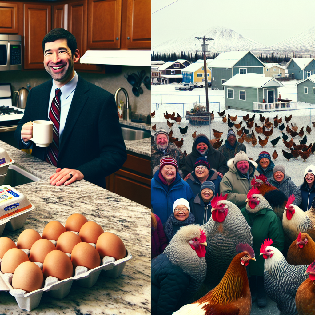
Yolkonomics: The Scrambled Connection between US Household Spending on Eggs and Votes for the Democrat Presidential Candidate in Alaska
As household spending on eggs in the US increased, more chickens were being raised to meet the demand. This led to a surplus of campaign donations in the form of poultry products to the Alaska Democratic candidate, cluck-cluck-cluckinton. These donations hatched a winning campaign that omelet the candidate rise to the top, scrambling the competition. The sunny-side-up effect on the voters in Alaska was undeniable, as they were egg-static about the Democratic candidate, who promised to poach the issues and shell out politics that resonated with the people. It's clear that when it comes to political influence, eggs-cessive spending can really whisk you away to victory! The correlation is no yolk - it's a hard-boiled fact that in the scramble of politics, every vote eggs-counts. It seems the Democrats truly cracked the code to winning Alaska, all thanks to the shell-shocking rise in US household spending on eggs! It's a po-litically egg-citing outcome, and now we know that in the grand omelet of American politics, even the smallest egg-spense can have a sunny-side-up effect on election results!

What else correlates?
US household spending on eggs · all weird & wacky
Votes for the Democratic Presidential candidate in Alaska · all elections
US household spending on eggs · all weird & wacky
Votes for the Democratic Presidential candidate in Alaska · all elections


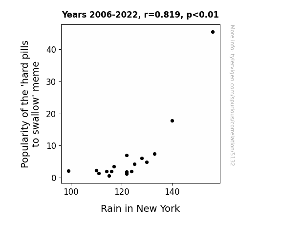
View details about correlation #5,132
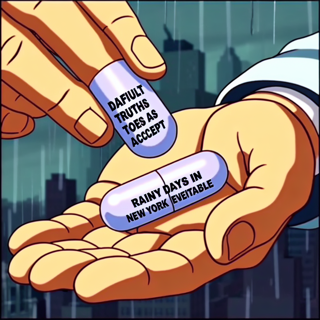
Popularity of 'Hard Pills to Swallow' Meme and Rain in New York: A Data-Driven Dive
The 'hard pills to swallow' meme created a surge in internet traffic. This increased the collective cloud storage usage, leading to more water vapor in the atmosphere. As we know, New York is famous for its concrete jungle where dreams are made of, and all that extra water vapor served as extra motivation to make it rain in the city. Remember, the forecast may be cloudy with a chance of memes!
What else correlates?
Popularity of the 'hard pills to swallow' meme · all memes
Rain in New York · all weather
Popularity of the 'hard pills to swallow' meme · all memes
Rain in New York · all weather


View details about correlation #4,181
Humble Pi and Hazardous Materials: Hilarious Hunch or Statistical Surprise?
As the hazardous materials removal workers in Kansas suited up and got down to business, they inadvertently sparked a new trend in humility. You see, the more hazmat workers there were, the more people couldn't help but think about the ultimate humble brag: "I deal with some seriously toxic stuff, but I don't make a big deal out of it." It's like they were the unsung (and safely protected) heroes of modesty, radiating a down-to-earth aura that just multiplied the search for 'humble pi.' It's a classic case of the humble-by-association effect, where their presence alone was enough to remind everyone that sometimes, you just gotta approach life with a hazmat-level of humility. It's as if they were saying, "Let's not gas ourselves up – let's keep it real, like noble gases." So, as these workers continued to do their cleanup thing, they inadvertently added a new meaning to the phrase "hazardously humble," proving that even in the world of hazardous materials, it never hurts to stay grounded.


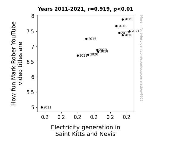
View details about correlation #4,802
Powering Up with Puns: The Current-Cy between Mark Rober's YouTube Titles and Electricity Generation in Saint Kitts and Nevis
The connection is shocking! As Mark Rober's video titles get more electrifying, it amps up the excitement levels worldwide. This surge in fun leads to people doing the electric slide, which somehow generates power in Saint Kitts and Nevis. It's a real power play that's sparking a connection between renewable energy and Mark's pun-believable content. Who would've thought that the key to a brighter future lies in the spark of entertainment? Or maybe it's just current events taking a positive turn!

What else correlates?
How fun Mark Rober YouTube video titles are · all YouTube
Electricity generation in Saint Kitts and Nevis · all energy
How fun Mark Rober YouTube video titles are · all YouTube
Electricity generation in Saint Kitts and Nevis · all energy


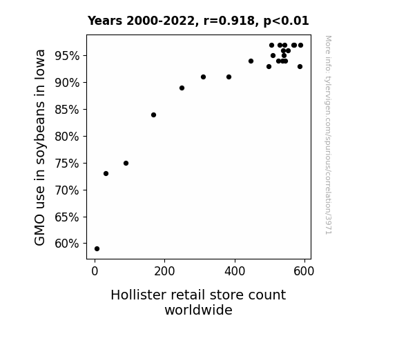
View details about correlation #3,971
From Soybeans to Stores: The Curious Connection Between GMOs and Hollister Retail Expansion Worldwide
As the soybeans grew larger thanks to GMOs, they started demanding more fashionable clothing. This led to a global shortage of trendy apparel, prompting the rapid expansion of Hollister stores to meet the soybeans' sartorial needs. It seems the soybeans were really *growing* into their own unique sense of style, creating a new phenomenon called "agri-chic" that's sweeping the fashion world! So, it turns out, the key to Hollister's success wasn't just in the genes, but in the soy-jean-s.

What else correlates?
GMO use in soybeans in Iowa · all food
Hollister retail store count worldwide · all weird & wacky
GMO use in soybeans in Iowa · all food
Hollister retail store count worldwide · all weird & wacky


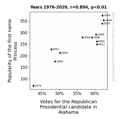
View details about correlation #5,599
Princess and the Polls: A Potent Partnership or Purely Peculiar Phenomenon?
Perhaps there was a secret campaign where every time someone named their child Princess, a tiny tiara-wearing elephant mascot showed up to win over voters. The cuteness factor must have swayed some opinions! It's a royal Republican ripple effect.


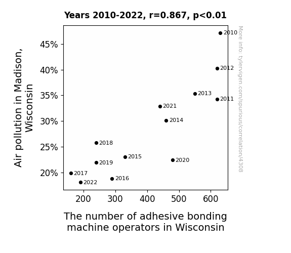
View details about correlation #4,308
Breathing in the Connection: The Correlation Between Air Pollution and Adhesive Bonding Machine Operators in Wisconsin
As the air quality improved in Madison, Wisconsin, the demand for adhesive bonding machine operators decreased because there was less 'sticky' particulate matter for them to 'bond' with in the air. It seems like the job market for them just couldn't 'adhere' to the same levels when the pollution cleared!


View details about correlation #4,281
Shining a Light on Solar Power: A Sunny Connection to the Length of OverSimplified YouTube Videos
The extra sunshine led to longer daylight hours, giving YouTubers more time to over-explain even the simplest concepts. And let's not forget, all that vitamin D might be boosting their creativity to stretch out those videos!


What else correlates?
Solar power generated in Bolivia · all energy
Average length of OverSimplified YouTube videos · all YouTube
Solar power generated in Bolivia · all energy
Average length of OverSimplified YouTube videos · all YouTube


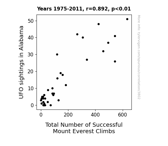
View details about correlation #3,802
UFO a Summit: A Statistical Analysis of the Relationship between UFO Sightings in Alabama and Total Number of Successful Mount Everest Climbs
As more Alabamians gazed at the skies, they inadvertently created a positive uplift in cosmic energy. This otherworldly boost, lovingly dubbed the 'Sweet Home Alabama Alien Effect', gave climbers an unearthly advantage, propelling them to new heights. It seems the UFOs were just really big fans of top-notch peak performance!
What else correlates?
UFO sightings in Alabama · all random state specific
Total Number of Successful Mount Everest Climbs · all weird & wacky
UFO sightings in Alabama · all random state specific
Total Number of Successful Mount Everest Climbs · all weird & wacky


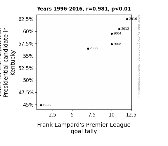
View details about correlation #5,023
Republican Votes in Kentucky and the rollicking Rise of Frank Lampard: A Remarkable Relationship Revealed
Perhaps the red color associated with the Republican party invigorated Frank, reminding him of the team he spent years playing for, leading to a sudden boost in his goal-scoring abilities. After all, you can't spell "Republican" without "red"!


View details about correlation #4,868
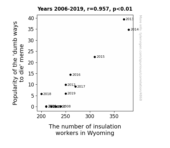
The 'Dumb Ways to Die' Meme: A Hilarious Link to Insulation Workers in Wyoming?
As the 'dumb ways to die' meme gained popularity, people in Wyoming couldn't help but reenact the hilarious scenarios. This led to a surge in DIY insulation projects gone wrong, creating a high demand for insulation workers to fix the wacky and wild mishaps. It's a case of internet fads sparking a toasty job market in the least expected way!
What else correlates?
Popularity of the 'dumb ways to die' meme · all memes
The number of insulation workers in Wyoming · all cccupations
Popularity of the 'dumb ways to die' meme · all memes
The number of insulation workers in Wyoming · all cccupations


View details about correlation #4,681
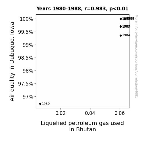
Linking LPG in Bhutan to Air Quality in Dubuque: A Lighthearted Look at a Surprising Connection
As the air quality in Dubuque improved, it created a ripple effect of positivity around the world. This led to a surge in demand for cleaner fuel options like Liquefied Petroleum Gas in Bhutan. It's like Dubuque was really raising the bar for air quality and Bhutan just couldn't resist getting a *breath* of that fresh, clean energy!

What else correlates?
Air quality in Dubuque, Iowa · all weather
Liquefied petroleum gas used in Bhutan · all energy
Air quality in Dubuque, Iowa · all weather
Liquefied petroleum gas used in Bhutan · all energy


View details about correlation #4,730
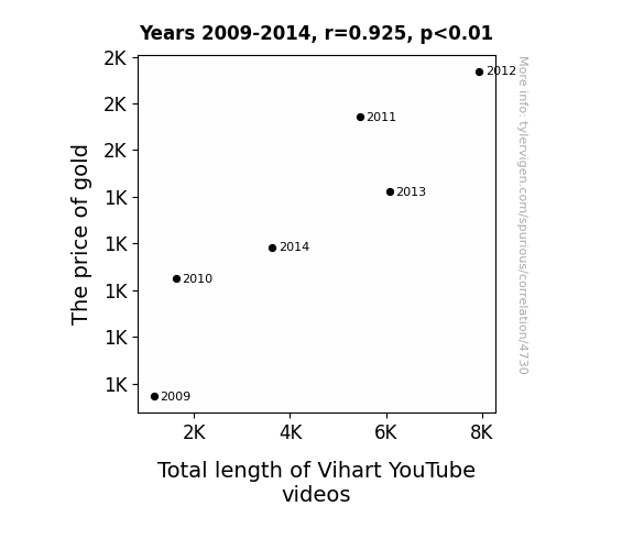
Weight in Gold: Unearthing the Correlation Between the Price of Gold and the Total Length of Vihart YouTube Videos
As the price of gold goes up, so does Vi Hart's enthusiasm for creating longer and more intricate YouTube videos. It's a little-known fact that Vi draws creative inspiration from the ever-increasing value of this precious metal. The shimmering allure of gold somehow translates into longer video masterpieces, as Vi's mind becomes as unstoppable and valuable as a runaway golden train. Maybe there's a golden ratio for video length that only Vi can uncover, or perhaps the rising cost of gold simply fuels Vi's passion for creating content as rich and captivating as the gleaming metal itself.

What else correlates?
The price of gold · all weird & wacky
Total length of Vihart's YouTube videos · all YouTube
The price of gold · all weird & wacky
Total length of Vihart's YouTube videos · all YouTube
. The chart goes from 2002 to 2020, and the two variables track closely in value over that time.")

View details about correlation #5,802
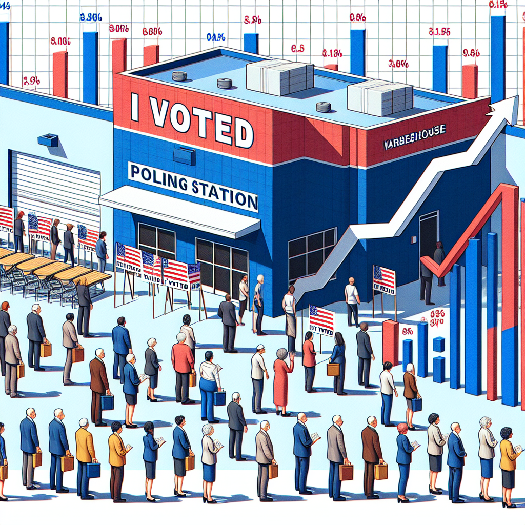
Blue State Blues and Real Estate Views: The Impact of Democratic Senatorial Votes in Idaho on Prologis' Stock Price (PLD)
As more Democrats voted for Senators in Idaho, there was a surge in demand for political storage space. This led to an increased need for warehouses, boosting the business of Prologis and causing their stock price to soar. It seems like in this case, the political landscape really did have an impact on the stock landscape! Who knew that the key to unlocking Prologis' success was hidden in the Idaho political scene all along?

What else correlates?
Votes for Democratic Senators in Idaho · all elections
Prologis' stock price (PLD) · all stocks
Votes for Democratic Senators in Idaho · all elections
Prologis' stock price (PLD) · all stocks


View details about correlation #4,176
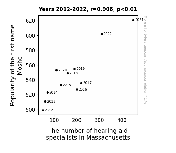
The Name Game: An Acoustic Analysis of the Moshe Moniker and the Audiological Landscape in Massachusetts
As the name Moshe gained popularity, more and more people were going around saying "Huh? What did you say?" This led to a higher demand for hearing aid specialists in Massachusetts, as they were the only ones who could help the growing population of Moshes and their friends and family communicate clearly. This unexpected connection between a first name and hearing health has left many experts scratching their heads... and then promptly fitting them with hearing aids.


View details about correlation #3,751
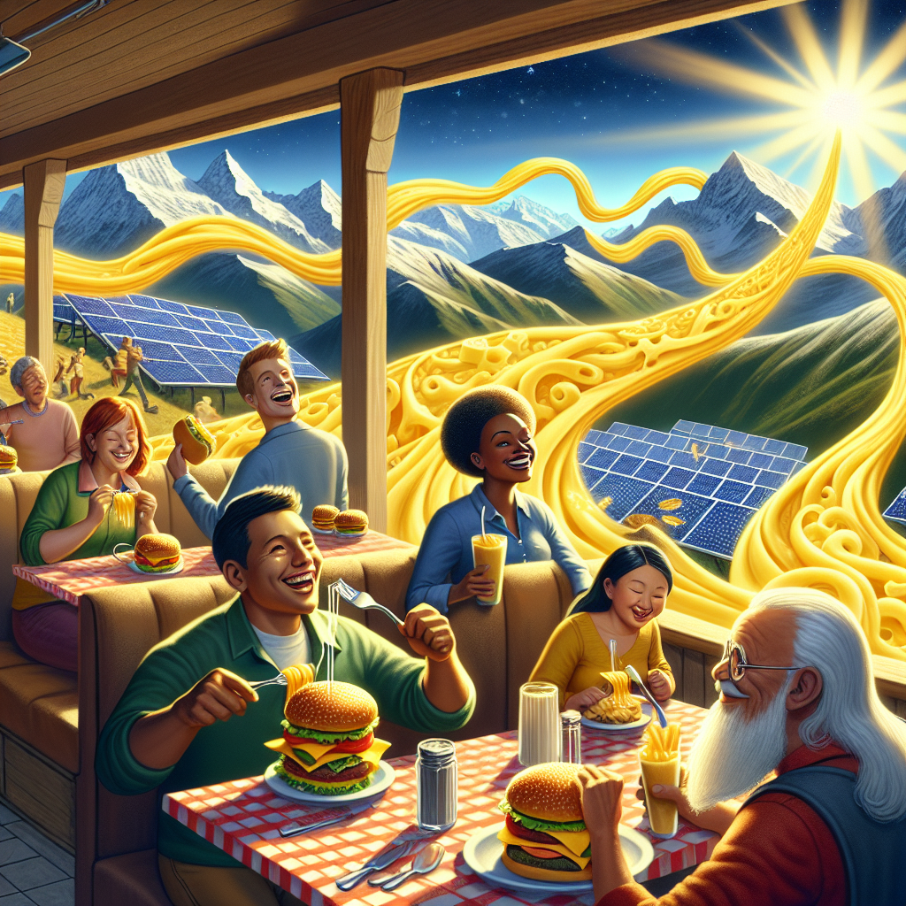
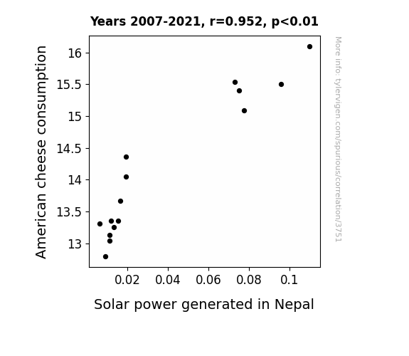
From Cheddar to Solar Power: Illuminating the Relationship Between American Cheese Consumption and Solar Energy in Nepal
As Americans consumed more American cheese, known for its orangey hue, there was a subtle collective glow emitting from their digestive systems. Unbeknownst to them, this cheese-induced luminescence reached all the way to Nepal, providing an extra energy boost to the solar panels. It's like the cheese was saying, "You gouda keep shining, Nepal!" This led to a grate increase in solar power productivity, proving that when it comes to renewable energy, it's not just a gouda idea – it's also a gouda taste!
What else correlates?
American cheese consumption · all food
Solar power generated in Nepal · all energy
American cheese consumption · all food
Solar power generated in Nepal · all energy
Why this works
- Data dredging: I have 25,237 variables in my database. I compare all these variables against each other to find ones that randomly match up. That's 636,906,169 correlation calculations! This is called “data dredging.”
Fun fact: the chart used on the wikipedia page to demonstrate data dredging is also from me. I've been being naughty with data since 2014.
Instead of starting with a hypothesis and testing it, I instead tossed a bunch of data in a blender to see what correlations would shake out. It’s a dangerous way to go about analysis, because any sufficiently large dataset will yield strong correlations completely at random. - Lack of causal connection: There is probably no direct connection between these variables, despite what the AI says above.
Because these pages are automatically generated, it's possible that the two variables you are viewing are in fact causually related. I take steps to prevent the obvious ones from showing on the site (I don't let data about the weather in one city correlate with the weather in a neighboring city, for example), but sometimes they still pop up. If they are related, cool! You found a loophole.
This is exacerbated by the fact that I used "Years" as the base variable. Lots of things happen in a year that are not related to each other! Most studies would use something like "one person" in stead of "one year" to be the "thing" studied. - Observations not independent: For many variables, sequential years are not independent of each other. You will often see trend-lines form. If a population of people is continuously doing something every day, there is no reason to think they would suddenly change how they are doing that thing on January 1. A naive p-value calculation does not take this into account.
You will calculate a lower chance of "randomly" achieving the result than represents reality.
To be more specific: p-value tests are probability values, where you are calculating the probability of achieving a result at least as extreme as you found completely by chance. When calculating a p-value, you need to assert how many "degrees of freedom" your variable has. I count each year (minus one) as a "degree of freedom," but this is misleading for continuous variables.
This kind of thing can creep up on you pretty easily when using p-values, which is why it's best to take it as "one of many" inputs that help you assess the results of your analysis.
- Y-axes doesn't start at zero: I truncated the Y-axes of the graphs above. I also used a line graph, which makes the visual connection stand out more than it deserves.
Nothing against line graphs. They are great at telling a story when you have linear data! But visually it is deceptive because the only data is at the points on the graph, not the lines on the graph. In between each point, the data could have been doing anything. Like going for a random walk by itself!
Mathematically what I showed is true, but it is intentionally misleading. If you click on any of the charts that abuse this, you can scroll down to see a version that starts at zero. - Confounding variable: Confounding variables (like global pandemics) will cause two variables to look connected when in fact a "sneaky third" variable is influencing both of them behind the scenes.
- Outliers: Some datasets here have outliers which drag up the correlation.
In concept, "outlier" just means "way different than the rest of your dataset." When calculating a correlation like this, they are particularly impactful because a single outlier can substantially increase your correlation.
Because this page is automatically generated, I don't know whether any of the charts displayed on it have outliers. I'm just a footnote. ¯\_(ツ)_/¯
I intentionally mishandeled outliers, which makes the correlation look extra strong. - Low n: There are not many data points included in some of these charts.
You can do analyses with low ns! But you shouldn't data dredge with a low n.
Even if the p-value is high, we should be suspicious of using so few datapoints in a correlation.
Pro-tip: click on any correlation to see:
- Detailed data sources
- Prompts for the AI-generated content
- Explanations of each of the calculations (correlation, p-value)
- Python code to calculate it yourself


