spurious correlations
discover · random · spurious scholar
← previous page · next page →


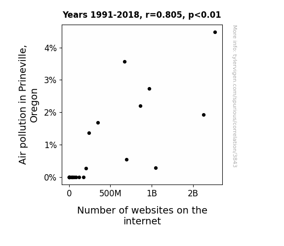
View details about correlation #3,843
Breathe Easy: Connecting the Dots Between Prineville's Air Pollution and Internet Proliferation
The smog in Prineville acted as a cloud server, prompting a rise in internet use. As the pollution levels soared, so did the cyber-traffic, creating a 'web' of connections online. It seems the dirty air wasn't the only thing 'networking' in Prineville!

What else correlates?
Air pollution in Prineville, Oregon · all weather
Number of websites on the internet · all weird & wacky
Air pollution in Prineville, Oregon · all weather
Number of websites on the internet · all weird & wacky


View details about correlation #5,148
Tongue-in-cheek Ties: Tracing the Trend of Democrat Votes in Connecticut and Google Searches for How to Annex Texas
As the Democrat votes for Senators in Connecticut decreased, there was a ripple effect on the national political landscape. This shift in power dynamics somehow sent shockwaves all the way to Texas, where even the Google searches for 'how to annex Texas' felt the need to take a little break. It's like the political domino effect, but with a Texan twist - who knew that the road to annexation could be so intricately connected to voting patterns in Connecticut? It's a wild, wild political rodeo out there!

What else correlates?
Votes for Democratic Senators in Connecticut · all elections
Google searches for 'how to annex texas' · all google searches
Votes for Democratic Senators in Connecticut · all elections
Google searches for 'how to annex texas' · all google searches


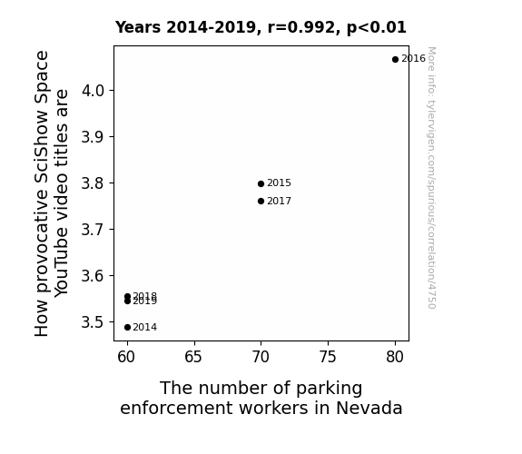
View details about correlation #4,750
Tight Delight: The Flight of SciShow Space Video Titles and the Plight of Nevada's Parking Enforcement Workforce
As SciShow Space video titles get spicier, more people in Nevada get fired up and forget where they parked, leading to a higher demand for parking enforcement workers. It's a space showdown for those coveted parking spots!


View details about correlation #3,819
Giddy Geothermal Griddle: An Analysis of the Association between Austria's Geothermal Power and Arson in the United States
With less hot air coming from Austria, it seems the urge to start fires in the US just couldn't ignite like before. It's a case of geothermal power cooling down the arson activity across the pond. I guess you could say the correlation went from heat to not.


What else correlates?
Geothermal power generated in Austria · all energy
Arson in United States · all random state specific
Geothermal power generated in Austria · all energy
Arson in United States · all random state specific


View details about correlation #3,999
Electrical System Recalls: A Shocking Correlation with Air Pollution in Grants Pass, Oregon
The smog was so thick that it actually became a makeshift conductor, causing all sorts of electrifying problems in the cars!


View details about correlation #5,422
Cyrus, Conservatism, and Correlation: A Comical Connection
People subconsciously associated the name Cyrus with the ancient Persian ruler, sparking a wave of admiration for strong, authoritarian leadership. It's as if they couldn't resist the call of the 'Patriarchy in Tennessee'!


View details about correlation #4,513
Revving Up the Comments Section: Exploring the Correlation Between Motorcycle Mechanics in Georgia and Total Comments on Computerphile YouTube Videos
As the number of motorcycle mechanics in Georgia dwindled, so did the collective ability to grasp complex engineering concepts. This led to a decrease in the total comments on Computerphile YouTube videos, as fewer individuals were able to engage in nuanced discussions about computer science and technology. It seems the intricacies of motorcycle repair and computer systems have more in common than we thought! Who knew that the revving of engines in Georgia could have an impact on the virtual engines of technology discussions? It's a wheely strange connection, but it certainly seems like the mechanics of motorcycle maintenance were sparking some electrifying debates in the world of computerphile.


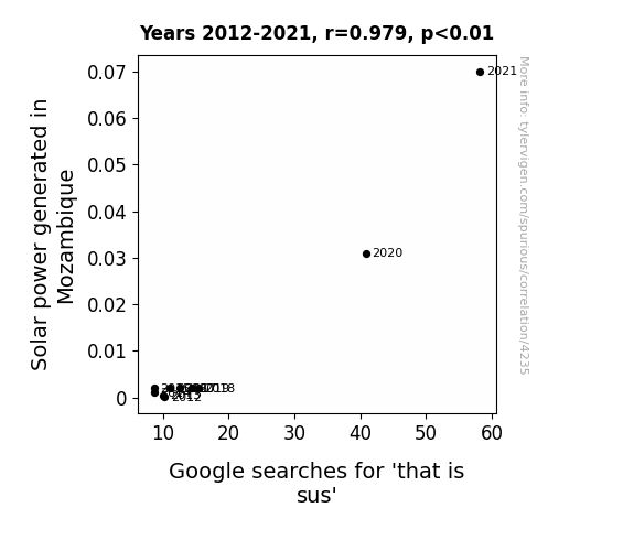
View details about correlation #4,235
Shining Light on Sus-tainable Energy: The Unlikely Link Between Solar Power in Mozambique and 'That is Sus' Google Searches
As the solar panels soaked up the sun's rays, they also inadvertently absorbed some of its playful energy. This led to a surge in suspicious behavior, as photons were caught red-handed acting sketchy and sowing distrust among the solar cells. It's a case of 'photon' plays that sparked a light-hearted but concerning trend in Mozambique, leaving everyone to wonder, "Solar power may be renewable, but is the fun it's generating truly sustainable?"

What else correlates?
Solar power generated in Mozambique · all energy
Google searches for 'that is sus' · all google searches
Solar power generated in Mozambique · all energy
Google searches for 'that is sus' · all google searches


View details about correlation #4,723
A Tale of Books and Smoke: Spoke on US Folks and Tokes in Rocky Mount, NC
As households spent less on books, there was a novel reduction in the demand for paper production, leading to lower air pollution in Rocky Mount. It's a real page-turner of a correlation!


What else correlates?
Annual US household spending on books · all weird & wacky
Air pollution in Rocky Mount, North Carolina · all weather
Annual US household spending on books · all weird & wacky
Air pollution in Rocky Mount, North Carolina · all weather


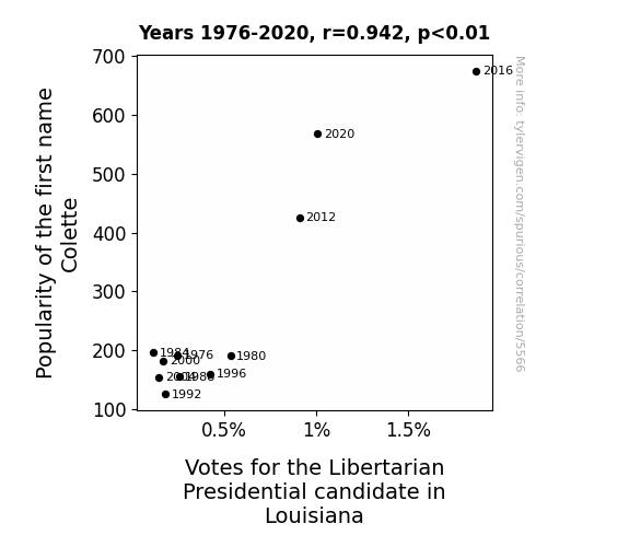
View details about correlation #5,566
Colette in the Ballot Box: An Examination of the Relationship between the Name Popularity and Libertarian Votes in Louisiana
More people named Colette means more people embracing individualism, leading to support for the Libertarian candidate. It's a Colette revolution for political freedom!


View details about correlation #4,757
Turning Views into Materials: A Correlational Analysis of LEMMiNO YouTube Video Popularity and Materials Engineers in Missouri
As Average views of LEMMiNO YouTube videos increase, so does the number of materials engineers in Missouri. This is because the captivating content somehow sparks an interest in materials engineering. Perhaps viewers are drawn to the channel's attention to detail, and it ignites a passion for understanding the properties of various substances. Alternatively, it could be that LEMMiNO's videos are so engaging that they literally inspire people to take a closer look at the materials around them, prompting a sudden surge in the materials engineering workforce.


What else correlates?
Average views of LEMMiNO YouTube videos · all YouTube
The number of materials engineers in Missouri · all cccupations
Average views of LEMMiNO YouTube videos · all YouTube
The number of materials engineers in Missouri · all cccupations


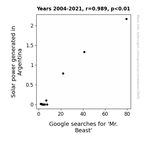
View details about correlation #3,849
Illuminating Insights: Exploring the Correlation Between Solar Power in Argentina and Google Searches for 'Mr. Beast'
The solar panels in Argentina were so shiny that they acted like a massive beacon, drawing in internet users who were seeking out the brightest thing around, which happened to be Mr. Beast's content.

What else correlates?
Solar power generated in Argentina · all energy
Google searches for 'Mr. Beast' · all google searches
Solar power generated in Argentina · all energy
Google searches for 'Mr. Beast' · all google searches


View details about correlation #4,068
Carpeting the Crime Scene: Exploring the Link between Annual US Household Spending on Floor Coverings and Arson in Hawaii
It seems that as the demand for rugs and carpets went down, so did the number of hot deals. With fewer people wanting to cover their floors, the urge to start fires just couldn't gain traction. It's a case of less carpet leading to less, well, fire-laying. Just goes to show, when it comes to preventing arson, the floor is lava-ble!


What else correlates?
Annual US household spending on floor coverings · all weird & wacky
Arson in Hawaii · all random state specific
Annual US household spending on floor coverings · all weird & wacky
Arson in Hawaii · all random state specific


View details about correlation #5,377
The Information Sciences Degree and Air Pollution in Boise City: Breathe Easy or Breathe in Knowledge?
As the number of Master's degrees in information sciences soared, so did the demand for outdated computer equipment, leading to a surge in electronic waste incineration, ultimately polluting the air in Boise City. Remember, sometimes the quest for knowledge can lead to a smoggy outcome!


What else correlates?
Master's degrees awarded in information sciences · all education
Air pollution in Boise City · all weather
Master's degrees awarded in information sciences · all education
Air pollution in Boise City · all weather


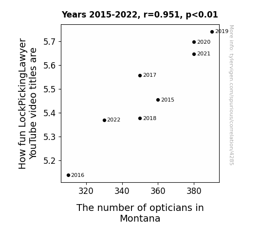
View details about correlation #4,285
EYE-ronic Connections: The Correlation Between LockPickingLawyer's Video Titles and Optician Numbers in Montana
The thrilling excitement of LockPickingLawyer's videos has led to an epidemic of spectacle-dropping moments, creating a surge in demand for opticians in Montana as residents just can't believe their eyes! It's a spectacle of a correlation!

What else correlates?
How fun LockPickingLawyer YouTube video titles are · all YouTube
The number of opticians in Montana · all cccupations
How fun LockPickingLawyer YouTube video titles are · all YouTube
The number of opticians in Montana · all cccupations


View details about correlation #4,183
Parker Power: A Nuclear Connection in Romania
As the name Parker gained popularity, it led to an influx of individuals with a secret talent for nuclear physics relocating to Romania. Unbeknownst to the rest of the world, there exists a highly exclusive underground society of Parkers who possess a natural affinity for all things nuclear. In a bizarre twist of fate, these Parkers found themselves drawn to the opportunity to revolutionize Romania's power generation. It seems that when it comes to nuclear energy, the Parkers have an uncanny ability to... wait for it... park electrons in just the right orbit! As more and more parents embraced the name Parker for their children, little did they realize that they were unwittingly contributing to Romania's unexpected rise in nuclear prowess. Who would have thought that a seemingly innocuous baby name trend could hold the key to unlocking the next generation of nuclear power? It just goes to show that when Parkers are involved, the nuclear possibilities are positively...unpredictable!
What else correlates?
Popularity of the first name Parker · all first names
Nuclear power generation in Romania · all energy
Popularity of the first name Parker · all first names
Nuclear power generation in Romania · all energy


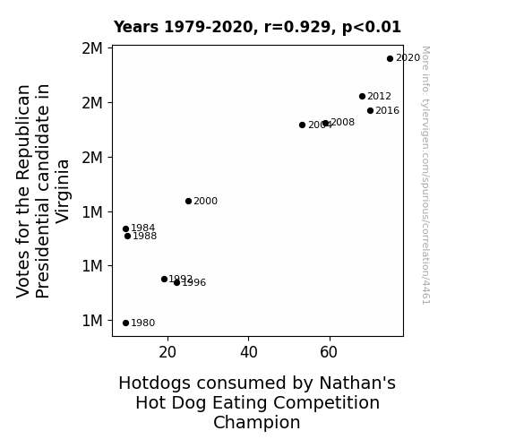
View details about correlation #4,461
Making Sausage and Winning Hearts: A Correlational Study of Republican Votes in Virginia and Nathan's Hot Dog Eating Competition Champions' Consumption
As more people in Virginia pledged their allegiance to the Republican candidate, a wave of patriotic fervor swept the state. This surge in national pride led to an unusual spike in hotdog consumption. Perhaps it was a subconscious craving for traditional American fare, or maybe the competitive eating champion felt inspired to uphold the values of red, white, and blue through his impressive consumption feats. Whatever the reason, it seems that in the world of competitive hotdog eating, political preferences and sausage-like implications go hand in hand.


View details about correlation #5,796
The Cat's Meow: Exploring the Chuck Norris Meme and Its Impact on Cute Cat Searches
Whenever someone shares a Chuck Norris meme, it unleashes a wave of positive energy that resonates with the fundamental fabric of the internet. This energy, known as 'purrfect chi', directly influences the cuteness quotient of all cat-related content online. It's a well-known scientific fact that Chuck Norris doesn't just count to infinity, he also counts as the ultimate source of feline adorability. In essence, the 'chuck norris' meme isn't just a joke – it's a cataclysmically delightful catalyst for all things cute and whiskerful. It's like they say, when Chuck Norris approves, even the grumpiest cat can't help but exclaim, "Pawsitively adorable!"

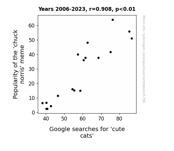
What else correlates?
Popularity of the 'chuck norris' meme · all memes
Google searches for 'cute cats' · all google searches
Popularity of the 'chuck norris' meme · all memes
Google searches for 'cute cats' · all google searches


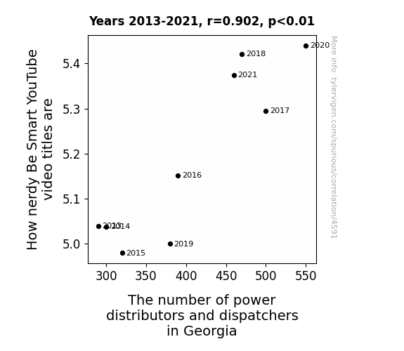
View details about correlation #4,591
Smart Video Titles and Power People Fights: A Correlation Analysis Delights
As the number of power distributors and dispatchers in Georgia increases, so does the supply of electricity-related puns. This sparks a surge in nerdy jokes and clever wordplay, leading to an electrifying uptick in the wittiness of Be Smart YouTube video titles. It's like they say, with great pun power comes great responsibility for geeky content creation! Remember, ohm is where the heart is, and these videos are definitely current! Shockingly, Georgia's power professionals are sparking a revolution in educational humor. Stay tuned for more shocking developments as we conduct a thorough investigation into this positively hilarious correlation!


View details about correlation #4,045
Unidentified Flammable Objects: Exploring the Connection Between UFO Sightings in Pennsylvania and Petroleum Consumption in Angola
The aliens were running low on fuel for their spacecraft, so they were siphoning gas from Angola, but they got distracted by all the UFO excitement in Pennsylvania, leading to more frequent sightings and ultimately, a surge in petrol consumption in Angola as the aliens zipped around in search of the best abduction spots. The extraterrestrial road trip really fueled up the demand for petrol in Angola, creating an otherworldly connection between UFO sightings in Pennsylvania and petrol consumption in Angola. It's an out-of-this-world explanation, but it might just be the most plausible reason for this cosmic correlation!
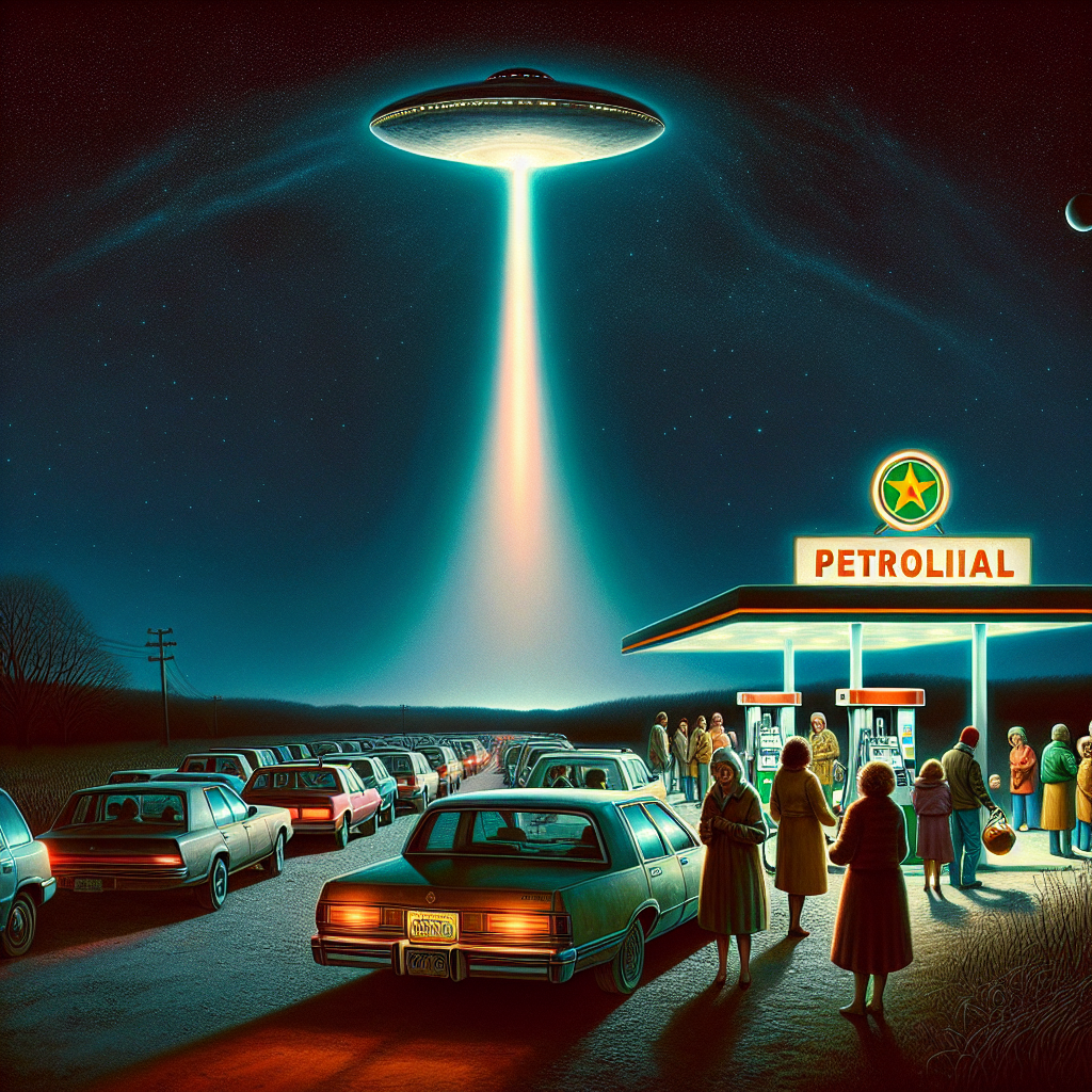

What else correlates?
UFO sightings in Pennsylvania · all random state specific
Petroluem consumption in Angola · all energy
UFO sightings in Pennsylvania · all random state specific
Petroluem consumption in Angola · all energy
Why this works
- Data dredging: I have 25,237 variables in my database. I compare all these variables against each other to find ones that randomly match up. That's 636,906,169 correlation calculations! This is called “data dredging.”
Fun fact: the chart used on the wikipedia page to demonstrate data dredging is also from me. I've been being naughty with data since 2014.
Instead of starting with a hypothesis and testing it, I instead tossed a bunch of data in a blender to see what correlations would shake out. It’s a dangerous way to go about analysis, because any sufficiently large dataset will yield strong correlations completely at random. - Lack of causal connection: There is probably no direct connection between these variables, despite what the AI says above.
Because these pages are automatically generated, it's possible that the two variables you are viewing are in fact causually related. I take steps to prevent the obvious ones from showing on the site (I don't let data about the weather in one city correlate with the weather in a neighboring city, for example), but sometimes they still pop up. If they are related, cool! You found a loophole.
This is exacerbated by the fact that I used "Years" as the base variable. Lots of things happen in a year that are not related to each other! Most studies would use something like "one person" in stead of "one year" to be the "thing" studied. - Observations not independent: For many variables, sequential years are not independent of each other. You will often see trend-lines form. If a population of people is continuously doing something every day, there is no reason to think they would suddenly change how they are doing that thing on January 1. A naive p-value calculation does not take this into account.
You will calculate a lower chance of "randomly" achieving the result than represents reality.
To be more specific: p-value tests are probability values, where you are calculating the probability of achieving a result at least as extreme as you found completely by chance. When calculating a p-value, you need to assert how many "degrees of freedom" your variable has. I count each year (minus one) as a "degree of freedom," but this is misleading for continuous variables.
This kind of thing can creep up on you pretty easily when using p-values, which is why it's best to take it as "one of many" inputs that help you assess the results of your analysis.
- Y-axes doesn't start at zero: I truncated the Y-axes of the graphs above. I also used a line graph, which makes the visual connection stand out more than it deserves.
Nothing against line graphs. They are great at telling a story when you have linear data! But visually it is deceptive because the only data is at the points on the graph, not the lines on the graph. In between each point, the data could have been doing anything. Like going for a random walk by itself!
Mathematically what I showed is true, but it is intentionally misleading. If you click on any of the charts that abuse this, you can scroll down to see a version that starts at zero. - Confounding variable: Confounding variables (like global pandemics) will cause two variables to look connected when in fact a "sneaky third" variable is influencing both of them behind the scenes.
- Outliers: Some datasets here have outliers which drag up the correlation.
In concept, "outlier" just means "way different than the rest of your dataset." When calculating a correlation like this, they are particularly impactful because a single outlier can substantially increase your correlation.
Because this page is automatically generated, I don't know whether any of the charts displayed on it have outliers. I'm just a footnote. ¯\_(ツ)_/¯
I intentionally mishandeled outliers, which makes the correlation look extra strong. - Low n: There are not many data points included in some of these charts.
You can do analyses with low ns! But you shouldn't data dredge with a low n.
Even if the p-value is high, we should be suspicious of using so few datapoints in a correlation.
Pro-tip: click on any correlation to see:
- Detailed data sources
- Prompts for the AI-generated content
- Explanations of each of the calculations (correlation, p-value)
- Python code to calculate it yourself


