spurious correlations
discover · random · spurious scholar
← previous page · next page →


View details about correlation #3,828
The Inflated Effects of Air Pollution: A Breath of Fresh Air from Bismarck, North Dakota
As the air pollution in Bismarck, North Dakota increased, it led to a higher demand for industrial-grade air fresheners across the country. This unexpected surge in air freshener purchases caused a domino effect, leading to a spike in the production costs of various goods. Ultimately, this sneaky inflationary pressure wafted its way into the calculation of the Consumer Price Index for Urban Consumers, eliciting a stinky situation for the economy.


What else correlates?
Air pollution in Bismarck, North Dakota · all weather
Inflation in the US · all weird & wacky
Air pollution in Bismarck, North Dakota · all weather
Inflation in the US · all weird & wacky


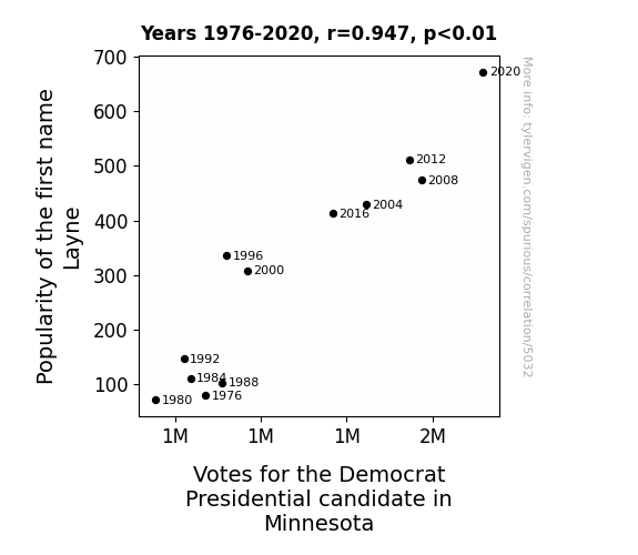
View details about correlation #5,032
The Ballad of Layne and Left Leaning: Exploring the Link Between Layne's Popularity and Democratic Presidential Votes in the Land of 10,000 Lakes
The theory is that every time someone named Layne is born, a simultaneous surge of support for the Democrat candidate is mysteriously generated in Minnesota. Some believe it to be a coincidental cosmic alignment, while others think it could be a secret political strategy linked to baby naming trends. One thing's for sure - the Layne effect on Minnesota politics is real, and it's one nursery rhyme of a situation!

. The chart goes from 2003 to 2022, and the two variables track closely in value over that time.")

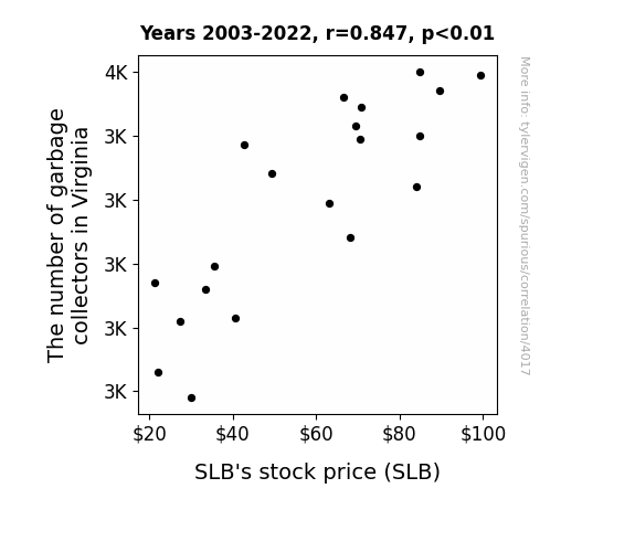
View details about correlation #4,017
Rubbish or Riches? Exploring the Relationship between Garbage Collectors in Virginia and SLB's Stock Price
As the number of garbage collectors in Virginia decreased, there was a corresponding increase in uncollected waste. This led to a surge in the rodent population as the furry critters feasted on the overflowing garbage. Now, these plump rodents began to indulge in a bit of tunneling, unknowingly compromising the structural integrity of the ground. Lo and behold, this led to an unexpected increase in demand for Schlumberger's oilfield services, as their expertise in dealing with underground cavities and drilling suddenly became invaluable in preventing rodent-induced land collapses. With the sudden shift in focus, Schlumberger's core business in oilfield technology took a hit, causing their stock price to decrease.

What else correlates?
The number of garbage collectors in Virginia · all cccupations
SLB's stock price (SLB) · all stocks
The number of garbage collectors in Virginia · all cccupations
SLB's stock price (SLB) · all stocks


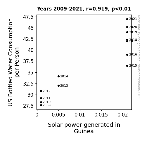
View details about correlation #3,765
Sunny Side Up: Shedding Light on the Relationship Between US Bottled Water Consumption and Solar Power in Guinea
As Americans gulped down more bottled water, it created a surge in global hydration levels. This led to a ripple effect, sparking a renewed interest in renewable energy sources. The H2-overflow reached all the way to Guinea, where they were able to tap into this newfound solar power of positive thinking. It just go to show, when it rains, it pours – both blessings and bright ideas!

What else correlates?
US Bottled Water Consumption per Person · all food
Solar power generated in Guinea · all energy
US Bottled Water Consumption per Person · all food
Solar power generated in Guinea · all energy


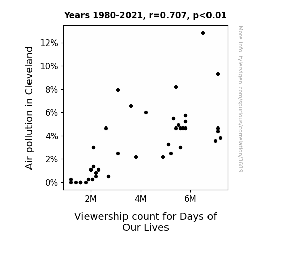
View details about correlation #3,689
Clearing the Air: Correlating Cleveland's Air Pollution with Days of Our Lives Viewership
As the air cleared, residents were able to go outside and find more fulfilling ways to spend their time than watching daytime soap operas, like taking up competitive pigeon racing.

What else correlates?
Air pollution in Cleveland · all weather
Viewership count for Days of Our Lives · all weird & wacky
Air pollution in Cleveland · all weather
Viewership count for Days of Our Lives · all weird & wacky


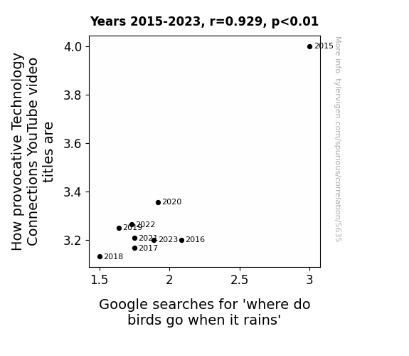
View details about correlation #5,635
The Provocative Power of Puzzling Ponderings: The Connection Between Technology Tidbits and Tempting Twitterings
As people became more interested in bird behavior during inclement weather, they realized that the real drama was happening outside their windows. Faced with the choice of watching a video about birds or witnessing the avian antics firsthand, viewers opted for the live-action show. So, as the fascination with rainy day bird whereabouts grew, the allure of technology-related content dwindled, ultimately leading to less provocative titles for Technology Connections YouTube videos.


View details about correlation #4,877
Ain't Nobody Got Time for That: A Meme-tastic Analysis of its Impact on Computer Hardware Engineering in Maryland
As the meme gained traction, more and more people embraced the 'ain't nobody got time for that' attitude, leading to a surge in demand for efficient technology. Seeing the potential for creating quicker, more effective hardware, individuals in Maryland were inspired to pursue careers in computer engineering, ultimately contributing to the rise in the number of computer hardware engineers in the state. Because when it comes to technological advancement, 'ain't nobody got time for slow processors!'


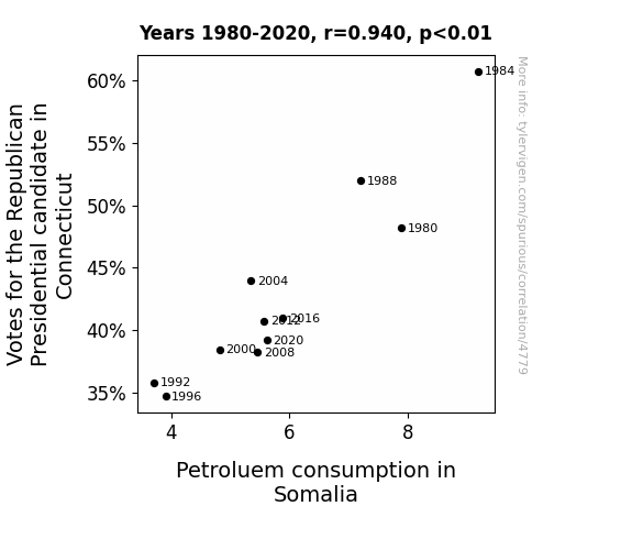
View details about correlation #4,779
Connecticut Republican Votes and Somalia's Petroleum Puzzling Parallels: A Statistical Study
As the support for the Republican candidate waned in Connecticut, there was a surplus of hot air in the state. This led to an innovative solution where all that extra political bluster was collected and converted into energy. This new source of power was then shared with Somalia, decreasing their reliance on petroleum. It’s a classic case of a political outcome having an unexpected, but ‘windy’, global impact!


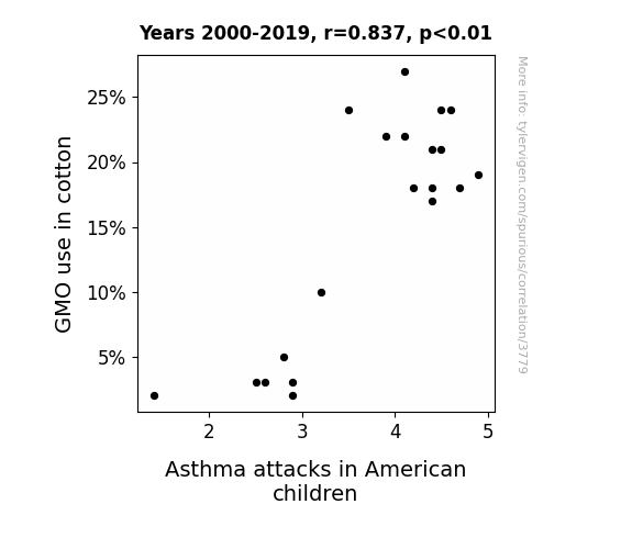
View details about correlation #3,779
Genetically Muddled Offspring: Exploring the Asthma-GMO Cotton Connection in American Children
As GMO use in cotton decreased, so did the size of the cotton candy bushes, which in turn led to fewer children consuming oversized cotton candy, thus reducing the risk of asthma attacks from sugar overload. Remember, moderation is key, even in the whimsical world of sugary confections!

What else correlates?
GMO use in cotton · all food
Asthma attacks in American children · all weird & wacky
GMO use in cotton · all food
Asthma attacks in American children · all weird & wacky


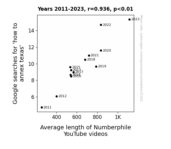
View details about correlation #5,162
Searching for Lone Star State Secrets: The Texas Annexation Googling and Numberphile Video Length Correlation
As people became more interested in annexing Texas, the state's sheer size and geometry prompted a wave of mathematical discussions. This influx of geometry enthusiasts led to a surge in demand for longer Numberphile videos to explore the vast and complex concepts in greater detail. It seems everything really is big in Texas, including the impact on educational video content!

What else correlates?
Google searches for 'how to annex texas' · all google searches
Average length of Numberphile YouTube videos · all YouTube
Google searches for 'how to annex texas' · all google searches
Average length of Numberphile YouTube videos · all YouTube


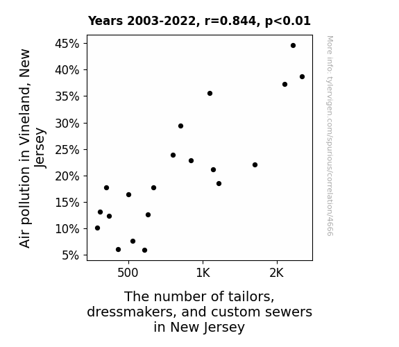
View details about correlation #4,666
Sewing Through the Smog: The Stitching Connection Between Air Pollution in Vineland, New Jersey and the Number of Tailors, Dressmakers, and Custom Sewers in New Jersey
The air was sew clean that they just couldn't measure up anymore. As the pollution cleared, so did the need for alterations. The sewers couldn't stitch around the fact that the demand for their services was dwindling faster than a spool of thread. It seems like the dress for success motto took a hem-larious turn in Vineland!


View details about correlation #4,626
The Libertarian Effect: Unveiling the Fossilized Connection Between New York's Presidential Votes and Haiti's Fuel Consumption
As the votes for the Libertarian Presidential candidate in New York increased, it created a ripple effect leading to a surge in interest in "rocking the vote." This newfound enthusiasm for voting caused an unexpected spike in demand for campaign materials, leading to an uptick in production and transportation. This, in turn, led to more fossil fuels being burned, kindling a fiery debate on the impact of third-party candidates on global energy usage. It seems like even from a distance, political choices can have far-reaching, electrifying consequences in unexpected places.


What else correlates?
Votes for the Libertarian Presidential candidate in New York · all elections
Fossil fuel use in Haiti · all energy
Votes for the Libertarian Presidential candidate in New York · all elections
Fossil fuel use in Haiti · all energy


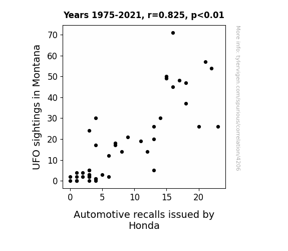
View details about correlation #4,206
Aliens, Recalls, and Rhymes: Unveiling the Interstellar Interplay of UFO Sightings in Montana and Honda Automotive Recalls
As UFOs zipped through Montana skies, they unknowingly emitted anti-gravitational waves that caused minor malfunctions in Honda vehicles, prompting the company to issue more recalls for safety checks. Remember, it’s not just the cows in Montana having close encounters anymore!

What else correlates?
UFO sightings in Montana · all random state specific
Automotive recalls issued by Honda · all weird & wacky
UFO sightings in Montana · all random state specific
Automotive recalls issued by Honda · all weird & wacky


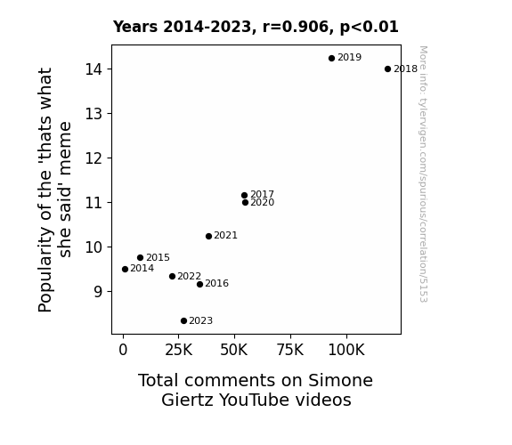
View details about correlation #5,153
That's What She Said: A Meme-orable Connection to YouTube Activity
The 'that's what she said' meme led to more people seeking out jokes and humor, creating a ripple effect of laughter and engagement across the internet. It's like the meme became the unofficial commentator of her videos, adding an unexpected twist to every comment section!

What else correlates?
Popularity of the 'thats what she said' meme · all memes
Total comments on Simone Giertz's YouTube videos · all YouTube
Popularity of the 'thats what she said' meme · all memes
Total comments on Simone Giertz's YouTube videos · all YouTube


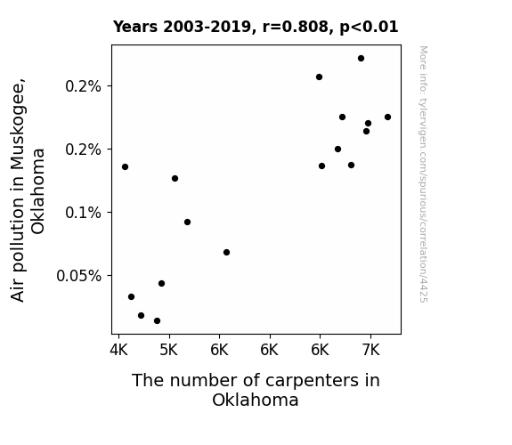
View details about correlation #4,425
Clearing the Air: A Breath of Fresh Data in Uncovering the Sawdust Connection Between Air Pollution and Carpenter Numbers in Muskogee, Oklahoma
As the air became cleaner, the previously lumberjack-sounding coughs of the residents diminished. This led to a decrease in the demand for wooden chests for storing inhalers, which in turn lowered the need for carpenters to craft these chests. With the air now crisp and the need for inhaler storage reduced, the carpenters in Oklahoma decided to pursue new careers, such as professional air guitarists, to make the most of the pollution-free atmosphere.

What else correlates?
Air pollution in Muskogee, Oklahoma · all weather
The number of carpenters in Oklahoma · all cccupations
Air pollution in Muskogee, Oklahoma · all weather
The number of carpenters in Oklahoma · all cccupations


View details about correlation #4,404
Fueling Political Fire: Examining the Flammable Relationship between Libertarian Votes in Arizona and Kerosene Consumption in Libya
As Libertarian votes for Senators in Arizona increase, there is a corresponding rise in the production of inflatable cacti. These cacti, being a popular symbol of the Wild West, are in high demand for Western-themed parties in Libya. This surge in demand for inflatable cacti leads to a boom in the kerosene-powered air pumps industry in Libya, ultimately resulting in a noticeable increase in the consumption of kerosene in the country. It's a truly unexpected ripple effect of political shifts!

What else correlates?
Votes for Libertarian Senators in Arizona · all elections
Kerosene used in Libya · all energy
Votes for Libertarian Senators in Arizona · all elections
Kerosene used in Libya · all energy


View details about correlation #3,781
When UFOs Light up the Californian Sky, Vegas Hotels Reach for the Stars: An Unexpected Correlation
The surge in UFO sightings in California led to a spike in interest in outer space, prompting more people to take impromptu trips to Las Vegas in the hopes of getting a glimpse of intergalactic travelers. Hotels took advantage of this otherworldly trend by advertising their rooms as the perfect spot for UFO spotting, leading to a significant increase in check-ins. It seems even aliens can't resist the alluring glow of the Vegas strip!

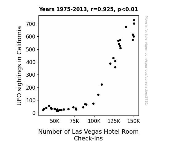
What else correlates?
UFO sightings in California · all random state specific
Number of Las Vegas Hotel Room Check-Ins · all weird & wacky
UFO sightings in California · all random state specific
Number of Las Vegas Hotel Room Check-Ins · all weird & wacky


View details about correlation #5,050
The Novel Connection: A Tale of Literature Degrees and the Enigmatic 'Slenderman' Meme
As the number of English degrees dropped, so did the *pen-chant* for creating compelling and *wordy* content. The lack of expertise in crafting *syl-lit* narratives may have led to a *vocab* in 'slenderman' references. Without a *prose* for interpretation, the once *punc-tuated* meme lost its *a-djective* appeal, leaving its fan base feeling *punctu-*ally underwhelmed.

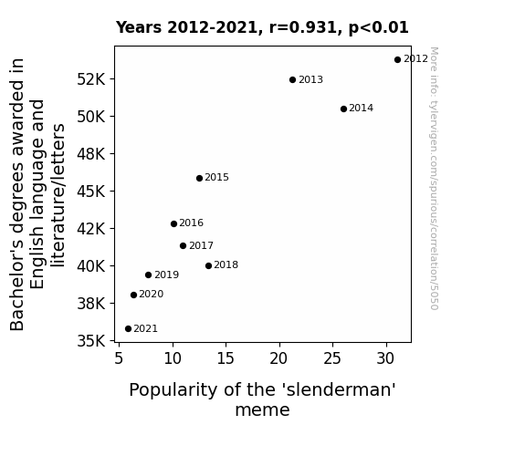
What else correlates?
Bachelor's degrees awarded in literature · all education
Popularity of the 'slenderman' meme · all memes
Bachelor's degrees awarded in literature · all education
Popularity of the 'slenderman' meme · all memes


View details about correlation #4,766
Cutting-Edge Connections: The Machinist Magnitude Measured by MinuteEarth Mirth
As the number of machinists in Nebraska decreases, there's less precision in the Cornhusker State. This precision loss somehow leads to MinuteEarth video titles being less cool, creating a dis-oil-ution of snazzy machining puns that once sp-ark-ed excitement.

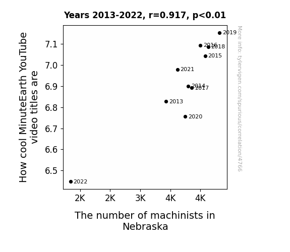
What else correlates?
How cool MinuteEarth YouTube video titles are · all YouTube
The number of machinists in Nebraska · all cccupations
How cool MinuteEarth YouTube video titles are · all YouTube
The number of machinists in Nebraska · all cccupations


View details about correlation #4,793
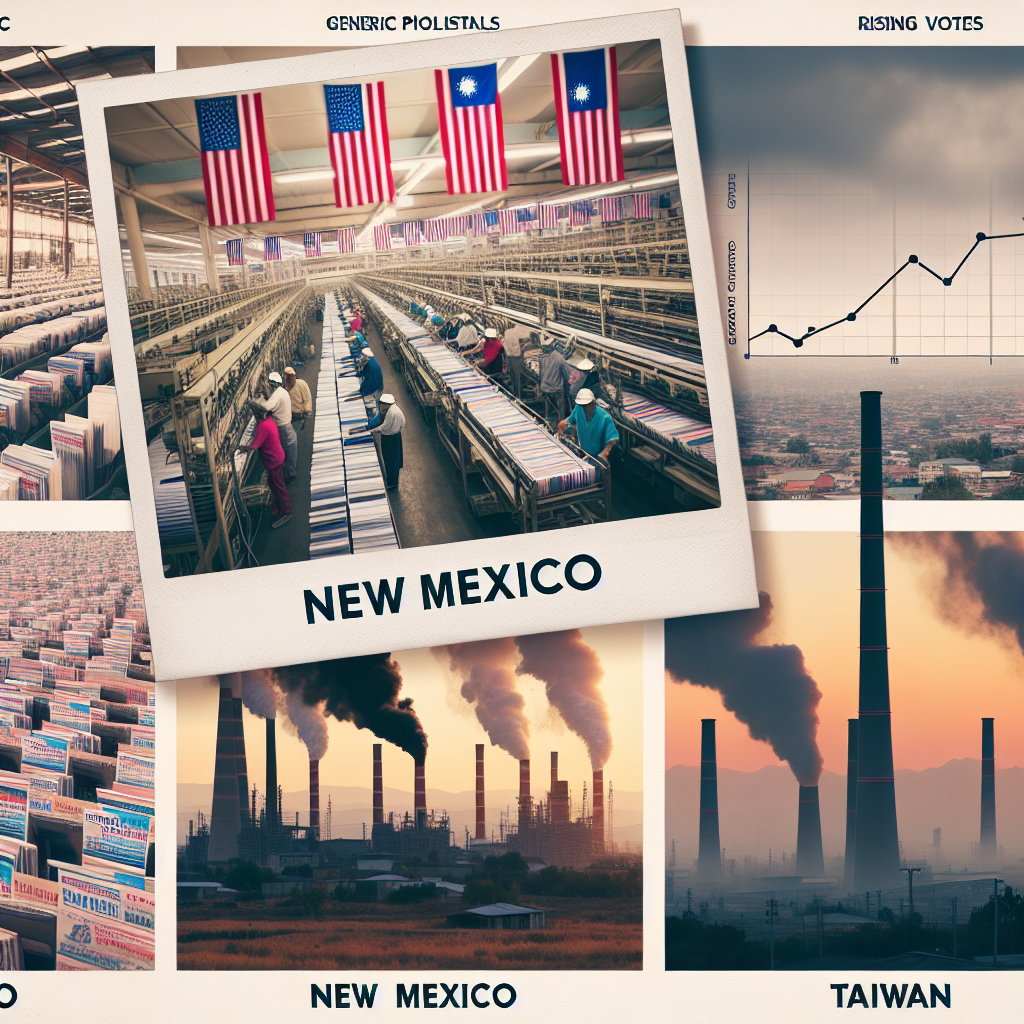
The Grand Old Biomass: Uncovering the Surprising Relationship Between Republican Votes in New Mexico and Biomass Power in Taiwan
As the Republican candidate's support in New Mexico grew, so did the demand for campaign materials. This led to a surge in the production of paper and cardboard, prompting Taiwan to ramp up its biomass power generation to meet the rising paper product exports. It's a classic case of political polarization igniting a fiery passion for... renewable energy? Well, at least it's keeping the political landscape green in more ways than one!

Why this works
- Data dredging: I have 25,237 variables in my database. I compare all these variables against each other to find ones that randomly match up. That's 636,906,169 correlation calculations! This is called “data dredging.”
Fun fact: the chart used on the wikipedia page to demonstrate data dredging is also from me. I've been being naughty with data since 2014.
Instead of starting with a hypothesis and testing it, I instead tossed a bunch of data in a blender to see what correlations would shake out. It’s a dangerous way to go about analysis, because any sufficiently large dataset will yield strong correlations completely at random. - Lack of causal connection: There is probably no direct connection between these variables, despite what the AI says above.
Because these pages are automatically generated, it's possible that the two variables you are viewing are in fact causually related. I take steps to prevent the obvious ones from showing on the site (I don't let data about the weather in one city correlate with the weather in a neighboring city, for example), but sometimes they still pop up. If they are related, cool! You found a loophole.
This is exacerbated by the fact that I used "Years" as the base variable. Lots of things happen in a year that are not related to each other! Most studies would use something like "one person" in stead of "one year" to be the "thing" studied. - Observations not independent: For many variables, sequential years are not independent of each other. You will often see trend-lines form. If a population of people is continuously doing something every day, there is no reason to think they would suddenly change how they are doing that thing on January 1. A naive p-value calculation does not take this into account.
You will calculate a lower chance of "randomly" achieving the result than represents reality.
To be more specific: p-value tests are probability values, where you are calculating the probability of achieving a result at least as extreme as you found completely by chance. When calculating a p-value, you need to assert how many "degrees of freedom" your variable has. I count each year (minus one) as a "degree of freedom," but this is misleading for continuous variables.
This kind of thing can creep up on you pretty easily when using p-values, which is why it's best to take it as "one of many" inputs that help you assess the results of your analysis.
- Y-axes doesn't start at zero: I truncated the Y-axes of the graphs above. I also used a line graph, which makes the visual connection stand out more than it deserves.
Nothing against line graphs. They are great at telling a story when you have linear data! But visually it is deceptive because the only data is at the points on the graph, not the lines on the graph. In between each point, the data could have been doing anything. Like going for a random walk by itself!
Mathematically what I showed is true, but it is intentionally misleading. If you click on any of the charts that abuse this, you can scroll down to see a version that starts at zero. - Confounding variable: Confounding variables (like global pandemics) will cause two variables to look connected when in fact a "sneaky third" variable is influencing both of them behind the scenes.
- Outliers: Some datasets here have outliers which drag up the correlation.
In concept, "outlier" just means "way different than the rest of your dataset." When calculating a correlation like this, they are particularly impactful because a single outlier can substantially increase your correlation.
Because this page is automatically generated, I don't know whether any of the charts displayed on it have outliers. I'm just a footnote. ¯\_(ツ)_/¯
I intentionally mishandeled outliers, which makes the correlation look extra strong. - Low n: There are not many data points included in some of these charts.
You can do analyses with low ns! But you shouldn't data dredge with a low n.
Even if the p-value is high, we should be suspicious of using so few datapoints in a correlation.
Pro-tip: click on any correlation to see:
- Detailed data sources
- Prompts for the AI-generated content
- Explanations of each of the calculations (correlation, p-value)
- Python code to calculate it yourself


