spurious correlations
discover · random · spurious scholar
← previous page · next page →


View details about correlation #3,897
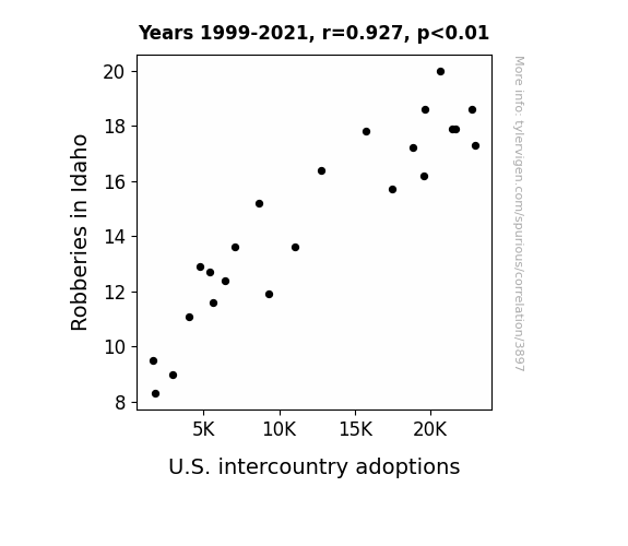
An Unlikely Pair: The Link Between Robberies in Idaho and U.S. Intercountry Adoptions
Criminals found it more lucrative to steal hearts instead of valuables, leading to a nationwide shortage of babies for adoption. Looks like Idaho's drop in robberies really stole the show!

What else correlates?
Robberies in Idaho · all random state specific
U.S. intercountry adoptions · all weird & wacky
Robberies in Idaho · all random state specific
U.S. intercountry adoptions · all weird & wacky


View details about correlation #5,345
Name Nomen-clature: The Trevon Trend & Gangnam Style: A Correlative Analysis
As fewer babies were named Trevon, there were fewer potential dancers available to keep the 'gangnam style' meme alive. It seems Trevon was the key to keeping the dance craze going - who knew?


What else correlates?
Popularity of the first name Trevon · all first names
Popularity of the 'gangnam style' meme · all memes
Popularity of the first name Trevon · all first names
Popularity of the 'gangnam style' meme · all memes


View details about correlation #4,553
Stand-up Maths and Soil: A Comedic Correlation Analysis in Oregon's Agricultural Education Sector
As the agricultural sciences teachers in Oregon dwindled, so did the crop of professionalism in the world of stand-up math. Without their valuable contribution, the field just couldn't find the right formula for maintaining a polished image. It seems the comedy of errors multiplied exponentially, leading to a harvest of punprecedented, unprofessional video titles. It's a prime example of how the roots of stand-up math professionalism are deeply intertwined with the agricultural sciences teachers in Oregon.


View details about correlation #3,701
Clearing the Air: The Gas-tly Link Between Air Pollution in Toledo and Kerosene Use in the United States
The cleaner air in Toledo led to an increase in the population of rare, air-purifying bacteria. These bacteria emitted a gas that just happened to neutralize kerosene molecules. As a result, the demand for kerosene decreased across the United States. Who would have thought that microscopic organisms could have such a big impact on the energy industry?

What else correlates?
Air pollution in Toledo · all weather
Kerosene used in United States · all energy
Air pollution in Toledo · all weather
Kerosene used in United States · all energy


View details about correlation #4,345
Parking Brake Libertarianism: An Underestimated Relationship Between Political Preferences and Automotive Mishaps
As more people voted for the Libertarian candidate, they unknowingly unleashed a wave of free-spirited, non-interventionist energy. This unbridled liberty somehow found its way into the manufacturing process, causing parking brake components to say, "You can't contain me, man!" and leading to a sudden need for recalls. Remember, when it comes to parking brakes and politics, sometimes the correlation is just brake-coincidence!
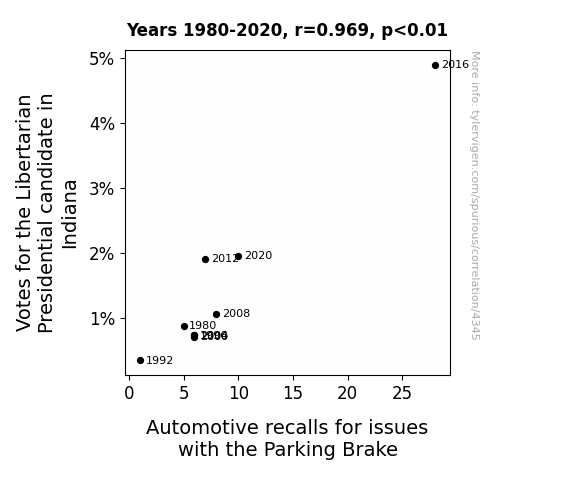
. The chart goes from 2006 to 2023, and the two variables track closely in value over that time.")

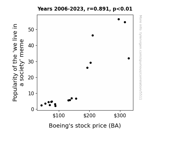
View details about correlation #5,511
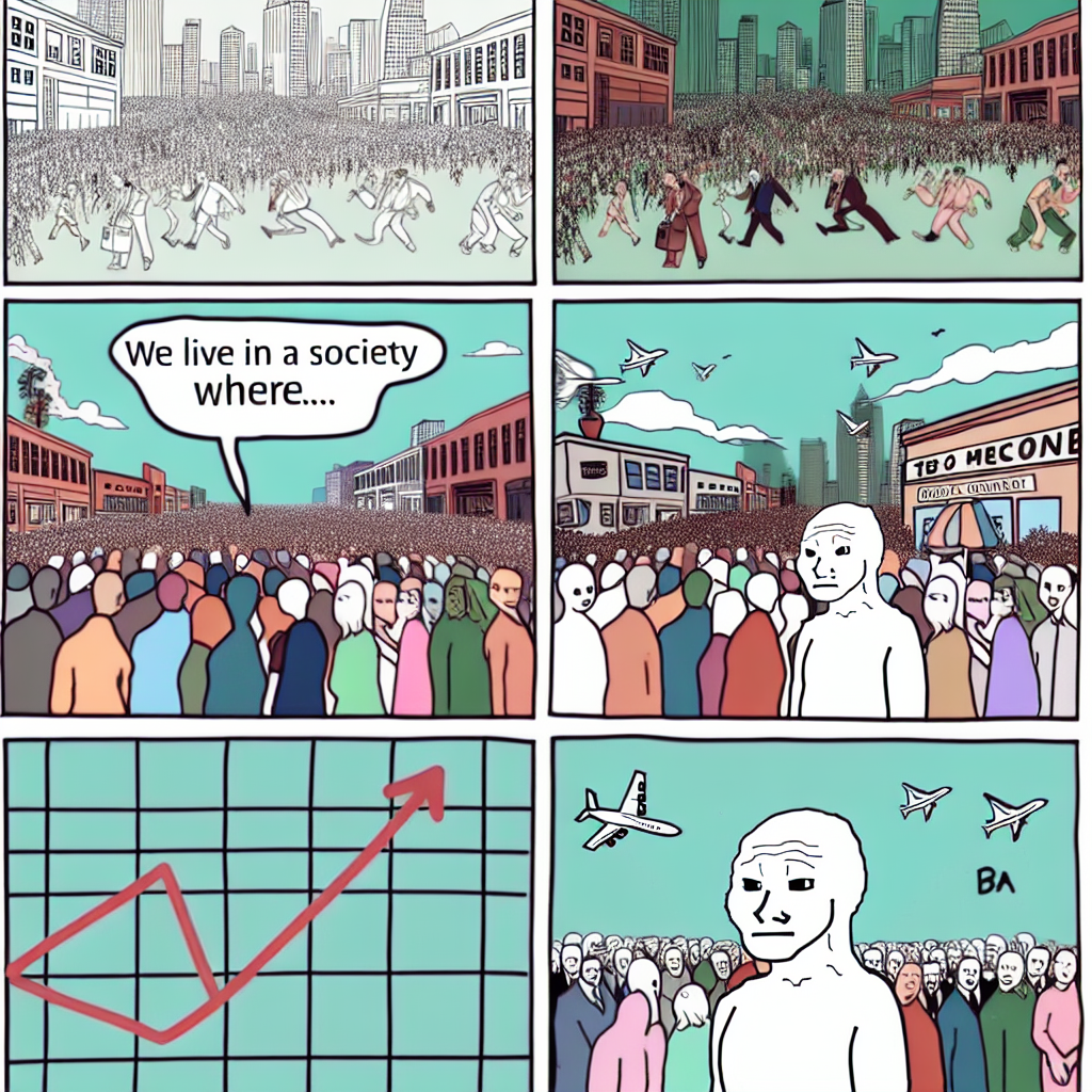
Flying High: The 'We Live in a Society' Meme's Notoriety and Boeing's Stock Viability
As the 'we live in a society' meme gained traction, more people started pondering the complexities of societal structures. This led to a surge in philosophical discussions, including the impact of commercial aviation on modern society. As Boeing planes became emblematic of connectivity and technological advancement, these discussions inadvertently sparked a wave of admiration for the company. Essentially, the meme served as a catalyst for a Boeing appreciation club, propelling their stock price to new heights.
What else correlates?
Popularity of the 'we live in a society' meme · all memes
Boeing's stock price (BA) · all stocks
Popularity of the 'we live in a society' meme · all memes
Boeing's stock price (BA) · all stocks


View details about correlation #3,927
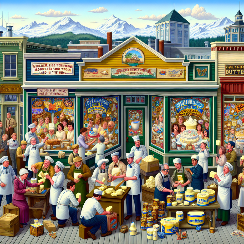
Butter Consumption and Labor Production: A Gouda or Brie Connection?
As butter consumption increased, so did the demand for buttery pastries in Alaska. This led to a boom in the bakery industry, creating a need for more merchandise displayers and window trimmers to showcase all the delicious baked goods. As they say, it's a buttery delicious cycle of job creation in the Last Frontier!

What else correlates?
Butter consumption · all food
The number of merchandise displayers and window trimmers in Alaska · all cccupations
Butter consumption · all food
The number of merchandise displayers and window trimmers in Alaska · all cccupations


View details about correlation #3,871
Penning the Popular: Probing the Paradoxical Proclivity of the Name Unique and its Preposterous Proximity to Petroleum Predilection in North Macedonia
As fewer and fewer babies were ironically given the same "unique" name, the collective sighs of relief from kindergarten teachers and Starbucks baristas led to a measurable reduction in stress levels. This newfound inner peace somehow sparked a wave of eco-friendly decision making in North Macedonia, ultimately leading to a decrease in fossil fuel use. It's as if the universe whispered, "Be less unique, but in a totally green way."


What else correlates?
Popularity of the first name Unique · all first names
Fossil fuel use in North Macedonia · all energy
Popularity of the first name Unique · all first names
Fossil fuel use in North Macedonia · all energy


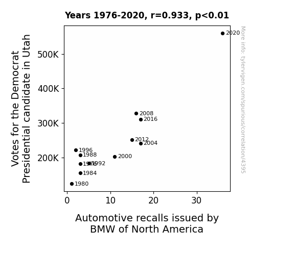
View details about correlation #4,395
The Blue Wave and Recalled Wheels: Unveiling the Curious Association Between Democratic Presidential Votes in Utah and BMW Automotive Recalls
As more people showed support for the Democrat Presidential candidate in Utah, the collective electrical energy created by their enthusiasm somehow interfered with the BMW vehicles, triggering a higher number of recalls. The surge of democratic voting power in the state seemed to rev up a magnetic force that just couldn't be reined in, leading BMW of North America to recall more cars in an attempt to harness the electrifying political atmosphere on the roads. It's as if the campaign voltage sparked a chain reaction, ultimately driving BMW to address and rectify any potential issues, making it a truly electric connection between politics and automotive performance!


View details about correlation #5,136
Rick and Morty Fandom's Insightful Odyssey: A Correlation Analysis with Total Reddit Comments on 3Blue1Brown YouTube Videos
The more people who watch Rick and Morty, the smarter they become. This leads them to seek out and engage with intellectually stimulating content like 3Blue1Brown, resulting in a surge of thought-provoking comments. It's like a portal gun for expanding their minds and diving into discussions about math and science. Wubba lubba dub dub, let's delve into some calculus, Morty!


What else correlates?
Google searches for 'rick and morty' · all google searches
Total comments on 3Blue1Brown YouTube videos · all YouTube
Google searches for 'rick and morty' · all google searches
Total comments on 3Blue1Brown YouTube videos · all YouTube


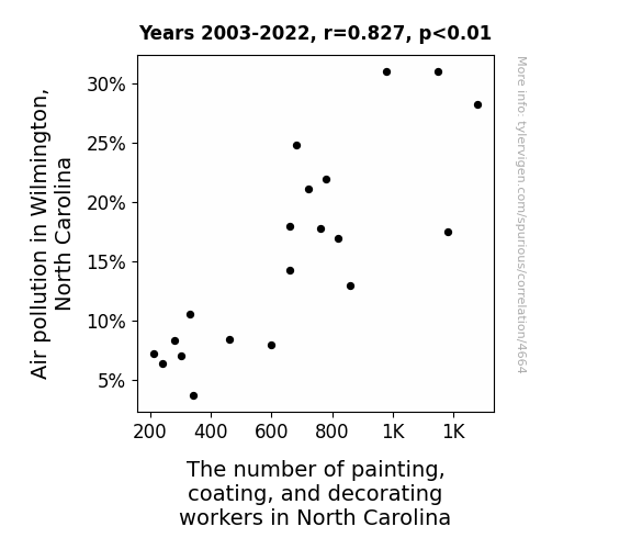
View details about correlation #4,664
The Color of the Wind: A Punny Look at Air Pollution in Wilmington, North Carolina and the Number of Painting, Coating, and Decorating Workers in North Carolina
As the air became cleaner, the previously camouflaged painting, coating, and decorating workers found it harder to blend in with their surroundings. This led to a decline in their numbers as they struggled to find new ways to showcase their impeccable blending skills. The job market for professional chameleons took a colorful turn, leaving many to ponder the true cost of a breath of fresh air.


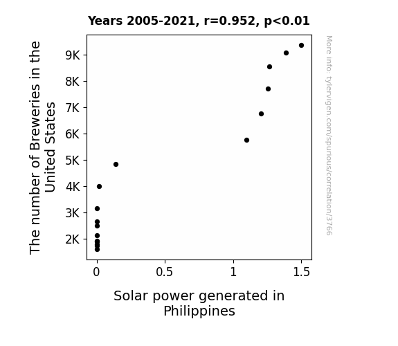
View details about correlation #3,766
Ale and Kale: The Pale Tale of Breweries and Solar Flare
As the number of breweries in the United States has gone up, so has the production of beer. This has led to an increase in the demand for refrigeration to keep all that beer cold. The surge in the refrigeration industry has inadvertently created a need for more efficient energy solutions. This sudden demand for refrigeration has caused a ripple effect all the way to the Philippines, prompting a spike in the adoption of solar power technology. It's a sudsy situation that's sparking a bright idea for renewable energy in the Philippines! Looks like the power of fermentation is not just brewing beer, but also brewing up some solar energy initiatives. It's a real ale-truism that the sun's got some competition from these hops and barle(y) watts!
What else correlates?
The number of Breweries in the United States · all food
Solar power generated in Philippines · all energy
The number of Breweries in the United States · all food
Solar power generated in Philippines · all energy


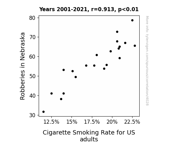
View details about correlation #4,028
The Great Nebraska Heist: Uncovering the Correlation Between Robberies and Smoking Rates in the U.S.
As the number of robberies in Nebraska decreased, there was a corresponding decrease in the demand for stolen cigarettes on the black market. This led to a temporary shortage of cheap cigarettes available to US adults, prompting many to either cut back or quit smoking altogether. As the saying goes, you can't steal a healthy set of lungs!

What else correlates?
Robberies in Nebraska · all random state specific
Cigarette Smoking Rate for US adults · all weird & wacky
Robberies in Nebraska · all random state specific
Cigarette Smoking Rate for US adults · all weird & wacky


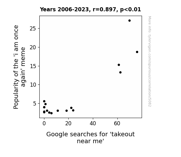
View details about correlation #5,082
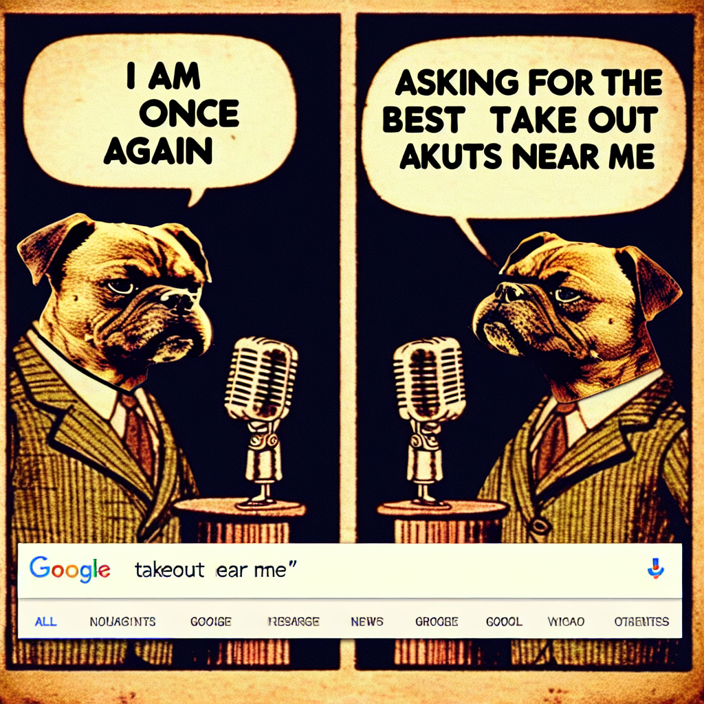
The Meme-ing of Takeout: An Analysis of the 'i am once again' Meme's Influence on Takeout Near Me Google Searches
The 'i am once again' meme was spreading like wildfire, leading to an internet sensation. As more people hopped on the bandwagon, they found themselves craving some hot and fresh content, much like they craved hot and fresh takeout. It's no wonder that as the meme gained popularity, so did the hunger for nearby takeout options. It seems the meme wasn't just serving up laughs, but also serving as a reminder for everyone to stir things up and spice up their lives with a saucy takeout treat. After all, when the meme says, "i am once again asking for your financial support," the takeout industry hears, "i am once again asking for your flavorful support." The meme's rise to fame truly took the term 'meme-licious' to a whole new level, proving that in the fast-paced world of internet culture, even a simple phrase can stir up a wok of appetite for takeout. Looks like this meme wasn't just a flash in the pan – it was a delivery of laughter and cravings, leaving everyone saying, "I am once again ordering takeout near me."
What else correlates?
Popularity of the 'i am once again' meme · all memes
Google searches for 'takeout near me' · all google searches
Popularity of the 'i am once again' meme · all memes
Google searches for 'takeout near me' · all google searches


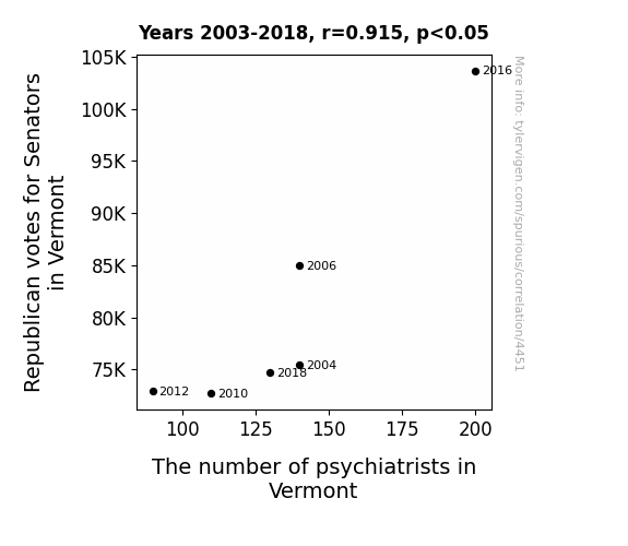
View details about correlation #4,451
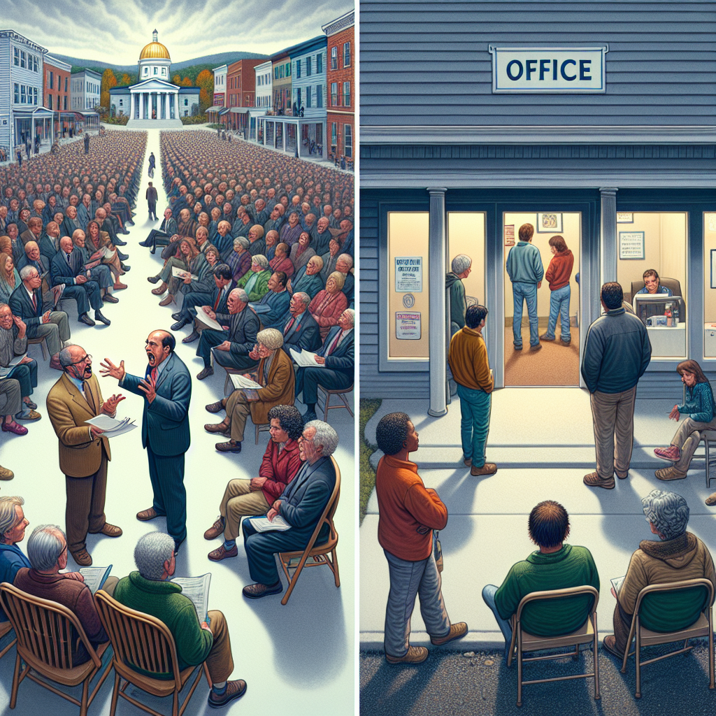
The Elephant in the Therapy Room: An Analysis of the Correlation between Republican Votes for Senators and the Number of Psychiatrists in Vermont
As Republican votes for Senators in Vermont increase, their opposing viewpoints create more intense political debates. This leads to a surge in demand for psychiatrists as Vermonters struggle to cope with the heightened political tensions. Plus, all the head-scratching and eye-rolling during political discussions is inadvertently creating a booming market for therapy sessions.
What else correlates?
Votes for Republican Senators in Vermont · all elections
The number of psychiatrists in Vermont · all cccupations
Votes for Republican Senators in Vermont · all elections
The number of psychiatrists in Vermont · all cccupations


View details about correlation #4,617
Fuel for Thought: The YouTube Fossil Fueled Funnies
As more people watch these trendy videos, there's a surge in dance-offs to the catchy tunes, leading to a spike in body heat and the need for fans powered by electricity, ultimately increasing the demand for fossil fuels in Croatia. Remember, staying 'hip' can sometimes 'burn' a lot of energy!

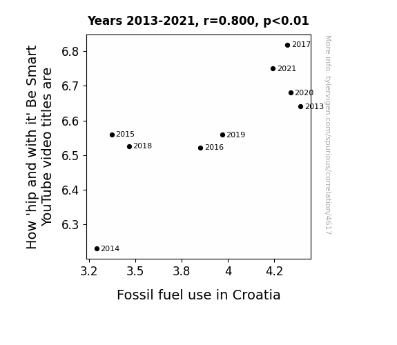
What else correlates?
How 'hip and with it' 'Be Smart' science YouTube video titles are · all YouTube
Fossil fuel use in Croatia · all energy
How 'hip and with it' 'Be Smart' science YouTube video titles are · all YouTube
Fossil fuel use in Croatia · all energy


View details about correlation #4,133
The Huntsville Hustle: Air Pollution and American Idol Season Finale Viewership Scale
As the air cleared up, people no longer felt the need to stay indoors and watch TV. It seems like the smog was the only thing keeping them glued to their screens, talk about a smoggy show!


What else correlates?
Air pollution in Huntsville · all weather
Viewership count of American Idol Season Finale · all weird & wacky
Air pollution in Huntsville · all weather
Viewership count of American Idol Season Finale · all weird & wacky


View details about correlation #5,070
The Rickroll Hullabaloo and Housing Price Whoopdedoodledoo: Exploring the Correlation Between 'Never Gonna Give You Up' and Real Estate Speculation
As the 'rickroll' meme faded in popularity, the demand for never gonna give you up, a traditional anthem for real estate enthusiasts, plummeted. With fewer people involuntarily serenading the housing market, sellers struggled to attract potential buyers, leading to a decrease in housing prices. It seems the power of 'rickrolling' in real estate was truly never gonna give house prices up!
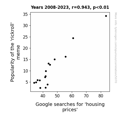
What else correlates?
Popularity of the 'rickroll' meme · all memes
Google searches for 'housing prices' · all google searches
Popularity of the 'rickroll' meme · all memes
Google searches for 'housing prices' · all google searches


View details about correlation #3,792
Maize Mania: The Corny Connection Between GMOs and Compensation Managers in Michigan
As the GMO usage in Michigan corn decreased, it led to a surprising ripple effect in the job market. You see, with the non-GMO corn, there were fewer kernels per cob, meaning smaller, more dainty corn cobs. This sparked a statewide trend in creating miniature decorative corn cobs, perfect for adorning office desks. Well, as demand for these adorably shrunken corn cobs skyrocketed, it inadvertently led to a decline in office space across Michigan. And with smaller office spaces, there was simply no need for as many compensation and benefits managers. Who would have thought that the path to downsizing in the workforce would lead us right through the cornfields?

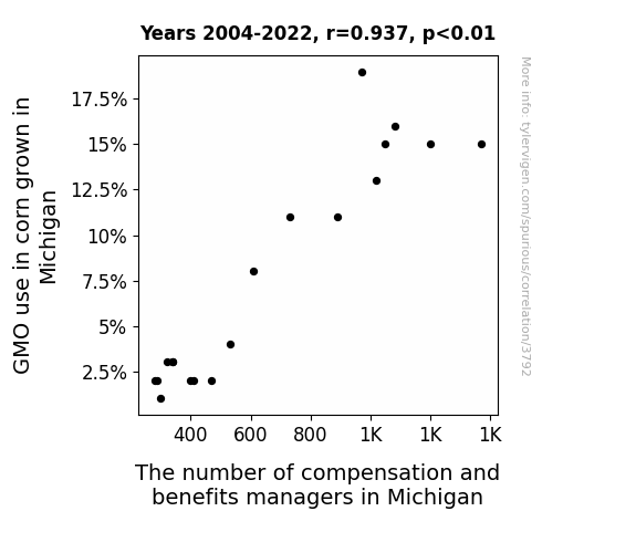
What else correlates?
GMO use in corn grown in Michigan · all food
The number of compensation and benefits managers in Michigan · all cccupations
GMO use in corn grown in Michigan · all food
The number of compensation and benefits managers in Michigan · all cccupations


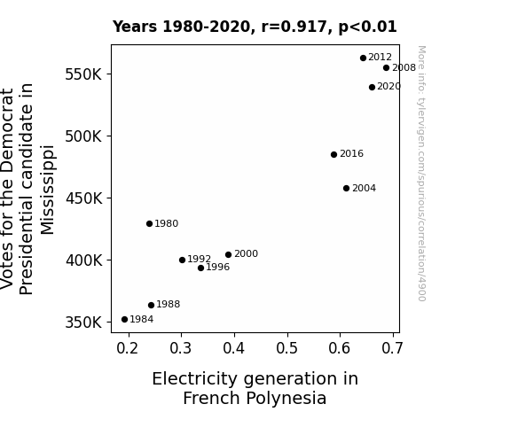
View details about correlation #4,900
Powering Up the Polls: Illuminating the Relationship Between Democrat Votes in Mississippi and Electricity Generation in French Polynesia
As more Mississippians showed support for the Democrat, a wave of anticipation energized French Polynesia, leading to a power surge in electricity generation. It seems the political currents were shockingly strong!

Why this works
- Data dredging: I have 25,237 variables in my database. I compare all these variables against each other to find ones that randomly match up. That's 636,906,169 correlation calculations! This is called “data dredging.”
Fun fact: the chart used on the wikipedia page to demonstrate data dredging is also from me. I've been being naughty with data since 2014.
Instead of starting with a hypothesis and testing it, I instead tossed a bunch of data in a blender to see what correlations would shake out. It’s a dangerous way to go about analysis, because any sufficiently large dataset will yield strong correlations completely at random. - Lack of causal connection: There is probably no direct connection between these variables, despite what the AI says above.
Because these pages are automatically generated, it's possible that the two variables you are viewing are in fact causually related. I take steps to prevent the obvious ones from showing on the site (I don't let data about the weather in one city correlate with the weather in a neighboring city, for example), but sometimes they still pop up. If they are related, cool! You found a loophole.
This is exacerbated by the fact that I used "Years" as the base variable. Lots of things happen in a year that are not related to each other! Most studies would use something like "one person" in stead of "one year" to be the "thing" studied. - Observations not independent: For many variables, sequential years are not independent of each other. You will often see trend-lines form. If a population of people is continuously doing something every day, there is no reason to think they would suddenly change how they are doing that thing on January 1. A naive p-value calculation does not take this into account.
You will calculate a lower chance of "randomly" achieving the result than represents reality.
To be more specific: p-value tests are probability values, where you are calculating the probability of achieving a result at least as extreme as you found completely by chance. When calculating a p-value, you need to assert how many "degrees of freedom" your variable has. I count each year (minus one) as a "degree of freedom," but this is misleading for continuous variables.
This kind of thing can creep up on you pretty easily when using p-values, which is why it's best to take it as "one of many" inputs that help you assess the results of your analysis.
- Y-axes doesn't start at zero: I truncated the Y-axes of the graphs above. I also used a line graph, which makes the visual connection stand out more than it deserves.
Nothing against line graphs. They are great at telling a story when you have linear data! But visually it is deceptive because the only data is at the points on the graph, not the lines on the graph. In between each point, the data could have been doing anything. Like going for a random walk by itself!
Mathematically what I showed is true, but it is intentionally misleading. If you click on any of the charts that abuse this, you can scroll down to see a version that starts at zero. - Confounding variable: Confounding variables (like global pandemics) will cause two variables to look connected when in fact a "sneaky third" variable is influencing both of them behind the scenes.
- Outliers: Some datasets here have outliers which drag up the correlation.
In concept, "outlier" just means "way different than the rest of your dataset." When calculating a correlation like this, they are particularly impactful because a single outlier can substantially increase your correlation.
Because this page is automatically generated, I don't know whether any of the charts displayed on it have outliers. I'm just a footnote. ¯\_(ツ)_/¯
I intentionally mishandeled outliers, which makes the correlation look extra strong. - Low n: There are not many data points included in some of these charts.
You can do analyses with low ns! But you shouldn't data dredge with a low n.
Even if the p-value is high, we should be suspicious of using so few datapoints in a correlation.
Pro-tip: click on any correlation to see:
- Detailed data sources
- Prompts for the AI-generated content
- Explanations of each of the calculations (correlation, p-value)
- Python code to calculate it yourself


