spurious correlations
discover · random · spurious scholar
← previous page · next page →
. The chart goes from 2002 to 2022, and the two variables track closely in value over that time.")

View details about correlation #3,755
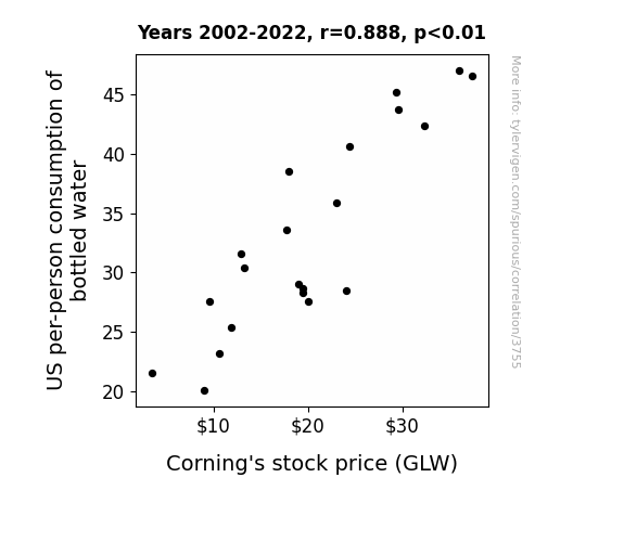
Pouring Over the Data: The Bottled Water-Corning's GLW Connection
As the demand for bottled water rose, so did the need for Corning's glass to contain it, leading to a surge in stock price. It's a glass act for Corning as they ride the wave of hydration!

What else correlates?
US per-person consumption of bottled water · all weird & wacky
Corning's stock price (GLW) · all stocks
US per-person consumption of bottled water · all weird & wacky
Corning's stock price (GLW) · all stocks


View details about correlation #5,487
Navigating Through The Netherlands: Air Pollution's Impact on Google Searches for 'Titanic'
The air pollution created a haze over the city, leading people to reminisce about the foggy scenes in Titanic. As the smog thickened, so did their interest in the ill-fated ship, prompting them to embark on a virtual journey through the search engine waters of Google.


What else correlates?
Air pollution in Holland, Michigan · all weather
Google searches for 'Titanic' · all google searches
Air pollution in Holland, Michigan · all weather
Google searches for 'Titanic' · all google searches


View details about correlation #4,024
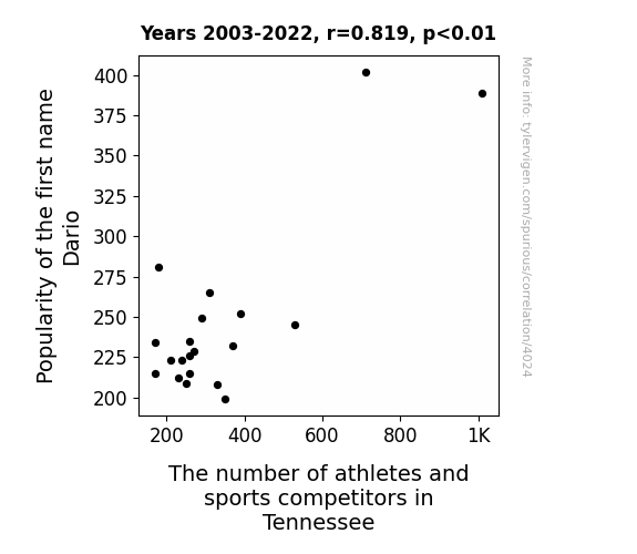
Handle with 'Dario': An Exploration of the 'Name' Game in Tennessee Athletics
There must be something in the Dario! As the name Dario gained popularity, it created a domino effect in Tennessee, inspiring more parents to name their kids after future sports stars. It seems like the secret to athletic success in Tennessee is simply Dar-IO-ing to be a part of the action!


View details about correlation #4,512
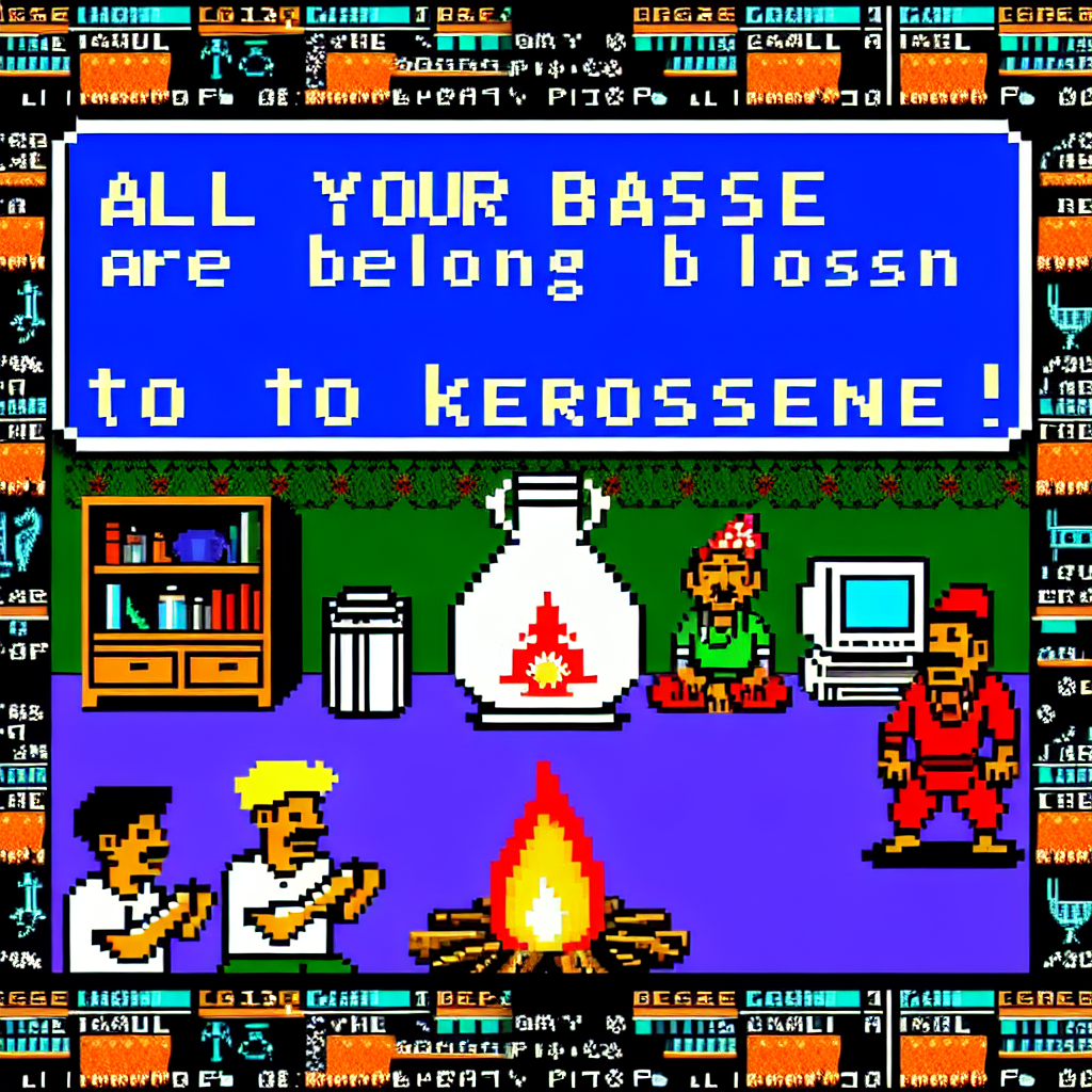
Kerosene: Igniting Trends in OverSimplified YouTube Video Titles
As Kerosene usage in South Sudan increases, it leads to more people staying up late watching videos, causing OverSimplified YouTube video titles to become trendier in order to capture their attention. This in turn leads to a rise in Kerosene usage as people binge-watch videos to learn history in a way that’s, well, over simplified. It’s a fiery cycle of historical enlightenment and late-night entertainment!


What else correlates?
How trendy OverSimplified YouTube video titles are · all YouTube
Kerosene used in South Sudan · all energy
How trendy OverSimplified YouTube video titles are · all YouTube
Kerosene used in South Sudan · all energy


View details about correlation #4,871
An Appetizing Affiliation: Correlation Between Republican Votes for Senators in Nevada and Hotdog Consumption by Nathan's Hot Dog Eating Competition Champion
It’s simple really. As the Republican votes for Senators in Nevada increased, so did the competitiveness in the state. This led to a surge in support for local businesses, including the popular food chain Nathan’s Famous. The demand for hotdogs skyrocketed, creating a bun-believable ripple effect all the way to the Nathan's Hot Dog Eating Competition. You could say it was a real case of legis-laters gonna legi-SLATE the appetite for victory!


View details about correlation #5,448
The Road to Success: Bachelor's Degrees in Transportation and Their Impact on Air Quality in St. Cloud, Minnesota
As more graduates entered the field, they were driving, full speed ahead, creating a traffic jam of new ideas for transportation methods. Unfortunately, all these brainy commuters overlooked the importance of eco-friendly practices, leading to a higher level of emissions and ultimately adding fuel to the air pollution problem in St. Cloud. It seems like they needed a little more direction on the 'clean air' highway!
What else correlates?
Bachelor's degrees awarded in Transportation · all education
Air pollution in St. Cloud, Minnesota · all weather
Bachelor's degrees awarded in Transportation · all education
Air pollution in St. Cloud, Minnesota · all weather


View details about correlation #3,784
Ahmed: A Name to Engineer By? Investigating the Correlation Between Ahmed's Popularity and University Engineering Teachers in Georgia
As the number of babies named Ahmed increased, so did the demand for toy construction sets, leading to a nationwide shortage of qualified engineering teachers. After all, someone had to teach the future generation of Ahmeds how to build their inevitable robot army.


View details about correlation #4,863
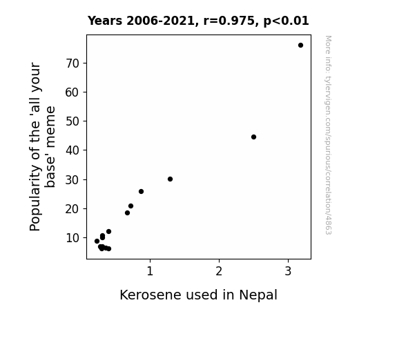
All Your Base Are Belong to Nepal: Exploring the Connection Between 'All Your Base' Meme Popularity and Kerosene Consumption
As the 'all your base' meme faded into obscurity, people simply didn't have the same urge to inappropriately quote it in everyday conversations. This led to a significant reduction in eye-rolling and facepalming incidents across the globe. With fewer instances of secondhand embarrassment being generated, there was a decreased need for kerosene-fueled 'Forget Me Now' devices designed to erase those cringy memories. In Nepal, this ultimately resulted in a decrease in the overall demand for kerosene, freeing up more resources for important undertakings, like perfecting the art of momo-making. The meme may have lost its spark, but at least it sparked a slightly less flammable situation in the land of the Himalayas!
What else correlates?
Popularity of the 'all your base' meme · all memes
Kerosene used in Nepal · all energy
Popularity of the 'all your base' meme · all memes
Kerosene used in Nepal · all energy


View details about correlation #4,420
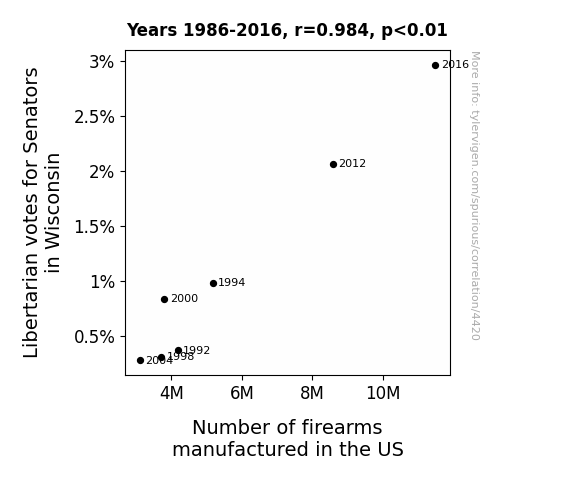
Lock, Stock, and Ballot: A Rhyming Connection Between Libertarian Votes and Firearms Manufacture in the Badger State
The filibuster reform allows for greater productivity in Senate, leading to a boost in the economy. This economic growth incentivizes more people to invest in firearms, driving up the demand for manufactured firearms. After all, nothing says freedom like owning a piece of American-made firepower!
What else correlates?
Votes for Libertarian Senators in Wisconsin · all elections
Number of firearms manufactured in the US · all weird & wacky
Votes for Libertarian Senators in Wisconsin · all elections
Number of firearms manufactured in the US · all weird & wacky


View details about correlation #5,679
Up in Smoke: Uncovering the Fiery Relationship Between Air Pollution in St. Marys, Pennsylvania, and Arson in the United States
As air pollution decreased in St. Marys, Pennsylvania, the smog particles that were once the arsonist's accomplices dispersed, leaving would-be fires high and dry. With their usual partners in crime nowhere to be found, arson rates across the United States simply went up in smoke. It seems that for these fire-starters, the polluted air was their fuel, and without it, their fiery shenanigans just couldn't catch on. Who would have thought that cleaning up the air in one small town could have such a *blazing* impact nationwide?


What else correlates?
Air pollution in St. Marys, Pennsylvania · all weather
Arson in United States · all random state specific
Air pollution in St. Marys, Pennsylvania · all weather
Arson in United States · all random state specific


View details about correlation #4,515
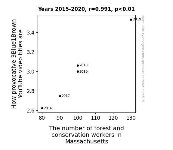
Rhyme of the Time: How Provocative 3Blue1Brown Video Titles Predict the Flock of Forest and Conservation Workers in Massachusetts
The more provocative the 3Blue1Brown video titles, the more they attract viewers. This leads to an increase in brain activity and a sudden passion for nature and the great outdoors. As a result, more people in Massachusetts are inspired to pursue careers as forest and conservation workers in order to protect and preserve the environment. It's like 3Blue1Brown is secretly branching out into eco-education, one clickbait title at a time.


View details about correlation #3,911
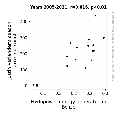
Pitching Strikes: The VerlandER Effect on Belizean HydRO-power
The increased kinetic energy from Verlander's powerful pitches somehow resonates with the water molecules, optimizing their movement through the turbines in a way that boosts overall hydroelectric output. And that's why every strikeout is not just a win for the team, but also a win for renewable energy in Belize.

What else correlates?
Justin Verlander's season strikeout count · all sports
Hydopower energy generated in Belize · all energy
Justin Verlander's season strikeout count · all sports
Hydopower energy generated in Belize · all energy


View details about correlation #4,358
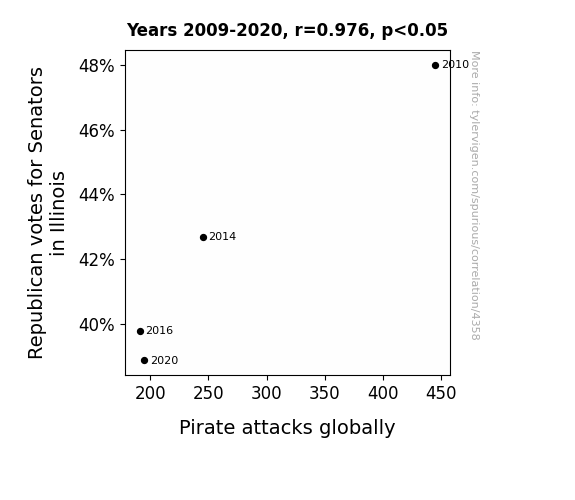
The Correlation Between Illinois Republican Votes for Senators and Global Pirate Attacks: A Statistical Swashbuckling Study
As the Republican votes for Senators in Illinois decreased, it created a lack of support for policies that promoted seafaring adventures. This in turn led to a plank in the pirate population, as their booty prospects were no longer a shore thing. Without the political winds blowing in their favor, the pirates found themselves adrift in a sea of electoral change, ultimately sailing towards a major arrrrr-ccas in their global marauding activities. Without the Senatorial support, it seems the pirates couldn’t Illinois the seas as much as before, and their flagging morale scuppered their usual high-seas shenanigans. It just goes to show, even landlocked voting trends can have a ripple effect on the seven seas!
What else correlates?
Votes for Republican Senators in Illinois · all elections
Pirate attacks globally · all weird & wacky
Votes for Republican Senators in Illinois · all elections
Pirate attacks globally · all weird & wacky


View details about correlation #5,004
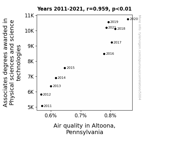
Astonishing Associations: Assessing Altoona's Air quality and Awarded Associates in the Physical sciences
As the number of people with Associates degrees in Physical sciences and science technologies rose, so did their penchant for creating innovative air purification technologies. These degree-holding whiz kids were on a clean air mission, developing ground-breaking methods to scrub the atmosphere of pollutants. You could say they really 'elevated' Altoona's air quality, proving that when it comes to cleaning up the environment, a little bit of science knowledge can go a lung way!

What else correlates?
Associates degrees awarded in Physical sciences · all education
Air quality in Altoona, Pennsylvania · all weather
Associates degrees awarded in Physical sciences · all education
Air quality in Altoona, Pennsylvania · all weather


View details about correlation #4,873
Pipeline Plethora and Deep Look Drama: An Intriguing Correlation
As the demand for pipelines rose in Wisconsin, so too did the need for comprehensive training videos. This led to an influx of pipelayers creating their own YouTube tutorials, resulting in longer Deep Look videos overall. Remember, the key to laying pipes efficiently is taking things one segment at a time!


What else correlates?
The number of pipelayers in Wisconsin · all cccupations
Total length of Deep Look YouTube videos · all YouTube
The number of pipelayers in Wisconsin · all cccupations
Total length of Deep Look YouTube videos · all YouTube


View details about correlation #3,739
Shocking Sus-picion: Illuminating the Correspondence between Electricity Generation in Liberia and Google Searches for 'That is Sus'
As electricity generation in Liberia increased, more people had the power to play online games, which led to an uptick in using the slang term "sus" from the game Among Us, causing the Google searches for 'that is sus' to surge. A shocking connection, indeed!


What else correlates?
Electricity generation in Liberia · all energy
Google searches for 'that is sus' · all google searches
Electricity generation in Liberia · all energy
Google searches for 'that is sus' · all google searches


View details about correlation #4,317
Driving Votes: The Correlation Between New Car Spending and Democrat Senatorial Support in Florida
As household spending on new cars rises, more Floridians experience the joy of vehicle ownership. This leads to an increase in car-related conversations and camaraderie, bringing people together to discuss common interests, including politics. The heightened enthusiasm for cars somehow translates to a surge in support for Democratic Senatorial candidates, as if the rev of a Democratic engine resonates with the newly purchased cars, creating a unique electoral alignment fueled by automotive vibes.


What else correlates?
Annual US household spending on new cars · all weird & wacky
Votes for Democratic Senators in Florida · all elections
Annual US household spending on new cars · all weird & wacky
Votes for Democratic Senators in Florida · all elections


View details about correlation #5,819
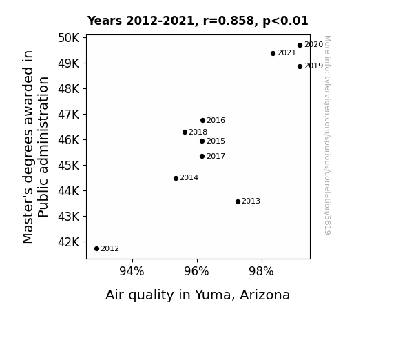
The Master's Degree Metamorphosis: Exploring the Correlation Between Public Administration Graduates and Air Quality in Yuma, Arizona
As more public administrators graduated, they implemented a groundbreaking 'Clean Air for Yuma' initiative, which involved unconventional methods like using bureaucracy to disperse pollution, creating a 'Mist-ical Solutions' task force, and introducing a 'Fresh Idea Friday' policy that encouraged brainstorming innovative ways to tackle air quality issues. The result was a breath of fresh air for Yuma, as the city experienced a surge in eco-friendly practices and a smog-reduction strategy that was simply masterful.

What else correlates?
Master's degrees awarded in Public administration · all education
Air quality in Yuma, Arizona · all weather
Master's degrees awarded in Public administration · all education
Air quality in Yuma, Arizona · all weather


View details about correlation #4,507
Teaching the Beast: Unraveling the Correlation Between Preschool Teachers in Florida and Total Comments on MrBeast YouTube Videos
As the number of preschool teachers in Florida increased, so did the demand for finger-painting and macaroni art tutorials, leading to a surge in comments like "Wow, I could never make a macaroni portrait that good!" and "These finger-painting skills are UNREAL!" on MrBeast's videos. Looks like those teachers are not only shaping young minds, but also influencing YouTube engagement!


What else correlates?
The number of preschool teachers in Florida · all cccupations
Total comments on MrBeast's YouTube videos · all YouTube
The number of preschool teachers in Florida · all cccupations
Total comments on MrBeast's YouTube videos · all YouTube


View details about correlation #3,824
Blown Away: Unveiling the Celestial Influence on Wind Power in the United Kingdom
The gravitational tug-of-war between the distant planets created a celestial breeze, fortuitously boosting wind power production on Earth. As the outer giants played cosmic hide-and-seek, their intricate dance inadvertently sent gusts of energy towards our humble planet, providing a much-needed and quite literal power surge for the United Kingdom. It seems that even in the vast expanse of space, the winds of change can have a very real impact on our renewable energy sources!
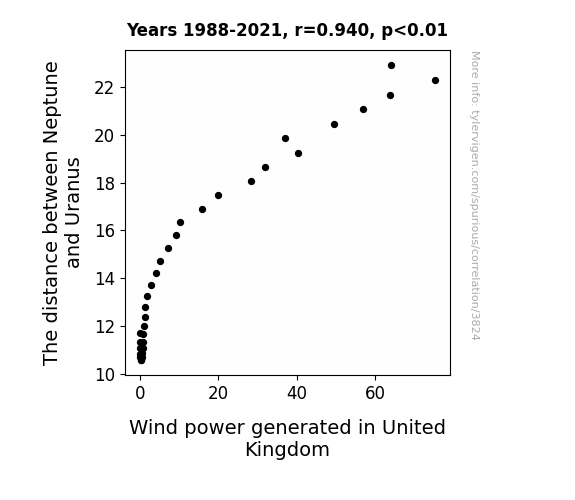
What else correlates?
The distance between Neptune and Uranus · all planets
Wind power generated in United Kingdom · all energy
The distance between Neptune and Uranus · all planets
Wind power generated in United Kingdom · all energy
Why this works
- Data dredging: I have 25,237 variables in my database. I compare all these variables against each other to find ones that randomly match up. That's 636,906,169 correlation calculations! This is called “data dredging.”
Fun fact: the chart used on the wikipedia page to demonstrate data dredging is also from me. I've been being naughty with data since 2014.
Instead of starting with a hypothesis and testing it, I instead tossed a bunch of data in a blender to see what correlations would shake out. It’s a dangerous way to go about analysis, because any sufficiently large dataset will yield strong correlations completely at random. - Lack of causal connection: There is probably no direct connection between these variables, despite what the AI says above.
Because these pages are automatically generated, it's possible that the two variables you are viewing are in fact causually related. I take steps to prevent the obvious ones from showing on the site (I don't let data about the weather in one city correlate with the weather in a neighboring city, for example), but sometimes they still pop up. If they are related, cool! You found a loophole.
This is exacerbated by the fact that I used "Years" as the base variable. Lots of things happen in a year that are not related to each other! Most studies would use something like "one person" in stead of "one year" to be the "thing" studied. - Observations not independent: For many variables, sequential years are not independent of each other. You will often see trend-lines form. If a population of people is continuously doing something every day, there is no reason to think they would suddenly change how they are doing that thing on January 1. A naive p-value calculation does not take this into account.
You will calculate a lower chance of "randomly" achieving the result than represents reality.
To be more specific: p-value tests are probability values, where you are calculating the probability of achieving a result at least as extreme as you found completely by chance. When calculating a p-value, you need to assert how many "degrees of freedom" your variable has. I count each year (minus one) as a "degree of freedom," but this is misleading for continuous variables.
This kind of thing can creep up on you pretty easily when using p-values, which is why it's best to take it as "one of many" inputs that help you assess the results of your analysis.
- Y-axes doesn't start at zero: I truncated the Y-axes of the graphs above. I also used a line graph, which makes the visual connection stand out more than it deserves.
Nothing against line graphs. They are great at telling a story when you have linear data! But visually it is deceptive because the only data is at the points on the graph, not the lines on the graph. In between each point, the data could have been doing anything. Like going for a random walk by itself!
Mathematically what I showed is true, but it is intentionally misleading. If you click on any of the charts that abuse this, you can scroll down to see a version that starts at zero. - Confounding variable: Confounding variables (like global pandemics) will cause two variables to look connected when in fact a "sneaky third" variable is influencing both of them behind the scenes.
- Outliers: Some datasets here have outliers which drag up the correlation.
In concept, "outlier" just means "way different than the rest of your dataset." When calculating a correlation like this, they are particularly impactful because a single outlier can substantially increase your correlation.
Because this page is automatically generated, I don't know whether any of the charts displayed on it have outliers. I'm just a footnote. ¯\_(ツ)_/¯
I intentionally mishandeled outliers, which makes the correlation look extra strong. - Low n: There are not many data points included in some of these charts.
You can do analyses with low ns! But you shouldn't data dredge with a low n.
Even if the p-value is high, we should be suspicious of using so few datapoints in a correlation.
Pro-tip: click on any correlation to see:
- Detailed data sources
- Prompts for the AI-generated content
- Explanations of each of the calculations (correlation, p-value)
- Python code to calculate it yourself


