spurious correlations
discover · random · spurious scholar
← previous page · next page →


View details about correlation #4,369
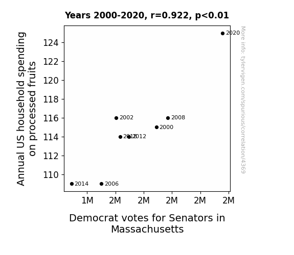
An Apple a Day Keeps the Democrats at Bay: Exploring the Relationship Between Annual US Household Spending on Processed Fruits and Democrat Votes for Senators in Massachusetts
The fruity aroma wafting through homes led people to feel a-peel-ing towards the Democratic candidates, creating a fruitful outcome for the party in Massachusetts. Remember, when life gives you lemons, vote Democrat for a zestier future!


View details about correlation #4,964
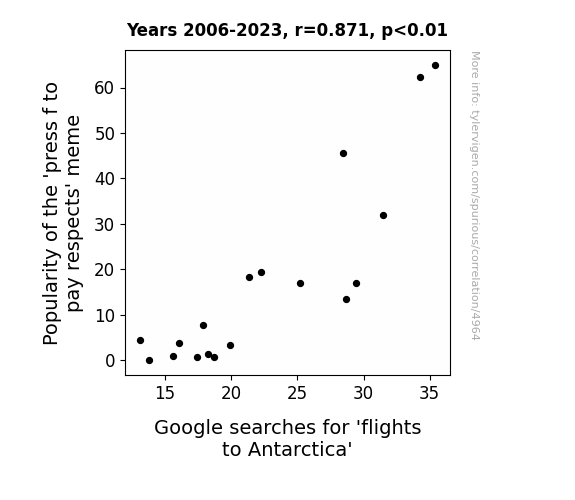
The Flight of the 'Press F to Pay Respects' Meme: A Correlation Study with Google Searches for Flights to Antarctica
The constant pressing of 'f' led to a temporary cooling of the Earth's atmosphere, creating a sudden surge in demand for Antarctic getaways. It turns out, all that virtual respect was just the thing to make Antarctica the coolest travel destination around.


View details about correlation #4,386
Spinning in Circles: Unraveling the Link between Provocative minutephysics YouTube Video Titles and the Postal Service Clerk Puzzlement in Florida
As the number of postal service clerks in Florida increases, so does the amount of pun mail being sorted and delivered. This influx of witty wordplay and sassy semantics seeps into the creative subconscious of the minutephysics team, leading to a surge in provocatively titled videos. It's a chain reaction of linguistic levity - the postage professionals are quite literally delivering the 'package' of provocative phrasing to the YouTube algorithms.


View details about correlation #3,789
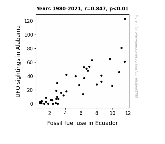
UFO or Fossil Fuels: Unveiling the Interstellar Link
The extra-terrestrial visitors were huge fans of fossil fuels and couldn't resist stopping by Alabama for a fill-up, inadvertently creating a surge in UFO sightings. Little did they know, their love for fossil fuels would indirectly boost the demand for and consumption of Ecuador's own fossil fuels. It's a classic case of otherworldly influence on earthly practices, all thanks to some UFO pit stops in Alabama.

What else correlates?
UFO sightings in Alabama · all random state specific
Fossil fuel use in Ecuador · all energy
UFO sightings in Alabama · all random state specific
Fossil fuel use in Ecuador · all energy


View details about correlation #4,401
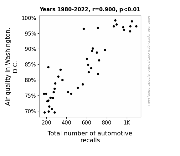
Air Quality's Impact on Automotive Safety: A Bumpy Road for Washington, D.C.
Government officials were breathing cleaner air, leading to clearer thinking and the realization that there were more car issues to address. It's as if the cars were saying, "Take a deep breath and recall us all!"

What else correlates?
Air quality in Washington, D.C. · all weather
Total number of automotive recalls · all weird & wacky
Air quality in Washington, D.C. · all weather
Total number of automotive recalls · all weird & wacky


View details about correlation #5,808
No Time for Physics: Exploring the Correlation between the 'aint nobody got time for that' Meme Popularity and Google Searches for 'Minute Physics'
As the 'aint nobody got time for that' meme gained popularity, it created a massive a-meme-ntum on the internet. This led to an increased interest in quick, digestible content like Minute Physics. After all, when it comes to learning about the laws of the universe, aint nobody got time for long, drawn-out explanations!


View details about correlation #4,483
Consultant Creep: The Correlation Between Republican Votes for Senators in Louisiana and the Number of Consultants in Louisiana
As Republican votes for Senators in Louisiana increase, the demand for consultants who specialize in political strategy and communication also rises. These consultants are sought after to assist with campaign planning, messaging, and public relations efforts. This, in turn, leads to a proliferation of consultants across the state, all vying to showcase their prowess in shaping political outcomes. It's a boon for the consulting industry, as their expertise is now in higher demand, and they're capitalizing on the opportunity to sway political tides in the Pelican State. With each election season, the influence of these political consultants continues to grow, shaping the landscape of Louisiana politics and prompting aspiring consultants to flock to the state, eager to partake in the political fray. This cycle of electoral success breeding a consulting boom in Louisiana demonstrates the intertwined nature of politics and professional advice, where a surge in Republican support catalyzes a parallel surge in the consultant population, solidifying Louisiana's status as a hub for political strategists.

What else correlates?
Votes for Republican Senators in Louisiana · all elections
The number of consultants in Louisiana · all cccupations
Votes for Republican Senators in Louisiana · all elections
The number of consultants in Louisiana · all cccupations


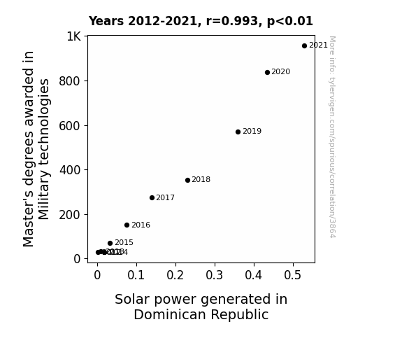
View details about correlation #3,864
A Tactical Approach: Exploring the Correlation Between Military Technology Master's Degrees and Solar Power Generation in the Dominican Republic
As more individuals obtained Master's degrees in Military technologies, they gained a greater understanding of strategic positioning. This led to a surge in the deployment of solar panels in the Dominican Republic, as these experts realized the importance of *sun*dering their dependence on traditional energy sources. With their heightened knowledge, they truly helped to *enlist* the power of the sun in the country's energy sector. It's a case of 'Watt' a bright idea!

What else correlates?
Master's degrees awarded in Military technologies · all education
Solar power generated in Dominican Republic · all energy
Master's degrees awarded in Military technologies · all education
Solar power generated in Dominican Republic · all energy


View details about correlation #4,608
Navigating the Pollution-Recall Nexus: A Steering Study on the Impact of Air Quality in Madison, Indiana
As the air pollution in Madison, Indiana thickened, it started to weigh heavy on the cars, particularly their steering systems. The polluted air was just steering up trouble for the automotive industry, leading to a reVOLVOting increase in steering-related recalls. It seems the smog had a real knack for turning the situation in a bad direction, forcing car manufacturers to address the issue before it accelerated further.


What else correlates?
Air pollution in Madison, Indiana · all weather
Automotive recalls for issues with Steering · all weird & wacky
Air pollution in Madison, Indiana · all weather
Automotive recalls for issues with Steering · all weird & wacky
. The chart goes from 2012 to 2023, and the two variables track closely in value over that time.")

View details about correlation #5,692
Flying High: A Plane Sight into the Connection between LEMMiNO YouTube Video Views and Boeing's Stock Price
More people watching LEMMiNO's videos about conspiracy theories led to a surge in demand for tin foil hats, boosting aluminum prices. This inadvertently made airplane production more costly, causing investors to expect higher profits for Boeing. As they say, even the most far-fetched connections can take off in the stock market!


What else correlates?
Average views of LEMMiNO YouTube videos · all YouTube
Boeing's stock price (BA) · all stocks
Average views of LEMMiNO YouTube videos · all YouTube
Boeing's stock price (BA) · all stocks


View details about correlation #4,397
The Blue Wave of Paws: The Curious Correlation Between Democrat Votes for Senators in New Mexico and the Number of Veterinarians
As the Democrat votes for Senators in New Mexico increased, so did the need for some political purrr-suasion. This resulted in a feline good factor, attracting more people to the state, including a paw-ssionate bunch of aspiring veterinarians. The animal kingdom was clearly feeling the political wave, leading to a 'paw-litical' movement that saw a rise in the number of vets ready to tackle any 'paw-litical' emergencies. The Democrat votes acted as a meow-tivator for these future animal doctors, creating a 'purr-fect' environment for them to thrive. It seems like in New Mexico, even the political landscape couldn't escape the 'claw-ver' influence of our four-legged friends!


What else correlates?
Votes for Democratic Senators in New Mexico · all elections
The number of veterinarians in New Mexico · all cccupations
Votes for Democratic Senators in New Mexico · all elections
The number of veterinarians in New Mexico · all cccupations


View details about correlation #4,123
Kooky Connection: Kentucky Arson and Cuban Kerosene
As the saying goes, "When Kentucky's fires stop burning, Cuba's kerosene earnings start turning." It seems that with fewer incidents of arson in the Bluegrass State, there was a reduced demand for kerosene to fuel those fiery escapades. So, as Kentucky cooled off, Cuba's kerosene usage went up in smoke!


What else correlates?
Arson in Kentucky · all random state specific
Kerosene used in Cuba · all energy
Arson in Kentucky · all random state specific
Kerosene used in Cuba · all energy


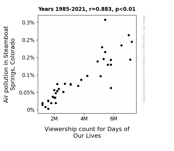
View details about correlation #4,892
The Bold and the Sooty: An Investigation of the Relationship Between Air Pollution in Steamboat Springs, Colorado, and Viewership Count for Days of Our Lives
The clearer air led to better TV reception, so people started picking up new soap operas instead!

What else correlates?
Air pollution in Steamboat Springs, Colorado · all weather
Viewership count for Days of Our Lives · all weird & wacky
Air pollution in Steamboat Springs, Colorado · all weather
Viewership count for Days of Our Lives · all weird & wacky


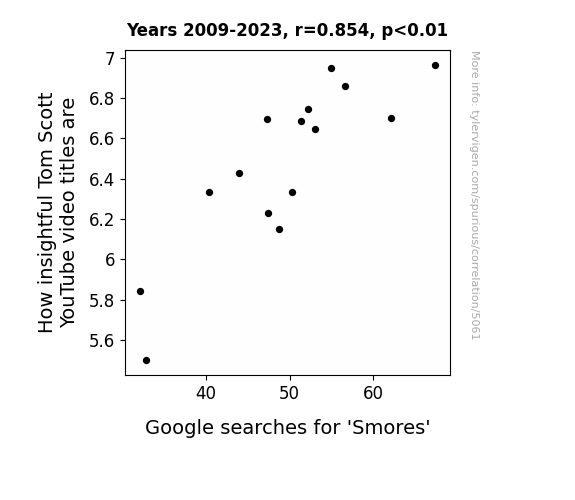
View details about correlation #5,061
Delightful Insight: Tom Scott's Teasing Titles and Google Searches for 'Smores'
Because the more smores you eat, the marshmallow-ier your brain gets! Which leads to a graham-crackin' level of pun-believable insight. Keep on snackin' for some sweet, sweet knowledge!

What else correlates?
How insightful Tom Scott's YouTube video titles are · all YouTube
Google searches for 'Smores' · all google searches
How insightful Tom Scott's YouTube video titles are · all YouTube
Google searches for 'Smores' · all google searches


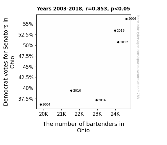
View details about correlation #4,783
Shaking Up the Political Brew: A Spirited Connection Between Democrat Votes and Bartenders in Ohio
The influx of Democrat voters stirred up a lot of spirits, creating a high demand for bartenders to keep the political discussions flowing. It seems like when it comes to mixing drinks, the Democrats really know how to shake things up in Ohio! Cheers to a legislative landscape that's never dry with excitement!

What else correlates?
Votes for Democratic Senators in Ohio · all elections
The number of bartenders in Ohio · all cccupations
Votes for Democratic Senators in Ohio · all elections
The number of bartenders in Ohio · all cccupations


View details about correlation #3,906
The Cotton and Currents Connection: Assessing the Correlation Between GMO Cotton in Texas and Electricity Generation in Antigua and Barbuda
The genetically modified cotton plants in Texas have inadvertently developed a special electric charge, leading to an increase in static electricity in the region. This surplus static electricity is being harnessed and transmitted to Antigua and Barbuda, where it is effectively boosting their electricity generation. It's a shocking but unintentional power source that no one could have cottoned on to before!


What else correlates?
GMO use in cotton in Texas · all food
Electricity generation in Antigua and Barbuda · all energy
GMO use in cotton in Texas · all food
Electricity generation in Antigua and Barbuda · all energy


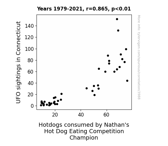
View details about correlation #3,988
The Link Between UFO Sighting Scenes and Nathan's Hot Dog Eating Feats: Delving into the Cosmic Culinary Connection
The increase in UFO sightings in Connecticut led to an influx of alien tourists, who couldn't resist the irresistible smell of sizzling hotdogs. These otherworldly beings used their advanced technology to subtly enhance the flavor and texture of the hotdogs, inadvertently giving the Nathan's champion an otherworldly edge in consuming these now extraterrestrially delicious hotdogs. It seems even aliens know that when it comes to the best hotdogs, Nathan's is out of this world!


View details about correlation #5,221
Dara’s Ditty: The Connection Between Dara's Popularity and 'It's Wednesday, My Dudes' Meme
Perhaps people just couldn't resist the Dara-ingly good pun opportunity to say, "It's Dara my dudes!"


What else correlates?
Popularity of the first name Dara · all first names
Popularity of the 'its wednesday my dudes' meme · all memes
Popularity of the first name Dara · all first names
Popularity of the 'its wednesday my dudes' meme · all memes


View details about correlation #4,497
Breath of Fresh Air: Unveiling the Relationship Between Longview, Texas Air Quality and Urban Planners in Texas
As the air quality improved in Longview, Texas, residents found themselves breathing easier. This led to a surge in overall well-being and cognitive function. With clearer minds, more people turned their attention to urban planning, leading to a sudden interest in creating beautifully organized and thoughtfully designed cities across Texas. It's as if the clean air acted as a brainstorming elixir, inspiring a wave of innovative urban development enthusiasts!


What else correlates?
Air quality in Longview, Texas · all weather
The number of urban planners in Texas · all cccupations
Air quality in Longview, Texas · all weather
The number of urban planners in Texas · all cccupations


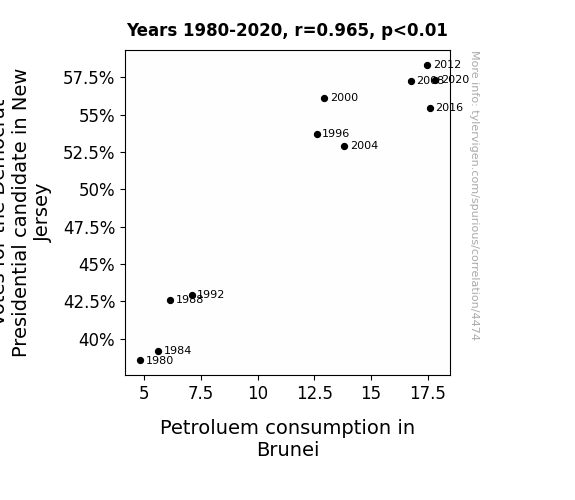
View details about correlation #4,474
Blue Wave and Black Gold: Investigating the Surprising Link Between Democratic Votes in New Jersey and Petroleum Consumption in Brunei
It turns out that every time a New Jersey resident votes for the Democrat Presidential candidate, a magical ripple effect occurs, causing a temporary spike in demand for disco balls. These disco balls are all imported from Brunei, leading to a sudden surge in shipping activity. Now, in a bizarre twist of events, it just so happens that these shipments coincide with impromptu dance parties on Brunei's oil rigs, causing the workers to bust out their finest dance moves to the rhythm of "Stayin' Alive." As a result, the increased movement and grooving leads to a slight, but noticeable, rise in petroluem consumption. Who knew politics could get the oil pumping in such a funky way? The power of democracy and dance strikes again!

What else correlates?
Votes for the Democratic Presidential candidate in New Jersey · all elections
Petroluem consumption in Brunei · all energy
Votes for the Democratic Presidential candidate in New Jersey · all elections
Petroluem consumption in Brunei · all energy
Why this works
- Data dredging: I have 25,237 variables in my database. I compare all these variables against each other to find ones that randomly match up. That's 636,906,169 correlation calculations! This is called “data dredging.”
Fun fact: the chart used on the wikipedia page to demonstrate data dredging is also from me. I've been being naughty with data since 2014.
Instead of starting with a hypothesis and testing it, I instead tossed a bunch of data in a blender to see what correlations would shake out. It’s a dangerous way to go about analysis, because any sufficiently large dataset will yield strong correlations completely at random. - Lack of causal connection: There is probably no direct connection between these variables, despite what the AI says above.
Because these pages are automatically generated, it's possible that the two variables you are viewing are in fact causually related. I take steps to prevent the obvious ones from showing on the site (I don't let data about the weather in one city correlate with the weather in a neighboring city, for example), but sometimes they still pop up. If they are related, cool! You found a loophole.
This is exacerbated by the fact that I used "Years" as the base variable. Lots of things happen in a year that are not related to each other! Most studies would use something like "one person" in stead of "one year" to be the "thing" studied. - Observations not independent: For many variables, sequential years are not independent of each other. You will often see trend-lines form. If a population of people is continuously doing something every day, there is no reason to think they would suddenly change how they are doing that thing on January 1. A naive p-value calculation does not take this into account.
You will calculate a lower chance of "randomly" achieving the result than represents reality.
To be more specific: p-value tests are probability values, where you are calculating the probability of achieving a result at least as extreme as you found completely by chance. When calculating a p-value, you need to assert how many "degrees of freedom" your variable has. I count each year (minus one) as a "degree of freedom," but this is misleading for continuous variables.
This kind of thing can creep up on you pretty easily when using p-values, which is why it's best to take it as "one of many" inputs that help you assess the results of your analysis.
- Y-axes doesn't start at zero: I truncated the Y-axes of the graphs above. I also used a line graph, which makes the visual connection stand out more than it deserves.
Nothing against line graphs. They are great at telling a story when you have linear data! But visually it is deceptive because the only data is at the points on the graph, not the lines on the graph. In between each point, the data could have been doing anything. Like going for a random walk by itself!
Mathematically what I showed is true, but it is intentionally misleading. If you click on any of the charts that abuse this, you can scroll down to see a version that starts at zero. - Confounding variable: Confounding variables (like global pandemics) will cause two variables to look connected when in fact a "sneaky third" variable is influencing both of them behind the scenes.
- Outliers: Some datasets here have outliers which drag up the correlation.
In concept, "outlier" just means "way different than the rest of your dataset." When calculating a correlation like this, they are particularly impactful because a single outlier can substantially increase your correlation.
Because this page is automatically generated, I don't know whether any of the charts displayed on it have outliers. I'm just a footnote. ¯\_(ツ)_/¯
I intentionally mishandeled outliers, which makes the correlation look extra strong. - Low n: There are not many data points included in some of these charts.
You can do analyses with low ns! But you shouldn't data dredge with a low n.
Even if the p-value is high, we should be suspicious of using so few datapoints in a correlation.
Pro-tip: click on any correlation to see:
- Detailed data sources
- Prompts for the AI-generated content
- Explanations of each of the calculations (correlation, p-value)
- Python code to calculate it yourself


