spurious correlations
discover · random · spurious scholar
← previous page · next page →


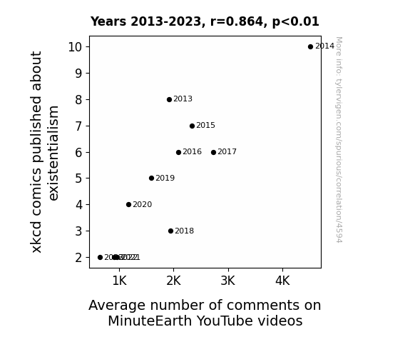
View details about correlation #4,594
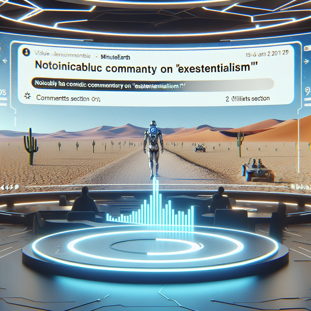
The Existential Comic Conundrum: An Analysis of xkcd Comics and Its Relationship with Average Comment Counts on MinuteEarth YouTube Videos
The decline in existential xkcd comics has left MinuteEarth viewers feeling unfulfilled, leading to a lack of engagement. It seems the absence of 'xkcd-istential' humor has created a 'comic-crisis' for the comment section! Remember, when it comes to internet content, every 'comment' counts!


View details about correlation #5,119
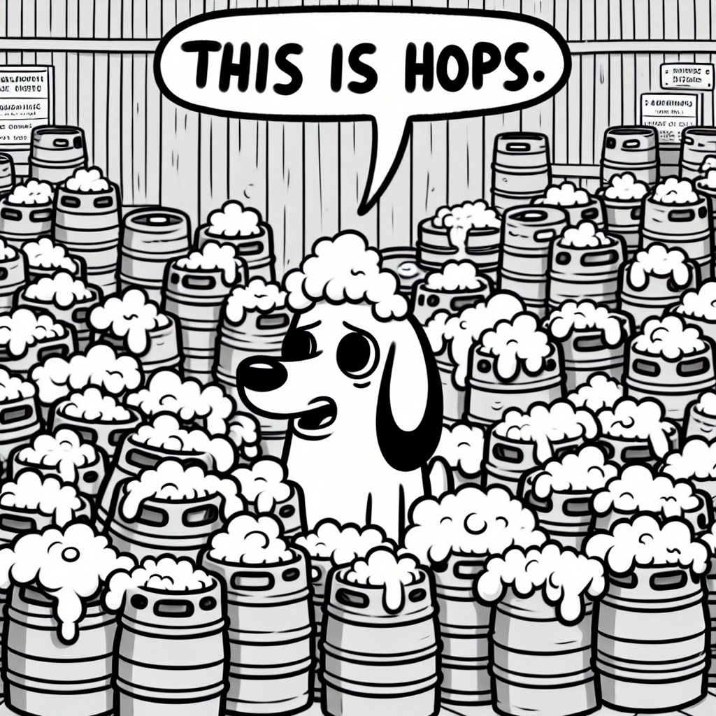
Crafts on Draft: The State of Brews and Moods in the United States
As the number of breweries in the United States increased, so did the production of craft beers. This led to a corresponding increase in the consumption of said beers. As more people imbibed, they found themselves in situations reminiscent of the 'this is fine' meme, where everything may seem to be falling apart, but they were determined to stay optimistic and unfazed - much like the characters in the meme who calmly sipped their coffee amidst chaos. This increased relatability fueled the meme's popularity, creating a hoppy connection between the burgeoning brewery scene and the spread of the 'this is fine' meme.

What else correlates?
The number of Breweries in the United States · all food
Popularity of the 'this is fine' meme · all memes
The number of Breweries in the United States · all food
Popularity of the 'this is fine' meme · all memes


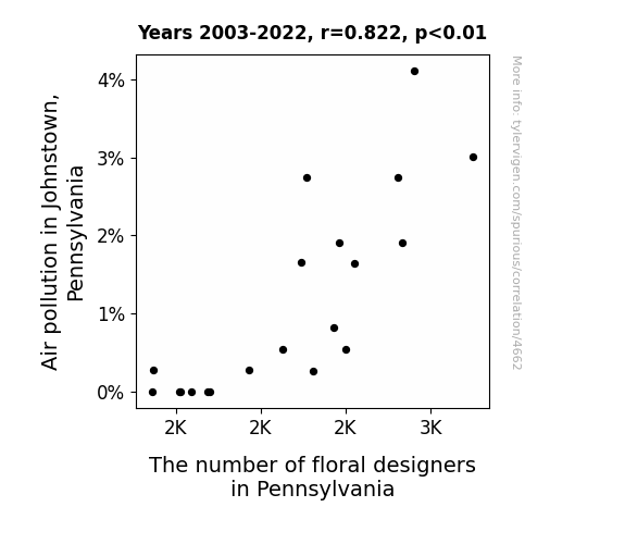
View details about correlation #4,662
The Pollen Paradox: Examining the Relationship Between Air Pollution in Johnstown, Pennsylvania and the Number of Floral Designers in Pennsylvania
As the air became cleaner, flowers no longer felt the need to hire designers for their petals, ultimately leading to a decrease in floral designers in the state. With no more smoggy competition, the floral industry wilted away, leaving Pennsylvania's floral designers out of a job.

What else correlates?
Air pollution in Johnstown, Pennsylvania · all weather
The number of floral designers in Pennsylvania · all cccupations
Air pollution in Johnstown, Pennsylvania · all weather
The number of floral designers in Pennsylvania · all cccupations


View details about correlation #4,412
Republican Votes, Fossil Fuels, and Utah's Quirks: A Quirky Correlation
As the number of Republican votes for Senators in Utah rises, so does the demand for balloons to celebrate. Suriname, feeling the festive vibes, decides to host the world's first Fossil Fuel Fueled Balloon Festival, leading to a significant uptick in fossil fuel use. It's a gas-guzzling, politically-charged party in the skies over Suriname!

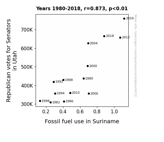
What else correlates?
Votes for Republican Senators in Utah · all elections
Fossil fuel use in Suriname · all energy
Votes for Republican Senators in Utah · all elections
Fossil fuel use in Suriname · all energy


View details about correlation #3,889
Mystery in the Sky: UFO Sightings in Georgia and Mount Everest Climbing Highs
The aliens were offering climbers secret shortcuts and extra oxygen in exchange for learning how to line dance. Guess even extraterrestrials can't resist a good hoedown at high altitudes!

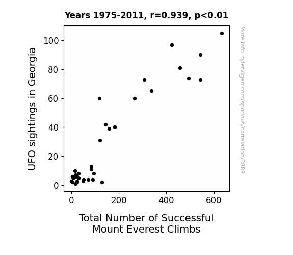
What else correlates?
UFO sightings in Georgia · all random state specific
Total Number of Successful Mount Everest Climbs · all weird & wacky
UFO sightings in Georgia · all random state specific
Total Number of Successful Mount Everest Climbs · all weird & wacky


View details about correlation #5,179
Shining Bright or Just a Gem?: The Radiance of Ruby and the Tech-Titillating Titles on YouTube
Perhaps as more people were named Ruby, there was a spike in demand for stylish and trendy items, leading to a greater interest in cool technology. It's as if the name itself brought a touch of modernity and sleekness to everything it was associated with, including YouTube video titles about technology. It's like the Ruby effect - making even the nerdiest of topics seem fabulous. Or maybe, just maybe, there's a secret correlation between Ruby-named individuals and an innate ability to appreciate the coolest aspects of technology, creating a sort of 'tech-chic' trend that couldn't be ignored! It's a gem of a theory that shines brightly with whimsical charm!


What else correlates?
Popularity of the first name Ruby · all first names
How cool Technology Connections YouTube video titles are · all YouTube
Popularity of the first name Ruby · all first names
How cool Technology Connections YouTube video titles are · all YouTube


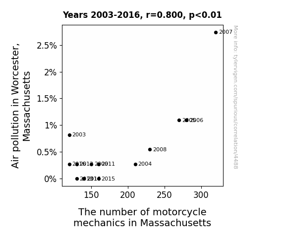
View details about correlation #4,488
The Hazy Connection: A Study on the Relationship Between Air Pollution in Worcester, Massachusetts and the Number of Motorcycle Mechanics in Massachusetts
As air pollution decreased in Worcester, Massachusetts, there was less need for "exhausting" motorcycle repairs, leading to a decrease in the number of motorcycle mechanics in the state. Motorcycle mechanics were no longer "saddled" with as much work, as cleaner air meant fewer issues with engine performance and maintenance. It seems like the correlation between air pollution and the number of motorcycle mechanics was just a "bikey" coincidence!


View details about correlation #4,376
Fueling the Political Fire: A Combustible Connection Between Republican Votes in Arkansas and Kerosene Consumption in Comoros
As more Senators were elected in Arkansas, the surplus hot air from political debates was inadvertently collected and shipped to Comoros, where it was repurposed as an eco-friendly alternative to kerosene.


What else correlates?
Votes for Republican Senators in Arkansas · all elections
Kerosene used in Comoros · all energy
Votes for Republican Senators in Arkansas · all elections
Kerosene used in Comoros · all energy


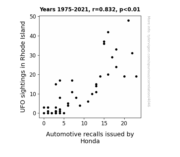
View details about correlation #4,046
Spotted Lights and Automotive Plights: Rhode Island UFO Sightings and Honda Recalls Delights
The UFO sightings were giving off such strong 'Honda' waves, it was interfering with the cars' functioning, prompting the need for more recalls to address the otherworldly issues. It seems the aliens were really revving up their presence in Rhode Island, and Honda just couldn't keep their vehicles 'grounded' from the cosmic car trouble. It's like the UFOs were saying, "Take us to your dealer... for some recall repairs!"
What else correlates?
UFO sightings in Rhode Island · all random state specific
Automotive recalls issued by Honda · all weird & wacky
UFO sightings in Rhode Island · all random state specific
Automotive recalls issued by Honda · all weird & wacky


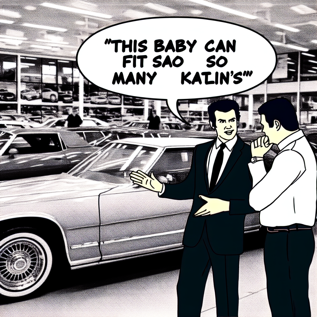
View details about correlation #5,641
Slapdash Analyzation: Katlin's Connection to the 'Slaps Roof of Car' Phenomenon
As fewer and fewer people were named Katlin, there were simply less roofs of cars to slap.

What else correlates?
Popularity of the first name Katlin · all first names
Popularity of the 'slaps roof of car' meme · all memes
Popularity of the first name Katlin · all first names
Popularity of the 'slaps roof of car' meme · all memes


View details about correlation #4,430
Oh, the Air We Share: A Pair of Affair Between Cincinnati Air Quality and Ohio Nurse Practitioners' Care
The improved air quality in Cincinnati led to a decrease in cases of respiratory illnesses. This, in turn, reduced the workload of current nurse practitioners, prompting the need for more nurse practitioners in Ohio to be hired to maintain the appropriate patient-to-nurse ratio. As a result, the number of nurse practitioners in Ohio increased in response to the unexpectedly clean air in Cincinnati.


What else correlates?
Air quality in Cincinnati · all weather
The number of nurse practitioners in Ohio · all cccupations
Air quality in Cincinnati · all weather
The number of nurse practitioners in Ohio · all cccupations


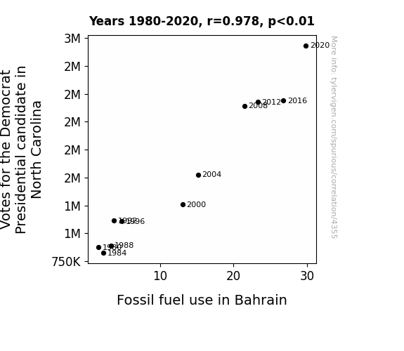
View details about correlation #4,355
Palm Votes and Oil Floats: A Spurious Correlation or a Political Mirage?
Every time a Democrat Presidential candidate in North Carolina gets more votes, a secret underground network of fossil fuel-loving moles in Bahrain receive a signal to ramp up their energy consumption in support. It's a classic case of political fervor igniting distant actions, fueled by a combination of patriotic passion and a penchant for prehistoric power sources!

What else correlates?
Votes for the Democratic Presidential candidate in North Carolina · all elections
Fossil fuel use in Bahrain · all energy
Votes for the Democratic Presidential candidate in North Carolina · all elections
Fossil fuel use in Bahrain · all energy


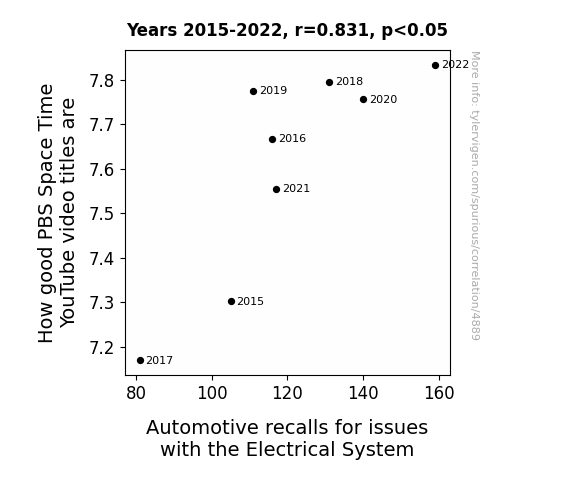
View details about correlation #4,889
Shockingly Good Titles: The Electrifying Connection Between PBS Space Time YouTube Video Titles and Automotive Recalls for Electrical System Issues
As more automotive recalls for electrical system issues occur, the energy in the universe becomes more unstable, leading to an exponential improvement in PBS Space Time video titles. Remember, a shocking title is the spark to intergalactic curiosity!


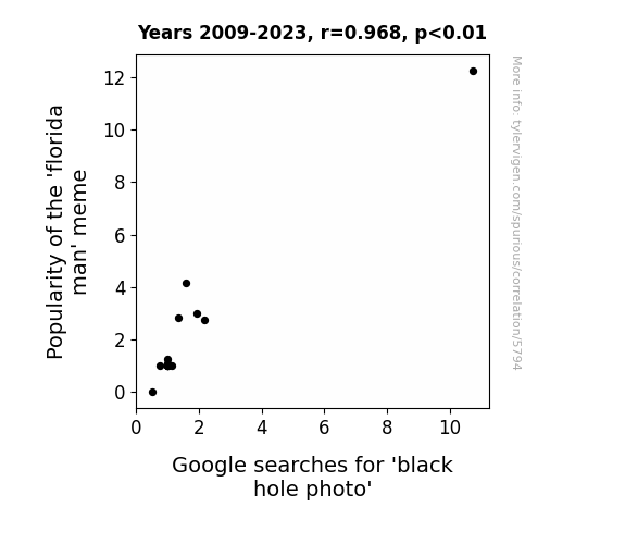
View details about correlation #5,794
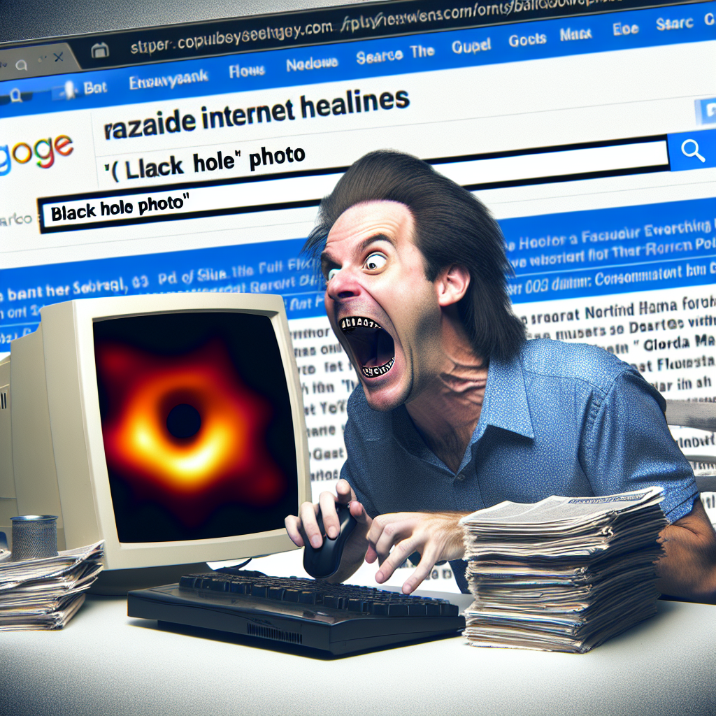
Caught in a Meme Hole: The Correlation Between the 'Florida Man' Phenomenon and Google Searches for the Black Hole Photo
As the Florida man meme gained traction, the gravitational pull of its absurdity warped our collective sense of reality, inadvertently leading to a renewed interest in capturing the most mind-bending, space-defying moments - like finally photographing a black hole.
What else correlates?
Popularity of the 'florida man' meme · all memes
Google searches for 'black hole photo' · all google searches
Popularity of the 'florida man' meme · all memes
Google searches for 'black hole photo' · all google searches


View details about correlation #5,913
Every time someone named Allegra walked into a room, they generated a small but noticeable electric charge, leading to an increase in demand for electrical and electronics repairers in order to keep up with the shocking surge of static electricity-related equipment malfunctions. It was like a real-life version of The Electric Allegra!
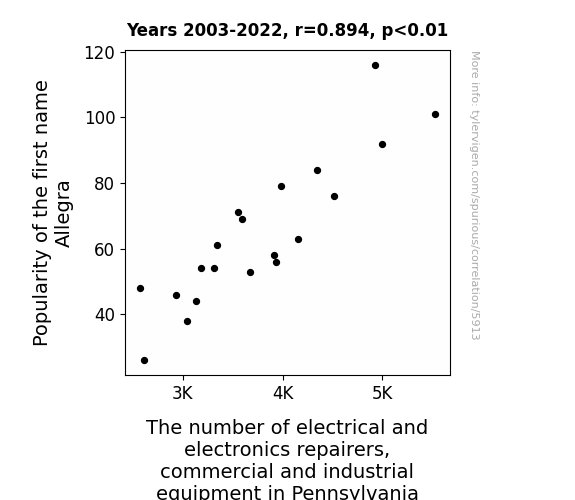


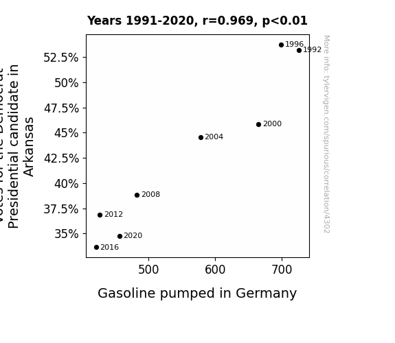
View details about correlation #4,302
Fueling the Vote: A Surprising Correlation Between Democrat Votes in Arkansas and Gasoline Consumption in Germany
As the enthusiasm for the Democrat candidate waned in Arkansas, the collective sighs led to a minor atmospheric disturbance. This disturbance, in turn, disrupted the jet stream in a way that slightly altered the atmospheric pressure systems above Germany, ultimately leading to a minuscule decrease in the efficiency of gasoline combustion. Remember, every vote counts, even in the world of fluid dynamics and atmospheric science!

What else correlates?
Votes for the Democratic Presidential candidate in Arkansas · all elections
Gasoline pumped in Germany · all energy
Votes for the Democratic Presidential candidate in Arkansas · all elections
Gasoline pumped in Germany · all energy


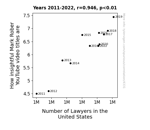
View details about correlation #4,331
The Ties Between Title Insightfulness in Mark Rober's YouTube Videos and the Total Tally of Lawyers in the United States
As the number of lawyers in the United States increases, the competition for clients becomes fiercer. To stand out, lawyers start honing their marketing strategies, and what better way to connect with potential clients than by demonstrating their insightfulness? So, they all turn to Mark Rober's videos for inspiration on crafting compelling and insightful content. After all, if they can't win cases, they might as well win the YouTube algorithm! As a result, Mark Rober's video titles become increasingly packed with wisdom and ingenuity as he inadvertently becomes the go-to guru for the legal industry, leading to a boom in insightful video titles. The verdict is in: it's a case of legal minds seeking YouTube finds!

What else correlates?
How insightful Mark Rober YouTube video titles are · all YouTube
Number of Lawyers in the United States · all weird & wacky
How insightful Mark Rober YouTube video titles are · all YouTube
Number of Lawyers in the United States · all weird & wacky


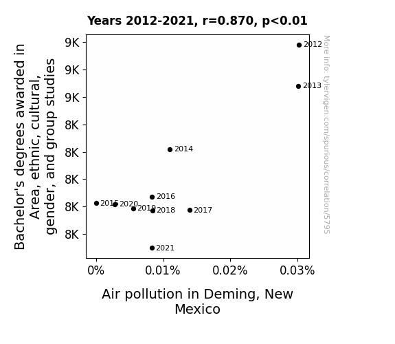
View details about correlation #5,795
Clearing the Air Around Gender Studies: A Bachelor's Degree of Separation from Air Pollution in Deming, New Mexico
As fewer students pursued degrees in these studies, there was a corresponding decrease in the production of academic hot air. This led to a significant reduction in verbal pollution levels, ultimately improving the air quality in Deming, New Mexico. As the discussions about gender, culture, and ethnic studies decreased, so did the atmospheric disruption, creating a more breathable and harmonious environment for all. It's a case of less academic discourse leading to cleaner, fresher air - truly a breath of relief for the residents of Deming!

What else correlates?
Bachelor's degrees awarded in gender studies · all education
Air pollution in Deming, New Mexico · all weather
Bachelor's degrees awarded in gender studies · all education
Air pollution in Deming, New Mexico · all weather


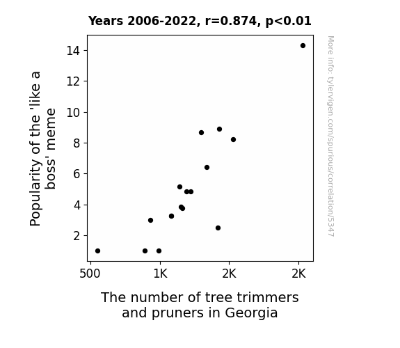
View details about correlation #5,347
Trimming Trees Like a Boss: Exploring the Relationship Between 'Like a Boss' Meme Popularity and Tree Trimmers and Pruners in Georgia
As the 'like a boss' meme gained traction, more and more people were inspired to take charge and show their tree trimming skills. The connection became clear - the meme was branching out a whole new wave of arborists. It seems like bark-eting themselves as the ultimate tree trimmers became the latest trend. After all, when you can leaf everyone in awe of your pruning prowess, why wouldn't you want to be a part of that sappy success? It's as if the meme was shouting, "Sequoia later, basic trimmers, Georgia's got a whole forest of boss-like professionals now!" And that's how the 'like a boss' meme not only went viral, but also cultivated a whole new forest of tree trimmers and pruners in Georgia. Talk about branching out in the job market! Keep on sprucing up those trees, Georgia, and remember to always handle your tasks like a true arborist boss!
What else correlates?
Popularity of the 'like a boss' meme · all memes
The number of tree trimmers and pruners in Georgia · all cccupations
Popularity of the 'like a boss' meme · all memes
The number of tree trimmers and pruners in Georgia · all cccupations


View details about correlation #3,767
The Storm Surge: A Quirky Investigation into the Relationship between the Popularity of the Name Storm and Hydroelectric Power Generation in Kosovo
As the name Storm gained popularity, it created a ripple effect of enthusiasm and 'current'-ly charged energy in the region. The 'reign' of this electrifying name sparked a surge in hydropower generation, as people were 'flooded' with a renewed sense of 'watt'-er power. It seems the connection between the name Storm and hydropower in Kosovo is truly 'shock'-ing!
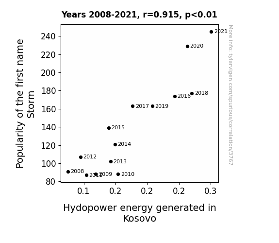
What else correlates?
Popularity of the first name Storm · all first names
Hydopower energy generated in Kosovo · all energy
Popularity of the first name Storm · all first names
Hydopower energy generated in Kosovo · all energy
Why this works
- Data dredging: I have 25,237 variables in my database. I compare all these variables against each other to find ones that randomly match up. That's 636,906,169 correlation calculations! This is called “data dredging.”
Fun fact: the chart used on the wikipedia page to demonstrate data dredging is also from me. I've been being naughty with data since 2014.
Instead of starting with a hypothesis and testing it, I instead tossed a bunch of data in a blender to see what correlations would shake out. It’s a dangerous way to go about analysis, because any sufficiently large dataset will yield strong correlations completely at random. - Lack of causal connection: There is probably no direct connection between these variables, despite what the AI says above.
Because these pages are automatically generated, it's possible that the two variables you are viewing are in fact causually related. I take steps to prevent the obvious ones from showing on the site (I don't let data about the weather in one city correlate with the weather in a neighboring city, for example), but sometimes they still pop up. If they are related, cool! You found a loophole.
This is exacerbated by the fact that I used "Years" as the base variable. Lots of things happen in a year that are not related to each other! Most studies would use something like "one person" in stead of "one year" to be the "thing" studied. - Observations not independent: For many variables, sequential years are not independent of each other. You will often see trend-lines form. If a population of people is continuously doing something every day, there is no reason to think they would suddenly change how they are doing that thing on January 1. A naive p-value calculation does not take this into account.
You will calculate a lower chance of "randomly" achieving the result than represents reality.
To be more specific: p-value tests are probability values, where you are calculating the probability of achieving a result at least as extreme as you found completely by chance. When calculating a p-value, you need to assert how many "degrees of freedom" your variable has. I count each year (minus one) as a "degree of freedom," but this is misleading for continuous variables.
This kind of thing can creep up on you pretty easily when using p-values, which is why it's best to take it as "one of many" inputs that help you assess the results of your analysis.
- Y-axes doesn't start at zero: I truncated the Y-axes of the graphs above. I also used a line graph, which makes the visual connection stand out more than it deserves.
Nothing against line graphs. They are great at telling a story when you have linear data! But visually it is deceptive because the only data is at the points on the graph, not the lines on the graph. In between each point, the data could have been doing anything. Like going for a random walk by itself!
Mathematically what I showed is true, but it is intentionally misleading. If you click on any of the charts that abuse this, you can scroll down to see a version that starts at zero. - Confounding variable: Confounding variables (like global pandemics) will cause two variables to look connected when in fact a "sneaky third" variable is influencing both of them behind the scenes.
- Outliers: Some datasets here have outliers which drag up the correlation.
In concept, "outlier" just means "way different than the rest of your dataset." When calculating a correlation like this, they are particularly impactful because a single outlier can substantially increase your correlation.
Because this page is automatically generated, I don't know whether any of the charts displayed on it have outliers. I'm just a footnote. ¯\_(ツ)_/¯
I intentionally mishandeled outliers, which makes the correlation look extra strong. - Low n: There are not many data points included in some of these charts.
You can do analyses with low ns! But you shouldn't data dredge with a low n.
Even if the p-value is high, we should be suspicious of using so few datapoints in a correlation.
Pro-tip: click on any correlation to see:
- Detailed data sources
- Prompts for the AI-generated content
- Explanations of each of the calculations (correlation, p-value)
- Python code to calculate it yourself


