spurious correlations
discover · random · spurious scholar
← previous page · next page →


View details about correlation #4,753
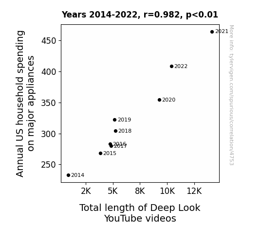
The Great Appliance Adventure: Exploring the Link Between Household Spending and Deep Look Length
As households invested in fancier fridges and cooler cooktops, Deep Look had to extend their videos to ensure they were 'washing' all the information and not just giving viewers a 'dryer' understanding of the topics. After all, they couldn't just 'microwave' the content and risk leaving everyone feeling 'defrosted' and unsatisfied. This led to a 'spin cycle' of longer videos, because when it comes to explaining science, they don't believe in taking shortcuts - they prefer to 'refrigerate' the information until it's 'fully thawed' for the audience.

What else correlates?
Annual US household spending on major appliances · all weird & wacky
Total length of Deep Look YouTube videos · all YouTube
Annual US household spending on major appliances · all weird & wacky
Total length of Deep Look YouTube videos · all YouTube


View details about correlation #5,504
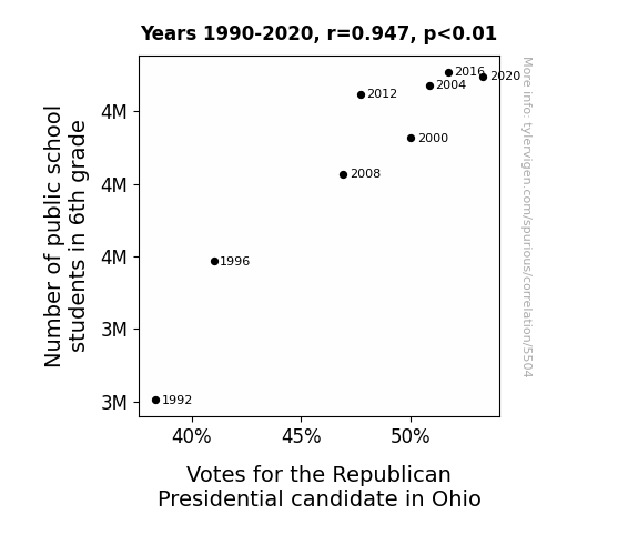
Grades and Votes: A Correlation of Fate in the Buckeye State
As the number of 6th graders in public schools in Ohio increased, so did the demand for chocolate milk in the cafeteria. This led to a surplus in the local dairy industry, prompting dairy farmers to show their support for the Republican Party. In a truly moo-ving fashion, these farmers rallied their herds and galloped to the nearest polling stations, ultimately tipping the scales in favor of the Republican candidate. It's udderly ridiculous, but it seems like those 6th graders had a stake in the political dairy-ction after all!


View details about correlation #4,606
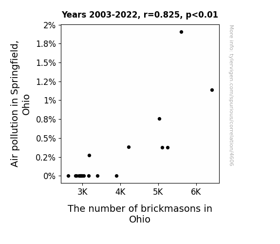
The Connection Between Air Pollution and Brickmason Evolution: A Look at Springfield Air From Nine to Five
Due to cleaner air, the bricks in Springfield became self-aware and started laying themselves, rendering brickmasons obsolete.

What else correlates?
Air pollution in Springfield, Ohio · all weather
The number of brickmasons in Ohio · all cccupations
Air pollution in Springfield, Ohio · all weather
The number of brickmasons in Ohio · all cccupations


View details about correlation #3,949
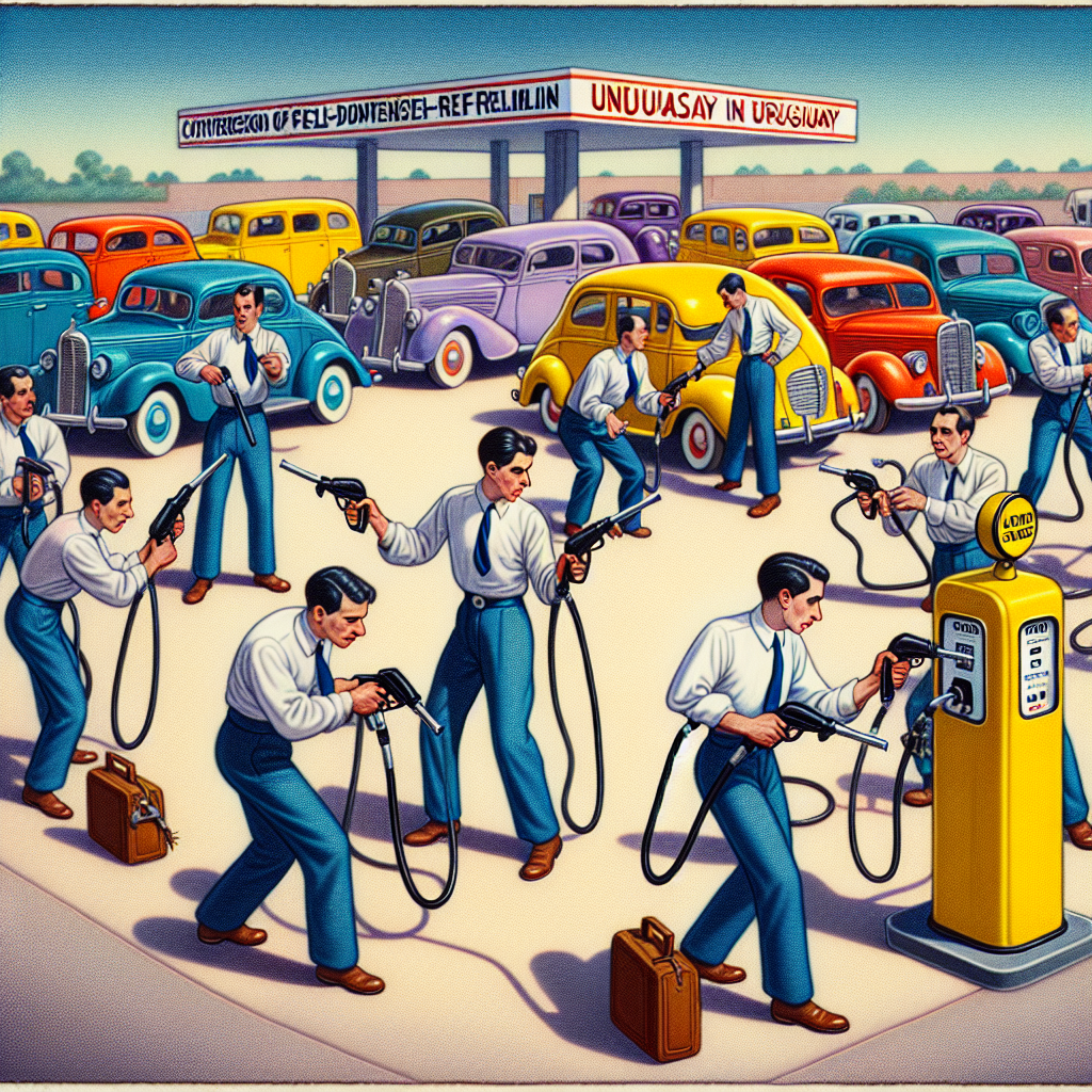
Fueling the Fire: Examining the Correlation Between Robberies in South Dakota and Gasoline Consumption in Uruguay
As robberies increased in South Dakota, more getaway cars were needed. This led to a higher demand for gasoline, prompting an uptick in gasoline pumped in Uruguay as part of an elaborate black market car fueling scheme. Who knew that the roads from South Dakota to Uruguay were the new hotbed for not-so-highway robbery!

What else correlates?
Robberies in South Dakota · all random state specific
Gasoline pumped in Uruguay · all energy
Robberies in South Dakota · all random state specific
Gasoline pumped in Uruguay · all energy


View details about correlation #4,638
Unboxing the Relationship Between Total Views on Casually Explained YouTube Videos and Customer Satisfaction with JCPenney: A Revealing Analysis
The soothing voice and subtle wit of Casually Explained may have subconsciously convinced viewers to embrace the 'casual Friday' dress code, leading to a surge in demand for JCPenney's stylish yet comfortable clothing. After all, nothing says satisfaction like finding the perfect pair of elastic-waist pants. Remember, when in doubt, dress comfortably and carry a dry sense of humor!


What else correlates?
Total views on Casually Explained YouTube videos · all YouTube
Customer satisfaction with JCPenney · all weird & wacky
Total views on Casually Explained YouTube videos · all YouTube
Customer satisfaction with JCPenney · all weird & wacky


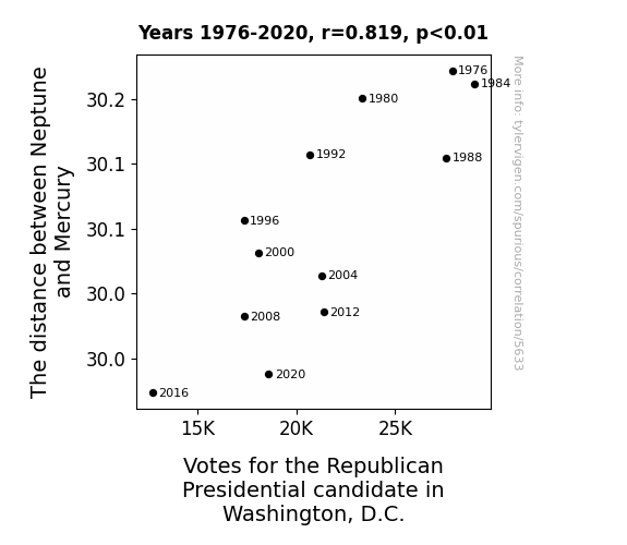
View details about correlation #5,633
Planetary Politics: Exploring the Astrological Influences on Voting Patterns in Washington, D.C.
As Neptune inched closer, it created a gravitational "blue wave" effect, pulling Republican votes in the capital down like a cosmic conservative conundrum! The GOP just couldn't planetself firmly enough in the political atmosphere as the Neptunian nudges left them feeling a bit Mercurial about their choices. Remember, in space no one can hear you lean to the right!


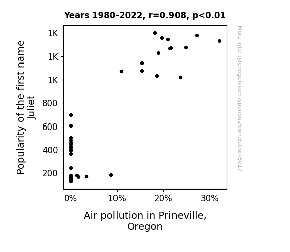
View details about correlation #5,017
Juliet's in the Name and Pollution in the Air: A Correlation Study in Prineville, Oregon
As more and more babies were named Juliet, parents couldn't resist buying personalized 'J for Juliet' car air fresheners. Unfortunately, the overwhelmingly floral and fruity scent led to open window confusion on the roads, creating traffic jams and ultimately increasing air pollution in Prineville, Oregon.

What else correlates?
Popularity of the first name Juliet · all first names
Air pollution in Prineville, Oregon · all weather
Popularity of the first name Juliet · all first names
Air pollution in Prineville, Oregon · all weather


View details about correlation #4,196
Scoring on the Diamond: Exploring the Jet Fuel Connection - A Statistical Analysis of Runs Scored by the Colorado Rockies and Jet Fuel Consumption in the United States
As the jets soar through the skies, they unknowingly create subtle air currents that carry baseballs in the desired direction, giving the Colorado Rockies an unexpected home run advantage. It's a classic case of high-flying interference leading to a whole new ball game!


What else correlates?
Jet fuel used in United States · all energy
Runs scored by the Colorado Rockies · all sports
Jet fuel used in United States · all energy
Runs scored by the Colorado Rockies · all sports


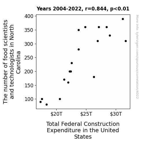
View details about correlation #4,022
Analyzing the Palate and the Cranes: The Correlation between Food Scientists in North Carolina and Federal Construction Expenditure in the United States
As more food scientists and technologists flocked to North Carolina, they inadvertently discovered a way to use biscuit dough as a sustainable and surprisingly sturdy building material. This led to a nationwide shift in construction practices, with federal projects now embracing the cost-effective and deliciously aromatic approach to building everything from government offices to infrastructure. The flaky yet structurally sound nature of these biscuit buildings has revolutionized the construction industry, creating a ripple effect of buttery innovation and giving a whole new meaning to the term "built to taste." It's a biscuit bonanza that's taken the nation by storm, proving once and for all that in the world of construction, it's not just about the dough – it's about the rising impact of food scientists on federal expenditure.


View details about correlation #5,482
Red State Tales: Republican Ballots and Green Poop Queries in the Empire State
The increase in Republican votes for Senators in New York has led to a surge in green poop queries because it appears that political preferences have become so influential that even our digestive systems are getting politically colored!

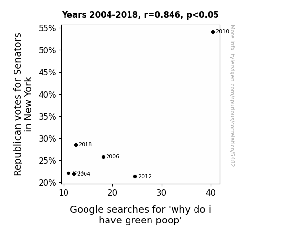
. The chart goes from 2002 to 2023, and the two variables track closely in value over that time.")

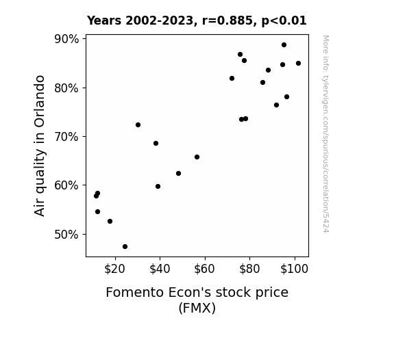
View details about correlation #5,424
Foul Fumes or Financial Folly: Air Quality in Orlando and the Fluctuations of Fomento Econ's Stock Price
The improved air quality in Orlando led to people feeling fresher and having clearer minds. This, in turn, sparked a higher demand for Fomento Econ's products, sending their stock price soaring. It seems like when the air is cleaner, their profits are just mint to increase!

What else correlates?
Air quality in Orlando · all weather
Fomento Econ's stock price (FMX) · all stocks
Air quality in Orlando · all weather
Fomento Econ's stock price (FMX) · all stocks


View details about correlation #4,668
The Nuclear 'Reactor' to Success: Exploring the Correlation Between Nuclear Power Generation in Mexico and the Average Number of Likes on AsapSCIENCE YouTube Videos
The increase in nuclear power generation in Mexico led to a rise in the country's overall energy efficiency. This, in turn, meant that more people had the energy and focus to engage with and appreciate the educational content produced by AsapSCIENCE. The powerful and positively charged nature of nuclear energy somehow sparked a chain reaction of increased interest in science, ultimately boosting the average number of likes on AsapSCIENCE YouTube videos.
What else correlates?
Nuclear power generation in Mexico · all energy
The average number of likes on AsapSCIENCE YouTube videos · all YouTube
Nuclear power generation in Mexico · all energy
The average number of likes on AsapSCIENCE YouTube videos · all YouTube


View details about correlation #3,925
Connect the Dots: The Set and Exhibit Designers-Plane Crashes Correlation in New Mexico and Beyond
The influx of creative talent led to an unexpected trend of designing airplane sets with realistic crash simulations, catching the aviation industry off guard and leading to an increase in actual plane crashes worldwide. It turns out, what happens in New Mexico doesn't stay in New Mexico when it comes to gravity-defying stagecraft! So, buckle up and ensure your seat backs and tray tables are in their full upright and locked position - it's going to be a bumpy, yet artistically impressive, ride!


What else correlates?
The number of set and exhibit designers in New Mexico · all cccupations
Global plane crashes · all weird & wacky
The number of set and exhibit designers in New Mexico · all cccupations
Global plane crashes · all weird & wacky


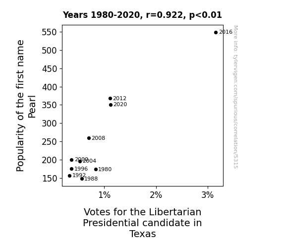
View details about correlation #5,315
The Libertarian Lean of the Pearl: A Shellebration of Name Popularity and Political Preference in the Lone Star State
As the name Pearl gained popularity, more people were drawn to individualism, just like the unique, independent character of a pearl in an oyster. These individuals were more likely to support the Libertarian candidate, creating a 'liber-tide' of votes in Texas.


View details about correlation #4,972
Air We Feeling Under the Weather: A Quirky Connection Between Air Quality in Baton Rouge and 'I Have the Flu' Google Searches
The fresher air must have flu away your symptoms! Or maybe people were just feeling too congested to type.


What else correlates?
Air quality in Baton Rouge · all weather
Google searches for 'i have the flu' · all google searches
Air quality in Baton Rouge · all weather
Google searches for 'i have the flu' · all google searches


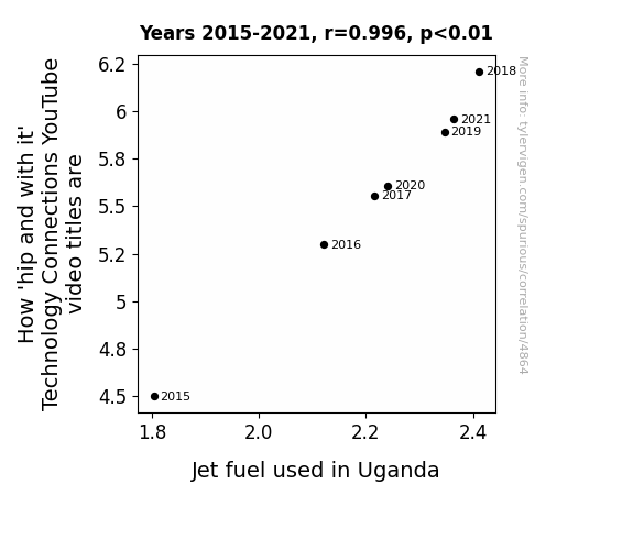
View details about correlation #4,864
Fueling the Fire: A Combustible Connection Between Technology YouTube Video Titles and Jet Fuel Consumption in Uganda
As the use of jet fuel in Uganda increases, it creates a ripple effect, leading to a surge in the production of dance-activated generators, ultimately fueling the 'hip and with it' vibes of Technology Connections. Remember, it's not just the technology that's revving up!

What else correlates?
How 'hip and with it' Technology Connections YouTube video titles are · all YouTube
Jet fuel used in Uganda · all energy
How 'hip and with it' Technology Connections YouTube video titles are · all YouTube
Jet fuel used in Uganda · all energy


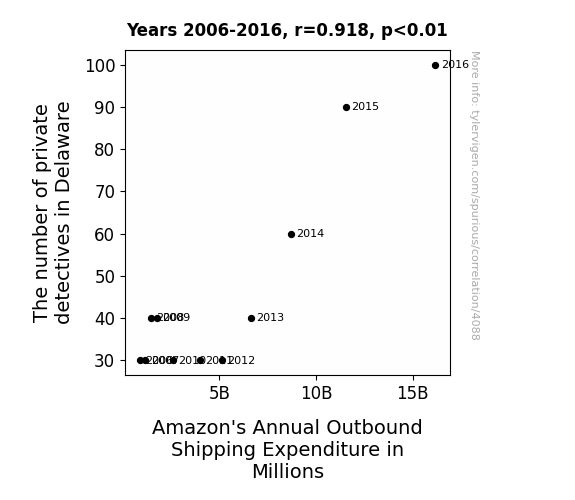
View details about correlation #4,088
Detective Density, Deliveries, and Delight: The Rhyme and Reason behind Delaware's Sleuths and Amazon's Bucks
As the number of private detectives in Delaware increased, so did the rate of wily raccoons pilfering packages from porches. These masked bandits were conducting their own heists, prompting Amazon to invest more in outbound shipping to compensate for the stolen goods. After all, when it comes to outsmarting sneaky critters, Amazon wasn't about to let the raccoons run away with their profits!


View details about correlation #5,807
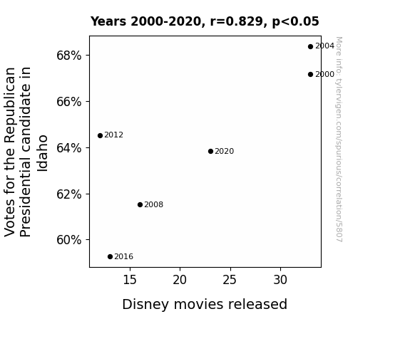
Idaho Votes and Disney Quotes: Examining the Relationship Between Republican Presidential Voting Trends and Disney Movie Releases
As Idahoans became less politically active, they also became less inclined to watch movies, leading to a decrease in demand for Disney films nationwide. It's as if the Magic Kingdom lost its electoral college appeal!

What else correlates?
Votes for the Republican Presidential candidate in Idaho · all elections
Disney movies released · all films & actors
Votes for the Republican Presidential candidate in Idaho · all elections
Disney movies released · all films & actors


View details about correlation #5,576
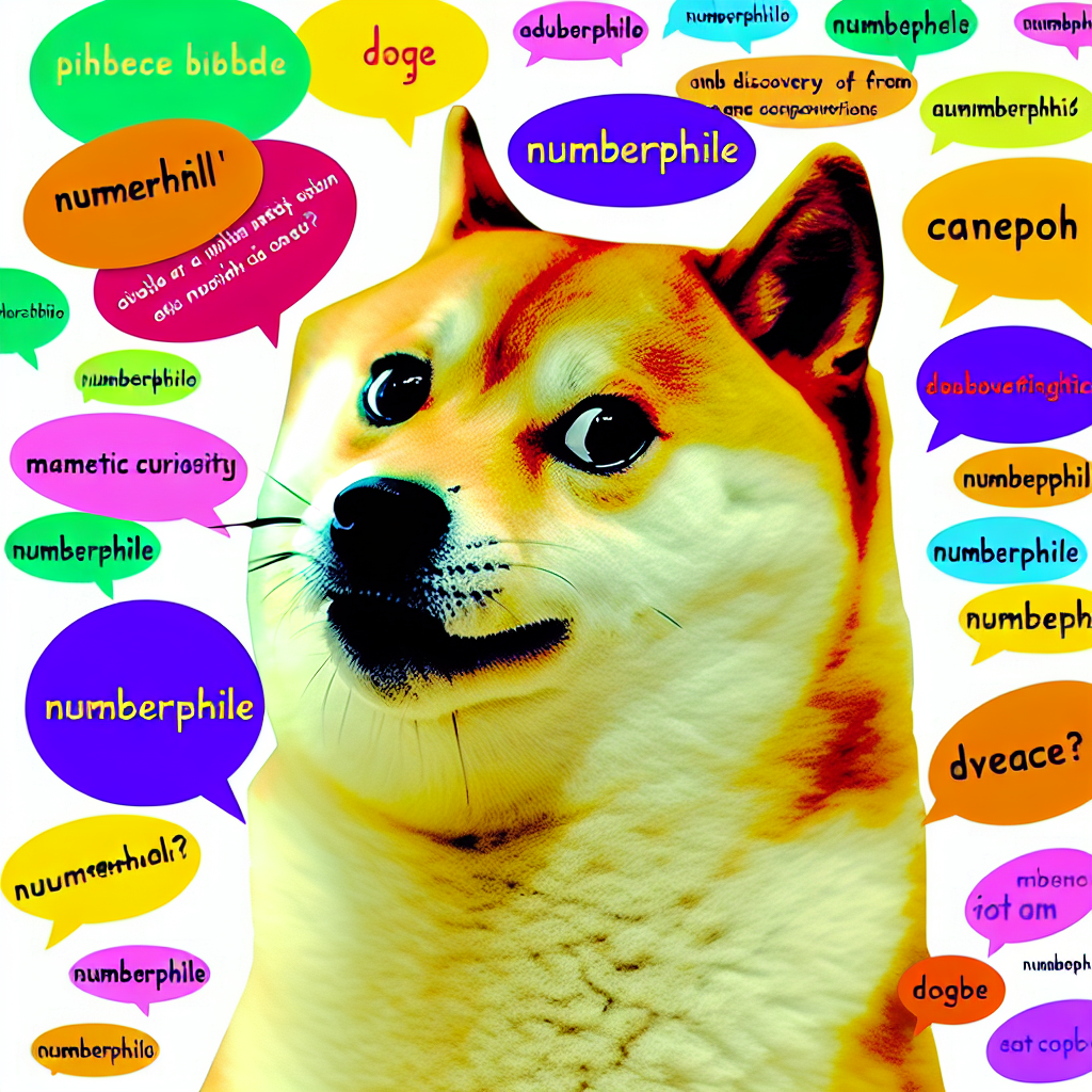
Pawsitively Trending: The Howl Relationship between 'Doge' Meme Popularity and 'Numberphile' Google Searches
As the 'doge' meme gained traction, more people became familiar with the concept of numbers, leading them to seek out entertaining and educational math content like Numberphile. The internet's love for 'doge' inadvertently unleashed a wave of numerical curiosity, proving once again that even a meme can't escape the fundamental laws of arithmetic. Remember, much math, so wow!

What else correlates?
Popularity of the 'doge' meme · all memes
Google searches for 'Numberphile' · all google searches
Popularity of the 'doge' meme · all memes
Google searches for 'Numberphile' · all google searches


View details about correlation #4,100
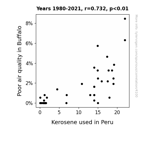
From Buffalo to Peru: Unraveling the Air-Pollution-Kerosene Conundrum
The decrease in air pollution in Buffalo led to a decrease in Buffalo wings consumption. This caused a reduced demand for kerosene for deep frying, ultimately leading to a decrease in kerosene used in Peru. Looks like the 'flap' over air pollution had a 'fowl' impact on kerosene usage in Peru! Just 'winging' it with this explanation!

What else correlates?
Air pollution in Buffalo · all weather
Kerosene used in Peru · all energy
Air pollution in Buffalo · all weather
Kerosene used in Peru · all energy
Why this works
- Data dredging: I have 25,237 variables in my database. I compare all these variables against each other to find ones that randomly match up. That's 636,906,169 correlation calculations! This is called “data dredging.”
Fun fact: the chart used on the wikipedia page to demonstrate data dredging is also from me. I've been being naughty with data since 2014.
Instead of starting with a hypothesis and testing it, I instead tossed a bunch of data in a blender to see what correlations would shake out. It’s a dangerous way to go about analysis, because any sufficiently large dataset will yield strong correlations completely at random. - Lack of causal connection: There is probably no direct connection between these variables, despite what the AI says above.
Because these pages are automatically generated, it's possible that the two variables you are viewing are in fact causually related. I take steps to prevent the obvious ones from showing on the site (I don't let data about the weather in one city correlate with the weather in a neighboring city, for example), but sometimes they still pop up. If they are related, cool! You found a loophole.
This is exacerbated by the fact that I used "Years" as the base variable. Lots of things happen in a year that are not related to each other! Most studies would use something like "one person" in stead of "one year" to be the "thing" studied. - Observations not independent: For many variables, sequential years are not independent of each other. You will often see trend-lines form. If a population of people is continuously doing something every day, there is no reason to think they would suddenly change how they are doing that thing on January 1. A naive p-value calculation does not take this into account.
You will calculate a lower chance of "randomly" achieving the result than represents reality.
To be more specific: p-value tests are probability values, where you are calculating the probability of achieving a result at least as extreme as you found completely by chance. When calculating a p-value, you need to assert how many "degrees of freedom" your variable has. I count each year (minus one) as a "degree of freedom," but this is misleading for continuous variables.
This kind of thing can creep up on you pretty easily when using p-values, which is why it's best to take it as "one of many" inputs that help you assess the results of your analysis.
- Y-axes doesn't start at zero: I truncated the Y-axes of the graphs above. I also used a line graph, which makes the visual connection stand out more than it deserves.
Nothing against line graphs. They are great at telling a story when you have linear data! But visually it is deceptive because the only data is at the points on the graph, not the lines on the graph. In between each point, the data could have been doing anything. Like going for a random walk by itself!
Mathematically what I showed is true, but it is intentionally misleading. If you click on any of the charts that abuse this, you can scroll down to see a version that starts at zero. - Confounding variable: Confounding variables (like global pandemics) will cause two variables to look connected when in fact a "sneaky third" variable is influencing both of them behind the scenes.
- Outliers: Some datasets here have outliers which drag up the correlation.
In concept, "outlier" just means "way different than the rest of your dataset." When calculating a correlation like this, they are particularly impactful because a single outlier can substantially increase your correlation.
Because this page is automatically generated, I don't know whether any of the charts displayed on it have outliers. I'm just a footnote. ¯\_(ツ)_/¯
I intentionally mishandeled outliers, which makes the correlation look extra strong. - Low n: There are not many data points included in some of these charts.
You can do analyses with low ns! But you shouldn't data dredge with a low n.
Even if the p-value is high, we should be suspicious of using so few datapoints in a correlation.
Pro-tip: click on any correlation to see:
- Detailed data sources
- Prompts for the AI-generated content
- Explanations of each of the calculations (correlation, p-value)
- Python code to calculate it yourself


