spurious correlations
discover · random · spurious scholar
← previous page · next page →


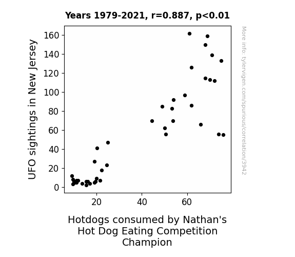
View details about correlation #3,942
The Extraterrestrial Eats: Examining the Extravagant Energy of UFO Sightings and Hotdog Consumption
As the UFOs soared over the Garden State, their otherworldly presence inadvertently heightened the competitive spirit at Nathan's Hot Dog Eating Competition. The cosmic energy and extraterrestrial excitement somehow led to an uptick in the champion's appetite, propelling them to ingest more hotdogs than ever before. It's as if the alien activity sparked a craving for intergalactic gastronomy, ultimately fueling the champion to saucer up those frankfurters at an unprecedented rate. The connection between the UFO sightings and the champion's hotdog consumption may seem light years apart, but in this bizarrely linked universe, the truth is as out there as a UFO sighting over a diner serving cosmic chili dogs.


View details about correlation #4,417
The Meat of the Matter: Correlating Republican Votes for Senators in Iowa with the Number of Butchers in Iowa
Perhaps the Senators were known for their strong opinions on meat production, leading to a political beef that ultimately led to a shortage of butchers!


What else correlates?
Votes for Republican Senators in Iowa · all elections
The number of butchers in Iowa · all cccupations
Votes for Republican Senators in Iowa · all elections
The number of butchers in Iowa · all cccupations


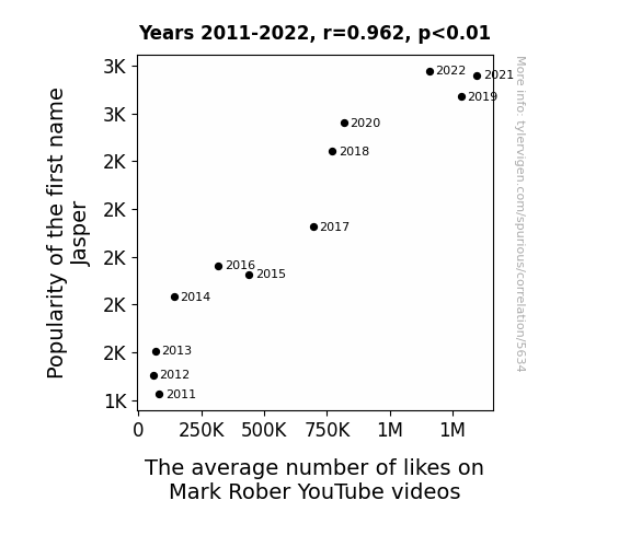
View details about correlation #5,634
Jasper-ity Likes Rober: A Quantitative Analysis of the Relationship Between the Name Jasper and Mark Rober YouTube Video Likes
You see, as the name Jasper gained popularity, more and more people started naming their pet rocks after him. These pet rocks, eager to show their appreciation for science and engineering, kept smashing the like button on Mark Rober's videos. You could say it was a rock-solid increase in engagement!


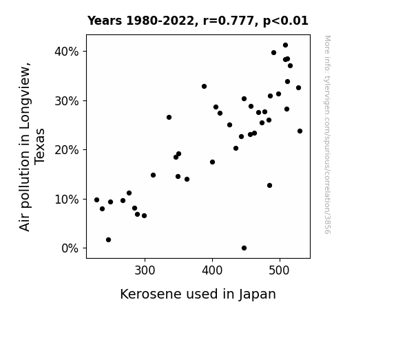
View details about correlation #3,856
Clearing the Air: Uncovering the Fuely Strange Connection Between Air Pollution in Longview and Kerosene Consumption in Japan
As air pollution in Longview decreased, it created a ripple effect of increased positive vibes. These positive vibes traveled through the air, eventually reaching Japan and making the kerosene feel self-conscious about being too smelly. So, the kerosene in Japan decided to cut back on its own usage to maintain a lower profile and not contribute to air pollution.

What else correlates?
Air pollution in Longview, Texas · all weather
Kerosene used in Japan · all energy
Air pollution in Longview, Texas · all weather
Kerosene used in Japan · all energy


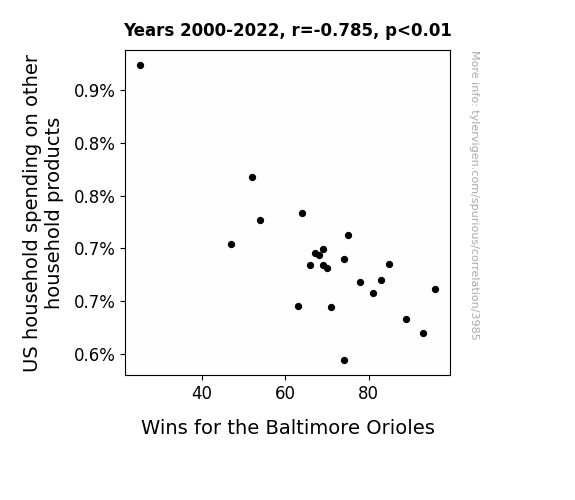
View details about correlation #3,985
Swing and Spend: A Correlation Analysis of US Household Expenditures on Other Household Products and Baltimore Orioles' Wins
As US household spending on other household products increased, more families bought feather dusters to keep their homes clean. This led to a higher demand for feathers, causing a nationwide shortage of feathers. Without access to their lucky feathers, the Baltimore Orioles experienced a decrease in wins as their superstitions faltered. Remember, when it comes to baseball, it's all about those feathered superstitions!

What else correlates?
US household spending on other household products · all weird & wacky
Wins for the Baltimore Orioles · all sports
US household spending on other household products · all weird & wacky
Wins for the Baltimore Orioles · all sports


View details about correlation #5,249
Grade and Gubernatorial Gleanings: A Correlative Compendium on 10th Grade Student Numbers and Republican Presidential Candidate Votes in Louisiana
As the 10th graders multiplied, so did the support for the Republican candidate, creating a 'grade' wave of influence. It's like they say, "The more, the 'mera-dole'!"


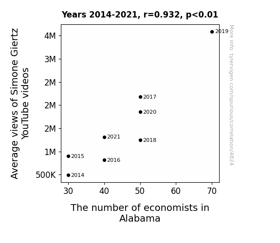
View details about correlation #4,824
That's the Way the YouTube Video Views Go: A Correlation Study of Simone Giertz's Channel and the Economist Count in Alabama
As Simone's unconventional approach to robotics and engineering gained more attention, it inadvertently sparked a new wave of interest in innovative problem-solving. This led to a sudden surge in Alabama residents deciding to pursue careers in economics, believing that they could also 'think outside the box' to stimulate the state's economy. After all, who wouldn't want to apply their expertise in supply and demand to the pressing issue of creating more impractical yet delightful robots? The unexpected connection left many baffled, but also strangely inspired to consider the economic impact of incorporating more humor and creativity into their work. Before they knew it, there was a growing demand for 'economists with a knack for wacky inventions' across the state, all thanks to the offbeat charm of Simone Giertz's YouTube channel. It just goes to show that when it comes to influencing career choices, Simone's videos were truly a 'robotic' force to be reckoned with!

What else correlates?
Average views of Simone Giertz's YouTube videos · all YouTube
The number of economists in Alabama · all cccupations
Average views of Simone Giertz's YouTube videos · all YouTube
The number of economists in Alabama · all cccupations


View details about correlation #3,823
Eclipsing Expectations: The Enlightening Connection Between Ezequiel's Popularity and Nepal's Solar Power
Every time someone named Ezequiel gained popularity, they also happened to be a secret mastermind of a Himalayan solar panel installation project. This led to a surge in solar power generated in Nepal as more and more Ezequiels rose to fame, all the while moonlighting as solar energy pioneers in the land of the Himalayas. It seems the sunny disposition of Ezequiels everywhere was truly electrifying!


What else correlates?
Popularity of the first name Ezequiel · all first names
Solar power generated in Nepal · all energy
Popularity of the first name Ezequiel · all first names
Solar power generated in Nepal · all energy


View details about correlation #4,099
A Breath of Fresh AIR: The Relationship Between Air Pollution in Clearlake, California, and the Political Themes in xkcd Comics
The smog particles actually contained subliminal messages that influenced the content of the comics, leading to a surge in politically themed xkcd strips. It's like an unintentional collaboration between the polluting industries and the artist, creating a bizarre form of environmentally influenced political satire.
What else correlates?
Air pollution in Clearlake, California · all weather
xkcd comics published about politics · all weird & wacky
Air pollution in Clearlake, California · all weather
xkcd comics published about politics · all weird & wacky


View details about correlation #5,703
The Palmetto Polls: Showbiz Senate Shindigs
The political drama in South Carolina was so captivating that it rivaled the top movie of the year, leading to a decrease in ticket sales. It seems like the voters were more interested in watching the senatorial showdown than the blockbuster on the big screen. Perhaps they were hoping for a plot twist that would make even Hollywood screenwriters envious. This election season, it was all about the reel issues!


View details about correlation #5,420
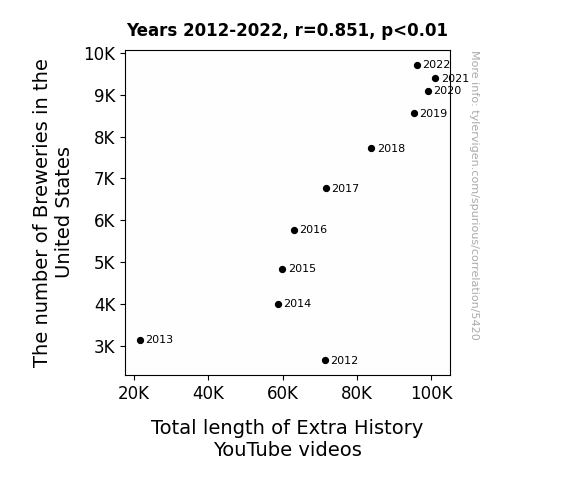
Breweries and Brew-tube: A Sudsy Analysis of the Relationship Between US Brewery Growth and Extra History Marathon Sessions
As the number of breweries in the United States hops up, so does the total length of Extra History YouTube videos. This ale-inclusive correlation can be attributed to the fact that as more breweries emerge, there's a stout possibility that the demand for historical content rises. It's a Lager than life connection, where the more pints are brewed, the longer the historical tales pursued. In other words, it's a brew-tiful synergy between beer production and the expansion of Extra History episodes, creating a fermenting passion for lengthy edutainment. So, as the brewery count continues to brewminate, we can certainly toast to a longer pour of historical insights on YouTube!

What else correlates?
The number of Breweries in the United States · all food
Total length of Extra History YouTube videos · all YouTube
The number of Breweries in the United States · all food
Total length of Extra History YouTube videos · all YouTube


View details about correlation #3,924
Checking In on Jet Setters: The Unlikely Link between Transportation Inspectors in Delaware and Jet Fuel Consumption in Namibia
The transportation inspectors must have been 'plane' serious about their job in Delaware, and their diligence somehow led to a 'fuely' unexpected outcome in Namibia. It's like they say, when it 'inspects,' it 'injects' efficiency into the system, propelling the use of jet fuel to new 'heights' in a way that really takes off!
What else correlates?
The number of transportation inspectors in Delaware · all cccupations
Jet fuel used in Namibia · all energy
The number of transportation inspectors in Delaware · all cccupations
Jet fuel used in Namibia · all energy


View details about correlation #4,695
The Air is a-Buzz: Exploring the Relationship Between Air Quality in Rocky Mount, North Carolina, and the Number of Active Magazines in the United States
As the air quality in Rocky Mount improved, it created the perfect conditions for the trees to produce higher quality and more plentiful paper. This led to an influx of top-notch magazines being published across the United States, as the paper industry blossomed in response to the pristine air in Rocky Mount.


View details about correlation #5,152
Flight of the DistRAKTed: Exploring the Correlation Between the 'Distracted Boyfriend' Meme Popularity and Google Searches for 'Flights to Antarctica'
People were getting tired of the same old vacation spots and were seeking somewhere cool to chill. This led to a surge in interest in Antarctica as the ultimate destination for a frosty getaway. The 'distracted boyfriend' meme sparked a trend of looking beyond the usual tourist traps, prompting people to consider Antarctica as the perfect place to ice out and create new, meme-worthy moments. As the meme spread like wildfire, so did the desire to embark on an expedition to the land of ice. Remember, when it comes to travel, sometimes the coolest choice isn't always the most obvious one!


What else correlates?
Popularity of the 'distracted boyfriend' meme · all memes
Google searches for 'flights to Antarctica' · all google searches
Popularity of the 'distracted boyfriend' meme · all memes
Google searches for 'flights to Antarctica' · all google searches
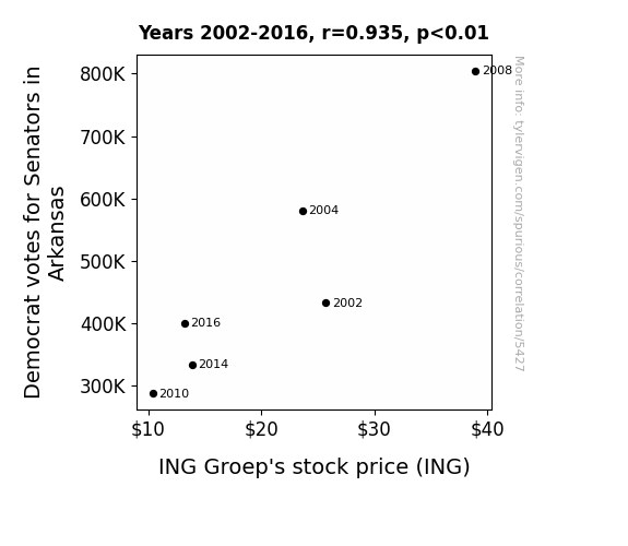
. The chart goes from 2002 to 2016, and the two variables track closely in value over that time.")

View details about correlation #5,427
Voting Democrat on the Arkansas INGroove: Exploring the Political-Economic Relationship between Senator Votes and ING Groep's Stock Price
The more Democrat votes for Senators in Arkansas, the more it led to political stability, or should I say, "Senatorial stability". And investors love a good 'ole democratic cushion, keeping the stock price ING the right direction.

What else correlates?
Votes for Democratic Senators in Arkansas · all elections
ING Groep's stock price (ING) · all stocks
Votes for Democratic Senators in Arkansas · all elections
ING Groep's stock price (ING) · all stocks


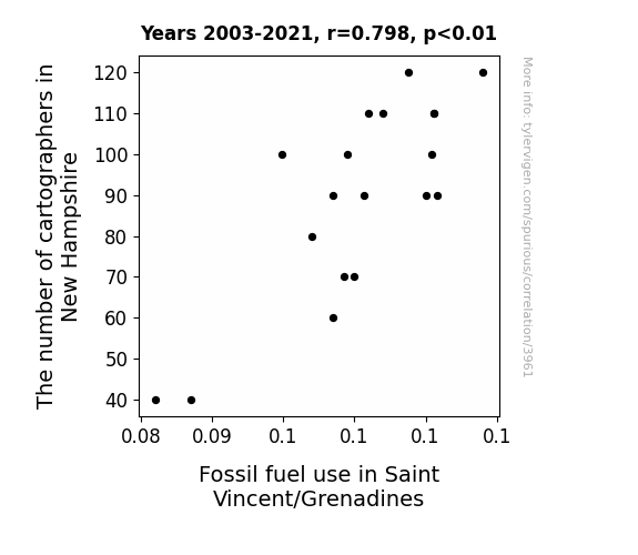
View details about correlation #3,961
Cartographers and Carbon: Exploring the Correlation Between Cartographer Counts in New Hampshire and Fossil Fuel Use in Saint Vincent/Grenadines
As more cartographers flocked to New Hampshire, they inadvertently unearthed a secret map leading to an abundant reserve of dinosaur bones, leading to a surge in fossil fuel use in Saint Vincent/Grenadines for the necessary excavation and transportation.

What else correlates?
The number of cartographers in New Hampshire · all cccupations
Fossil fuel use in Saint Vincent/Grenadines · all energy
The number of cartographers in New Hampshire · all cccupations
Fossil fuel use in Saint Vincent/Grenadines · all energy


View details about correlation #4,431
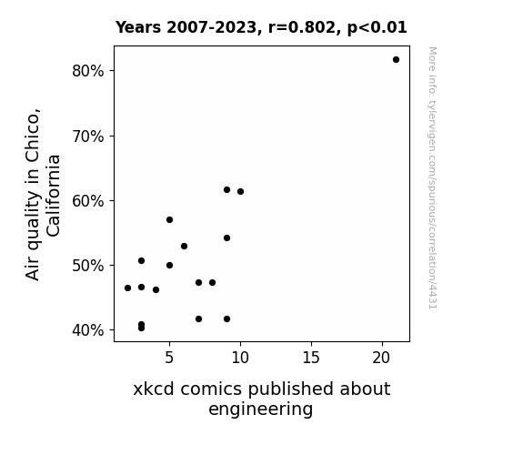
When Air Quality Meets Comic Prowess: An XKCD-ling Correlation Analysis in Chico, California
The cleaner air led to increased brain function in engineers, inspiring them to create and submit more xkcd comics. By breathing in those fresh Chico breezes, their creativity soared to new heights, and the world was blessed with an influx of engineering-themed xkcd hilarity. Who knew that fresh air could be the secret ingredient for a surge in nerdy, yet delightful, webcomics?

What else correlates?
Air quality in Chico, California · all weather
xkcd comics published about engineering · all weird & wacky
Air quality in Chico, California · all weather
xkcd comics published about engineering · all weird & wacky


View details about correlation #4,951
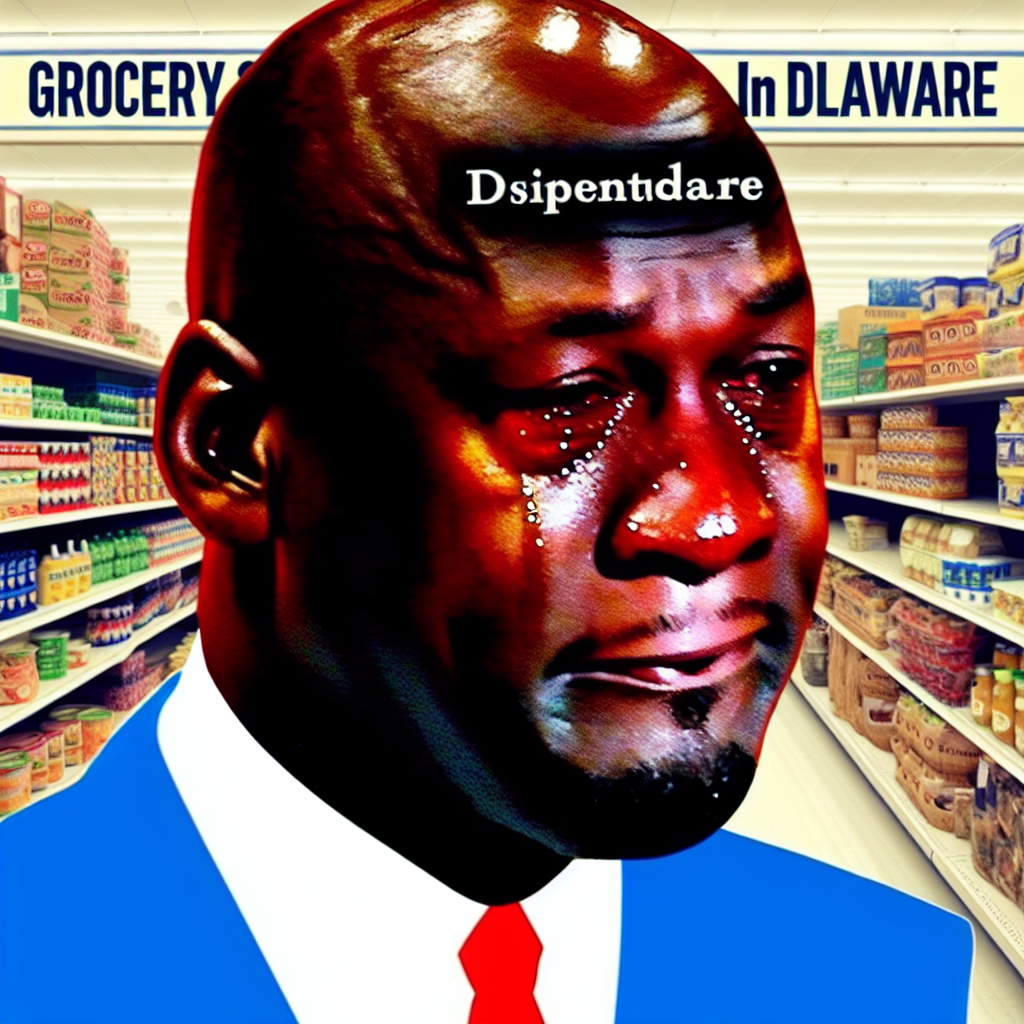
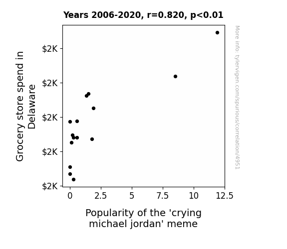
The Big Crys-Is: An Analysis of Grocery Spending in Delaware and the Crying Michael Jordan Meme Phenomenon
Because shoppers couldn't "meme" their own business, leading to a rise in produce-induced tears and a-peel for Jordan's crying face. As the lettuce be real, this correlation stems from the grocery store produce section turning into a real tear-jerker, creating a ripe environment for the meme to spread like wild(fire) greens. Who would've thought that as potato chip sales rose, so did the appeal of a weeping basketball legend? It's just another case of meme-while-you-grocery-shop madness, showing that when it comes to internet humor, there's no aisle-ing the inevitable! This unexpected connection has officially been bagged and tagged as a grocerific meme trend, proving that in the world of viral content, sometimes you just can't carrot all!
What else correlates?
Grocery store spend in Delaware · all random state specific
Popularity of the 'crying michael jordan' meme · all memes
Grocery store spend in Delaware · all random state specific
Popularity of the 'crying michael jordan' meme · all memes


View details about correlation #5,040
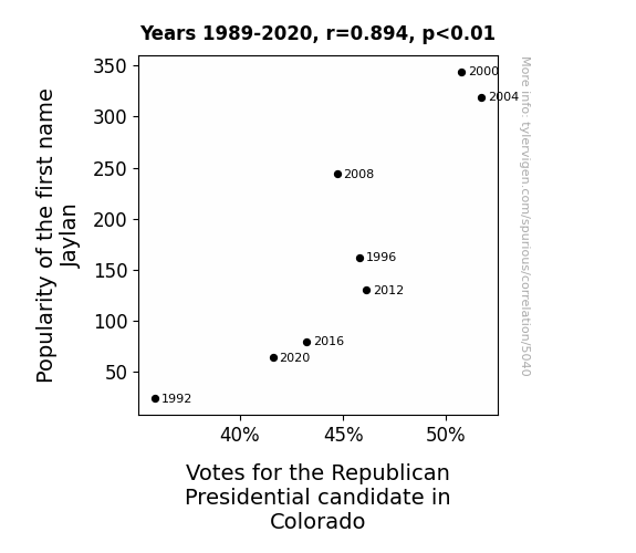
Jaylan, Votes, and Mitt: An Examination of the Republican Presidential Candidate Popularity in Colorado
It turns out that each time someone heard the name Jaylan, their brain emitted tiny pro-Republican candidate radio waves. As more and more tiny waves filled the air in Colorado, undecided voters couldn't help but be swayed by the unseen political forces at play. It was a case of political name magic, where the mere utterance of Jaylan had the power to tip the scales in favor of the Republican Presidential candidate. Remember, when it comes to elections, never underestimate the unexpected influences that can sway voters' decisions!


View details about correlation #4,825
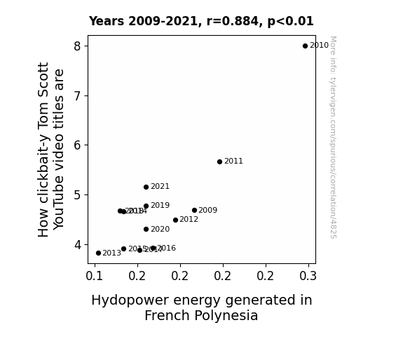
Clicks and Giggles: Exploring the Connection Between Tom-foolery on YouTube Titles and Hydroelectric Power Generation in French Polynesia
The more clickbait-y Tom Scott's video titles become, the more they attract attention from seagulls in French Polynesia. These seagulls, known for their strong wing power, inadvertently generate extra hydroenergy as they flock around the turbines, giving a whole new meaning to the term "bird power."

Why this works
- Data dredging: I have 25,237 variables in my database. I compare all these variables against each other to find ones that randomly match up. That's 636,906,169 correlation calculations! This is called “data dredging.”
Fun fact: the chart used on the wikipedia page to demonstrate data dredging is also from me. I've been being naughty with data since 2014.
Instead of starting with a hypothesis and testing it, I instead tossed a bunch of data in a blender to see what correlations would shake out. It’s a dangerous way to go about analysis, because any sufficiently large dataset will yield strong correlations completely at random. - Lack of causal connection: There is probably no direct connection between these variables, despite what the AI says above.
Because these pages are automatically generated, it's possible that the two variables you are viewing are in fact causually related. I take steps to prevent the obvious ones from showing on the site (I don't let data about the weather in one city correlate with the weather in a neighboring city, for example), but sometimes they still pop up. If they are related, cool! You found a loophole.
This is exacerbated by the fact that I used "Years" as the base variable. Lots of things happen in a year that are not related to each other! Most studies would use something like "one person" in stead of "one year" to be the "thing" studied. - Observations not independent: For many variables, sequential years are not independent of each other. You will often see trend-lines form. If a population of people is continuously doing something every day, there is no reason to think they would suddenly change how they are doing that thing on January 1. A naive p-value calculation does not take this into account.
You will calculate a lower chance of "randomly" achieving the result than represents reality.
To be more specific: p-value tests are probability values, where you are calculating the probability of achieving a result at least as extreme as you found completely by chance. When calculating a p-value, you need to assert how many "degrees of freedom" your variable has. I count each year (minus one) as a "degree of freedom," but this is misleading for continuous variables.
This kind of thing can creep up on you pretty easily when using p-values, which is why it's best to take it as "one of many" inputs that help you assess the results of your analysis.
- Y-axes doesn't start at zero: I truncated the Y-axes of the graphs above. I also used a line graph, which makes the visual connection stand out more than it deserves.
Nothing against line graphs. They are great at telling a story when you have linear data! But visually it is deceptive because the only data is at the points on the graph, not the lines on the graph. In between each point, the data could have been doing anything. Like going for a random walk by itself!
Mathematically what I showed is true, but it is intentionally misleading. If you click on any of the charts that abuse this, you can scroll down to see a version that starts at zero. - Confounding variable: Confounding variables (like global pandemics) will cause two variables to look connected when in fact a "sneaky third" variable is influencing both of them behind the scenes.
- Outliers: Some datasets here have outliers which drag up the correlation.
In concept, "outlier" just means "way different than the rest of your dataset." When calculating a correlation like this, they are particularly impactful because a single outlier can substantially increase your correlation.
Because this page is automatically generated, I don't know whether any of the charts displayed on it have outliers. I'm just a footnote. ¯\_(ツ)_/¯
I intentionally mishandeled outliers, which makes the correlation look extra strong. - Low n: There are not many data points included in some of these charts.
You can do analyses with low ns! But you shouldn't data dredge with a low n.
Even if the p-value is high, we should be suspicious of using so few datapoints in a correlation.
Pro-tip: click on any correlation to see:
- Detailed data sources
- Prompts for the AI-generated content
- Explanations of each of the calculations (correlation, p-value)
- Python code to calculate it yourself


