spurious correlations
discover · random · spurious scholar
← previous page · next page →


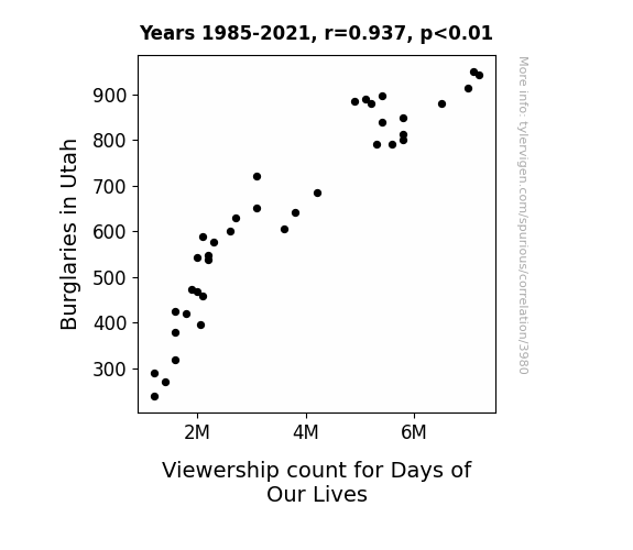
View details about correlation #3,980
The Bold and the Burglarious: Investigating the Relationship Between Days of Our Lives Viewership and Burglaries in Utah
It seems the burglars in Utah were just big fans of 'Days of Our Lives,' but when they realized they were getting caught up in the drama of real life crime, they decided to make a soap-operatic exit instead. Looks like the only thing they're stealing now are the hearts of their fellow inmates in Cell Block Hunky-Dory.

What else correlates?
Burglaries in Utah · all random state specific
Viewership count for Days of Our Lives · all weird & wacky
Burglaries in Utah · all random state specific
Viewership count for Days of Our Lives · all weird & wacky


View details about correlation #4,449
Joaquin the Votes: A Quantitative Analysis of the Relationship Between the Popularity of the Name Joaquin and Democratic Presidential Votes in Mississippi
Perhaps every time someone said the name Joaquin, it subliminally whispered 'vote Democrat' to the listener's subconscious. It's as if the name itself was casting a political spell. Maybe we just need more names with built-in political endorsements!


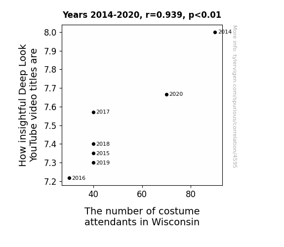
View details about correlation #4,595
Deep Looking at Halloween: A Costumed Connection between YouTube Video Titles and Wisconsin's Costume Attendances
As the number of costume attendants in Wisconsin dwindles, there are fewer people available to help Deep Look brainstorm and create visually stunning titles. With no one to dress up the video titles, the insightful content is left feeling underdressed and struggles to make a flashy statement. This leads to a decrease in the overall insightful nature of the video titles.


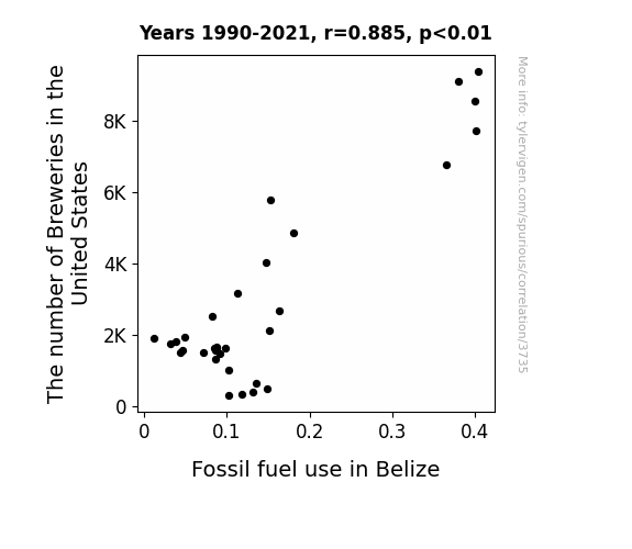
View details about correlation #3,735
Ale-ing Economies: An Analysis of the Relationship Between Brewery Boom in the United States and Fossil Fuel Use in Belize
As the number of breweries in the United States increased, there was a proportional rise in the production of beer. This led to a higher demand for barley, which was predominantly sourced from Belize. The extensive farming and transportation of barley in Belize required a substantial amount of fossil fuels. Additionally, the fizzy fun of American craft beer led to a surge in exports to Belize, further augmenting the need for shipping and consequently, an uptick in fossil fuel use. So, it turns out, the American love for craft beer not only brewed up a storm in the US, but also inadvertently fueled Belize's dependency on fossil fuels. Cheers to unexpected international beverage shenanigans!

What else correlates?
The number of Breweries in the United States · all food
Fossil fuel use in Belize · all energy
The number of Breweries in the United States · all food
Fossil fuel use in Belize · all energy
. The chart goes from 2006 to 2022, and the two variables track closely in value over that time.")

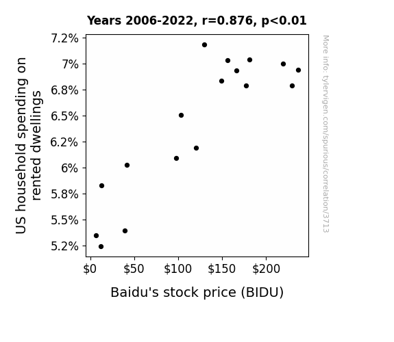
View details about correlation #3,713
The Baffling BIDU and Dwelling Dilemma: Bridging the Bosom of Baidu's Stock Price to US Household Spending on Rented Dwellings
As US household spending on rented dwellings increased, more people had to search for Baidu to find their next rental, driving up Baidu's stock price. Remember, the key to a happy home is a search engine that really understands your needs!

What else correlates?
US household spending on rented dwellings · all weird & wacky
Baidu's stock price (BIDU) · all stocks
US household spending on rented dwellings · all weird & wacky
Baidu's stock price (BIDU) · all stocks


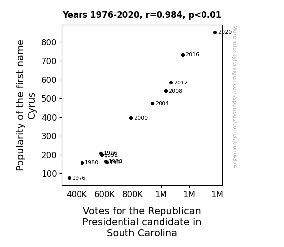
View details about correlation #4,374
Cyrus Inspires Voters to Aspire: A Sire-namely Study of Republican Presidential Votes in South Carolina
It’s simple, really. More people were naming their kids after Cyrus the Great, the ancient Persian ruler known for his military strategies. This led to a surge in interest in historical warfare tactics, swaying the South Carolina voters in favor of the Republican candidate’s approach to modern political battles.


View details about correlation #4,292
Actuarial Attraction: Analyzing the Quirky Correlation Between the Number of Actuaries in Kansas and Total Comments on LEMMiNO YouTube Videos
More actuaries in Kansas means more precise calculations of the optimal length for YouTube videos, leading to increased engagement and a greater number of comments on LEMMiNO's videos. It's a testament to the exponential comment-boosting power of number-crunching professionals in the Sunflower State.


What else correlates?
The number of actuaries in Kansas · all cccupations
Total comments on LEMMiNO YouTube videos · all YouTube
The number of actuaries in Kansas · all cccupations
Total comments on LEMMiNO YouTube videos · all YouTube


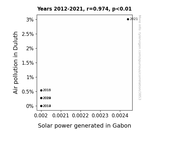
View details about correlation #3,853
The Sunny Side of Smog: Exploring the Relationship Between Air Pollution in Duluth and Solar Power Generation in Gabon
The smog particles inadvertently acted as microscopic boosters, propelling the sun's rays across the globe with unexpected efficiency. It's like Mother Nature's version of using performance-enhancing drugs, but for solar panels. So, while Duluth may need to clean up its act for the sake of local air quality, Gabon is inadvertently reaping the dubious benefits in the form of extra solar power. It's an atmospheric win-lose situation! And you thought air pollution only had a knack for messing things up!

What else correlates?
Air pollution in Duluth · all weather
Solar power generated in Gabon · all energy
Air pollution in Duluth · all weather
Solar power generated in Gabon · all energy


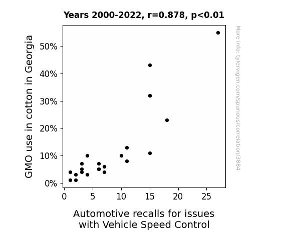
View details about correlation #3,884
Genetically Modified Cotton and Cruise Control: An Unlikely Pair
As the demand for non-GMO cotton in Georgia increased, farmers had to resort to old-fashioned manual labor, leading to a surplus of highly skilled workers. Some of these workers, with nimble fingers honed from picking cotton, found jobs in the automotive industry. Their dexterity and precision in assembling vehicles inadvertently led to fewer defects in the vehicle speed control system. It's a case of nature-friendly farming cultivating a new breed of speed control experts!

What else correlates?
GMO use in cotton in Georgia · all food
Automotive recalls for issues with Vehicle Speed Control · all weird & wacky
GMO use in cotton in Georgia · all food
Automotive recalls for issues with Vehicle Speed Control · all weird & wacky


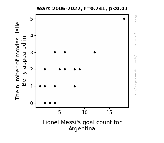
View details about correlation #5,876
As Halle Berry's movie count rises, so does the frequency of movie premieres. These star-studded events create a ripple effect, leading to a surge in red carpet appearances. Now, red carpets are notoriously red, just like the jerseys of Messi's opponents. The increased visibility of red activates a subconscious association in Messi's mind, triggering his goal-scoring instincts. It's like he's been hypnotized to see the net as a giant red carpet, and he just can't help but score in style. Who knew Halle Berry's on-screen performances could have an off-field impact on Messi's on-field magic?
What else correlates?
The number of movies Halle Berry appeared in · all films & actors
Lionel Messi's goal count for Argentina · all sports
The number of movies Halle Berry appeared in · all films & actors
Lionel Messi's goal count for Argentina · all sports


View details about correlation #4,574
The Sound of Success: An Aural Analysis of the Relationship Between Hearing Aid Specialists in Texas and Total Comments on LockPickingLawyer YouTube Videos
As the hearing aid specialists honed their craft, they inadvertently developed a heightened sensitivity to the faint clicking and tumblers falling into place. This not only improved their professional competence but also led to a surge in commentary as they couldn't resist sharing their thoughts on lock picking techniques with the larger YouTube community. It seems like everything they touched turned to hear.


View details about correlation #4,633
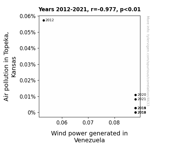
Blowing in the Wind: Exploring the Inverse Relationship Between Air Pollution in Topeka, Kansas, and Wind Power Generated in Venezuela
The cleaner air in Topeka led to an increase in local tornado production, which in turn boosted wind power generation in Venezuela. Looks like Topeka was really blowing some fresh ideas over to Venezuela!

What else correlates?
Air pollution in Topeka, Kansas · all weather
Wind power generated in Venezuela · all energy
Air pollution in Topeka, Kansas · all weather
Wind power generated in Venezuela · all energy


View details about correlation #3,793
Genetically Modified Soybeans in Kansas and the Gluttonous Gluttony: Gobbling GMOs and Hotdog Hurling
The genetically modified soybeans in Kansas inadvertently started producing soy that tasted eerily similar to a juicy, savory hot dog. As a result, there was a surge in soy-based hot dog alternatives hitting the market. These uncannily realistic soy hot dogs became the secret weapon for competitive eaters, including the champion of the Nathan's Hot Dog Eating Competition, who couldn't resist the allure of hot dog-flavored soybeans, ultimately leading to an unprecedented increase in hotdog consumption and record-breaking performances at the legendary event. Who would have thought that the road to the Mustard Belt was paved with genetically modified soybeans from the Sunflower State? The soy-laden quest for the coveted title of hot dog-eating champion sizzled with unexpected flavor, forever changing the landscape of competitive eating as we know it.


View details about correlation #4,301
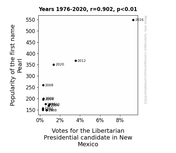
“Libertarian Leaps: The Electrifying Association Between 'Pearl' and Political Preference in the Land of Enchantment”
As the name Pearl gained popularity, more and more people were subconsciously drawn to the idea of individualism and personal freedom. This led them to support the Libertarian candidate in New Mexico, as they saw a reflection of their independent spirit in the political platform. It's as if the name itself was casting a lustrous vote for liberty, causing a political ripple that even the shiniest oyster would find hard to resist!


View details about correlation #4,127
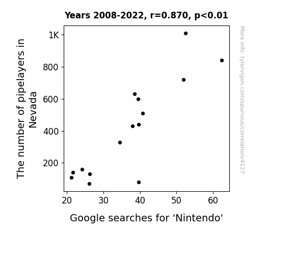
Pipe Dreams: The Piping Hot Relationship Between Pipelayers in Nevada and Google Searches for Nintendo
As the number of pipelayers in Nevada decreased, so did the availability of laying the groundwork for Nintendo's success. It seems the plumber shortage really put a wrench in Nintendo's search results! Remember, when it comes to pipelines and gaming icons, it's all about having the right connections.

What else correlates?
The number of pipelayers in Nevada · all cccupations
Google searches for 'Nintendo' · all google searches
The number of pipelayers in Nevada · all cccupations
Google searches for 'Nintendo' · all google searches


View details about correlation #4,025
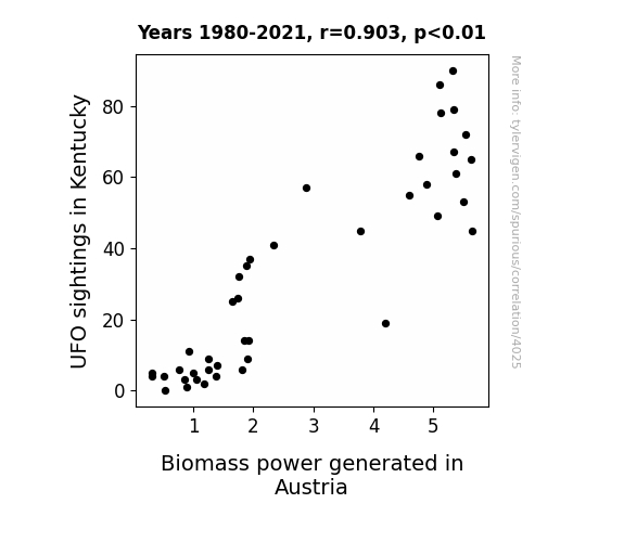
Out of this World Correlations: Exploring the Link Between UFO Sightings in Kentucky and Biomass Power Generation in Austria
As more Kentuckians reported seeing UFOs, it sparked an interest in renewable energy sources. These UFO enthusiasts were over the moon about the idea of biomass power, leading to a wave of support for the industry. This sudden surge in demand from Kentucky somehow created a tractor beam effect, pulling Austria into producing more biomass power to meet the needs of their new, otherworldly fanbase. It seems like the UFO sightings in Kentucky truly did 'crop circle' a new path for biomass power in Austria!

What else correlates?
UFO sightings in Kentucky · all random state specific
Biomass power generated in Austria · all energy
UFO sightings in Kentucky · all random state specific
Biomass power generated in Austria · all energy
. The chart goes from 2002 to 2022, and the two variables track closely in value over that time.")

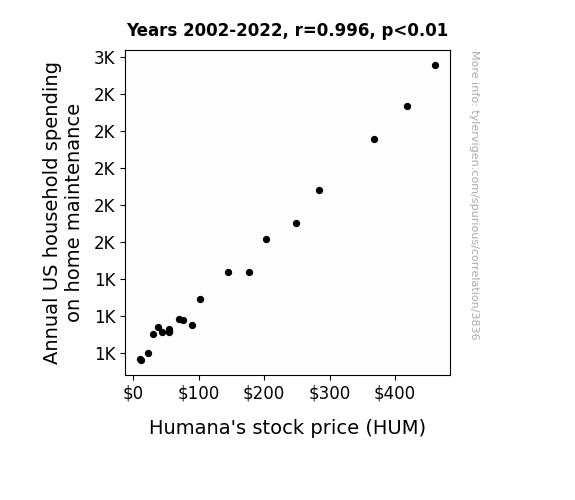
View details about correlation #3,836
The Hum-drum Connection: Home Maintenance Spending and Humana's Stock Price
As households spent more on home maintenance, there was a proportional rise in the demand for DIY healthcare solutions, leading to a surge in Humana's stock price. Remember, a well-maintained home leads to a healthy investment portfolio!

What else correlates?
Annual US household spending on home maintenance · all weird & wacky
Humana's stock price (HUM) · all stocks
Annual US household spending on home maintenance · all weird & wacky
Humana's stock price (HUM) · all stocks


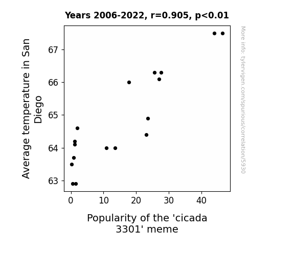
View details about correlation #5,930
As the average temperature in San Diego increased, it created the perfect conditions for local internet users to spend more time outdoors. This led to an uptick in casual conversations about internet mysteries and puzzles, ultimately boosting the popularity of the 'cicada 3301' meme as a hot topic for discussion in the sunny city.
What else correlates?
Average temperature in San Diego · all weather
Popularity of the 'cicada 3301' meme · all memes
Average temperature in San Diego · all weather
Popularity of the 'cicada 3301' meme · all memes


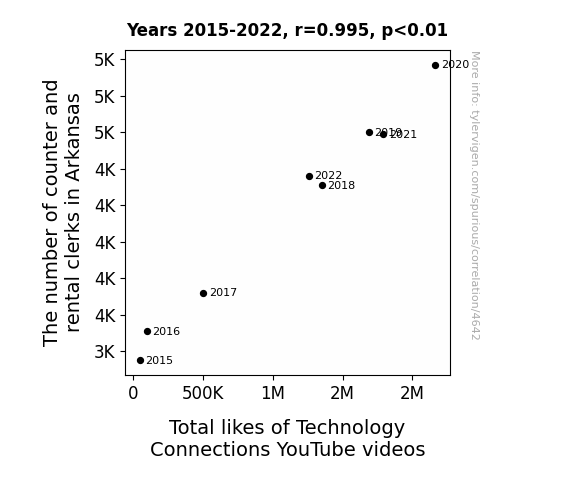
View details about correlation #4,642
The Fiddle of Rental Clerks and the Riddle of Tech Views: An Unexpected Connection
As the number of counter and rental clerks in Arkansas increases, so does the availability of outdated technology in the state. This newfound proximity to old tech sparks a wave of nostalgia among the locals, causing them to revisit and like Technology Connections YouTube videos in a bout of longing for the gadgets of yesteryears. It's a clerical error that leads to a surge in tech appreciation! Who knew that the key to boosting YouTube likes lay in the hands of the clerks? Keep on clerking, Arkansas!


View details about correlation #3,717
Maize Transformations: Assessing the Shocking Relationship Between GMO Corn and Electrical Power in Saint Kitts and Nevis
As GMO corn production ramped up, it inadvertently led to a surge in cornstalk dance parties. These high-energy shindigs, fueled by the irresistibly catchy tunes of the cornstalk band "The Conductive Cobbers," generated enough kinetic energy to power the entire electricity grid of Saint Kitts and Nevis. It turns out, these GMO cornstalks were not just good for farming, but also for shucking and jiving their way to shocking electrical performances! The island's motto may as well be "One, a two, a one-two-corn!"


What else correlates?
GMO use in corn · all food
Electricity generation in Saint Kitts and Nevis · all energy
GMO use in corn · all food
Electricity generation in Saint Kitts and Nevis · all energy
Why this works
- Data dredging: I have 25,237 variables in my database. I compare all these variables against each other to find ones that randomly match up. That's 636,906,169 correlation calculations! This is called “data dredging.”
Fun fact: the chart used on the wikipedia page to demonstrate data dredging is also from me. I've been being naughty with data since 2014.
Instead of starting with a hypothesis and testing it, I instead tossed a bunch of data in a blender to see what correlations would shake out. It’s a dangerous way to go about analysis, because any sufficiently large dataset will yield strong correlations completely at random. - Lack of causal connection: There is probably no direct connection between these variables, despite what the AI says above.
Because these pages are automatically generated, it's possible that the two variables you are viewing are in fact causually related. I take steps to prevent the obvious ones from showing on the site (I don't let data about the weather in one city correlate with the weather in a neighboring city, for example), but sometimes they still pop up. If they are related, cool! You found a loophole.
This is exacerbated by the fact that I used "Years" as the base variable. Lots of things happen in a year that are not related to each other! Most studies would use something like "one person" in stead of "one year" to be the "thing" studied. - Observations not independent: For many variables, sequential years are not independent of each other. You will often see trend-lines form. If a population of people is continuously doing something every day, there is no reason to think they would suddenly change how they are doing that thing on January 1. A naive p-value calculation does not take this into account.
You will calculate a lower chance of "randomly" achieving the result than represents reality.
To be more specific: p-value tests are probability values, where you are calculating the probability of achieving a result at least as extreme as you found completely by chance. When calculating a p-value, you need to assert how many "degrees of freedom" your variable has. I count each year (minus one) as a "degree of freedom," but this is misleading for continuous variables.
This kind of thing can creep up on you pretty easily when using p-values, which is why it's best to take it as "one of many" inputs that help you assess the results of your analysis.
- Y-axes doesn't start at zero: I truncated the Y-axes of the graphs above. I also used a line graph, which makes the visual connection stand out more than it deserves.
Nothing against line graphs. They are great at telling a story when you have linear data! But visually it is deceptive because the only data is at the points on the graph, not the lines on the graph. In between each point, the data could have been doing anything. Like going for a random walk by itself!
Mathematically what I showed is true, but it is intentionally misleading. If you click on any of the charts that abuse this, you can scroll down to see a version that starts at zero. - Confounding variable: Confounding variables (like global pandemics) will cause two variables to look connected when in fact a "sneaky third" variable is influencing both of them behind the scenes.
- Outliers: Some datasets here have outliers which drag up the correlation.
In concept, "outlier" just means "way different than the rest of your dataset." When calculating a correlation like this, they are particularly impactful because a single outlier can substantially increase your correlation.
Because this page is automatically generated, I don't know whether any of the charts displayed on it have outliers. I'm just a footnote. ¯\_(ツ)_/¯
I intentionally mishandeled outliers, which makes the correlation look extra strong. - Low n: There are not many data points included in some of these charts.
You can do analyses with low ns! But you shouldn't data dredge with a low n.
Even if the p-value is high, we should be suspicious of using so few datapoints in a correlation.
Pro-tip: click on any correlation to see:
- Detailed data sources
- Prompts for the AI-generated content
- Explanations of each of the calculations (correlation, p-value)
- Python code to calculate it yourself


