spurious correlations
discover · random · spurious scholar
← previous page · next page →


View details about correlation #4,304
All in Jest? Senatorial Votes in East and Nathan's Hot Dog Feasts
As Republican votes for Senators in Alabama increased, it led to a rise in support for local businesses, including the beef industry. This ultimately resulted in more resources and promotion for Nathan's Famous, encouraging people to relish in their hot dogs. It seems like in this case, "voting red" really did mean a "wiener winner" for the hot dog eating competition!


. The chart goes from 2002 to 2022, and the two variables track closely in value over that time.")

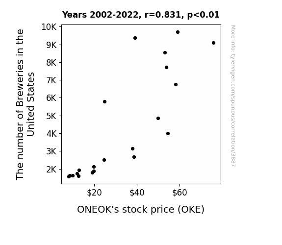
View details about correlation #3,887
A Brew and OKE Link: The Sync of Beer and Stock
As the number of breweries in the United States increased, so did the demand for natural gas to power their brewing and bottling operations. This boosted ONEOK's stock price as they are a major player in the natural gas industry, proving that a rising craft beer tide lifts all stock prices - cheers to that!

What else correlates?
The number of Breweries in the United States · all food
ONEOK's stock price (OKE) · all stocks
The number of Breweries in the United States · all food
ONEOK's stock price (OKE) · all stocks


View details about correlation #4,816
The Perplexing Pondering of Polluted Post: A Punny Probe into the Relationship Between Air Pollution in El Paso and the Population of Postal Service Machine Operators in Texas
As the air quality improved in El Paso, mail-eating dust bunnies went extinct, leading to a surplus of postal machines and a subsequent downsizing of the operator workforce in Texas. Remember, even postal machines need a breath of fresh air!


What else correlates?
Air pollution in El Paso · all weather
The number of postal service machine operators in Texas · all cccupations
Air pollution in El Paso · all weather
The number of postal service machine operators in Texas · all cccupations


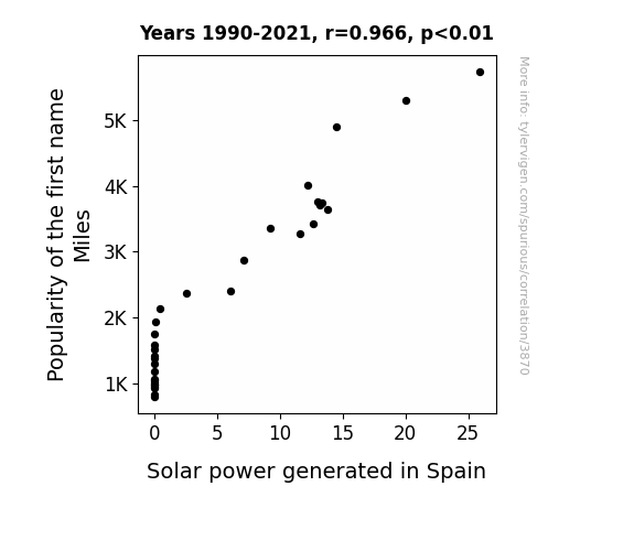
View details about correlation #3,870
Marvelous Miles: Merit of Moniker Meets Solar Sirens in Spain
As the name Miles gained popularity, more parents were subconsciously inclined to take their children on road trips, leading to an unexpected surge in demand for gas. This sudden spike in gas consumption prompted Spain to invest heavily in solar power as a clean energy alternative, inadvertently boosting solar power generated in the country. Remember, sometimes the sun shines brighter on a name!

What else correlates?
Popularity of the first name Miles · all first names
Solar power generated in Spain · all energy
Popularity of the first name Miles · all first names
Solar power generated in Spain · all energy


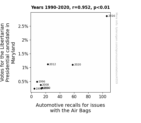
View details about correlation #4,359
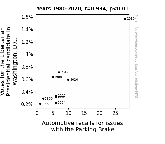
Air-Bagged Ballots: A Libertarian Look at Automotive Recalls in Maryland
As the Libertarian candidate gained popularity, more people started carpooling to rallies and events. This sudden increase in the number of passengers in vehicles put additional pressure on the air bags, leading to a higher rate of malfunctions and ultimately triggering more automotive recalls. It seems like even air bags can't handle the surge of individual freedom and shared road trips!
. The chart goes from 2008 to 2023, and the two variables track closely in value over that time.")

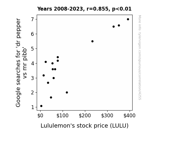
View details about correlation #4,255
As people debated the superior soda, Dr Pepper fans became more energized and pumped up. This led to a surge in demand for Lululemon's yoga pants as Dr Pepper enthusiasts embraced their active lifestyles, inadvertently boosting Lululemon's stock price. It's a fizzy, stretchy, and ultimately uplifting connection!
What else correlates?
Google searches for 'dr pepper vs mr pibb' · all google searches
Lululemon's stock price (LULU) · all stocks
Google searches for 'dr pepper vs mr pibb' · all google searches
Lululemon's stock price (LULU) · all stocks


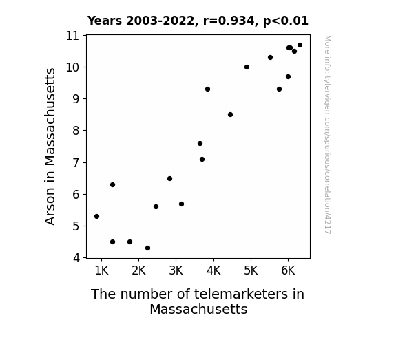
View details about correlation #4,217
Fanning the Flames: A Hotline to Arson? A Correlational Study of Arson in Massachusetts and the Number of Telemarketers
As the flames of arson decreased, so did the fiery passion for telemarketing, leading to a smoldering decrease in the number of telemarketers in Massachusetts. It seems even telemarketers couldn't handle the heat!

What else correlates?
Arson in Massachusetts · all random state specific
The number of telemarketers in Massachusetts · all cccupations
Arson in Massachusetts · all random state specific
The number of telemarketers in Massachusetts · all cccupations


View details about correlation #4,701
From Vincennes to India: Clearing the Air on Biomass Power
The delightful scent of fresh air in Vincennes, Indiana wafted all the way to India, rejuvenating the tired biomass power plants. As the air quality improved in Vincennes, it somehow acted as a motivational speaker for the biomass power industry in India, prompting them to rev up production. It's like a bizarre case of aromatic international inspiration, where Vincennes became the unwitting air purifier influencers for the biomass power sector in India.


What else correlates?
Air quality in Vincennes, Indiana · all weather
Biomass power generated in India · all energy
Air quality in Vincennes, Indiana · all weather
Biomass power generated in India · all energy


View details about correlation #4,649
Libertarian Laissez-Faire: A Correlation Analysis of Arizona Senate Votes and International Tourist Arrivals
As the demand for libertarian views in Arizona fell, so did the supply of laissez-faire fairies. Without these magical creatures promoting open borders, the worldwide influx of tourists experienced a sharp decline. It seems like when it comes to international travel, the invisible hand of the market was just not waving them in as before!

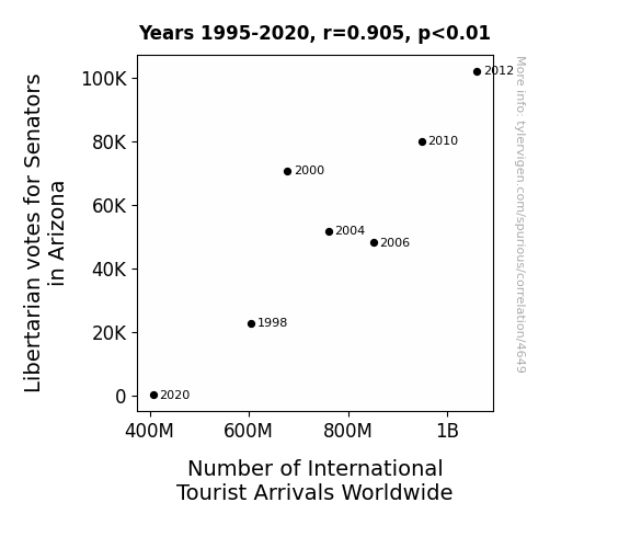
. The chart goes from 2002 to 2022, and the two variables track closely in value over that time.")

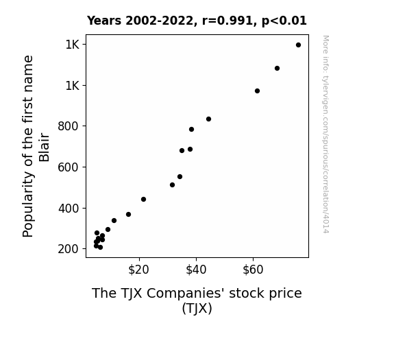
View details about correlation #4,014
The Blair Witch Stock Project: Examining the Blair Name Popularity and TJX Companies' Stock Performance
As more babies were named Blair, they developed a subconscious desire for stylish yet discounted clothing. This led to a surge in demand for TJX Companies' products, ultimately driving up their stock price.

What else correlates?
Popularity of the first name Blair · all first names
The TJX Companies' stock price (TJX) · all stocks
Popularity of the first name Blair · all first names
The TJX Companies' stock price (TJX) · all stocks


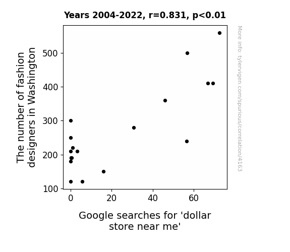
View details about correlation #4,163
Fashionably Frugal: The Fluttering Fluctuations Between Fashion Designers and Frugal Finds
As more fashion designers set up shop in Washington, the demand for unique, high-end clothing soared. This led people to search for cheaper accessories and basics to complement their designer looks, hence the increased interest in dollar stores. You could say the fashion wave created a ripple effect all the way to the dollar store, proving that in the world of retail, every outfit needs a budget-friendly accessory to truly 'dollar' it up!


View details about correlation #4,865
Rhyme Time: An Unexpected Correlation Between Cool Casually Explained Comedy and Iraqi LPG Consumption
As the demand for LPG in Iraq rose, so did the coolness level of the YouTube video titles. It seems the LPG wasn't the only thing getting fired up over there! Just like propane, these video titles are heating up the internet! It's a real gas how that correlation works, isn't it?

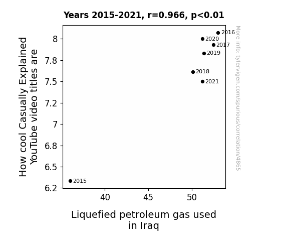
What else correlates?
How cool Casually Explained YouTube video titles are · all YouTube
Liquefied petroleum gas used in Iraq · all energy
How cool Casually Explained YouTube video titles are · all YouTube
Liquefied petroleum gas used in Iraq · all energy


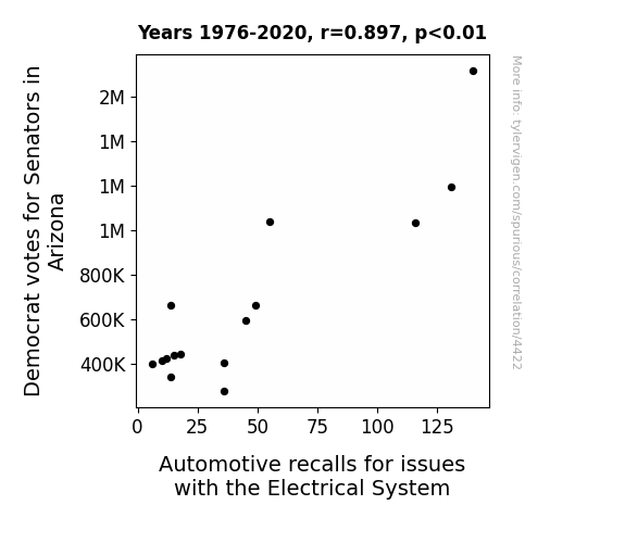
View details about correlation #4,422
Shocking Politics: The Electrifying Relationship Between Democratic Votes in Arizona Senate Races and Automotive Electrical System Recalls
The surge in Democrat votes for Senators in Arizona has sparked a higher demand for electric cars among the constituents. As more people switch to electric vehicles, the strain on the state's electrical infrastructure has surged, leading to fluctuations in power supply. These power surges and outages are, in turn, zapping the electronic systems in traditional cars, prompting a shocking rise in automotive recalls for electrical issues. It's a real jolt to the automotive industry!


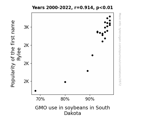
View details about correlation #3,972
GMOybeans: A Soy-Cial Study on the Rylee-iance of Names
As the number of parents naming their children Rylee rose, so did the demand for products with unique spellings, leading to an increased need for alternative ingredients like GMO soybeans in South Dakota. This in turn drove farmers to ramp up their GMO soybean production to keep up with the Rylee-related demand for unconventional snacks and drinks. Who knew that a popular name could have such a soy-ful impact on agriculture!
What else correlates?
Popularity of the first name Rylee · all first names
GMO use in soybeans in South Dakota · all food
Popularity of the first name Rylee · all first names
GMO use in soybeans in South Dakota · all food


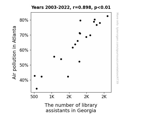
View details about correlation #4,739
The Air-ious Connection: Examining the Correlation between Air Pollution in Atlanta and the Number of Library Assistants in Georgia
As the air quality improved, the job market for library assistants became quite 'aerodynamic,' leading many to pursue other careers outside of the library system. The clean air acted as a catalyst for change, blowing away the old positions and paving the way for new opportunities elsewhere. The correlation suggests that in the battle of Atlanta air pollution versus library assistant jobs, the fresh, clean air came out as the unexpected winner, leaving behind nothing but 'book dust' in its wake. It seems like in this case, a breath of fresh air wasn't just a figure of speech, but a career-changing phenomenon!

What else correlates?
Air pollution in Atlanta · all weather
The number of library assistants in Georgia · all cccupations
Air pollution in Atlanta · all weather
The number of library assistants in Georgia · all cccupations


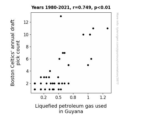
View details about correlation #3,877
From Celtics Picks to Gas Leaks: A Correlation That's Nothin' But Net
The fewer draft picks meant fewer Celtics, which led to a decrease in hot air production, creating a shortage of LPG in Guyana, where they were apparently big fans of the Celtics.

What else correlates?
Boston Celtics' annual draft pick count · all sports
Liquefied petroleum gas used in Guyana · all energy
Boston Celtics' annual draft pick count · all sports
Liquefied petroleum gas used in Guyana · all energy


View details about correlation #4,479
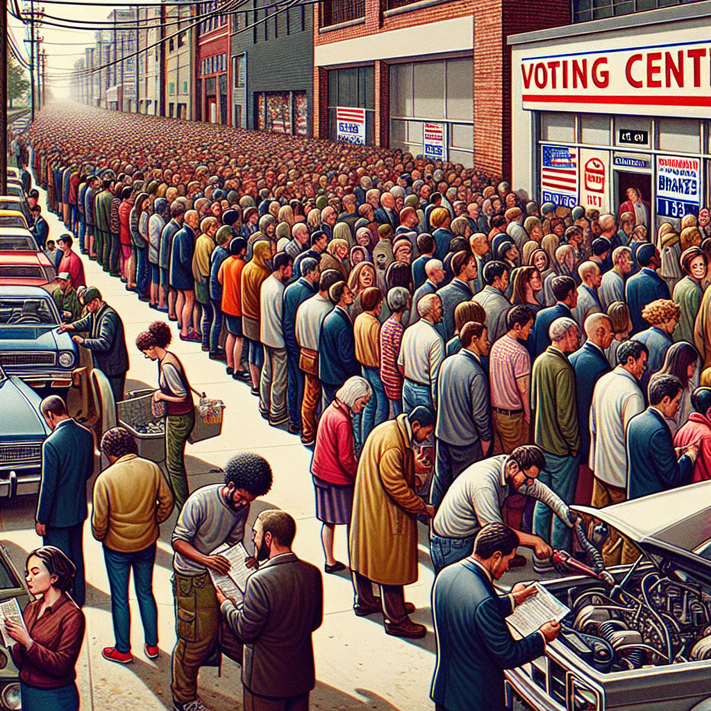
Brake the Vote: A Libertarian Review of Parking Brake Recalls in Washington, D.C.
As the support for the Libertarian candidate revved up in D.C., it put the brakes on the traditional two-party system. This political shift somehow triggered a chain reaction in the automotive industry, leading to more thorough inspections and an increase in parking brake recalls. It seems like even in the world of politics, when it rains, it auto-pours!


View details about correlation #4,861
What else correlates?
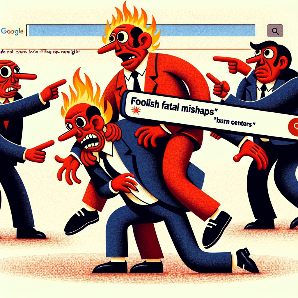
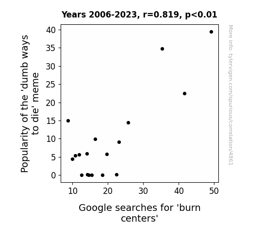
Popularity of the 'dumb ways to die' meme · all memes
Google searches for 'burn centers' · all google searches
Popularity of the 'dumb ways to die' meme · all memes
Google searches for 'burn centers' · all google searches


View details about correlation #3,723
Rainy Data and Printing Press Prowess: Exploring the Correlation between Annual Rainy Days in San Francisco and the Number of Printing Press Operators in Rhode Island
As Annual Rainy Days in San Francisco increased, more people may have taken up indoor hobbies, like stamp collecting. This surge in stamp collecting may have created a higher demand for printed materials, leading to an increased need for printing press operators in Rhode Island. Remember, a rainy day in one city can lead to a printing spree in another!


What else correlates?
Annual Rainy Days in San Francisco · all weather
The number of printing press operators in Rhode Island · all cccupations
Annual Rainy Days in San Francisco · all weather
The number of printing press operators in Rhode Island · all cccupations


View details about correlation #3,696
Gasping for Victory: The Propane Scoring Connection
The extra LPG in the air is giving the Bears' offensive line a fiery boost, propelling them to score more points than ever before! Or maybe it's just sparking some explosive plays on the field, either way, it's a gas-powered touchdown party!

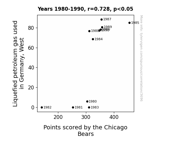
What else correlates?
Liquefied petroleum gas used in Germany, West · all energy
Points scored by the Chicago Bears · all sports
Liquefied petroleum gas used in Germany, West · all energy
Points scored by the Chicago Bears · all sports
Why this works
- Data dredging: I have 25,237 variables in my database. I compare all these variables against each other to find ones that randomly match up. That's 636,906,169 correlation calculations! This is called “data dredging.”
Fun fact: the chart used on the wikipedia page to demonstrate data dredging is also from me. I've been being naughty with data since 2014.
Instead of starting with a hypothesis and testing it, I instead tossed a bunch of data in a blender to see what correlations would shake out. It’s a dangerous way to go about analysis, because any sufficiently large dataset will yield strong correlations completely at random. - Lack of causal connection: There is probably no direct connection between these variables, despite what the AI says above.
Because these pages are automatically generated, it's possible that the two variables you are viewing are in fact causually related. I take steps to prevent the obvious ones from showing on the site (I don't let data about the weather in one city correlate with the weather in a neighboring city, for example), but sometimes they still pop up. If they are related, cool! You found a loophole.
This is exacerbated by the fact that I used "Years" as the base variable. Lots of things happen in a year that are not related to each other! Most studies would use something like "one person" in stead of "one year" to be the "thing" studied. - Observations not independent: For many variables, sequential years are not independent of each other. You will often see trend-lines form. If a population of people is continuously doing something every day, there is no reason to think they would suddenly change how they are doing that thing on January 1. A naive p-value calculation does not take this into account.
You will calculate a lower chance of "randomly" achieving the result than represents reality.
To be more specific: p-value tests are probability values, where you are calculating the probability of achieving a result at least as extreme as you found completely by chance. When calculating a p-value, you need to assert how many "degrees of freedom" your variable has. I count each year (minus one) as a "degree of freedom," but this is misleading for continuous variables.
This kind of thing can creep up on you pretty easily when using p-values, which is why it's best to take it as "one of many" inputs that help you assess the results of your analysis.
- Y-axes doesn't start at zero: I truncated the Y-axes of the graphs above. I also used a line graph, which makes the visual connection stand out more than it deserves.
Nothing against line graphs. They are great at telling a story when you have linear data! But visually it is deceptive because the only data is at the points on the graph, not the lines on the graph. In between each point, the data could have been doing anything. Like going for a random walk by itself!
Mathematically what I showed is true, but it is intentionally misleading. If you click on any of the charts that abuse this, you can scroll down to see a version that starts at zero. - Confounding variable: Confounding variables (like global pandemics) will cause two variables to look connected when in fact a "sneaky third" variable is influencing both of them behind the scenes.
- Outliers: Some datasets here have outliers which drag up the correlation.
In concept, "outlier" just means "way different than the rest of your dataset." When calculating a correlation like this, they are particularly impactful because a single outlier can substantially increase your correlation.
Because this page is automatically generated, I don't know whether any of the charts displayed on it have outliers. I'm just a footnote. ¯\_(ツ)_/¯
I intentionally mishandeled outliers, which makes the correlation look extra strong. - Low n: There are not many data points included in some of these charts.
You can do analyses with low ns! But you shouldn't data dredge with a low n.
Even if the p-value is high, we should be suspicious of using so few datapoints in a correlation.
Pro-tip: click on any correlation to see:
- Detailed data sources
- Prompts for the AI-generated content
- Explanations of each of the calculations (correlation, p-value)
- Python code to calculate it yourself


