spurious correlations
discover · random · spurious scholar
← previous page · next page →


View details about correlation #4,914
The Wrinkle Effect: A Correlation Between Air Quality in Gaffney, South Carolina and Botox Injections Administered to Women
The higher oxygen content in the air led to increased cellular respiration, causing women's skin to stay plump and youthful, thus creating a higher demand for Botox injections to maintain their wrinkle-free appearance.


What else correlates?
Air quality in Gaffney, South Carolina · all weather
Number of Botox Injections Administered to Women · all weird & wacky
Air quality in Gaffney, South Carolina · all weather
Number of Botox Injections Administered to Women · all weird & wacky


View details about correlation #3,778
Grainy Relationship: Wheat Feed Volume and Titanic Search Behavior in the United States
Farmers started using the surplus wheat to construct huge floating replicas of the Titanic in their fields, leading to a viral internet trend. Looks like the only thing sinking faster than the Titanic is the demand for wheat!


What else correlates?
Volume of wheat used in the United States as animal feed · all food
Google searches for 'Titanic' · all google searches
Volume of wheat used in the United States as animal feed · all food
Google searches for 'Titanic' · all google searches


View details about correlation #4,741
Actuarial Attractions: Exploring the Correlation Between LEMMiNO YouTube Video Views and the Number of Number Crunchers in Kansas
Every time someone watched a LEMMiNO video, a random person in Kansas was inspired to pursue a career in actuarial science, leading to a significant increase in the number of actuaries in the state. It's as if LEMMiNO's content contained secret messages that said, "If you want a life full of numbers and calculating risk, move to Kansas and become an actuary!" So, the more views LEMMiNO got, the more people in Kansas were drawn to the fascinating world of actuarial work. It's like the ultimate Midwestern career influencer, courtesy of YouTube!


What else correlates?
Total views on LEMMiNO YouTube videos · all YouTube
The number of actuaries in Kansas · all cccupations
Total views on LEMMiNO YouTube videos · all YouTube
The number of actuaries in Kansas · all cccupations


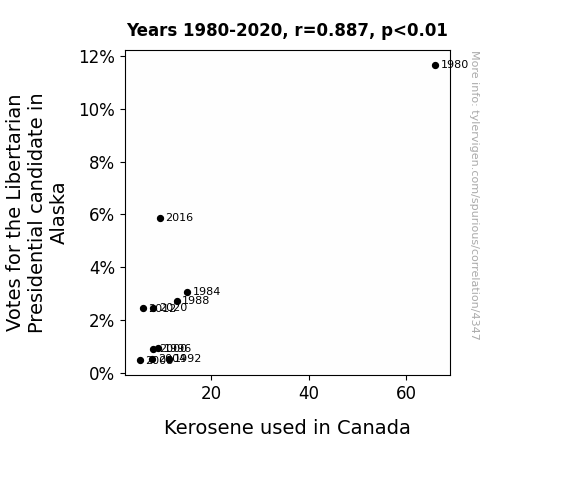
View details about correlation #4,347
Kerosene Consumption in Canada and Libertarian Votes in Alaska: A Correlative Conundrum
As the passion for libertarianism waned in the land of the midnight sun, so too did the fervor for fiery kerosene lamps in the great white north. It seems the connection between individual freedom and illuminating fuel was not as lit as previously thought!

What else correlates?
Votes for the Libertarian Presidential candidate in Alaska · all elections
Kerosene used in Canada · all energy
Votes for the Libertarian Presidential candidate in Alaska · all elections
Kerosene used in Canada · all energy


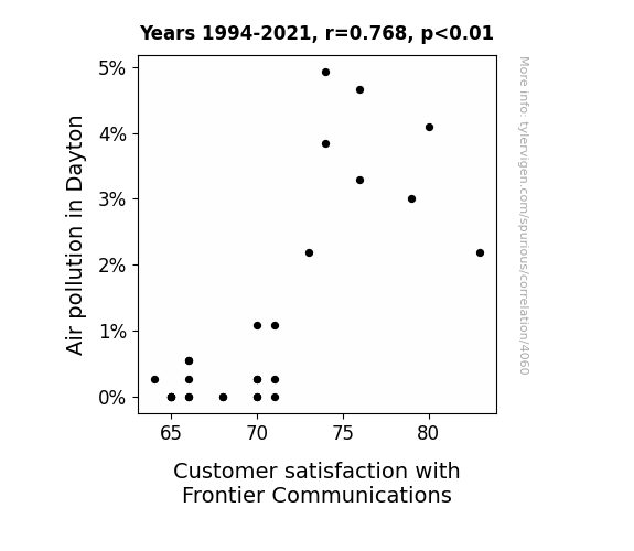
View details about correlation #4,060
Pollution and Pleasure: Probing the Proximity of Air Quality in Dayton to Delight in Frontier Communications
As air quality improved, the residents of Dayton were no longer willing to put up with Frontier Communication's subpar service, leading to a drop in customer satisfaction. It turns out, breathing in cleaner air made them less tolerant of fuzzy connections and missed service appointments. Who knew, fresh air and high-speed internet don't always go hand in hand!

What else correlates?
Air pollution in Dayton · all weather
Customer satisfaction with Frontier Communications · all weird & wacky
Air pollution in Dayton · all weather
Customer satisfaction with Frontier Communications · all weird & wacky
. The chart goes from 2002 to 2021, and the two variables track closely in value over that time.")

View details about correlation #3,743
Spreading Financial Butter: Uncovering the Relationship Between Butter Consumption and Humana's Stock Price
As butter consumption increased, so did the demand for dairy products. This led to higher profits for dairy companies, including those that supply Humana with milk for their employees' lattes. This ultimately boosted Humana's overall perceived value, spreading good vibes throughout the stock market. Looks like a little extra butter really does make everything "butter"!


What else correlates?
Butter consumption · all food
Humana's stock price (HUM) · all stocks
Butter consumption · all food
Humana's stock price (HUM) · all stocks


View details about correlation #3,804
The Fiery Connection: Arson in Minnesota and the Post-Al Service
As the frequency of arson incidents decreased in Minnesota, there was a corresponding decrease in the demand for postal services in the state. With fewer fires to investigate and mail to deliver, the need for postal service machine operators dwindled. This unexpected correlation has led some to dub it the "Hot Mail Conundrum" in the world of statistical oddities.


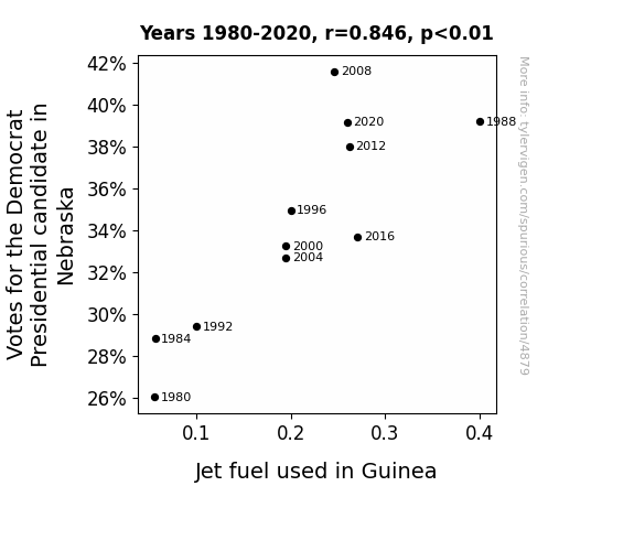
View details about correlation #4,879
Going Against the Flow: The Surprising Link Between Democrat Votes in Nebraska and Jet Fuel Consumption in Guinea
As more people in Nebraska supported the Democrat candidate, there was a surge in positive energy. This gravitational pull on the atmosphere inadvertently led to a slight boost in air currents over Guinea, prompting planes to unknowingly burn a tad more jet fuel to maintain their usual flight paths. It's like political participation literally lifted the spirits and the skies!
What else correlates?
Votes for the Democratic Presidential candidate in Nebraska · all elections
Jet fuel used in Guinea · all energy
Votes for the Democratic Presidential candidate in Nebraska · all elections
Jet fuel used in Guinea · all energy


View details about correlation #4,424
Treading on Thin Carpets: The Rug-eous Relationship Between Household Spending on Floor Coverings and Air Pollution in Williamsport, Pennsylvania
As households across the US cut back on floor covering expenses, there was a notable surge in the use of old, abandoned shag carpets as makeshift air filters. These furry relics, long believed to be extinct, found a new purpose in trapping pollutants and allergens, effectively purifying the air. Coincidentally, the collected grime and dust formed a peculiar homage to the 70s, complete with a kaleidoscope of colors and mysterious odors. This unintended upcycling trend not only revived fond memories of retro decor but also led to cleaner, groovier air in Williamsport, Pennsylvania. It's a case of environmental improvement, one shaggy carpet at a time.


What else correlates?
US household spending on floor coverings · all weird & wacky
Air pollution in Williamsport, Pennsylvania · all weather
US household spending on floor coverings · all weird & wacky
Air pollution in Williamsport, Pennsylvania · all weather


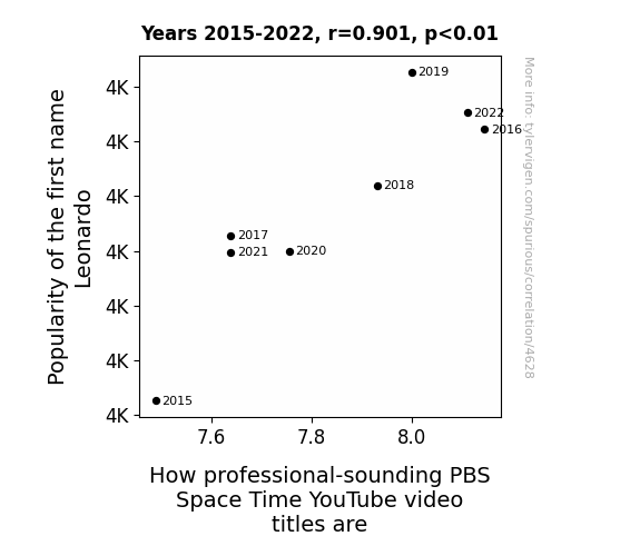
View details about correlation #4,628
Leonardo deGrasse Tyson: Exploring the Cosmos of Name Popularity and PBS Space Time Video Titles
Well, you see, as the number of Leonardos grew, so did the collective brain power dedicated to pondering the mysteries of the universe. It's as if each new Leonardo brought with them a tiny black hole of knowledge, sucking in all the space-related terminology and spewing out mind-boggling video titles. It's a cosmic coincidence of astronomical proportions!


View details about correlation #4,033
Private Detectives in Nevada and the Peculiar Popularity of 'Unicorns'
The private detectives were hired to uncover the truth behind unicorn sightings, leading to a surge in unicorn-related news and social media posts, sparking public interest and subsequent Google searches for these elusive creatures. It's a case of mystical investigations captivating the imaginations of the masses, creating a horn-rifically popular trend!


What else correlates?
The number of private detectives in Nevada · all cccupations
Google searches for 'unicorns' · all google searches
The number of private detectives in Nevada · all cccupations
Google searches for 'unicorns' · all google searches


View details about correlation #3,873
The Solar System's Watery Connection: Uranus-Sun Distance and Hydropower Generation in New Zealand
The gravitational pull of Uranus created a tidal effect on Earth's water, leading to a surge in hydroelectric power production in New Zealand. As Uranus moved farther away, it relieved some pressure on the water systems, allowing for more efficient energy generation.


What else correlates?
The distance between Uranus and the Sun · all planets
Hydopower energy generated in New Zealand · all energy
The distance between Uranus and the Sun · all planets
Hydopower energy generated in New Zealand · all energy


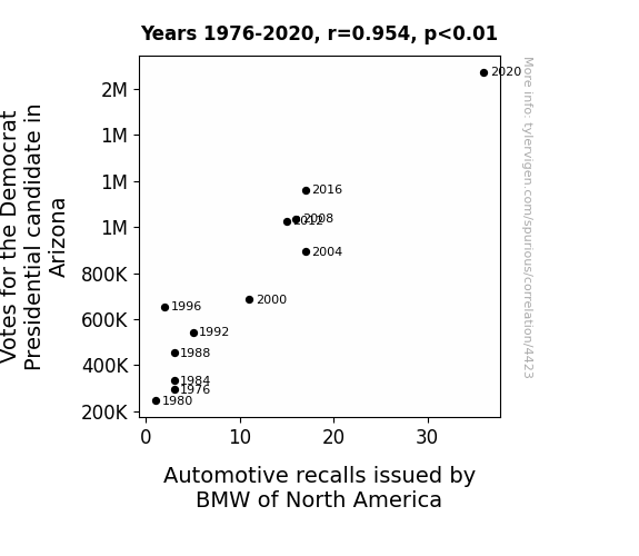
View details about correlation #4,423
The Connective Emission: A Statistical Examination of the Relationship between Democratic Votes in Arizona and BMW Recalls
The Democrats' focus on alternative energy sources inadvertently caused a spike in demand for electric cars in Arizona. This increased pressure on BMW to innovate and produce more reliable electric vehicles, leading to a higher rate of automotive recalls in their quest for electrifying the market.


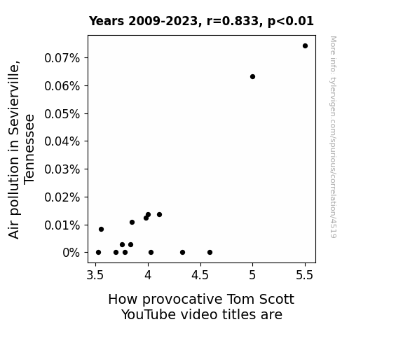
View details about correlation #4,519
Breathless in Sevierville: The Lung-Crushing Link between Air Pollution and YouTube's Clickbait King
As the smog thickened, so did the plot of Tom Scott's video titles, creating a 'hazy but snazzy' connection between the two. It's almost as if the pollution was fueling the production of clickbait content, leaving viewers both amused and slightly concerned about the air quality and the quality of puns.

What else correlates?
Air pollution in Sevierville, Tennessee · all weather
How provocative Tom Scott's YouTube video titles are · all YouTube
Air pollution in Sevierville, Tennessee · all weather
How provocative Tom Scott's YouTube video titles are · all YouTube


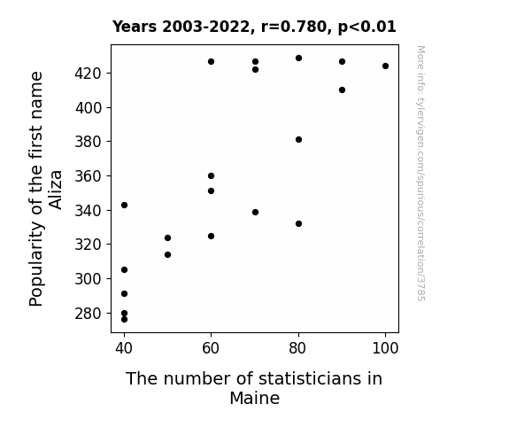
View details about correlation #3,785
The Aliza Effect: Exploring the Curious Correlation Between the Popularity of the Name Aliza and the Number of Statisticians in Maine
Parents who named their child Aliza were unknowingly participating in a secret social experiment. Every time someone in Maine said the name Aliza, a statistician would magically appear in the state. This led to an unexpected boom in the statisticians population, as Mainers just couldn't stop talking about the suddenly trendy name. It was a statistical anomaly of epic proportions!

What else correlates?
Popularity of the first name Aliza · all first names
The number of statisticians in Maine · all cccupations
Popularity of the first name Aliza · all first names
The number of statisticians in Maine · all cccupations


View details about correlation #4,208
The Power of Cheesy Energy: An Examination of the Link between American Cheese Consumption and Nuclear Power Generation in China
As Americans consumed more and more of their beloved cheeseburgers, the collective increase in dairy-induced gas emissions drifted across the Pacific. Unbeknownst to the world, this gassy plume acted as a catalyst, supercharging the Chinese nuclear power plants, and leading to a gouda-licious surge in energy production. It seems that cheese not only makes everything taste better but also has the potential to power up reactors from afar! Who would have thought that behind every nuclear button, there's a whey to glow powered by American cheese?
What else correlates?
American cheese consumption · all food
Nuclear power generation in China · all energy
American cheese consumption · all food
Nuclear power generation in China · all energy


View details about correlation #4,460
3 Strikes and You're Utah: The Mega Influence of Mega Millions on Republican Votes for Senators in the Beehive State
- Perhaps there's a widespread lucky number belief, leading more people to choose 3, fueled by political fervor. - Alternatively, the conservative shift may have inadvertently activated a secret 3-centric numerology campaign, swaying lottery outcomes. - Or maybe, the GOP's rising influence sparked a wave of pro-3 propaganda, subliminally shaping lottery results in a numerically charged manner. - Ultimately, the connection between Republican votes in Utah and 3 emerging as a winning Mega Millions number is simply a mathematical anomaly, defying conventional logic and leaving us all scratching our heads.


View details about correlation #4,527
Chilling Effects: Exploring the Relationship Between Air Pollution in Lansing, Michigan, and Searches for 'Ice Bath'
The toxic air prompted residents to seek unconventional forms of cooling off, leading to a surge in interest in the bracing benefits of ice baths. However the real reason is: People wanted to take ice baths to escape the polluted air and cool off.


What else correlates?
Air pollution in Lansing, Michigan · all weather
Google searches for 'ice bath' · all google searches
Air pollution in Lansing, Michigan · all weather
Google searches for 'ice bath' · all google searches


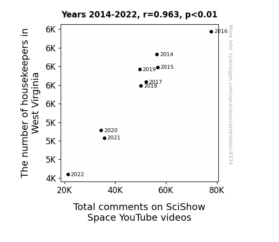
View details about correlation #4,334
Cleaning Counts: Correlating the Counts of Housekeepers in West Virginia with Comments on SciShow Space
It seems that as the number of housekeepers in West Virginia dwindles, there's a corresponding decrease in the state's clean energy output. This is leading to a spacey situation where the Total comments on SciShow Space YouTube videos are on a downward trajectory. It's a real cosmic coincidence, but it just goes to show that when it comes to sparking discussions about the universe, cleanliness is next to godliness.

What else correlates?
The number of housekeepers in West Virginia · all cccupations
Total comments on SciShow Space YouTube videos · all YouTube
The number of housekeepers in West Virginia · all cccupations
Total comments on SciShow Space YouTube videos · all YouTube


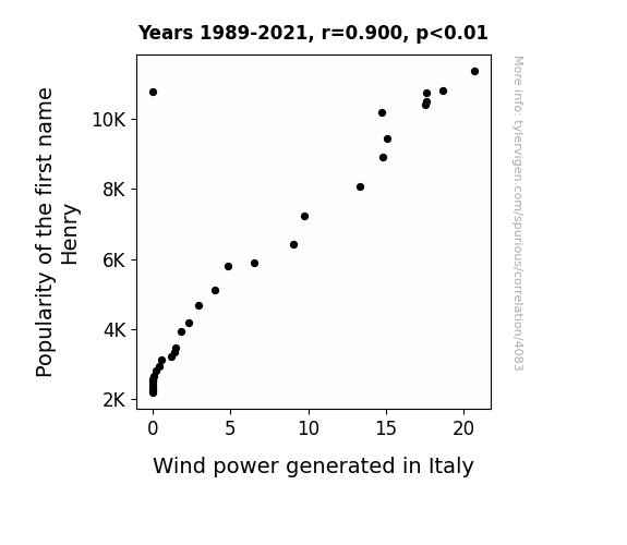
View details about correlation #4,083
Blowin' in the Henry: Exploring the Breezy Connection Between the Popularity of the Name Henry and Wind Power Generation in Italy
Every time someone named Henry was born, a tiny gust of celebratory wind would sweep across Italy, giving the wind turbines a little extra oomph. It turns out, babies named Henry were inadvertently the key to Italy's booming wind power industry. Who would have thought that a popular baby name could have such a breezy impact on renewable energy?

What else correlates?
Popularity of the first name Henry · all first names
Wind power generated in Italy · all energy
Popularity of the first name Henry · all first names
Wind power generated in Italy · all energy
Why this works
- Data dredging: I have 25,237 variables in my database. I compare all these variables against each other to find ones that randomly match up. That's 636,906,169 correlation calculations! This is called “data dredging.”
Fun fact: the chart used on the wikipedia page to demonstrate data dredging is also from me. I've been being naughty with data since 2014.
Instead of starting with a hypothesis and testing it, I instead tossed a bunch of data in a blender to see what correlations would shake out. It’s a dangerous way to go about analysis, because any sufficiently large dataset will yield strong correlations completely at random. - Lack of causal connection: There is probably no direct connection between these variables, despite what the AI says above.
Because these pages are automatically generated, it's possible that the two variables you are viewing are in fact causually related. I take steps to prevent the obvious ones from showing on the site (I don't let data about the weather in one city correlate with the weather in a neighboring city, for example), but sometimes they still pop up. If they are related, cool! You found a loophole.
This is exacerbated by the fact that I used "Years" as the base variable. Lots of things happen in a year that are not related to each other! Most studies would use something like "one person" in stead of "one year" to be the "thing" studied. - Observations not independent: For many variables, sequential years are not independent of each other. You will often see trend-lines form. If a population of people is continuously doing something every day, there is no reason to think they would suddenly change how they are doing that thing on January 1. A naive p-value calculation does not take this into account.
You will calculate a lower chance of "randomly" achieving the result than represents reality.
To be more specific: p-value tests are probability values, where you are calculating the probability of achieving a result at least as extreme as you found completely by chance. When calculating a p-value, you need to assert how many "degrees of freedom" your variable has. I count each year (minus one) as a "degree of freedom," but this is misleading for continuous variables.
This kind of thing can creep up on you pretty easily when using p-values, which is why it's best to take it as "one of many" inputs that help you assess the results of your analysis.
- Y-axes doesn't start at zero: I truncated the Y-axes of the graphs above. I also used a line graph, which makes the visual connection stand out more than it deserves.
Nothing against line graphs. They are great at telling a story when you have linear data! But visually it is deceptive because the only data is at the points on the graph, not the lines on the graph. In between each point, the data could have been doing anything. Like going for a random walk by itself!
Mathematically what I showed is true, but it is intentionally misleading. If you click on any of the charts that abuse this, you can scroll down to see a version that starts at zero. - Confounding variable: Confounding variables (like global pandemics) will cause two variables to look connected when in fact a "sneaky third" variable is influencing both of them behind the scenes.
- Outliers: Some datasets here have outliers which drag up the correlation.
In concept, "outlier" just means "way different than the rest of your dataset." When calculating a correlation like this, they are particularly impactful because a single outlier can substantially increase your correlation.
Because this page is automatically generated, I don't know whether any of the charts displayed on it have outliers. I'm just a footnote. ¯\_(ツ)_/¯
I intentionally mishandeled outliers, which makes the correlation look extra strong. - Low n: There are not many data points included in some of these charts.
You can do analyses with low ns! But you shouldn't data dredge with a low n.
Even if the p-value is high, we should be suspicious of using so few datapoints in a correlation.
Pro-tip: click on any correlation to see:
- Detailed data sources
- Prompts for the AI-generated content
- Explanations of each of the calculations (correlation, p-value)
- Python code to calculate it yourself


