spurious correlations
discover · random · spurious scholar
← previous page · next page →


View details about correlation #4,925
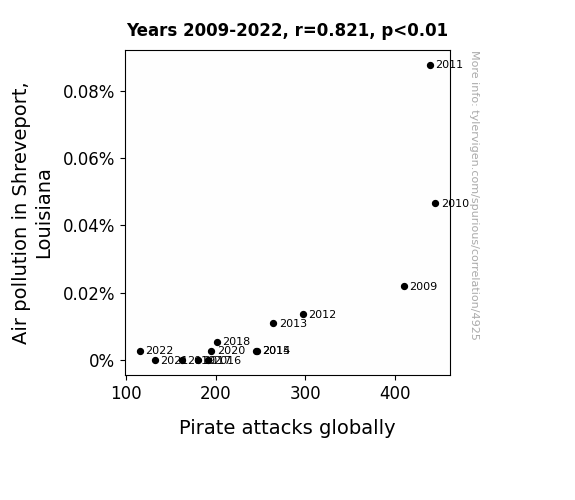
Clearing the Air: An Analysis of the Correlation Between Air Pollution in Shreveport and the Frequency of Pirate Attacks Worldwide
As air pollution decreased in Shreveport, Louisiana, the sky became clearer. This inadvertently made it easier for pirates to spot naval ships from a distance, giving them more time to prepare for an attack. With the element of surprise compromised, the global pirate community found their operations significantly hindered. Who would have thought that the actions of buccaneers on the high seas were so intricately linked to the environmental policies of a city in Louisiana? The Jolly Roger may be flying at half-mast, but at least the air quality is looking shipshape!

What else correlates?
Air pollution in Shreveport, Louisiana · all weather
Pirate attacks globally · all weird & wacky
Air pollution in Shreveport, Louisiana · all weather
Pirate attacks globally · all weird & wacky


View details about correlation #4,330
Get with the Times: A Hip Connection Between YouTube Video Titles and 'How to Move to Europe' Google Searches
As more people start considering a move to Europe, they realize they need to be as 'hip and with it' as the Europeans, prompting them to watch Be Smart YouTube videos to brush up on their knowledge. After all, you can't just waltz into Europe without knowing the latest trends - it's all about being culturally prepared to bust a move across the pond!


View details about correlation #4,589
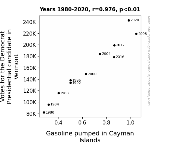
Fueling the Vote: An Unlikely Alliance Between Electoral Preferences and Petroleum Pumping Patterns
As more Vermont residents showed their support for the Democratic candidate, the overall political atmosphere became charged. This led to an increase in positive energy, which, as we all know, is directly linked to the concept of potential energy in the field of physics. This increase in potential energy created a ripple effect, influencing the molecules in the gasoline pumped in the Cayman Islands, causing them to move at a slightly faster rate and thus increasing the overall volume of gasoline pumped. It's like the gasoline couldn't help but get a little bit more fired up itself!

What else correlates?
Votes for the Democratic Presidential candidate in Vermont · all elections
Gasoline pumped in Cayman Islands · all energy
Votes for the Democratic Presidential candidate in Vermont · all elections
Gasoline pumped in Cayman Islands · all energy


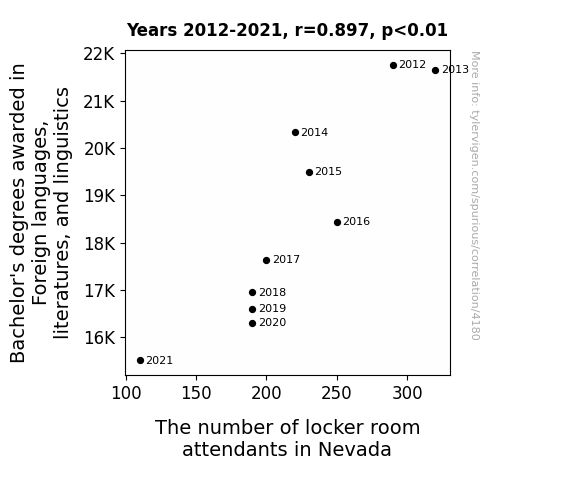
View details about correlation #4,180
Talking the Talk, Mopping the Floor: A Linguistic Analysis of the Correlation Between Bachelor's Degrees in Linguistics and the Number of Locker Room Attendants in Nevada
As fewer students pursued foreign language degrees, there was a nationwide shortage of people who could effectively communicate with non-English speaking athletes. This led to a linguistic divide in the locker room, with attendants struggling to understand player requests. Eventually, the chaos and mix-ups became too much, prompting many locker room attendants in Nevada to seek alternative career paths with less multilingual stress, such as becoming mime instructors or professional hide-and-seek players.
What else correlates?
Bachelor's degrees awarded in linguistics · all education
The number of locker room attendants in Nevada · all cccupations
Bachelor's degrees awarded in linguistics · all education
The number of locker room attendants in Nevada · all cccupations


View details about correlation #3,952
Clearing the Air: An Air Pollution Study and Soap Opera Viewership in Houston
As the air quality improved, people in Houston felt energized and no longer felt the need to stay indoors and watch daytime television. This led to a decrease in viewership for Days of Our Lives. Additionally, with cleaner air, residents were more inclined to engage in outdoor activities and socialize instead of being cooped up at home, tuning in to the show.


What else correlates?
Air pollution in Houston · all weather
Viewership count for Days of Our Lives · all weird & wacky
Air pollution in Houston · all weather
Viewership count for Days of Our Lives · all weird & wacky


View details about correlation #4,381
Smol But Mighty: Exploring the Correlation Between Google Searches for 'Smol' and Total Length of Simone Giertz YouTube Videos
As more people became interested in all things smol, Simone Giertz responded by creating longer videos to showcase a wider variety of tiny, adorable robots and gadgets. This led to a correlation between the two, as the smol trend inadvertently influenced the length of Simone's entertaining and inventive content. Remember, good things come in small packages, including YouTube videos!

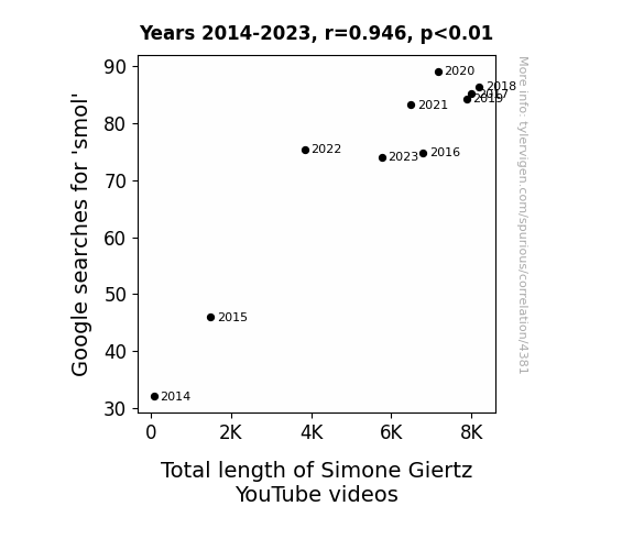
What else correlates?
Google searches for 'smol' · all google searches
Total length of Simone Giertz's YouTube videos · all YouTube
Google searches for 'smol' · all google searches
Total length of Simone Giertz's YouTube videos · all YouTube


View details about correlation #4,107
Blowin' in the Eleanor: The Winds of Name Popularity and Wind Power Generation in the United Kingdom
As the name Eleanor gained more popularity, it led to a surge in individuals with a natural inclination for 'Eleanor-gy' conservation. These folks were 'fan's of sustainable living and were 'gust' in time to advocate for increased wind power usage. As more Eleanors joined the movement, they proved to be 'aerodynamic' in their ability to 'renew' public interest in wind energy. It seems the connection between Eleanor and wind power is truly 'blowing in the wind!'


What else correlates?
Popularity of the first name Eleanor · all first names
Wind power generated in United Kingdom · all energy
Popularity of the first name Eleanor · all first names
Wind power generated in United Kingdom · all energy


View details about correlation #4,360
Voting Democ-RATically: A Tail of Two Sensibilities in Montana
The Democrat Senators were really pushing for more literary representation, so they made it a campaign "write" in. It's a plot twist nobody saw coming, but it seems like Montana is now experiencing a major "book" in Democratic support!

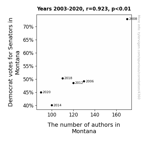
What else correlates?
Votes for Democratic Senators in Montana · all elections
The number of authors in Montana · all cccupations
Votes for Democratic Senators in Montana · all elections
The number of authors in Montana · all cccupations


View details about correlation #3,986
The Enigma of Extraterrestrial Encounters: Unraveling the Link Between UFO Sightings in Washington and Las Vegas Hotel Room Check-Ins
The increase in UFO sightings in Washington caused a surge in curiosity and extraterrestrial excitement across the country. As people flocked to the area in hopes of glimpsing these otherworldly visitors, they found themselves drawn to continue their journey to Las Vegas, the 'UFO' (Unbelievable Fun Oasis) capital of the world, leading to a cosmic rise in hotel room check-ins. It seems like these UFOs aren't the only things abducting attention and creating a stellar influx of tourists in the city of entertainment - talk about a close encounter of the Vegas kind!

What else correlates?
UFO sightings in Washington · all random state specific
Number of Las Vegas Hotel Room Check-Ins · all weird & wacky
UFO sightings in Washington · all random state specific
Number of Las Vegas Hotel Room Check-Ins · all weird & wacky


View details about correlation #4,294
Cotton and Clickbait: Correlating Cotton GMO Use in Arkansas with the Catchiness of The Game Theorists YouTube Video Titles
As GMO cotton production in Arkansas surged, it inadvertently led to the creation of ultra-smooth cotton, elevating the comfort of clothing. This newfound comfort sparked a wave of relaxation, causing The Game Theorists to brainstorm and come up with more thought-provoking video titles as they luxuriated in their genetically modified cotton garments. The softer the cotton, the harder they tugged at our intellectual threads with their enticing video concepts. Who knew that a little GM tinkering could lead to a fashionably strategic move in the game of YouTube titling!


What else correlates?
GMO use in cotton in Arkansas · all food
How provocative The Game Theorists YouTube video titles are · all YouTube
GMO use in cotton in Arkansas · all food
How provocative The Game Theorists YouTube video titles are · all YouTube
. The chart goes from 2002 to 2023, and the two variables track closely in value over that time.")

View details about correlation #4,434
A Clear Connection: The Diesel Dilemma - Investigating the Impact of Air Quality in Truckee, California on General Electric's Stock Price
As air pollution in Truckee decreased, the demand for air purifiers and related products also went down. This led to a decrease in General Electric's stock price, as the company's air purification division took a hit. With fresher air in Truckee, it seems the market for clean air technology just couldn't stay afloat, leaving GE gasping for stock value. Looks like their shares needed a breath of fresh air, but instead, they got a whiff of financial trouble!


What else correlates?
Air pollution in Truckee, California · all weather
General Electric's stock price (GE) · all stocks
Air pollution in Truckee, California · all weather
General Electric's stock price (GE) · all stocks


View details about correlation #3,768
Blowing in the Wind: The Char-lotta Wind Connection in Switzerland
The name Charlotte sounds like "char" as in char grilled, and all that extra char in the air is creating more wind for Switzerland's turbines! Go figure, it's a real char-ming connection!

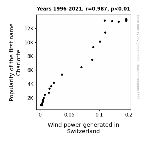
What else correlates?
Popularity of the first name Charlotte · all first names
Wind power generated in Switzerland · all energy
Popularity of the first name Charlotte · all first names
Wind power generated in Switzerland · all energy


View details about correlation #4,885
Connecting Kentucky's Libertarian Leanings to Air Bag Anomalies: A Curious Correlation
The increased support for the Libertarian candidate led to more people demanding freedom of choice, including the freedom to drive cars with faulty airbags, creating a deflating situation for car manufacturers.


View details about correlation #4,502
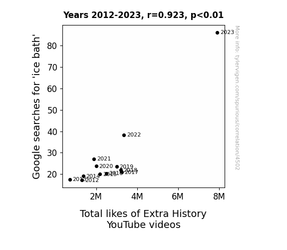
Chill-Vibes and Chills: Exploring the Frosty Relationship between Google Searches for 'Ice Bath' and Total Likes of Extra History YouTube Videos
The frigid waters of the ice bath prompt viewers to seek warmth and comfort, leading them to cozy up with a hot beverage and binge-watch Extra History. As they shiver and shake, they hit the like button repeatedly in an attempt to generate some digital heat. This ultimately boosts the total likes of Extra History YouTube videos. After all, nothing warms the heart like a good history lesson and the thought of never, ever taking an ice bath.

What else correlates?
Google searches for 'ice bath' · all google searches
Total likes of Extra History YouTube videos · all YouTube
Google searches for 'ice bath' · all google searches
Total likes of Extra History YouTube videos · all YouTube


View details about correlation #4,918
Butterfly Effect: Exploring the Correlation Between the 'is this a butterfly' Meme Popularity and the Number of University Cultural Studies Teachers in Missouri
As the 'is this a butterfly' meme gained traction, more and more people turned to cultural studies for a deeper understanding of butterfly symbolism and its connection to existential meme philosophy. After all, if a meme can flutter its way into the depths of the internet, surely it must hold profound cultural significance. So, as the meme continued to spread its wings, universities in Missouri had no choice but to meet the soaring demand for butterfly-related intellectual discourse. After all, someone had to answer the age-old question: "To be a butterfly or not to be a butterfly, that is the meme-ning."


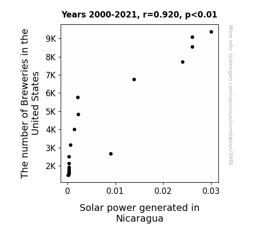
View details about correlation #3,946
A Brewing Sunshine: The Ale-ged Connection Between the Number of Breweries in the United States and Solar Power Generated in Nicaragua
As the number of breweries in the United States increased, so did the demand for ice-cold beer. This led to a surge in orders for high-quality hops. Nicaraguan farmers, seeing this as a golden opportunity, decided to switch from traditional crops to growing more hops. As a result, there was a boom in agricultural productivity in Nicaragua. With all this extra sunlight, it only made sense to harness it for good use, leading to an increase in solar power generated in Nicaragua. So, you could say that the road to a brighter, solar-powered future is hopped with a frothy love for beer!

What else correlates?
The number of Breweries in the United States · all food
Solar power generated in Nicaragua · all energy
The number of Breweries in the United States · all food
Solar power generated in Nicaragua · all energy


View details about correlation #4,636
In Rice and Shine: The Risks of Rising Rice Consumption on Air Quality in Gulfport, Mississippi
As people cut back on rice, there were fewer grain dust emissions during processing and transportation, leading to cleaner air in Gulfport. You could say it's a case of "rice reduction leading to Gulfport's air purification"! Who knew that lowering rice consumption could be the grain solution for cleaner air in Mississippi!


What else correlates?
Global Per Capita Rice Consumption · all weird & wacky
Air pollution in Gulfport, Mississippi · all weather
Global Per Capita Rice Consumption · all weird & wacky
Air pollution in Gulfport, Mississippi · all weather


View details about correlation #4,550
No Cap Google Map: An Analysis of the Rapport Between Search Interest in 'No Cap' and the Likes on Tom Scott's YouTube Tap
Whenever 'no cap' is searched, it triggers a series of events. In an underground bunker, a team of highly trained cap-wearing goats (yes, they exist) diligently start double-tapping on Tom Scott's videos using specially designed hoof-friendly touchscreens. This surge in capricious likes not only boosts Tom's video engagement but also inadvertently promotes goat fashion, leading to a spike in the sale of tiny, trendy caps for goats. As more goats embrace this newfound style, they become influencers in their own right, drawing attention to Tom's content and creating a cap-tivating cycle of like-worthy videos. It's a shear coincidence with a bleatiful outcome!


What else correlates?
Google searches for 'no cap' · all google searches
The average number of likes on Tom Scott's YouTube videos · all YouTube
Google searches for 'no cap' · all google searches
The average number of likes on Tom Scott's YouTube videos · all YouTube


View details about correlation #3,786
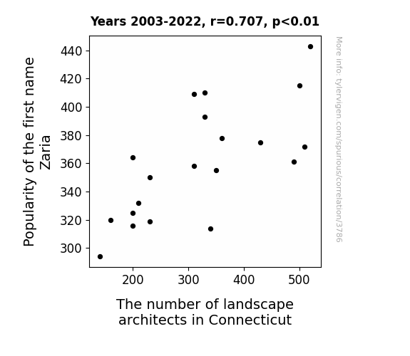
Zaria-n Landscapes: Exploring the Correlation between the Popularity of the Name Zaria and the Number of Landscape Architects in Connecticut
As the popularity of the name Zaria waned, so did the demand for zany garden designs, leading to a decrease in the need for landscape architects in Connecticut. It seems the connection between Zaria and flora just couldn't take root, leaving the industry feeling a little unpopularity-planted!

What else correlates?
Popularity of the first name Zaria · all first names
The number of landscape architects in Connecticut · all cccupations
Popularity of the first name Zaria · all first names
The number of landscape architects in Connecticut · all cccupations


View details about correlation #4,442
Blue in the Bayou: The Coup of Kerosene and the Vote for Democratic Senators in Louisiana
French Polynesia, known for its stunning beauty and crystal-clear waters, has seen a surprising decline in kerosene consumption. This unexpected trend seems to have an unlikely connection to the voting patterns in Louisiana. As Democrat support waned for Senators in the state, it inadvertently set off a chain of events leading to the dip in kerosene usage in French Polynesia. It appears that the political ripples in Louisiana have somehow crossed the vast expanse of the Pacific Ocean, causing a curious domino effect. Perhaps it's a case of political polarization leading to a parallel plunge in Pacific petroleum usage. It's a truly baffling correlation that has left experts scratching their heads and wondering about the hidden intercontinental impact of political shifts. With equations as complex as the geopolitical landscape and variables as diverse as global energy markets, this unforeseen relationship serves as a captivating reminder that in the intricate web of world affairs, anything - even the most unlikely connections - is possible.


What else correlates?
Votes for Democratic Senators in Louisiana · all elections
Kerosene used in French Polynesia · all energy
Votes for Democratic Senators in Louisiana · all elections
Kerosene used in French Polynesia · all energy
Why this works
- Data dredging: I have 25,237 variables in my database. I compare all these variables against each other to find ones that randomly match up. That's 636,906,169 correlation calculations! This is called “data dredging.”
Fun fact: the chart used on the wikipedia page to demonstrate data dredging is also from me. I've been being naughty with data since 2014.
Instead of starting with a hypothesis and testing it, I instead tossed a bunch of data in a blender to see what correlations would shake out. It’s a dangerous way to go about analysis, because any sufficiently large dataset will yield strong correlations completely at random. - Lack of causal connection: There is probably no direct connection between these variables, despite what the AI says above.
Because these pages are automatically generated, it's possible that the two variables you are viewing are in fact causually related. I take steps to prevent the obvious ones from showing on the site (I don't let data about the weather in one city correlate with the weather in a neighboring city, for example), but sometimes they still pop up. If they are related, cool! You found a loophole.
This is exacerbated by the fact that I used "Years" as the base variable. Lots of things happen in a year that are not related to each other! Most studies would use something like "one person" in stead of "one year" to be the "thing" studied. - Observations not independent: For many variables, sequential years are not independent of each other. You will often see trend-lines form. If a population of people is continuously doing something every day, there is no reason to think they would suddenly change how they are doing that thing on January 1. A naive p-value calculation does not take this into account.
You will calculate a lower chance of "randomly" achieving the result than represents reality.
To be more specific: p-value tests are probability values, where you are calculating the probability of achieving a result at least as extreme as you found completely by chance. When calculating a p-value, you need to assert how many "degrees of freedom" your variable has. I count each year (minus one) as a "degree of freedom," but this is misleading for continuous variables.
This kind of thing can creep up on you pretty easily when using p-values, which is why it's best to take it as "one of many" inputs that help you assess the results of your analysis.
- Y-axes doesn't start at zero: I truncated the Y-axes of the graphs above. I also used a line graph, which makes the visual connection stand out more than it deserves.
Nothing against line graphs. They are great at telling a story when you have linear data! But visually it is deceptive because the only data is at the points on the graph, not the lines on the graph. In between each point, the data could have been doing anything. Like going for a random walk by itself!
Mathematically what I showed is true, but it is intentionally misleading. If you click on any of the charts that abuse this, you can scroll down to see a version that starts at zero. - Confounding variable: Confounding variables (like global pandemics) will cause two variables to look connected when in fact a "sneaky third" variable is influencing both of them behind the scenes.
- Outliers: Some datasets here have outliers which drag up the correlation.
In concept, "outlier" just means "way different than the rest of your dataset." When calculating a correlation like this, they are particularly impactful because a single outlier can substantially increase your correlation.
Because this page is automatically generated, I don't know whether any of the charts displayed on it have outliers. I'm just a footnote. ¯\_(ツ)_/¯
I intentionally mishandeled outliers, which makes the correlation look extra strong. - Low n: There are not many data points included in some of these charts.
You can do analyses with low ns! But you shouldn't data dredge with a low n.
Even if the p-value is high, we should be suspicious of using so few datapoints in a correlation.
Pro-tip: click on any correlation to see:
- Detailed data sources
- Prompts for the AI-generated content
- Explanations of each of the calculations (correlation, p-value)
- Python code to calculate it yourself


