spurious correlations
discover · random · spurious scholar
← previous page · next page →


View details about correlation #4,911
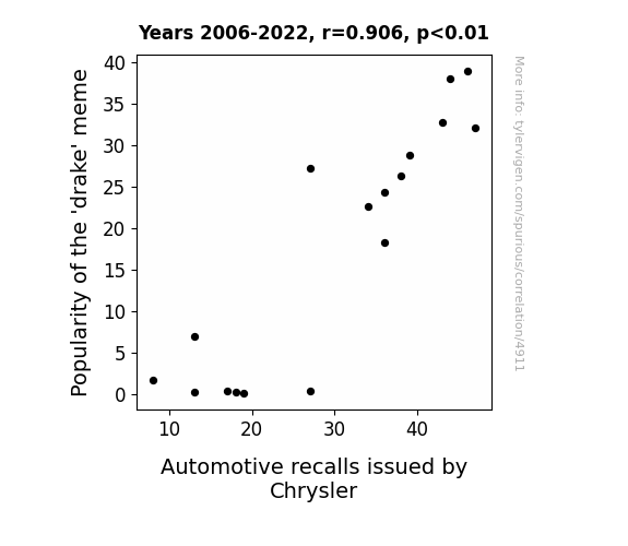
Stopping the Recall: An Unforgettable Connection between 'Drake' Meme Popularity and Automotive Woes at Chrysler
The 'drake' meme led to more people saying "No" to Chrysler's vehicles, causing a surge in automotive recalls as the cars grappled with an existential crisis of being liked. Remember, even cars have feelings, and sometimes they just need a little 'Wheel' therapy!
What else correlates?
Popularity of the 'drake' meme · all memes
Automotive recalls issued by Chrysler · all weird & wacky
Popularity of the 'drake' meme · all memes
Automotive recalls issued by Chrysler · all weird & wacky
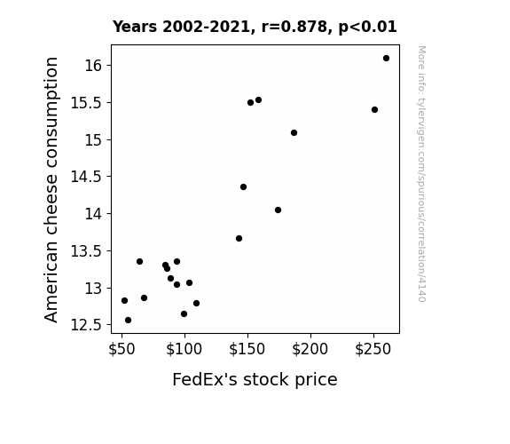
. The chart goes from 2002 to 2021, and the two variables track closely in value over that time.")

View details about correlation #4,140
Cheddar and FedEx: A Cheese-Laden Analysis of American Cheese Consumption and FDX Stock Price Fluctuations
As American cheese consumption increased, so did the demand for grilled cheese sandwiches. This led to a spike in comfort food cravings, causing people to seek out nostalgic, feel-good experiences. As a result, there was a significant rise in online retail therapy, leading to an uptick in FedEx's delivery services. It's a gouda be true case of dairy-fueled economics - the cheesier the market gets, the feta the stocks seem to perform!

What else correlates?
American cheese consumption · all food
FedEx's stock price (FDX) · all stocks
American cheese consumption · all food
FedEx's stock price (FDX) · all stocks


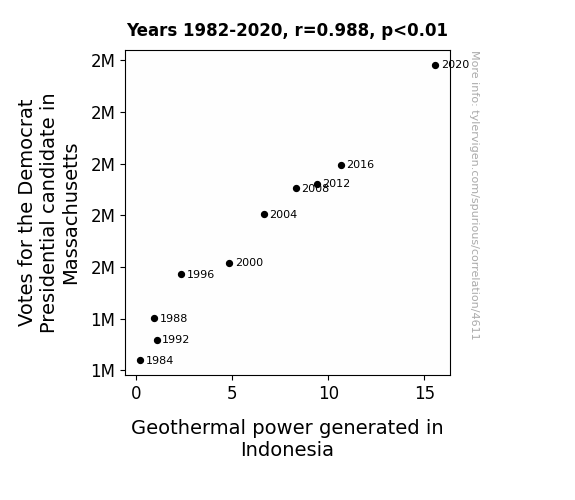
View details about correlation #4,611
The Democra-Magma Connection: Exploring the Surprising Relationship Between Democratic Vote Share in Massachusetts and Geothermal Power Generation in Indonesia
As more support heated up for the Democrat candidate in Massachusetts, it sent a powerful jolt of energy through the political landscape. This surge in enthusiasm created a seismic shift, leading to an eruption of votes. This in turn sent a message that reverberated all the way to Indonesia, where it sparked a movement towards geothermal power. It seems like even from across the globe, the political climate has a way of influencing renewable energy - talk about a truly electri-frying connection!


View details about correlation #4,190
The Sociological Search: Unearthing the Correlation Between Sociologists in North Carolina and 'Mr. Beast' Google Searches
As the number of sociologists in North Carolina rose, so did the understanding of social dynamics. This led to a surge in Mr. Beast's fans trying to figure out the best strategies to win his challenges and ultimately befriend a local sociologist - who then went on to analyze Mr. Beast's impact on society, leading to even more research and further fueling the cycle of internet stardom. It's a sociological phenomenon in the making!

What else correlates?
The number of sociologists in North Carolina · all cccupations
Google searches for 'Mr. Beast' · all google searches
The number of sociologists in North Carolina · all cccupations
Google searches for 'Mr. Beast' · all google searches


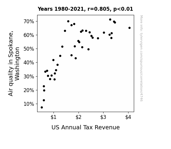
View details about correlation #4,746
Breathing Easier: Unveiling the Relationship between Air Quality in Spokane, Washington and US Annual Tax Revenue
The cleaner air led to better fuel combustion, which in turn increased productivity and income. You could say it really fueled the economy, giving everyone a breath of fresh air when it came to their finances!

What else correlates?
Air quality in Spokane, Washington · all weather
US Annual Tax Revenue · all weird & wacky
Air quality in Spokane, Washington · all weather
US Annual Tax Revenue · all weird & wacky


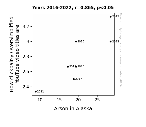
View details about correlation #4,874
Fire and Flaming Clickbait: Unveiling the Wildfire of YouTube Titles and Arson in Alaska
As the clickbait level of OverSimplified video titles rises, so does the temptation to set fire to the 'like' button. It's a case of spark-worthy content igniting the desire to watch the world burn, leading to an inferno of comedic historical reenactments. One might say the correlation between clickbait-y titles and Alaskan arson is hot topic, creating a blaze of interest in both misleading thumbnails and actual flames. Remember, only you can prevent overly sensationalized historical content from fueling this fiery correlation.

What else correlates?
How clickbait-y OverSimplified YouTube video titles are · all YouTube
Arson in Alaska · all random state specific
How clickbait-y OverSimplified YouTube video titles are · all YouTube
Arson in Alaska · all random state specific


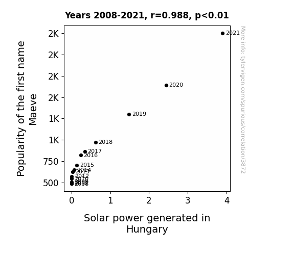
View details about correlation #3,872
Maeve's Name Wave and Hungary's Solar Power Sway
As the name Maeve gained popularity, it led to a surge in the number of people doing the "Maeve" dance, a dance move that mimics the graceful movements of wind turbines. This inadvertently created a higher demand for sustainable energy sources, prompting Hungary to invest more in solar power. It's a shining example of how a name can spark a renewable energy revolution!

What else correlates?
Popularity of the first name Maeve · all first names
Solar power generated in Hungary · all energy
Popularity of the first name Maeve · all first names
Solar power generated in Hungary · all energy


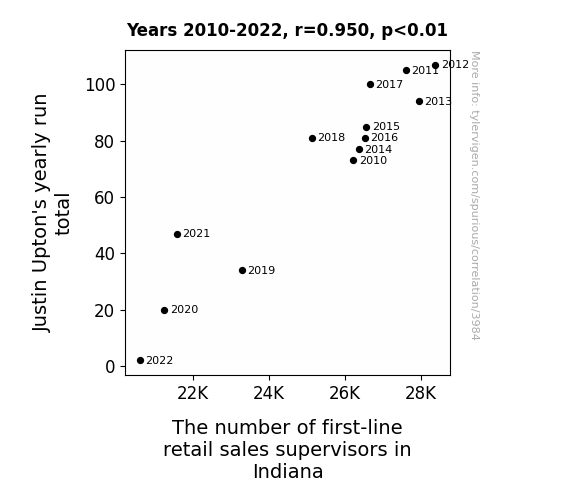
View details about correlation #3,984
Batting Cleanup or Retail Cleanup? An Unlikely Correlation between Justin Upton's Yearly Run Total and First-Line Retail Sales Supervisors in Indiana
As Justin Upton's yearly run total decreased, it led to a mysterious shortage of baseball-themed discount sales in Indiana. This, in turn, meant there was less need for first-line retail sales supervisors to oversee the highly specialized merchandising of baseball jerseys, caps, and bobbleheads. With fewer runs scored, it's a retail conundrum that even the most seasoned sales supervisor couldn't field.
What else correlates?
Justin Upton's yearly run total · all sports
The number of first-line retail sales supervisors in Indiana · all cccupations
Justin Upton's yearly run total · all sports
The number of first-line retail sales supervisors in Indiana · all cccupations


View details about correlation #4,470
Brake-ing the Mold: The Libertarian Candidate's Influence on Parking Brake Recalls in California
As the level of political freedom rhetoric in the state decreased, the molecules in the air became less likely to engage in rebellious behavior. This led to a harmonious alignment of atomic particles within the parking brake systems, effectively reducing the need for recalls. It's as if the ideologies of individual choice and limited government intervention had a direct impact on the mechanical operations of parked vehicles. Who would have thought that the political climate could pump the brakes on automotive malfunctions? Remember, when it comes to liberty and parking brakes, every vote counts!

. The chart goes from 2002 to 2022, and the two variables track closely in value over that time.")

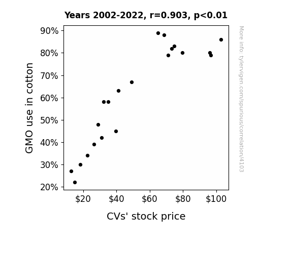
View details about correlation #4,103
GMO Gloat: A Cotton Connection to CVS Stock Price
As cotton plants genetically modified to repel pests became more prevalent, there was a surprising side effect - the pesky insects began to seek out alternative sources of sustenance. This inadvertently led to a decrease in the bug population near CVS stores, making the shopping experience more pleasant for customers. As word spread about the unexpected benefits of visiting CVS, more people flocked to the stores, boosting sales and ultimately causing an increase in CVS stock price. Who would have thought that GMO cotton could have such a buzz-worthy impact on the world of retail? It's like the cotton said, "You can't bug CVS anymore!"

What else correlates?
GMO use in cotton · all food
CVS stock price (CVS) · all stocks
GMO use in cotton · all food
CVS stock price (CVS) · all stocks


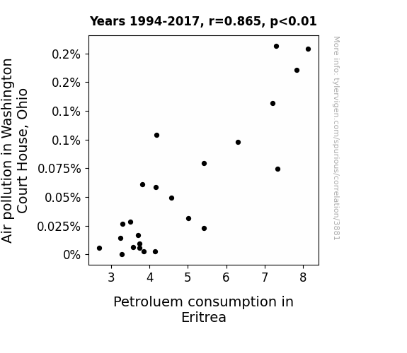
View details about correlation #3,881
Clearing the Air: Uncovering the Gas-Tly Connection Between Air Pollution in Washington Court House, Ohio and Petroleum Consumption in Eritrea
As the air in Washington Court House cleared up, it set off a chain reaction of renewed environmental conscientiousness. People in Eritrea, feeling the unexpected urge to carpool from all the way across the world, collectively decided to cut back on their petroleum usage. It's like the butterfly effect, but with eco-friendly vibes transcending borders!

What else correlates?
Air pollution in Washington Court House, Ohio · all weather
Petroluem consumption in Eritrea · all energy
Air pollution in Washington Court House, Ohio · all weather
Petroluem consumption in Eritrea · all energy


View details about correlation #4,518
Smart Video Titles and Montana Firefighter Fights: An Unlikely Affiliation Delights
The firefighters in Montana are skilled at extinguishing fires, but they're also experts at creating sizzling, attention-grabbing YouTube video titles. With their fiery passion for both saving lives and content creation, these multitasking heroes have elevated the standard of professionalism, leading to a cascade of polished and sophisticated video titles on Be Smart. It's a true case of putting out fires in the most professional and linguistically captivating manner possible.


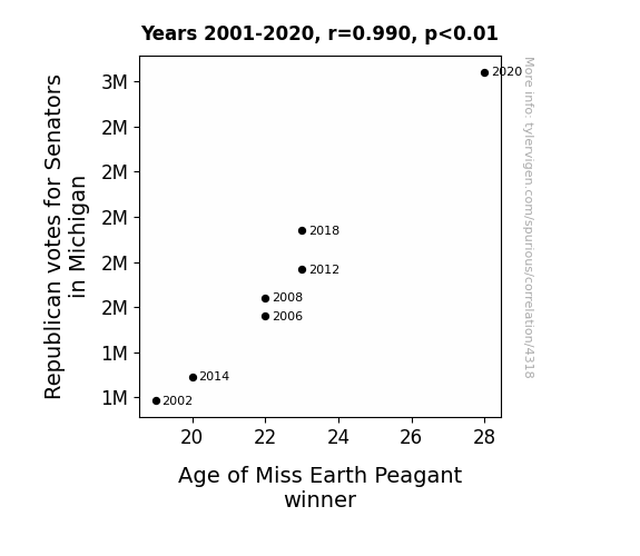
View details about correlation #4,318
Republican Vote Ages Like Fine Wine: A Correlation Between Michigan Senatorial Elections and Miss Earth Pageant Winners
As the Republican votes for Senators in Michigan increased, so did the demand for Michigan's famous cherries. This led to a cherry boom, with farmers using age-old techniques to grow plumper, juicier fruit. Unbeknownst to many, the secret fertilizer turned out to be a youth elixir for the skin. As a result, contestants in the Miss Earth Pageant, including the eventual winner, couldn't help but showcase a youthful glow, giving a whole new meaning to age and beauty! So, in a strange twist of fate, the path to the pageant crown was paved with the pits of politics, making it a truly fruitiful affair. And that's how a political sway in Michigan had everyone saying, "Make cherries, not war!"
What else correlates?
Votes for Republican Senators in Michigan · all elections
Age of Miss Earth Peagant winner · all weird & wacky
Votes for Republican Senators in Michigan · all elections
Age of Miss Earth Peagant winner · all weird & wacky


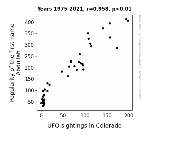
View details about correlation #3,992
Abdullah's Alien Encounters: Exploring the Otherworldly Connection Between Name Popularity and UFO Sightings in Colorado
Because as the popularity of the name Abdullah rose, more people started addressing each other as "AbDUDEah" in Colorado. This unintentional distress signal to the intergalactic surfers in their UFOs led to an increase in sightings as they tried to catch the gnarly waves of misunderstanding.
What else correlates?
Popularity of the first name Abdullah · all first names
UFO sightings in Colorado · all random state specific
Popularity of the first name Abdullah · all first names
UFO sightings in Colorado · all random state specific


View details about correlation #4,489
Bounding Biomass: Bridging the Air Quality in Owensboro, Kentucky and Biomass Power in Burma
The cleaner air in Owensboro led to a sudden burst of positivity, inspiring a local inventor to create a groundbreaking device that runs on pure, unadulterated good vibes. This device, in a strange turn of events, ended up being the missing key to supercharging biomass power production in Burma. It turns out, all the Burmese power plants needed was a daily dose of Owensboro's refreshing air to operate at an unprecedented level of efficiency, creating a bizarre but undeniably uplifting connection between the two distant locations.


What else correlates?
Air quality in Owensboro, Kentucky · all weather
Biomass power generated in Burma · all energy
Air quality in Owensboro, Kentucky · all weather
Biomass power generated in Burma · all energy


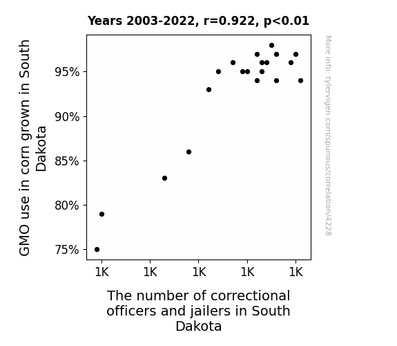
View details about correlation #4,228
Stalk-ing the Connection: GMO Corn and the Corn-nectional Officers
The corn started exhibiting stalky behavior, leading to a rise in kernel delinquency. It seems the GMOs were just adding a-maize-ing levels of resistibility! The increase in correctional officers and jailers was simply a-llama-nting. Corny as it may sound, it's a-maize-ing what can happen in the husk of time.


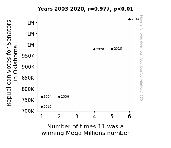
View details about correlation #4,370
Eleven is the Winning Number: Exploring the Curious Connection between Republican Votes for Senators in Oklahoma and the Frequency of 11 as a Mega Millions Winning Number
The rise in Republican votes in Oklahoma has energized the state, leading to an increased power draw. This surge in energy has sparked a higher frequency of 11 being a winning Mega Millions number, as the electrons just can't seem to resist that magnetic digit! They say politics is shocking, but who knew it could amp up the lottery too? It's truly an electrifying connection!


View details about correlation #4,677
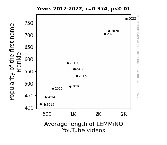
A Frank-ly Lengthy Exploration: The Relationship between the Popularity of the First Name Frankie and the Average Length of LEMMiNO YouTube Videos
Well, as the name Frankie gained popularity, more and more parents started naming their kids after the cool, laid-back vibe often associated with the name. This led to a surge in chill, easygoing individuals who just so happened to have a knack for creating in-depth, lengthy YouTube videos. The Frankies of the world inadvertently became the driving force behind an unusual but undeniable uptick in the average length of LEMMiNO's content. It's as if there's a secret connection between the name Frankie and an innate ability to spin captivating, longer-than-expected tales, turning the YouTube landscape into a playground for extended narratives and intriguing explorations. So, if you ever wondered about the mysterious link between a popular name and the length of online videos, it seems that the Frankies might hold the key to unlocking this quirky phenomenon!
What else correlates?
Popularity of the first name Frankie · all first names
Average length of LEMMiNO YouTube videos · all YouTube
Popularity of the first name Frankie · all first names
Average length of LEMMiNO YouTube videos · all YouTube


View details about correlation #4,210
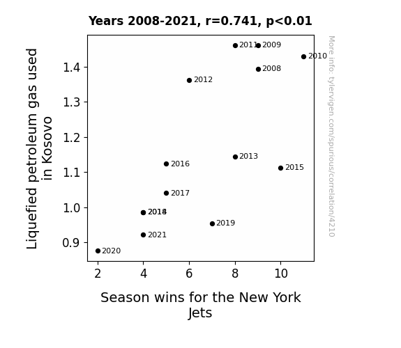
Feeling the Heat: Examining the Connection between LPG in Kosovo and the New York Jets' Gridiron Frolics
As the LPG usage in Kosovo plummeted, it created a shortage of hot air. This shortage somehow found its way to the New York Jets, leaving them unable to inflate their performance. It seems the connection between gas and the Jets is no laughing matter after all!
What else correlates?
Liquefied petroleum gas used in Kosovo · all energy
Season wins for the New York Jets · all sports
Liquefied petroleum gas used in Kosovo · all energy
Season wins for the New York Jets · all sports


View details about correlation #3,787
Spreading Butter, Building Bridges: A Creamy Correlation Between Butter Consumption and the Number of Bridge and Lock Tenders in Texas
As butter consumption increased, so did the demand for delicious baked goods. This created a booming industry for bakeries in Texas, leading to the need for more bridge and lock tenders to facilitate the transportation of these tasty treats across the state. It's a butterly delicious connection that's really spreading!


What else correlates?
Butter consumption · all food
The number of bridge and lock tenders in Texas · all cccupations
Butter consumption · all food
The number of bridge and lock tenders in Texas · all cccupations
Why this works
- Data dredging: I have 25,237 variables in my database. I compare all these variables against each other to find ones that randomly match up. That's 636,906,169 correlation calculations! This is called “data dredging.”
Fun fact: the chart used on the wikipedia page to demonstrate data dredging is also from me. I've been being naughty with data since 2014.
Instead of starting with a hypothesis and testing it, I instead tossed a bunch of data in a blender to see what correlations would shake out. It’s a dangerous way to go about analysis, because any sufficiently large dataset will yield strong correlations completely at random. - Lack of causal connection: There is probably no direct connection between these variables, despite what the AI says above.
Because these pages are automatically generated, it's possible that the two variables you are viewing are in fact causually related. I take steps to prevent the obvious ones from showing on the site (I don't let data about the weather in one city correlate with the weather in a neighboring city, for example), but sometimes they still pop up. If they are related, cool! You found a loophole.
This is exacerbated by the fact that I used "Years" as the base variable. Lots of things happen in a year that are not related to each other! Most studies would use something like "one person" in stead of "one year" to be the "thing" studied. - Observations not independent: For many variables, sequential years are not independent of each other. You will often see trend-lines form. If a population of people is continuously doing something every day, there is no reason to think they would suddenly change how they are doing that thing on January 1. A naive p-value calculation does not take this into account.
You will calculate a lower chance of "randomly" achieving the result than represents reality.
To be more specific: p-value tests are probability values, where you are calculating the probability of achieving a result at least as extreme as you found completely by chance. When calculating a p-value, you need to assert how many "degrees of freedom" your variable has. I count each year (minus one) as a "degree of freedom," but this is misleading for continuous variables.
This kind of thing can creep up on you pretty easily when using p-values, which is why it's best to take it as "one of many" inputs that help you assess the results of your analysis.
- Y-axes doesn't start at zero: I truncated the Y-axes of the graphs above. I also used a line graph, which makes the visual connection stand out more than it deserves.
Nothing against line graphs. They are great at telling a story when you have linear data! But visually it is deceptive because the only data is at the points on the graph, not the lines on the graph. In between each point, the data could have been doing anything. Like going for a random walk by itself!
Mathematically what I showed is true, but it is intentionally misleading. If you click on any of the charts that abuse this, you can scroll down to see a version that starts at zero. - Confounding variable: Confounding variables (like global pandemics) will cause two variables to look connected when in fact a "sneaky third" variable is influencing both of them behind the scenes.
- Outliers: Some datasets here have outliers which drag up the correlation.
In concept, "outlier" just means "way different than the rest of your dataset." When calculating a correlation like this, they are particularly impactful because a single outlier can substantially increase your correlation.
Because this page is automatically generated, I don't know whether any of the charts displayed on it have outliers. I'm just a footnote. ¯\_(ツ)_/¯
I intentionally mishandeled outliers, which makes the correlation look extra strong. - Low n: There are not many data points included in some of these charts.
You can do analyses with low ns! But you shouldn't data dredge with a low n.
Even if the p-value is high, we should be suspicious of using so few datapoints in a correlation.
Pro-tip: click on any correlation to see:
- Detailed data sources
- Prompts for the AI-generated content
- Explanations of each of the calculations (correlation, p-value)
- Python code to calculate it yourself


