spurious correlations
discover · random · spurious scholar
← previous page · next page →


View details about correlation #3,685
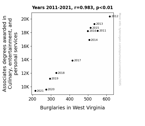
The Roast and Steal: A Correlational Analysis of Culinary Degrees and Burglaries in the Hills of West Virginia
As the number of Associates degrees awarded in Culinary, entertainment, and personal services decreased, there were fewer aspiring chefs and entertainers entering the job market. This led to a sudden shortage of talented individuals to host elaborate dinner parties and perform at swanky events. With the entertainment and personal services sector taking a hit, burglars in West Virginia found themselves out of work, as there were fewer high-end homes to target for their next big heist. After all, why break into a house with mediocre microwave dinners and no live entertainment, when they could hold out for a lavish culinary experience and a private concert? It seems like the real crime here was the lack of flavorful dishes and show-stopping performances to keep the burglars entertained and well-fed! Who knew that the key to reducing burglaries in West Virginia lay in the sizzling skills of culinary and entertainment graduates, leaving the burglars with no choice but to hang up their black ski masks and pursue more legitimate careers in the world of fine dining and showbiz! It's a classic case of 'if you can't stand the heat, stay out of the burglary business!
What else correlates?
Culinary Associates degrees awarded · all education
Burglaries in West Virginia · all random state specific
Culinary Associates degrees awarded · all education
Burglaries in West Virginia · all random state specific


View details about correlation #4,435
The Sound of Smog: A Harmonious Analysis of the Relationship between Air Pollution in Hanford, California and United States Music Album Sales
As the air cleared in Hanford, people found they no longer needed to 'breathe' new life into their music collection, leading to a decrease in album sales across the country. The correlation can be attributed to the fact that with fresher air, residents felt less 'O-zone' to stay indoors and listen to music, ultimately affecting the nation's album sales.


What else correlates?
Air pollution in Hanford, California · all weather
United States music album sales · all weird & wacky
Air pollution in Hanford, California · all weather
United States music album sales · all weird & wacky


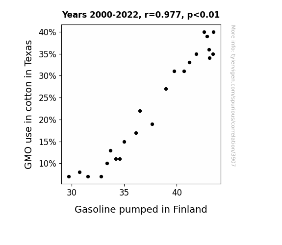
View details about correlation #3,907
: Seed to Pump: An Unlikely Alliance between GMO Cotton in Texas and Gasoline in Finland
As Texas cut back on GMO cotton, there was less need for fuel, leading to a reduction in gasoline production. The situation truly went from "organic" to "inorganic" in the cotton fields, creating a gin-credible ripple effect. The Finnish thought of this correlation as utterly unpresidented. We can say it really oil started with the seeds of change in Texas!

What else correlates?
GMO use in cotton in Texas · all food
Gasoline pumped in Finland · all energy
GMO use in cotton in Texas · all food
Gasoline pumped in Finland · all energy


View details about correlation #3,800
Heli-calling for Help: Analyzing the Relationship Between Telephone Operators in Oklahoma and Google Searches for 'Helicopter Accident'
As the number of telephone operators in Oklahoma decreased, there were fewer people available to make prank calls to helicopter pilots, leading to a decrease in their distraction and ultimately fewer helicopter accidents.


. The chart goes from 2012 to 2021, and the two variables track closely in value over that time.")

View details about correlation #4,155
The Tempest of Technology: Tracing the Tumultuous Ties between Bachelor's Degrees in Military Technologies and Thermo Fisher Scientific Stock Prices
As more people became knowledgeable in military tech and applied sciences, they realized the potential for using Thermo Fisher's equipment to create the ultimate weapon: a freeze ray that could immobilize enemy forces with extreme cold. This led to an unexpected surge in demand for Thermo Fisher's products, causing their stock price to soar as investors caught wind of the chillingly profitable military applications. Thermo Fisher's future seemed to be on ice, but in the best way possible!


View details about correlation #4,071
The Great Dakota Patent Heist: Uncovering the Connection Between Robberies in North Dakota and US Patents
As the saying goes, "desperate times call for brilliant inventions!" The spike in robberies in North Dakota led to an unexpected surge in innovation, as residents sought new ways to protect their belongings and outsmart the thieves. This ultimately resulted in an increase in patents granted in the US, as North Dakotans' sticky situations bred a new wave of creative problem-solving. Remember, necessity may be the mother of invention, but a good old-fashioned heist is the wacky uncle!


What else correlates?
Robberies in North Dakota · all random state specific
Patents granted in the US · all weird & wacky
Robberies in North Dakota · all random state specific
Patents granted in the US · all weird & wacky


View details about correlation #4,380
Watt's Clickbait Got to Do with It? The Shocking Connection Between The Game Theorists' YouTube Titles and Renewable Energy Production in Canada
As The Game Theorists' video titles become more enticing, viewers experience a surge in motivation, manifesting as a newfound interest in renewable energy. This unprecedented drive prompts a wave of creativity and innovation in Canada, leading to groundbreaking advancements in renewable energy production. Ultimately, The Game Theorists' clickbait mastery inadvertently sparks a nationwide push towards a more sustainable future. Remember, it's all just a theory - a game theory!


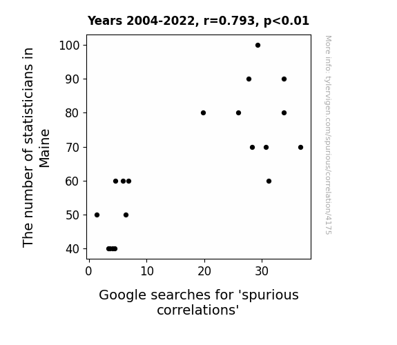
View details about correlation #4,175
Maine Statisticians and 'Spurious Correlations': A Tale of Google Search Relation
As the number of statisticians in Maine increases, so does the likelihood of someone discovering an absurdly specific and completely spurious correlation, like the number of pirates in the 18th century correlating with global warming. It appears that when you have more statisticians in the mix, you also have more people with the time and expertise to uncover these bizarre, yet seemingly significant, relationships. The presence of these number-crunching professionals in Maine may be inadvertently fueling the creation of spurious correlations, as they put their analytical skills to the test and stumble upon these nonsensical, but entertaining, statistical connections. Who would have thought that the key to unlocking spurious correlations lies in the strangely specific world of Maine's statistical community? Or perhaps it's just a spurious correlation in itself.

What else correlates?
The number of statisticians in Maine · all cccupations
Google searches for 'spurious correlations' · all google searches
The number of statisticians in Maine · all cccupations
Google searches for 'spurious correlations' · all google searches
. The chart goes from 2002 to 2023, and the two variables track closely in value over that time.")

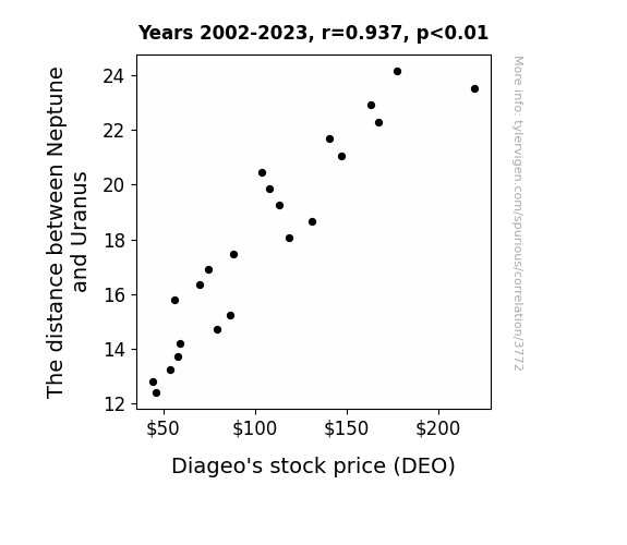
View details about correlation #3,772
Planetary Proximity and Boozy Booty: A Correlational Study of Neptune-Uranus Distance and Diageo's Stock Price
As the gap widened, it created a gravitational pull on Earth's liquid assets, leading to a surge in demand for alcoholic beverages, thereby boosting Diageo's stock price.

What else correlates?
The distance between Neptune and Uranus · all planets
Diageo's stock price (DEO) · all stocks
The distance between Neptune and Uranus · all planets
Diageo's stock price (DEO) · all stocks


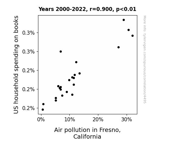
View details about correlation #4,495
Air Pollution's Prose Effect: The Connection Between U.S. Household Spending on Books and Carbon Footprint in Fresno
As US household spending on books decreased, fewer books were produced, leading to a decline in paper production. With less demand for paper, there were fewer trees cut down, which meant more trees were available to absorb carbon emissions. Some of these trees happened to be magical air-cleansing book trees, and as their numbers increased, they worked their leafy, literary charm to specifically clean the air in Fresno, California. It's like a real-life version of The Lorax, but with a plot twist where the trees were indirectly saved by people buying fewer books!

What else correlates?
US household spending on books · all weird & wacky
Air pollution in Fresno, California · all weather
US household spending on books · all weird & wacky
Air pollution in Fresno, California · all weather


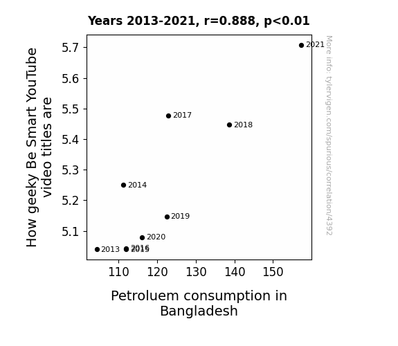
View details about correlation #4,392
Geek Chic and Gasoline: The Rhyme and Reason of How Geeky Be Smart YouTube Video Titles and Petroleum Consumption in Bangladesh
As Bangladeshi citizens watched more How Geeky Be Smart videos, they couldn't help but fuel their love for learning, leading to a surge in petroleum consumption as they drove to quench their thirst for knowledge. It seems like their passion for geeking out was really driving them to gas up and go!

What else correlates?
How geeky 'Be Smart' science YouTube video titles are · all YouTube
Petroluem consumption in Bangladesh · all energy
How geeky 'Be Smart' science YouTube video titles are · all YouTube
Petroluem consumption in Bangladesh · all energy


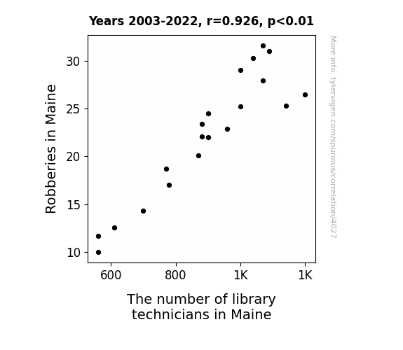
View details about correlation #4,027
The Unlikely Connection Between Book 'Em, Danno! and Bookshelves: A Study of the Relationship Between Robberies in Maine and the Number of Library Technicians
As the saying goes, the pen is mightier than the sword - and apparently, it's also mightier than the ski mask! With fewer robberies, there was a reduced demand for stealthy, quick-handed individuals, thus leading to a decline in library technician numbers. It seems like those skilled in the art of the heist decided to turn over a new leaf and check out careers that were a better fit for their bookish talents. Looks like they traded in their fingerprints for ink prints!

What else correlates?
Robberies in Maine · all random state specific
The number of library technicians in Maine · all cccupations
Robberies in Maine · all random state specific
The number of library technicians in Maine · all cccupations


View details about correlation #3,826
I Can't Even Believe It: The Correlation between GMO Cotton in Arkansas and Google Searches for 'I Can't Even'
The GMO cotton in Arkansas kept dropping sassy remarks like, "You can't pick me out of a lineup!" and "I'm feelin' so fly, I must be ginned cotton!" This led to a surge in people exasperatedly declaring, "I can't even handle this cotton drama!" It seems the situation has been spun into a thread of confusion, leaving everyone in stitches.

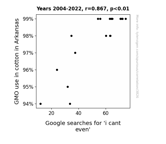
What else correlates?
GMO use in cotton in Arkansas · all food
Google searches for 'i cant even' · all google searches
GMO use in cotton in Arkansas · all food
Google searches for 'i cant even' · all google searches
. The chart goes from 2002 to 2023, and the two variables track closely in value over that time.")

View details about correlation #4,275
Clearing the Air: Exploring the Gasping Correlation Between Air Quality in Harrison, Arkansas, and Biogen's Stock Price
As the air quality improved in Harrison, Arkansas, the local population experienced a surge in energy and mental clarity. This led to a sudden spike in demand for outdoor activities, including a newfound enthusiasm for biogenetic-themed LARPing (live-action role-playing). With more people dressing up as their favorite DNA strands and reenacting cellular processes in the fresh, clean air, there was an unexpected uptick in Biogen's stock price as enthusiasts sought to embody their biotechnological heroes. It seems like cleaner air isn't just good for lungs, but also for the whimsical world of biogenetic finance!

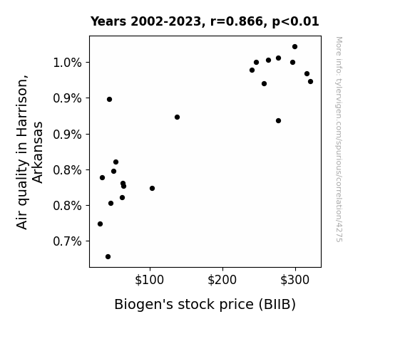
What else correlates?
Air quality in Harrison, Arkansas · all weather
Biogen's stock price (BIIB) · all stocks
Air quality in Harrison, Arkansas · all weather
Biogen's stock price (BIIB) · all stocks


View details about correlation #1,600
Sunny Side Up: Illuminating the Relationship Between Solar Power Generation in Senegal and Sales of LP/Vinyl Albums
As Solar power generation in Senegal increased, it led to a surge in positive vibes. This, in turn, sparked a revival of interest in retro music. People found themselves irresistibly drawn to the funky, groovy beats of old-school LPs and vinyl albums, contributing to a surprising uptick in sales. It seems that as the solar panels soaked up the sun, they also radiated a ‘stayin’ alive’ energy that reignited a passion for classic tunes, proving that when it comes to music sales, the sun definitely has the most LP potential!

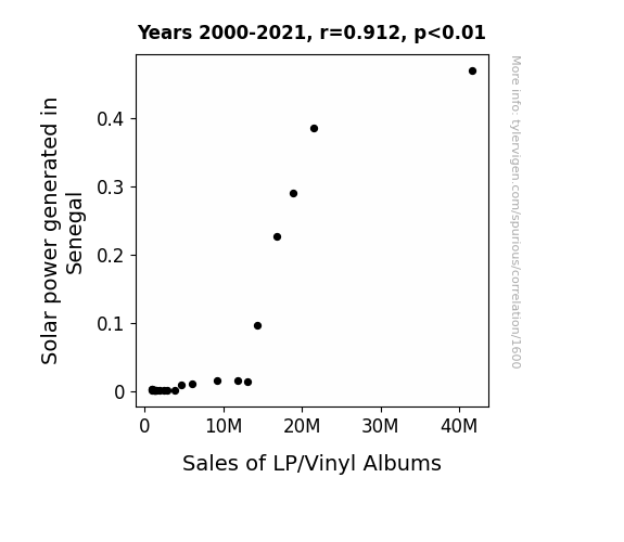
What else correlates?
Solar power generated in Senegal · all energy
Sales of LP/Vinyl Albums · all weird & wacky
Solar power generated in Senegal · all energy
Sales of LP/Vinyl Albums · all weird & wacky


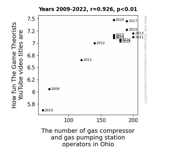
View details about correlation #4,577
The Game Theorists' YouTube Titles: A Gas-terly Perspective on the Labor Market in Ohio
As the video titles got more fun, it created a ripple of joy that wafted through the air, reaching Ohio and inspiring people to pursue careers in the gas industry. After all, who wouldn't want to bring some extra 'pump' to their job?


View details about correlation #4,476
From GMO to GOP: Unraveling the Cotton-nection Between Genetically Modified Cotton and Republican Votes in Louisiana
As the saying goes, when it comes to GMO cotton in Louisiana, it's a real 'bale' of laughs. Perhaps the Republican candidate's campaign slogan should have been "Make Agriculture 'Grate' Again"! With GMO cotton on the rise, it looks like the Republican party really knows how to 'sow' the seeds of success in Louisiana. Who knew that a little bit of genetic modification could 'cotton' so well with Republican voters? It seems like in the political fields of Louisiana, the Republicans are really 'harvesting' the support, straight to the 'polls'! Remember, when it comes to politics and cotton, it’s all about 'reaping' what you 'sow'! Keep in mind that this explanation is only a humorous thought exercise, and in reality, political decisions are influenced by a wide range of complex factors.


What else correlates?
GMO use in cotton in Louisiana · all food
Votes for the Republican Presidential candidate in Louisiana · all elections
GMO use in cotton in Louisiana · all food
Votes for the Republican Presidential candidate in Louisiana · all elections


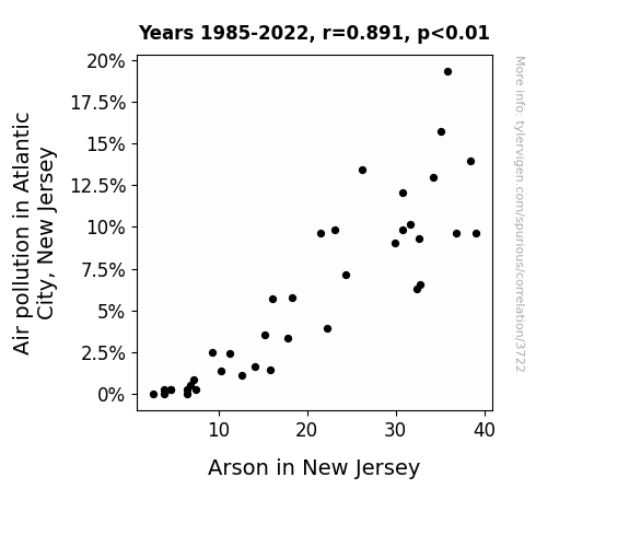
View details about correlation #3,722
The Soot and the Spontaneous: Air Pollution in Atlantic City, New Jersey and Arson in New Jersey
It's believed that as the air quality improved in Atlantic City, the infamous smell of burnt casinos and money became less potent, leading to a decrease in the urge to start fires for unconventional air freshening purposes. The correlation is strengthened by the fact that as people were no longer constantly surrounded by a smoky atmosphere, they were less likely to mistake actual emergency situations for just another day in Atlantic City.

What else correlates?
Air pollution in Atlantic City, New Jersey · all weather
Arson in New Jersey · all random state specific
Air pollution in Atlantic City, New Jersey · all weather
Arson in New Jersey · all random state specific


View details about correlation #4,234
Blowin' in the Jasper: A Breezy Investigation into the Jasper Name Popularity-Wind Power Link in France
As the number of Jaspers grew, so did the collective jaunty attitude, leading to an upsurge in spontaneous whistling. The melodious tunes created atmospheric disturbances, ultimately boosting wind power productivity in France. Remember, it's not the gusts of wind, it's the Jaspers that make the turbines spin!
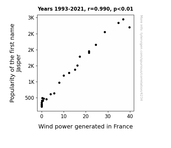
What else correlates?
Popularity of the first name Jasper · all first names
Wind power generated in France · all energy
Popularity of the first name Jasper · all first names
Wind power generated in France · all energy


View details about correlation #4,354
Counting Coaches: The Link Between Numberphile Video Title Coolness and Utah’s Sports Scouts
The influx of coaches and scouts in Utah has led to a surge in counting-related competitions. As these mathematical showdowns gain traction, Numberphile is jumping on the bandwagon by creating trendy and 'hip' video titles to appeal to this emerging demographic of numerically-inclined sports enthusiasts in the Beehive State. It's a real game-changer for the world of numbers!

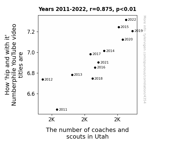
Why this works
- Data dredging: I have 25,237 variables in my database. I compare all these variables against each other to find ones that randomly match up. That's 636,906,169 correlation calculations! This is called “data dredging.”
Fun fact: the chart used on the wikipedia page to demonstrate data dredging is also from me. I've been being naughty with data since 2014.
Instead of starting with a hypothesis and testing it, I instead tossed a bunch of data in a blender to see what correlations would shake out. It’s a dangerous way to go about analysis, because any sufficiently large dataset will yield strong correlations completely at random. - Lack of causal connection: There is probably no direct connection between these variables, despite what the AI says above.
Because these pages are automatically generated, it's possible that the two variables you are viewing are in fact causually related. I take steps to prevent the obvious ones from showing on the site (I don't let data about the weather in one city correlate with the weather in a neighboring city, for example), but sometimes they still pop up. If they are related, cool! You found a loophole.
This is exacerbated by the fact that I used "Years" as the base variable. Lots of things happen in a year that are not related to each other! Most studies would use something like "one person" in stead of "one year" to be the "thing" studied. - Observations not independent: For many variables, sequential years are not independent of each other. You will often see trend-lines form. If a population of people is continuously doing something every day, there is no reason to think they would suddenly change how they are doing that thing on January 1. A naive p-value calculation does not take this into account.
You will calculate a lower chance of "randomly" achieving the result than represents reality.
To be more specific: p-value tests are probability values, where you are calculating the probability of achieving a result at least as extreme as you found completely by chance. When calculating a p-value, you need to assert how many "degrees of freedom" your variable has. I count each year (minus one) as a "degree of freedom," but this is misleading for continuous variables.
This kind of thing can creep up on you pretty easily when using p-values, which is why it's best to take it as "one of many" inputs that help you assess the results of your analysis.
- Y-axes doesn't start at zero: I truncated the Y-axes of the graphs above. I also used a line graph, which makes the visual connection stand out more than it deserves.
Nothing against line graphs. They are great at telling a story when you have linear data! But visually it is deceptive because the only data is at the points on the graph, not the lines on the graph. In between each point, the data could have been doing anything. Like going for a random walk by itself!
Mathematically what I showed is true, but it is intentionally misleading. If you click on any of the charts that abuse this, you can scroll down to see a version that starts at zero. - Confounding variable: Confounding variables (like global pandemics) will cause two variables to look connected when in fact a "sneaky third" variable is influencing both of them behind the scenes.
- Outliers: Some datasets here have outliers which drag up the correlation.
In concept, "outlier" just means "way different than the rest of your dataset." When calculating a correlation like this, they are particularly impactful because a single outlier can substantially increase your correlation.
Because this page is automatically generated, I don't know whether any of the charts displayed on it have outliers. I'm just a footnote. ¯\_(ツ)_/¯
I intentionally mishandeled outliers, which makes the correlation look extra strong. - Low n: There are not many data points included in some of these charts.
You can do analyses with low ns! But you shouldn't data dredge with a low n.
Even if the p-value is high, we should be suspicious of using so few datapoints in a correlation.
Pro-tip: click on any correlation to see:
- Detailed data sources
- Prompts for the AI-generated content
- Explanations of each of the calculations (correlation, p-value)
- Python code to calculate it yourself


