spurious correlations
discover · random · spurious scholar
← previous page · next page →


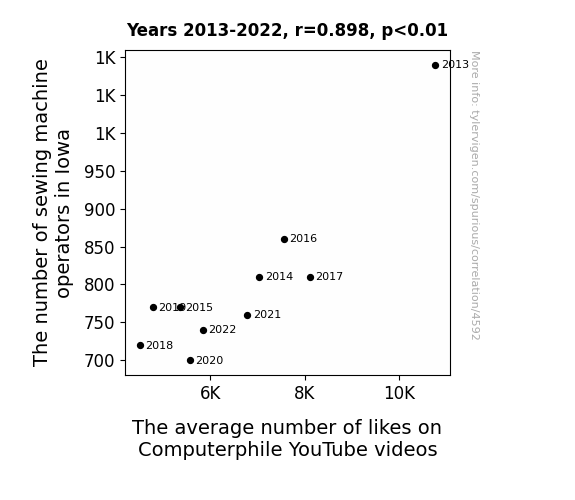
View details about correlation #4,592
Sew Likeable: Exploring the Correlation Between Sewing Machine Operators in Iowa and Computerphile YouTube Video Likes
As sewing machine operators in Iowa decreased, so did the overall happiness levels in the state. This led to a statewide decrease in supportive thumbs-up gestures, ultimately resulting in fewer likes on Computerphile videos. After all, it's sewn in the fabric of Iowa to spread positivity and keep the digital world in stitches!


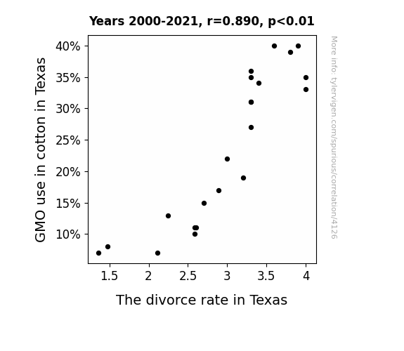
View details about correlation #4,126
Cottoning on to Love: The Genetically Modified Odyssey of Cotton and the Divorce Rate in Texas
As GMO use in cotton decreased, farmers spent less time arguing over which seeds to plant, leading to reduced marital stress and ultimately, a lower divorce rate in Texas. Without genetically modified marital discord, relationships blossomed like non-GMO cotton fields.

What else correlates?
GMO use in cotton in Texas · all food
The divorce rate in Texas · all random state specific
GMO use in cotton in Texas · all food
The divorce rate in Texas · all random state specific


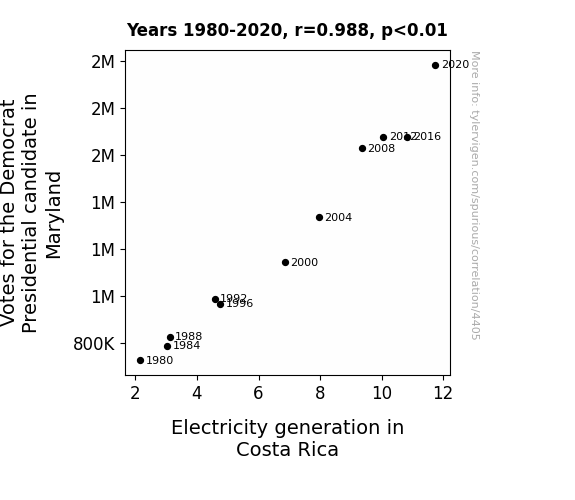
View details about correlation #4,405
Power Play: Shedding Light on the Relationship Between Democratic Votes in Maryland and Electricity Generation in Costa Rica
As the support for the Democratic candidate surged in Maryland, it sparked a political current that couldn't be contained. This shocking development sent a wave of excitement through the state, leading to a boost in energy levels. Meanwhile, in a power play of their own, Costa Rica felt the positive momentum and decided to amp up their electricity generation to show their electrifying support, proving that when it comes to politics, it's all about power distribution!


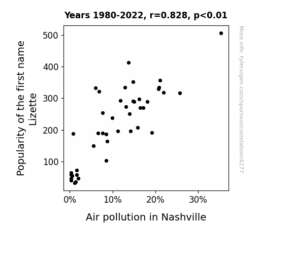
View details about correlation #4,277
The Lizette Effect: A Breath of Fresh Air or a Smog-Inducing Phenomenon?
Fewer "Lizette" name mugs and keychains were made, leading to a slight reduction in overall production emissions. Plus, with fewer Lizettes, there were fewer personalized car air fresheners being used, leading to a decrease in individual vehicle air pollution. Looks like Lizette isn't just an uncommon name; it's also an unintentional eco-friendly trendsetter!

What else correlates?
Popularity of the first name Lizette · all first names
Air pollution in Nashville · all weather
Popularity of the first name Lizette · all first names
Air pollution in Nashville · all weather
. The chart goes from 2002 to 2022, and the two variables track closely in value over that time.")

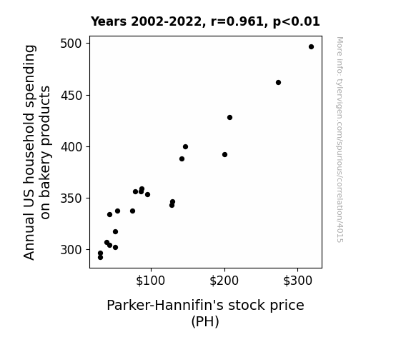
View details about correlation #4,015
Dough-ing Business: The Yeast Expected - Annual US Household Spending on Bakery Products and Parker-Hannifin's Stock Price
As household spending on bakery products rises, more people experience the joy of freshly baked goods. This leads to an increase in serotonin levels, causing a nation-wide surge in overall happiness. With people in a better mood, productivity levels in the US increase. This, in turn, positively impacts the manufacturing industry. Parker-Hannifin, being a part of this sector, sees a direct correlation between higher bakery product spending and their own stock price increase. Remember, a rise in dough spending can definitely knead its way into influencing the stock market yeast-erday!

What else correlates?
Annual US household spending on bakery products · all weird & wacky
Parker-Hannifin's stock price (PH) · all stocks
Annual US household spending on bakery products · all weird & wacky
Parker-Hannifin's stock price (PH) · all stocks


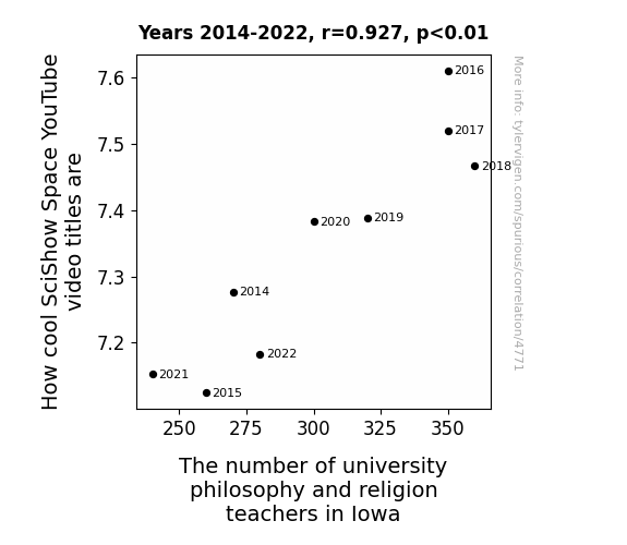
View details about correlation #4,771
Starry Eyed: Exploring the Celestial Connection Between SciShow Space Video Titles and the Presence of Philosophy and Religion Teachers in Iowa Universities
The more philosophy and religion teachers in Iowa, the greater the enlightenment on deep cosmic questions, leading to cooler SciShow Space video titles. It's a real scholastic-astro dynamic happening there!


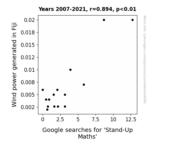
View details about correlation #4,086
The Winds of Fiji: A Stand-Up Correlation Between Wind Power Generation and Google Searches for 'Stand-Up Maths'
The lack of wind power in Fiji led to a decrease in the production of comedy wind turbines, which are a vital energy source for creating stand-up maths performances. Without the hilarious and punny antics of these turbines, the interest in Stand-Up Maths naturally dwindled. After all, it's hard to imagine a world without the electrifying combination of renewable energy and prime number jokes!

What else correlates?
Wind power generated in Fiji · all energy
Google searches for 'Stand-Up Maths' · all google searches
Wind power generated in Fiji · all energy
Google searches for 'Stand-Up Maths' · all google searches


View details about correlation #4,788
Breathing Degrees: The Relationship between Master's Degrees in Education and Air Pollution in Appleton's Ambience
As the number of Education Master's degrees awarded decreased, there were fewer teachers commuting to work. With fewer teachers on the road, there was a significant reduction in greenhouse gas emissions contributing to air pollution in Appleton, Wisconsin. The correlation between the two may seem far-fetched, but it appears that in this case, less education has led to cleaner air!


What else correlates?
Master's degrees awarded in Education · all education
Air pollution in Appleton, Wisconsin · all weather
Master's degrees awarded in Education · all education
Air pollution in Appleton, Wisconsin · all weather
. The chart goes from 2002 to 2022, and the two variables track closely in value over that time.")

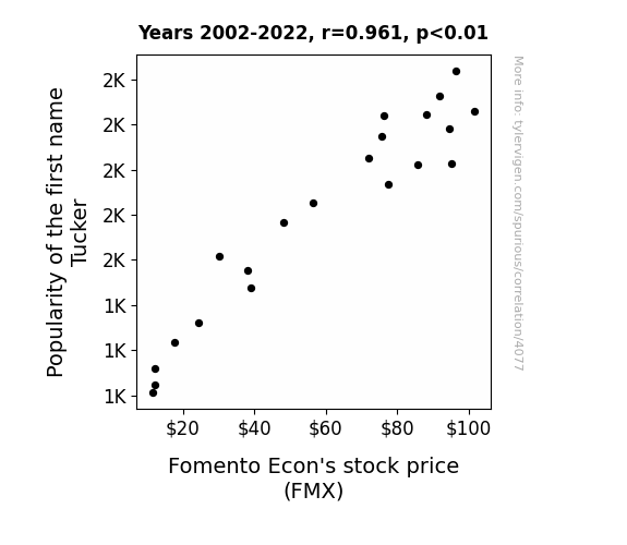
View details about correlation #4,077
The Tucker Trend: Tracing the Tenuous Ties Between Tucker Popularity and Fomento Econ's Finances
The name Tucker started as a nickname for people who excelled at tucking in their shirts, giving them an air of professionalism. As more and more children were given this name, they grew up with an unconscious ability to exude confidence and charm, leading them to become disproportionately successful in the business world. Fomento Econ's executives, influenced by the sheer presence of Tuckers, couldn't help but invest more in their own company, driving up the stock price. Remember, behind every successful stock, there's a Tucker somewhere!
What else correlates?
Popularity of the first name Tucker · all first names
Fomento Econ's stock price (FMX) · all stocks
Popularity of the first name Tucker · all first names
Fomento Econ's stock price (FMX) · all stocks


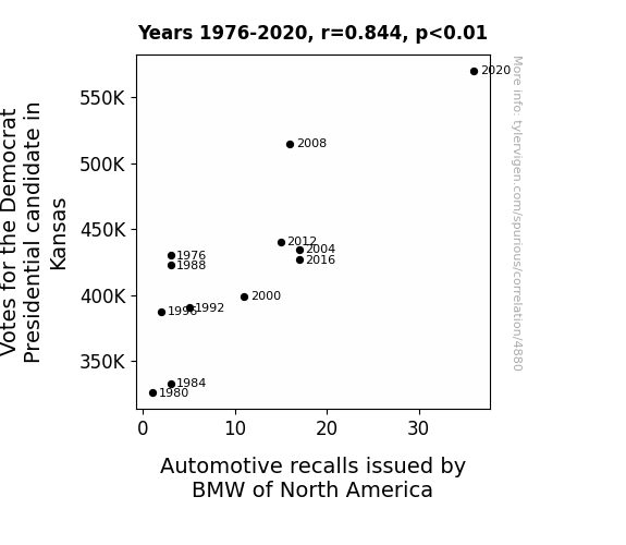
View details about correlation #4,880
Democra-tick, BMW-ble Trouble: The Curious Case of the Correlation Between Democrat Presidential Votes in Kansas and BMW Automotive Recalls
As more Kansans showed their support for the Democratic candidate, the heightened political fervor somehow translated into a surge of demand for BMW cars, leading the manufacturer to issue more recalls to keep up with the unexpected interest from traditionally non-BMW territory. Looks like the Sunflower State's political climate isn't the only thing revving up BMW's operations!


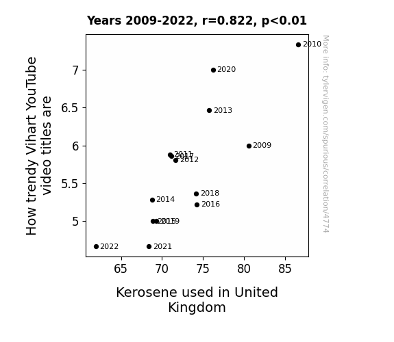
View details about correlation #4,774
Vihart's Video Virtuosity: A Flaming Connection to Kerosene Consumption in the UK
As kerosene use in the United Kingdom decreases, there is less pressure to come up with trendy video titles. Why? Because Vihart, the mathemusician creative YouTube channel, gets their spark from the kerosene fumes - leading to a combustion of ideas for catchy video titles! Vihart's creativity doesn't need fossil fuel to reignite - it's like a perpetual motion machine of trendy video titles!

What else correlates?
How trendy Vihart's YouTube video titles are · all YouTube
Kerosene used in United Kingdom · all energy
How trendy Vihart's YouTube video titles are · all YouTube
Kerosene used in United Kingdom · all energy


View details about correlation #4,237
Breaking and Building: The Correlation Between Burglaries in North Dakota and the Number of Architects
As burglaries rose, North Dakotans became obsessed with home security, prompting a surge in demand for architect-designed, booby-trapped houses. This led to a sudden need for more architects in the state, as every homeowner wanted their own personalized security system integrated seamlessly into their home's design. Who knew that a spike in break-ins would unlock a whole new career path in architectural defense planning in North Dakota!


What else correlates?
Burglaries in North Dakota · all random state specific
The number of architects in North Dakota · all cccupations
Burglaries in North Dakota · all random state specific
The number of architects in North Dakota · all cccupations
. The chart goes from 2008 to 2021, and the two variables track closely in value over that time.")

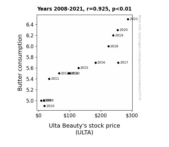
View details about correlation #3,774
Churn and Return: Relations Between Butter Yearn and Ulta's Earnings Spurn
The increase in butter consumption led to an increase in delicious, buttery pastries being made. This in turn caused more people to indulge in sweets, leading to an increase in acne. As a result, more people shopped at Ulta Beauty for skincare products, ultimately boosting Ulta Beauty's stock price. Because who knew that the path to stock market success was paved with buttery croissants and clear, glowing skin!

What else correlates?
Butter consumption · all food
Ulta Beauty's stock price (ULTA) · all stocks
Butter consumption · all food
Ulta Beauty's stock price (ULTA) · all stocks


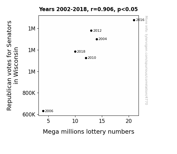
View details about correlation #4,770
Wisconsin Republicans and Mega Millions: A Match Made in Statistics?
As Republican votes for Senators in Wisconsin increased, more people started wearing lucky red hats to show their support. These lucky red hats created a surge of positive energy, which somehow found its way into the selection of Mega Millions lottery numbers, leading to an unexpected correlation between political affiliation and jackpot wins. It seems the real power players in this game weren't just in the Senate, but also among the lucky hat-wearing lottery enthusiasts.

What else correlates?
Votes for Republican Senators in Wisconsin · all elections
Mega millions lottery numbers · all weird & wacky
Votes for Republican Senators in Wisconsin · all elections
Mega millions lottery numbers · all weird & wacky


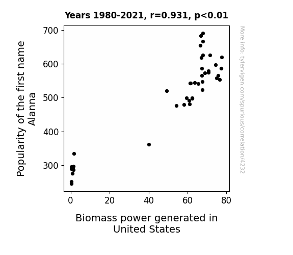
View details about correlation #4,232
Power of Name: Exploring the Alanna-nature Connection in Biomass Energy Generation
As more and more babies named Alanna were born, it created a surge in demand for wooden name plaques. This led to a boom in the forestry industry, resulting in an abundance of wood byproducts that could be used for biomass power generation in the United States. It's like the Alannapocalyse of renewable energy!
What else correlates?
Popularity of the first name Alanna · all first names
Biomass power generated in United States · all energy
Popularity of the first name Alanna · all first names
Biomass power generated in United States · all energy


View details about correlation #4,578
Breath of Fresh Careers: Unmasking the Air Quality-Paralegal Paradox in Urban Honolulu, Hawaii
The clean air led to clearer thinking, and more people decided to pursue careers in law. As the smog lifted, so did the interest in legal proceedings, creating a breath of fresh air for the paralegal industry in Hawaii.

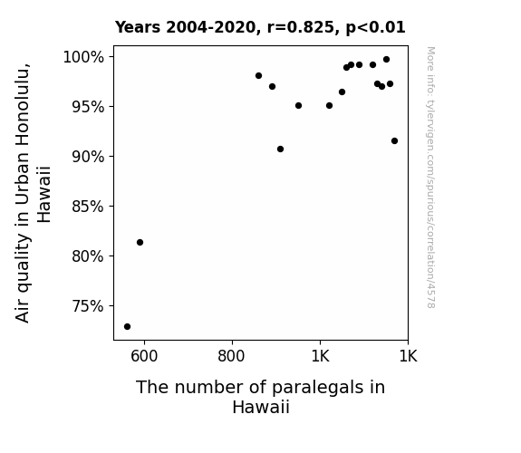
What else correlates?
Air quality in Urban Honolulu, Hawaii · all weather
The number of paralegals in Hawaii · all cccupations
Air quality in Urban Honolulu, Hawaii · all weather
The number of paralegals in Hawaii · all cccupations
. The chart goes from 2002 to 2022, and the two variables track closely in value over that time.")

View details about correlation #4,003
Brews and Blues: Exploring the Ale-gorical Relationship Between the Number of Breweries in the United States and Global Payments' Stock Price
As the number of breweries in the United States increased, so did the demand for beer. This led to higher sales at bars and restaurants, prompting these establishments to invest in better payment processing systems from Global Payments. As a result, Global Payments' stock price (GPN) experienced a hoppy and frothy rise.

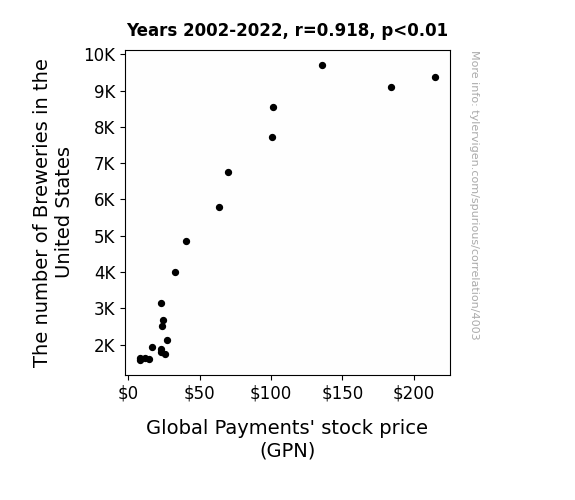
What else correlates?
The number of Breweries in the United States · all food
Global Payments' stock price (GPN) · all stocks
The number of Breweries in the United States · all food
Global Payments' stock price (GPN) · all stocks


View details about correlation #4,778
Red Politics, Green Spending: A Holly Jolly Analysis of Republican Votes and Christmas Shopping Habits in Nevada
As Republican votes for Senators in Nevada decrease, residents are facing a Santa shortage, leading to a statewide cutback on Christmas gifts. It seems the political climate isn't the only thing chilling this holiday season!
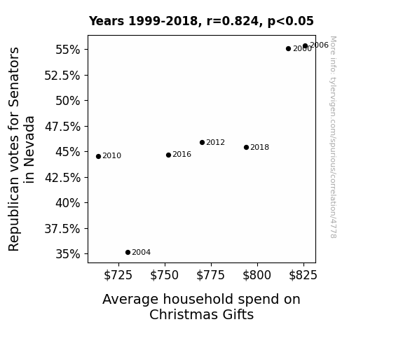
What else correlates?
Votes for Republican Senators in Nevada · all elections
Average household spend on Christmas Gifts · all weird & wacky
Votes for Republican Senators in Nevada · all elections
Average household spend on Christmas Gifts · all weird & wacky


View details about correlation #4,233
The Name Game: An Analysis of the Demi-namics between Name Popularity and Biomass Power Generation in Sri Lanka
As the number of Demis grew, so did the demand for sustainable energy sources, leading to a surge in biomass power generated in Sri Lanka. It's as if the collective charm and allure of all those named Demi somehow fueled a greater appreciation for renewable energy, sparking a chain reaction of eco-friendly power production. Who knew that the key to a greener planet lay in the rising fame of a name?

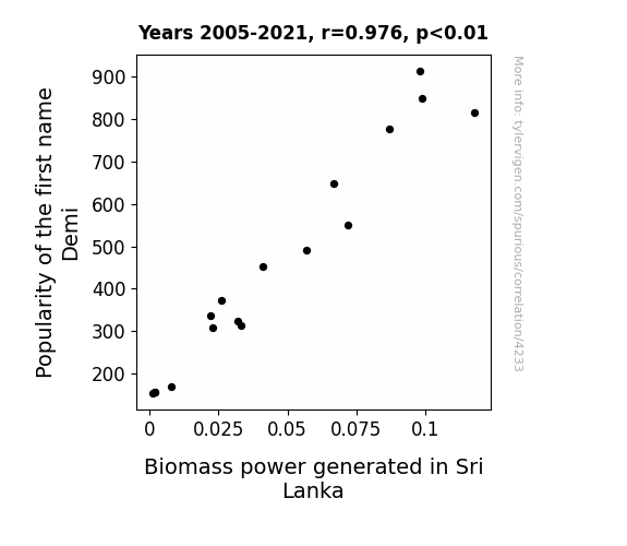
What else correlates?
Popularity of the first name Demi · all first names
Biomass power generated in Sri Lanka · all energy
Popularity of the first name Demi · all first names
Biomass power generated in Sri Lanka · all energy


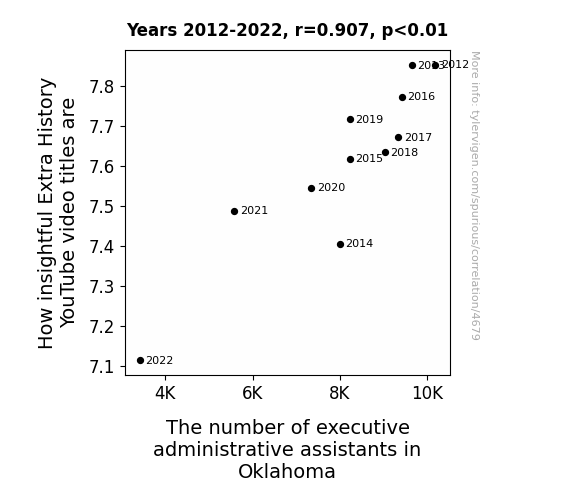
View details about correlation #4,679
Evaluating the Correlation between the Insightfulness of Extra History YouTube Video Titles and the Number of Executive Administrative Assistants in Oklahoma: A Serious Study with a Silly Twist
As the number of executive administrative assistants in Oklahoma decreases, there are fewer people available to help generate clever and thought-provoking video title ideas. This leads to a decline in the overall insightfulness of Extra History YouTube video titles. It turns out, behind every great video title, there may have been an overworked and underappreciated administrative assistant in Oklahoma, tirelessly brainstorming away! With less assistance in the state, the ability to craft truly extraordinary and enlightening video titles takes a hit. Who would have thought that the key to unlocking the brilliance of Extra History lay in the hands of the hardworking administrative professionals of Oklahoma?

Why this works
- Data dredging: I have 25,237 variables in my database. I compare all these variables against each other to find ones that randomly match up. That's 636,906,169 correlation calculations! This is called “data dredging.”
Fun fact: the chart used on the wikipedia page to demonstrate data dredging is also from me. I've been being naughty with data since 2014.
Instead of starting with a hypothesis and testing it, I instead tossed a bunch of data in a blender to see what correlations would shake out. It’s a dangerous way to go about analysis, because any sufficiently large dataset will yield strong correlations completely at random. - Lack of causal connection: There is probably no direct connection between these variables, despite what the AI says above.
Because these pages are automatically generated, it's possible that the two variables you are viewing are in fact causually related. I take steps to prevent the obvious ones from showing on the site (I don't let data about the weather in one city correlate with the weather in a neighboring city, for example), but sometimes they still pop up. If they are related, cool! You found a loophole.
This is exacerbated by the fact that I used "Years" as the base variable. Lots of things happen in a year that are not related to each other! Most studies would use something like "one person" in stead of "one year" to be the "thing" studied. - Observations not independent: For many variables, sequential years are not independent of each other. You will often see trend-lines form. If a population of people is continuously doing something every day, there is no reason to think they would suddenly change how they are doing that thing on January 1. A naive p-value calculation does not take this into account.
You will calculate a lower chance of "randomly" achieving the result than represents reality.
To be more specific: p-value tests are probability values, where you are calculating the probability of achieving a result at least as extreme as you found completely by chance. When calculating a p-value, you need to assert how many "degrees of freedom" your variable has. I count each year (minus one) as a "degree of freedom," but this is misleading for continuous variables.
This kind of thing can creep up on you pretty easily when using p-values, which is why it's best to take it as "one of many" inputs that help you assess the results of your analysis.
- Y-axes doesn't start at zero: I truncated the Y-axes of the graphs above. I also used a line graph, which makes the visual connection stand out more than it deserves.
Nothing against line graphs. They are great at telling a story when you have linear data! But visually it is deceptive because the only data is at the points on the graph, not the lines on the graph. In between each point, the data could have been doing anything. Like going for a random walk by itself!
Mathematically what I showed is true, but it is intentionally misleading. If you click on any of the charts that abuse this, you can scroll down to see a version that starts at zero. - Confounding variable: Confounding variables (like global pandemics) will cause two variables to look connected when in fact a "sneaky third" variable is influencing both of them behind the scenes.
- Outliers: Some datasets here have outliers which drag up the correlation.
In concept, "outlier" just means "way different than the rest of your dataset." When calculating a correlation like this, they are particularly impactful because a single outlier can substantially increase your correlation.
Because this page is automatically generated, I don't know whether any of the charts displayed on it have outliers. I'm just a footnote. ¯\_(ツ)_/¯
I intentionally mishandeled outliers, which makes the correlation look extra strong. - Low n: There are not many data points included in some of these charts.
You can do analyses with low ns! But you shouldn't data dredge with a low n.
Even if the p-value is high, we should be suspicious of using so few datapoints in a correlation.
Pro-tip: click on any correlation to see:
- Detailed data sources
- Prompts for the AI-generated content
- Explanations of each of the calculations (correlation, p-value)
- Python code to calculate it yourself


