spurious correlations
discover · random · spurious scholar
← previous page · next page →


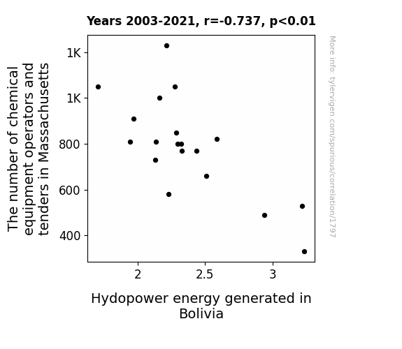
View details about correlation #1,797
Powering on: Hydro-Connectivity between Massachusetts Chemical Operators and Bolivian Hydropower Generation
As the chemical equipment operators and tenders in Massachusetts decreased, there was a surplus of oversized, malfunctioning equipment. Through a series of wacky shipping mishaps, this equipment found its way to Bolivia, where it was repurposed by a team of innovative engineers into hydroelectric generators. What started as a logistical nightmare for Massachusetts turned into a shocking success for Bolivia, as the unintentional export of expertise led to an unexpected surge in hydropower energy production. The world can now only marvel at the sheer power of this unplanned, intercontinental collaboration, and it just goes to show that when it comes to energy, sometimes the best solutions flow from the most improbable sources.


View details about correlation #1,556
From Soybeans to Sighing: The Relationship Between GMO Use in Illinois and 'I Can't Even' Google Searches
The soybeans started expressing themselves in ways no one could comprehend, leaving everyone in a state of agricultural confusion. The GMO soybeans were just too much for people to handle, leading to a widespread feeling of botanic bewilderment. The soybeans' inner turmoil was reflected in the collective exasperation of internet users, creating a crop of memes and jokes that just couldn't be odder. It was a situation that even the most seasoned farmers couldn't crop with, and soon the entire state of Illinois found itself in a soy-based existential crisis.


What else correlates?
GMO use in soybeans in Illinois · all food
Google searches for 'i cant even' · all google searches
GMO use in soybeans in Illinois · all food
Google searches for 'i cant even' · all google searches


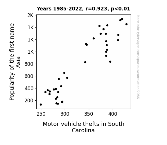
View details about correlation #2,086
Can't 'Asia' the Connection: Exploring the Correlation Between the Popularity of the Name 'Asia' and Motor Vehicle Thefts in South Carolina
As more babies were named Asia, there was a subconscious societal shift towards a desire for exotic travel, leading to an uptick in car thefts as people tried to fulfill their newfound wanderlust. The baby name book didn't mention anything about unintended crime waves!

What else correlates?
Popularity of the first name Asia · all first names
Motor vehicle thefts in South Carolina · all random state specific
Popularity of the first name Asia · all first names
Motor vehicle thefts in South Carolina · all random state specific


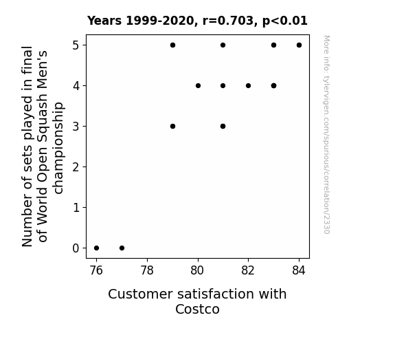
View details about correlation #2,330
Smash, Serve, and Savings: The Racket of Squash and Costco Customer Contentment
The intense back and forth in squash finals gets people pumped, leading to higher endorphin levels. These endorphins make shoppers at Costco feel even more satisfied with their bulk purchases, creating a racket of happiness in the aisles. It's a real game-changer for their overall shopping experience.


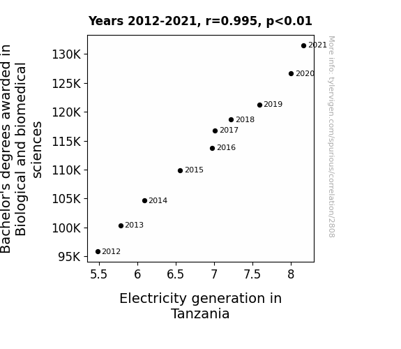
View details about correlation #2,808
Sparking Interest: The Shocking Connection Between Bachelor's Degrees in Biological and Biomedical Sciences and Electricity Generation in Tanzania
As the number of Bachelor's degrees in Biological and biomedical sciences rose, so did the understanding of current flow in biological systems. This sparked a surge in bio-electricity research in Tanzania, leading to shocking advancements in sustainable energy production. It's as if these graduates were ion-ically charged to make a powerful impact on Tanzania's power sector!

What else correlates?
Bachelor's degrees awarded in biomedical sciences · all education
Electricity generation in Tanzania · all energy
Bachelor's degrees awarded in biomedical sciences · all education
Electricity generation in Tanzania · all energy
. The chart goes from 2003 to 2022, and the two variables track closely in value over that time.")

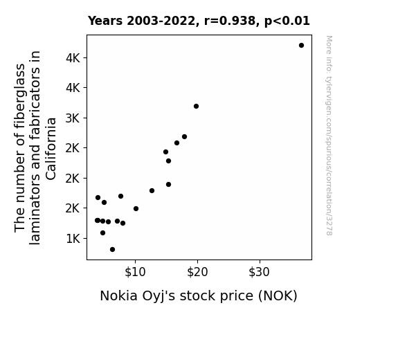
View details about correlation #3,278
Weaving Together Nokia's Future: The Fiber Glassimations of Stock Prices
The shortage of fiberglass laminators and fabricators in California led to a decrease in the production of oversized, novelty Nokia cell phone props, causing a decline in public interest and ultimately impacting Nokia Oyj's stock price. Who knew that California had such a big hand in shaping the stock market - talk about a ripple effect!


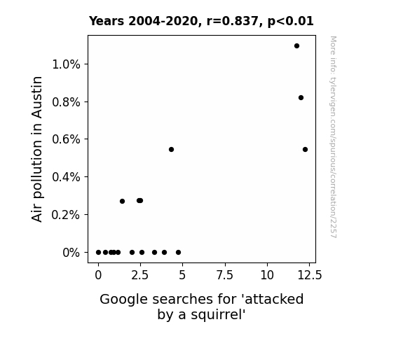
View details about correlation #2,257
Nuts About Pollution: The Squirrelly Relationship Between Air Quality in Austin and Google Searches for 'Attacked by a Squirrel'
With cleaner air, squirrels in Austin are feeling more energized and peaceful, leading to a decrease in their aggressive behavior. It turns out, they were just really cranky because of all the pollution, and now they're not as eager to start squirrel fights. Remember, only you can prevent squirrel-on-human combat by keeping the air clean and the squirrels serene!

What else correlates?
Air pollution in Austin · all weather
Google searches for 'attacked by a squirrel' · all google searches
Air pollution in Austin · all weather
Google searches for 'attacked by a squirrel' · all google searches


View details about correlation #1,893
The Arkansas UFO Flap: A Link to Nathan's Hot Dog Cap
The influx of extraterrestrial activity in Arkansas has led to a surge in demand for space-themed food, including rocket dogs and cosmic canines. As a result, the local Nathan's hot dog champion has been training by chowing down on an astronomical amount of hotdogs in preparation for a potential intergalactic hot dog eating showdown. It seems the UFO sightings have really launched his appetite to infinity and beyond!


View details about correlation #3,544
Spreading Sunshine: The Buttery Connection Between Butter Consumption and Solar Power Generation in Luxembourg
As butter consumption increased, people's greasy fingers accidentally created a more reflective surface on solar panels, leading to greater sunlight absorption and an overall boost in solar power generation in Luxembourg. The power of dairy strikes again!


What else correlates?
Butter consumption · all food
Solar power generated in Luxembourg · all energy
Butter consumption · all food
Solar power generated in Luxembourg · all energy
. The chart goes from 2010 to 2022, and the two variables track closely in value over that time.")

View details about correlation #2,657
The Teachings of the STOCK: A Punny Investigation into the Relationship Between Pennsylvania School Teachers and Vale S.A.'s Stock Price
The decrease in school teachers meant fewer people to teach about rocks and minerals. This led to a decline in students' interest in mining, ultimately impacting Vale S.A.'s stock price as future demand for minerals waned.


What else correlates?
The number of school teachers in Pennsylvania · all cccupations
Vale S.A.'s stock price (VALE) · all stocks
The number of school teachers in Pennsylvania · all cccupations
Vale S.A.'s stock price (VALE) · all stocks


View details about correlation #1,619
The Ties between Jason and Haze in Denver's Days: A Correlation Analysis
Fewer people were requesting personalized license plates with the name JASON, leading to a decline in production at the local license plate manufacturing plant. This reduction in manufacturing activity resulted in lower emissions of pollutants into the atmosphere, consequently improving the air quality in Denver.


What else correlates?
Popularity of the first name Jason · all first names
Air pollution in Denver, Colorado · all weather
Popularity of the first name Jason · all first names
Air pollution in Denver, Colorado · all weather


View details about correlation #1,451
Justice League: The Correlation Between Marvel Comic-Based Film Budgets and the Legal Universe
As the Total budget of Marvel comic-based films released increased, it led to a surge in superhero merchandise. This, in turn, created a high demand for intellectual property lawyers specializing in copyright and trademark issues related to these iconic characters. The success of the Marvel movies essentially fueled a need for legal superheroes to protect their lucrative franchises, thus contributing to the rise in the Number of Lawyers in the United States. Remember, with great box office power comes great legal responsibility!


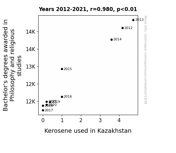
View details about correlation #1,838
The Enlightenment Effect: Illuminating the Relationship Between Philosophy and Religious Studies Degrees and Kerosene Consumption in Kazakhstan
As fewer students pondered the meaning of life and the universe, there was a collective shift towards simpler, more practical pursuits in Kazakhstan. This led to a decreased demand for kerosene as people opted for alternative forms of lighting and heating, finding enlightenment in energy-efficient solutions. After all, who needs to burn kerosene when you're no longer burning with existential questions?

What else correlates?
Bachelor's degrees awarded in Philosophy · all education
Kerosene used in Kazakhstan · all energy
Bachelor's degrees awarded in Philosophy · all education
Kerosene used in Kazakhstan · all energy


View details about correlation #3,291
Scoring Goals and Assisting Occupational Therapy: A Correlation Study in English Premier League and Iowa
As the Golden Boot Player's English Premier League goal tally increases, more people in Iowa are inspired to pursue careers as occupational therapy assistants in order to help others get back on their feet after their own attempts at recreating the player's impressive goals result in injury. This influx of new occupational therapy assistants leads to a higher demand for their services across the state, ultimately improving the overall well-being of Iowans.


. The chart goes from 2002 to 2023, and the two variables track closely in value over that time.")

View details about correlation #3,641
Air Quality in Pittsburgh: A 'Breathtaking' Impact on Walmart's Stock Price (WMT)
The cleaner air in Pittsburgh led to people feeling more energetic and eager to go shopping at Walmart, boosting the company's sales and ultimately their stock price. It's amazing what a breath of fresh air can do for the retail industry!


What else correlates?
Air quality in Pittsburgh · all weather
Walmart's stock price (WMT) · all stocks
Air quality in Pittsburgh · all weather
Walmart's stock price (WMT) · all stocks


View details about correlation #2,465
Kansas UFOs and Kooky Climbs: A Closer Connection
As more Kansans reported seeing UFOs, it created a buzz in the state. This led to a surge in interest in outer space and interstellar travel. Consequently, more people in Kansas became interested in reaching new heights, quite literally. They were over the moon about the idea of conquering Everest, and it was as if a gravitational pull was drawing them to the challenge. It's like the UFO sightings sparked a cosmic shift in the mindset of Kansan adventurers, propelling them to scale new peaks.


What else correlates?
UFO sightings in Kansas · all random state specific
Total Number of Successful Mount Everest Climbs · all weird & wacky
UFO sightings in Kansas · all random state specific
Total Number of Successful Mount Everest Climbs · all weird & wacky


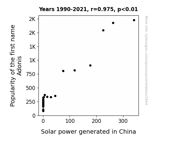
View details about correlation #2,444
Shining Bright: The Solar-Powered Popularity of Adonis
More babies named Adonis led to a spike in stroller production, inadvertently creating a higher demand for solar-powered factories in China. As these little Adonis fans cruised around in their sunlit strollers, they unknowingly became tiny ambassadors for solar power, brightening up the nation one baby step at a time. It's an illuminating cycle of adorably-named eco-influence!
What else correlates?
Popularity of the first name Adonis · all first names
Solar power generated in China · all energy
Popularity of the first name Adonis · all first names
Solar power generated in China · all energy


View details about correlation #2,469
Cotton GMO: Does It Make Your Desktop Glow?
Farmers were no longer "cropping" up those genetically modified cotton plants, leading to a shortage of 1080p and 4K wallpapers. It seems the connection between organic cotton and organic screensavers is sewn into the fabric of technology. This correlation clearly shows that when it comes to sprouting new desktop backgrounds, Mississippi's non-GMO cotton fields were truly pixelating the market.


What else correlates?
GMO use in cotton in Mississippi · all food
Google searches for 'desktop background' · all google searches
GMO use in cotton in Mississippi · all food
Google searches for 'desktop background' · all google searches


View details about correlation #2,127
Building Bridges: Exploring the Architectural Association Between Associates Degrees and Truck Driving in the District of Columbia
As more people became interested in building stuff, they also developed a passion for trucking it around. It's like they couldn't handle just designing the buildings, they had to 'drive' home their love for construction. It's a concrete example of how one degree can 'elevate' an entire industry!

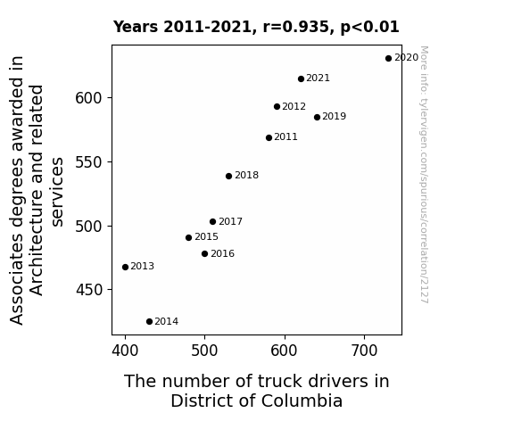
. The chart goes from 2002 to 2022, and the two variables track closely in value over that time.")

View details about correlation #2,151
Moo-ving Markets: The Milky Way to Stock Market Analysis
As US household spending on fresh milk and cream decreased, it led to a surplus of dairy products. This surplus led to an increase in the popularity of dairy-based challenges on social media, such as the gallon milk challenge. As more and more people participated in these challenges, there was a surge in data usage to upload and view videos, causing a strain on telecom networks. This increased demand for data put pressure on companies like Vodafone, leading to a decrease in their stock price as they scrambled to upgrade their infrastructure to support the udderly ridiculous trend.

What else correlates?
US household spending on fresh milk and cream · all weird & wacky
Vodafone Group's stock price (VOD) · all stocks
US household spending on fresh milk and cream · all weird & wacky
Vodafone Group's stock price (VOD) · all stocks
Why this works
- Data dredging: I have 25,237 variables in my database. I compare all these variables against each other to find ones that randomly match up. That's 636,906,169 correlation calculations! This is called “data dredging.”
Fun fact: the chart used on the wikipedia page to demonstrate data dredging is also from me. I've been being naughty with data since 2014.
Instead of starting with a hypothesis and testing it, I instead tossed a bunch of data in a blender to see what correlations would shake out. It’s a dangerous way to go about analysis, because any sufficiently large dataset will yield strong correlations completely at random. - Lack of causal connection: There is probably no direct connection between these variables, despite what the AI says above.
Because these pages are automatically generated, it's possible that the two variables you are viewing are in fact causually related. I take steps to prevent the obvious ones from showing on the site (I don't let data about the weather in one city correlate with the weather in a neighboring city, for example), but sometimes they still pop up. If they are related, cool! You found a loophole.
This is exacerbated by the fact that I used "Years" as the base variable. Lots of things happen in a year that are not related to each other! Most studies would use something like "one person" in stead of "one year" to be the "thing" studied. - Observations not independent: For many variables, sequential years are not independent of each other. You will often see trend-lines form. If a population of people is continuously doing something every day, there is no reason to think they would suddenly change how they are doing that thing on January 1. A naive p-value calculation does not take this into account.
You will calculate a lower chance of "randomly" achieving the result than represents reality.
To be more specific: p-value tests are probability values, where you are calculating the probability of achieving a result at least as extreme as you found completely by chance. When calculating a p-value, you need to assert how many "degrees of freedom" your variable has. I count each year (minus one) as a "degree of freedom," but this is misleading for continuous variables.
This kind of thing can creep up on you pretty easily when using p-values, which is why it's best to take it as "one of many" inputs that help you assess the results of your analysis.
- Y-axes doesn't start at zero: I truncated the Y-axes of the graphs above. I also used a line graph, which makes the visual connection stand out more than it deserves.
Nothing against line graphs. They are great at telling a story when you have linear data! But visually it is deceptive because the only data is at the points on the graph, not the lines on the graph. In between each point, the data could have been doing anything. Like going for a random walk by itself!
Mathematically what I showed is true, but it is intentionally misleading. If you click on any of the charts that abuse this, you can scroll down to see a version that starts at zero. - Confounding variable: Confounding variables (like global pandemics) will cause two variables to look connected when in fact a "sneaky third" variable is influencing both of them behind the scenes.
- Outliers: Some datasets here have outliers which drag up the correlation.
In concept, "outlier" just means "way different than the rest of your dataset." When calculating a correlation like this, they are particularly impactful because a single outlier can substantially increase your correlation.
Because this page is automatically generated, I don't know whether any of the charts displayed on it have outliers. I'm just a footnote. ¯\_(ツ)_/¯
I intentionally mishandeled outliers, which makes the correlation look extra strong. - Low n: There are not many data points included in some of these charts.
You can do analyses with low ns! But you shouldn't data dredge with a low n.
Even if the p-value is high, we should be suspicious of using so few datapoints in a correlation.
Pro-tip: click on any correlation to see:
- Detailed data sources
- Prompts for the AI-generated content
- Explanations of each of the calculations (correlation, p-value)
- Python code to calculate it yourself


