spurious correlations
discover · random · spurious scholar
← previous page · next page →


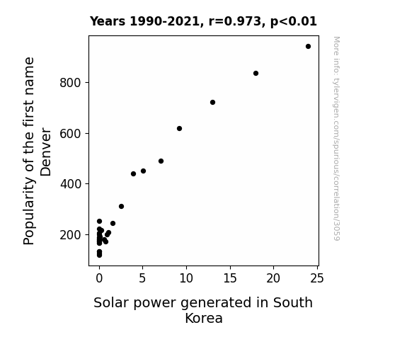
View details about correlation #3,059
The Illuminating Influence of Denver: Examining the Correlation Between the Popularity of the Name and Solar Power Generation in South Korea
As more babies were named Denver, their parents unconsciously gravitated towards sunny, positive vibes. This inadvertently led to a surge in upbeat energy in South Korea, thereby boosting the solar power generated. It's like the whole country got a dose of sunshine-infused motivation from the name alone!

What else correlates?
Popularity of the first name Denver · all first names
Solar power generated in South Korea · all energy
Popularity of the first name Denver · all first names
Solar power generated in South Korea · all energy


View details about correlation #3,401
Kernel of Truth: Unearthing the Corny Connection Between GMO Adoption in Michigan and Britney Spears Searches
The lack of GMOs led to corn stalks doing a natural, non-conforming sway, reminiscent of a Britney Spears performance, which satisfied people's need for entertainment, thereby reducing the desire to search for Britney Spears.


What else correlates?
GMO use in corn grown in Michigan · all food
Google searches for 'Britney Spears' · all google searches
GMO use in corn grown in Michigan · all food
Google searches for 'Britney Spears' · all google searches


View details about correlation #2,170
Swishing & Teaching: An Unlikely Association between Chicago Bulls Win Percentage and Middle School Teachers in New Hampshire
As the Bulls kept winning, more people were attracted to the exciting world of basketball. This led to a surge in demand for coaching at the middle school level, prompting a hiring spree for sports-loving individuals. New Hampshire, known for its passion for education, couldn't resist adding more middle school teachers to their roster, creating a hoopla of job opportunities! It's a slam dunk for both the Bulls and the educators in the Granite State.
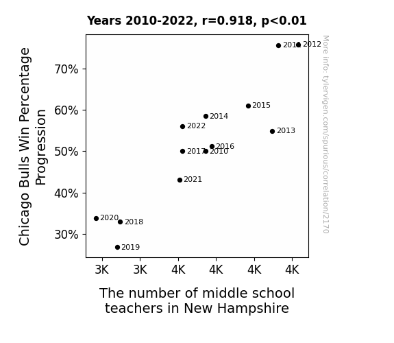
. The chart goes from 2006 to 2022, and the two variables track closely in value over that time.")

View details about correlation #1,343
Sunrise to Stock Rise: A Cracking Correlation Between Egg Spending and Ameriprise Financial's Stock Price
As household spending on eggs cracked open, it led to an egg-ceptional rise in demand for breakfast items. This sunny-side up surge in the breakfast sector whisked up profits for companies like Ameriprise Financial, prompting sunny financial forecasts and scrambling to invest in AMP stock. It seems like the market really knows how to shell-ebrate a nest-egg opportunity! Remember, the sunny side is always a-bovum when it comes to egg-citing stock trends.

What else correlates?
Annual US household spending on eggs · all weird & wacky
Ameriprise Financial's stock price (AMP) · all stocks
Annual US household spending on eggs · all weird & wacky
Ameriprise Financial's stock price (AMP) · all stocks


View details about correlation #2,809
Engineering a Bright Future: The Connection Between Bachelor's Degrees in Engineering Technologies and Renewable Energy Production in Cameroon
As the number of engineering technology graduates rose, so did their innovative 'watt' ideas and 'solar' panels of expertise. This sparked a 'renewed' interest and 'engineered' a brighter future for renewable energy production in Cameroon. It seems like these graduates were truly 'powering' up the industry and giving it the 'green light' to thrive. With their 'current' knowledge and 'magnetic' personalities, they were able to 'transform' the energy sector and 'propel' it towards a more sustainable path. Perhaps they simply had a 'positive charge' that couldn't be 'resisted'!


What else correlates?
Bachelor's degrees awarded in Engineering technologies · all education
Renewable energy production in Cameroon · all energy
Bachelor's degrees awarded in Engineering technologies · all education
Renewable energy production in Cameroon · all energy


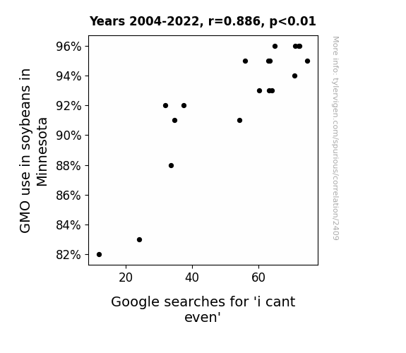
View details about correlation #2,409
Soy 'I Cant Even': The Link Between GMO Soybeans and Millennial Frustration in Minnesota
The genetically modified soybeans became so advanced that even their own DNA couldn't even handle it. The soybeans were walking around like, "I can't even photosynthesize right now." And their pods were all, "I can't even contain myself." It was a whole soy-entific meltdown. The internet just couldn't handle the soybean drama, and people everywhere were like, "I can't even." The soybeans basically turned Minnesota into the Land of 10,000 Memes.

What else correlates?
GMO use in soybeans in Minnesota · all food
Google searches for 'i cant even' · all google searches
GMO use in soybeans in Minnesota · all food
Google searches for 'i cant even' · all google searches


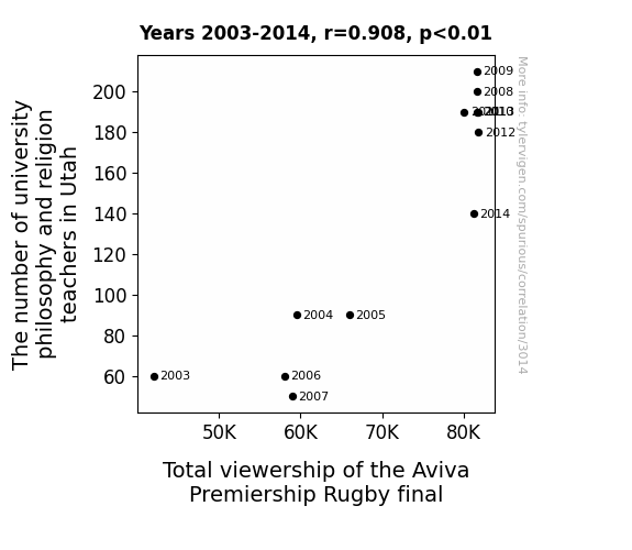
View details about correlation #3,014
The Rhyme and Reason of Utah's Philosophers and the Aviva Premiership Rugby Final: A Statistical Odyssey
As more philosophy and religion teachers joined the mix, they couldn't help but ponder the deeper meanings of scrums, tackles, and try attempts. Their metaphysical musings on the essence of the game somehow resonated with the locals, drawing them to the TV screens in droves. It seems like in the holy trinity of rugby, the philosophers and religion teachers became the unexpected third influence, propelling the viewership to new heights.


View details about correlation #1,567
Addie's Popularity and xkcd Comics: A Comical Correlation
Fewer Addies meant fewer individuals exclaiming, "Adore Addie's allusions!" which led to Randall Munroe's perplexity about producing literary xkcds.


What else correlates?
Popularity of the first name Addie · all first names
xkcd comics published about literature · all weird & wacky
Popularity of the first name Addie · all first names
xkcd comics published about literature · all weird & wacky


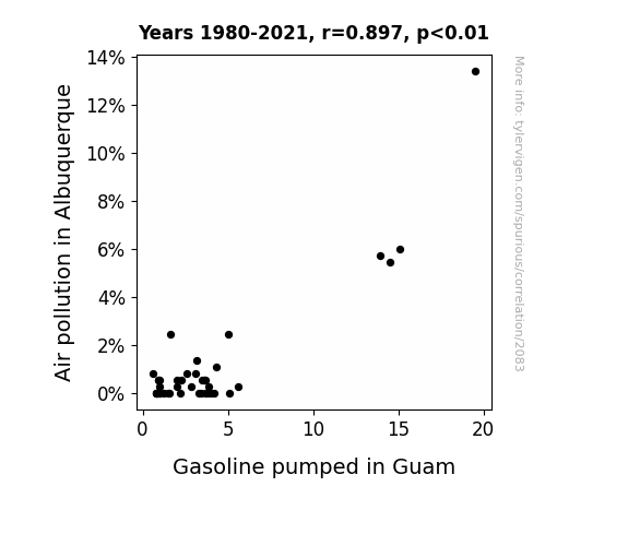
View details about correlation #2,083
The Gas and the Furious: Uncovering the Link Between Air Pollution in Albuquerque and Gasoline Pumped in Guam
As the air in Albuquerque cleared up, it actually developed a peculiar magnetic property that started to attract the gasoline molecules in Guam. This unprecedented phenomenon led to a subtle but steady decrease in the amount of gasoline being pumped, as the gasoline couldn't help but be drawn towards the cleaner air in Albuquerque. It's a classic case of environmental magnetism leading to an unintentional fuel fiasco!

What else correlates?
Air pollution in Albuquerque · all weather
Gasoline pumped in Guam · all energy
Air pollution in Albuquerque · all weather
Gasoline pumped in Guam · all energy
. The chart goes from 2003 to 2023, and the two variables track closely in value over that time.")

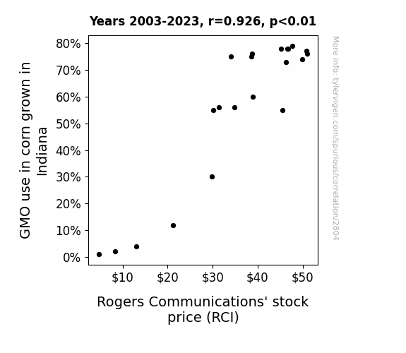
View details about correlation #2,804
Cross-Pollinating Stock Market Trends: The Corny Connection Between GMO Usage in Indiana and RCI Stock Price
As GMO use in Indiana corn increased, it led to the creation of a new strain of corn with built-in Wi-Fi capabilities. This corn, now known as "Corny-Fi," unexpectedly disrupted the telecommunications industry by providing free internet access to nearby areas. As people flocked to corn fields for both their technologically advanced produce and convenient internet access, the demand for Rogers Communications' services skyrocketed. Additionally, the corn's ability to auto-tweet its growth progress and post on Instagram led to a viral social media sensation, further boosting the company's stock price. This unforeseen connection between agriculture and technology not only changed the way we think about farming and communication, but also gave a whole new meaning to the term "going viral!"

What else correlates?
GMO use in corn grown in Indiana · all food
Rogers Communications' stock price (RCI) · all stocks
GMO use in corn grown in Indiana · all food
Rogers Communications' stock price (RCI) · all stocks


View details about correlation #1,908
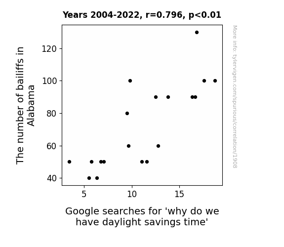
Chasing Daylight: A Correlation Study Between Bailiffs in Alabama and Google Searches for 'Why Do We Have Daylight Savings Time'
As the number of bailiffs in Alabama went up, so did the demand for official timekeeping. This led to a sudden realization that daylight was simply not pulling its weight in the economy. In an effort to hold daylight more accountable for its productivity, policymakers enacted daylight savings time. This shift in time management allowed for improved efficiency in the sunshine sector, ultimately leading to a brighter future for all. And that's why, when it comes to the clock, even daylight has to show up for work on time!


View details about correlation #2,795
Playing with Fire: Arson in Minnesota and xkcd Comics on Shimmering Romance
The decrease in arson in Minnesota led to fewer fiery relationships, resulting in less inspiration for xkcd romance comics. I guess you could say the spark was missing!


What else correlates?
Arson in Minnesota · all random state specific
xkcd comics published about romance · all weird & wacky
Arson in Minnesota · all random state specific
xkcd comics published about romance · all weird & wacky


View details about correlation #3,115
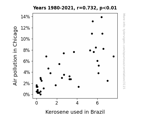
Smoke Signals: The Correlation between Air Pollution in the Windy City and Kerosene Consumption in the Land of Samba
As air pollution in Chicago decreased, it created a ripple effect on global air quality. This, in turn, led to a decrease in the demand for kerosene in Brazil. As we all know, cleaner air has a magical way of communicating with kerosene molecules, convincing them to just chill out and not get burned. The international kerosene community was like, "Hey, if Chicago can clean up its act, maybe we should take a little breather too." And voila, before you know it, Brazilian kerosene consumption took a nosedive, all thanks to the winds of change originating in the Windy City.

What else correlates?
Air pollution in Chicago · all weather
Kerosene used in Brazil · all energy
Air pollution in Chicago · all weather
Kerosene used in Brazil · all energy
. The chart goes from 2002 to 2022, and the two variables track closely in value over that time.")

View details about correlation #3,044
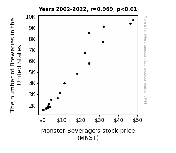
Brewing Up Stock: The Ale-urement of Breweries in the United States and Monster Beverage's Stock Price
As the number of breweries in the United States hops up, there's a corresponding spike in demand for specialty and craft beers. This leads to a surge in the consumption of hoppy, malted beverages. As more people ale out, they're searching for unique and energizing drinks to lager their spirits. This shift in drinking preferences creates a monster of a situation for the beverage industry, as it prompts a booming interest in Monster Beverage's products. It seems the competition is getting lager, but for Monster Beverage, it's a stout reminder that when it comes to quenching modern thirsts, they're the real ale.

What else correlates?
The number of Breweries in the United States · all food
Monster Beverage's stock price (MNST) · all stocks
The number of Breweries in the United States · all food
Monster Beverage's stock price (MNST) · all stocks


View details about correlation #3,365
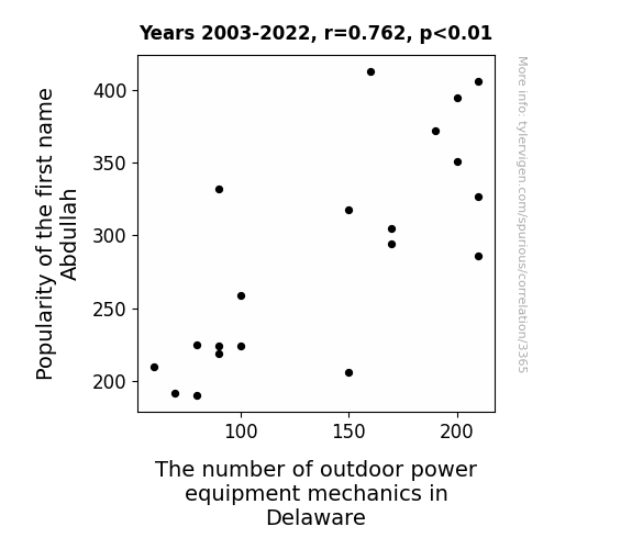
Abdullah Abdul-Lawn: Exploring the Correlation Between the Popularity of the Name Abdullah and the Number of Outdoor Power Equipment Mechanics in Delaware
As the name Abdullah gained popularity, parents subconsciously steered their children toward careers that embodied strength and reliability. This led to a surge in interest in outdoor power equipment mechanics in Delaware, as young individuals with the name Abdullah felt a deep, inexplicable connection to the inner workings of lawnmowers, leaf blowers, and chainsaws. It's as if the name itself carried a faint, undeniable hum of mechanical prowess, propelling an entire generation toward a shared destiny of fixing anything with a small engine in the First State.


View details about correlation #3,138
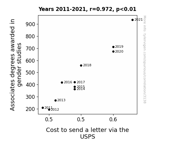
Peculiar Pairings: Probing the Link between Gender Studies Associates Degrees and Postal Prices
More gender studies discussions led to debates over the gender pay gap, prompting an influx of mail to and from lawmakers with passionate pleas for change. It's the stampede of ideas that's truly driving up the cost!

What else correlates?
Associates degrees awarded in gender studies · all education
Cost to send a letter via the USPS · all weird & wacky
Associates degrees awarded in gender studies · all education
Cost to send a letter via the USPS · all weird & wacky


View details about correlation #2,337
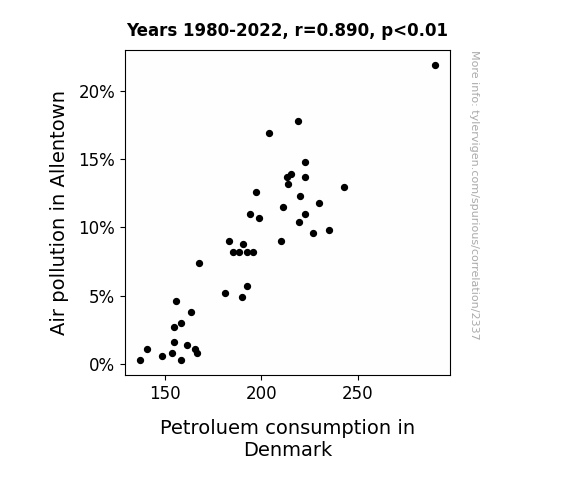
Air Quality Blight in Allentown and Denmark's Petroleum Bright: An Unlikely Correlation Delight
As Allentown's air got cleaner, it blew a breath of fresh air all the way to Denmark, convincing them to take a 'fir'mer stance on reducing petroleum usage. This unexpected connection could be a result of a global network of air currents affectionately known as the 'breezy alliance'. Who knew that fighting pollution in one town could have such far-reaching 'consequenclean air-ies'?
What else correlates?
Air pollution in Allentown · all weather
Petroluem consumption in Denmark · all energy
Air pollution in Allentown · all weather
Petroluem consumption in Denmark · all energy
. The chart goes from 2003 to 2022, and the two variables track closely in value over that time.")

View details about correlation #3,488
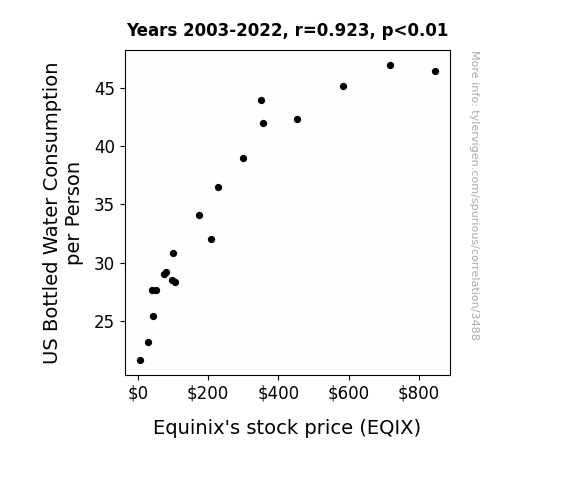
The Thirst for Equinix: Unveiling the Aqua-Stock Nexus
The surge in bottled water consumption led to a higher demand for plastic bottles, ultimately boosting the need for storage and distribution services. This put added pressure on companies like Equinix, causing their stock price to flow uphill, just like a refreshing stream of liquid assets. After all, when it rains, it pure-ly pours for businesses involved in the aqua industry!

What else correlates?
US Bottled Water Consumption per Person · all food
Equinix's stock price (EQIX) · all stocks
US Bottled Water Consumption per Person · all food
Equinix's stock price (EQIX) · all stocks


View details about correlation #3,331
Samara-Monious Connection: The Ecclesiastical Influence on the Popularity of the Name Samara in West Virginia
As the name Samara gained popularity, more parents were inadvertently summoning their children into a future of spiritual leadership. It seems that the connection between "Samara" and "sacred calling" was more than just a ring of coincidence. With each new Samara born, it was as if a higher power was saying, "Sam-ara your life's work is to serve the Lord!" It's a priestigious name indeed, and it had folks saying, "Holy Samara-mony, our state is blessed with a surge of clergy!" It's safe to say that this naming trend was truly a divine intervention for the religious landscape of West Virginia.

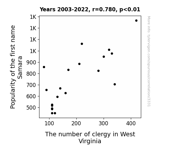
What else correlates?
Popularity of the first name Samara · all first names
The number of clergy in West Virginia · all cccupations
Popularity of the first name Samara · all first names
The number of clergy in West Virginia · all cccupations


View details about correlation #2,626
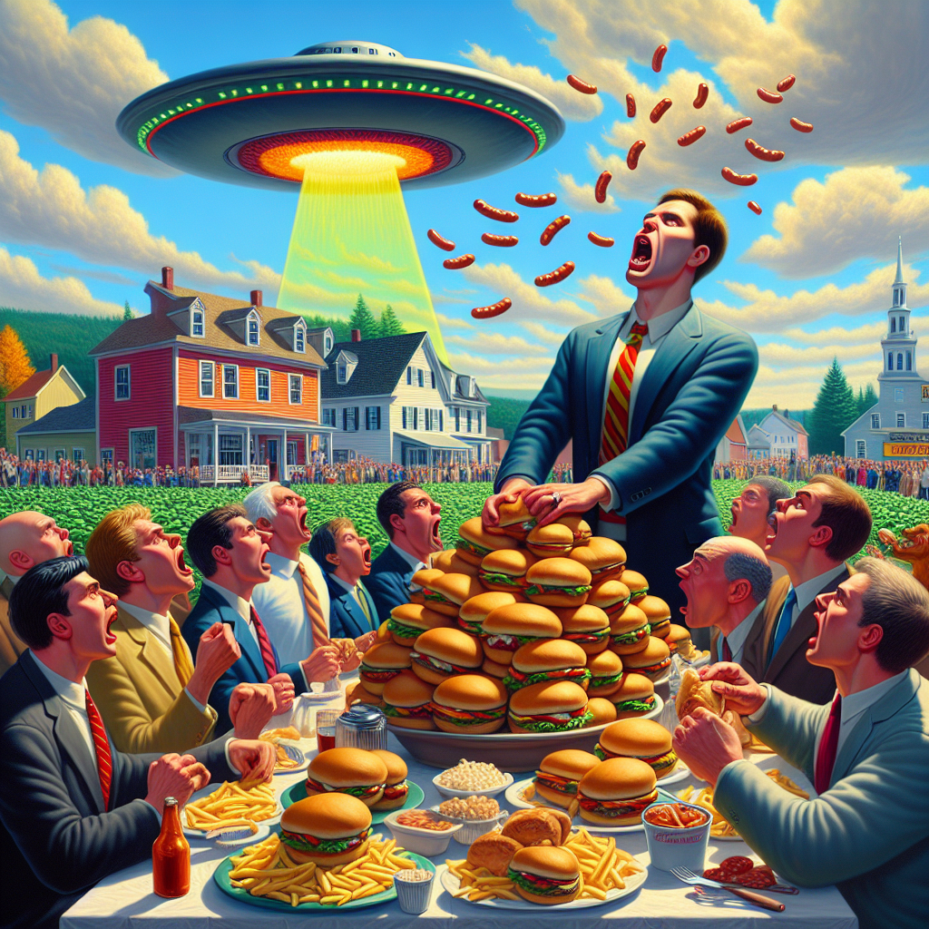
Flying Saucers and Meaty Wowsers: The Correlation Between UFO Sightings in Maine and Hotdogs Consumed by Nathan's Hot Dog Eating Competition Champion
The extraterrestrial visitors were actually big fans of competitive eating, and their telepathic cravings for processed meat products were inadvertently boosting the champion's consumption. It seems they were conducting a secret "snack and abduct" operation, leading to an unexpected alliance between the reigning hot dog hero and the outer space enthusiasts. It was a classic case of cosmic cravings leading to an unexpected wiener-take-all situation.

Why this works
- Data dredging: I have 25,237 variables in my database. I compare all these variables against each other to find ones that randomly match up. That's 636,906,169 correlation calculations! This is called “data dredging.”
Fun fact: the chart used on the wikipedia page to demonstrate data dredging is also from me. I've been being naughty with data since 2014.
Instead of starting with a hypothesis and testing it, I instead tossed a bunch of data in a blender to see what correlations would shake out. It’s a dangerous way to go about analysis, because any sufficiently large dataset will yield strong correlations completely at random. - Lack of causal connection: There is probably no direct connection between these variables, despite what the AI says above.
Because these pages are automatically generated, it's possible that the two variables you are viewing are in fact causually related. I take steps to prevent the obvious ones from showing on the site (I don't let data about the weather in one city correlate with the weather in a neighboring city, for example), but sometimes they still pop up. If they are related, cool! You found a loophole.
This is exacerbated by the fact that I used "Years" as the base variable. Lots of things happen in a year that are not related to each other! Most studies would use something like "one person" in stead of "one year" to be the "thing" studied. - Observations not independent: For many variables, sequential years are not independent of each other. You will often see trend-lines form. If a population of people is continuously doing something every day, there is no reason to think they would suddenly change how they are doing that thing on January 1. A naive p-value calculation does not take this into account.
You will calculate a lower chance of "randomly" achieving the result than represents reality.
To be more specific: p-value tests are probability values, where you are calculating the probability of achieving a result at least as extreme as you found completely by chance. When calculating a p-value, you need to assert how many "degrees of freedom" your variable has. I count each year (minus one) as a "degree of freedom," but this is misleading for continuous variables.
This kind of thing can creep up on you pretty easily when using p-values, which is why it's best to take it as "one of many" inputs that help you assess the results of your analysis.
- Y-axes doesn't start at zero: I truncated the Y-axes of the graphs above. I also used a line graph, which makes the visual connection stand out more than it deserves.
Nothing against line graphs. They are great at telling a story when you have linear data! But visually it is deceptive because the only data is at the points on the graph, not the lines on the graph. In between each point, the data could have been doing anything. Like going for a random walk by itself!
Mathematically what I showed is true, but it is intentionally misleading. If you click on any of the charts that abuse this, you can scroll down to see a version that starts at zero. - Confounding variable: Confounding variables (like global pandemics) will cause two variables to look connected when in fact a "sneaky third" variable is influencing both of them behind the scenes.
- Outliers: Some datasets here have outliers which drag up the correlation.
In concept, "outlier" just means "way different than the rest of your dataset." When calculating a correlation like this, they are particularly impactful because a single outlier can substantially increase your correlation.
Because this page is automatically generated, I don't know whether any of the charts displayed on it have outliers. I'm just a footnote. ¯\_(ツ)_/¯
I intentionally mishandeled outliers, which makes the correlation look extra strong. - Low n: There are not many data points included in some of these charts.
You can do analyses with low ns! But you shouldn't data dredge with a low n.
Even if the p-value is high, we should be suspicious of using so few datapoints in a correlation.
Pro-tip: click on any correlation to see:
- Detailed data sources
- Prompts for the AI-generated content
- Explanations of each of the calculations (correlation, p-value)
- Python code to calculate it yourself


