spurious correlations
discover · random · spurious scholar
← previous page · next page →


View details about correlation #1,601
The Power of Biomass: A Spin on Google Searches for 'I Am Dizzy'
The excessive spinning of the biomass turbines in Serbia is creating a secret wave of dizziness that is being transmitted through the internet, causing people worldwide to frantically search for 'i am dizzy' as they unknowingly tune into this bio-energetic sensation. It's a renewable energy revolution with an unexpected side effect - a global case of the twirlies!


What else correlates?
Biomass power generated in Serbia · all energy
Google searches for 'i am dizzy' · all google searches
Biomass power generated in Serbia · all energy
Google searches for 'i am dizzy' · all google searches
. The chart goes from 2002 to 2023, and the two variables track closely in value over that time.")

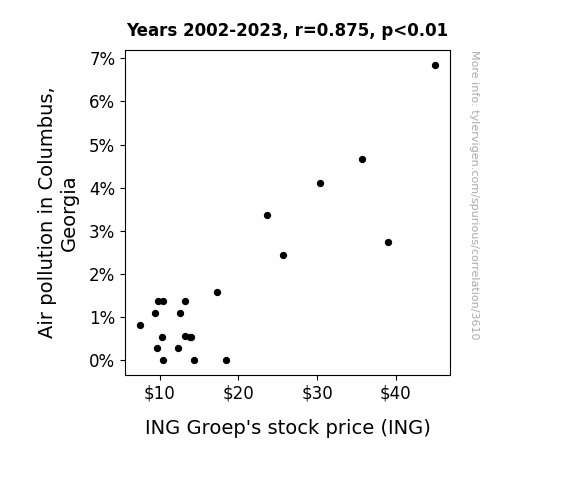
View details about correlation #3,610
When Air Pollution Floats, ING Groep's Stock Drowns: A Tale of Columbus, Georgia
As air pollution in Columbus, Georgia increased, people started buying more air purifiers, leading to a surge in electricity demand. This caused a spike in the need for loans to fund power projects, benefiting ING Groep. You could say ING's stock price was truly electrifying, riding the smoggy wave to financial success!

What else correlates?
Air pollution in Columbus, Georgia · all weather
ING Groep's stock price (ING) · all stocks
Air pollution in Columbus, Georgia · all weather
ING Groep's stock price (ING) · all stocks


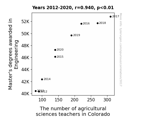
View details about correlation #3,017
Engineering Degrees Up, Ag Science Teachers Interrupted: A Statistical Relationship Unearthed in Colorado
As more engineers mastered their field, they began to "plant the seeds" of interest in agricultural sciences, leading to a bumper crop of students pursuing this career. It seems they couldn't resist the allure of applying their knowledge to cultivate new opportunities in the world of farming and environmental science. It's clear that this unexpected connection has taken root and is truly groundbreaking for the agricultural education sector in Colorado. Who knew that the key to growing the next generation of agricultural sciences teachers lay in the innovative minds of those with a Master's in Engineering?


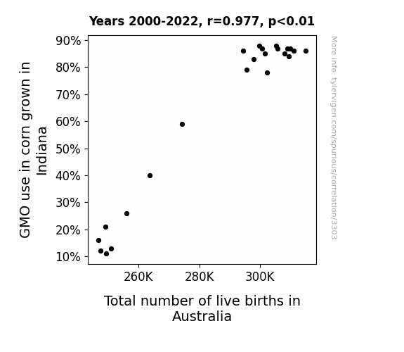
View details about correlation #3,303
The Maizey Connection: Unearthing the Relationship Between GMO Corn in Indiana and Australian Live Births
As GMO corn production in Indiana rose, so did the spirit of fertility, leading to a baby boom on the other side of the world. It's like the corn was whispering sweet, baby-making secrets to the land down under. Who knew that the key to the population growth in Australia was being sown in the fields of Indiana all along?

What else correlates?
GMO use in corn grown in Indiana · all food
Total number of live births in Australia · all weird & wacky
GMO use in corn grown in Indiana · all food
Total number of live births in Australia · all weird & wacky


View details about correlation #1,650
Blowing in the Wind: A Gust of Arthur-nomics in Ukraine's Wind Power Generation
As the name Arthur gained popularity, more people were subconsciously reminded of King Arthur and his legendary Knights of the Round Table. These individuals, feeling a sudden surge of chivalry and valor, decided to channel their inner knights and joust with the air, thereby creating gusts of wind. This unexpected medieval reenactment phenomenon led to a boost in wind power generation in Ukraine, as the country found itself with an abundance of free, renewable energy courtesy of the new-age Arthurs and their noble aspirations. Who would've thought that the winds of change were actually propelled by a wave of Arthurian inspiration?

What else correlates?
Popularity of the first name Arthur · all first names
Wind power generated in Ukraine · all energy
Popularity of the first name Arthur · all first names
Wind power generated in Ukraine · all energy
. The chart goes from 2008 to 2023, and the two variables track closely in value over that time.")

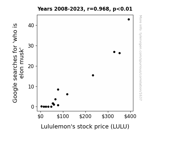
View details about correlation #1,637
Musk Mystique: Mapping the Mirthful Market Movement with Google Searches for 'Who is Elon Musk' and Lululemon's Lively Stock Price
As more people became enlightened about the enigmatic figure of Elon Musk, a wave of inspiration and ambition swept over them. This led to a sudden surge in demand for self-improvement, manifesting in a collective decision to embrace a more active lifestyle. With a newfound desire to emulate Musk's productivity and drive, the populace flocked to purchase athleisure wear, particularly Lululemon's sleek and innovative offerings. This unexpected connection between a tech tycoon and a yoga pants purveyor ultimately propelled Lululemon's stock price to astonishing heights, proving that in the world of finance, even the most obscure links can shape market trends. It's as if the investment world collectively decided that the path to financial success lies in donning Lululemon attire while pondering the complexities of space travel and electric vehicles, all thanks to a curious interest in a certain CEO.

What else correlates?
Google searches for 'who is elon musk' · all google searches
Lululemon's stock price (LULU) · all stocks
Google searches for 'who is elon musk' · all google searches
Lululemon's stock price (LULU) · all stocks


View details about correlation #3,595
Legislating Learning: An Analysis of the Class-Size Correlation in Alaska
The influx of 9th graders sparked a sudden interest in politics, leading to a surge in student government campaigns. These campaigns became so competitive that they caught the attention of the current legislators who decided to mentor the aspiring young politicians. This unexpected mentorship program eventually led to a higher number of legislators in Alaska as more and more students entered into the political arena, proving that sometimes the real change-makers are not old enough to vote!


What else correlates?
Number of public school students in 9th grade · all education
The number of legislators in Alaska · all cccupations
Number of public school students in 9th grade · all education
The number of legislators in Alaska · all cccupations


View details about correlation #2,672
The Air Fair Connection: A Correlation Between Air Pollution in Huntington, Indiana and the Publication of xkcd Comics on Existentialism
The decrease in air pollution led to clearer thinking, which made people less likely to ponder the futility of existence as depicted in xkcd comics. It seems the smog was really clouding their existential thoughts!


What else correlates?
Air pollution in Huntington, Indiana · all weather
xkcd comics published about existentialism · all weird & wacky
Air pollution in Huntington, Indiana · all weather
xkcd comics published about existentialism · all weird & wacky


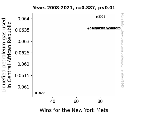
View details about correlation #3,663
Pitchers and Propane: Exploring the Link Between Liquefied Petroleum Gas in Central African Republic and Wins for the New York Mets
The Mets' secret good luck charm is the smell of freshly grilled sausages wafting through the stadium, thanks to the widespread use of LPG in the Central African Republic. This unexpectedly boosts the team's morale and performance, leading to more wins on the field. Who knew that the path to victory for the Mets was through the savory scent of barbequed goodness?

What else correlates?
Liquefied petroleum gas used in Central African Republic · all energy
Wins for the New York Mets · all sports
Liquefied petroleum gas used in Central African Republic · all energy
Wins for the New York Mets · all sports
. The chart goes from 2008 to 2023, and the two variables track closely in value over that time.")

View details about correlation #2,787
Reddit-al Street: A Correlative Analysis of Google Searches for 'Reddit' and Lennar's Stock Price
As more people spent time browsing memes and cat videos on Reddit, productivity across the nation plummeted. This led to a surge in demand for new homes, including those built by Lennar. It's the 'scrolling through Reddit instead of working' effect on the economy!


What else correlates?
Google searches for 'reddit' · all google searches
Lennar's stock price (LEN.B) · all stocks
Google searches for 'reddit' · all google searches
Lennar's stock price (LEN.B) · all stocks


View details about correlation #3,429
Curds and Construction: The Cheddar Connection between Cottage Cheese Consumption and Reinforcing Iron and Rebar Workers in Alabama
As Cottage cheese consumption decreased, it led to a reduction in the curdled dairy expanse within the populace. This in turn lowered the overall coagulated inspiration, leading fewer individuals to pursue careers in reinforcing iron and rebar work in Alabama. Remember, when the curds are no longer the word, it's the steel industry that feels the stir!


What else correlates?
Cottage cheese consumption · all food
The number of reinforcing iron and rebar workers in Alabama · all cccupations
Cottage cheese consumption · all food
The number of reinforcing iron and rebar workers in Alabama · all cccupations


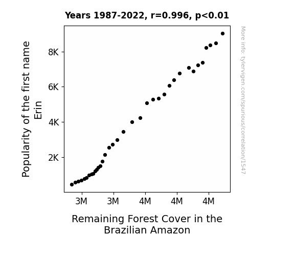
View details about correlation #1,547
Evaluating Erin: Exploring the Entertaining Effect of Ecstaticly Named Entities on Ecosystem Earthiness
As the name Erin fell out of favor, fewer babies were named after her. This led to a decline in the number of tree-huggers, ultimately reducing the collective effort to save the Amazon. It seems that without enough Erins, the Amazon couldn't 'leaf' up to its full potential for protection! But hey, maybe we just need a 're-leaf' of faith in the next generation of nature lovers.

What else correlates?
Popularity of the first name Erin · all first names
Remaining Forest Cover in the Brazilian Amazon · all weird & wacky
Popularity of the first name Erin · all first names
Remaining Forest Cover in the Brazilian Amazon · all weird & wacky


View details about correlation #3,074
Smoggy Skies and Sunny Bolivian Energy: An Unlikely Pairing of Air Pollution in Orlando and Solar Power Generated in Bolivia
The smog from Orlando somehow made its way to Bolivia, creating a solar panel supercharge by coating them with a thick layer of pollution. As the panels struggled to harness the smoggy sunlight, they inadvertently became more efficient at converting the polluted rays into power. It's like they put on pollution-powered capes and became the unlikely superheroes of renewable energy. Who would've thought that the key to advancing solar technology was hidden in a hazy, roundabout journey from Florida to Bolivia?


What else correlates?
Air pollution in Orlando · all weather
Solar power generated in Bolivia · all energy
Air pollution in Orlando · all weather
Solar power generated in Bolivia · all energy
. The chart goes from 2010 to 2023, and the two variables track closely in value over that time.")

View details about correlation #3,588
Uncovering the Musk-LEN Connection: A Goofy Analysis of the Google Search Stock Correlation
As Elon Musk's popularity soared, people realized they wanted to live in homes as innovative as his tech projects. This sparked a sudden interest in Lennar's homes, leading to an influx of buyers and driving up the demand for Lennar's stock. It seems Musk's electric personality sparked a powerful connection to Lennar's success in the housing market!


What else correlates?
Google searches for 'elon musk' · all google searches
Lennar's stock price (LEN) · all stocks
Google searches for 'elon musk' · all google searches
Lennar's stock price (LEN) · all stocks


View details about correlation #3,236
Genetically-Modified Cotton: Sow Your Seeds, Reap More Masons in Alabama
The GMO cotton was engineered to grow softer and more pliable, leading to a higher demand for intricate brick designs. With the switch to non-GMO cotton, there was a noticeable decrease in the need for the expert hands of brickmasons across the state. These masons, once kept busy by the allure of GMO-induced brick complexities, found themselves facing a wall of unemployment as the demand for their artisanal bricklaying skills crumbled like, well, non-GMO cotton. Brick by brick, the GMO cotton had unwittingly built a lucrative niche market for the brickmasons, only to leave them out of work when their genetically modified canvas disappeared. The irony wasn't lost on the now nonplussed brickmasons, who had to go back to the drawing board to find new ways to bring home the bacon without the genetically enhanced cotton connection.


What else correlates?
GMO use in cotton in Alabama · all food
The number of brickmasons in Alabama · all cccupations
GMO use in cotton in Alabama · all food
The number of brickmasons in Alabama · all cccupations


View details about correlation #1,825
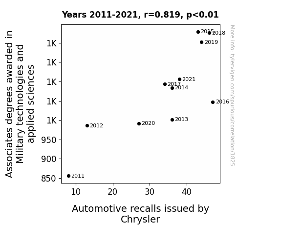
Driving Forces: The Surprisingly High Correlation Between Military Technology and Applied Sciences Associate Degrees and Chrysler Automotive Recalls
As more people became knowledgeable about military technologies, there was a surge in creative DIY modifications to Chrysler vehicles, leading to unexpected malfunctions and prompting a higher number of recalls. From attempting to install top-secret missile guidance systems in minivans to retrofitting tanks with luxurious heated seats, the intersection of military and automotive expertise created a combustible mix of innovation and chaos on the roads.


View details about correlation #2,874
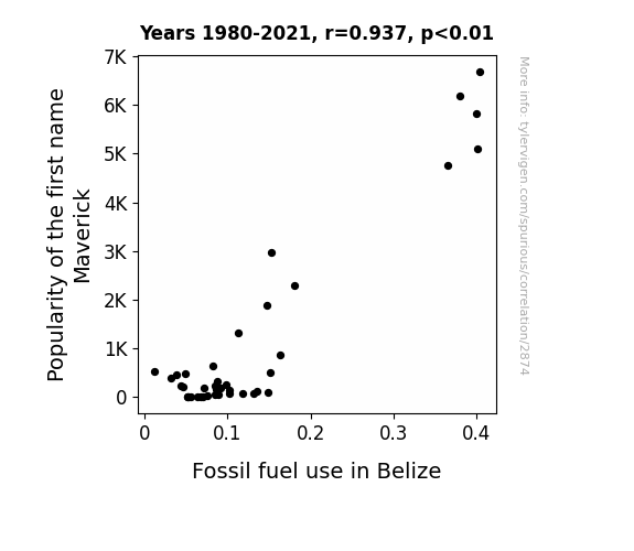
The Mav-erick Rises: A Fuelish Connection Between Name Popularity and Fossil Fuel Use in Belize
As the name Maverick gained popularity, more parents were subconsciously influenced by the image of a daring, independent individual. This led to a spike in baby boys being named Maverick, and as they grew up, they developed a fascination with all things related to being a maverick, including fast cars and motorbikes. This sudden interest in vehicles sparked a nationwide craze for driving, subsequently leading to a sharp rise in fossil fuel use in Belize. It's like the butterfly effect, but with a toddler shouting "Yeehaw" while playing with toy trucks and inadvertently shaping the country's energy consumption habits.

What else correlates?
Popularity of the first name Maverick · all first names
Fossil fuel use in Belize · all energy
Popularity of the first name Maverick · all first names
Fossil fuel use in Belize · all energy
. The chart goes from 2002 to 2023, and the two variables track closely in value over that time.")

View details about correlation #3,470
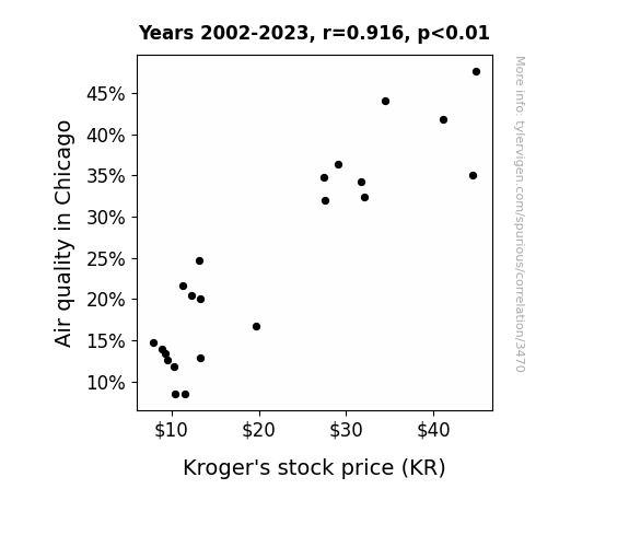
Air we are, Kroger: The Impact of Chicago Air Quality on KR Stock Price
As air quality improved, people had more energy and were in better moods, leading to an increase in grocery shopping. This boosted Kroger's sales and ultimately their stock price.

What else correlates?
Air quality in Chicago · all weather
Kroger's stock price (KR) · all stocks
Air quality in Chicago · all weather
Kroger's stock price (KR) · all stocks


View details about correlation #2,901
Cotton's GMO Foes and Togs of Prose: A Correlational Study of Alabama
As GMO use in cotton decreased, the size of cotton flowers also decreased. This led to a shortage of oversized, photogenic cotton blooms, causing a decline in demand for cotton field photo shoots. As a result, fewer photographers found it lucrative to specialize in capturing the natural beauty of Alabama's cotton fields, leading to a decrease in the number of photographers in the state.


What else correlates?
GMO use in cotton in Alabama · all food
The number of photographers in Alabama · all cccupations
GMO use in cotton in Alabama · all food
The number of photographers in Alabama · all cccupations


View details about correlation #1,394
Mysterious Missouri and Marvelous Mount Everest: Exploring the Enigmatic Link between UFO Sightings and Successful Summits
The higher presence of UFOs in Missouri has inadvertently boosted the state's corn production. This has led to an unusually high supply of corn syrup, which has inexplicably enhanced the physical endurance and strength of mountain climbers, particularly those attempting to conquer Mount Everest. It seems that these climbers have unknowingly been fueling themselves with a secret, out-of-this-world ingredient, giving a whole new meaning to the term "alien energy." It's a-maize-ing how these UFOs have indirectly contributed to reaching new heights in mountain climbing!


What else correlates?
UFO sightings in Missouri · all random state specific
Total Number of Successful Mount Everest Climbs · all weird & wacky
UFO sightings in Missouri · all random state specific
Total Number of Successful Mount Everest Climbs · all weird & wacky
Why this works
- Data dredging: I have 25,237 variables in my database. I compare all these variables against each other to find ones that randomly match up. That's 636,906,169 correlation calculations! This is called “data dredging.”
Fun fact: the chart used on the wikipedia page to demonstrate data dredging is also from me. I've been being naughty with data since 2014.
Instead of starting with a hypothesis and testing it, I instead tossed a bunch of data in a blender to see what correlations would shake out. It’s a dangerous way to go about analysis, because any sufficiently large dataset will yield strong correlations completely at random. - Lack of causal connection: There is probably no direct connection between these variables, despite what the AI says above.
Because these pages are automatically generated, it's possible that the two variables you are viewing are in fact causually related. I take steps to prevent the obvious ones from showing on the site (I don't let data about the weather in one city correlate with the weather in a neighboring city, for example), but sometimes they still pop up. If they are related, cool! You found a loophole.
This is exacerbated by the fact that I used "Years" as the base variable. Lots of things happen in a year that are not related to each other! Most studies would use something like "one person" in stead of "one year" to be the "thing" studied. - Observations not independent: For many variables, sequential years are not independent of each other. You will often see trend-lines form. If a population of people is continuously doing something every day, there is no reason to think they would suddenly change how they are doing that thing on January 1. A naive p-value calculation does not take this into account.
You will calculate a lower chance of "randomly" achieving the result than represents reality.
To be more specific: p-value tests are probability values, where you are calculating the probability of achieving a result at least as extreme as you found completely by chance. When calculating a p-value, you need to assert how many "degrees of freedom" your variable has. I count each year (minus one) as a "degree of freedom," but this is misleading for continuous variables.
This kind of thing can creep up on you pretty easily when using p-values, which is why it's best to take it as "one of many" inputs that help you assess the results of your analysis.
- Y-axes doesn't start at zero: I truncated the Y-axes of the graphs above. I also used a line graph, which makes the visual connection stand out more than it deserves.
Nothing against line graphs. They are great at telling a story when you have linear data! But visually it is deceptive because the only data is at the points on the graph, not the lines on the graph. In between each point, the data could have been doing anything. Like going for a random walk by itself!
Mathematically what I showed is true, but it is intentionally misleading. If you click on any of the charts that abuse this, you can scroll down to see a version that starts at zero. - Confounding variable: Confounding variables (like global pandemics) will cause two variables to look connected when in fact a "sneaky third" variable is influencing both of them behind the scenes.
- Outliers: Some datasets here have outliers which drag up the correlation.
In concept, "outlier" just means "way different than the rest of your dataset." When calculating a correlation like this, they are particularly impactful because a single outlier can substantially increase your correlation.
Because this page is automatically generated, I don't know whether any of the charts displayed on it have outliers. I'm just a footnote. ¯\_(ツ)_/¯
I intentionally mishandeled outliers, which makes the correlation look extra strong. - Low n: There are not many data points included in some of these charts.
You can do analyses with low ns! But you shouldn't data dredge with a low n.
Even if the p-value is high, we should be suspicious of using so few datapoints in a correlation.
Pro-tip: click on any correlation to see:
- Detailed data sources
- Prompts for the AI-generated content
- Explanations of each of the calculations (correlation, p-value)
- Python code to calculate it yourself


