spurious correlations
discover · random · spurious scholar
← previous page · next page →


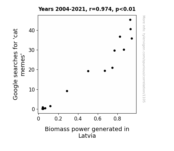
View details about correlation #1,105
From Cat Memes to Green Energy: Exploring the Feline Phenomenon in Latvia's Biomass Power Generation
The extra cat memes were so electrifyingly funny that they sparked a wave of creativity in Latvia, leading to the development of a new cat-astrophic energy source. As people laughed and shared the memes, their collective feline energy somehow translated into a boost for biomass power in Latvia. It's like the purr-fect recipe for renewable energy - just add a sprinkle of cat memes and watch the power production soar!

What else correlates?
Google searches for 'cat memes' · all google searches
Biomass power generated in Latvia · all energy
Google searches for 'cat memes' · all google searches
Biomass power generated in Latvia · all energy
. The chart goes from 2012 to 2021, and the two variables track closely in value over that time.")

View details about correlation #2,385
From Combat to Computer: Exploring the Impact of Bachelor's Degrees in Military Technologies on Microsoft's Stock Price
As the knowledge of military technologies and applied sciences graduates went up, so did the productivity and efficiency at Microsoft. It's like they were armed with the right skills to drive innovation and lead the company to new heights. This influx of talent gave Microsoft a strategic edge, leading to a boom in their stock price. The correlation here is clear: a force to be reckoned with in the job market was directly linked to the surge in MSFT's success.


What else correlates?
Bachelor's degrees awarded in Military technologies · all education
Microsoft's stock price (MSFT) · all stocks
Bachelor's degrees awarded in Military technologies · all education
Microsoft's stock price (MSFT) · all stocks


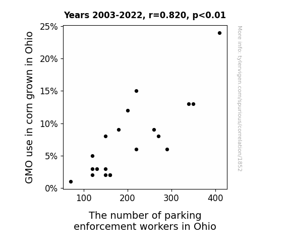
View details about correlation #1,852
Kernel Connection: Unpacking the Relationship between GMO Corn and Parking Enforcement Workers in Ohio
The decrease in GMO use led to a bumper crop of non-GMO corn, creating a maze-like effect in the fields. As the cornstalks grew taller and more perplexing, parking enforcement workers found themselves inadvertently wandering into the cornfields during their patrols and getting hopelessly lost. Faced with the bewildering prospect of ticketing lost vehicles within the corn labyrinth, many parking enforcement workers decided to seek less perplexing employment opportunities, ultimately leading to a decrease in their numbers statewide.

What else correlates?
GMO use in corn grown in Ohio · all food
The number of parking enforcement workers in Ohio · all cccupations
GMO use in corn grown in Ohio · all food
The number of parking enforcement workers in Ohio · all cccupations


View details about correlation #1,164
Time and Frankfurters: A Rhyming Analysis of xkcd Comics and Nathan's Hot Dog Eating Contest Victories
As the number of xkcd comics about time increased, so did the champion's ability to perceive time slowing down, allowing them to eat more hotdogs in the same amount of time. They say time flies when you're eating sausages!


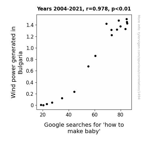
View details about correlation #1,494
Blustery Baby Boom: Bulgaria's Breezy Business and Baby-making Behavior
The increase in Wind power generated in Bulgaria has led to a surge in energy, creating a more charged atmosphere, and, well, it seems that people are just feeling a little more 'revved up' to learn about making babies. Looks like those Bulgarian winds are blowing in some extra baby-making inspiration! Plus, who wouldn't be in the mood for a little 'turbine and romance' with all that power buzzing around?

What else correlates?
Wind power generated in Bulgaria · all energy
Google searches for 'how to make baby' · all google searches
Wind power generated in Bulgaria · all energy
Google searches for 'how to make baby' · all google searches
. The chart goes from 2002 to 2022, and the two variables track closely in value over that time.")

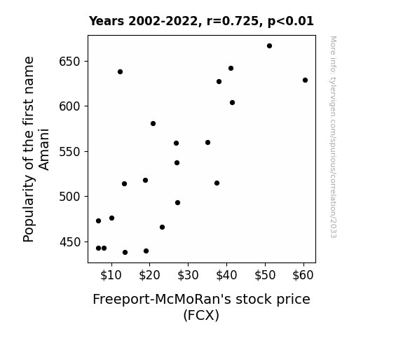
View details about correlation #2,033
The Amani Affect: An Exploration of the Correlation Between Amani's Popularity and Freeport-McMoRan's Stock Price
As more parents named their kids Amani, there was a corresponding surge in demand for personalized license plates, leading to a spike in aluminum production. Freeport-McMoRan, a major player in the aluminum industry, saw their stock price rise as they capitalized on this unexpected baby name trend. Remember, when it comes to the stock market, even the seemingly unrelated factors can have a baby-namingly big impact!

What else correlates?
Popularity of the first name Amani · all first names
Freeport-McMoRan's stock price (FCX) · all stocks
Popularity of the first name Amani · all first names
Freeport-McMoRan's stock price (FCX) · all stocks


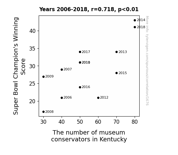
View details about correlation #1,676
Punting for Punters: A Gridiron Analysis of Super Bowl Champion's Winning Score and the Curious Connection to Kentucky's Museum Conservators
As the Super Bowl Champion's Winning Score increases, more and more footballs are being retired and sent to museums for display. This sudden influx of football memorabilia in museums across the country has created a higher demand for museum conservators in Kentucky to properly care for and maintain these valuable sports artifacts. After all, it takes a special skill set to delicately dust off Tom Brady's game-winning football or to meticulously polish Peyton Manning's record-breaking pigskin. And as the gridiron glory keeps reaching new heights, so does the need for expert museum conservators to ensure that Kentucky's sports history remains in pristine condition for future generations to appreciate. It's a touchdown for both the Super Bowl and the museum industry in the Bluegrass State!

What else correlates?
Super Bowl Champion's Winning Score · all sports
The number of museum conservators in Kentucky · all cccupations
Super Bowl Champion's Winning Score · all sports
The number of museum conservators in Kentucky · all cccupations


View details about correlation #1,210
The Great Space Race: Jupiter's Place, Earth's Grace, and Facebook's Embrace
As the distance between Jupiter and Earth increases, so does the gravitational pull on Facebook servers, leading to faster loading times and smoother user experience. You could say it's all about that extra-terrestrial connection giving a whole new meaning to reaching for the stars in customer satisfaction! So, when it comes to happy Facebook users, it's not just a space oddity, it's a planetary party!


What else correlates?
The distance between Jupiter and Earth · all planets
Customer satisfaction with Facebook · all weird & wacky
The distance between Jupiter and Earth · all planets
Customer satisfaction with Facebook · all weird & wacky


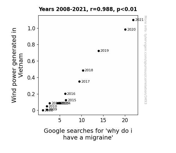
View details about correlation #3,493
Blowin' in the Mind: Unraveling the Wind Power - Migraine Search Connection
The increase in wind power generated in Vietnam has led to stronger, more assertive breezes. As a result, people are inadvertently being involved in more intense games of 'who can blink more' with the wind. Constantly trying to out-blink the gusts has put a strain on their eye muscles, leading to an uptick in migraines as a result of 'wind-induced blink fatigue.'
What else correlates?
Wind power generated in Vietnam · all energy
Google searches for 'why do i have a migraine' · all google searches
Wind power generated in Vietnam · all energy
Google searches for 'why do i have a migraine' · all google searches


View details about correlation #1,662
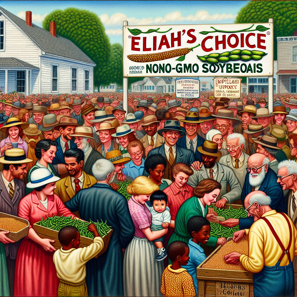
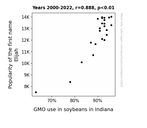
The Elijah Effect: Unraveling the Soybean Saga in Indiana
As the number of babies named Elijah rose, so did the demand for soy-based products. This led to a higher need for genetically modified soybeans to keep up with the sudden surge in Elijah's consuming tofu and soy milk. Remember, with great soy comes great responsibility.
What else correlates?
Popularity of the first name Elijah · all first names
GMO use in soybeans in Indiana · all food
Popularity of the first name Elijah · all first names
GMO use in soybeans in Indiana · all food


View details about correlation #2,396
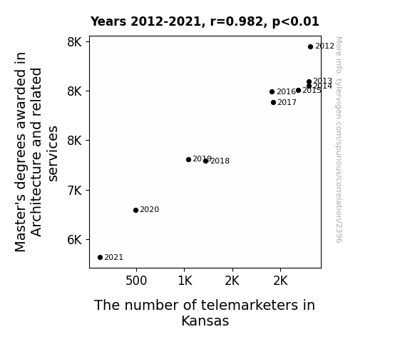
Building a Connection: Architecture Master's Degrees and the Toll of Telemarketers in the Wheat State
As the number of Master's degrees in Architecture and related services decreased, there were fewer people with grand designs for annoying phone calls, leading to a decline in the telemarketing industry in Kansas. It seems there was a disconnect between creating blueprints and trying to make sales pitches, ultimately leading to a hang-up on pursuing telemarketing as a career in the Sunflower State.

What else correlates?
Master's degrees awarded in Architecture · all education
The number of telemarketers in Kansas · all cccupations
Master's degrees awarded in Architecture · all education
The number of telemarketers in Kansas · all cccupations
. The chart goes from 2002 to 2022, and the two variables track closely in value over that time.")

View details about correlation #3,409
An Apple a Day Keeps the Stock Market in Play: Examining the Relationship Between US Household Spending on Fruits and Vegetables and Emerson Electric Co.'s Stock Price
As households spent more on fruits and vegetables, they started to feel the financial squeeze. To save on energy costs, they turned to Emerson Electric Co. for more efficient appliances. This surge in demand powered up the company's stock price, proving that a healthy investment in produce can truly be the seed for EMR's success. It's just another case of the stock market riding the gravy... or should I say, the green smoothie train! Remember, folks, when life gives you melons, consider investing in EMR!


View details about correlation #1,018
High-Flyin' Correlations: Investigating the Relationship Between Where Do Birds Go When it Rains Google Searches and Jet Fuel Consumption in the Maldives
As the search for avian rain retreats took flight, it created a surge in bird-watching. This led to a boom in eco-tourism in the Maldives, as bird enthusiasts flocked to the islands, inadvertently driving up the demand for jet fuel to reach this feathered paradise. It seems the skies weren't just for the birds anymore, as the Maldives experienced a wing-sational increase in jet fuel consumption!


What else correlates?
Google searches for 'where do birds go when it rains' · all google searches
Jet fuel used in Maldives · all energy
Google searches for 'where do birds go when it rains' · all google searches
Jet fuel used in Maldives · all energy


View details about correlation #2,912
Breath of the Wild: Unearthing the Impact of Air Pollution on Violent Crime Rates in Lansing, Michigan
The dirty air had everyone feeling more revved up, leading to an increase in altercations. You could say the smog was really adding fuel to the fire of criminal activity. It seems like when it comes to pollution and violent crime in Lansing, there's just no 'clean' connection! But in all seriousness, the correlation is likely due to other factors, such as socioeconomic conditions and population density, rather than a direct causal link between air quality and criminal behavior.


What else correlates?
Air pollution in Lansing, Michigan · all weather
Violent crime rates · all random state specific
Air pollution in Lansing, Michigan · all weather
Violent crime rates · all random state specific


View details about correlation #3,144
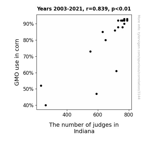
Stalk-ing the Connection: Corn GMO Usage and the Judicial Headcount in Indiana
As GMO use in corn increased, the corn production also increased significantly. This led to a surplus of corn, driving the demand for corn-based products. With more corn available, the production of cornbread, a beloved staple in Indiana, skyrocketed. This sudden boom in cornbread production created a need for more judges in various cornbread baking competitions across the state. It's safe to say that the judges were definitely earning their daily bread, and the cornnection between GMO corn and the influx of judges in Indiana is truly a-maize-ing!

What else correlates?
GMO use in corn · all food
The number of judges in Indiana · all cccupations
GMO use in corn · all food
The number of judges in Indiana · all cccupations
. The chart goes from 2002 to 2022, and the two variables track closely in value over that time.")

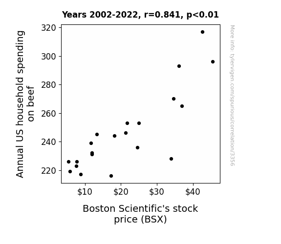
View details about correlation #3,356
Beef Relief: A Correlational Grief in Household Spending and BSX Belief
As households spent more on beef, they also invested in more comfortable couches to enjoy their meaty meals, leading to a surge in demand for Boston Scientific's heartburn and acid reflux medications, which boosted the company's stock price. Remember, a happy tummy makes for a happy stock market!

What else correlates?
Annual US household spending on beef · all weird & wacky
Boston Scientific's stock price (BSX) · all stocks
Annual US household spending on beef · all weird & wacky
Boston Scientific's stock price (BSX) · all stocks


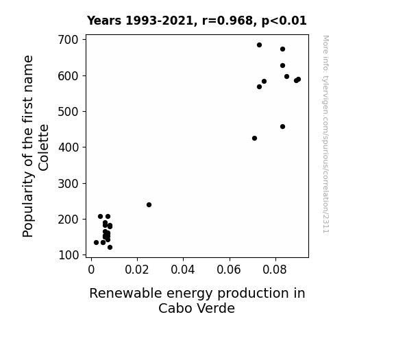
View details about correlation #2,311
Electrifying Colette: Exploring the Shocking Link between the Popularity of the Name and Renewable Energy Production in Cabo Verde
As the number of Colettes in the world rose, so did the collective positive energy. This led to a spike in renewable energy production in Cabo Verde as the Colettes unknowingly became beacons of sustainable power. It's as if their very presence whispered the secrets of harnessing energy from natural sources, sparking a renewable revolution, proving that the true power of change Colette in the hands of the people!

What else correlates?
Popularity of the first name Colette · all first names
Renewable energy production in Cabo Verde · all energy
Popularity of the first name Colette · all first names
Renewable energy production in Cabo Verde · all energy


View details about correlation #2,546
The Force is Strong with Air Pollution: A Correlational Study between Air Quality in Gadsden, Alabama and Google Searches for 'Luke Skywalker'
The air pollution created a hazy atmosphere, making it feel like the time when Luke Skywalker was in the swamps of Dagobah. This led people to search for Luke Skywalker to seek guidance on using the Force to navigate through the smog like he navigated through the swamps. It's as if the pollution inadvertently turned Gadsden into a real-life training ground for aspiring Jedi!


What else correlates?
Air pollution in Gadsden, Alabama · all weather
Google searches for 'luke skywalker' · all google searches
Air pollution in Gadsden, Alabama · all weather
Google searches for 'luke skywalker' · all google searches


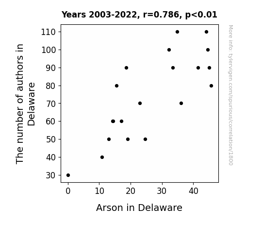
View details about correlation #1,800
Getting to the Bottom of it: The Unlikely Link Between Authors in Delaware and Arson Incidents
With fewer authors, there were fewer plot twists to spark interest in committing a fiery crime. As the literary population dwindled, so did the desire to light up the local scene. It seems the pen wasn't the only thing losing its spark in Delaware! Or, perhaps there were just too many "unpublishable" attempts at crime fiction, leaving would-be arsonists feeling like their ideas were all just...up in smoke. After all, when you can't even novel-ize your plans, it's not as easy to ignite that literary-inspired arson spree.

What else correlates?
The number of authors in Delaware · all cccupations
Arson in Delaware · all random state specific
The number of authors in Delaware · all cccupations
Arson in Delaware · all random state specific
. The chart goes from 2002 to 2022, and the two variables track closely in value over that time.")

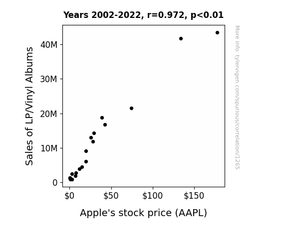
View details about correlation #1,265
Spinning Profits: The Sound of Vinyls and the Apple of Investors' Eye
The nostalgia from listening to old-school music on vinyl prompted investors to long for the good old days of Apple products, driving up demand for their stock. Remember, nothing says "buy low, sell high" like a good old-fashioned vinyl record spin!

What else correlates?
Sales of LP/Vinyl Albums · all weird & wacky
Apple's stock price (AAPL) · all stocks
Sales of LP/Vinyl Albums · all weird & wacky
Apple's stock price (AAPL) · all stocks
Why this works
- Data dredging: I have 25,237 variables in my database. I compare all these variables against each other to find ones that randomly match up. That's 636,906,169 correlation calculations! This is called “data dredging.”
Fun fact: the chart used on the wikipedia page to demonstrate data dredging is also from me. I've been being naughty with data since 2014.
Instead of starting with a hypothesis and testing it, I instead tossed a bunch of data in a blender to see what correlations would shake out. It’s a dangerous way to go about analysis, because any sufficiently large dataset will yield strong correlations completely at random. - Lack of causal connection: There is probably no direct connection between these variables, despite what the AI says above.
Because these pages are automatically generated, it's possible that the two variables you are viewing are in fact causually related. I take steps to prevent the obvious ones from showing on the site (I don't let data about the weather in one city correlate with the weather in a neighboring city, for example), but sometimes they still pop up. If they are related, cool! You found a loophole.
This is exacerbated by the fact that I used "Years" as the base variable. Lots of things happen in a year that are not related to each other! Most studies would use something like "one person" in stead of "one year" to be the "thing" studied. - Observations not independent: For many variables, sequential years are not independent of each other. You will often see trend-lines form. If a population of people is continuously doing something every day, there is no reason to think they would suddenly change how they are doing that thing on January 1. A naive p-value calculation does not take this into account.
You will calculate a lower chance of "randomly" achieving the result than represents reality.
To be more specific: p-value tests are probability values, where you are calculating the probability of achieving a result at least as extreme as you found completely by chance. When calculating a p-value, you need to assert how many "degrees of freedom" your variable has. I count each year (minus one) as a "degree of freedom," but this is misleading for continuous variables.
This kind of thing can creep up on you pretty easily when using p-values, which is why it's best to take it as "one of many" inputs that help you assess the results of your analysis.
- Y-axes doesn't start at zero: I truncated the Y-axes of the graphs above. I also used a line graph, which makes the visual connection stand out more than it deserves.
Nothing against line graphs. They are great at telling a story when you have linear data! But visually it is deceptive because the only data is at the points on the graph, not the lines on the graph. In between each point, the data could have been doing anything. Like going for a random walk by itself!
Mathematically what I showed is true, but it is intentionally misleading. If you click on any of the charts that abuse this, you can scroll down to see a version that starts at zero. - Confounding variable: Confounding variables (like global pandemics) will cause two variables to look connected when in fact a "sneaky third" variable is influencing both of them behind the scenes.
- Outliers: Some datasets here have outliers which drag up the correlation.
In concept, "outlier" just means "way different than the rest of your dataset." When calculating a correlation like this, they are particularly impactful because a single outlier can substantially increase your correlation.
Because this page is automatically generated, I don't know whether any of the charts displayed on it have outliers. I'm just a footnote. ¯\_(ツ)_/¯
I intentionally mishandeled outliers, which makes the correlation look extra strong. - Low n: There are not many data points included in some of these charts.
You can do analyses with low ns! But you shouldn't data dredge with a low n.
Even if the p-value is high, we should be suspicious of using so few datapoints in a correlation.
Pro-tip: click on any correlation to see:
- Detailed data sources
- Prompts for the AI-generated content
- Explanations of each of the calculations (correlation, p-value)
- Python code to calculate it yourself


