spurious correlations
discover · random · spurious scholar
← previous page · next page →


View details about correlation #2,098
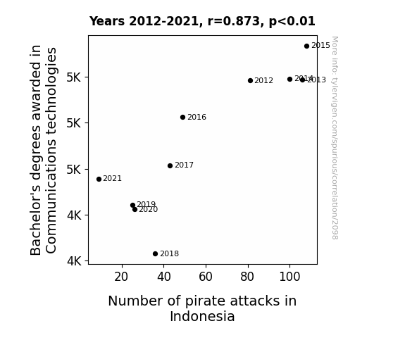
The High Seas of Communication: A Correlational Study of Bachelor's Degrees in Communications Technologies and Pirate Attacks in Indonesia
As fewer people were able to effectively communicate via technology, the pirates in Indonesia could no longer coordinate their attacks as efficiently. This led to a decrease in successful pirate raids and ultimately contributed to the overall decline in pirate attacks in the region. Who would have thought that a downturn in tech-savvy graduates could lead to smoother sailing in Indonesian waters?


View details about correlation #1,316
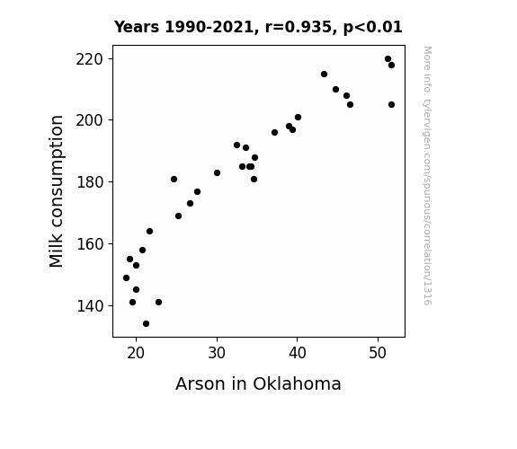
Got Milk? Uncovering the Flammable Link: A Study on Milk Consumption and Arson in Oklahoma
Cow tipping became less popular, leading to a downturn in Milk consumption. With fewer people sneaking around farms at night, there was a corresponding decrease in opportunities for udder destruction. As a result, the overall Milk supply decreased, creating a shortage. This shortage led to higher Milk prices, making it harder for individuals to afford enough Milk to fuel their late-night cereal cravings. Without a full Moo-urning meal, people lacked the dairy-induced energy to carry out their nefarious fire-starting plans. In essence, the lack of Milk put a damper on the potential for dairy-ous arson in Oklahoma.

What else correlates?
Milk consumption · all food
Arson in Oklahoma · all random state specific
Milk consumption · all food
Arson in Oklahoma · all random state specific


View details about correlation #3,347
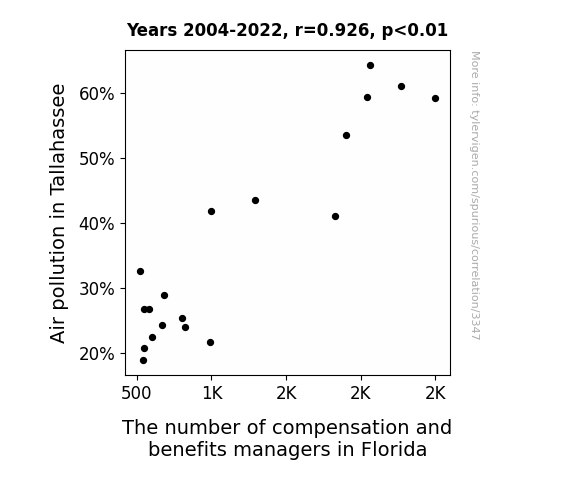
Clearing the Air: The Smoggy Relationship Between Air Pollution in Tallahassee and the Compensation and Benefits Manager Occupation in Florida
As the air became cleaner in Tallahassee, it also became clear to compensation and benefits managers that Florida’s sunshine and laid-back atmosphere were the real perks. They decided to take a breather and maybe branch out to greener pastures, leading to a decrease in their numbers. They simply couldn’t resist the ‘compelling’ idea of seeking a ‘beneficial’ change elsewhere. It seems like when it comes to career choices, these managers are as ‘fickle’ as Florida’s weather – always ready to ‘wind’ down and ‘air’ out new opportunities!

What else correlates?
Air pollution in Tallahassee · all weather
The number of compensation and benefits managers in Florida · all cccupations
Air pollution in Tallahassee · all weather
The number of compensation and benefits managers in Florida · all cccupations
. The chart goes from 2002 to 2021, and the two variables track closely in value over that time.")

View details about correlation #3,260
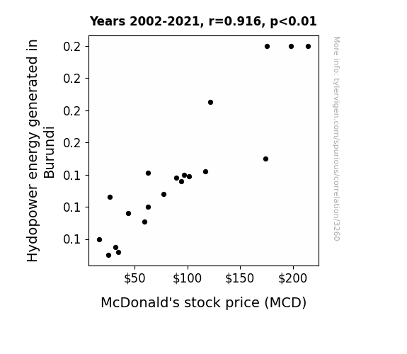
Flipping Big Macs: A Whopper of a Relationship Between Hydroelectric Power Production in Burundi and McDonald's Stock Price
As hydroelectric power production in Burundi has surged, so has the local population's happiness. This unexpected surge in positivity has led to a dramatic increase in cravings for McDonald's deliciously unhealthy fast food, boosting their sales and ultimately their stock price. Who knew that a little extra surge of hydro energy could also spark a surge in Big Mac consumption? It's a case of hydroelectric happiness leading to McDividends!

What else correlates?
Hydopower energy generated in Burundi · all energy
McDonald's stock price (MCD) · all stocks
Hydopower energy generated in Burundi · all energy
McDonald's stock price (MCD) · all stocks


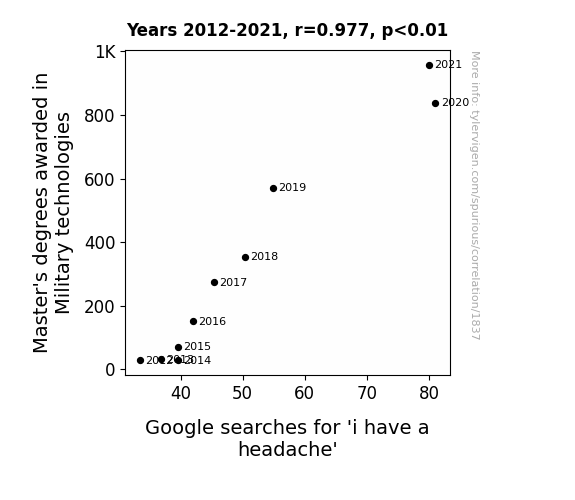
View details about correlation #1,837
Migrant Militants and Migraines: Matching Master's Degrees in Military Technologies with Migraine-related Google Searches
As the knowledge of military technologies advanced, so did the use of advanced weaponry systems, leading to louder explosions. These explosions caused shocking headaches, prompting more people to search for "i have a headache" on Google. In this case, it's a real blast from the past that's coming back to haunt us!


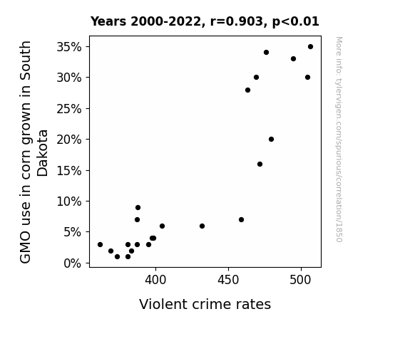
View details about correlation #1,850
Stalked by Science: A-maize-ing Connections Between GMO Corn in South Dakota and Violent Crime Rates
As farmers spent less time genetically modifying their corn, they had more time to participate in community policing, leading to a decrease in violent crime rates. After all, it's hard to stalk and rob a house when you're busy debating the ethics of corn genetics.

What else correlates?
GMO use in corn grown in South Dakota · all food
Violent crime rates · all random state specific
GMO use in corn grown in South Dakota · all food
Violent crime rates · all random state specific


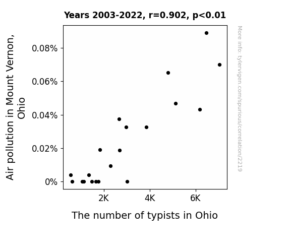
View details about correlation #2,219
The Mount Vernon Pollution Commotion and Ohio's Typist Promotion: A Correlational Examination
As the air became cleaner, the typists realized they could finally type their own resignation letters and pursue their dream jobs, like professional bubble wrap popper or international panda cuddler. With a deep breath of fresh air, they bid adieu to the monotonous clacking of keys and embraced a future unburdened by ink ribbons and paper jams.

What else correlates?
Air pollution in Mount Vernon, Ohio · all weather
The number of typists in Ohio · all cccupations
Air pollution in Mount Vernon, Ohio · all weather
The number of typists in Ohio · all cccupations
. The chart goes from 2002 to 2022, and the two variables track closely in value over that time.")

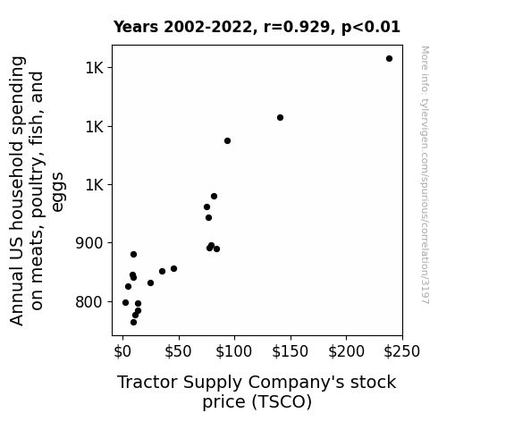
View details about correlation #3,197
Meat Your Investments: A Quantitative Study of the Relationship Between Household Spending on Animal Products and Tractor Supply Company's Stock Price
As household spending on meat, poultry, fish, and eggs rose, more people rekindled their love for grilling. This led to a surge in backyard barbecues, causing a sudden spike in demand for all things related to outdoor cooking, including Tractor Supply Company's products. It's like the stock price was on a grill and just couldn't resist the sizzle of profits!


View details about correlation #3,128
Dyllan the Fuel: Investigating the Correlation Between the Popularity of the Name Dyllan and Fossil Fuel Use in Lithuania
As the name Dyllan fell out of favor, fewer babies were named after Dylan, the protagonist in the children's TV show “The Magic Tractor Adventure.” With the waning interest in the character, the tractor merchandise sales plummeted. This led to a surplus of unsold toy tractors, which were then repurposed as eco-friendly energy alternators in Lithuania, ultimately decreasing the country's reliance on fossil fuels.

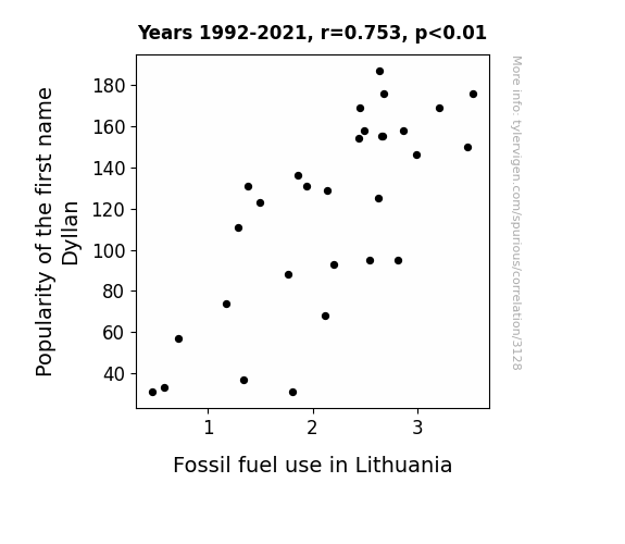
What else correlates?
Popularity of the first name Dyllan · all first names
Fossil fuel use in Lithuania · all energy
Popularity of the first name Dyllan · all first names
Fossil fuel use in Lithuania · all energy


View details about correlation #2,128
Associates in the Social Sciences: The Prequel to Packing for Europe?
As more people became experts in social sciences and history, they realized that Europe is the place where a lot of the social and historical events unfolded. They probably all started daydreaming about living in castles, reenacting historical battles, and discussing philosophy in quaint European cafes. Who wouldn't want to move to a continent that's basically a living, breathing museum of all the cool stuff they learned in their classes?


View details about correlation #1,660
Grain Gain: A Corny Correlation between GMO Usage and Electronics Engineers in Illinois
As the corn's genetic modification dwindled, it seems the engineers just couldn't resist being a-maize-d by other career options. Without those GMOs, the corn couldn't corn-nect with the engineers on a kernel level, leading to a circuitous decrease in the number of tech-savvy individuals. It appears the engineers needed a different field to conduct their current, so they packed up their resistance and sought greener pastures. The correlation clearly shows that when it comes to engineering talent, GMO-free corn is not the kernel of success!


What else correlates?
GMO use in corn grown in Illinois · all food
The number of electronics engineers in Illinois · all cccupations
GMO use in corn grown in Illinois · all food
The number of electronics engineers in Illinois · all cccupations
. The chart goes from 2007 to 2023, and the two variables track closely in value over that time.")

View details about correlation #1,388
A Humorous Connection: xkcd Comics and Micron Technology's Stock Price
As the number of xkcd comics about research rose, more people became interested in scientific and technological advancements, leading to greater demand for the microchips produced by Micron Technology. It seems like these comics were generating some 'current' about the potential of microchips, sparking a positive 'resistance' to investing in MU stock!

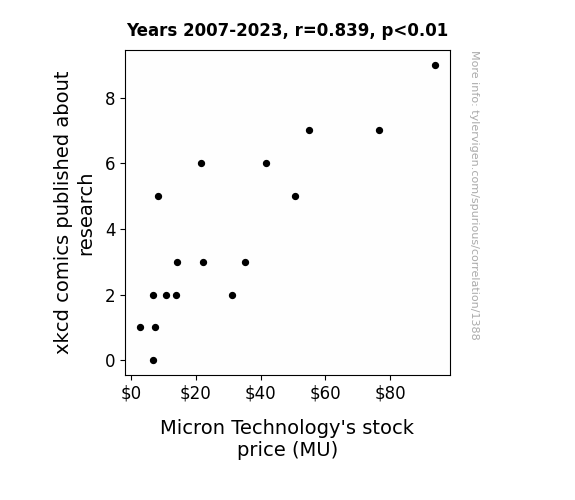
What else correlates?
xkcd comics published about research · all weird & wacky
Micron Technology's stock price (MU) · all stocks
xkcd comics published about research · all weird & wacky
Micron Technology's stock price (MU) · all stocks


View details about correlation #3,001
Air-ly Connecting the Dots: A Correlation Between Air Pollution in Prineville, Oregon and Fossil Fuel Use in Madagascar
The smog from Prineville wafted over to Madagascar, prompting the locals to say, "Hey, if Oregon can have dirty air, so can we!" And thus, a competition for the filthiest air was born. The winner gets a lifetime supply of respiratory problems!
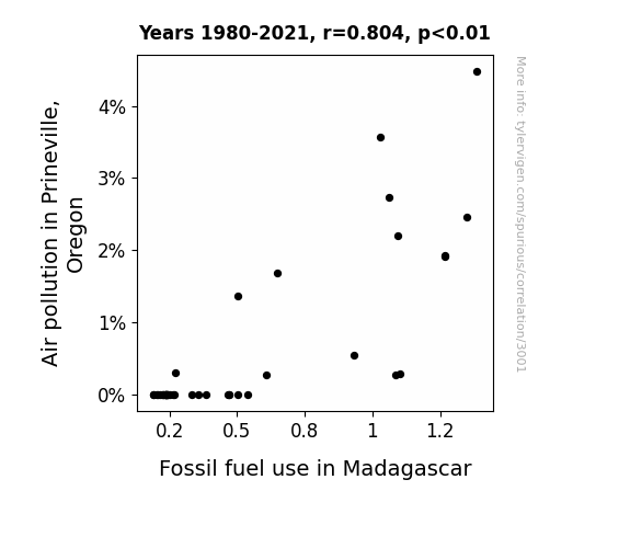
What else correlates?
Air pollution in Prineville, Oregon · all weather
Fossil fuel use in Madagascar · all energy
Air pollution in Prineville, Oregon · all weather
Fossil fuel use in Madagascar · all energy


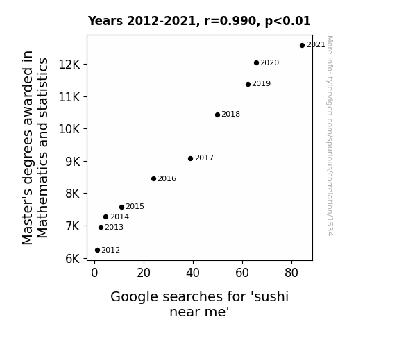
View details about correlation #1,534
Rolling in the Data: Uncovering the Relationship Between Master's Degrees in Mathematics and Sushi Searches
As the number of Master's degrees awarded in Mathematics and statistics rises, so too does the raw talent in the field. This influx of highly skilled individuals creates a tsunami of new ideas and concepts that have a profound impact on the world of data analysis. As math wizards and statistics gurus multiply like exponentials, they stir up a strong craving for precision and complexity, much like the art of crafting perfect sushi. The correlation is clear: as the love for numbers and calculations multiplies, it leads to a rise in the search for sushi near me, because when it comes to statistics, the proof is in the pudding – or in this case, the sushi!


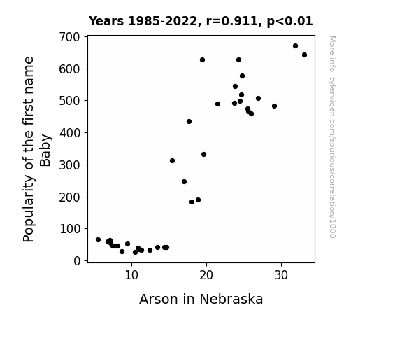
View details about correlation #1,880
Firestarter or Just Trendy: The Correlation Between Baby's Popularity and Arson in Nebraska
Fewer babies named Baby means there are fewer future adults with the last name of Baby. With fewer Babies around, there's less temptation to play with matches and light things on fire, thus leading to a decrease in arson in Nebraska. It's a Baby name miracle!

What else correlates?
Popularity of the first name Baby · all first names
Arson in Nebraska · all random state specific
Popularity of the first name Baby · all first names
Arson in Nebraska · all random state specific


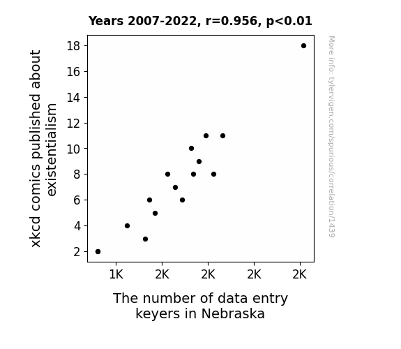
View details about correlation #1,439
Laughing All the Way to the Data: The Correlation Between xkcd Comics on Existentialism and the Number of Data Entry Keyers in Nebraska
As the existential xkcd comics dwindled, data keyers in Nebraska began questioning the meaning of their repetitive tasks. Without the assurance of a purposeful existence, they transcended the monotonous nature of their work, ultimately keying down their numbers. The comic-al shift in philosophical content led to a state of key-mergency as the workforce grappled with the futility of data entry in the grand schema of life.


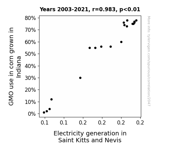
View details about correlation #2,047
Shocking Connection: The Kernel-Currant Nexus Between GMO Corn Cultivation in Indiana and Electricity Generation in Saint Kitts and Nevis
The genetically modified corn stalks in Indiana have developed a natural ability to conduct electricity, creating a new source of power. As the corn fields become electrified, Saint Kitts and Nevis are unknowingly receiving a boost in electricity generation, turning the Midwest into the shocking new hub of renewable energy. It's a-maize-ing how the corn industry is really sparking change in the Caribbean power scene!

What else correlates?
GMO use in corn grown in Indiana · all food
Electricity generation in Saint Kitts and Nevis · all energy
GMO use in corn grown in Indiana · all food
Electricity generation in Saint Kitts and Nevis · all energy


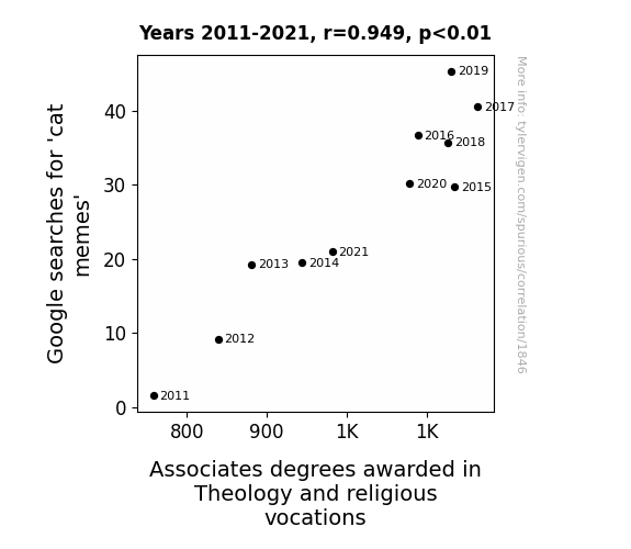
View details about correlation #1,846
Feline Funnies and Divine Degrees: A Pawsitively Purrplexing Correlation between 'Cat Memes' Google Searches and Associates Degrees in Theology and Religious Vocations
As the world became more familiar with the concept of the 'purr-fect' existence through cat memes, individuals felt a spiritual awakening, prompting them to pursue a deeper understanding of life and the universe. The memes served as a catalyst for contemplation, leading to a surge in interest in Theology and religious vocations. It's almost as if the internet was saying, "Let there be purr-spective!"

What else correlates?
Google searches for 'cat memes' · all google searches
Associates degrees awarded in Theology · all education
Google searches for 'cat memes' · all google searches
Associates degrees awarded in Theology · all education
. The chart goes from 2002 to 2022, and the two variables track closely in value over that time.")

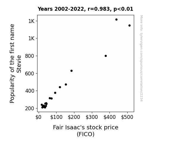
View details about correlation #2,234
Stevie's Surge: Studying the Stock Price Swings of FICO
More people named Stevie were applying for loans, leading to higher demand for Fair Isaac's credit scoring services. "Seems like Stevie and FICO are both building solid credit."

What else correlates?
Popularity of the first name Stevie · all first names
Fair Isaac's stock price (FICO) · all stocks
Popularity of the first name Stevie · all first names
Fair Isaac's stock price (FICO) · all stocks


View details about correlation #3,654
The Ozone Connection: Air Pollution in the Big Apple and Remaining Forest Cover in the Brazilian Amazon
The cleaner air in New York City meant that people didn't feel the need to buy as many artificial air fresheners. This led to a decrease in the demand for tropical rainforest-scented air fresheners, causing a drop in production. With the Amazon forest scent no longer being marketable, there was less incentive to maintain the remaining forest cover in the Brazilian Amazon. It seems like in this case, the Amazon couldn't stay afloat without that fresh NYC forest breeze!

What else correlates?
Air pollution in New York City · all weather
Remaining Forest Cover in the Brazilian Amazon · all weird & wacky
Air pollution in New York City · all weather
Remaining Forest Cover in the Brazilian Amazon · all weird & wacky
Why this works
- Data dredging: I have 25,237 variables in my database. I compare all these variables against each other to find ones that randomly match up. That's 636,906,169 correlation calculations! This is called “data dredging.”
Fun fact: the chart used on the wikipedia page to demonstrate data dredging is also from me. I've been being naughty with data since 2014.
Instead of starting with a hypothesis and testing it, I instead tossed a bunch of data in a blender to see what correlations would shake out. It’s a dangerous way to go about analysis, because any sufficiently large dataset will yield strong correlations completely at random. - Lack of causal connection: There is probably no direct connection between these variables, despite what the AI says above.
Because these pages are automatically generated, it's possible that the two variables you are viewing are in fact causually related. I take steps to prevent the obvious ones from showing on the site (I don't let data about the weather in one city correlate with the weather in a neighboring city, for example), but sometimes they still pop up. If they are related, cool! You found a loophole.
This is exacerbated by the fact that I used "Years" as the base variable. Lots of things happen in a year that are not related to each other! Most studies would use something like "one person" in stead of "one year" to be the "thing" studied. - Observations not independent: For many variables, sequential years are not independent of each other. You will often see trend-lines form. If a population of people is continuously doing something every day, there is no reason to think they would suddenly change how they are doing that thing on January 1. A naive p-value calculation does not take this into account.
You will calculate a lower chance of "randomly" achieving the result than represents reality.
To be more specific: p-value tests are probability values, where you are calculating the probability of achieving a result at least as extreme as you found completely by chance. When calculating a p-value, you need to assert how many "degrees of freedom" your variable has. I count each year (minus one) as a "degree of freedom," but this is misleading for continuous variables.
This kind of thing can creep up on you pretty easily when using p-values, which is why it's best to take it as "one of many" inputs that help you assess the results of your analysis.
- Y-axes doesn't start at zero: I truncated the Y-axes of the graphs above. I also used a line graph, which makes the visual connection stand out more than it deserves.
Nothing against line graphs. They are great at telling a story when you have linear data! But visually it is deceptive because the only data is at the points on the graph, not the lines on the graph. In between each point, the data could have been doing anything. Like going for a random walk by itself!
Mathematically what I showed is true, but it is intentionally misleading. If you click on any of the charts that abuse this, you can scroll down to see a version that starts at zero. - Confounding variable: Confounding variables (like global pandemics) will cause two variables to look connected when in fact a "sneaky third" variable is influencing both of them behind the scenes.
- Outliers: Some datasets here have outliers which drag up the correlation.
In concept, "outlier" just means "way different than the rest of your dataset." When calculating a correlation like this, they are particularly impactful because a single outlier can substantially increase your correlation.
Because this page is automatically generated, I don't know whether any of the charts displayed on it have outliers. I'm just a footnote. ¯\_(ツ)_/¯
I intentionally mishandeled outliers, which makes the correlation look extra strong. - Low n: There are not many data points included in some of these charts.
You can do analyses with low ns! But you shouldn't data dredge with a low n.
Even if the p-value is high, we should be suspicious of using so few datapoints in a correlation.
Pro-tip: click on any correlation to see:
- Detailed data sources
- Prompts for the AI-generated content
- Explanations of each of the calculations (correlation, p-value)
- Python code to calculate it yourself


