spurious correlations
discover · random · spurious scholar
← previous page · next page →


View details about correlation #2,052
What else correlates?
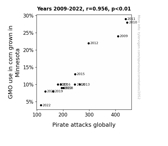
GMO use in corn grown in Minnesota · all food
Pirate attacks globally · all weird & wacky
GMO use in corn grown in Minnesota · all food
Pirate attacks globally · all weird & wacky


View details about correlation #4,245

What else correlates?
Google searches for 'how much wood can a woodchuck chuck' · all google searches
Kerosene used in Venezuela · all energy
Google searches for 'how much wood can a woodchuck chuck' · all google searches
Kerosene used in Venezuela · all energy


View details about correlation #5,857


View details about correlation #3,951

What else correlates?
Popularity of the first name Katherine · all first names
Burglaries in Hawaii · all random state specific
Popularity of the first name Katherine · all first names
Burglaries in Hawaii · all random state specific


View details about correlation #2,718

What else correlates?
Master's degrees awarded in Education · all education
US bank failures · all weird & wacky
Master's degrees awarded in Education · all education
US bank failures · all weird & wacky
. The chart goes from 2005 to 2021, and the two variables track closely in value over that time.")

View details about correlation #5,884

What else correlates?
American cheese consumption · all food
Alphabet's stock price (GOOGL) · all stocks
American cheese consumption · all food
Alphabet's stock price (GOOGL) · all stocks


View details about correlation #2,863
What else correlates?
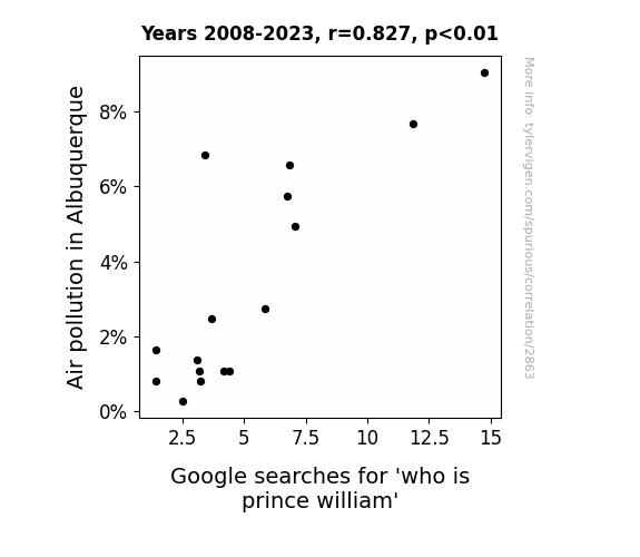
Air pollution in Albuquerque · all weather
Google searches for 'who is prince william' · all google searches
Air pollution in Albuquerque · all weather
Google searches for 'who is prince william' · all google searches


View details about correlation #3,099

What else correlates?
UFO sightings in New Mexico · all random state specific
Patents granted in the US · all weird & wacky
UFO sightings in New Mexico · all random state specific
Patents granted in the US · all weird & wacky


View details about correlation #5,851


View details about correlation #2,810
What else correlates?
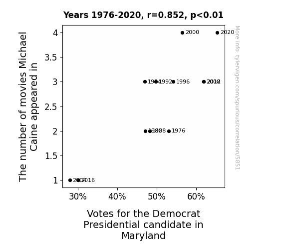
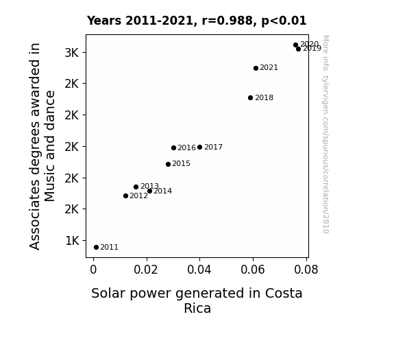
Associates degrees awarded in Music and dance · all education
Solar power generated in Costa Rica · all energy
Associates degrees awarded in Music and dance · all education
Solar power generated in Costa Rica · all energy
. The chart goes from 2002 to 2022, and the two variables track closely in value over that time.")

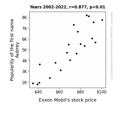
View details about correlation #4,112
What else correlates?
Popularity of the first name Aubrey · all first names
Exxon Mobil's stock price (XOM) · all stocks
Popularity of the first name Aubrey · all first names
Exxon Mobil's stock price (XOM) · all stocks


View details about correlation #2,848

What else correlates?
US household spending on processed fruits · all weird & wacky
GMO use in cotton in Louisiana · all food
US household spending on processed fruits · all weird & wacky
GMO use in cotton in Louisiana · all food


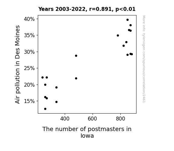
View details about correlation #2,461
What else correlates?
Air pollution in Des Moines · all weather
The number of postmasters in Iowa · all cccupations
Air pollution in Des Moines · all weather
The number of postmasters in Iowa · all cccupations


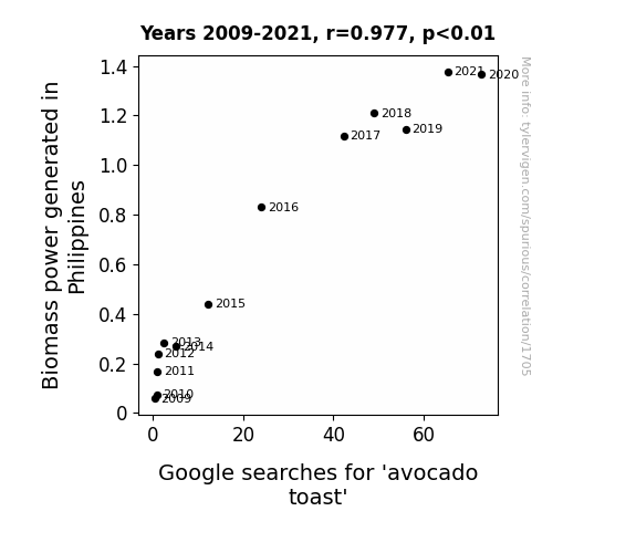
View details about correlation #1,705
What else correlates?
Biomass power generated in Philippines · all energy
Google searches for 'avocado toast' · all google searches
Biomass power generated in Philippines · all energy
Google searches for 'avocado toast' · all google searches


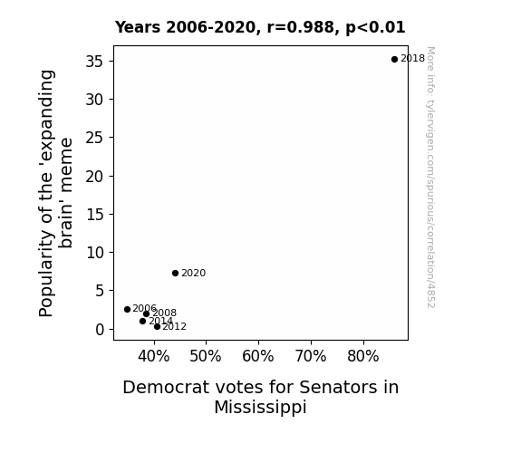
View details about correlation #4,852
What else correlates?
Popularity of the 'expanding brain' meme · all memes
Votes for Democratic Senators in Mississippi · all elections
Popularity of the 'expanding brain' meme · all memes
Votes for Democratic Senators in Mississippi · all elections


View details about correlation #5,912
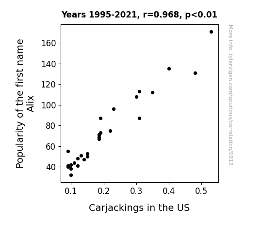
What else correlates?
Popularity of the first name Alix · all first names
Carjackings in the US · all weird & wacky
Popularity of the first name Alix · all first names
Carjackings in the US · all weird & wacky
. The chart goes from 2006 to 2023, and the two variables track closely in value over that time.")

View details about correlation #1,339
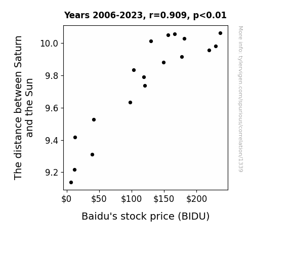
What else correlates?
The distance between Saturn and the Sun · all planets
Baidu's stock price (BIDU) · all stocks
The distance between Saturn and the Sun · all planets
Baidu's stock price (BIDU) · all stocks
Why this works
- Data dredging: I have 25,237 variables in my database. I compare all these variables against each other to find ones that randomly match up. That's 636,906,169 correlation calculations! This is called “data dredging.”
Fun fact: the chart used on the wikipedia page to demonstrate data dredging is also from me. I've been being naughty with data since 2014.
Instead of starting with a hypothesis and testing it, I instead tossed a bunch of data in a blender to see what correlations would shake out. It’s a dangerous way to go about analysis, because any sufficiently large dataset will yield strong correlations completely at random. - Lack of causal connection: There is probably no direct connection between these variables, despite what the AI says above.
Because these pages are automatically generated, it's possible that the two variables you are viewing are in fact causually related. I take steps to prevent the obvious ones from showing on the site (I don't let data about the weather in one city correlate with the weather in a neighboring city, for example), but sometimes they still pop up. If they are related, cool! You found a loophole.
This is exacerbated by the fact that I used "Years" as the base variable. Lots of things happen in a year that are not related to each other! Most studies would use something like "one person" in stead of "one year" to be the "thing" studied. - Observations not independent: For many variables, sequential years are not independent of each other. You will often see trend-lines form. If a population of people is continuously doing something every day, there is no reason to think they would suddenly change how they are doing that thing on January 1. A naive p-value calculation does not take this into account.
You will calculate a lower chance of "randomly" achieving the result than represents reality.
To be more specific: p-value tests are probability values, where you are calculating the probability of achieving a result at least as extreme as you found completely by chance. When calculating a p-value, you need to assert how many "degrees of freedom" your variable has. I count each year (minus one) as a "degree of freedom," but this is misleading for continuous variables.
This kind of thing can creep up on you pretty easily when using p-values, which is why it's best to take it as "one of many" inputs that help you assess the results of your analysis.
- Y-axes doesn't start at zero: I truncated the Y-axes of the graphs above. I also used a line graph, which makes the visual connection stand out more than it deserves.
Nothing against line graphs. They are great at telling a story when you have linear data! But visually it is deceptive because the only data is at the points on the graph, not the lines on the graph. In between each point, the data could have been doing anything. Like going for a random walk by itself!
Mathematically what I showed is true, but it is intentionally misleading. If you click on any of the charts that abuse this, you can scroll down to see a version that starts at zero. - Confounding variable: Confounding variables (like global pandemics) will cause two variables to look connected when in fact a "sneaky third" variable is influencing both of them behind the scenes.
- Outliers: Some datasets here have outliers which drag up the correlation.
In concept, "outlier" just means "way different than the rest of your dataset." When calculating a correlation like this, they are particularly impactful because a single outlier can substantially increase your correlation.
Because this page is automatically generated, I don't know whether any of the charts displayed on it have outliers. I'm just a footnote. ¯\_(ツ)_/¯
I intentionally mishandeled outliers, which makes the correlation look extra strong. - Low n: There are not many data points included in some of these charts.
You can do analyses with low ns! But you shouldn't data dredge with a low n.
Even if the p-value is high, we should be suspicious of using so few datapoints in a correlation.
Pro-tip: click on any correlation to see:
- Detailed data sources
- Prompts for the AI-generated content
- Explanations of each of the calculations (correlation, p-value)
- Python code to calculate it yourself


