spurious correlations
discover · random · spurious scholar
← previous page · next page →


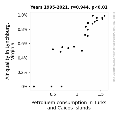
View details about correlation #4,568
Inhaling the Island Influence: A Correlation Analysis of Air Quality in Lynchburg, Virginia and Petroleum Consumption in Turks and Caicos Islands
Lynchburg's pristine air somehow triggered a chain reaction, leading to an insatiable urge for beach vacations in Turks and Caicos. This, in turn, caused a surge in flights and boat rides to the islands, ultimately revving up the demand for petroleum to power these tropical escapades. It's like the atmosphere in Lynchburg whispered to the residents, "You know what would complement this clean air? A coconut-scented, sunscreen-filled, Caribbean adventure!" And off they went, unknowingly creating a most unexpected link between Lynchburg's air quality and the petroleum paradise of Turks and Caicos. It's like a breath of fresh air led to a tidal wave of travel!

What else correlates?
Air quality in Lynchburg, Virginia · all weather
Petroluem consumption in Turks and Caicos Islands · all energy
Air quality in Lynchburg, Virginia · all weather
Petroluem consumption in Turks and Caicos Islands · all energy


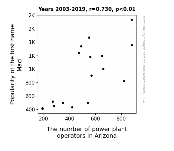
View details about correlation #3,964
The Maci Power: Exploring the Correlation Between the Popularity of the Name Maci and the Number of Power Plant Operators in Arizona
As more and more babies were named Maci, it was discovered that collectively they had the incredible ability to generate and control electricity. Harnessing this shocking new power source, Arizona saw a surge in Maci-named individuals taking on the important role of power plant operators. Who knew that the future of energy production was written in the stars for all the Macis out there?

What else correlates?
Popularity of the first name Maci · all first names
The number of power plant operators in Arizona · all cccupations
Popularity of the first name Maci · all first names
The number of power plant operators in Arizona · all cccupations


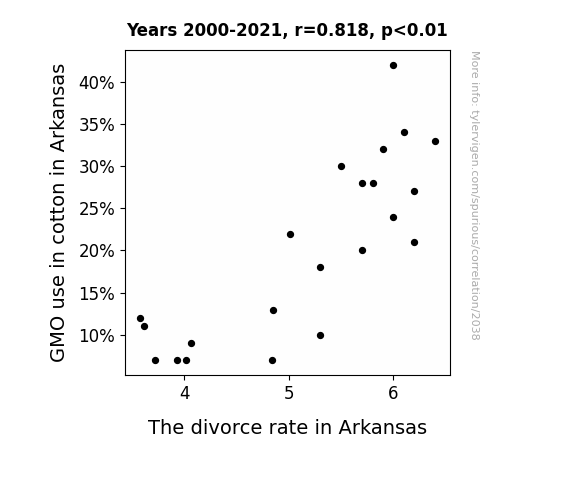
View details about correlation #2,038
Spinning Tales: The Genetic Modification of Cotton and the Unraveling of Marriages in Arkansas
As cotton fields became a little less genetically modified, the love bug began to bite a little harder. It seems the key to marital bliss was to let nature take its course, rather than meddling with genetically modified relationships.

What else correlates?
GMO use in cotton in Arkansas · all food
The divorce rate in Arkansas · all random state specific
GMO use in cotton in Arkansas · all food
The divorce rate in Arkansas · all random state specific


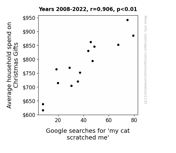
View details about correlation #1,135
Catty Christmas: Correlating Average Household Spend on Christmas Gifts with Google Searches for 'My Cat Scratched Me'
The scent of the new toys and treats enticed the cat into a frenzy of gift-protecting instincts, leading to an uptick in surprise attacks on unsuspecting family members.


View details about correlation #1,960
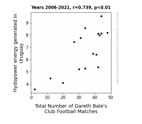
Kickin' it with Hydropower: The Bale and Flow of Uruguay's Energy and Football
As the water rushed through the dams, it created a ripple effect, leading to a surge in electricity production. This power boost coincidentally revved up the virtual arenas where Gareth Bale's digital counterparts competed in extra matches. It seems the flow of hydropower had a dam good influence on the frequency of Bale's on-screen appearances, sparking a wave of game time action. So, in a shocking turn of events, it was all about finding the right current to amp up the game and keep Bale plugged into the action!

What else correlates?
Hydopower energy generated in Uruguay · all energy
Total Number of Gareth Bale's Club Football Matches · all sports
Hydopower energy generated in Uruguay · all energy
Total Number of Gareth Bale's Club Football Matches · all sports


View details about correlation #2,343
The Kooky Connection: Kari's Kount and Maryland's Bailiff Bounty
Kari’s charm was just too alluring, leading to a rise in "court"-ships and ultimately more bailiffs needed to maintain order in Maryland’s halls of justice. It turns out, when it comes to naming trends, Kari has quite the appeal for law enforcement. So, it seems that Kari really does have the ‘bail’-ity to impact the state’s judicial system, one name at a time!


What else correlates?
Popularity of the first name Kari · all first names
The number of bailiffs in Maryland · all cccupations
Popularity of the first name Kari · all first names
The number of bailiffs in Maryland · all cccupations


View details about correlation #1,755
Air Pollution or Marital Dissolution? An Examination of the Relationship Between Air Quality in Winston, North Carolina and the Divorce Rate in North Carolina
As air quality improved, people could see things more clearly, including the love they had for each other. And remember, love isn't in the air - it's in Winston, North Carolina!


What else correlates?
Air pollution in Winston, North Carolina · all weather
The divorce rate in North Carolina · all random state specific
Air pollution in Winston, North Carolina · all weather
The divorce rate in North Carolina · all random state specific


View details about correlation #1,854
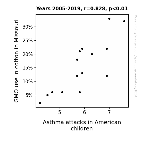
GMO Cotton in Missouri: A Breathy Dairy or Just Hot Air?
The decrease in GMO cotton meant fewer cotton plants were sneaking up behind unsuspecting children, thereby reducing the number of surprise tickle attacks on their lungs.
What else correlates?
GMO use in cotton in Missouri · all food
Asthma attacks in American children · all weird & wacky
GMO use in cotton in Missouri · all food
Asthma attacks in American children · all weird & wacky


View details about correlation #2,454
Liberal Arts and Lacrosse: A Lighthearted Look at the Link
As the number of liberal arts graduates dwindled, so did the ability to philosophize about the true essence of scoring differential in lacrosse. This led to a more practical, goal-oriented approach to the game, narrowing the point differentials and prompting the age-old question: If a midfielder scores in the forest and no one's around to hear it, does it still contribute to the point differential?


View details about correlation #4,791
Clickbait Craze and Aircraft Mechanics: Unraveling the Rhyme and Reason
The aircraft mechanics in Vermont are secretly working with LEMMiNO to determine the most attention-grabbing video titles, using their knowledge of aerodynamics to ensure the clickbait levels are sky high. As the mechanics tinker with more planes, they inadvertently inspire LEMMiNO to craft even more sensational video titles. It's a whole new level of "flying under the radar" for both parties.


View details about correlation #1,649
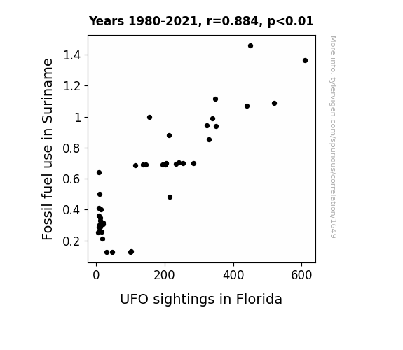
Fueling UFO Fables: The Fossil Fuel-Fueled Florida UFO Phenomenon
As the fossil fuels were burned in Suriname, they released mysterious and unusual emissions into the atmosphere. These emissions inadvertently acted as a beacon for intergalactic travelers, guiding UFOs towards the Sunshine State. It seems the aliens have a burgeoning interest in fossil fuel emissions as their preferred choice of celestial entertainment.

What else correlates?
Fossil fuel use in Suriname · all energy
UFO sightings in Florida · all random state specific
Fossil fuel use in Suriname · all energy
UFO sightings in Florida · all random state specific


View details about correlation #1,574
Leo's Legacy: Exploring the Correlation between the Name Leo and the Internet's Expansive Web
As the name Leo gained popularity, more parents were inspired to name their kids after the king of the jungle. This led to a surge in young, tech-savvy Leos who grew up to be web developers, creating a pride of internet-savvy individuals. These Leos roared their way into the online world, creating a 'Leot' of new websites. It's truly a case of "lionizing" the digital domain.


What else correlates?
Popularity of the first name Leo · all first names
Number of websites on the internet · all weird & wacky
Popularity of the first name Leo · all first names
Number of websites on the internet · all weird & wacky


View details about correlation #1,864
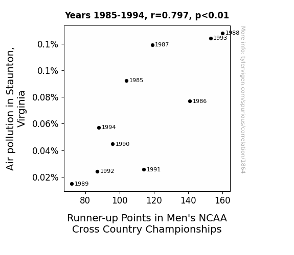
Breathless at the Finish Line: The Relationship Between Air Pollution in Staunton, Virginia and Runner-up Points in Men's NCAA Cross Country Championships
As the air cleared in Staunton, Virginia, it became easier for the cross country runners to take in oxygen and perform at their peak. With less pollution to slow them down, they really started to race ahead. One could say that as the pollution decreased, the runners' times also took a deep breath and improved. It's a classic case of smog-cess breeding success!

What else correlates?
Air pollution in Staunton, Virginia · all weather
Runner-up Points in Men's NCAA Cross Country Championships · all sports
Air pollution in Staunton, Virginia · all weather
Runner-up Points in Men's NCAA Cross Country Championships · all sports


View details about correlation #4,988
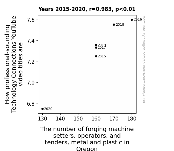
TechNifty or TechieNapping? Assessing the Relationship Between Tech YouTube Video Titles and Oregon's Forging Machine Operators
As the number of forging machine setters, operators, and tenders in Oregon decreases, there are fewer people around to “hammer out” the professionalism in technology connections, leading to a decline in professional-sounding video titles. It’s a real case of "forging" a connection between industrial occupations and YouTube content!


View details about correlation #3,994
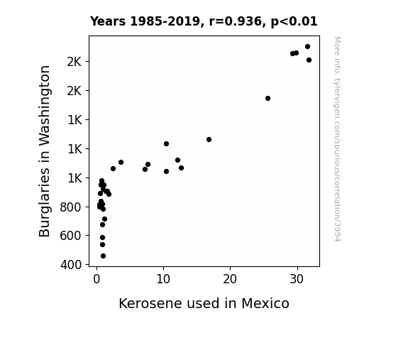
Fueling Crime: Exploring the Correlation Between Burglaries in Washington and Kerosene Usage in Mexico
As burglaries decreased in Washington, there was less need for improvised Molotov cocktails, leading to a reduced demand for kerosene in Mexico. Without the need to break into homes in Washington, the supply of kerosene from there also saw a decrease, causing a chain reaction that ultimately led to less kerosene being used in Mexico.

What else correlates?
Burglaries in Washington · all random state specific
Kerosene used in Mexico · all energy
Burglaries in Washington · all random state specific
Kerosene used in Mexico · all energy


View details about correlation #1,236
Rock 'n' Roll and Political Trolls: A Correlational Analysis of xkcd Comics and Rock N Roll Hall of Fame Inductee Count
As xkcd comics about politics increased, more people found themselves in a "comic rock and roll" mindset, leading to a surge in support for influential musicians. It's like these comics were the real "Hall of Fame-shakers," sparking a chain reaction of rock appreciation. It's all about that political satire rockin' the vote for music legends!


What else correlates?
xkcd comics published about politics · all weird & wacky
Rock N Roll Hall of Fame Inductee Count · all weird & wacky
xkcd comics published about politics · all weird & wacky
Rock N Roll Hall of Fame Inductee Count · all weird & wacky


View details about correlation #2,998
The Keyshawn Quotient: Exploring the Relationship Between the Popularity of the First Name Keyshawn and Air Pollution in Tuscaloosa, Alabama
As the popularity of the name Keyshawn rose, more and more babies were given this unique moniker. This led to a spike in demand for personalized car keychains featuring the name Keyshawn. Tuscaloosa, known for its love of souped-up trucks and joyriding, saw a corresponding increase in the use of cars, thus contributing to air pollution. It seems like in this case, Keyshawn wasn't just leaving a mark on baby name charts, but also on the environmental pollution index in a rather unexpected and gas-guzzling manner!


What else correlates?
Popularity of the first name Keyshawn · all first names
Air pollution in Tuscaloosa, Alabama · all weather
Popularity of the first name Keyshawn · all first names
Air pollution in Tuscaloosa, Alabama · all weather


View details about correlation #1,658
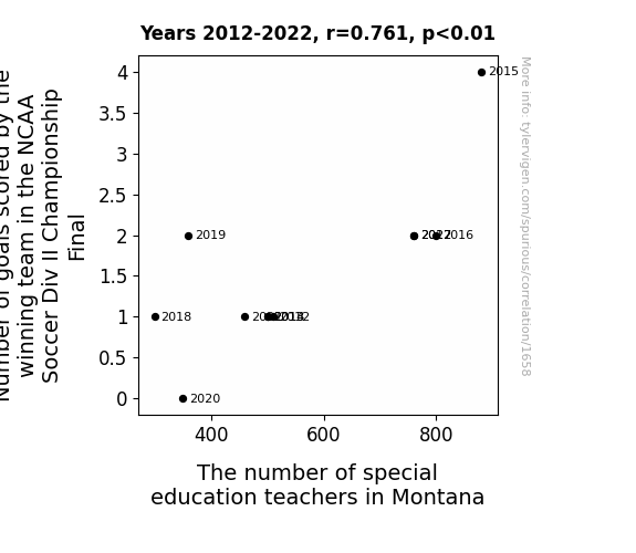
Scoring Goals and Teaching Souls: Unearthing the Unlikely Link Between NCAA Soccer and Montana's Special Education Teachers
Every time the winning team scored, a special education teacher in Montana received a sudden burst of inspiration, prompting more individuals to pursue a career in that field. It's a classic case of goal-scoring leading to goal-setting in the most unexpected way possible!


View details about correlation #2,066
Mastering Multi/Interdisciplinary Studies: Unraveling the Chilling Connection with Cold Showers
As the number of Master's degrees awarded in Multi/interdisciplinary studies rose, more people became adept at analyzing the complex web of societal expectations. This led to a sudden realization that taking cold showers aligns with the multi-faceted principles of minimalism, self-discipline, and environmental conservation. Choosing discomfort became the new interdisciplinary norm, sparking a chilling trend in personal hygiene. Remember, sometimes academic pursuits can lead to unexpected societal shivers!


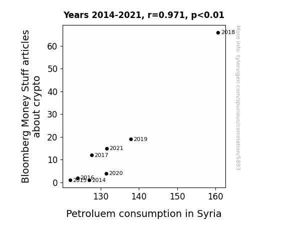
View details about correlation #5,893
From Petro to Crypto: A Rhyme Between Bloomberg's Line and Syria's Oil and Gas Time
The sudden surge in crypto coverage led to a nationwide obsession with mining virtual currencies, causing people to inadvertently leave their real-life engines running, consequently ramping up the demand for petroleum in Syria. Who knew that digital money could rev up the need for fossil fuels in such a tangible way? It's like they say, when it rains crypto, it pours petrol!

What else correlates?
Bloomberg Money Stuff articles about crypto · all weird & wacky
Petroluem consumption in Syria · all energy
Bloomberg Money Stuff articles about crypto · all weird & wacky
Petroluem consumption in Syria · all energy
Why this works
- Data dredging: I have 25,237 variables in my database. I compare all these variables against each other to find ones that randomly match up. That's 636,906,169 correlation calculations! This is called “data dredging.”
Fun fact: the chart used on the wikipedia page to demonstrate data dredging is also from me. I've been being naughty with data since 2014.
Instead of starting with a hypothesis and testing it, I instead tossed a bunch of data in a blender to see what correlations would shake out. It’s a dangerous way to go about analysis, because any sufficiently large dataset will yield strong correlations completely at random. - Lack of causal connection: There is probably no direct connection between these variables, despite what the AI says above.
Because these pages are automatically generated, it's possible that the two variables you are viewing are in fact causually related. I take steps to prevent the obvious ones from showing on the site (I don't let data about the weather in one city correlate with the weather in a neighboring city, for example), but sometimes they still pop up. If they are related, cool! You found a loophole.
This is exacerbated by the fact that I used "Years" as the base variable. Lots of things happen in a year that are not related to each other! Most studies would use something like "one person" in stead of "one year" to be the "thing" studied. - Observations not independent: For many variables, sequential years are not independent of each other. You will often see trend-lines form. If a population of people is continuously doing something every day, there is no reason to think they would suddenly change how they are doing that thing on January 1. A naive p-value calculation does not take this into account.
You will calculate a lower chance of "randomly" achieving the result than represents reality.
To be more specific: p-value tests are probability values, where you are calculating the probability of achieving a result at least as extreme as you found completely by chance. When calculating a p-value, you need to assert how many "degrees of freedom" your variable has. I count each year (minus one) as a "degree of freedom," but this is misleading for continuous variables.
This kind of thing can creep up on you pretty easily when using p-values, which is why it's best to take it as "one of many" inputs that help you assess the results of your analysis.
- Y-axes doesn't start at zero: I truncated the Y-axes of the graphs above. I also used a line graph, which makes the visual connection stand out more than it deserves.
Nothing against line graphs. They are great at telling a story when you have linear data! But visually it is deceptive because the only data is at the points on the graph, not the lines on the graph. In between each point, the data could have been doing anything. Like going for a random walk by itself!
Mathematically what I showed is true, but it is intentionally misleading. If you click on any of the charts that abuse this, you can scroll down to see a version that starts at zero. - Confounding variable: Confounding variables (like global pandemics) will cause two variables to look connected when in fact a "sneaky third" variable is influencing both of them behind the scenes.
- Outliers: Some datasets here have outliers which drag up the correlation.
In concept, "outlier" just means "way different than the rest of your dataset." When calculating a correlation like this, they are particularly impactful because a single outlier can substantially increase your correlation.
Because this page is automatically generated, I don't know whether any of the charts displayed on it have outliers. I'm just a footnote. ¯\_(ツ)_/¯
I intentionally mishandeled outliers, which makes the correlation look extra strong. - Low n: There are not many data points included in some of these charts.
You can do analyses with low ns! But you shouldn't data dredge with a low n.
Even if the p-value is high, we should be suspicious of using so few datapoints in a correlation.
Pro-tip: click on any correlation to see:
- Detailed data sources
- Prompts for the AI-generated content
- Explanations of each of the calculations (correlation, p-value)
- Python code to calculate it yourself


