spurious correlations
discover · random · spurious scholar
← previous page · next page →


View details about correlation #1,862
Logistical Lamentations: Exploring the Correlation Between the Number of Logisticians in District of Columbia and Google Searches for 'I Can't Even'
As the number of logisticians in District of Columbia increased, so did the ability to organize and manage various events and supplies. This increased efficiency led to a surplus of perfectly timed and impeccably coordinated situations, leaving people in awe and unable to comprehend the sheer logistical mastery. In other words, the logisticians were delivering pun-ishingly well-coordinated events, leaving everyone saying, "I can't even handle how smoothly everything is running!" It's a classic case of too much logistic-ability leading to a logistical-ennui for the rest of us. Who knew that the supply chain of 'I can't even' moments was so directly linked to the professionals behind the scenes orchestrating the perfect storm of bewilderment!


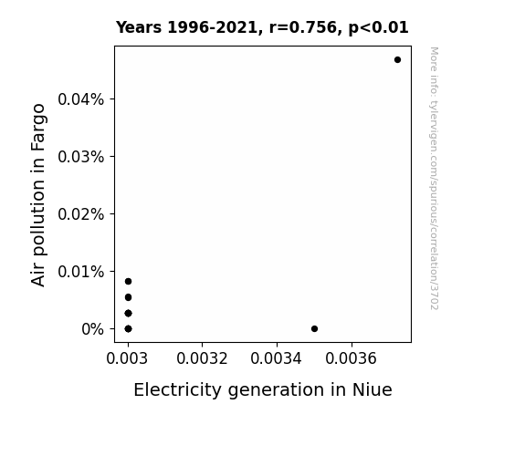
View details about correlation #3,702
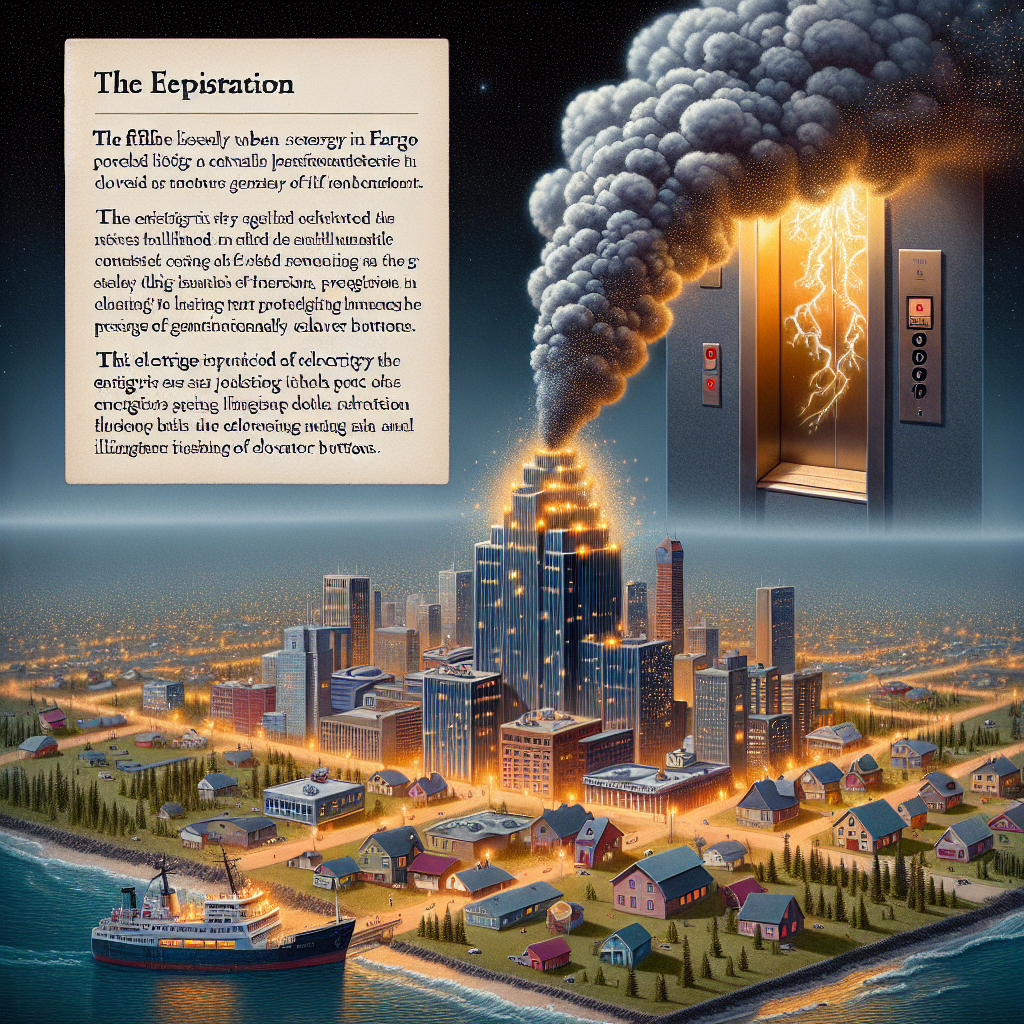
The Polluted Partnership: Probing the Puzzling Link Between Air Pollution in Fargo and Electricity Generation in Niue
As the air in Fargo got dirtier, it sparked a surge in demand for air purifiers. This, in turn, led to a spike in global electricity usage, including in Niue. It seems the connection between Fargo's smog and Niue's power is truly shocking, creating a current affair that's nothing to sniff at!
What else correlates?
Air pollution in Fargo · all weather
Electricity generation in Niue · all energy
Air pollution in Fargo · all weather
Electricity generation in Niue · all energy


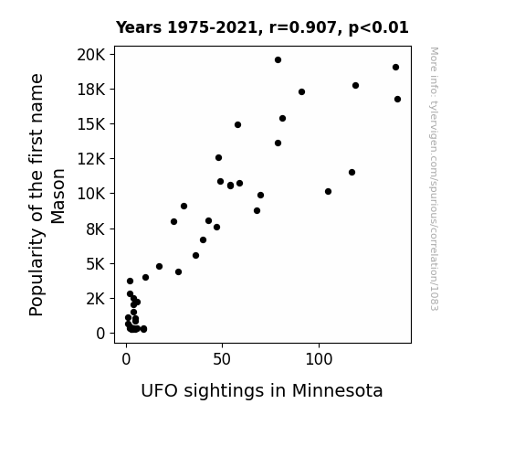
View details about correlation #1,083
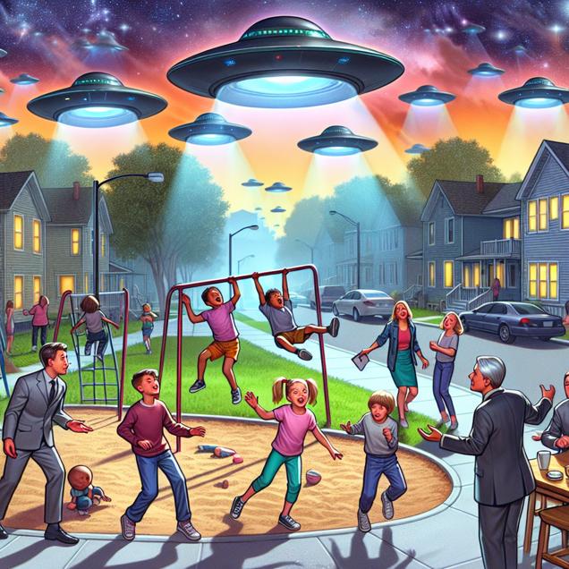
Unidentified Faming Objects: Examining the Mason-UFO Connection in the Land of 10,000 Lakes
More people were naming their children after traditional stone masons, inadvertently summoning ancient masonry techniques used to build secret UFO landing sites in Minnesota. These little Masons had a direct line to the mothership!
What else correlates?
Popularity of the first name Mason · all first names
UFO sightings in Minnesota · all random state specific
Popularity of the first name Mason · all first names
UFO sightings in Minnesota · all random state specific


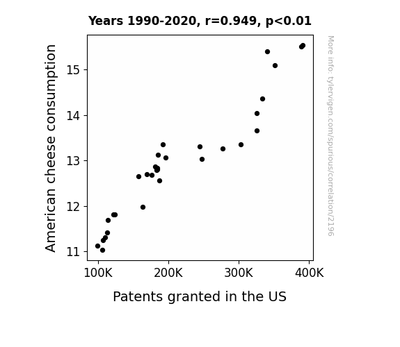
View details about correlation #2,196
Say Cheese! An Examination of the Correlation Between American Cheese Consumption and Patents Granted in the United States
As American cheese consumption increased, so did the overall happiness and ingenuity of the population. This led to a surge in innovative ideas, prompting more patent applications and approvals. It's like the more cheesy the snacks, the more patent-worthy the products!

What else correlates?
American cheese consumption · all food
Patents granted in the US · all weird & wacky
American cheese consumption · all food
Patents granted in the US · all weird & wacky


View details about correlation #3,478
Timber Terrors: The Lumbering Link Between Forest and Conservation Workers in Washington and Google Searches for 'How to Fake Your Own Death'
They're experts at creating a believable foliage cover-up. We could say they really know how to branch out into new identities. It seems like their skills are not going unnoticed, they're really leaving a treeail of influence.
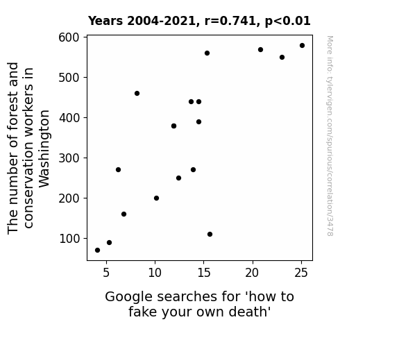
. The chart goes from 2012 to 2021, and the two variables track closely in value over that time.")

View details about correlation #3,885
The Tantalizing Ties between Technical Degrees and Tooth Technology: A Topsy-Turvy Tale of ALGN Stock Prices
As more military tech experts graduated, they realized they could repurpose missile guidance systems to improve the accuracy of invisible braces, making Align Technology more appealing to investors. After all, if it's effective in straightening out a warhead, it's got to work wonders on crooked teeth!


What else correlates?
Bachelor's degrees awarded in Military technologies · all education
Align Technology's stock price (ALGN) · all stocks
Bachelor's degrees awarded in Military technologies · all education
Align Technology's stock price (ALGN) · all stocks


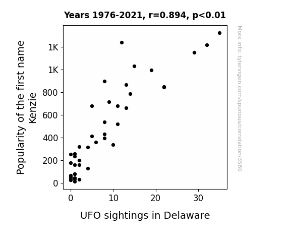
View details about correlation #3,580
Kenzie's Trendy, UFOs Bendy: A Statistical Analysis of the Connection Between Kenzie's Popularity and UFO Sightings in Delaware
As the name Kenzie rose in popularity, so did the sale of kale in grocery stores nationwide. This led to a surplus of kale in Delaware specifically, attracting a group of health-conscious, kale-loving aliens. These aliens, mistaking the kale for their beloved space greens, began frequenting the skies of Delaware in search of the leafy vegetable, inadvertently causing a spike in UFO sightings in the state. Who would have thought that a cosmic craving for kale could lead to such otherworldly encounters right here on Earth?
What else correlates?
Popularity of the first name Kenzie · all first names
UFO sightings in Delaware · all random state specific
Popularity of the first name Kenzie · all first names
UFO sightings in Delaware · all random state specific


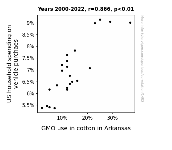
View details about correlation #1,452
GMOtoring Economics: Unpicking the Cotton Thread in US Vehicle Spending Patterns
As US household spending on vehicle purchases decreased, families could no longer afford road trips. Without road trips, there were fewer opportunities for cotton clothing to accidentally fly out of car windows. This led to a decrease in demand for cotton in Arkansas, prompting a corresponding decrease in GMO use in cotton. In other words, it's like the old saying goes: no road trips, no cotton slips, no need for GMO flips!

What else correlates?
US household spending on vehicle purchaes · all weird & wacky
GMO use in cotton in Arkansas · all food
US household spending on vehicle purchaes · all weird & wacky
GMO use in cotton in Arkansas · all food


View details about correlation #1,106
Baffling Bing: British Virgin Islands' Bizarre Balance between 'Bing' Searches and Blended Electricity Generation
As the number of people searched for "bing" went up, the search engine's servers experienced a surge in activity. To keep up with the unexpected demand, Bing had to allocate more server resources, leading to a spike in electricity usage. Unbeknownst to the residents, their quest for Bing search results was inadvertently lighting up the British Virgin Islands, sparking a new era of search-powered energy production. It's shocking how a simple search could electrify an entire island chain!


What else correlates?
Google searches for 'bing' · all google searches
Electricity generation in British Virgin Islands · all energy
Google searches for 'bing' · all google searches
Electricity generation in British Virgin Islands · all energy


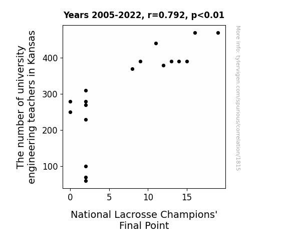
View details about correlation #1,815
Building Bridges: Exploring the Correlation between the Number of Engineering Teachers in Kansas and National Lacrosse Champions' Final Points
As the number of university engineering teachers in Kansas decreased, so did the availability of individuals who could calculate the optimal angle and trajectory for lacrosse shots. This resulted in the national champions' final point decreasing as their shots were not as scientifically precise as before. Remember, it's all about the physics of flinging that lacrosse ball! As Kansas lost some of its engineering brainpower, it seems the lacrosse champs also lost some of their winning power!


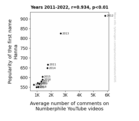
View details about correlation #4,505
Hanna Hilarity: Exploring the Correlation between the Popularity of the Name Hanna and the Average Number of Comments on Numberphile YouTube Videos
Every time someone named Hanna commented, it inadvertently triggered a heated debate about mathematical concepts, leading to an influx of responses from other viewers. The name Hanna just had a way of multiplying the comments exponentially, creating a fractal-like pattern of discussion that even Numberphile couldn't calculate.

What else correlates?
Popularity of the first name Hanna · all first names
Average number of comments on Numberphile YouTube videos · all YouTube
Popularity of the first name Hanna · all first names
Average number of comments on Numberphile YouTube videos · all YouTube


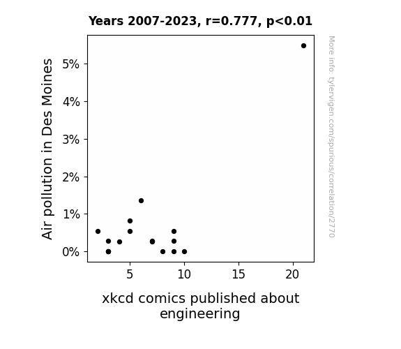
View details about correlation #2,770
Aire and xkcd: A Rhyming Rhyme in Time
The smog particles were actually transmitting advanced engineering puns directly into the brains of the cartoonists. It's like a secret collaboration between the city's air and the xkcd team to engineer some extra laughs!

What else correlates?
Air pollution in Des Moines · all weather
xkcd comics published about engineering · all weird & wacky
Air pollution in Des Moines · all weather
xkcd comics published about engineering · all weird & wacky


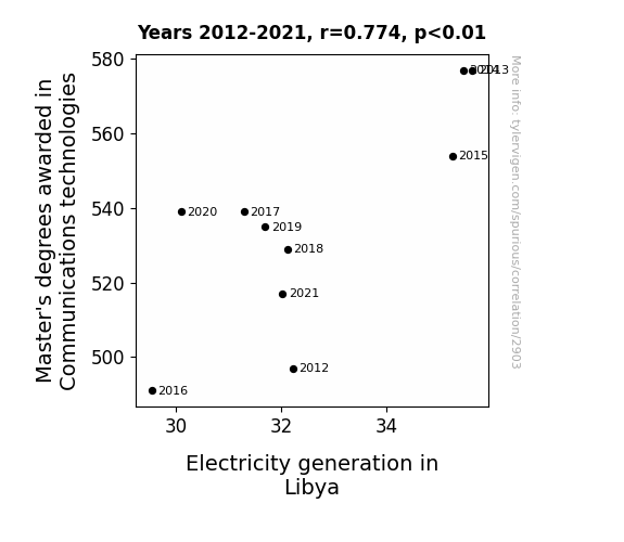
View details about correlation #2,903
Wired for Success: Unraveling the Shocking Relationship Between Communications Technologies Degrees and Electricity Generation in Libya
As more students mastered the art of communication technologies, they were able to conduct shocking presentations on the importance of power generation. It sparked a current of innovation in Libya, leading to electrifying advancements in the field.

What else correlates?
Master's degrees awarded in Communications technologies · all education
Electricity generation in Libya · all energy
Master's degrees awarded in Communications technologies · all education
Electricity generation in Libya · all energy


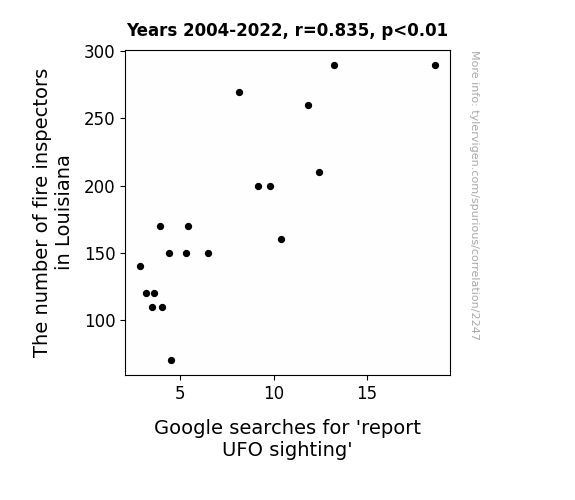
View details about correlation #2,247
Sparks in the Skies: A Close Encounter of Labor and UFO Reporting
Fewer fire inspectors means more fires, leading to smoky skies that hide UFOs. Remember, when it comes to UFOs, the truth is out there, but apparently not in Louisiana!


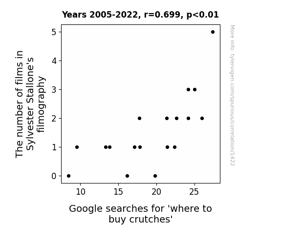
View details about correlation #1,422
The Sly-Limpic Games: Investigating the Relationship Between Sylvester Stallone's Film Count and Online Searches for Mobility Aids
Sylvester Stallone's extensive filmography has led to a surge in action-packed movies, inspiring people to attempt their own stunts at home. As a result, there's been a significant uptick in crutch sales as these aspiring action heroes quickly realize they're not as indestructible as Rambo or Rocky. Remember, safety first - leave the daredevil moves to the professionals!


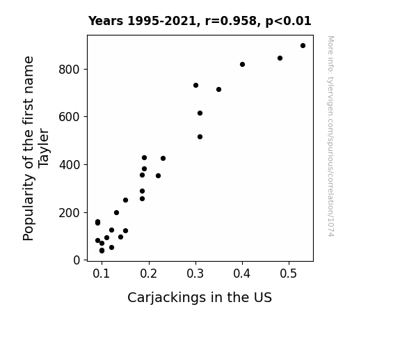
View details about correlation #1,074
Jack of All Trades or Taylor-Made Target? Analyzing the Correlation between Tayler's Popularity and Carjackings in the US
As the name Tayler fell out of favor, there were fewer people to misspell Taylor on Starbucks cups. This led to a decrease in mix-ups and subsequent road rage, ultimately lowering the frequency of carjackings in the US. Remember, a car's not a car without the right name on its cup!
What else correlates?
Popularity of the first name Tayler · all first names
Carjackings in the US · all weird & wacky
Popularity of the first name Tayler · all first names
Carjackings in the US · all weird & wacky
. The chart goes from 2002 to 2022, and the two variables track closely in value over that time.")

View details about correlation #1,641
Ales and Sales: The Correlation between Breweries and Kroger's Stock Price
As the number of breweries in the United States hops up, people develop a stronger taste for unique craft beers. This leads to an increase in demand for specialty brews, benefiting grocery chains like Kroger, and causing their stock price to Lager behind. It's a real ale-ing force in the market!


What else correlates?
The number of Breweries in the United States · all food
Kroger's stock price (KR) · all stocks
The number of Breweries in the United States · all food
Kroger's stock price (KR) · all stocks


View details about correlation #3,400
Torn-ADC: Exploring the Stormy Relationship Between Oklahoma's Tornado Statistics and Montana's Childcare Workforce
The lack of airborne excitement job vacancies in the tornado nanny sector is definitely a blow to Montana's childcare workforce. It seems they've been swept away from their career aspirations!

What else correlates?
Tornados in Oklahoma · all weather
The number of childcare workers in Montana · all cccupations
Tornados in Oklahoma · all weather
The number of childcare workers in Montana · all cccupations


View details about correlation #1,787
Unraveling UFOs and Unleaded Unleashed: Exploring the Interplay Between UFO Sightings in Connecticut and Liquefied Petroleum Gas in Thailand
The UFOs were actually powered by LPG from Thailand, but due to a mix-up in their advanced technology, they inadvertently created a tractor beam effect, drawing LPG molecules towards them as they flew over Connecticut, thereby increasing the supply in Thailand. Remember, it's not just humans who are gassy in this universe!
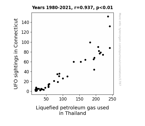
What else correlates?
UFO sightings in Connecticut · all random state specific
Liquefied petroleum gas used in Thailand · all energy
UFO sightings in Connecticut · all random state specific
Liquefied petroleum gas used in Thailand · all energy


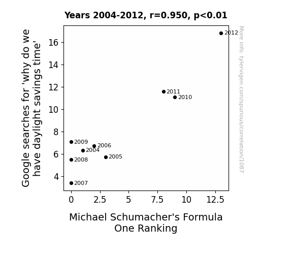
View details about correlation #1,087
Timing is Everything: The Link between Daylight Savings Time Queries and Schumacher's Formula One Ranking
As more people began questioning the concept of daylight saving time, it inadvertently led to an uptick in philosophical discussions. This intellectual stimulation somehow reached Michael Schumacher, who found new inspiration in the idea of time manipulation. He then applied this fresh perspective to his racing strategies, giving him a slight but crucial edge on the track. It's as if the collective pondering of time indirectly turbocharged Schumacher's performance, proving that even the most unexpected connections can rev up success in the fast lane of Formula One.
Why this works
- Data dredging: I have 25,237 variables in my database. I compare all these variables against each other to find ones that randomly match up. That's 636,906,169 correlation calculations! This is called “data dredging.”
Fun fact: the chart used on the wikipedia page to demonstrate data dredging is also from me. I've been being naughty with data since 2014.
Instead of starting with a hypothesis and testing it, I instead tossed a bunch of data in a blender to see what correlations would shake out. It’s a dangerous way to go about analysis, because any sufficiently large dataset will yield strong correlations completely at random. - Lack of causal connection: There is probably no direct connection between these variables, despite what the AI says above.
Because these pages are automatically generated, it's possible that the two variables you are viewing are in fact causually related. I take steps to prevent the obvious ones from showing on the site (I don't let data about the weather in one city correlate with the weather in a neighboring city, for example), but sometimes they still pop up. If they are related, cool! You found a loophole.
This is exacerbated by the fact that I used "Years" as the base variable. Lots of things happen in a year that are not related to each other! Most studies would use something like "one person" in stead of "one year" to be the "thing" studied. - Observations not independent: For many variables, sequential years are not independent of each other. You will often see trend-lines form. If a population of people is continuously doing something every day, there is no reason to think they would suddenly change how they are doing that thing on January 1. A naive p-value calculation does not take this into account.
You will calculate a lower chance of "randomly" achieving the result than represents reality.
To be more specific: p-value tests are probability values, where you are calculating the probability of achieving a result at least as extreme as you found completely by chance. When calculating a p-value, you need to assert how many "degrees of freedom" your variable has. I count each year (minus one) as a "degree of freedom," but this is misleading for continuous variables.
This kind of thing can creep up on you pretty easily when using p-values, which is why it's best to take it as "one of many" inputs that help you assess the results of your analysis.
- Y-axes doesn't start at zero: I truncated the Y-axes of the graphs above. I also used a line graph, which makes the visual connection stand out more than it deserves.
Nothing against line graphs. They are great at telling a story when you have linear data! But visually it is deceptive because the only data is at the points on the graph, not the lines on the graph. In between each point, the data could have been doing anything. Like going for a random walk by itself!
Mathematically what I showed is true, but it is intentionally misleading. If you click on any of the charts that abuse this, you can scroll down to see a version that starts at zero. - Confounding variable: Confounding variables (like global pandemics) will cause two variables to look connected when in fact a "sneaky third" variable is influencing both of them behind the scenes.
- Outliers: Some datasets here have outliers which drag up the correlation.
In concept, "outlier" just means "way different than the rest of your dataset." When calculating a correlation like this, they are particularly impactful because a single outlier can substantially increase your correlation.
Because this page is automatically generated, I don't know whether any of the charts displayed on it have outliers. I'm just a footnote. ¯\_(ツ)_/¯
I intentionally mishandeled outliers, which makes the correlation look extra strong. - Low n: There are not many data points included in some of these charts.
You can do analyses with low ns! But you shouldn't data dredge with a low n.
Even if the p-value is high, we should be suspicious of using so few datapoints in a correlation.
Pro-tip: click on any correlation to see:
- Detailed data sources
- Prompts for the AI-generated content
- Explanations of each of the calculations (correlation, p-value)
- Python code to calculate it yourself


