spurious correlations
discover · random · spurious scholar
← previous page · next page →


View details about correlation #1,701
Churning the Currents: Exploring the Butter-Renewable Energy Nexus in Burundi
As butter consumption increased, the surplus grease caused a slickening effect on the nation's productivity. This led to a surge in buttery smooth operations at the renewable energy facilities, ultimately churning out more power.


What else correlates?
Butter consumption · all food
Renewable energy production in Burundi · all energy
Butter consumption · all food
Renewable energy production in Burundi · all energy


View details about correlation #1,231
Breathe Easy, Search Cheesy: Air Pollution and 'Baroque Obama' Query Data in Berlin, New Hampshire
The cleaner air led to the growth of more refined and cultured individuals in Berlin, New Hampshire. As their tastes became more sophisticated, they no longer found the ornate and elaborate musical stylings of Baroque Obama as appealing.


What else correlates?
Air pollution in Berlin, New Hampshire · all weather
Google searches for 'Baroque Obama' · all google searches
Air pollution in Berlin, New Hampshire · all weather
Google searches for 'Baroque Obama' · all google searches


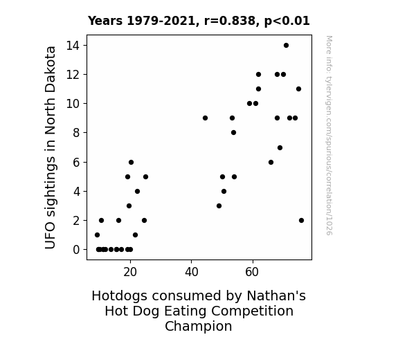
View details about correlation #1,026
Unidentified Flavors of Extraterrestrial Origin: A Statistical Analysis of the Link between UFO Sightings in North Dakota and Hotdogs Consumed by Nathan's Hot Dog Eating Competition Champion
The UFOs were actually giant flying grills, emitting a hypnotic smell of sizzling hotdogs as they zipped across the state. This otherworldly aroma inexplicably increased the appetite of the champion, leading to record-breaking hotdog consumption. Who knew that the key to winning the competition was written in the stars!


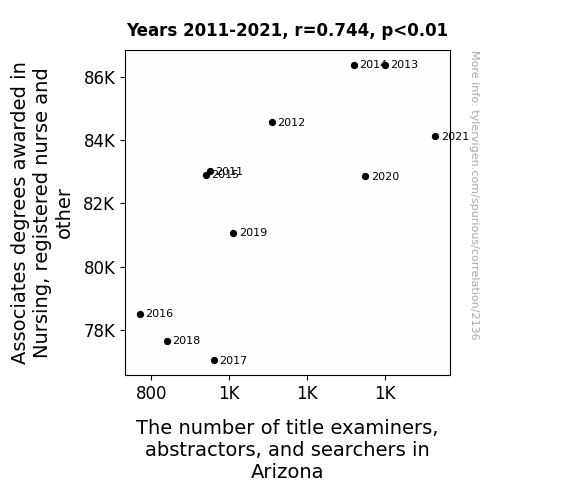
View details about correlation #2,136
Probing the Nexus Between Nursing Associate Degrees and the Numbers Game of Title Examiners, Abstractors, and Searchers in the Grand Canyon State: A Statistical Analysis
As more people became qualified to administer TLC, there was a corresponding increase in those who couldn't resist exclaiming, "You're clear for a happily ever after!" The demand for title examiners, abstractors, and searchers skyrocketed as love-stricken Arizonans sought professionals to ensure that their property titles were as secure as their romantic relationships. With a surge in nursing expertise, the state also experienced a parallel surge in the vital signs of its real estate industry. It seems that in Arizona, a healthy heart isn't the only thing that relies on a good, strong title! The correlation is crystal clear: as the number of nursing graduates rose, so did the need for title examiners, abstractors, and searchers in the Grand Canyon State. Who would have thought that a passion for healthcare could have such a heartwarming impact on the world of real estate? It's a tender tale of stethoscopes and property scopes, where ensuring the wellness of both hearts and deeds has become a harmonious duet. It looks like in Arizona, a healthy dose of nursing expertise is just what the real estate doctor ordered!


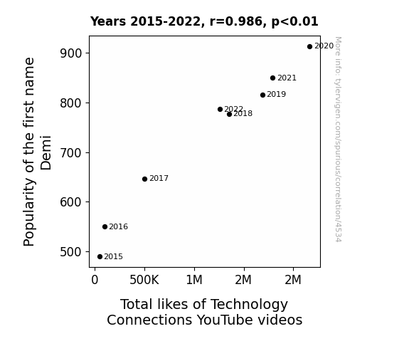
View details about correlation #4,534
The Demi Dilemma: Demystifying the Dependence of Demi's Popularity on Technology Connections' Total Likes
Because the name "Demi" sounds like "demi-god," leading people to believe that watching Technology Connections will give them supernatural levels of tech knowledge and power.

What else correlates?
Popularity of the first name Demi · all first names
Total likes of Technology Connections YouTube videos · all YouTube
Popularity of the first name Demi · all first names
Total likes of Technology Connections YouTube videos · all YouTube


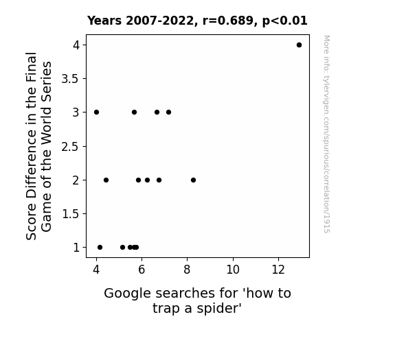
View details about correlation #1,915
Spidey Scores: The Surprising Connection Between World Series Score Difference and Arachnid Traps
As the score difference decreased, so did the spidey senses of the fans. With a closer game, they were too wrapped up in the baseball action to focus on trapping spiders. The web of excitement on the field left them with no room to catch any arachnids at home. It seems when the stakes are high in the World Series, the only thing getting caught are fly balls, not spiders. Who knew that the secret to spider-free homes lay in the outcome of the final game! Remember, a tight game keeps the spider traps at bay.


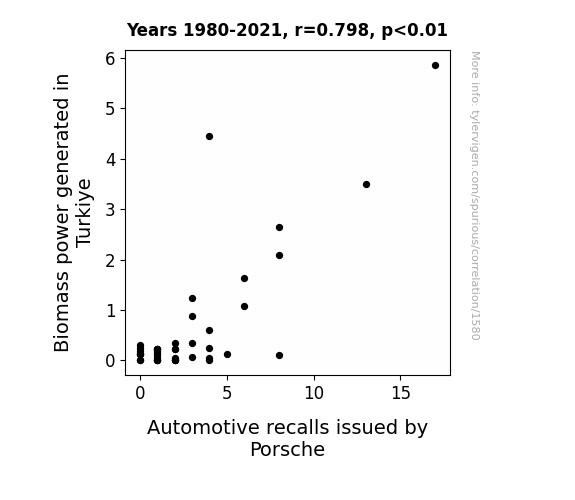
View details about correlation #1,580
Türkiye's Biomass Boffins: Uncovering the Porsche Recall Rhyme
The extra energy was revving up more than just the cars!

What else correlates?
Biomass power generated in Turkiye · all energy
Automotive recalls issued by Porsche · all weird & wacky
Biomass power generated in Turkiye · all energy
Automotive recalls issued by Porsche · all weird & wacky


View details about correlation #1,477
Forrest Gump's Impact: Exploring the Hanks-On Relationship Between Tom Hanks Movies and the Quantity of Mechanical Engineers in Delaware
Tom Hanks' on-screen charm and relatability inspired a wave of young Delawareans to pursue their passion for building and fixing things, ultimately leading to a surge in mechanical engineering interest and enrollment in the state. As more people watched Tom Hanks in movies, they felt a sudden urge to tinker with gadgets and gizmos, unknowingly fueling a quirky Hollywood to Delaware pipeline of engineering talent. Who knew that Tom Hanks' blockbuster performances would also engineer a real-life workforce boom in the First State!


What else correlates?
Number of films featuring Tom Hanks · all films & actors
The number of mechanical engineers in Delaware · all cccupations
Number of films featuring Tom Hanks · all films & actors
The number of mechanical engineers in Delaware · all cccupations
. The chart goes from 2008 to 2022, and the two variables track closely in value over that time.")

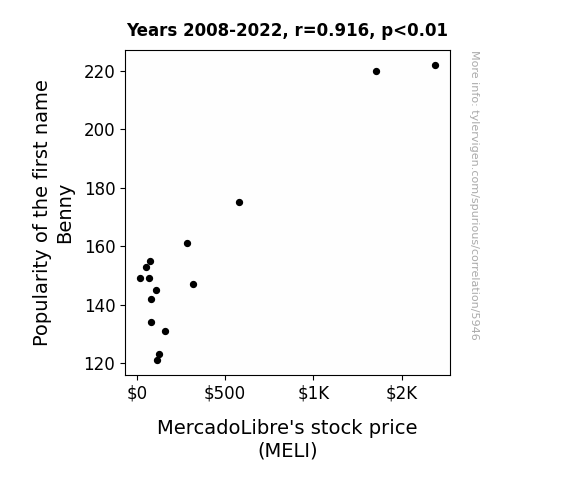
View details about correlation #5,946
The Benny and the Bull Market: The Curious Connection Between the Popularity of the Name Benny and MELI Stock Price
Every time someone named Benny was born, a secret algorithm at MercadoLibre was activated, leading to a perfect combination of increased online shopping demand and mysteriously upbeat office morale, ultimately boosting the company's stock price. It's as if the market just couldn't resist the 'Benny-ficial' influence on e-commerce!

What else correlates?
Popularity of the first name Benny · all first names
MercadoLibre's stock price (MELI) · all stocks
Popularity of the first name Benny · all first names
MercadoLibre's stock price (MELI) · all stocks


View details about correlation #1,845
Chilling Connections: The Association Between Biological Science Associates Degrees and Google Searches for 'Cold Shower'
As more students delved into the world of biological sciences, they couldn't help but be drawn to the idea of phylogenetically cooling off like our aquatic ancestors. It seems they developed a nerdy fascination with the concepts of thermal regulation and homeostasis, leading to a sudden surge in the pursuit of a chilling experience. You could say these biology buffs really raised the bar for understanding the 'ecology' of taking cold showers!


What else correlates?
Associates degrees awarded in Biological sciences · all education
Google searches for 'cold shower' · all google searches
Associates degrees awarded in Biological sciences · all education
Google searches for 'cold shower' · all google searches


View details about correlation #2,710
Windy Whims: Weaving Wind Power in Latvia with the Lawyers' Load in the US
As wind turbines in Latvia spun faster, they created a unique low-frequency hum that resonated with the subconscious minds of people in the US, prompting more individuals to pursue a career in law. It's like the turbines were inadvertently broadcasting the message, "Sue-eee, Sue-eee, Sue-eee" across the seas, leading to a gust of interest in legal matters. The unforeseen legal windfall from Latvia left many baffled, as the connection between renewable energy and the influx of lawyers blew their minds.


What else correlates?
Wind power generated in Latvia · all energy
Number of Lawyers in the United States · all weird & wacky
Wind power generated in Latvia · all energy
Number of Lawyers in the United States · all weird & wacky


View details about correlation #2,885
An Out-of-this-World Correlation: Exploring the Relationship Between Celestial Bodies and UFO Sightings in the American Midwest
Perhaps the UFOs needed some extra space for a cosmic game of hide-and-seek.


What else correlates?
The distance between Uranus and Saturn · all planets
UFO sightings in Iowa · all random state specific
The distance between Uranus and Saturn · all planets
UFO sightings in Iowa · all random state specific


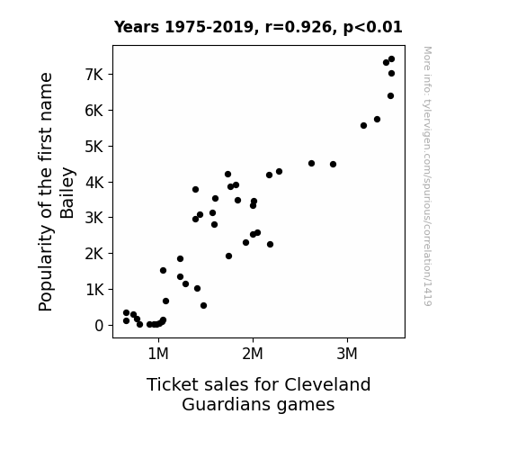
View details about correlation #1,419
The Ballad of Bailey: A Name's Impact on Cleveland Guardians Game Attendance
Every time the name "Bailey" became popular, a new wave of parents named their children after the beloved mascot, creating a surge in young Cleveland Guardians fans. This led to increased demand for tickets and ultimately boosted ticket sales for the games.

What else correlates?
Popularity of the first name Bailey · all first names
Ticket sales for Cleveland Guardians games · all sports
Popularity of the first name Bailey · all first names
Ticket sales for Cleveland Guardians games · all sports


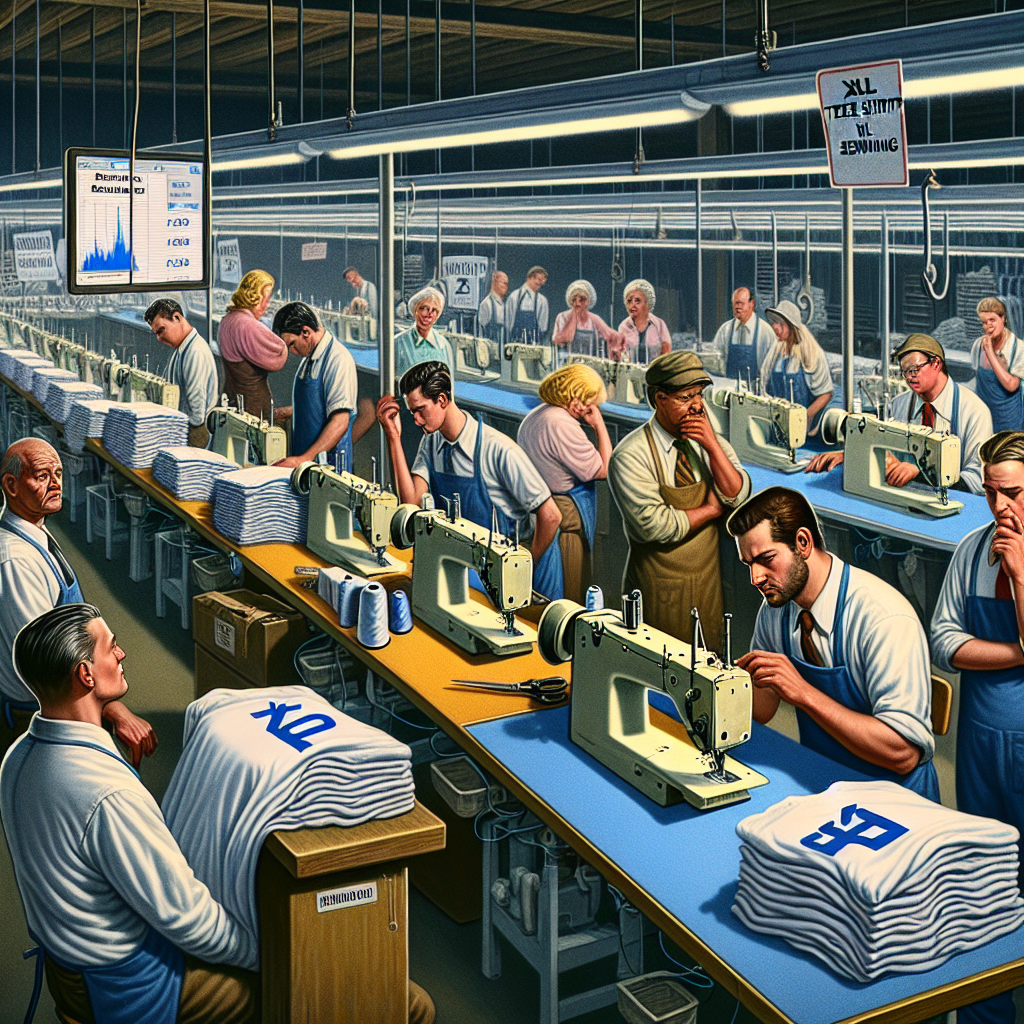
View details about correlation #5,828
The Sew What? Connection: Exploring the Correlation Between Google Searches for 'XL Tee Shirts' and the Number of Sewing Machine Operators in Wisconsin
As XL tee shirt sales shrank, so did the workforce in Wisconsin, it seems they just couldn't 'measure up' to the demand anymore. We'd have thought they could have 'sewn' up the market, but it looks like they 'unraveled' instead.
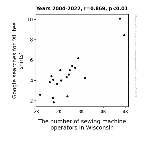
. The chart goes from 2002 to 2022, and the two variables track closely in value over that time.")

View details about correlation #1,267
Stocking Up: The Link Between Household Spending on Home Maintenance and SBAC Stock Price
As households invested more in home maintenance, they realized their properties needed better communication infrastructure, leading to an increased demand for SBA Communications' services and driving up their stock price. Remember, a well-maintained home is a well-connected home!
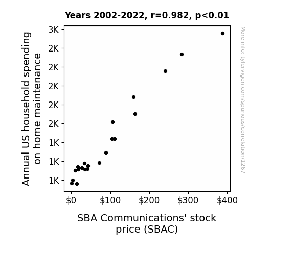
What else correlates?
Annual US household spending on home maintenance · all weird & wacky
SBA Communications' stock price (SBAC) · all stocks
Annual US household spending on home maintenance · all weird & wacky
SBA Communications' stock price (SBAC) · all stocks


View details about correlation #2,671
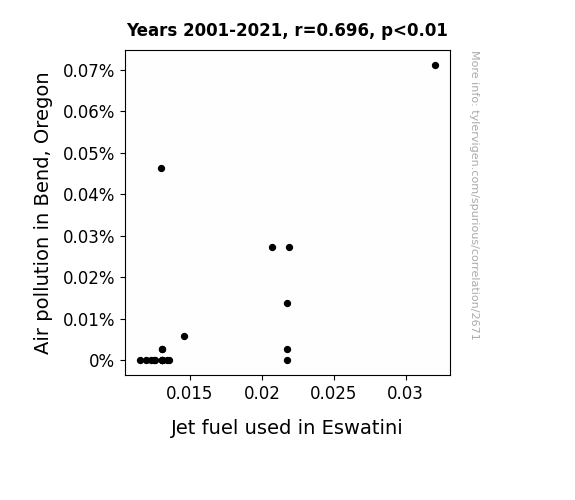
The Ties Between Skies: Environmental Impacts of Air Pollution in Bend, Oregon and Jet Fuel Usage in Eswatini
The air pollution in Bend, Oregon created a localized disruption in the Earth's atmosphere, leading to a chain reaction that somehow ended with a surge in jet fuel production and usage in Eswatini. This unexpected connection has even baffled the most renowned environmental scientists, who now believe that the skies may just have a quirky sense of interconnectedness. It's like the butterfly effect, but with a hint of aviation fuel and a whole lot of head-scratching.

What else correlates?
Air pollution in Bend, Oregon · all weather
Jet fuel used in Eswatini · all energy
Air pollution in Bend, Oregon · all weather
Jet fuel used in Eswatini · all energy


View details about correlation #2,799
Culturizing the Gridiron: Exploring the Yogurt-ious Relationship Between Yogurt Consumption and Total Points Scored by the New England Patriots
Yogurt consumption led to an influx of good bacteria in fans' digestive systems, boosting their overall mood and positivity. This, in turn, created a ripple effect of good vibes that somehow made its way to the Patriots, inspiring them to score more points. It's like the circle of pro-biotic life, but with a touchdown twist!


What else correlates?
Yogurt consumption · all food
Total Points scored by the New England Patriots in the NFL season · all sports
Yogurt consumption · all food
Total Points scored by the New England Patriots in the NFL season · all sports


View details about correlation #3,463
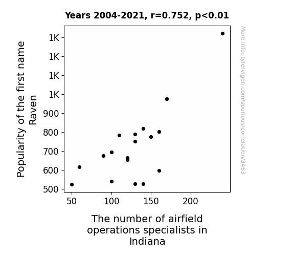
Raven's Flock and Airfield Clock: A Statistical Analysis of Name Popularity and Occupational Demand in Indiana
The decrease in popularity of the name Raven led to fewer people being superstitious about birds, which ultimately decreased the demand for airfield operations specialists in Indiana. With fewer individuals believing in the ominous connotations of the name Raven, there was a reduced perceived need for professionals to handle potential bird-related issues at airfields.


View details about correlation #2,612
The Organic Odyssey: Unpeeling the Connection Between Kale and Customer Contentment at JCPenney
As organic food sales rose, so did the overall health and well-being of the population. With bodies fortified by nutrient-rich, pesticide-free produce, people had the energy to shop at JCPenney. This led to a happier, more satisfied customer base, creating a peas-ful and organic shopping experience that was a perfect fit for JCPenney's growth.


What else correlates?
Organic Food Sales Volume in the United States · all weird & wacky
Customer satisfaction with JCPenney · all weird & wacky
Organic Food Sales Volume in the United States · all weird & wacky
Customer satisfaction with JCPenney · all weird & wacky


View details about correlation #2,084
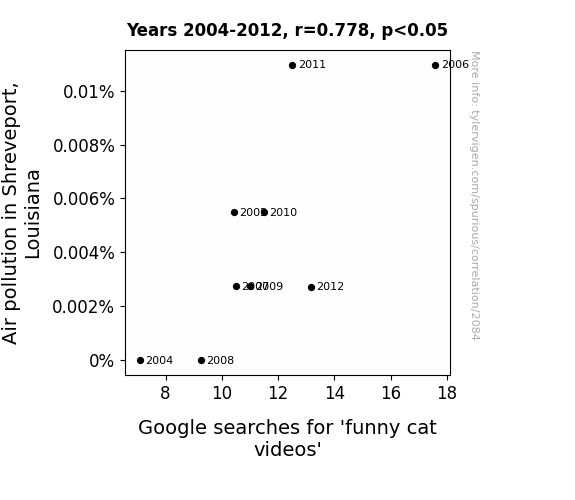
Pawsitively Hilarious: Exploring the Relationship Between Air Pollution in Shreveport, Louisiana and Google Searches for 'Funny Cat Videos'
The smog acted as a catalyst for cats to perform impromptu stand-up comedy routines, leading to an influx of hilarious feline content online. Remember, when the air gets hazy, the cats get crazy!

What else correlates?
Air pollution in Shreveport, Louisiana · all weather
Google searches for 'funny cat videos' · all google searches
Air pollution in Shreveport, Louisiana · all weather
Google searches for 'funny cat videos' · all google searches
Why this works
- Data dredging: I have 25,237 variables in my database. I compare all these variables against each other to find ones that randomly match up. That's 636,906,169 correlation calculations! This is called “data dredging.”
Fun fact: the chart used on the wikipedia page to demonstrate data dredging is also from me. I've been being naughty with data since 2014.
Instead of starting with a hypothesis and testing it, I instead tossed a bunch of data in a blender to see what correlations would shake out. It’s a dangerous way to go about analysis, because any sufficiently large dataset will yield strong correlations completely at random. - Lack of causal connection: There is probably no direct connection between these variables, despite what the AI says above.
Because these pages are automatically generated, it's possible that the two variables you are viewing are in fact causually related. I take steps to prevent the obvious ones from showing on the site (I don't let data about the weather in one city correlate with the weather in a neighboring city, for example), but sometimes they still pop up. If they are related, cool! You found a loophole.
This is exacerbated by the fact that I used "Years" as the base variable. Lots of things happen in a year that are not related to each other! Most studies would use something like "one person" in stead of "one year" to be the "thing" studied. - Observations not independent: For many variables, sequential years are not independent of each other. You will often see trend-lines form. If a population of people is continuously doing something every day, there is no reason to think they would suddenly change how they are doing that thing on January 1. A naive p-value calculation does not take this into account.
You will calculate a lower chance of "randomly" achieving the result than represents reality.
To be more specific: p-value tests are probability values, where you are calculating the probability of achieving a result at least as extreme as you found completely by chance. When calculating a p-value, you need to assert how many "degrees of freedom" your variable has. I count each year (minus one) as a "degree of freedom," but this is misleading for continuous variables.
This kind of thing can creep up on you pretty easily when using p-values, which is why it's best to take it as "one of many" inputs that help you assess the results of your analysis.
- Y-axes doesn't start at zero: I truncated the Y-axes of the graphs above. I also used a line graph, which makes the visual connection stand out more than it deserves.
Nothing against line graphs. They are great at telling a story when you have linear data! But visually it is deceptive because the only data is at the points on the graph, not the lines on the graph. In between each point, the data could have been doing anything. Like going for a random walk by itself!
Mathematically what I showed is true, but it is intentionally misleading. If you click on any of the charts that abuse this, you can scroll down to see a version that starts at zero. - Confounding variable: Confounding variables (like global pandemics) will cause two variables to look connected when in fact a "sneaky third" variable is influencing both of them behind the scenes.
- Outliers: Some datasets here have outliers which drag up the correlation.
In concept, "outlier" just means "way different than the rest of your dataset." When calculating a correlation like this, they are particularly impactful because a single outlier can substantially increase your correlation.
Because this page is automatically generated, I don't know whether any of the charts displayed on it have outliers. I'm just a footnote. ¯\_(ツ)_/¯
I intentionally mishandeled outliers, which makes the correlation look extra strong. - Low n: There are not many data points included in some of these charts.
You can do analyses with low ns! But you shouldn't data dredge with a low n.
Even if the p-value is high, we should be suspicious of using so few datapoints in a correlation.
Pro-tip: click on any correlation to see:
- Detailed data sources
- Prompts for the AI-generated content
- Explanations of each of the calculations (correlation, p-value)
- Python code to calculate it yourself


