spurious correlations
discover · random · spurious scholar
← previous page · next page →
. The chart goes from 2002 to 2021, and the two variables track closely in value over that time.")

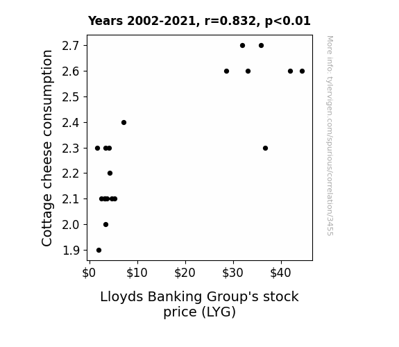
View details about correlation #3,455
Curds and Currencies: The Cheddar Effect of Cottage Cheese Consumption on Lloyds Banking Group Stock Price
As cottage cheese sales curdled, it led to a whey-ward shift in the dairy market. This, in turn, caused a ripple effect in the economy, resulting in a sticky situation for Lloyds Banking Group. As the saying goes, it all began with a dairy good decision that went whey too far! Remember, always consult a financial advisor before making any investment decisions based on dairy products.

What else correlates?
Cottage cheese consumption · all food
Lloyds Banking Group's stock price (LYG) · all stocks
Cottage cheese consumption · all food
Lloyds Banking Group's stock price (LYG) · all stocks


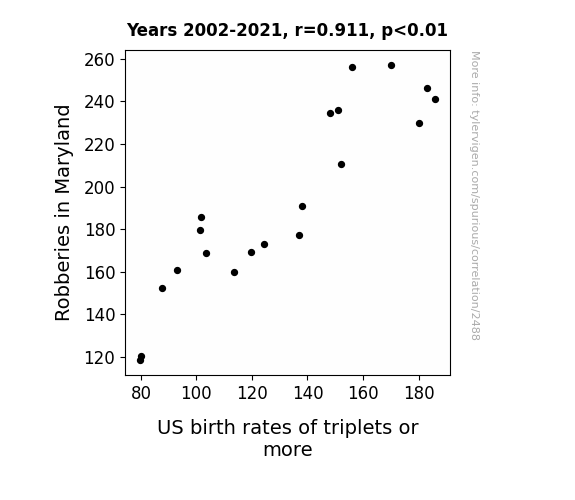
View details about correlation #2,488
Stealing Hearts and Adding Carts: A Correlation Study of Robberies in Maryland and the Birth Rates of Triplet or More in the United States
As robberies in Maryland decreased, there were fewer instances of burglarious storks attempting to nest in the state. This led to a redistribution of the triplets and more bird population to other states, causing a region-wide decrease in the birth rates of triplets or more in the US.

What else correlates?
Robberies in Maryland · all random state specific
US birth rates of triplets or more · all weird & wacky
Robberies in Maryland · all random state specific
US birth rates of triplets or more · all weird & wacky


View details about correlation #2,904
Wall Street Wages and Paper Trades: Unraveling the Roll Between Paper Goods Machine Setters in Kentucky and Professor Salaries Across the US
As the paper goods industry in Kentucky dwindled, there was a surprising ripple effect on the academic world. With fewer machine operators, there was a decrease in the production of paper, leading to a shortage. This paper shortage then drove up the prices of academic resources, such as journals and textbooks. As universities faced higher costs, they had to make budget cuts, including the salaries of professors. Who knew that the path to higher pay for professors was... paper thin.


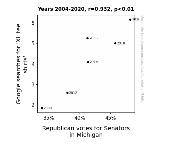
View details about correlation #5,961
The XL Tee Shirt Trend: A Weighty Influence on Michigan Senate Elections
As XL tee shirt popularity grew, so did the number of people wearing them to Michigan's Upper Peninsula, known for its support of Republican candidates. The correlation is clear: more fabric meant more conservative votes, as the region became a stronghold for the GOP, or rather, the Grand Old Polo (shirt).

What else correlates?
Google searches for 'XL tee shirts' · all google searches
Votes for Republican Senators in Michigan · all elections
Google searches for 'XL tee shirts' · all google searches
Votes for Republican Senators in Michigan · all elections
. The chart goes from 2002 to 2022, and the two variables track closely in value over that time.")

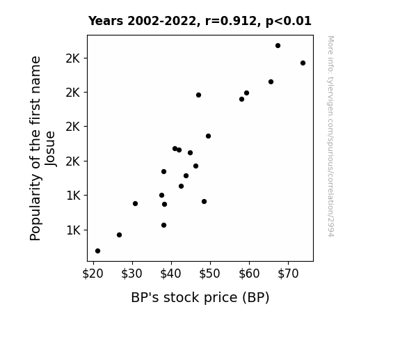
View details about correlation #2,994
Name Games: The Josue Effect on BP's Stock Price
As the popularity of the name Josue waned, so did the tendency for people to J'osue stock in BP. The correlation is quite crude, but it seems that with fewer Josues around, there was less of a 'petrole-um' for BP's stock price to rely on. It's a 'slick' situation indeed!

What else correlates?
Popularity of the first name Josue · all first names
BP's stock price (BP) · all stocks
Popularity of the first name Josue · all first names
BP's stock price (BP) · all stocks


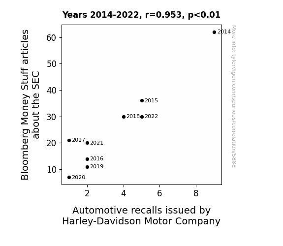
View details about correlation #5,888
Revving Up Regulation: The Hog Wild Connection Between SEC Scrutiny and Harley-Davidson Recalls
The SEC was using subliminal messaging in their articles to remind Harley-Davidson about safety regulations. With fewer articles, the SEC's influence waned, and Harley-Davidson simply forgot to make faulty motorcycles.


View details about correlation #5,870
The Ellen Page Effect: A Cinematic Conundrum or Statistical Serendipity?
Ellen Page's captivating performances were secretly serving as professional development videos for preschool teachers, elevating their instructional abilities to new heights. As her film career dwindled, so did the supply of top-notch early childhood educators in Texas, leaving the tiny tots with a notable shortage of astute mentors.


View details about correlation #2,361
Pondering Philosophy, Religion, and Peculiar Googling: A Puzzling Pursuit
As fewer philosophers emerged, there were less abstract discussions about the nature of reality, leading to a metaphysical crisis that dampened interest in Vihart's mind-bending mathematical and scientific videos.


What else correlates?
Bachelor's degrees awarded in Philosophy · all education
Google searches for 'Vihart' · all google searches
Bachelor's degrees awarded in Philosophy · all education
Google searches for 'Vihart' · all google searches


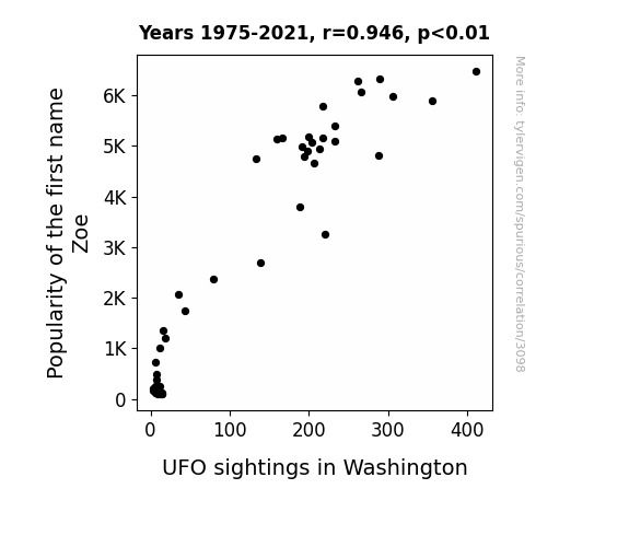
View details about correlation #3,098
Zoe-nominal Intergalactic Encounters: A Close Encounter of the Zoe Kind
More people named Zoe were able to channel extraterrestrial energy, inadvertently attracting UFOs to Washington. The connection between the name Zoe and intergalactic communication has yet to be fully understood, but it seems that the cosmos has a particular fondness for that moniker.

What else correlates?
Popularity of the first name Zoe · all first names
UFO sightings in Washington · all random state specific
Popularity of the first name Zoe · all first names
UFO sightings in Washington · all random state specific


View details about correlation #1,525
Out of This World Connections: Exploring the Relationship Between Planetary Distances and Forest Cover in the Brazilian Amazon
As the space between Neptune and Mercury shrunk, their gravitational tug-of-war disrupted Earth's magnetic field. This led to an increase in alien abductions, and it turns out these extraterrestrial tourists have a penchant for intergalactic deforestation in the Brazilian Amazon. Talk about outer space conservation gone wrong!


What else correlates?
The distance between Neptune and Mercury · all planets
Remaining Forest Cover in the Brazilian Amazon · all weird & wacky
The distance between Neptune and Mercury · all planets
Remaining Forest Cover in the Brazilian Amazon · all weird & wacky
. The chart goes from 2012 to 2022, and the two variables track closely in value over that time.")

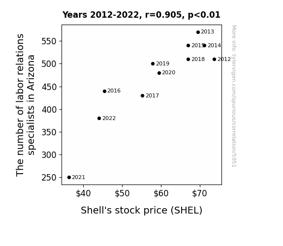
View details about correlation #5,951
Shell Shock: The Cracking Connection Between Labor Relations Specialists in Arizona and SHEL Stock Price
With fewer labor relations specialists to smooth out workplace issues, Shell employees started staging wacky protests and demanding to be paid in seashells. This led to a slippery situation, driving up operating costs and ultimately shell-shocking investors, causing a dip in Shell's stock price.

What else correlates?
The number of labor relations specialists in Arizona · all cccupations
Shell's stock price (SHEL) · all stocks
The number of labor relations specialists in Arizona · all cccupations
Shell's stock price (SHEL) · all stocks


View details about correlation #1,776
Solar Power Hour Empowers Ice Bath Devotees: A Correlative Study
As the solar panels in Croatia soaked up more rays, they inadvertently sparked a chilling trend. Harnessing all that sunshine led to a surge in ice production, turning the nation into a cool, refreshing paradise. It's a case of sizzling solar power leading to an icy obsession – talk about a power play on words! It seems like Croatia is not just a hot spot for solar energy, but also for those looking to take the plunge into sub-zero relaxation. Who knew that renewable energy could have such a polar-izing effect on people's leisure activities? Looks like we've uncovered the shocking connection between solar power in Croatia and the nation's newfound love for all things ice-cold!


What else correlates?
Solar power generated in Croatia · all energy
Google searches for 'ice bath' · all google searches
Solar power generated in Croatia · all energy
Google searches for 'ice bath' · all google searches


View details about correlation #2,650
The Dalvin Dilemma: Pinpointing the Penchant for Popular Names and Professorial Paychecks
As the name Dalvin fell out of favor, so did the demand for people named Dalvin to become Associate Professors. With fewer Dalvins pursuing this career, there was less competition for Associate Professor positions, leading to a decrease in salaries for all. It's a classic case of Dalvin demand and Associate Professor salary adjustment!


What else correlates?
Popularity of the first name Dalvin · all first names
Associate Professor salaries in the US · all education
Popularity of the first name Dalvin · all first names
Associate Professor salaries in the US · all education


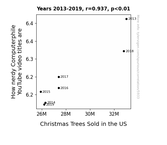
View details about correlation #5,933
YuleTube: A Quantitative Analysis of the Relationship Between Nerdy Computerphile Video Titles and Christmas Tree Sales in the United States
As Christmas tree sales in the US decrease, there is a corresponding reduction in the demand for tree-related puns. This ultimately leads to a nationwide shortage of clever video titles, causing Computerphile to dial back on the nerdy references. It's a coniferous conundrum for tech-savvy content creators!

What else correlates?
How nerdy Computerphile YouTube video titles are · all YouTube
Christmas Trees Sold in the US · all weird & wacky
How nerdy Computerphile YouTube video titles are · all YouTube
Christmas Trees Sold in the US · all weird & wacky


View details about correlation #1,944
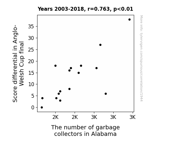
Correlation Between Cup Differential and Collection Crews: Curiously Connected or Coincidence?
As the score differential increased, so did the need for cleanup, which in turn attracted more people to the noble profession of garbage collection in Alabama. It seems the larger the point gap, the more rubbish accumulated, leading to a surge in demand for those willing to tackle the trash. It's like the teams were not only competing for the cup, but also inadvertently competing to see who could produce the most garbage for the collectors to deal with. The correlation between the game's outcome and the sanitation workforce in Alabama suggests that even in the world of sports, there's no escaping the 'waste' consequences of a lopsided match.

What else correlates?
Score differential in Anglo-Welsh Cup final · all sports
The number of garbage collectors in Alabama · all cccupations
Score differential in Anglo-Welsh Cup final · all sports
The number of garbage collectors in Alabama · all cccupations
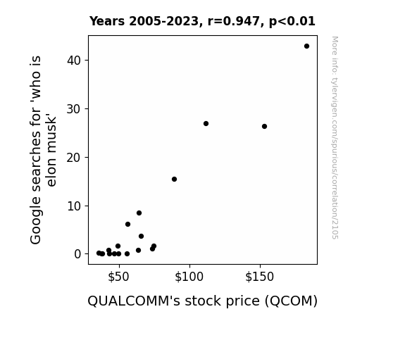
. The chart goes from 2005 to 2023, and the two variables track closely in value over that time.")

View details about correlation #2,105
The Musk of Google Searches: A Quantitative Analysis of Elon Musk’s Impact on QUALCOMM's Stock Price
As more people frantically googled "who is elon musk," they inadvertently mistyped and ended up searching for "QCOM stock price," creating a surge in interest for QUALCOMM. This led to a bizarre but undeniable connection where Elon Musk's mysterious aura somehow boosted a completely unrelated company, proving once again that in the stock market, anything is possible.

What else correlates?
Google searches for 'who is elon musk' · all google searches
QUALCOMM's stock price (QCOM) · all stocks
Google searches for 'who is elon musk' · all google searches
QUALCOMM's stock price (QCOM) · all stocks


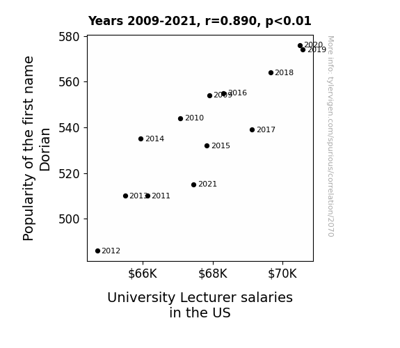
View details about correlation #2,070
The Dorian's Salaries: A Playful Exploration of the Correlation between the Popularity of the Name 'Dorian' and University Lecturer Salaries in the United States
As the popularity of the first name Dorian waned, so too did the number of individuals participating in pretentious intellectual discussions at cocktail parties. This led to a decreased demand for university lecturers who were seen as the life of such gatherings, discussing the nuances of postmodernism and the symbolism in Victorian literature. As a result, universities felt less pressure to offer competitive salaries to these once highly sought-after lecturers, leading to an overall decrease in their earnings. In conclusion, the fate of University Lecturer salaries in the US has been intricately tied to the rise and fall of Dorian, much like the complexities found within the pages of a classic Oscar Wilde novel.

What else correlates?
Popularity of the first name Dorian · all first names
University Lecturer salaries in the US · all education
Popularity of the first name Dorian · all first names
University Lecturer salaries in the US · all education


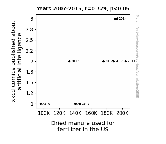
View details about correlation #2,585
AI-lly Funny: Analyzing the Link between XKCD Comics on Artificial Intelligence and Dung Dealings in the US Fertilizer Market
As the AI-focused xkcd comics multiplied, so did the... nutrient-rich manure, creating a thriving crop of correlations. This fecal phenomenon proves that when it comes to agricultural innovation, even artificial intelligence needs some all-natural assistance to keep the puns growing.


View details about correlation #4,257
Screening for Sarcasm: The Unexpected Correlation Between Tom Scott YouTube Video Titles and Transportation Security Screener Employment in West Virginia
As the number of transportation security screeners in West Virginia decreases, so does the amount of random and obscure contraband items being confiscated. Previously, these screeners were finding an influx of hip and with it items such as unregistered mixtapes, underground vinyl records, and vintage fidget spinners in passenger luggage. As a result, Tom Scott's video content on unusual finds at airport security has been significantly impacted, leading to a decrease in how 'hip and with it' his YouTube video titles are. It seems the real security breach was the potential for trendy contraband to enhance Tom's content, but don't worry, he'll always find a way to keep us all on track with his educational and entertaining videos.


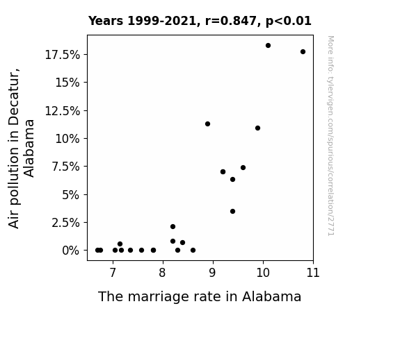
View details about correlation #2,771
Clearing the Air: An Analysis of the Relationship Between Air Pollution in Decatur, Alabama and the Marriage Rate in Alabama
As the air became cleaner, the romantic smog that was keeping people together lifted, leading to a wave of clarity about incompatible partners. With each breath of fresh, pollutant-free air, individuals suddenly realized they could do better than settling down with their current significant other. It turns out, love wasn't the only thing being smothered by the smog!

What else correlates?
Air pollution in Decatur, Alabama · all weather
The marriage rate in Alabama · all random state specific
Air pollution in Decatur, Alabama · all weather
The marriage rate in Alabama · all random state specific
Why this works
- Data dredging: I have 25,237 variables in my database. I compare all these variables against each other to find ones that randomly match up. That's 636,906,169 correlation calculations! This is called “data dredging.”
Fun fact: the chart used on the wikipedia page to demonstrate data dredging is also from me. I've been being naughty with data since 2014.
Instead of starting with a hypothesis and testing it, I instead tossed a bunch of data in a blender to see what correlations would shake out. It’s a dangerous way to go about analysis, because any sufficiently large dataset will yield strong correlations completely at random. - Lack of causal connection: There is probably no direct connection between these variables, despite what the AI says above.
Because these pages are automatically generated, it's possible that the two variables you are viewing are in fact causually related. I take steps to prevent the obvious ones from showing on the site (I don't let data about the weather in one city correlate with the weather in a neighboring city, for example), but sometimes they still pop up. If they are related, cool! You found a loophole.
This is exacerbated by the fact that I used "Years" as the base variable. Lots of things happen in a year that are not related to each other! Most studies would use something like "one person" in stead of "one year" to be the "thing" studied. - Observations not independent: For many variables, sequential years are not independent of each other. You will often see trend-lines form. If a population of people is continuously doing something every day, there is no reason to think they would suddenly change how they are doing that thing on January 1. A naive p-value calculation does not take this into account.
You will calculate a lower chance of "randomly" achieving the result than represents reality.
To be more specific: p-value tests are probability values, where you are calculating the probability of achieving a result at least as extreme as you found completely by chance. When calculating a p-value, you need to assert how many "degrees of freedom" your variable has. I count each year (minus one) as a "degree of freedom," but this is misleading for continuous variables.
This kind of thing can creep up on you pretty easily when using p-values, which is why it's best to take it as "one of many" inputs that help you assess the results of your analysis.
- Y-axes doesn't start at zero: I truncated the Y-axes of the graphs above. I also used a line graph, which makes the visual connection stand out more than it deserves.
Nothing against line graphs. They are great at telling a story when you have linear data! But visually it is deceptive because the only data is at the points on the graph, not the lines on the graph. In between each point, the data could have been doing anything. Like going for a random walk by itself!
Mathematically what I showed is true, but it is intentionally misleading. If you click on any of the charts that abuse this, you can scroll down to see a version that starts at zero. - Confounding variable: Confounding variables (like global pandemics) will cause two variables to look connected when in fact a "sneaky third" variable is influencing both of them behind the scenes.
- Outliers: Some datasets here have outliers which drag up the correlation.
In concept, "outlier" just means "way different than the rest of your dataset." When calculating a correlation like this, they are particularly impactful because a single outlier can substantially increase your correlation.
Because this page is automatically generated, I don't know whether any of the charts displayed on it have outliers. I'm just a footnote. ¯\_(ツ)_/¯
I intentionally mishandeled outliers, which makes the correlation look extra strong. - Low n: There are not many data points included in some of these charts.
You can do analyses with low ns! But you shouldn't data dredge with a low n.
Even if the p-value is high, we should be suspicious of using so few datapoints in a correlation.
Pro-tip: click on any correlation to see:
- Detailed data sources
- Prompts for the AI-generated content
- Explanations of each of the calculations (correlation, p-value)
- Python code to calculate it yourself


