spurious correlations
discover · random · spurious scholar
← previous page · next page →


View details about correlation #4,256
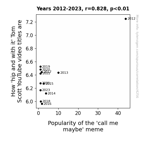
Tom Scott's 'Top Notch' YouTube Titles and the 'Call Me Maybe' Craze: A Correlation Analysis
As the 'call me maybe' meme loses its luster, the energy it once infused into the collective consciousness is now being siphoned into other internet fads, leaving poor Tom Scott with a dwindling supply of hipness to draw from. It's a classic case of memetic osmosis, where Tom's coolness levels are directly linked to the overall memescape, and unfortunately for him, the currents of online trends have taken a swift and merciless turn. It's a real meme-mood board meltdown, and Tom's video titles are just collateral damage in the ever-shifting landscape of internet absurdity.
What else correlates?
How 'hip and with it' Tom Scott's YouTube video titles are · all YouTube
Popularity of the 'call me maybe' meme · all memes
How 'hip and with it' Tom Scott's YouTube video titles are · all YouTube
Popularity of the 'call me maybe' meme · all memes


View details about correlation #3,466
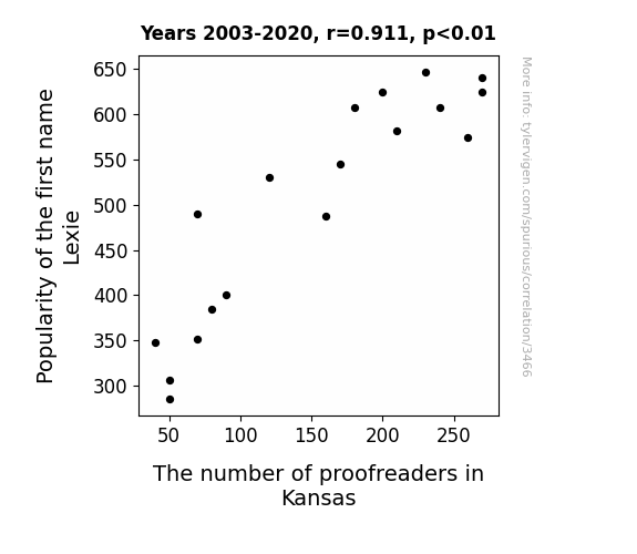
Lexie's Popularity in Kansas and the Proofreader Arrangement
After hearing the name Lexie, many proofreaders in Kansas couldn't help but focus on the fact that it's just one letter away from 'Lexicon', which reminded them of dictionaries. The more they thought about it, the more they realized that language is constantly evolving, and they just couldn't deal with the ever-changing landscape of words. As a result, they decided to pursue alternative careers, like professional yodeling or ostrich farming, where the rules are more...concrete.

What else correlates?
Popularity of the first name Lexie · all first names
The number of proofreaders in Kansas · all cccupations
Popularity of the first name Lexie · all first names
The number of proofreaders in Kansas · all cccupations
. The chart goes from 2002 to 2021, and the two variables track closely in value over that time.")

View details about correlation #1,521
Solar Swirls: Sweden's Sunbeams and Amazon's Ascendancy
Increased solar power in Sweden led to a surge in Viking energy, which somehow boosted demand for online shopping on Amazon. The sun-powered Vikings must have had a strong urge to pillage the digital aisles for the finest loot, hence driving up the stock price. It's a shining example of how renewable energy can spark unexpected market effects and illuminate the connection between Nordic solar panels and e-commerce empires!


What else correlates?
Solar power generated in Sweden · all energy
Amazon.com's stock price (AMZN) · all stocks
Solar power generated in Sweden · all energy
Amazon.com's stock price (AMZN) · all stocks


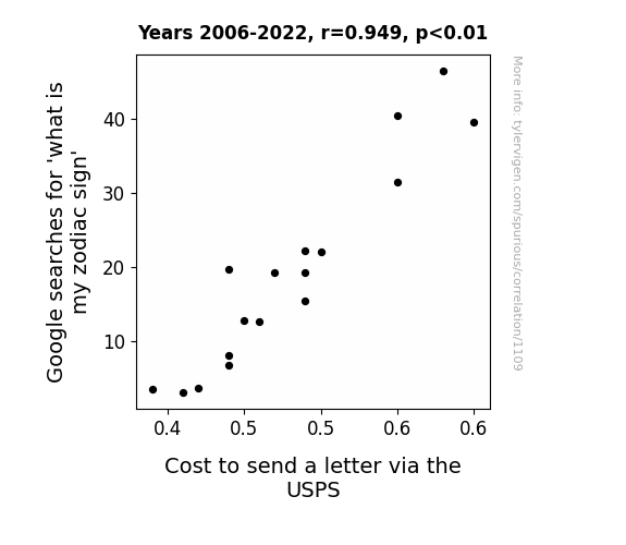
View details about correlation #1,109
Stargazing Stamps: Unveiling the Celestial Connection Between Zodiac Signs and Postal Prices
As people frantically searched to uncover their true zodiac identity, the celestial energy somehow interfered with USPS systems, leading to a cosmic surge in postage costs. It's as if the alignment of the stars sparked an increase in snail mail expenses, proving that even the whims of the zodiac can't escape affecting the price of a stamp! Remember, the next time you're hit with high postage fees, blame it on the astrological uncertainty that swept the nation.
What else correlates?
Google searches for 'what is my zodiac sign' · all google searches
Cost to send a letter via the USPS · all weird & wacky
Google searches for 'what is my zodiac sign' · all google searches
Cost to send a letter via the USPS · all weird & wacky


View details about correlation #4,619
The Air You Breathe vs. The Videos You Click: A Correlation Between Air Quality in Red Bluff, California and Clickbait-y minutephysics YouTube Video Titles
The cleaner air in Red Bluff led to people feeling more energized and creative. This in turn inspired the creators of minutephysics to come up with more attention-grabbing, clickbait-y video titles to reel in viewers. It's like their brains were breathing in fresh, innovative ideas along with the clean air!

What else correlates?
Air quality in Red Bluff, California · all weather
How clickbait-y minutephysics YouTube video titles are · all YouTube
Air quality in Red Bluff, California · all weather
How clickbait-y minutephysics YouTube video titles are · all YouTube


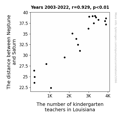
View details about correlation #1,066
The Cosmic Classroom: Exploring the Correlation Between the Distance from Neptune to Saturn and the Number of Kindergarten Teachers in Louisiana
As the gap between these two celestial bodies closed in, it created a gravitational flux that specifically targeted Louisiana. This led to a statewide shortage of helium, making it impossible to continue inflating all the balloons necessary for classroom decor. Without a ballooning budget, the demand for kindergarten teachers deflated faster than a popped balloon at a birthday party. It seems even in the vastness of space, Neptune and Saturn couldn't resist a little "classroom chaos" of their own. Guess you could say the job market for kindergarten teachers in Louisiana really hit rock-bottom, or should I say, outer-space-bottom! The struggle was real, or should I say, intergalactic!

What else correlates?
The distance between Neptune and Saturn · all planets
The number of kindergarten teachers in Louisiana · all cccupations
The distance between Neptune and Saturn · all planets
The number of kindergarten teachers in Louisiana · all cccupations


View details about correlation #1,492
A Sparkling Connection: The Ruby Name Phenomenon and Biomass Power Generation in Hungary
As the name Ruby gained popularity, more parents were subtly influenced to choose eco-friendly baby products in shades of green, sparking a surprising demand for renewable energy sources like biomass power. This led to a domino effect in Hungary, where the sudden surge in green energy usage was affectionately dubbed "The Ruby Effect" by local environmentalists. It just go to show, when it comes to making a difference, every little Ruby counts!

What else correlates?
Popularity of the first name Ruby · all first names
Biomass power generated in Hungary · all energy
Popularity of the first name Ruby · all first names
Biomass power generated in Hungary · all energy


View details about correlation #5,890
The Bitcoin Batters: A Correlational Analysis of Bloomberg Money Stuff Articles and the Average Age of Batters for the Los Angeles Angels
As the coverage of Bitcoin in Bloomberg Money Stuff grew, more and more people started to feel like they were in the big leagues of finance. This newfound sense of financial prowess led to an increased interest in baseball, particularly among older individuals seeking a new hobby after retirement. The Los Angeles Angels, being a prominent team, became the top choice for these new, financially savvy fans. As a result, there was a sudden surge in older individuals trying out for the team, ultimately raising the average age of batters. It seems like Bitcoin wasn't just a home run in the world of finance, but also inadvertently pitched in to the age demographics of a professional baseball team!


. The chart goes from 2010 to 2023, and the two variables track closely in value over that time.")

View details about correlation #4,114
Elongated Musings: Unveiling the Electric Connection Between Elon Musk Searches and Lennar's LEN.B Stock Price
As people's fascination with Elon Musk grew, so did the desire for innovative homes. This surge in interest boosted the housing market, leading to higher demand for Lennar's properties. It seems like Elon's electric charm sparked a profitable connection to Lennar's stock, truly electrifying the market with a Musk-see effect!


What else correlates?
Google searches for 'elon musk' · all google searches
Lennar's stock price (LEN.B) · all stocks
Google searches for 'elon musk' · all google searches
Lennar's stock price (LEN.B) · all stocks


View details about correlation #2,340
On the Cement Trail: Unearthing the Relationship Between Air Pollution in Huntsville and the Number of Cement Masons and Concrete Finishers in Alabama
As the air quality in Huntsville improved, fewer people were seen walking around wearing cement shoes, leading to a decline in the demand for cement masons and concrete finishers in Alabama. This unexpected fashion shift has created a concrete jungle out there, where even the busiest of construction workers are finding themselves at a standstill. It seems that in this bizarre scenario, the path to cleaner air has been paved with fewer masons and finishers leaving their mark.


What else correlates?
Air pollution in Huntsville · all weather
The number of cement masons and concrete finishers in Alabama · all cccupations
Air pollution in Huntsville · all weather
The number of cement masons and concrete finishers in Alabama · all cccupations


View details about correlation #1,042
Terrors and Tiarra: Exploring the Correlation Between the Popularity of the Name Tiarra and Violent Crime Rates in the United States
As the popularity of the name Tiarra decreased, there were fewer individuals named Tiarra. This led to a nationwide shortage of Tiarra-tough individuals, who were often recruited by criminal organizations for their unique set of skills. With fewer Tiarra-tough enforcers available, the overall capability of organized crime to carry out violent activities was significantly reduced. This unexpected impact on the criminal underworld has sparked debates among sociologists and led some to suggest the implementation of Tiarra-naming incentives to maintain the delicate balance of toughness in our society.


What else correlates?
Popularity of the first name Tiarra · all first names
Violent crime rates · all random state specific
Popularity of the first name Tiarra · all first names
Violent crime rates · all random state specific


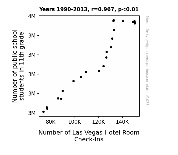
View details about correlation #1,075
The Peculiar Pairing: Pupil Population and Sin City Slumber Statistics
As more 11th graders entered the public school system, word spread about the Pythagorean parties happening in Vegas. The allure of square dancing, exponential fun, and acute entertainment proved too tempting to resist. It seems the real math lesson was that what happens in Vegas stays in Vegas, unless it's a report card!
What else correlates?
Number of public school students in 11th grade · all education
Number of Las Vegas Hotel Room Check-Ins · all weird & wacky
Number of public school students in 11th grade · all education
Number of Las Vegas Hotel Room Check-Ins · all weird & wacky


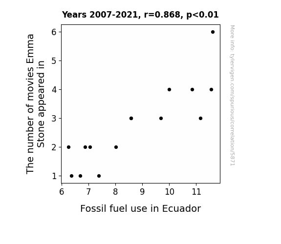
View details about correlation #5,871
The Emma Stone Effect: Unearthing the Link Between Her Filmography and Fossil Fuel Consumption in Ecuador
As Emma Stone's star power rose, so did the demand for movie premieres, leading to an unprecedented surge in red carpet events. This, in turn, caused a global shortage of red dye, prompting a frantic search for alternative sources. Lo and behold, Ecuador suddenly found itself at the center of a booming market for fossilized red tree resin, a key ingredient in creating the perfect shade of red carpet.

What else correlates?
The number of movies Emma Stone appeared in · all films & actors
Fossil fuel use in Ecuador · all energy
The number of movies Emma Stone appeared in · all films & actors
Fossil fuel use in Ecuador · all energy


View details about correlation #1,661
Kernel of Truth: Exploring the Interplay Between GMO Corn and 'I Can't Even' Google Searches in Wisconsin
The genetically modified corn in Wisconsin developed a new protein that inadvertently triggered existential crises in anyone who consumed it. As a result, people found themselves unable to even just like the corn couldn't even grow like regular corn, and the confusion led to a surge in searches for "i cant even." It was a-maize-ing and confusing times for everyone involved.


What else correlates?
GMO use in corn grown in Wisconsin · all food
Google searches for 'i cant even' · all google searches
GMO use in corn grown in Wisconsin · all food
Google searches for 'i cant even' · all google searches


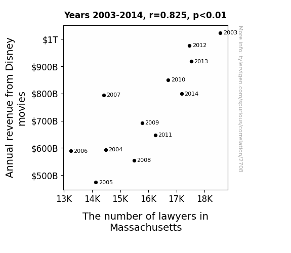
View details about correlation #2,708
The Legal Lion King: A Tale of Disney Movie Revenue and Massachusetts Lawyers
As Disney movie revenue dropped, there were fewer cases of copyright infringement in Massachusetts, leading to a decreased demand for lawyers. You could say the legal field was no longer "Goofy" about protecting intellectual property!

What else correlates?
Annual revenue from Disney movies · all films & actors
The number of lawyers in Massachusetts · all cccupations
Annual revenue from Disney movies · all films & actors
The number of lawyers in Massachusetts · all cccupations


View details about correlation #1,232
Barrett Buoyancy: A Statistical Analysis of the Relationship Between the Popularity of the Name Barrett and Automotive Recalls Issued by Mercedes-Benz USA
It's simple, really. The name Barrett has been revving up in popularity, and it seems to have sparked some kind of bumper-to-bumper connection with the automotive industry. Perhaps there's a new trend where all the little Barretts out there are just car magnets, drawing attention to potential issues. It's like the Mercedes-Benz is saying, "Danke for the heads-up, Barrett brigade! Looks like we've got a kid in every car now, bringing a whole new meaning to 'recall-ling' all units." Who knew that a rising first name could gear up such a response from a luxury car manufacturer? Looks like when it comes to automotive recalls, Barrett is definitely in drive!


What else correlates?
Popularity of the first name Barrett · all first names
Automotive recalls issued by Mercedes-Benz USA · all weird & wacky
Popularity of the first name Barrett · all first names
Automotive recalls issued by Mercedes-Benz USA · all weird & wacky


View details about correlation #2,321
Roguish Robberies and Ridiculous Refueling: Revisiting the Relationship between Robberies in Nevada and Gasoline Pumped in Latvia
Fewer robberies in Nevada meant there was less demand for getaway cars. This led to a surplus of gasoline in the US, so they decided to export some to Latvia. As a result, the amount of gasoline pumped in Latvia decreased. It's a case of international traffic jams and heists leading to a fueling funny business!
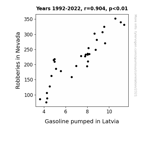
What else correlates?
Robberies in Nevada · all random state specific
Gasoline pumped in Latvia · all energy
Robberies in Nevada · all random state specific
Gasoline pumped in Latvia · all energy
. The chart goes from 2010 to 2023, and the two variables track closely in value over that time.")

View details about correlation #1,062
WhatsApp Wackiness: Weighing the Wobbly Wired Wisdom on Coke's Stock Price
As people spent more time chatting on WhatsApp, they found themselves thirstier than usual. This led to an increase in demand for Coca-Cola products, ultimately boosting The Coca-Cola Company's stock price.


What else correlates?
Google searches for 'whatsapp' · all google searches
The Coca-Cola Company's stock price (KO) · all stocks
Google searches for 'whatsapp' · all google searches
The Coca-Cola Company's stock price (KO) · all stocks


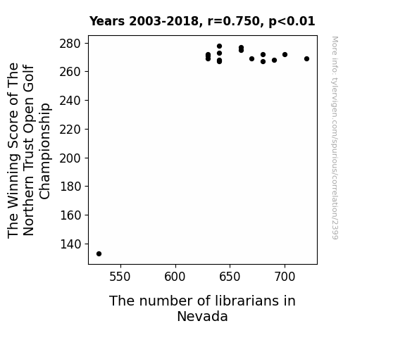
View details about correlation #2,399
Teeing Up the Numbers: A Fairway to Measure the Winning Score of The Northern Trust Open Golf Championship and the Librarians of Nevada
As The Winning Score of The Northern Trust Open Golf Championship increases, golf fans' happiness and excitement also rise. This heightened state of enjoyment leads to an influx of people taking up the sport of golf. With more individuals teeing off in Nevada, there is a greater demand for golf-related literature and instructional materials. This surge in demand for golf books and information prompts the need for additional librarians in Nevada to help organize and disseminate these resources effectively. So, basically, as the winning score goes up, so does the number of librarians in Nevada, all thanks to the unexpected connection between golfing success and library staffing levels! It's like a hole-in-one for the literary world!


View details about correlation #5,936
The Popularity of Reginald and FOXNews.com: A Name-nificent Connection?
Fewer people were 'Regi'nald fans of the name, leading to a decline in FOXNews.com satisfaction because they couldn't 'Regi'naldy believe the content anymore. It was a case of name association leading to news frustration.


What else correlates?
Popularity of the first name Reginald · all first names
Customer satisfaction with FOXNews.com · all weird & wacky
Popularity of the first name Reginald · all first names
Customer satisfaction with FOXNews.com · all weird & wacky
Why this works
- Data dredging: I have 25,237 variables in my database. I compare all these variables against each other to find ones that randomly match up. That's 636,906,169 correlation calculations! This is called “data dredging.”
Fun fact: the chart used on the wikipedia page to demonstrate data dredging is also from me. I've been being naughty with data since 2014.
Instead of starting with a hypothesis and testing it, I instead tossed a bunch of data in a blender to see what correlations would shake out. It’s a dangerous way to go about analysis, because any sufficiently large dataset will yield strong correlations completely at random. - Lack of causal connection: There is probably no direct connection between these variables, despite what the AI says above.
Because these pages are automatically generated, it's possible that the two variables you are viewing are in fact causually related. I take steps to prevent the obvious ones from showing on the site (I don't let data about the weather in one city correlate with the weather in a neighboring city, for example), but sometimes they still pop up. If they are related, cool! You found a loophole.
This is exacerbated by the fact that I used "Years" as the base variable. Lots of things happen in a year that are not related to each other! Most studies would use something like "one person" in stead of "one year" to be the "thing" studied. - Observations not independent: For many variables, sequential years are not independent of each other. You will often see trend-lines form. If a population of people is continuously doing something every day, there is no reason to think they would suddenly change how they are doing that thing on January 1. A naive p-value calculation does not take this into account.
You will calculate a lower chance of "randomly" achieving the result than represents reality.
To be more specific: p-value tests are probability values, where you are calculating the probability of achieving a result at least as extreme as you found completely by chance. When calculating a p-value, you need to assert how many "degrees of freedom" your variable has. I count each year (minus one) as a "degree of freedom," but this is misleading for continuous variables.
This kind of thing can creep up on you pretty easily when using p-values, which is why it's best to take it as "one of many" inputs that help you assess the results of your analysis.
- Y-axes doesn't start at zero: I truncated the Y-axes of the graphs above. I also used a line graph, which makes the visual connection stand out more than it deserves.
Nothing against line graphs. They are great at telling a story when you have linear data! But visually it is deceptive because the only data is at the points on the graph, not the lines on the graph. In between each point, the data could have been doing anything. Like going for a random walk by itself!
Mathematically what I showed is true, but it is intentionally misleading. If you click on any of the charts that abuse this, you can scroll down to see a version that starts at zero. - Confounding variable: Confounding variables (like global pandemics) will cause two variables to look connected when in fact a "sneaky third" variable is influencing both of them behind the scenes.
- Outliers: Some datasets here have outliers which drag up the correlation.
In concept, "outlier" just means "way different than the rest of your dataset." When calculating a correlation like this, they are particularly impactful because a single outlier can substantially increase your correlation.
Because this page is automatically generated, I don't know whether any of the charts displayed on it have outliers. I'm just a footnote. ¯\_(ツ)_/¯
I intentionally mishandeled outliers, which makes the correlation look extra strong. - Low n: There are not many data points included in some of these charts.
You can do analyses with low ns! But you shouldn't data dredge with a low n.
Even if the p-value is high, we should be suspicious of using so few datapoints in a correlation.
Pro-tip: click on any correlation to see:
- Detailed data sources
- Prompts for the AI-generated content
- Explanations of each of the calculations (correlation, p-value)
- Python code to calculate it yourself


