spurious correlations
discover · random · spurious scholar
← previous page · next page →


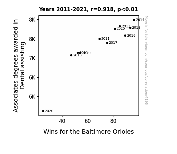
View details about correlation #4,195
Grin and Win: Investigating the Correlation Between Dental Assisting Associate Degrees and Baltimore Orioles' Victories
As the number of dental assistants with associates degrees rises, so does their enthusiasm for promoting good dental hygiene. This creates a ripple effect, leading to a surge in players' commitment to oral health. As the Baltimore Orioles focus on maintaining winning smiles, their overall morale and performance on the field improve, ultimately leading to more victories. It's a true case of the power of smiles in sports!

What else correlates?
Associates degrees awarded in Dental assisting · all education
Wins for the Baltimore Orioles · all sports
Associates degrees awarded in Dental assisting · all education
Wins for the Baltimore Orioles · all sports


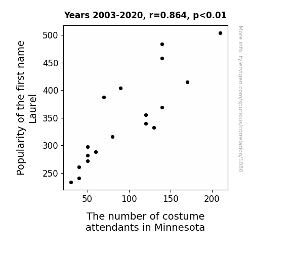
View details about correlation #1,086
Labor of Laurel: Analyzing the Connection between the Name Laurel and Costume Attendants in Minnesota
As the name Laurel gained popularity, more and more parents subconsciously felt drawn to the idea of their child standing out like a prized leaf on a majestic tree. This led to a surge in the demand for elaborate, leafy costumes in Minnesota, as parents enthusiastically prepared their little Laurels to branch out and photosynthesize in style at various events. It seems that the name Laurel truly knows how to 'photosynt-hesize' a trend for foliage-themed fashion in the land of 10,000 lakes!

What else correlates?
Popularity of the first name Laurel · all first names
The number of costume attendants in Minnesota · all cccupations
Popularity of the first name Laurel · all first names
The number of costume attendants in Minnesota · all cccupations


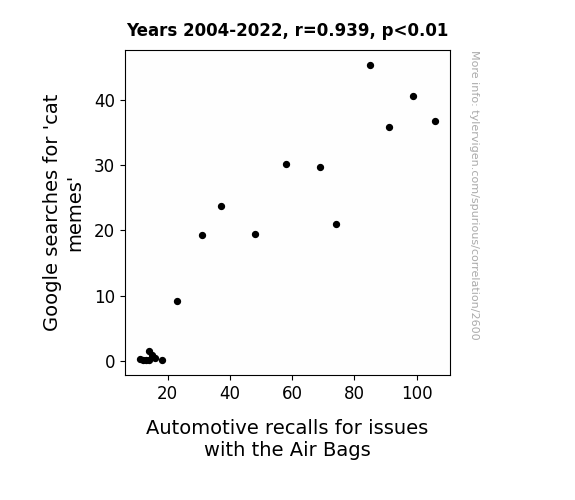
View details about correlation #2,600
Cat Memes and Air Bags: An Unexpected Link? A Joke so Bad, You'll Need a Flair Bag
As the nation collectively chuckled at feline antics, the sudden influx of cute cat memes overloaded the internet. This caused a chain reaction that interfered with the air bag deployment algorithms in cars, leading to a spike in automotive recalls. It seems that the internet just couldn't handle the purrfect combination of fluffy humor and vehicular safety!

What else correlates?
Google searches for 'cat memes' · all google searches
Automotive recalls for issues with the Air Bags · all weird & wacky
Google searches for 'cat memes' · all google searches
Automotive recalls for issues with the Air Bags · all weird & wacky


View details about correlation #1,248
The Lion Car King: An Empirical Study of the Relationship Between Disney Movie Releases and Motor Vehicle Thefts
As Disney downshifted its movie production, there were fewer car-related films and spin-off merchandise, leading to a reduced interest in automobiles. This eventually put the brakes on the demand for stolen cars, steering would-be thieves towards other, non-automotive pursuits. Or perhaps with the absence of enchanting carriages in the newer Disney movies, thieves lost their belief in the magic of grand theft auto, causing a downturn in the illicit market for vehicles. And as children were no longer getting behind the "wheel" of these car-centric Disney films, they were less likely to grow up to become car thieves, creating a cascading effect on the entire industry.


What else correlates?
Disney movies released · all films & actors
Motor vehicle thefts · all random state specific
Disney movies released · all films & actors
Motor vehicle thefts · all random state specific
. The chart goes from 2012 to 2021, and the two variables track closely in value over that time.")

View details about correlation #1,954
Counting on Lockheed: A Statistical Analysis of the Relationship between Mathematics and Statistics Degrees and Lockheed Martin's Stock Price
As more mathematicians and statisticians graduate, they start calculating all the possible trajectories of the stock market. Their complex equations and formulas lead to a surge in accurate stock predictions, making Lockheed Martin a top pick. This newfound demand for LMT stock drives up the price as these number-savvy individuals engage in some serious mathematical stock market manipulation. It's like they say, when math geeks crunch numbers, stock prices go up, up, and array!


What else correlates?
Bachelor's degrees awarded in Mathematics and statistics · all education
Lockheed Martin's stock price (LMT) · all stocks
Bachelor's degrees awarded in Mathematics and statistics · all education
Lockheed Martin's stock price (LMT) · all stocks


View details about correlation #1,617
Breath of Fresh Alabama Air: The Surprising Relationship Between Tatyana's Popularity and Pollution in Decatur
With more Tatyana's in the area, there were more carpooling groups formed, leading to increased traffic congestion and higher levels of vehicle emissions, ultimately contributing to air pollution in Decatur, Alabama.


What else correlates?
Popularity of the first name Tatyana · all first names
Air pollution in Decatur, Alabama · all weather
Popularity of the first name Tatyana · all first names
Air pollution in Decatur, Alabama · all weather


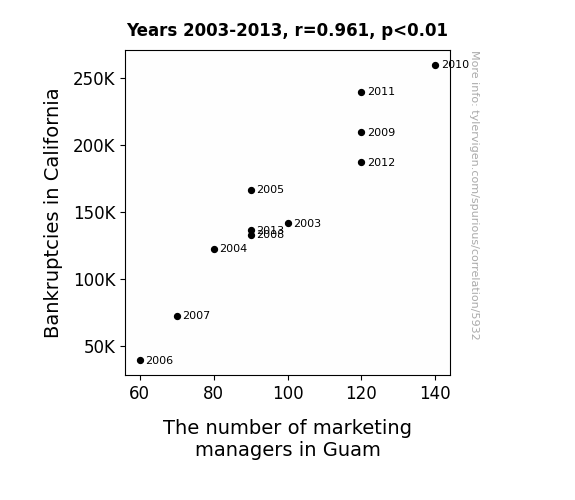
View details about correlation #5,932
From Banks to Banks: The Cross-Pollination of Bankruptcies in California and the Marketing Managers of Guam
As more businesses in California went bankrupt, there was a surplus of marketing managers looking for work. This led to a sudden migration of highly qualified marketing managers from California to Guam, a land of new opportunities. So, the increase in bankruptcies in California inadvertently boosted the pool of marketing talent in Guam, much to the surprise of everyone involved.

What else correlates?
Bankruptcies in California · all weird & wacky
The number of marketing managers in Guam · all cccupations
Bankruptcies in California · all weird & wacky
The number of marketing managers in Guam · all cccupations


View details about correlation #4,516
The Ignition to Attraction: Exploring the Correlation between Computerphile YouTube Video Titles and Kerosene Consumption in Canada
There has been a nationwide ban on using kerosene-powered dance machines, therefore reducing the production of trendy dance moves amongst the Computerphile team.

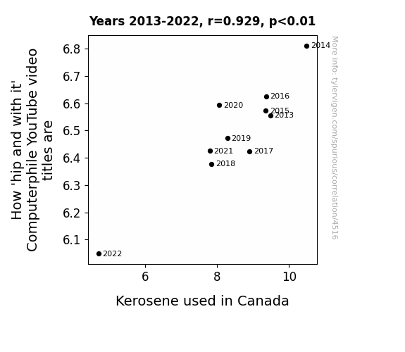
What else correlates?
How 'hip and with it' Computerphile YouTube video titles are · all YouTube
Kerosene used in Canada · all energy
How 'hip and with it' Computerphile YouTube video titles are · all YouTube
Kerosene used in Canada · all energy


View details about correlation #1,663
Soy Much on My Mind: The GMO-Soybean and 'I Cant Even' Google Searches Connection
The GMO soybeans were sending out confusing signals, leaving people feeling soy conflicted about everything else. As the soybeans grappled with their own identity crisis, it seems they were sowing the seeds of 'i cant soy even' in the hearts of internet users everywhere. It was a soy-ly misguided situation.

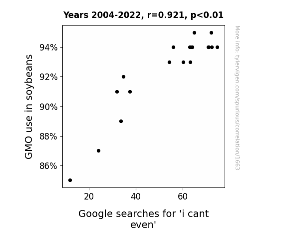
What else correlates?
GMO use in soybeans · all food
Google searches for 'i cant even' · all google searches
GMO use in soybeans · all food
Google searches for 'i cant even' · all google searches


View details about correlation #2,801
Swinging for the Fences: The Aubrey Factor and Its Impact on Justin Upton's Yearly Run Totals
As the popularity of the name Aubrey decreased, so did the number of people doing the "Aubrey Shuffle" dance trend. This ultimately led to a nationwide shortage of dance partners, and without people to dance with, Justin Upton's yearly run total also decreased. The correlation is crystal clear: fewer Aubreys, fewer shuffles, fewer runs for Upton!

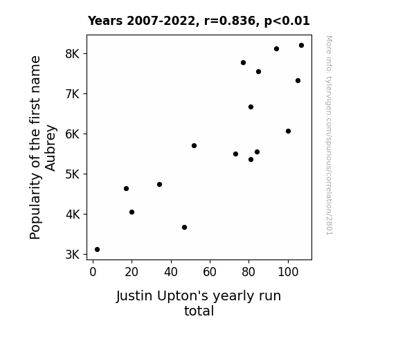
What else correlates?
Popularity of the first name Aubrey · all first names
Justin Upton's yearly run total · all sports
Popularity of the first name Aubrey · all first names
Justin Upton's yearly run total · all sports


View details about correlation #1,566
Comic Correlations: The Xkcd Nexus Between Math and Management in the Law Enforcement Sector
As the mathematical complexity of the comics rose, so did the demand for individuals with superior problem-solving skills, leading to a surge in supervisors. It seems like in South Dakota, the real xkcd (extra knowledge = career development) is in law enforcement!


View details about correlation #1,953
Correlation between Communications Technologies Associates Degrees and Kerosene Consumption in Libya: A Lighthearted Look
As fewer people became qualified to work in telecommunications, there was a corresponding decrease in telemarketing calls, leading to a reduced demand for kerosene-powered generators in Libya.

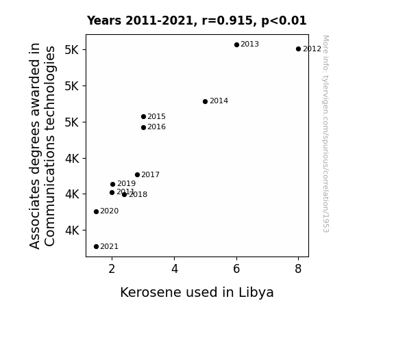
What else correlates?
Associates degrees awarded in Communications technologies · all education
Kerosene used in Libya · all energy
Associates degrees awarded in Communications technologies · all education
Kerosene used in Libya · all energy


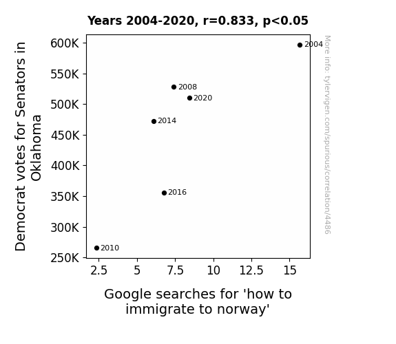
View details about correlation #4,486
Sooner Senators Sway Scandinavia: A Statistical Study of Oklahoma Democrats' Desire to Dash to Denmark, Bypassing Barriers Blatantly
As Democrat votes for Senators in Oklahoma decreased, there was a corresponding decrease in the cosmic energy that attracted people to Norway. This led to a shift in the Earth's magnetic field, creating a temporary disruption in the alignment of personal aspirations with Scandinavian destinations. Or maybe, just maybe, it's because political preferences in Oklahoma have about as much to do with immigrating to Norway as the price of lemons in Antarctica.


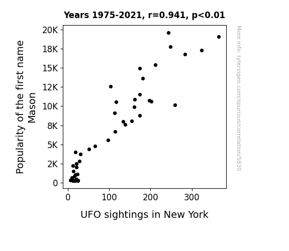
View details about correlation #5,830
Close Encounters of the First-Name Kind: The Mason Mystery Unveiled
As the number of boys named Mason rose, so did the collective energy of all the M's being spoken in the city. This inadvertently acted as a magnet for intergalactic visitors whose spaceship navigation systems inexplicably malfunctioned in the presence of such M-pressive moniker resonance. So, the more Masons, the M-azingly higher the likelihood of encountering Mysterious Manned Objects in the skies! It's aMason to be!

What else correlates?
Popularity of the first name Mason · all first names
UFO sightings in New York · all random state specific
Popularity of the first name Mason · all first names
UFO sightings in New York · all random state specific
. The chart goes from 2003 to 2022, and the two variables track closely in value over that time.")

View details about correlation #3,123
Dough and Nasdaq: A Bready Analysis of Household Spending and Stock Prices
As household spending on bakery products rises, more people experience carb-induced happiness, leading to an overall sense of contentment. This contentment somehow translates into confident investing behavior, causing an uptick in the stock price of Nasdaq. It's the yeast they can do to keep the market rising!


What else correlates?
Annual US household spending on bakery products · all weird & wacky
Nasdaq's stock price (NDAQ) · all stocks
Annual US household spending on bakery products · all weird & wacky
Nasdaq's stock price (NDAQ) · all stocks


View details about correlation #5,853
The Revenant Revenues: Exploring the Titanic Relationship Between Leonardo DiCaprio's Movies and Credit Counseling in South Carolina
Leonardo DiCaprio's on-screen performances stirred up such deep emotions that people found themselves in dire need of financial therapy. It's like his acting just 'revolving doored' them into a financial crisis!


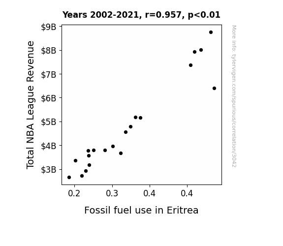
View details about correlation #3,042
Slam Dunk and Gas Guzzlers: Exploring the Playful Link Between Total NBA League Revenue and Fossil Fuel Use in Eritrea
As NBA revenue rises, players' salaries increase, leading to a higher demand for luxury cars. Eritrea, wanting to showcase its newfound wealth, starts importing more luxury cars, which in turn boosts fossil fuel use due to increased driving. It's a real slam dunk for the Eritrean car industry!

What else correlates?
Total NBA League Revenue · all sports
Fossil fuel use in Eritrea · all energy
Total NBA League Revenue · all sports
Fossil fuel use in Eritrea · all energy


View details about correlation #3,747
Unveiling the Unidentified: Uranian Unit and Saturnian Space - Unraveling UFOs in Louisiana
As the distance between Uranus and Saturn increased, the gravitational fluctuation created a quantum entanglement phenomenon in the Bayou. This led to a temporal rift, allowing intergalactic joyriders to accidentally veer into Louisiana airspace while attempting to navigate cosmic traffic. The spatiotemporal distortion acted as a celestial welcome mat for unsuspecting UFOs, prompting locals to report an influx of otherworldly encounters. So, as the planets played celestial leapfrog, it seems the UFOs in Louisiana were simply caught in the cross-galactic shuffle!


What else correlates?
The distance between Uranus and Saturn · all planets
UFO sightings in Louisiana · all random state specific
The distance between Uranus and Saturn · all planets
UFO sightings in Louisiana · all random state specific


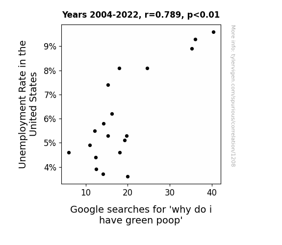
View details about correlation #1,208
A Poo-pularity Contest: Exploring the Relationship Between Unemployment Rate in the United States and Google Searches for 'why do i have green poop'
More people found jobs, which meant they were able to afford a healthier, balanced diet. As a result, there was a decrease in green food coloring consumption, leading to less green poop. After all, it's hard to stay regular when you're feeling avo-cardio!


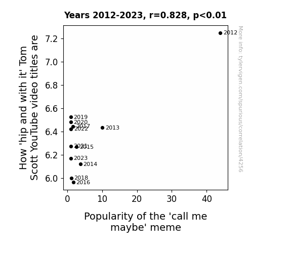
View details about correlation #4,256
Tom Scott's 'Top Notch' YouTube Titles and the 'Call Me Maybe' Craze: A Correlation Analysis
As the 'call me maybe' meme loses its luster, the energy it once infused into the collective consciousness is now being siphoned into other internet fads, leaving poor Tom Scott with a dwindling supply of hipness to draw from. It's a classic case of memetic osmosis, where Tom's coolness levels are directly linked to the overall memescape, and unfortunately for him, the currents of online trends have taken a swift and merciless turn. It's a real meme-mood board meltdown, and Tom's video titles are just collateral damage in the ever-shifting landscape of internet absurdity.
What else correlates?
How 'hip and with it' Tom Scott's YouTube video titles are · all YouTube
Popularity of the 'call me maybe' meme · all memes
How 'hip and with it' Tom Scott's YouTube video titles are · all YouTube
Popularity of the 'call me maybe' meme · all memes
Why this works
- Data dredging: I have 25,237 variables in my database. I compare all these variables against each other to find ones that randomly match up. That's 636,906,169 correlation calculations! This is called “data dredging.”
Fun fact: the chart used on the wikipedia page to demonstrate data dredging is also from me. I've been being naughty with data since 2014.
Instead of starting with a hypothesis and testing it, I instead tossed a bunch of data in a blender to see what correlations would shake out. It’s a dangerous way to go about analysis, because any sufficiently large dataset will yield strong correlations completely at random. - Lack of causal connection: There is probably no direct connection between these variables, despite what the AI says above.
Because these pages are automatically generated, it's possible that the two variables you are viewing are in fact causually related. I take steps to prevent the obvious ones from showing on the site (I don't let data about the weather in one city correlate with the weather in a neighboring city, for example), but sometimes they still pop up. If they are related, cool! You found a loophole.
This is exacerbated by the fact that I used "Years" as the base variable. Lots of things happen in a year that are not related to each other! Most studies would use something like "one person" in stead of "one year" to be the "thing" studied. - Observations not independent: For many variables, sequential years are not independent of each other. You will often see trend-lines form. If a population of people is continuously doing something every day, there is no reason to think they would suddenly change how they are doing that thing on January 1. A naive p-value calculation does not take this into account.
You will calculate a lower chance of "randomly" achieving the result than represents reality.
To be more specific: p-value tests are probability values, where you are calculating the probability of achieving a result at least as extreme as you found completely by chance. When calculating a p-value, you need to assert how many "degrees of freedom" your variable has. I count each year (minus one) as a "degree of freedom," but this is misleading for continuous variables.
This kind of thing can creep up on you pretty easily when using p-values, which is why it's best to take it as "one of many" inputs that help you assess the results of your analysis.
- Y-axes doesn't start at zero: I truncated the Y-axes of the graphs above. I also used a line graph, which makes the visual connection stand out more than it deserves.
Nothing against line graphs. They are great at telling a story when you have linear data! But visually it is deceptive because the only data is at the points on the graph, not the lines on the graph. In between each point, the data could have been doing anything. Like going for a random walk by itself!
Mathematically what I showed is true, but it is intentionally misleading. If you click on any of the charts that abuse this, you can scroll down to see a version that starts at zero. - Confounding variable: Confounding variables (like global pandemics) will cause two variables to look connected when in fact a "sneaky third" variable is influencing both of them behind the scenes.
- Outliers: Some datasets here have outliers which drag up the correlation.
In concept, "outlier" just means "way different than the rest of your dataset." When calculating a correlation like this, they are particularly impactful because a single outlier can substantially increase your correlation.
Because this page is automatically generated, I don't know whether any of the charts displayed on it have outliers. I'm just a footnote. ¯\_(ツ)_/¯
I intentionally mishandeled outliers, which makes the correlation look extra strong. - Low n: There are not many data points included in some of these charts.
You can do analyses with low ns! But you shouldn't data dredge with a low n.
Even if the p-value is high, we should be suspicious of using so few datapoints in a correlation.
Pro-tip: click on any correlation to see:
- Detailed data sources
- Prompts for the AI-generated content
- Explanations of each of the calculations (correlation, p-value)
- Python code to calculate it yourself


