spurious correlations
discover · random · spurious scholar
← previous page · next page →
. The chart goes from 2007 to 2021, and the two variables track closely in value over that time.")

View details about correlation #4,113
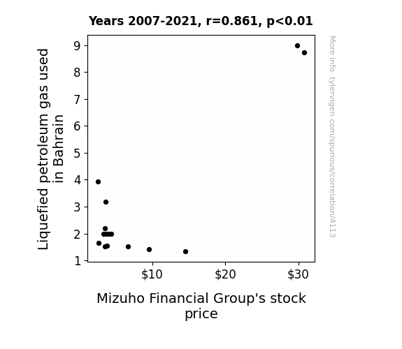
The Sizzle and Fizzle: LPG in Bahrain and the MFG Stock Price Boil Over
The extra LPG in Bahrain is creating a booming market for flamethrower juggling performances. As the demand for entertainment surges, so does the demand for bank loans to fund these fiery spectacles. Mizuho Financial Group, being in the lending business, is experiencing a hot streak of interest and fees, propelling their stock price to new heights. Remember, when the juggling gets tough, the tough get banking with MFG!

What else correlates?
Liquefied petroleum gas used in Bahrain · all energy
Mizuho Financial Group's stock price (MFG) · all stocks
Liquefied petroleum gas used in Bahrain · all energy
Mizuho Financial Group's stock price (MFG) · all stocks


View details about correlation #1,739
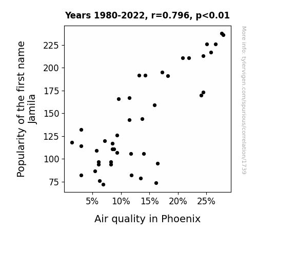
Jamila's Jam: A Breath of Fresh Air in Phoenix
As the name Jamila fell out of favor, people started using the phrase "Ja-mildew-a" instead, unknowingly conjuring up humid and smoggy conditions in Phoenix. This linguistic shift led to an increase in indoor air freshener use, creating a demand for aerosols that wafted all the way to Arizona, contributing to the decrease in air quality. Remember, it's not just about being Jamila-friendly, it's also about being eco-friendly!

What else correlates?
Popularity of the first name Jamila · all first names
Air quality in Phoenix · all weather
Popularity of the first name Jamila · all first names
Air quality in Phoenix · all weather


View details about correlation #5,943
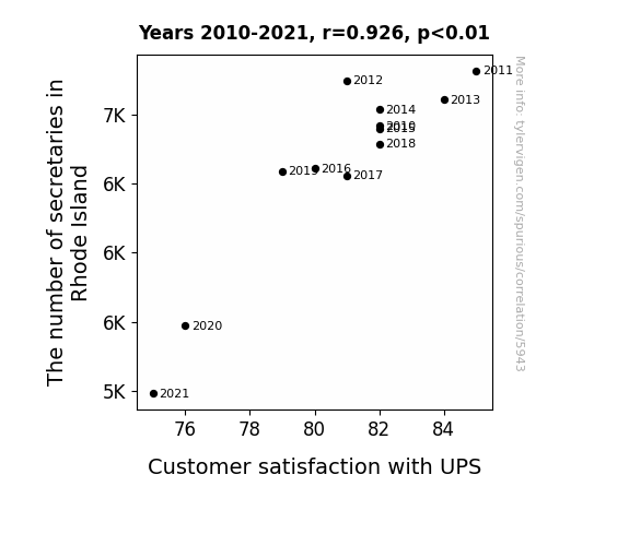
Special Delivery: Uncovering the Secretary-ous Connection Between Rhode Island's Secretarial Workforce and UPS Customer Satisfaction
With fewer secretaries around, there was a surge in rogue package labeling. The packages were being given the wrong addresses, causing a lot of confusion. It was an uproar!

What else correlates?
The number of secretaries in Rhode Island · all cccupations
Customer satisfaction with UPS · all weird & wacky
The number of secretaries in Rhode Island · all cccupations
Customer satisfaction with UPS · all weird & wacky


View details about correlation #2,354
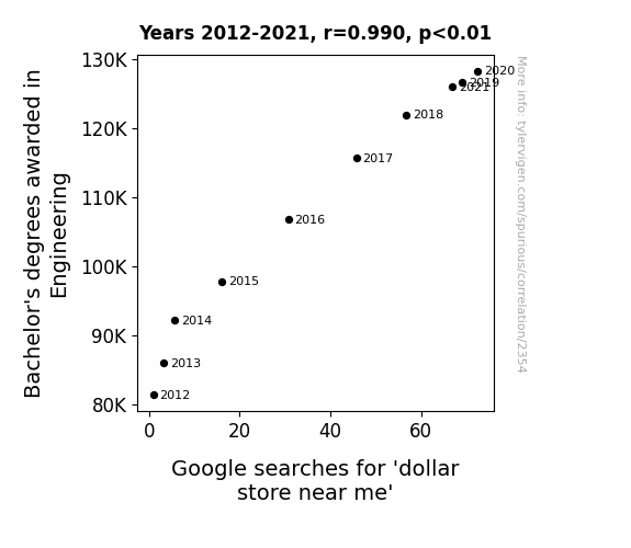
Engineering Enrollment and Economic Endeavors: Exploring the Enigmatic Link between Bachelor's Degrees and Dollar Store Searches
As the number of Engineering graduates rose, so did their affinity for innovative, cost-effective solutions. This led to a surge in dollar store franchise ownership, as former students applied their skills to optimize the operation of these stores. The result? An influx of high-quality, yet inexplicably affordable, merchandise at a dollar store near you, capturing the interest and search queries of bargain-hunting locals. Remember, when it comes to bargain shopping, these engineers didn't just ace the calculus - they engineered a retail revolution!

What else correlates?
Bachelor's degrees awarded in Engineering · all education
Google searches for 'dollar store near me' · all google searches
Bachelor's degrees awarded in Engineering · all education
Google searches for 'dollar store near me' · all google searches


View details about correlation #5,878
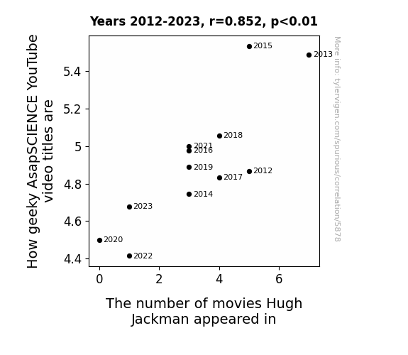
The Wolverine Effect: Exploring the Interplay Between Geeky AsapSCIENCE YouTube Video Titles and Hugh Jackman's Cinematic Appearances
Every time AsapSCIENCE releases a super geeky video, Hugh Jackman feels a sudden urge to take on another movie role, because let's face it, who wouldn't want to be a part of such nerdy greatness? It's like his geeky senses start tingling, and before you know it, he's donning those adamantium claws or belting out a song as P.T. Barnum. Geekiness just has that mutant power to attract Hugh Jackman to the big screen!


View details about correlation #5,024
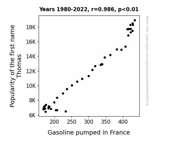
The Thomas Trend: Exploring the Pump-ularity of Gasoline in France
Fewer people were using the name Thomas as their secret code to access underground gasoline reserves, leading to a decrease in unauthorized fuel pumping in France.

What else correlates?
Popularity of the first name Thomas · all first names
Gasoline pumped in France · all energy
Popularity of the first name Thomas · all first names
Gasoline pumped in France · all energy


View details about correlation #1,082
Google's Net Income and LP/Vinyl Album Sales: An Unlikely Rhyme in Time
As Google's net income rose, they invested in a secret underground project to bring back the nostalgia of vinyl records. Using their advanced algorithms, they identified the perfect target audience and created a resurgence in the love for analog music. Little did anyone know, Google's true profit was in spinning old-school beats, making them the real OG of the music industry.


What else correlates?
Google's Net Income · all stocks
Sales of LP/Vinyl Albums · all weird & wacky
Google's Net Income · all stocks
Sales of LP/Vinyl Albums · all weird & wacky


View details about correlation #2,194
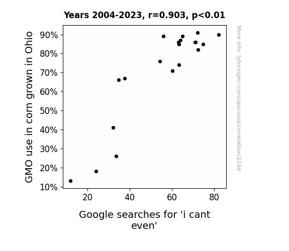
GMO-cornfusion: A Kernel of Truth behind I Can't Even Searches
The corn started expressing its existential crisis, leading to a wave of empathetic confusion among internet users. With their genetically modified woes, the corn just couldn't even, and neither could anyone else. It was a-maize-ing how the internet was stalked by this cob-founding development.
What else correlates?
GMO use in corn grown in Ohio · all food
Google searches for 'i cant even' · all google searches
GMO use in corn grown in Ohio · all food
Google searches for 'i cant even' · all google searches


View details about correlation #4,640
From E(dit)Nerd to Producer: A Reel-y Nerdy Investigation into the Relationship between YouTube Video Titles and Film and Video Editors in Puerto Rico
The more editors there are, the reel the video titles become. As the editing talent pool grows, the content becomes a cut above the rest. It's like they say, the more the edits, the nerdy the hits! So it seems there's a direct correlation between the Puerto Rican editing prowess and the nerdy titles - it's a blockbuster of a connection!


View details about correlation #5,138
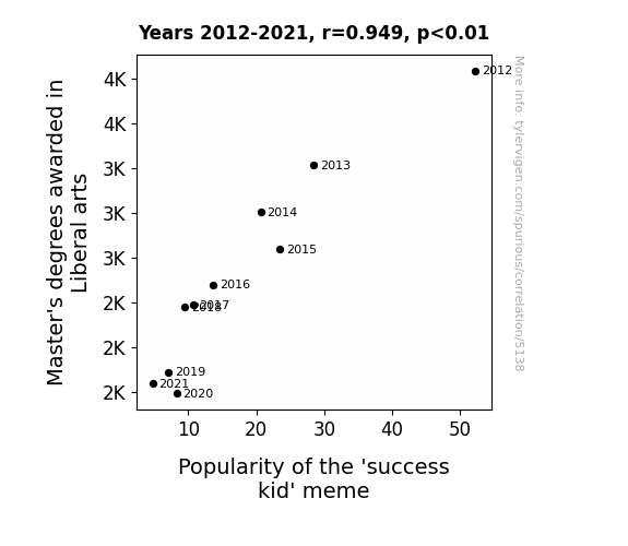
The Art of Success: A Meme-ingful Connection Between Master's Degrees in Liberal Arts and the Popularity of 'Success Kid'
As the number of Master's degrees in Liberal Arts decreased, there was a corresponding decline in the deep analysis of internet memes. This led to a reduced appreciation for the nuanced success of the 'success kid' meme. After all, no one could find the deeper meaning in the kiddie pool of memes anymore!

What else correlates?
Master's degrees awarded in Liberal arts · all education
Popularity of the 'success kid' meme · all memes
Master's degrees awarded in Liberal arts · all education
Popularity of the 'success kid' meme · all memes


View details about correlation #1,184
The Celestial Slot Machine Connection: Exploring the Correlation Between the Distance between Uranus and Earth and the Number of Slot Machines in Nevada
The gravitational pull from Uranus created a ripple effect on Earth's magnetic field, stimulating the pleasure centers in people's brains. As a result, there was a greater demand for entertainment, leading to an increase in the number of slot machines in Nevada as a way to capitalize on this cosmic amusement.


What else correlates?
The distance between Uranus and Earth · all planets
Number of Slot Machines in Nevada · all weird & wacky
The distance between Uranus and Earth · all planets
Number of Slot Machines in Nevada · all weird & wacky


View details about correlation #2,089
Will-i-Am's Effect: Analyzing the Correlation Between the Popularity of the Name William and Burglary Rates in South Carolina
Fewer Williams meant fewer people with the will toiammoral compass, leading to a decrease in sticky situations.


What else correlates?
Popularity of the first name William · all first names
Burglaries in South Carolina · all random state specific
Popularity of the first name William · all first names
Burglaries in South Carolina · all random state specific


View details about correlation #3,078
Dermatologist Density and Google Trends: The Link between Skin Experts and Sinful Mindsets in Kentucky
As the skincare specialists in Kentucky flourished, they began to unearth innovative techniques for preserving a youthful appearance. People couldn't help but marvel at how these specialists made things disappear without a trace. And as the experts honed their skills in making blemishes and wrinkles vanish, it inadvertently sparked a statewide interest in making other things, or rather, bodies, vanish too - leading to an unexpected surge in 'how to hide a body' searches. After all, when you're used to dealing with complexions, concealing a corpus must seem like a skin-deep secret! It's a case of beauty secrets taking an unexpectedly dark turn, leaving everyone to wonder if the real glow-up was in mastering the art of clandestine concealment.


View details about correlation #2,738
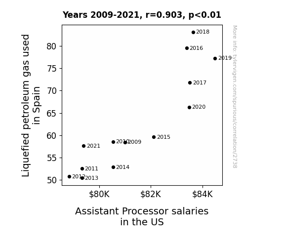
Fired up: Exploring the Flaming Relationship Between LPG in Spain and Assistant Processor Salaries in the US
As the demand for Liquefied Petroleum Gas (LPG) in Spain rose, more and more people started using it for cooking and heating. This led to a spike in the need for Assistant Processors in the US to handle and process the extra LPG orders coming from Spain. With all the gas-related work piling up, companies had to offer higher salaries to attract top talent, making it a truly "fiery" job market for Assistant Processors.

What else correlates?
Liquefied petroleum gas used in Spain · all energy
Assistant Processor salaries in the US · all education
Liquefied petroleum gas used in Spain · all energy
Assistant Processor salaries in the US · all education


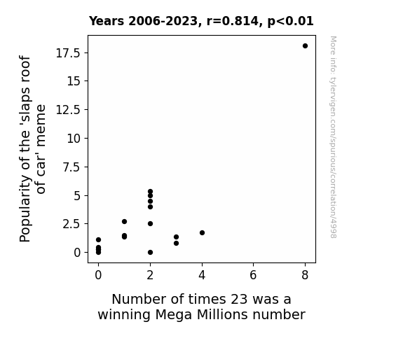
View details about correlation #4,998
Slap Me If I'm Wrong, But Is 23 the New Lucky Number? Exploring the Correlation Between the 'Slaps Roof of Car' Meme Popularity and 23 as a Winning Mega Millions Number
The meme made people slap their foreheads, activating the "luck" center of their brains! The meme created a 'shocking' increase in people buying An electric car coinciding With the meme's popularity. The electric buildup caused a 'positive charge' around the number 23, making it more likely to be drawn! As the meme spread, it 'revved up' the collective 'engine' of luck, leading to more 'powerful' vibes surrounding the number 23! The meme's popularity led to more people 'hitting' the jackpot, and 23 just happened to be along for the 'ride'! The meme's catchphrase actually became a subconscious mantra for lottery players, 'driving' them to choose 23 as their lucky number! The meme's impact was so 'far-reaching' that it 'accelerated' the probability of 23 being a winning number! The meme 'car'-ried a wave of good luck that 'auto'-matically made 23 a more 'wheel'-y good choice for lottery players!


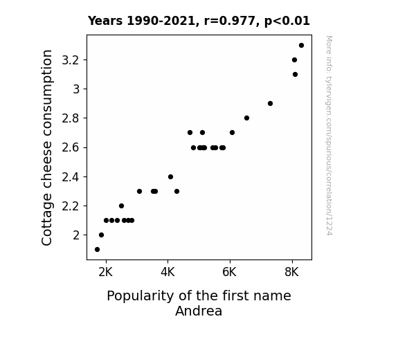
View details about correlation #1,224
The Scoop on Cottage Cheese: Analyzing the Popularity of the Name Andrea
As Cottage cheese consumption decreased, the overall level of curdled enthusiasm in the world plummeted. Unfortunately for Andreas everywhere, this meant a whey-d from being able to find their gouda soulmates and form the cheddar memories they had hoped for. With fewer people experiencing the cottage-core lifestyle, the appeal of naming their children after quaint, cheesy abodes like And-cheddrea or Mozzar-andrea just couldn't brie the same. It's a feta-ful situation for anyone with a fondness for Andrea, but hopefully, as Cottage cheese makes a comeback, so will the love for this moniker!

What else correlates?
Cottage cheese consumption · all food
Popularity of the first name Andrea · all first names
Cottage cheese consumption · all food
Popularity of the first name Andrea · all first names


View details about correlation #4,243
Guardians of the Galaxy: The Correlation between Transportation Security Screeners in West Virginia and Google Searches for 'How to Build a Bunker'
With fewer screeners around, the TSA implemented a new "Bring Your Own Bunker" policy, prompting a surge in West Virginians constructing their personal underground fortresses to ensure their own security. As a result, the demand for internet tutorials on bunker construction plummeted, as people realized that they were already experts in home fortification. Who needs a how-to guide when you can just repurpose your old fallout shelter blueprints from the 1950s? It was a real grassroots movement, or rather, an underground movement, in the Mountain State!


View details about correlation #5,873
The Olsens and the Nuptials: A Cinematic Study of Elizabeth Olsen's Filmography and Marriage Rates in the District of Columbia
As Elizabeth Olsen's filmography expanded, so did the love and romance permeating the nation's capital. It's no coincidence that as more people watched her on screen, they were inspired to seek out their own real-life love stories. Her captivating performances must have been creating a ripple effect of budding relationships, ultimately contributing to a surge in weddings. Who knew that the road to matrimonial bliss in D.C. was paved with the silver screen charisma of Elizabeth Olsen!


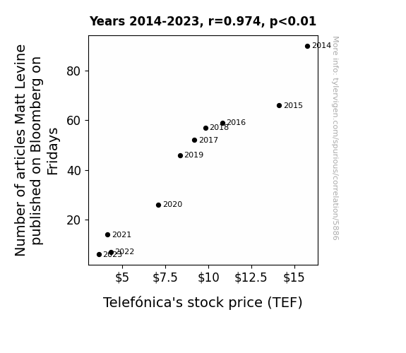
. The chart goes from 2014 to 2023, and the two variables track closely in value over that time.")

View details about correlation #5,886
Friday Flurry: Matt Levine's Musings and Telefónica's Tumultuous Tendencies
The decrease in Matt Levine's Friday articles led to a decrease in Friday finance humor, reducing overall Friday market enthusiasm, including Telefónica, and causing stock prices to dip on the brink of the weekend. It seems Levine's words were Telefoni-causing trouble!


View details about correlation #1,334
The Corn and the Furious: Exploring the GMO-Jet Fuel Connection
The corn cobs were actually secretly functioning as mini jet engines, so with fewer GMOs, there were fewer power-packed cobs to fuel the planes. It's not turbulence in the air, it's cornspiracy in the fields!


What else correlates?
GMO use in corn grown in Iowa · all food
Jet fuel used in Kosovo · all energy
GMO use in corn grown in Iowa · all food
Jet fuel used in Kosovo · all energy
Why this works
- Data dredging: I have 25,237 variables in my database. I compare all these variables against each other to find ones that randomly match up. That's 636,906,169 correlation calculations! This is called “data dredging.”
Fun fact: the chart used on the wikipedia page to demonstrate data dredging is also from me. I've been being naughty with data since 2014.
Instead of starting with a hypothesis and testing it, I instead tossed a bunch of data in a blender to see what correlations would shake out. It’s a dangerous way to go about analysis, because any sufficiently large dataset will yield strong correlations completely at random. - Lack of causal connection: There is probably no direct connection between these variables, despite what the AI says above.
Because these pages are automatically generated, it's possible that the two variables you are viewing are in fact causually related. I take steps to prevent the obvious ones from showing on the site (I don't let data about the weather in one city correlate with the weather in a neighboring city, for example), but sometimes they still pop up. If they are related, cool! You found a loophole.
This is exacerbated by the fact that I used "Years" as the base variable. Lots of things happen in a year that are not related to each other! Most studies would use something like "one person" in stead of "one year" to be the "thing" studied. - Observations not independent: For many variables, sequential years are not independent of each other. You will often see trend-lines form. If a population of people is continuously doing something every day, there is no reason to think they would suddenly change how they are doing that thing on January 1. A naive p-value calculation does not take this into account.
You will calculate a lower chance of "randomly" achieving the result than represents reality.
To be more specific: p-value tests are probability values, where you are calculating the probability of achieving a result at least as extreme as you found completely by chance. When calculating a p-value, you need to assert how many "degrees of freedom" your variable has. I count each year (minus one) as a "degree of freedom," but this is misleading for continuous variables.
This kind of thing can creep up on you pretty easily when using p-values, which is why it's best to take it as "one of many" inputs that help you assess the results of your analysis.
- Y-axes doesn't start at zero: I truncated the Y-axes of the graphs above. I also used a line graph, which makes the visual connection stand out more than it deserves.
Nothing against line graphs. They are great at telling a story when you have linear data! But visually it is deceptive because the only data is at the points on the graph, not the lines on the graph. In between each point, the data could have been doing anything. Like going for a random walk by itself!
Mathematically what I showed is true, but it is intentionally misleading. If you click on any of the charts that abuse this, you can scroll down to see a version that starts at zero. - Confounding variable: Confounding variables (like global pandemics) will cause two variables to look connected when in fact a "sneaky third" variable is influencing both of them behind the scenes.
- Outliers: Some datasets here have outliers which drag up the correlation.
In concept, "outlier" just means "way different than the rest of your dataset." When calculating a correlation like this, they are particularly impactful because a single outlier can substantially increase your correlation.
Because this page is automatically generated, I don't know whether any of the charts displayed on it have outliers. I'm just a footnote. ¯\_(ツ)_/¯
I intentionally mishandeled outliers, which makes the correlation look extra strong. - Low n: There are not many data points included in some of these charts.
You can do analyses with low ns! But you shouldn't data dredge with a low n.
Even if the p-value is high, we should be suspicious of using so few datapoints in a correlation.
Pro-tip: click on any correlation to see:
- Detailed data sources
- Prompts for the AI-generated content
- Explanations of each of the calculations (correlation, p-value)
- Python code to calculate it yourself


