spurious correlations
discover · random · spurious scholar
← previous page · next page →
. The chart goes from 2012 to 2021, and the two variables track closely in value over that time.")

View details about correlation #2,069
In Pursuit of Truth: The Link Between Bachelor's Degree Pursuits and the Travelers' Stock Equity
As the number of Parks and Recreation graduates rises, so does the nation's enthusiasm for outdoor activities. This leads to an uptick in people taking vacations and needing travel insurance, boosting the demand for The Travelers Companies' services. It's a degree-fying moment for both the graduates and the stockholders!


What else correlates?
Bachelor's degrees awarded in Parks & Recreation · all education
The Travelers Companies' stock price (TRV) · all stocks
Bachelor's degrees awarded in Parks & Recreation · all education
The Travelers Companies' stock price (TRV) · all stocks


View details about correlation #2,015
The Nina Effect: A Breath of Fresh Air or a Cloud of Pollution?
As the popularity of the name Nina waned, fewer parents were inspired to introduce their kids to the classic cartoon "Nina and the Smoggy Day," leading to a decline in demand for pollution-inducing merchandise. With fewer toy factories churning out plastic trinkets and electronic gizmos, the overall emissions in Jackson took a welcome nosedive. How's that for an unexpected ripple effect of baby name trends?

What else correlates?
Popularity of the first name Nina · all first names
Air pollution in Jackson · all weather
Popularity of the first name Nina · all first names
Air pollution in Jackson · all weather


View details about correlation #2,430
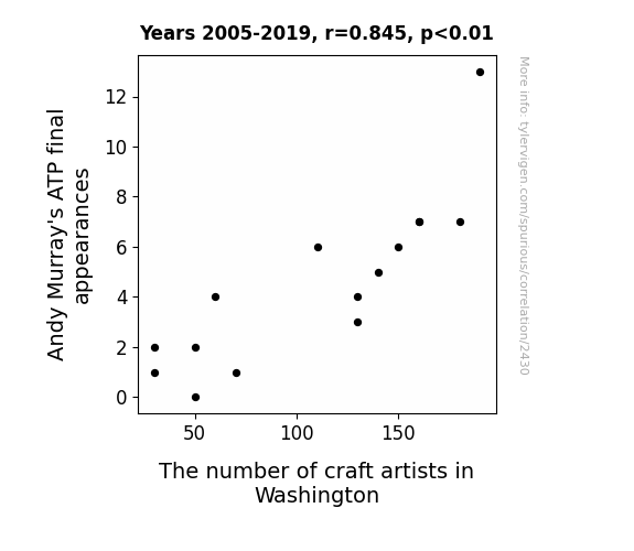
Serving Up Crafty Connections: An Examination of Andy Murray's ATP Final Appearances and the Number of Craft Artists in Washington
As Andy Murray's ATP final appearances increased, so did the demand for tennis gear sporting his name and logo. This led to a spike in crafting of Andy Murray-themed merchandise, inspiring an influx of craft artists in Washington hoping to capitalize on the trend. After all, who wouldn't want a handcrafted Andy Murray tennis racket cozy or a Murray-themed macramé tennis net for their living room?

What else correlates?
Andy Murray's ATP final appearances · all sports
The number of craft artists in Washington · all cccupations
Andy Murray's ATP final appearances · all sports
The number of craft artists in Washington · all cccupations


View details about correlation #2,528
Venture in the Antarctic: The Capricious Correlation between Renewable Energy Generation and Global Piracy Migration
The lack of renewable energy production in Antarctica led to a rise in penguin activism. These feisty birds, known for their tuxedo-clad demeanor, decided to take matters into their own flippers and declared war on all forms of maritime thievery. Their organized waddling and beak-based combat training struck fear into the hearts of pirates, prompting them to seek alternative, penguin-free career paths. After all, no scallywag wants to face a hoard of righteous, fish-loving pirates armed with nothing but unyielding determination and a lot of squawking. And that, my matey, is how the decrease in renewable energy production in Antarctica ultimately led to a global decline in pirate attacks. The world may never be the same, but at least our seas are safer from penguin-led mutinies!

What else correlates?
Renewable energy production in Antarctica · all energy
Pirate attacks globally · all weird & wacky
Renewable energy production in Antarctica · all energy
Pirate attacks globally · all weird & wacky


View details about correlation #2,067
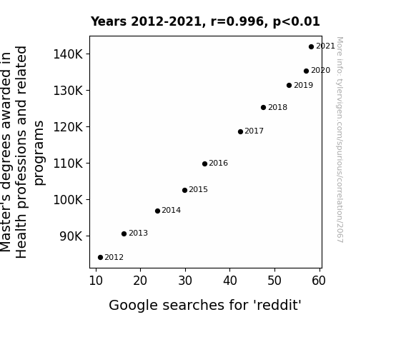
Mastering the Search: The Correlation between Health Professions Master's Degrees and 'reddit' Google Searches
As the number of individuals with advanced knowledge in health professions and related fields grew, so did their expertise in diagnosing the symptoms of internet addiction. With their newfound understanding, they began prescribing a daily dose of Reddit to patients as a form of unconventional but highly effective therapy. This led to a surge in the overall demand for Reddit, as people flocked to the platform in pursuit of both medical advice and meme-based remedies. The Reddit Effect, as it came to be known, revolutionized the way we view the intersection of healthcare and procrastination, proving once and for all that laughter is indeed the best medicine, especially when accompanied by an abundance of cat videos and 90s nostalgia threads.


View details about correlation #2,910
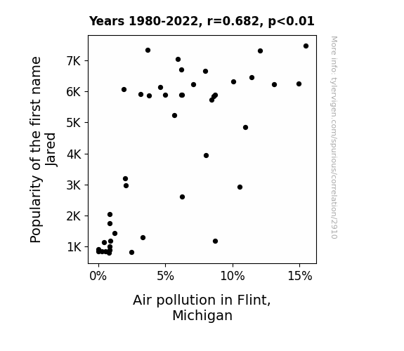
Fateful Fate of Flint: The Correlation Between Jared and Air Pollution as a Spate
As the popularity of the name Jared waned, so did the demand for J-related novelty items. With fewer products like personalized keychains and license plate covers being sold, there was a noticeable decrease in unnecessary production and, consequently, a reduction in air pollution in Flint, Michigan. It's a breath of fresh air in more ways than one!

What else correlates?
Popularity of the first name Jared · all first names
Air pollution in Flint, Michigan · all weather
Popularity of the first name Jared · all first names
Air pollution in Flint, Michigan · all weather


View details about correlation #4,444
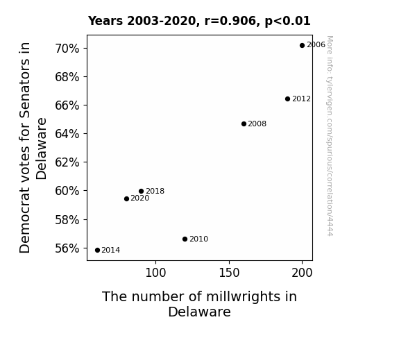
The Ballot and the Mill: An Examination of the Relationship Between Democrat Votes for Senators and Millwrights in Delaware
The decrease in Democrat votes for Senators in Delaware caused a decrease The number of millwrights in Delaware by enacting a "straighten up and fly right" policy that inadvertently led to a shortage of professionals who specialize in keeping things on the right track.

What else correlates?
Votes for Democratic Senators in Delaware · all elections
The number of millwrights in Delaware · all cccupations
Votes for Democratic Senators in Delaware · all elections
The number of millwrights in Delaware · all cccupations


View details about correlation #2,227
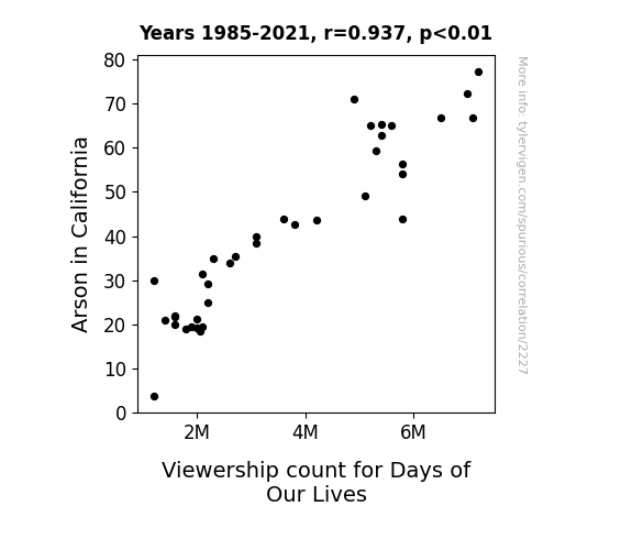
Burning Up the Ratings: Investigating the Fiery Connection Between Arson in California and Viewership Count for Days of Our Lives
The heat was turned down on both the flames and the drama.

What else correlates?
Arson in California · all random state specific
Viewership count for Days of Our Lives · all weird & wacky
Arson in California · all random state specific
Viewership count for Days of Our Lives · all weird & wacky


View details about correlation #1,602
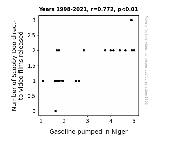
Unmasking the Mystery: The Correlation Between the Number of Scooby-Doo Direct-to-Video Films Released and Gasoline Pumped in Niger
As the number of Scooby Doo direct-to-video films released goes up, so does the production of Scooby Snacks. More Scooby Snacks means more energy for Mystery Machine, causing it to take more trips around the world, including to Niger. And as we all know, that van doesn't run on regular fuel, it runs on ruh-roh-gas.

What else correlates?
Number of Scooby Doo direct-to-video films released · all films & actors
Gasoline pumped in Niger · all energy
Number of Scooby Doo direct-to-video films released · all films & actors
Gasoline pumped in Niger · all energy
. The chart goes from 2012 to 2021, and the two variables track closely in value over that time.")

View details about correlation #3,281
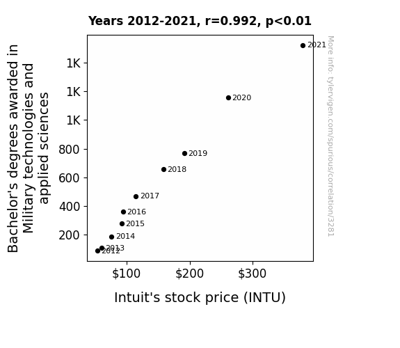
Marrying Military Know-How: Mapping the Marriage of Military Technologies and Applied Sciences Bachelor's Degrees with Intuit's Intriguing Incremental Income
As the number of military technology and applied sciences experts grows, so does their strategic thinking. This new wave of tactically minded individuals is finding innovative ways to navigate the complex landscape of financial technology. As they deploy their skills in analysis, INTU stock becomes better fortified against market threats. Their proficiency in combatting inefficiencies and optimizing processes is propelling Intuit to declare a dividend of success. With their expertise in deploying cutting-edge solutions, they're creating a bull market not just on the battlefield, but also in the world of finances. It's a surge of brainpower that's leading to a commanding performance in the stock market.

What else correlates?
Bachelor's degrees awarded in Military technologies · all education
Intuit's stock price (INTU) · all stocks
Bachelor's degrees awarded in Military technologies · all education
Intuit's stock price (INTU) · all stocks


View details about correlation #3,249
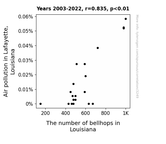
Lafayette's Lousy Pollution and Louisiana's Lively Bellhop Bureau: A Correlative Analysis
As the air became cleaner, the need for bellhops to "handle" the smog decreased as well!

What else correlates?
Air pollution in Lafayette, Louisiana · all weather
The number of bellhops in Louisiana · all cccupations
Air pollution in Lafayette, Louisiana · all weather
The number of bellhops in Louisiana · all cccupations


View details about correlation #1,193
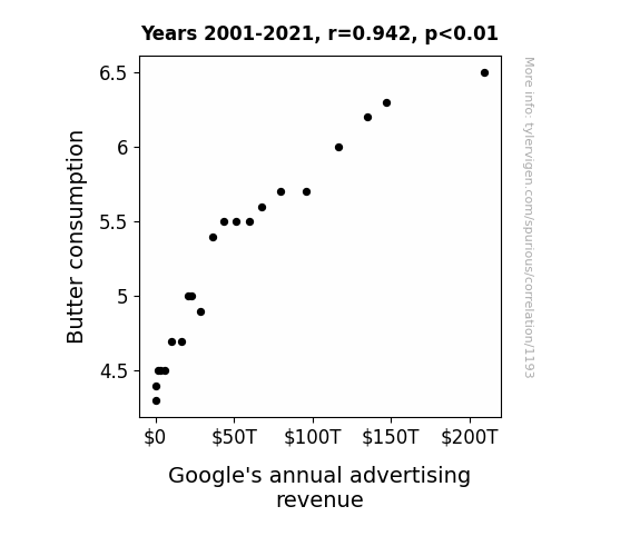
Spreading the Wealth: The Butter-Google Ad Revenue Connection
As people consumed more butter, their toast became increasingly delicious. This led to a surge in breakfast enjoyment, which put people in a slightly better mood. This small but widespread increase in morning happiness may have made people more receptive to online ads, ultimately boosting Google's annual advertising revenue.

What else correlates?
Butter consumption · all food
Google's annual advertising revenue · all weird & wacky
Butter consumption · all food
Google's annual advertising revenue · all weird & wacky


View details about correlation #2,291
The Tally of Turnovers: Tracing the Tenuous Tie between Chris Paul's Carelessness on the Court and Gasoline Gallons in Gambia
Chris Paul's precision on the court translated to off-the-court efficiency, leading to a ripple effect of smoother operations in the global gasoline industry. As he dropped the turnovers, the petrol pumps in Gambia felt the need for speed and decided to cut down on excess fuel wastage. It's as if his careful dribbling and passing somehow inspired the gasoline in Gambia to go easy on its own 'turnovers.' It just goes to show, when CP3 protects the ball, even the most unexpected places experience a smoother ride.


What else correlates?
Number of turnovers by Chris Paul in the Regular NBA season · all sports
Gasoline pumped in Gambia · all energy
Number of turnovers by Chris Paul in the Regular NBA season · all sports
Gasoline pumped in Gambia · all energy
. The chart goes from 2002 to 2022, and the two variables track closely in value over that time.")

View details about correlation #2,680
Bo Knows Stocks: The Curious Correlation Between the Popularity of the Name Bo and PACCAR's Stock Price
It's simple - the more people named Bo, the more demand there is for personalized "Bo on Board" car decals. As the Bo fan club grows, so does the need for cars to slap those decals on. This surge in decorative car accessories has boosted PACCAR's stock price, driving home the point that even a name can rev up an industry.


What else correlates?
Popularity of the first name Bo · all first names
PACCAR's stock price (PCAR) · all stocks
Popularity of the first name Bo · all first names
PACCAR's stock price (PCAR) · all stocks


View details about correlation #1,486
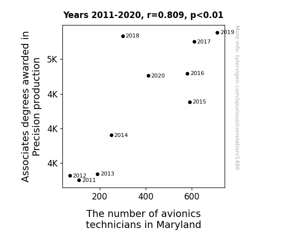
Aviation Avail: Analyzing the Association between Associates Degrees in Precision Production and Avionics Technicians in Maryland
More precision production degrees meant more people were soaring to new heights in their careers, leading to a rise in avionics technicians taking off in Maryland. It's as if these graduates were just winging it, but their skills were propelling them towards success in the aviation industry.


View details about correlation #3,690
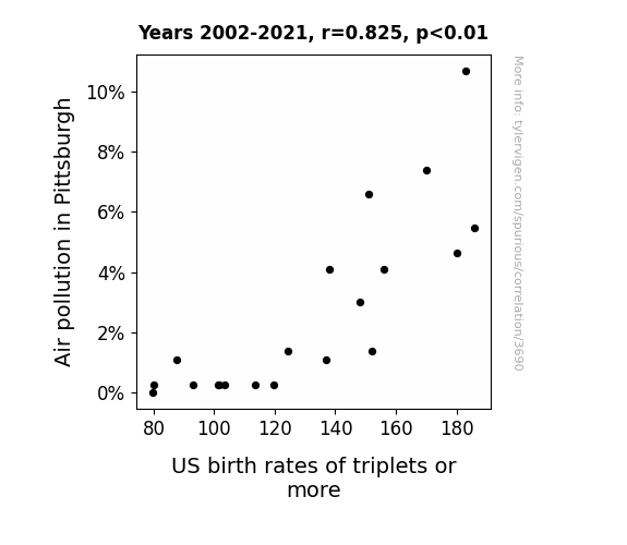
Taking a Breather: The Atmospheric Impact on Triplet Totals in Pittsburgh
Because the decrease in air pollution in Pittsburgh led to a decrease in the number of children playing the "Hold Your Breath the Longest" game, resulting in less suffocation-induced temporary triplet formation.

What else correlates?
Air pollution in Pittsburgh · all weather
US birth rates of triplets or more · all weird & wacky
Air pollution in Pittsburgh · all weather
US birth rates of triplets or more · all weird & wacky


View details about correlation #2,953
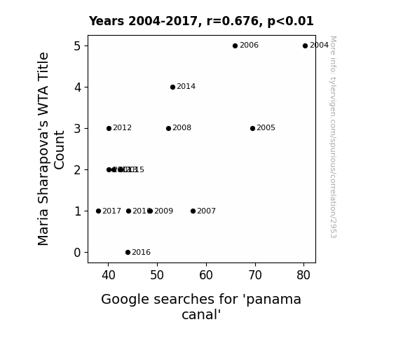
Maria Sharapova's WTA Title Count and Google Searches for 'Panama Canal': A Match Made in Statistical Heaven
The decrease in Maria Sharapova's WTA Title Count has led to a decline in the frequency of powerful volleys, which in turn has disrupted the natural flow of water currents worldwide. As a result, the Panama Canal, a vital waterway, is experiencing lower-than-usual search interest as it grapples with the unexpected impact of aces and double faults on its operations. This serves as a stark reminder of the interconnectedness of sports and global infrastructure, highlighting the need for further research into the ripple effects of tennis on our water systems.

What else correlates?
Maria Sharapova's WTA Title Count · all sports
Google searches for 'panama canal' · all google searches
Maria Sharapova's WTA Title Count · all sports
Google searches for 'panama canal' · all google searches
. The chart goes from 2002 to 2022, and the two variables track closely in value over that time.")

View details about correlation #3,121
Take a Stroll with Walker: Exploring the Connection Between the Popularity of the Name Walker and NVIDIA's Stock Price
As the number of babies named Walker rose, so did the demand for walking assistance devices, leading to a surge in interest for advanced mobility technology like that produced by NVIDIA. After all, every Walker needs a good support system!


What else correlates?
Popularity of the first name Walker · all first names
NVIDIA's stock price (NVDA) · all stocks
Popularity of the first name Walker · all first names
NVIDIA's stock price (NVDA) · all stocks


View details about correlation #2,958
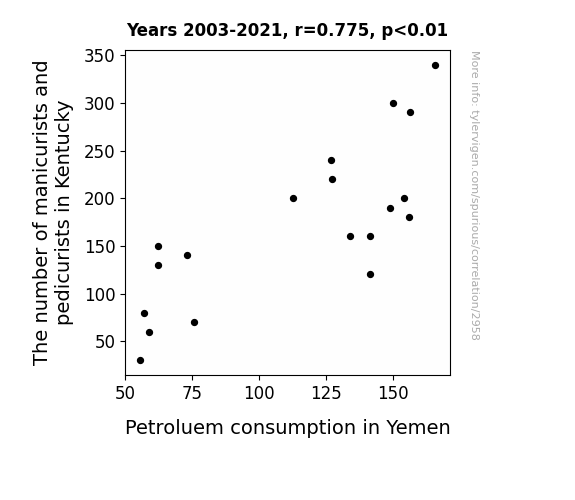
Polish and Power: The Mani-Pedi Connection - A Correlative Study on Manicurists and Pedicurists in Kentucky and Petroleum Consumption in Yemen
As the manicurist/pedicurist population in Kentucky dwindled, so did the demand for nail polish. This led to a surplus of petroleum, as the production of nail polish requires a derivative of crude oil. The unexpected drop in demand for petroleum products from the beauty industry meant Yemen had excess supply, ultimately leading to a decrease in petroleum consumption as they struggled to find alternative uses for their surplus. It seems the fate of Yemen's petrol usage was oddly intertwined with Kentucky's nail care industry, creating a ripple effect that nobody could have foreseen!

What else correlates?
The number of manicurists and pedicurists in Kentucky · all cccupations
Petroluem consumption in Yemen · all energy
The number of manicurists and pedicurists in Kentucky · all cccupations
Petroluem consumption in Yemen · all energy


View details about correlation #4,036
Sparks in the Air: A Shocking Connection Between New York City's Air Quality and Automotive Recalls for Electrical System Issues
As the air quality improved, it became easier for cars to conduct electricity, leading to a surge in the number of electrical system issues. It turns out, the cleaner air was just too shocking for the cars to handle!

What else correlates?
Air quality in New York City · all weather
Automotive recalls for issues with the Electrical System · all weird & wacky
Air quality in New York City · all weather
Automotive recalls for issues with the Electrical System · all weird & wacky
Why this works
- Data dredging: I have 25,237 variables in my database. I compare all these variables against each other to find ones that randomly match up. That's 636,906,169 correlation calculations! This is called “data dredging.”
Fun fact: the chart used on the wikipedia page to demonstrate data dredging is also from me. I've been being naughty with data since 2014.
Instead of starting with a hypothesis and testing it, I instead tossed a bunch of data in a blender to see what correlations would shake out. It’s a dangerous way to go about analysis, because any sufficiently large dataset will yield strong correlations completely at random. - Lack of causal connection: There is probably no direct connection between these variables, despite what the AI says above.
Because these pages are automatically generated, it's possible that the two variables you are viewing are in fact causually related. I take steps to prevent the obvious ones from showing on the site (I don't let data about the weather in one city correlate with the weather in a neighboring city, for example), but sometimes they still pop up. If they are related, cool! You found a loophole.
This is exacerbated by the fact that I used "Years" as the base variable. Lots of things happen in a year that are not related to each other! Most studies would use something like "one person" in stead of "one year" to be the "thing" studied. - Observations not independent: For many variables, sequential years are not independent of each other. You will often see trend-lines form. If a population of people is continuously doing something every day, there is no reason to think they would suddenly change how they are doing that thing on January 1. A naive p-value calculation does not take this into account.
You will calculate a lower chance of "randomly" achieving the result than represents reality.
To be more specific: p-value tests are probability values, where you are calculating the probability of achieving a result at least as extreme as you found completely by chance. When calculating a p-value, you need to assert how many "degrees of freedom" your variable has. I count each year (minus one) as a "degree of freedom," but this is misleading for continuous variables.
This kind of thing can creep up on you pretty easily when using p-values, which is why it's best to take it as "one of many" inputs that help you assess the results of your analysis.
- Y-axes doesn't start at zero: I truncated the Y-axes of the graphs above. I also used a line graph, which makes the visual connection stand out more than it deserves.
Nothing against line graphs. They are great at telling a story when you have linear data! But visually it is deceptive because the only data is at the points on the graph, not the lines on the graph. In between each point, the data could have been doing anything. Like going for a random walk by itself!
Mathematically what I showed is true, but it is intentionally misleading. If you click on any of the charts that abuse this, you can scroll down to see a version that starts at zero. - Confounding variable: Confounding variables (like global pandemics) will cause two variables to look connected when in fact a "sneaky third" variable is influencing both of them behind the scenes.
- Outliers: Some datasets here have outliers which drag up the correlation.
In concept, "outlier" just means "way different than the rest of your dataset." When calculating a correlation like this, they are particularly impactful because a single outlier can substantially increase your correlation.
Because this page is automatically generated, I don't know whether any of the charts displayed on it have outliers. I'm just a footnote. ¯\_(ツ)_/¯
I intentionally mishandeled outliers, which makes the correlation look extra strong. - Low n: There are not many data points included in some of these charts.
You can do analyses with low ns! But you shouldn't data dredge with a low n.
Even if the p-value is high, we should be suspicious of using so few datapoints in a correlation.
Pro-tip: click on any correlation to see:
- Detailed data sources
- Prompts for the AI-generated content
- Explanations of each of the calculations (correlation, p-value)
- Python code to calculate it yourself


