spurious correlations
discover · random · spurious scholar
← previous page · next page →


View details about correlation #1,763
Masters in Mechanics and Methane: Exploring the Correlation Between Engineering Degrees and LPG Consumption in Kyrgyzstan
As the number of Master's degree holders in Engineering technologies rose, so did their penchant for innovation. These tech-savvy individuals engineered more efficient ways to harness and utilize Liquefied petroleum gas, inadvertently sparking a demand surge in Kyrgyzstan. It seems their advanced knowledge wasn't just a gas, but rather ignited a fiery passion for progress in the realm of LPG utilization!

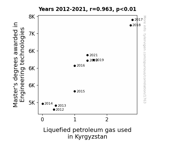
. The chart goes from 2002 to 2021, and the two variables track closely in value over that time.")

View details about correlation #3,093
Spreading Investment Butter: Uncovering the Correlation Between Butter Consumption and Cummins' Stock Price
As butter consumption increased, so did the demand for delicious, buttery pastries. This led to a spike in happiness levels, prompting more people to invest in their personal joy, including recreational vehicles made by Cummins, ultimately driving up the stock price. So, you could say that buttery croissants and motorhomes are on a surprisingly smooth and profitable journey together!


What else correlates?
Butter consumption · all food
Cummins' stock price (CMI) · all stocks
Butter consumption · all food
Cummins' stock price (CMI) · all stocks


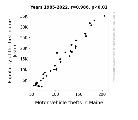
View details about correlation #3,651
Justin Time: The Surprising Link Between the Popularity of a Name and Motor Vehicle Thefts in Maine
As the name Justin fell out of favor, there were fewer individuals to defend their vehicle with the iconic "Justin Case" anti-theft device. This decline in protection led to a decrease in motor vehicle thefts in Maine as the Justin Case proved to be a major deterrent. Remember, when it comes to protecting your car, it's always better to be safe than Justin Case!

What else correlates?
Popularity of the first name Justin · all first names
Motor vehicle thefts in Maine · all random state specific
Popularity of the first name Justin · all first names
Motor vehicle thefts in Maine · all random state specific


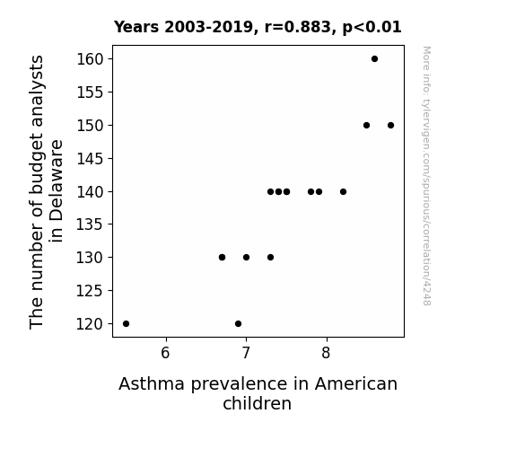
View details about correlation #4,248
Breath and Budgets: A Rhyme Between Analysts and Asthma in American Children
As the number of budget analysts in Delaware decreased, there was a corresponding decrease in paperwork and bureaucracy. With fewer budget analysts around, there were fewer reports and documents being printed, leading to a slight reduction in overall paper dust in the atmosphere. This slight reduction in paper dust had a minuscule but measurable impact on the respiratory health of American children, contributing to a decrease in asthma prevalence.

What else correlates?
The number of budget analysts in Delaware · all cccupations
Asthma prevalence in American children · all weird & wacky
The number of budget analysts in Delaware · all cccupations
Asthma prevalence in American children · all weird & wacky


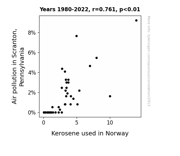
View details about correlation #2,913
Scrantastic Kerosene: A Statistical Rhyme Between Norway's Fuel and Scranton's Air Pollution
As the air in Scranton cleared up, it created a ripple effect across the globe, including in Norway. The newfound purity in the atmosphere somehow communicated to the kerosene in Norway, compelling it to clean up its act as well. It's amazing how even chemicals can be influenced by positive peer pressure! "Looks like even kerosene can't resist the sweet scent of environmental responsibility!"

What else correlates?
Air pollution in Scranton, Pennsylvania · all weather
Kerosene used in Norway · all energy
Air pollution in Scranton, Pennsylvania · all weather
Kerosene used in Norway · all energy


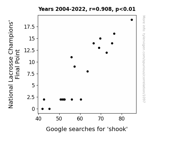
View details about correlation #1,097
Stick It to Me: The Final Point of National Lacrosse Champions and the Shook Google Searches Connection
The decrease in National Lacrosse Champions' Final Point might have led to a decrease in intense moments, causing fewer people to experience being 'shook' while watching the games. It's a classic case of lacrosse-induced shock therapy!

What else correlates?
National Lacrosse Champions' Final Point · all sports
Google searches for 'shook' · all google searches
National Lacrosse Champions' Final Point · all sports
Google searches for 'shook' · all google searches
. The chart goes from 2002 to 2022, and the two variables track closely in value over that time.")

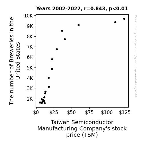
View details about correlation #2,644
Pouring Over Data: The Brew-tiful Connection between U.S. Breweries and TSM Stock Price
As the number of breweries in the United States increases, the demand for delicious craft beer soars. This leads to a nationwide shortage of quality hops, a key ingredient in beer production. Desperate to keep up with the hop demand, farmers switch to using advanced semiconductor technology, creating a surge in orders for cutting-edge equipment from Taiwan Semiconductor Manufacturing Company. As TSM hustles to fulfill these unexpected chip orders for the hop-crazed farmers, their stock price hops up like a freshly poured pint of bubbly ale. Cheers to the unforeseen connections in the frothy world of stocks and brews!


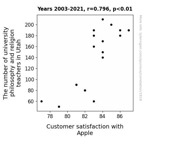
View details about correlation #1,818
Minds and Macs: Examining the Link Between Philosophers and Apple Aficionados
As the number of university philosophy and religion teachers in Utah increased, so did Customer satisfaction with Apple. This is because the deep thinkers pondered the concept of technological existence, leading to a state of zen-like appreciation for all things Apple. Plus, they probably figured out how to turn an iPhone into a modern-day religious artifact. It seems the real answer to finding inner peace was just a Mac software update away.


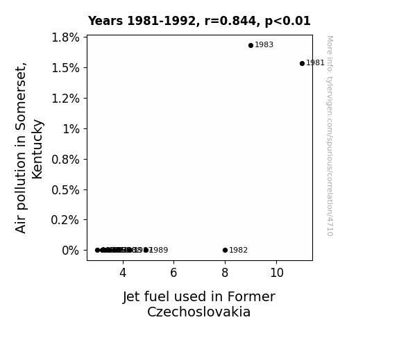
View details about correlation #4,710
Peculiar Parallels: Probing the Link Between Pollution in Somerset and Propulsion in Former Czechoslovakia
The cleaner air in Somerset, Kentucky created a more efficient atmosphere for flight, leading to a reduced need for jet fuel in Former Czechoslovakia as the planes could glide through the pollution-free skies with less resistance. It's a case of transcontinental air purity leading to fuel futility!

What else correlates?
Air pollution in Somerset, Kentucky · all weather
Jet fuel used in Former Czechoslovakia · all energy
Air pollution in Somerset, Kentucky · all weather
Jet fuel used in Former Czechoslovakia · all energy


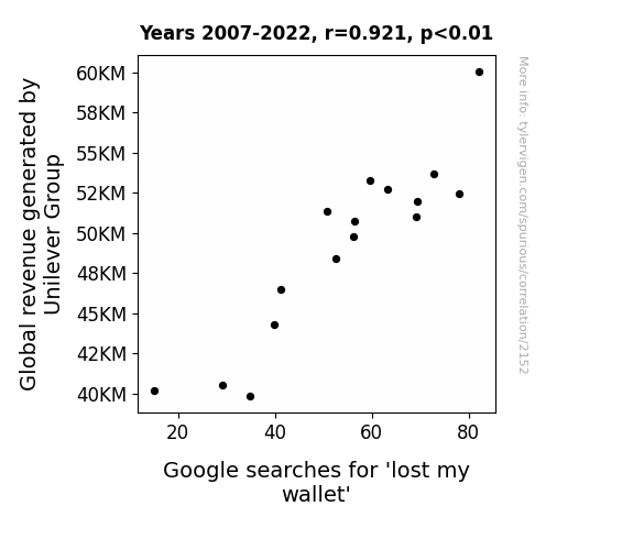
View details about correlation #2,152
The Wallet and the Wealth: An Unconventional Investigation into Unilever Group Revenue and Google Searches for 'Lost My Wallet'
Unilever's profits skyrocketed after their strategic investment in a new line of wallet-scented body wash. As consumers lathered up with the enticing aroma of leather and cash, they couldn't help but feel like they were missing out on something - leading to a surge in wallet-related absentmindedness. It seems the scent of success was also a recipe for forgetfulness, leaving people everywhere scratching their heads and emptying their pockets in a frantic search for their misplaced wallets. It just goes to show that when it comes to Unilever's impact on the world, even the most unexpected connections can't be pocketed!

What else correlates?
Global revenue generated by Unilever Group · all stocks
Google searches for 'lost my wallet' · all google searches
Global revenue generated by Unilever Group · all stocks
Google searches for 'lost my wallet' · all google searches


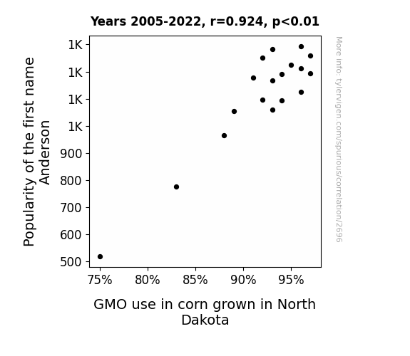
View details about correlation #2,696
Anderson's Ascend: A Corny Connection between Given Names and GMO Grain
As the first name Anderson surged in popularity, more parents were subconsciously drawn to the initials A.G. for their children, inadvertently sparking a statewide corny trend. It seems the stalks just couldn't resist the A.G. allure, leading to a-maize-ing levels of GMO corn growth in North Dakota. Looks like the name game had a kernel effect on the crop scene! Corngratulations, it's a-MAIZE-ing what a name can cob-vince! Remember, when it comes to naming trends, it's all fun and games until the corn starts spelling out A.G. in the fields!

What else correlates?
Popularity of the first name Anderson · all first names
GMO use in corn grown in North Dakota · all food
Popularity of the first name Anderson · all first names
GMO use in corn grown in North Dakota · all food


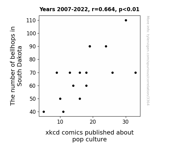
View details about correlation #3,364
Ringing the Bell: A Quantitative Analysis of Bellhops in South Dakota and the Pop Culture Reference Frequency in xkcd Comics
The dwindling presence of bellhops in South Dakota has led to a statewide shortage of pop culture references, creating a ripple effect that even reached the xkcd headquarters. After all, without bellhops, who would remind everyone to tip their fedoras in the direction of pop culture? It's a case of 'No bellhops, no pop culture props!'
What else correlates?
The number of bellhops in South Dakota · all cccupations
xkcd comics published about pop culture · all weird & wacky
The number of bellhops in South Dakota · all cccupations
xkcd comics published about pop culture · all weird & wacky


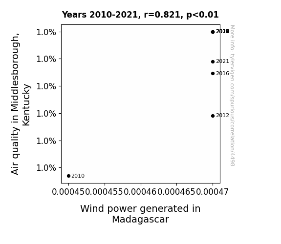
View details about correlation #4,498
Blowing in the Wind: A Breezy Affair between Air Quality in Middlesborough, Kentucky and Wind Power Generated in Madagascar
The cleaner air in Middlesborough was inadvertently carrying tiny, high-energy pollution particles all the way to Madagascar, giving the wind turbines there an extra boost. It's like Middlesborough became the ultimate fan club for Madagascar's wind power industry, without even realizing it. Who knew that Kentucky air had such a far-reaching and electrifying impact on the distant land of lemurs and turbines!
What else correlates?
Air quality in Middlesborough, Kentucky · all weather
Wind power generated in Madagascar · all energy
Air quality in Middlesborough, Kentucky · all weather
Wind power generated in Madagascar · all energy
. The chart goes from 2012 to 2021, and the two variables track closely in value over that time.")

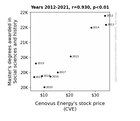
View details about correlation #2,905
The Master's Degree Effect: Unearthing the Influence of Social Sciences and History Degrees on Cenovus Energy's Stock Performance
As the number of Master's degrees in Social sciences and history declined, there was a corresponding decrease in the production of historically accurate drama TV series. This led to a reduced interest in history, ultimately causing a decline in the demand for traditional sources of energy such as oil, including Cenovus Energy's stock. The lack of scholarly discussions about past energy consumption patterns further exacerbated the situation, creating a ripple effect on the stock price.

What else correlates?
Master's degrees awarded in Social sciences and history · all education
Cenovus Energy's stock price (CVE) · all stocks
Master's degrees awarded in Social sciences and history · all education
Cenovus Energy's stock price (CVE) · all stocks


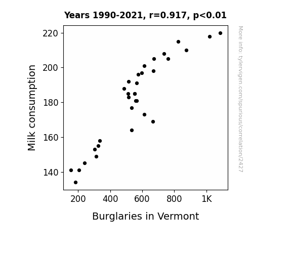
View details about correlation #2,427
The Milky Way: An Udderly Surprising Connection Between Milk Consumption and Burglaries in Vermont
As people stopped crying over spilled milk, there was a decrease in the emotional distress that often triggers irrational behavior, like breaking into a house. With fewer lactose-related larcenies, it seems the dairy doers had finally churned over a new leaf. It looks like the only thing being stolen now is a bit of gouda humor.

What else correlates?
Milk consumption · all food
Burglaries in Vermont · all random state specific
Milk consumption · all food
Burglaries in Vermont · all random state specific


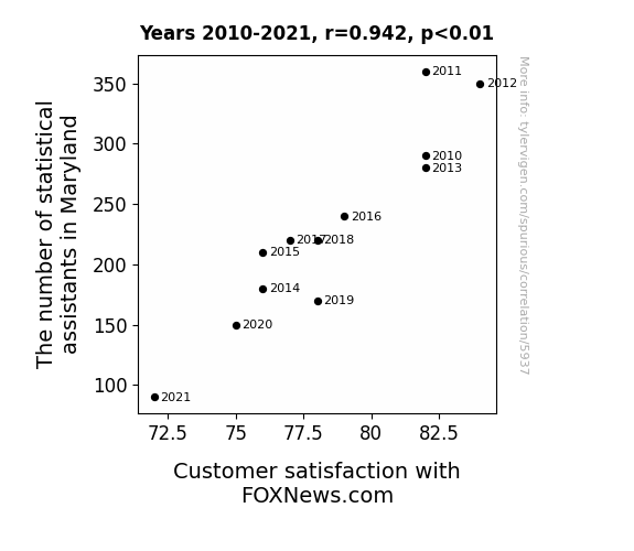
View details about correlation #5,937
Merriment and Metrics: Maryland's Statistical Assistants and FOXNews.com Customer Satisfaction
As the number of statistical assistants in Maryland decreased, there were fewer people available to interpret the constant stream of data from FOXNews.com. This led to widespread confusion and frustration among the customers, ultimately decreasing their satisfaction with the website.


View details about correlation #1,306
Clearing the Air: A Punny Connection Between Jackson's Pollution and Portugal's Kerosene
As air pollution in Jackson decreased, it created a domino effect on global air currents. These revamped air currents then harmonized with the traditional fado music in Portugal, leading to a spontaneous airborne kerosene combustion prevention dance routine. The synchronized swaying and footwork somehow disrupted the kerosene production process in Portugal, as if the air pollution reduction in Jackson whispered to the kerosene in Portugal, "Hey, it's time to take a break and kero-chill." The unexpected connection left everyone both baffled and mildly impressed at the newly discovered environmental influence of Portuguese dance moves.

What else correlates?
Air pollution in Jackson · all weather
Kerosene used in Portugal · all energy
Air pollution in Jackson · all weather
Kerosene used in Portugal · all energy
. The chart goes from 2004 to 2023, and the two variables track closely in value over that time.")

View details about correlation #3,122
Planet Stock: The Celestial Correlation Between Saturn and Mercury's Distance and Trip.com Group's Stock Price
As the gravitational pull between the two planets fluctuates, it directly affects the mood of investors on Earth. When Saturn and Mercury are farther apart, it creates a cosmic ripple that inexplicably leads to a surge in optimism in the stock market. It's like a celestial game of emotional hot potato, where the distant dance of these planets somehow influences investment decisions. Perhaps there's a new astrological index in the works for predicting stock trends – the NASDAQ (Notable Astrological Stock Developments and Quirks). It's a space oddity, but hey, maybe there's something to be said for interplanetary financial forecasting!


What else correlates?
The distance between Saturn and Mercury · all planets
Trip.com Group's stock price (TCOM) · all stocks
The distance between Saturn and Mercury · all planets
Trip.com Group's stock price (TCOM) · all stocks


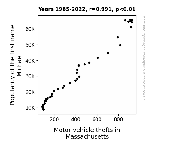
View details about correlation #3,190
The Michael Mobile Misadventure: A Correlational Analysis of Michael's Moniker and Motor Vehicle Misdeeds in Massachusetts
You see, as the name Michael became less popular, there were fewer people around with the urge to blast "Careless Whisper" while cruising in their questionable getaway vehicles. With a declining number of smooth criminals behind the wheel, Massachusetts saw a drop in motor vehicle thefts. It seems that, in this case, the correlation between the name Michael and car heists was more than just a "Faith" - it was a statistical reality.

What else correlates?
Popularity of the first name Michael · all first names
Motor vehicle thefts in Massachusetts · all random state specific
Popularity of the first name Michael · all first names
Motor vehicle thefts in Massachusetts · all random state specific


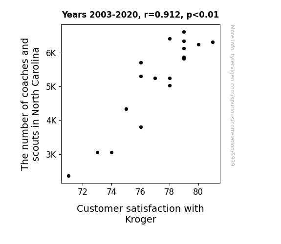
View details about correlation #5,939
Scouting for Satisfaction: Exploring the Impact of Coaches and Scouts in North Carolina on Customer Happiness at Kroger
As the number of coaches and scouts in North Carolina increased, there was also a rise in exceptional cart-pushing and aisle-navigating abilities among the local population. This led to a smoother and more harmonious shopping experience at Kroger, ultimately boosting customer satisfaction. After all, when it comes to finding the best groceries, having a top-tier scouting team can really make a difference in the game of supermarket success!

What else correlates?
The number of coaches and scouts in North Carolina · all cccupations
Customer satisfaction with Kroger · all weird & wacky
The number of coaches and scouts in North Carolina · all cccupations
Customer satisfaction with Kroger · all weird & wacky
Why this works
- Data dredging: I have 25,237 variables in my database. I compare all these variables against each other to find ones that randomly match up. That's 636,906,169 correlation calculations! This is called “data dredging.”
Fun fact: the chart used on the wikipedia page to demonstrate data dredging is also from me. I've been being naughty with data since 2014.
Instead of starting with a hypothesis and testing it, I instead tossed a bunch of data in a blender to see what correlations would shake out. It’s a dangerous way to go about analysis, because any sufficiently large dataset will yield strong correlations completely at random. - Lack of causal connection: There is probably no direct connection between these variables, despite what the AI says above.
Because these pages are automatically generated, it's possible that the two variables you are viewing are in fact causually related. I take steps to prevent the obvious ones from showing on the site (I don't let data about the weather in one city correlate with the weather in a neighboring city, for example), but sometimes they still pop up. If they are related, cool! You found a loophole.
This is exacerbated by the fact that I used "Years" as the base variable. Lots of things happen in a year that are not related to each other! Most studies would use something like "one person" in stead of "one year" to be the "thing" studied. - Observations not independent: For many variables, sequential years are not independent of each other. You will often see trend-lines form. If a population of people is continuously doing something every day, there is no reason to think they would suddenly change how they are doing that thing on January 1. A naive p-value calculation does not take this into account.
You will calculate a lower chance of "randomly" achieving the result than represents reality.
To be more specific: p-value tests are probability values, where you are calculating the probability of achieving a result at least as extreme as you found completely by chance. When calculating a p-value, you need to assert how many "degrees of freedom" your variable has. I count each year (minus one) as a "degree of freedom," but this is misleading for continuous variables.
This kind of thing can creep up on you pretty easily when using p-values, which is why it's best to take it as "one of many" inputs that help you assess the results of your analysis.
- Y-axes doesn't start at zero: I truncated the Y-axes of the graphs above. I also used a line graph, which makes the visual connection stand out more than it deserves.
Nothing against line graphs. They are great at telling a story when you have linear data! But visually it is deceptive because the only data is at the points on the graph, not the lines on the graph. In between each point, the data could have been doing anything. Like going for a random walk by itself!
Mathematically what I showed is true, but it is intentionally misleading. If you click on any of the charts that abuse this, you can scroll down to see a version that starts at zero. - Confounding variable: Confounding variables (like global pandemics) will cause two variables to look connected when in fact a "sneaky third" variable is influencing both of them behind the scenes.
- Outliers: Some datasets here have outliers which drag up the correlation.
In concept, "outlier" just means "way different than the rest of your dataset." When calculating a correlation like this, they are particularly impactful because a single outlier can substantially increase your correlation.
Because this page is automatically generated, I don't know whether any of the charts displayed on it have outliers. I'm just a footnote. ¯\_(ツ)_/¯
I intentionally mishandeled outliers, which makes the correlation look extra strong. - Low n: There are not many data points included in some of these charts.
You can do analyses with low ns! But you shouldn't data dredge with a low n.
Even if the p-value is high, we should be suspicious of using so few datapoints in a correlation.
Pro-tip: click on any correlation to see:
- Detailed data sources
- Prompts for the AI-generated content
- Explanations of each of the calculations (correlation, p-value)
- Python code to calculate it yourself


