spurious correlations
discover · random · spurious scholar
← previous page · next page →


View details about correlation #5,935
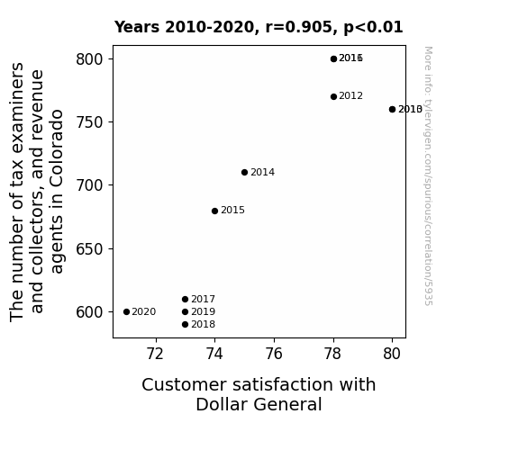
Tango of Tax Examiners and Collectors, and Revenue Agents in Colorado: Ties to Customer Contentment with Dollar General
The shortage of tax professionals led to a surplus of loose change in Colorado, prompting customers to realize they were being shortchanged at Dollar General.


View details about correlation #1,668
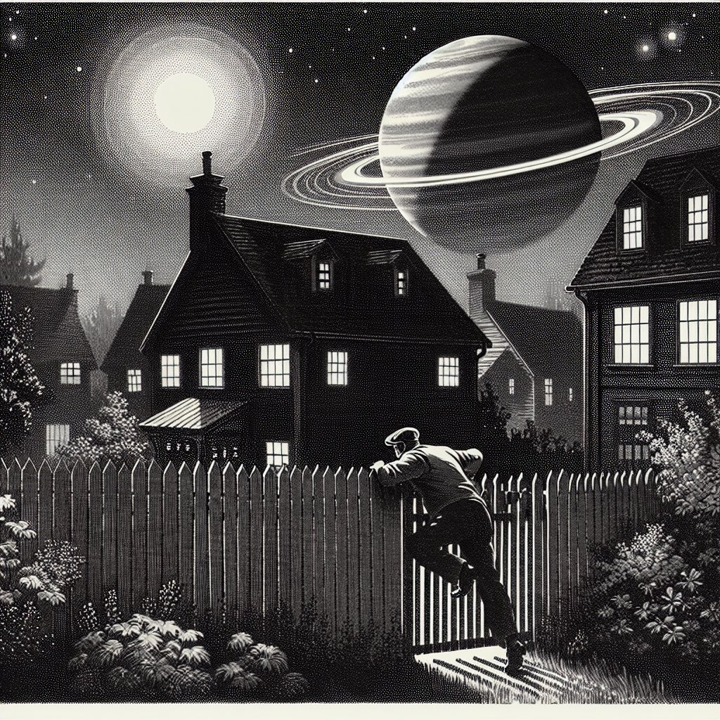
Out of This World: Exploring the Celestial Influence on Burglaries in New Jersey
As Neptune gets closer, its gravitational pull messes with thieves' getaway cars, leaving them stranded on the Turnpike. Remember, when the planets align, even the burglars stay in line!

What else correlates?
The distance between Neptune and Earth · all planets
Burglaries in New Jersey · all random state specific
The distance between Neptune and Earth · all planets
Burglaries in New Jersey · all random state specific


View details about correlation #3,669
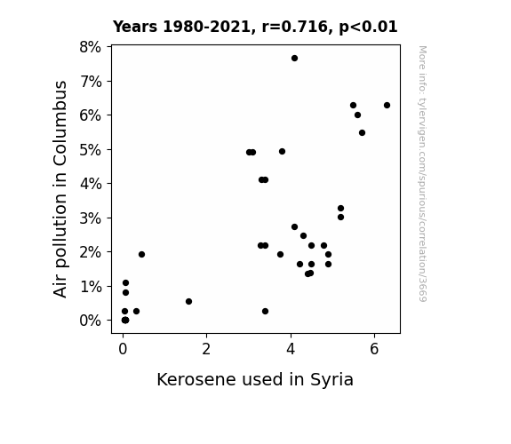
Blowing Smoke: Exploring the Link Between Air Pollution in Columbus and Kerosene Combustion in Syria
As air pollution in Columbus decreased, it led to a rise in eco-friendly initiatives. This caused a heightened interest in alternative energy sources globally. People in Syria, inspired by the green movement, switched to cleaner fuel options, including solar power and wind energy. This shift away from traditional kerosene use not only reduced air pollution in Syria, but also sparked a peaceful 'renewable energy' revolution in the region. This goes to show that when it comes to clean air and global impact, the winds of change can truly make a world of difference!

What else correlates?
Air pollution in Columbus · all weather
Kerosene used in Syria · all energy
Air pollution in Columbus · all weather
Kerosene used in Syria · all energy
. The chart goes from 2012 to 2021, and the two variables track closely in value over that time.")

View details about correlation #2,182
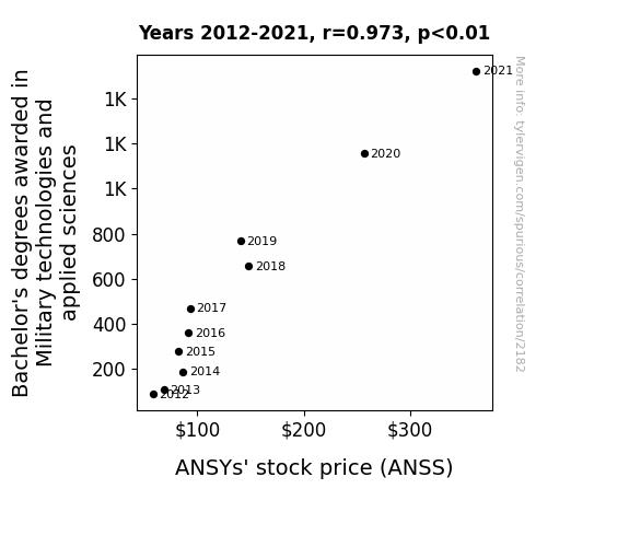
Brace for Impact: Exploring the Impact of Bachelor's Degrees in Military Technologies and Applied Sciences on ANSYS' Stock Price
As more students honed their military tech skills, they inadvertently programmed ANSYs' stock to rise in real life. Looks like their knowledge really armed them for success in the stock market!

What else correlates?
Bachelor's degrees awarded in Military technologies · all education
ANSYs' stock price (ANSS) · all stocks
Bachelor's degrees awarded in Military technologies · all education
ANSYs' stock price (ANSS) · all stocks


View details about correlation #1,125
Tech Support Troubles and Winnebago Woes: A Correlation between Computer User Support Specialists in Minnesota and Automotive Recalls
The rise in computer user support specialists led to a surge in automated systems on the Winnebago assembly line, ultimately causing a higher incidence of malfunctioning RV parts. It turns out, the specialists weren't just supporting computers, they were inadvertently sabotaging RV production with their tech support wizardry. "The only thing cruising down the highway faster than a Winnebago is the rate of computer support specialists getting hired in Minnesota!"


View details about correlation #1,609
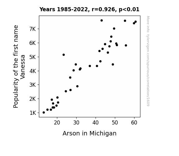
Playing with Fire: Exploring the Incendiary Relationship Between the Popularity of the Name Vanessa and Arson in Michigan
As the name Vanessa fell out of favor, it led to a decrease in the number of wannabe pyromaniacs in Michigan. Without their fiery leader, the arson trend just couldn't keep burning in the Great Lakes State. It seems that the spark for starting fires was directly linked to the popularity of this particular name!

What else correlates?
Popularity of the first name Vanessa · all first names
Arson in Michigan · all random state specific
Popularity of the first name Vanessa · all first names
Arson in Michigan · all random state specific


View details about correlation #1,752
Butter Power: Unveiling the Margarine of Geothermal Energy
As butter consumption increased, people's manner of spreading it on toast created more friction. This led to a rise in toast-dropping incidents across Germany. The increased buttered-toast-dropping created a demand for new, innovative ways to harness this buttery energy. As a result, German engineers developed geothermal power technology that could be activated by the impact of falling toast, effectively turning buttered toast into a renewable energy source. Who knew that the path to a greener future was spread with butter?


What else correlates?
Butter consumption · all food
Geothermal power generated in Germany · all energy
Butter consumption · all food
Geothermal power generated in Germany · all energy


View details about correlation #2,706
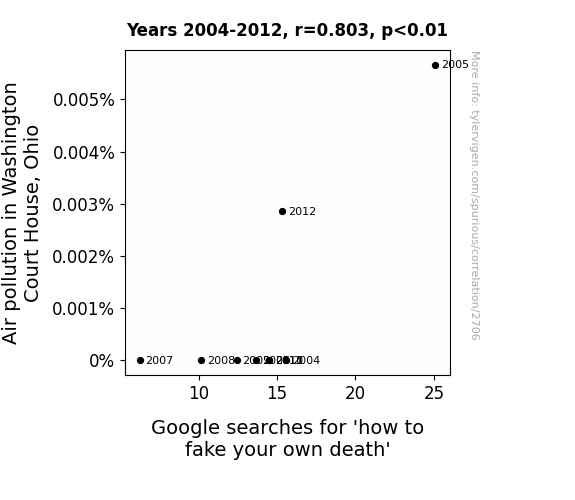
Pollution Puzzles and Pseudocide: An Analysis of Air Quality and Interest in Faking Death in Washington Court House, Ohio
The smog became so thick that it created the perfect cover for staging a dramatic car explosion and disappearance, while leaving behind nothing but a charred mannequin in your burnt-out car. It's like the ultimate magic trick, but with more coughing and respiratory issues. The polluted air provided the most convenient smoke screen for executing a vanishing act and starting a new life under a new identity. It's the environmental crisis no one saw coming, except for those who Googled it and vanished into thin (polluted) air.


View details about correlation #2,095
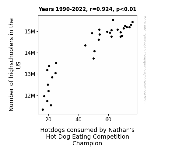
The Wiener-Take-All: Exploring the Correlation Between Highschoolers in the US and Nathan's Hot Dog Eating Competition
As the number of highschoolers in the US increases, so does the competitive spirit. This has a ripple effect on the Nathan's Hot Dog Eating Competition champion. The youth's exuberance and hunger for success somehow translate to a surge in hotdog consumption by the reigning champion. It's a classic case of students raising the (mustard) bar, leading to a wiener-takes-all situation in the world of competitive eating. After all, when it comes to consuming hotdogs at an alarming rate, it seems that the more highschoolers there are, the greater the bun-believable achievements in the sport!


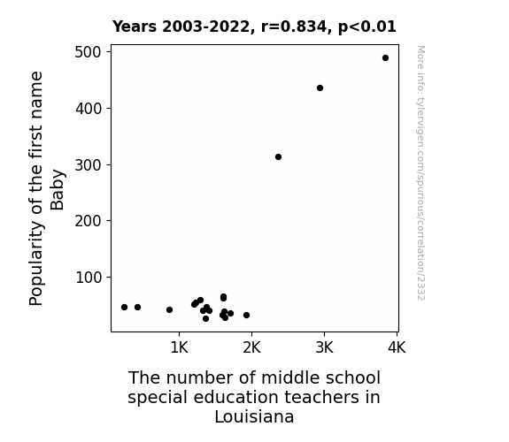
View details about correlation #2,332
The Surname Syndrome: A Statistical Analysis of Baby Names and Special Education Staffing in Louisiana Middle Schools
As the name Baby fell out of favor, fewer parents were inspired to name their children after an infant, leading to a decline in baby-related teacher positions. This created a baby-teacher trickle-down effect, ultimately reducing the need for middle school special education teachers in Louisiana. It's a classic case of baby name trends having unforeseen impacts on the education system - talk about a lesson in etymology!


View details about correlation #1,456
From Soybeans to Nukes: Exploring the Genetically Modified Connection
As GMO use in soybeans in Missouri increased, the excess plant growth led to a surge in biomass. This, in turn, triggered a chain reaction in Czechia, where some ingenious scientists created a new form of bio-nuclear power using soybean biomass as a renewable, eco-friendly fuel source. After all, who wouldn't want their power plant to be fueled by the incredible hulk of soybeans?
What else correlates?
GMO use in soybeans in Missouri · all food
Nuclear power generation in Czechia · all energy
GMO use in soybeans in Missouri · all food
Nuclear power generation in Czechia · all energy


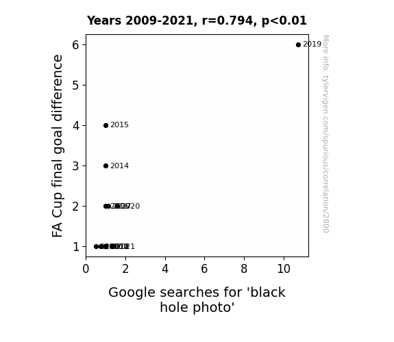
View details about correlation #2,800
Kicking Off the Event Horizon: Exploring the Goalpost Connection Between FA Cup Final Goal Difference and Google Searches for 'Black Hole Photo'
As FA Cup final goal differences increased, more people were drawn to the incredible displays of skill and precision in soccer, prompting a surge in interest in science and technology. This led to a higher demand for information about black holes, ultimately driving up the searches for 'black hole photo' on Google. After all, who knew that the key to unlocking the mysteries of the universe was hidden in the nail-biting moments of a football match? It's a goal-eactic connection!

What else correlates?
FA Cup final goal difference · all sports
Google searches for 'black hole photo' · all google searches
FA Cup final goal difference · all sports
Google searches for 'black hole photo' · all google searches


View details about correlation #1,157
Taxes, Suspension, and Bumps in the Road: A Correlational Odyssey
The government needed to raise more money, so they secretly installed tiny tax collectors on each car's suspension, causing a sudden spike in recalls due to the added weight and frequent ticketing of other vehicle parts for non-compliance.

What else correlates?
US Annual Tax Revenue · all weird & wacky
Automotive recalls for issues with Suspension · all weird & wacky
US Annual Tax Revenue · all weird & wacky
Automotive recalls for issues with Suspension · all weird & wacky


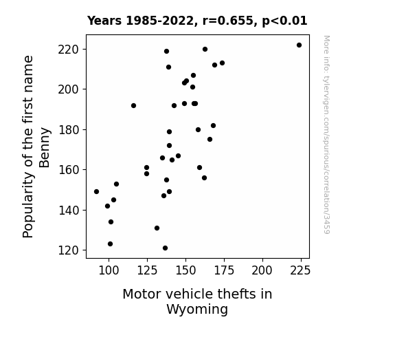
View details about correlation #3,459
Benny's Birth Name and Bungling Bandits: A Belabored Burlesque on the Balance of Bouncing Baby Names and Brazen Burglaries in the Big Wyoming Wonderland
The name Benny became so popular that every time someone in Wyoming shouted, "Benny, stop!" it inadvertently activated a swarm of remote-controlled car thieves with a peculiar affinity for the name. It got to the point where law enforcement had to issue a statewide PSA, urging parents to consider the potential consequences before naming their children after their beloved grandpas or favorite breakfast food.

What else correlates?
Popularity of the first name Benny · all first names
Motor vehicle thefts in Wyoming · all random state specific
Popularity of the first name Benny · all first names
Motor vehicle thefts in Wyoming · all random state specific


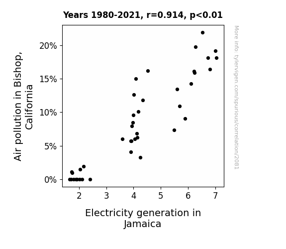
View details about correlation #2,081
Smoke Signals: The Shocking Relationship Between Air Pollution in Bishop, California and Electricity Generation in Jamaica
As air pollution in Bishop, California increased, it created a demand for air purifiers. These air purifiers were manufactured in Jamaica, leading to a surge in electricity generation to power the production process. It's shocking how Bishop's pollution sparked a positive current in Jamaica's electricity industry!

What else correlates?
Air pollution in Bishop, California · all weather
Electricity generation in Jamaica · all energy
Air pollution in Bishop, California · all weather
Electricity generation in Jamaica · all energy
. The chart goes from 2007 to 2022, and the two variables track closely in value over that time.")

View details about correlation #3,376
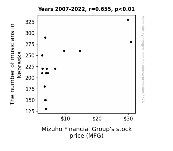
Strummin' and Succeedin': The Link Between Nebraska Musicians and Mizuho's Moolah
As the number of musicians in Nebraska grows, so does the need for financial support in the music industry. MFG stock is striking a chord with investors as they harmonize the perfect balance of financial services. It's a true case of investment symphony, where MFG is the conductor of success in an ever-growing economic orchestra. With MFG, it's all about maximizing your financial performance and hitting the high notes of prosperity. As Nebraska's musical talent flourishes, so does MFG's stock price, creating a lucrative duet of financial growth. It's a sound investment that's not to be Nebraska-n with! Remember, when it comes to MFG, the investment potential is music to your ears! So, let the music play on and watch MFG's stock price climb to the top of the charts!
What else correlates?
The number of musicians in Nebraska · all cccupations
Mizuho Financial Group's stock price (MFG) · all stocks
The number of musicians in Nebraska · all cccupations
Mizuho Financial Group's stock price (MFG) · all stocks


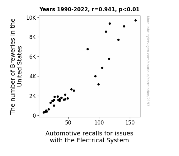
View details about correlation #2,193
Hoppy Hour and Electrical Power: The Breweries-Recalls Correlation in the United States
As the number of breweries in the United States increased, so did the demand for craft beer. This led to a surge in the production of hops, a key ingredient in beer. Now, hops are green, just like the wires used in automotive electrical systems. The unprecedented need for hops meant that more green dye was being produced to color the wires, and unfortunately, it turned out to conduct electricity even better than copper. This shocking development resulted in a higher frequency of automotive recalls for electrical system issues, as cars were essentially getting hop-wired. Remember, when it comes to beer-inspired car troubles, the situation can go from draft to defrost in no time.


View details about correlation #3,461
Blazing Jesses: The Incendiary Connection Between Name Popularity and Arson in Nevada
As the popularity of the name Jesse waned, there were fewer people belting out 'Jesse's Girl' in karaoke bars. This led to a reduction in embarrassing performances, lowering the overall risk of setting the dance floor on fire with their hot dance moves. With less literal and figurative fire sparking in Nevada, the cases of arson naturally decreased. Remember, you can't start a fire without a crooner!


What else correlates?
Popularity of the first name Jesse · all first names
Arson in Nevada · all random state specific
Popularity of the first name Jesse · all first names
Arson in Nevada · all random state specific


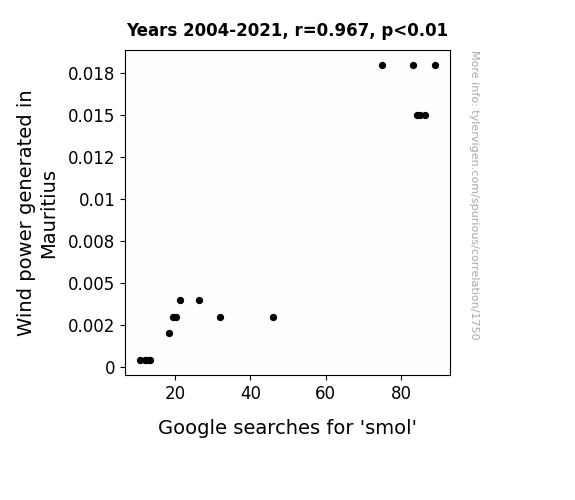
View details about correlation #1,750
Whimsical Wind Power: Waltzing with 'Smol' Searches in Mauritius
As the wind turbines spun, they emitted tiny, inaudible whispers of encouragement, somehow making everyone feel inexplicably small yet oh so cute. It's a gust-have effect on the entire nation!

What else correlates?
Wind power generated in Mauritius · all energy
Google searches for 'smol' · all google searches
Wind power generated in Mauritius · all energy
Google searches for 'smol' · all google searches


View details about correlation #3,340
Pie in the Sky: The Astronomical Relationship Between Jupiter's Distance and North Carolina's Food Scientists
The gravitational pull created a recipe for success that drew in more food scientists to the state, turning North Carolina into a sweet spot for culinary innovation and launching a new era of interplanetary gastronomy. Remember, when it comes to food science, it's all about that space taste!

Why this works
- Data dredging: I have 25,237 variables in my database. I compare all these variables against each other to find ones that randomly match up. That's 636,906,169 correlation calculations! This is called “data dredging.”
Fun fact: the chart used on the wikipedia page to demonstrate data dredging is also from me. I've been being naughty with data since 2014.
Instead of starting with a hypothesis and testing it, I instead tossed a bunch of data in a blender to see what correlations would shake out. It’s a dangerous way to go about analysis, because any sufficiently large dataset will yield strong correlations completely at random. - Lack of causal connection: There is probably no direct connection between these variables, despite what the AI says above.
Because these pages are automatically generated, it's possible that the two variables you are viewing are in fact causually related. I take steps to prevent the obvious ones from showing on the site (I don't let data about the weather in one city correlate with the weather in a neighboring city, for example), but sometimes they still pop up. If they are related, cool! You found a loophole.
This is exacerbated by the fact that I used "Years" as the base variable. Lots of things happen in a year that are not related to each other! Most studies would use something like "one person" in stead of "one year" to be the "thing" studied. - Observations not independent: For many variables, sequential years are not independent of each other. You will often see trend-lines form. If a population of people is continuously doing something every day, there is no reason to think they would suddenly change how they are doing that thing on January 1. A naive p-value calculation does not take this into account.
You will calculate a lower chance of "randomly" achieving the result than represents reality.
To be more specific: p-value tests are probability values, where you are calculating the probability of achieving a result at least as extreme as you found completely by chance. When calculating a p-value, you need to assert how many "degrees of freedom" your variable has. I count each year (minus one) as a "degree of freedom," but this is misleading for continuous variables.
This kind of thing can creep up on you pretty easily when using p-values, which is why it's best to take it as "one of many" inputs that help you assess the results of your analysis.
- Y-axes doesn't start at zero: I truncated the Y-axes of the graphs above. I also used a line graph, which makes the visual connection stand out more than it deserves.
Nothing against line graphs. They are great at telling a story when you have linear data! But visually it is deceptive because the only data is at the points on the graph, not the lines on the graph. In between each point, the data could have been doing anything. Like going for a random walk by itself!
Mathematically what I showed is true, but it is intentionally misleading. If you click on any of the charts that abuse this, you can scroll down to see a version that starts at zero. - Confounding variable: Confounding variables (like global pandemics) will cause two variables to look connected when in fact a "sneaky third" variable is influencing both of them behind the scenes.
- Outliers: Some datasets here have outliers which drag up the correlation.
In concept, "outlier" just means "way different than the rest of your dataset." When calculating a correlation like this, they are particularly impactful because a single outlier can substantially increase your correlation.
Because this page is automatically generated, I don't know whether any of the charts displayed on it have outliers. I'm just a footnote. ¯\_(ツ)_/¯
I intentionally mishandeled outliers, which makes the correlation look extra strong. - Low n: There are not many data points included in some of these charts.
You can do analyses with low ns! But you shouldn't data dredge with a low n.
Even if the p-value is high, we should be suspicious of using so few datapoints in a correlation.
Pro-tip: click on any correlation to see:
- Detailed data sources
- Prompts for the AI-generated content
- Explanations of each of the calculations (correlation, p-value)
- Python code to calculate it yourself


