spurious correlations
discover · random · spurious scholar
← previous page · next page →


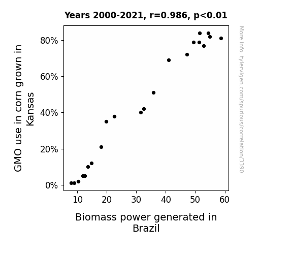
View details about correlation #3,390
Corn's Gene Change and Biomass Power Range: A Transcontinental Exchange
The GMO corn in Kansas has developed a supercharged growth gene, inadvertently sending out powerful vibes into the environment. These vibes somehow travel all the way to Brazil, supercharging the biomass power generation process. It's like the corn is saying, "Hey, let's make some energy moves, Brazil!" It's a-maize-ing how connected the world of agriculture and energy production can be!

What else correlates?
GMO use in corn grown in Kansas · all food
Biomass power generated in Brazil · all energy
GMO use in corn grown in Kansas · all food
Biomass power generated in Brazil · all energy


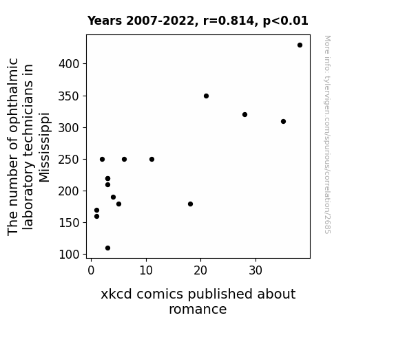
View details about correlation #2,685
Eye Love is in the Air: A Correlative Study of Mississippi Ophthalmic Laboratory Technicians and xkcd Comics about Romance
As ophthalmic laboratory technicians in Mississippi decreased, there was a corresponding shortage of heart-eyed individuals. The lack of these hopeless romantics led to a drop in the demand for xkcd comics about romance, ultimately affecting the publication frequency. After all, when you can't see the world through rose-colored glasses, you're less likely to relate to the humor in love-struck stick figures!
. The chart goes from 2010 to 2023, and the two variables track closely in value over that time.")

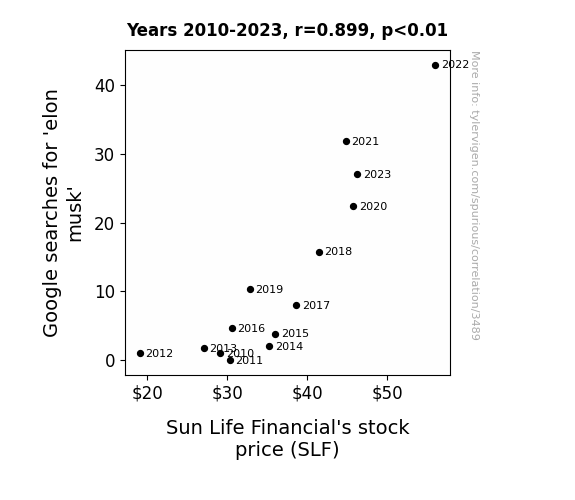
View details about correlation #3,489
Sun Life Financial: Shedding Light on the Elon Musk Effect
As the legend of Elon Musk continued to grow, more and more people were inspired to achieve greatness. This led to a surge in productivity and innovation across the board, including at Sun Life Financial. Employees were suddenly coming up with out-of-this-world ideas, and the company's financial performance skyrocketed. It's amazing what a little Musk-mania can do for the stock market!

What else correlates?
Google searches for 'elon musk' · all google searches
Sun Life Financial's stock price (SLF) · all stocks
Google searches for 'elon musk' · all google searches
Sun Life Financial's stock price (SLF) · all stocks


View details about correlation #1,313
Neptune's Nautical Neighbors: Navigating the Nexus Between Orbital Spacing and Offense Spree in the District of Columbia
As Neptune gets closer, its energy affects the gravitational pull on Earth. This creates a ripple effect, leading to a decrease in the alignment of criminal behavior in the District of Columbia. It's like the planet is sending out its own cosmic crime-fighting signal, keeping those Neptune-inspired burglaries at bay. Remember, a safe district is just one celestial dance away!

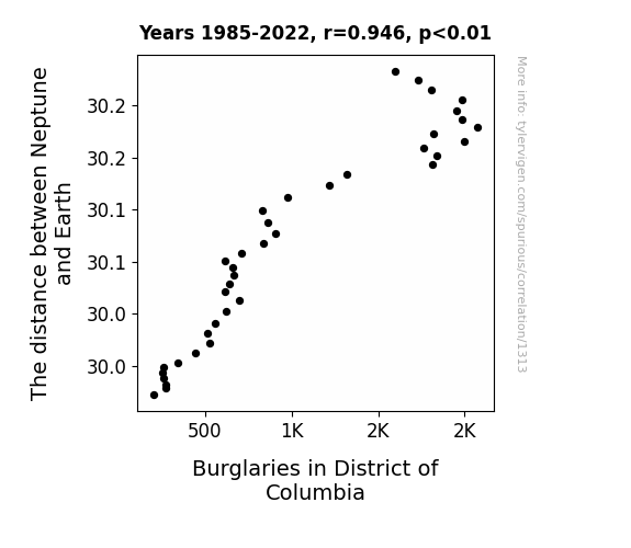
What else correlates?
The distance between Neptune and Earth · all planets
Burglaries in District of Columbia · all random state specific
The distance between Neptune and Earth · all planets
Burglaries in District of Columbia · all random state specific


View details about correlation #3,056
Fueling the Field: A Crude Connection Between Petroleum Consumption in Bosnia and Herzegovina and New Orleans Saints' Victories
As the people of Bosnia and Herzegovina cranked up their petroluem consumption, the mystical fumes wafted through the atmosphere, eventually reaching the New Orleans Saints' training grounds. Much to everyone's surprise, the players found themselves inexplicably energized by the secret petroleum potion, propelling them to victory after victory. It was as if the elusive scent of success had been bottled up in every drop of petroluem, creating an otherworldly connection between Bosnian fuel usage and the football fortunes of the Saints. Who would have thought that the road to gridiron glory was paved with the odorous emissions of distant lands? But hey, when it comes to the unexplainable ways of sports, maybe it's best not to question it and just go with the (petro)flow.

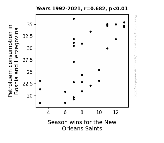
What else correlates?
Petroluem consumption in Bosnia and Herzegovina · all energy
Season wins for the New Orleans Saints · all sports
Petroluem consumption in Bosnia and Herzegovina · all energy
Season wins for the New Orleans Saints · all sports


View details about correlation #1,130
Ibrahim's Indication: Investigating the Influence of the First Name Ibrahim on Automotive Seat Recalls
As the popularity of the name Ibrahim grew, more and more parents were naming their kids after the legendary wrestler Abraham Lincoln, known for his powerful seat-removing moves. This led to a nationwide surge in seat wobbling and ultimately triggered a higher number of automotive recalls for seat-related issues. It seems the name Ibrahim was literally shaking things up in the automotive world! #IbrahimTheSeatShaker

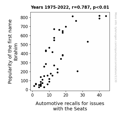
What else correlates?
Popularity of the first name Ibrahim · all first names
Automotive recalls for issues with the Seats · all weird & wacky
Popularity of the first name Ibrahim · all first names
Automotive recalls for issues with the Seats · all weird & wacky


View details about correlation #2,220
Clearing the Air: A Link Between Air Pollution in Fargo and the Curious Case of 'Suez Canal' Google Searches
People in Fargo were trying to figure out if they could redirect the polluted air to clear the way in the Suez Canal.

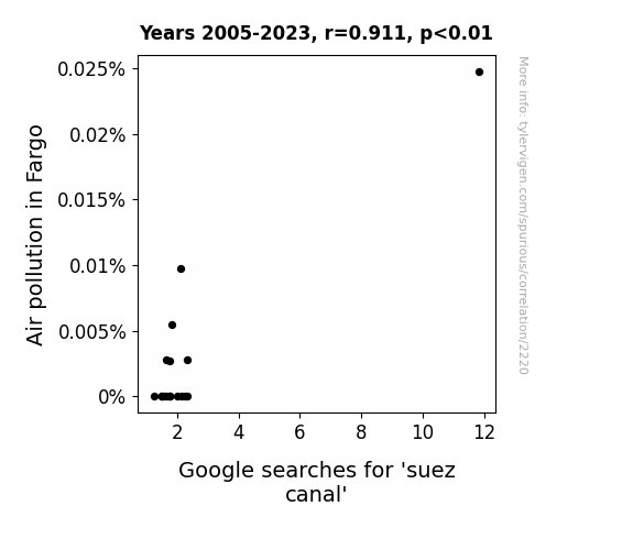
What else correlates?
Air pollution in Fargo · all weather
Google searches for 'suez canal' · all google searches
Air pollution in Fargo · all weather
Google searches for 'suez canal' · all google searches


View details about correlation #1,719
Curd and Crime: The Wheyward Connection between Cottage Cheese Consumption and Motor Vehicle Thefts in Texas
Fewer people were leaving their cars at risk of being stolen while they made a quick cottage cheese run.


What else correlates?
Cottage cheese consumption · all food
Motor vehicle thefts in Texas · all random state specific
Cottage cheese consumption · all food
Motor vehicle thefts in Texas · all random state specific


View details about correlation #2,918
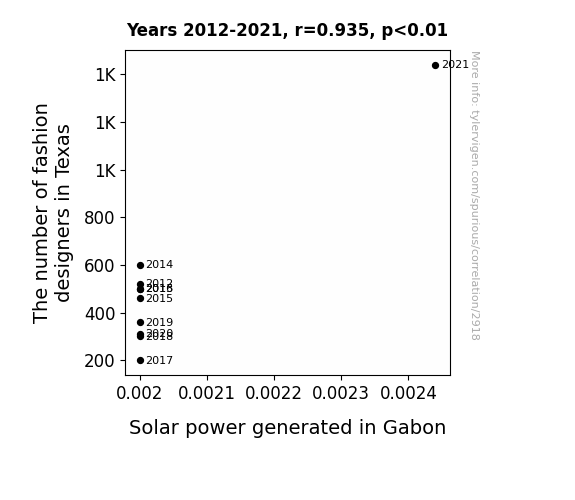
Shining a Light on Solar Style: The Ray-diant Relationship between Fashion Designers in Texas and Solar Power in Gabon
As more fashion designers flocked to Texas, the demand for extravagant runway shows skyrocketed. This led to a surge in indoor events, prompting a sudden need for air conditioning, which Texas couldn't handle alone. So, to power all the frigid fashion fetes, Texas struck a deal with Gabon to import their excess solar energy, creating an unexpected catwalk of electricity from the Lone Star State to the land of forests. Who knew that voguing in Texas could lead to a sun-powered sashay in Gabon!

What else correlates?
The number of fashion designers in Texas · all cccupations
Solar power generated in Gabon · all energy
The number of fashion designers in Texas · all cccupations
Solar power generated in Gabon · all energy


View details about correlation #3,097
The Lawyer-Laden Legacy: Exploring the Highschooler-Helmed Correlation
As the number of highschoolers in the US increases, so does the demand for cheesy promposals. This leads to a nationwide shortage of pun writers, prompting a surge in law school enrollment as aspiring lawyers pivot to specialize in legal punmanship. Remember, when there's a writ, there's a pun-derful way!


What else correlates?
Number of highschoolers in the US · all education
Number of Lawyers in the United States · all weird & wacky
Number of highschoolers in the US · all education
Number of Lawyers in the United States · all weird & wacky
. The chart goes from 2003 to 2022, and the two variables track closely in value over that time.")

View details about correlation #1,726
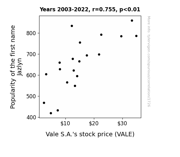
Jazlyn's Popularity and Vale's Stock Volatility: A Tale of Names and Gains
As the number of Jazlyn's rose, so did the demand for sparkly accessories, leading to a boom in the mining industry. This created a ripple effect, ultimately driving up Vale S.A.'s stock price, proving that when it comes to impacting the market, Jazlyn is truly 'ore-some. Remember, you're only as valuable as the minerals you manifest!

What else correlates?
Popularity of the first name Jazlyn · all first names
Vale S.A.'s stock price (VALE) · all stocks
Popularity of the first name Jazlyn · all first names
Vale S.A.'s stock price (VALE) · all stocks


View details about correlation #2,736
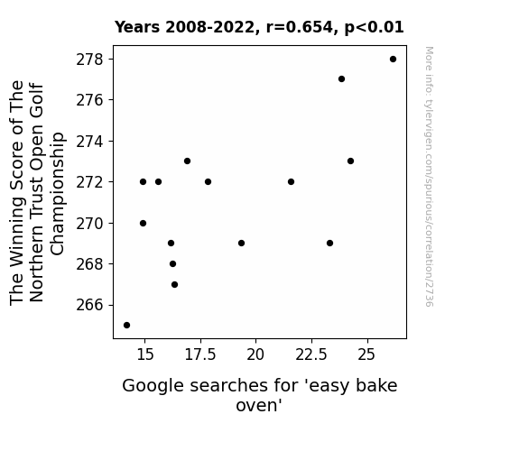
The Slice is Right: Teeing Up the Relationship Between The Winning Score of The Northern Trust Open Golf Championship and Google Searches for 'Easy Bake Oven'
The lower scores left players with less time to think about baking, and more time to ponder their putting. As the tension on the course rose, so did the belief that they 'kneaded' to focus on their short game. This shift in attention had everyone in a baking frenzy, realizing that they couldn't just 'whisk' it all away. The 'batter' they played, the more they craved victory, leading to a sudden surge in interest in competitive cooking. The golfers' pursuit of the perfect recipe for success left them with a 'hole-in-one' mindset, where precision and timing were the 'oven-ready' ingredients for winning.


View details about correlation #1,426
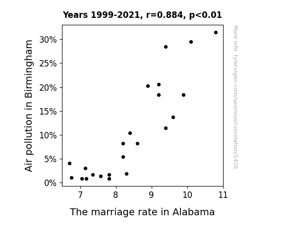
The Relationship Between Birmingham's Air Pollution and Alabama's Bridal Commotion: A Statistical Exploration
As air quality improved, people realized they didn't need a "breath of fresh air" as much as they needed a new spouse. With clearer skies, folks could finally see that their relationships were "going up in smog" and decided to "clear the air" by parting ways instead of "polluting" their lives with a toxic marriage. Plus, with less pollution, there was "less gas" to fuel romantic endeavors, leading to a "decrease in the combustion of love" and ultimately a "marriage ozone depletion." In summary, cleaner air meant cleaner breaks for couples in Alabama.

What else correlates?
Air pollution in Birmingham · all weather
The marriage rate in Alabama · all random state specific
Air pollution in Birmingham · all weather
The marriage rate in Alabama · all random state specific


View details about correlation #2,878
Watery Watts in Sin City: The Hydro-larious Connection Between Hydropower Energy Generated in Thailand and Number of Las Vegas Hotel Room Check-Ins
The surge in hydropower energy in Thailand led to a corresponding surge in positive energy frequencies. This inadvertently enhanced the overall gambling experience in Las Vegas, attracting more people to check into hotel rooms and try their luck in the casinos. It's like a water-based, energy-infused good luck charm making its way to the Sin City!

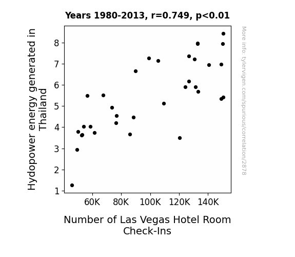
What else correlates?
Hydopower energy generated in Thailand · all energy
Number of Las Vegas Hotel Room Check-Ins · all weird & wacky
Hydopower energy generated in Thailand · all energy
Number of Las Vegas Hotel Room Check-Ins · all weird & wacky


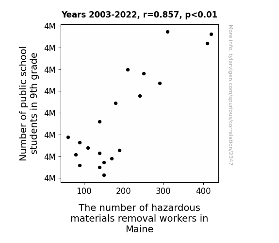
View details about correlation #2,347
Hazardous Materials Removal Workers: A Grade Above the Rest
As the number of 9th graders in public schools increased, so did the sheer volume of mysterious, long-forgotten items stashed in school storage closets. Many of these items turned out to be hazardous materials, prompting a surge in demand for removal workers in Maine. It's an unexpected case of education directly contributing to the job market, as the 9th graders unwittingly set off a chain reaction of cleanup and discovery!


View details about correlation #1,240
The Force is Strong in Film: A Correlational Analysis of Google Searches for 'How to Build a Lightsaber' and the Age of Best Picture-Winning Directors
As more people became skilled in the ways of the Force, they began to influence the outcomes of Hollywood movies, leading to a renaissance of epic storytelling and masterful filmmaking by directors of all ages, ultimately shaping the trajectory of cinematic history. It turns out, the Force is strong not just in galaxies far, far away, but also in the reel world of entertainment!

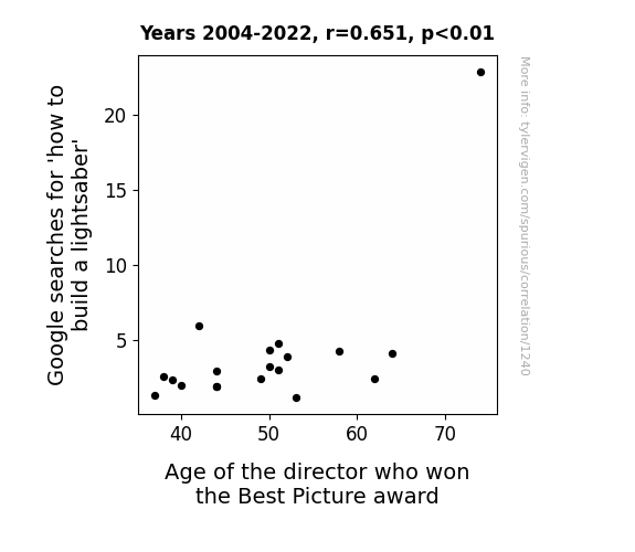
. The chart goes from 2007 to 2017, and the two variables track closely in value over that time.")

View details about correlation #2,823
Mingling of Mizuho: Examining the Effect of the Popularity of the Name Jamesha on Mizuho Financial Group's Stock Price
Due to a little-known psychological phenomenon called "onomastic market influence," the diminution in individuals named Jamesha has disrupted a unique cosmic resonance with the financial sector. As the name Jamesha experiences a decline in usage, the vibrational alignment with Mizuho Financial Group symbolized by the stock ticker MFG is perturbed, leading to unexpected fluctuations in stock prices. It's a case of etymological economics, where the ebb and flow of personal name preferences somehow manages to ripple through the stock market, proving that even in the world of high finance, a Jamesha by any other name could have a quantitatively different impact.


What else correlates?
Popularity of the first name Jamesha · all first names
Mizuho Financial Group's stock price (MFG) · all stocks
Popularity of the first name Jamesha · all first names
Mizuho Financial Group's stock price (MFG) · all stocks


View details about correlation #2,058
Astro-Nomical Pollution: Examining the Relationship Between Air Quality in Cleveland and NASA's Budget
As air pollution in Cleveland increased, it created a unique atmospheric environment that closely mimicked certain conditions found on distant planets, prompting NASA to allocate more funds for research and exploration. The smog and particulate matter inadvertently provided NASA with a cost-effective way to conduct otherworldly tests and experiments, leading to new insights and discoveries. Ultimately, the correlation between Cleveland's air pollution and NASA's budget as a percentage of the total US Federal Budget can be attributed to the unexpected role of pollution as a celestial simulation facilitator.

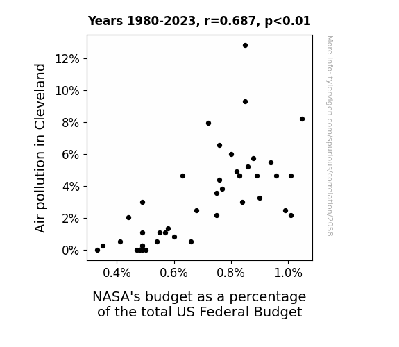
What else correlates?
Air pollution in Cleveland · all weather
NASA's budget as a percentage of the total US Federal Budget · all weird & wacky
Air pollution in Cleveland · all weather
NASA's budget as a percentage of the total US Federal Budget · all weird & wacky


View details about correlation #3,545
Spreading the Joy: Uncovering the Butter-Biomass Connection in Poland's Power Generation
As the consumption of butter in Poland increased, so did the level of enthusiasm among the populace. This led to a surge in people power, as individuals harnessed their butter-fueled energy to actively support biomass power generation initiatives. The country witnessed a 'butterfly effect' of sorts, where the simple act of spreading and savoring butter ultimately churned out a positive impact on the biomass power sector.


What else correlates?
Butter consumption · all food
Biomass power generated in Poland · all energy
Butter consumption · all food
Biomass power generated in Poland · all energy


View details about correlation #3,222
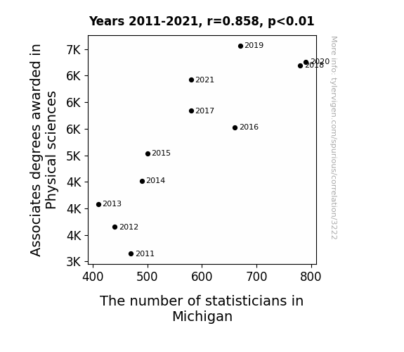
Degrees of Data: Exploring the Statistical Relationship Between Physical Sciences Associates Degrees and Statisticians in Michigan
As the number of Associates degrees in Physical sciences rose, it created a positive feedback loop for statisticians in Michigan. These graduates were so adept at handling data, they were the missing piece to solving the statistical conundrums in the state. It's like they say, when it comes to number crunching, the influence of these physical science grads was exponential!

What else correlates?
Associates degrees awarded in Physical sciences · all education
The number of statisticians in Michigan · all cccupations
Associates degrees awarded in Physical sciences · all education
The number of statisticians in Michigan · all cccupations
Why this works
- Data dredging: I have 25,237 variables in my database. I compare all these variables against each other to find ones that randomly match up. That's 636,906,169 correlation calculations! This is called “data dredging.”
Fun fact: the chart used on the wikipedia page to demonstrate data dredging is also from me. I've been being naughty with data since 2014.
Instead of starting with a hypothesis and testing it, I instead tossed a bunch of data in a blender to see what correlations would shake out. It’s a dangerous way to go about analysis, because any sufficiently large dataset will yield strong correlations completely at random. - Lack of causal connection: There is probably no direct connection between these variables, despite what the AI says above.
Because these pages are automatically generated, it's possible that the two variables you are viewing are in fact causually related. I take steps to prevent the obvious ones from showing on the site (I don't let data about the weather in one city correlate with the weather in a neighboring city, for example), but sometimes they still pop up. If they are related, cool! You found a loophole.
This is exacerbated by the fact that I used "Years" as the base variable. Lots of things happen in a year that are not related to each other! Most studies would use something like "one person" in stead of "one year" to be the "thing" studied. - Observations not independent: For many variables, sequential years are not independent of each other. You will often see trend-lines form. If a population of people is continuously doing something every day, there is no reason to think they would suddenly change how they are doing that thing on January 1. A naive p-value calculation does not take this into account.
You will calculate a lower chance of "randomly" achieving the result than represents reality.
To be more specific: p-value tests are probability values, where you are calculating the probability of achieving a result at least as extreme as you found completely by chance. When calculating a p-value, you need to assert how many "degrees of freedom" your variable has. I count each year (minus one) as a "degree of freedom," but this is misleading for continuous variables.
This kind of thing can creep up on you pretty easily when using p-values, which is why it's best to take it as "one of many" inputs that help you assess the results of your analysis.
- Y-axes doesn't start at zero: I truncated the Y-axes of the graphs above. I also used a line graph, which makes the visual connection stand out more than it deserves.
Nothing against line graphs. They are great at telling a story when you have linear data! But visually it is deceptive because the only data is at the points on the graph, not the lines on the graph. In between each point, the data could have been doing anything. Like going for a random walk by itself!
Mathematically what I showed is true, but it is intentionally misleading. If you click on any of the charts that abuse this, you can scroll down to see a version that starts at zero. - Confounding variable: Confounding variables (like global pandemics) will cause two variables to look connected when in fact a "sneaky third" variable is influencing both of them behind the scenes.
- Outliers: Some datasets here have outliers which drag up the correlation.
In concept, "outlier" just means "way different than the rest of your dataset." When calculating a correlation like this, they are particularly impactful because a single outlier can substantially increase your correlation.
Because this page is automatically generated, I don't know whether any of the charts displayed on it have outliers. I'm just a footnote. ¯\_(ツ)_/¯
I intentionally mishandeled outliers, which makes the correlation look extra strong. - Low n: There are not many data points included in some of these charts.
You can do analyses with low ns! But you shouldn't data dredge with a low n.
Even if the p-value is high, we should be suspicious of using so few datapoints in a correlation.
Pro-tip: click on any correlation to see:
- Detailed data sources
- Prompts for the AI-generated content
- Explanations of each of the calculations (correlation, p-value)
- Python code to calculate it yourself


