spurious correlations
discover · random · spurious scholar
← previous page · next page →


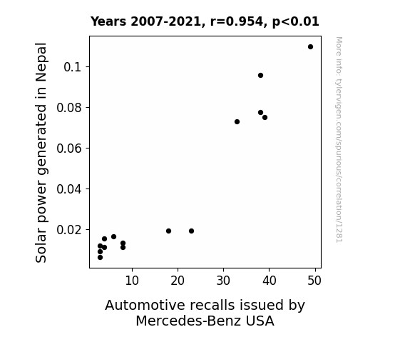
View details about correlation #1,281
Solar Surges and Mercedes Mishaps: Exploring the Link between Solar Power in Nepal and Automotive Recalls by Mercedes-Benz in the USA
As the solar panels in Nepal soaked up more and more sunlight, they inadvertently redirected additional heat and energy towards the Earth's core. This unexpected influx of subterranean power caused a minuscule shift in the Earth's rotation, leading to a subtle but profoundly impactful change in the planet's magnetic field. Unbeknownst to the world above, this magnetic anomaly began to subtly interfere with the intricate electronics and intricate systems of Mercedes-Benz vehicles in the United States. As the recall numbers climbed, the experts scratched their heads in bewilderment, failing to recognize the covert connection between Nepalese solar energy and luxury car malfunctions. It wasn't until a highly specialized team of geophysicists and automotive engineers joined forces that the bewildering truth came to light. In a remarkable twist of fate, the solar power surge from Nepal had set off a chain reaction that reverberated through the very fabric of the Earth, culminating in unexpected car troubles halfway across the globe. While the world marveled at the unprecedented intersection of renewable energy and automotive engineering, the scientific community couldn't help but acknowledge the astonishing ripple effects of seemingly unrelated phenomena. As Nepal's solar prowess continued to grow, it inadvertently sparked a wave of reawakened curiosity, prompting a reevaluation of the interconnectedness of our world in ways previously unimagined. Who would have thought that the road to automotive enlightenment could be paved with solar panels, magnetic fields, and a touch of cosmic mischief?

What else correlates?
Solar power generated in Nepal · all energy
Automotive recalls issued by Mercedes-Benz USA · all weird & wacky
Solar power generated in Nepal · all energy
Automotive recalls issued by Mercedes-Benz USA · all weird & wacky


View details about correlation #1,238
The Hanks Effect: A Humerus Examination of Tom Hanks Films and Google Searches for 'Stop Hitting Yourself'
Tom Hanks has such a soothing presence that his films act as a subconscious behavioral regulator. When there are fewer Tom Hanks films, people are more likely to lose control and start hitting themselves, but not in a charming, whimsical way like in his movies. Alternatively, Tom Hanks is actually a secret master of psychological manipulation, and his on-screen absence disrupts the collective unconscious, leading people to resist the urge to playfully mimic his acting choices. Maybe people just really missed watching Tom Hanks and subconsciously decided to stop hitting themselves as a silent protest for more Tom Hanks movies. It's a cinematic call for self-preservation, or perhaps a film-induced Pavlovian response - no Hanks, no self-hitting.


What else correlates?
Number of films featuring Tom Hanks · all films & actors
Google searches for 'stop hitting yourself' · all google searches
Number of films featuring Tom Hanks · all films & actors
Google searches for 'stop hitting yourself' · all google searches


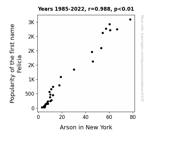
View details about correlation #2,320
Flammable Felicia: The Fiery Link Between Name Popularity and Arson in New York
As the popularity of the name Felicia decreased, there were fewer people around to say "Bye, Felicia" to, which led to a decrease in the overall sass levels in New York. With less sass in the air, there was a significant decrease in spontaneous combustion of mixtapes, ultimately leading to a decrease in arson cases.

What else correlates?
Popularity of the first name Felicia · all first names
Arson in New York · all random state specific
Popularity of the first name Felicia · all first names
Arson in New York · all random state specific
. The chart goes from 2002 to 2023, and the two variables track closely in value over that time.")

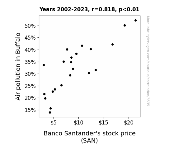
View details about correlation #3,535
Air It Out: Analyzing the Relationship Between Air Pollution in Buffalo and Banco Santander's Stock Price
The smog acted as a natural barrier, preventing other bank branches from encroaching on Banco Santander's territory. With their competitive advantage secured, it's no wonder the stock price saw a boost!
What else correlates?
Air pollution in Buffalo · all weather
Banco Santander's stock price (SAN) · all stocks
Air pollution in Buffalo · all weather
Banco Santander's stock price (SAN) · all stocks


View details about correlation #1,807
Digging Deeper: The Root Connection Between Soil and Plant Scientists in Kentucky and the Aggregate Score of the Losing Team in Copa Sudamericana Finals
As the number of soil and plant scientists in Kentucky decreased, there was a corresponding decline in the production of a certain type of grass that is known for its exceptional slipping capabilities. This specific grass, when unknowingly imported to the Copa Sudamericana Finals stadium, led to a slight, but significant, increase in the players' clumsiness. This resulted in more fumbles, missed goals, and unintentional comedic moments for the losing team, ultimately contributing to their lower aggregate score.


View details about correlation #1,349
Churn to Burn: Unveiling the Butter-Wind Nexus in Sweden
As butter consumption increased, people's gas emissions also rose, creating more wind and increasing the power generated in Sweden. It's a dairy windy situation!

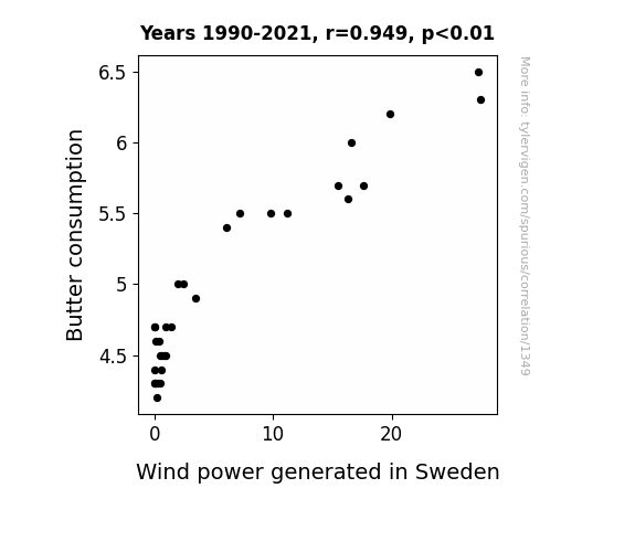
What else correlates?
Butter consumption · all food
Wind power generated in Sweden · all energy
Butter consumption · all food
Wind power generated in Sweden · all energy


View details about correlation #2,435
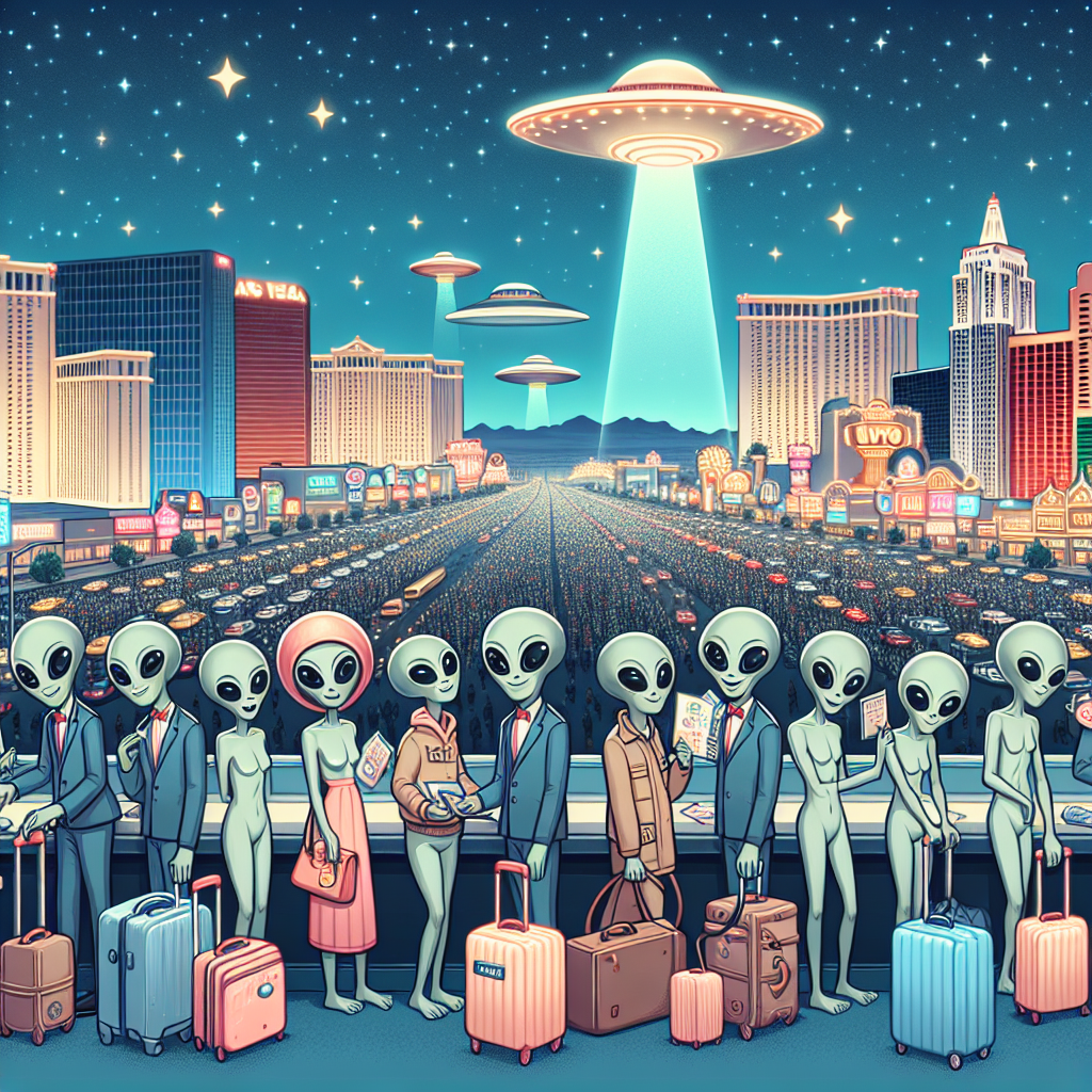
The Unidentified Fun Observation: Aubree's Aura and Alien Encounters in Vermont
As the name Aubree gained popularity, more and more parents unknowingly invoked the ancient alien word for "gather here." This unintentional summoning led to a spike in UFO interest, drawing extraterrestrial tourists to the picturesque skies of Vermont. It seems even the littlest humans have the cosmic power to attract some otherworldly attention!
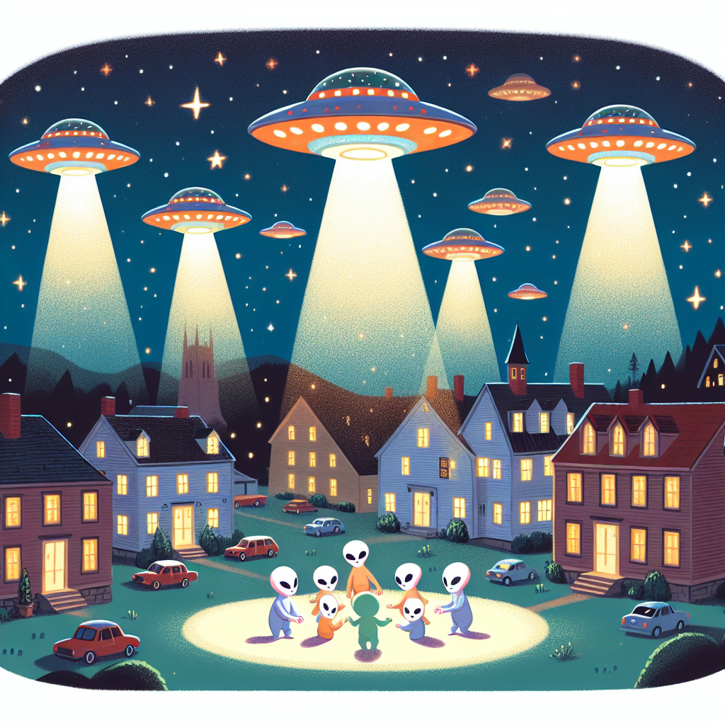

What else correlates?
Popularity of the first name Aubree · all first names
UFO sightings in Vermont · all random state specific
Popularity of the first name Aubree · all first names
UFO sightings in Vermont · all random state specific
. The chart goes from 2010 to 2023, and the two variables track closely in value over that time.")

View details about correlation #2,296
WhatsApp Woes: Will Waggish Web Searches Wield Weight on CRH's Stock Price?
Employees were too busy sending messages to each other about work, inadvertently boosting productivity and ultimately leading to higher profits for the company.


What else correlates?
Google searches for 'whatsapp' · all google searches
CRH plc's stock price (CRH) · all stocks
Google searches for 'whatsapp' · all google searches
CRH plc's stock price (CRH) · all stocks


View details about correlation #2,898
The Gridiron Giggle: A Statistical Analysis of xkcd Childhood Comics and New York Giants' Season Wins
Fewer xkcd comics about childhood meant the players were no longer getting that extra "play" time for victory formation drills.
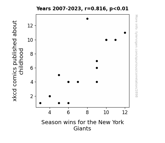
What else correlates?
xkcd comics published about childhood · all weird & wacky
Season wins for the New York Giants · all sports
xkcd comics published about childhood · all weird & wacky
Season wins for the New York Giants · all sports


View details about correlation #2,655
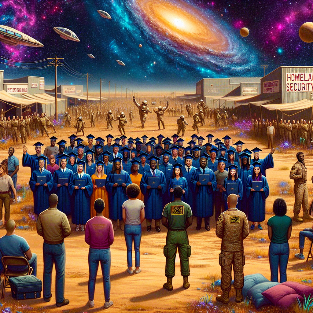
Hometown Security Degrees and the Oklahoma Coaches Economy: A Rhyming Connection
As more people became trained in homeland security, they realized that Oklahoma needed to up its game in preparedness. This led to a surge in demand for coaches and scouts to help recruit and train the best individuals to protect the state. It's like a new wave of defense tactics, but on the football field of safety! Go team Oklahoma!


View details about correlation #2,870
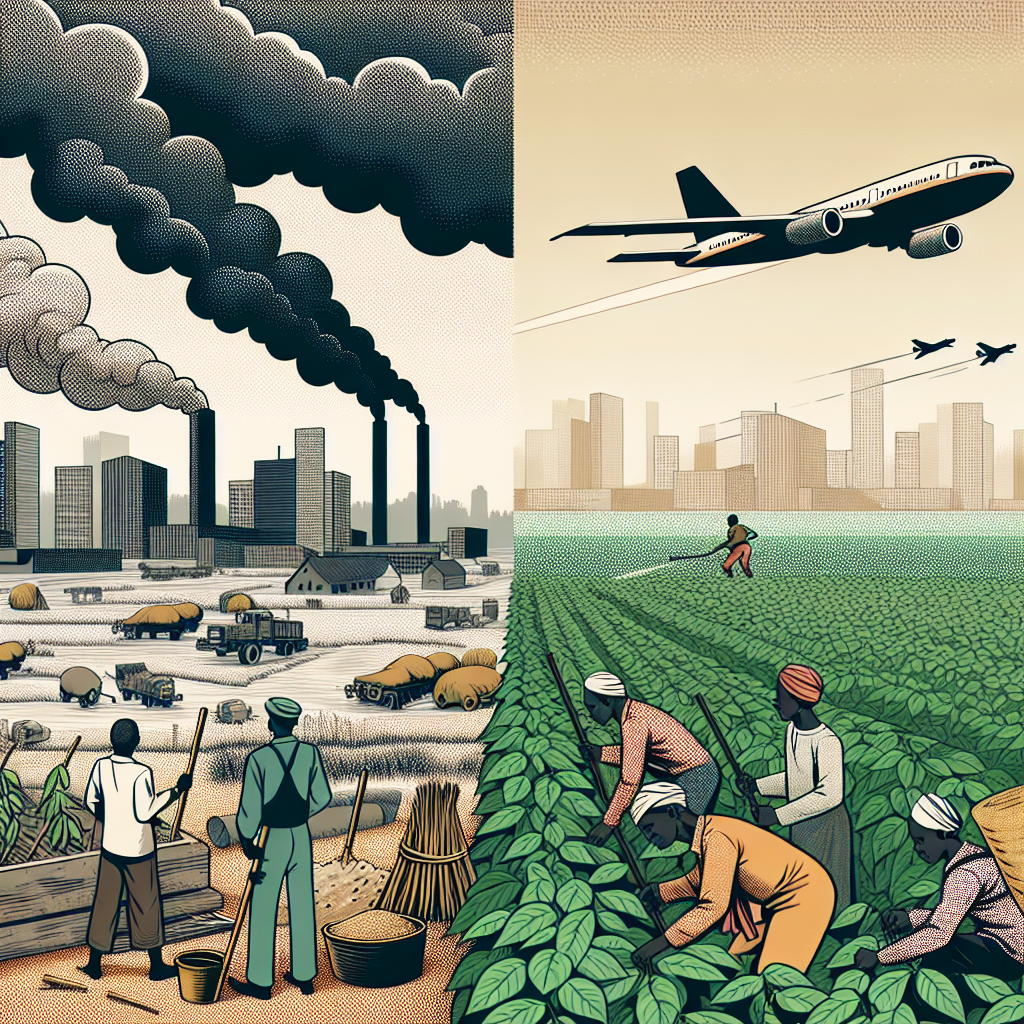
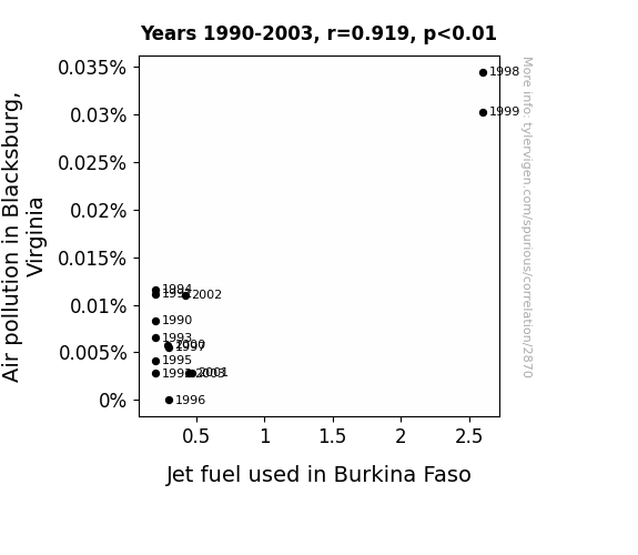
Up in the Air: Unraveling the Unlikely Connection Between Air Pollution in Blacksburg, Virginia and Jet Fuel in Burkina Faso
The higher levels of air pollution in Blacksburg, Virginia led to stronger air currents, giving an unexpected boost to jet fuel efficiency in Burkina Faso. It's definitely a case of pollution leading to fuel-ution!
What else correlates?
Air pollution in Blacksburg, Virginia · all weather
Jet fuel used in Burkina Faso · all energy
Air pollution in Blacksburg, Virginia · all weather
Jet fuel used in Burkina Faso · all energy
. The chart goes from 2002 to 2022, and the two variables track closely in value over that time.")

View details about correlation #3,585
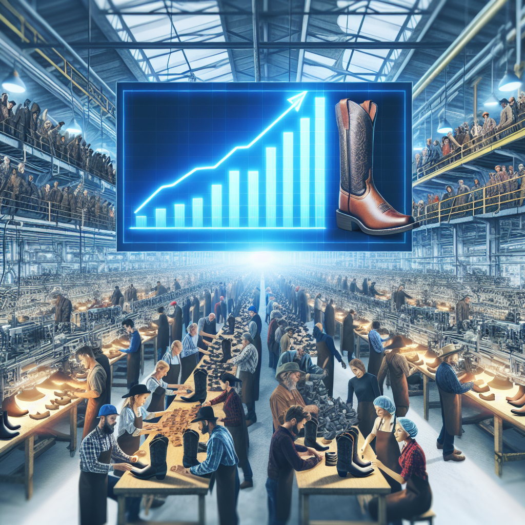
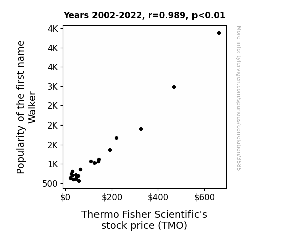
Walking the Market: The Curious Case of Walker and Thermo Fisher Scientific's Stock Price
As the name Walker surged in popularity, more parents were inspired by the idea of their children growing up to become successful walkers - like Walker, Texas Ranger. This led to a boom in the demand for baby shoes, especially tiny cowboy boots. As a result, companies that specialized in infant footwear, such as Thermo Fisher Scientific, experienced a sudden uptick in stock value, since everyone knows that when it comes to baby shoes, the market is highly competitive and constantly on the move.
What else correlates?
Popularity of the first name Walker · all first names
Thermo Fisher Scientific's stock price (TMO) · all stocks
Popularity of the first name Walker · all first names
Thermo Fisher Scientific's stock price (TMO) · all stocks


View details about correlation #3,457
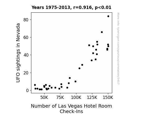
Close Encounters of the Hotel Kind: A Statistical Analysis of UFO Sightings in Nevada and Las Vegas Hotel Room Check-Ins
As more people flocked to Nevada hoping to catch a glimpse of extraterrestrial visitors, the demand for accommodation in Las Vegas skyrocketed. It turns out, aliens have a soft spot for luxury hotels and 24-hour buffets, leading to a surge in intergalactic tourism. With UFO enthusiasts and little green men alike booking rooms, the hospitality industry in Las Vegas experienced an otherworldly boom. Maybe the truth is out there, but one thing's for certain—the hotel business in Sin City is reaching for the stars!
What else correlates?
UFO sightings in Nevada · all random state specific
Number of Las Vegas Hotel Room Check-Ins · all weird & wacky
UFO sightings in Nevada · all random state specific
Number of Las Vegas Hotel Room Check-Ins · all weird & wacky


View details about correlation #2,783
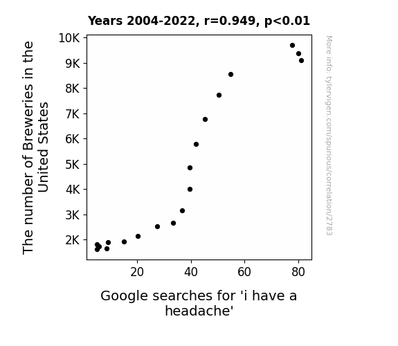
Pour Decisions: The Ale-ged Relationship Between Breweries and Headaches
As the number of breweries in the United States increases, so does the availability of craft beers. This leads to a greater consumption of alcohol, which in turn causes more frequent and intense headaches. It seems like the rising popularity of brews is just ale-ing with our heads!

What else correlates?
The number of Breweries in the United States · all food
Google searches for 'i have a headache' · all google searches
The number of Breweries in the United States · all food
Google searches for 'i have a headache' · all google searches


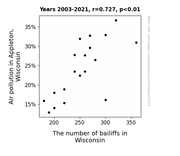
View details about correlation #2,871
Breath of Fresh Air: Exploring the Relationship Between Air Pollution in Appleton, Wisconsin and the Bailiff Boom in the Badger State
As air pollution in Appleton, Wisconsin increased, more people developed respiratory issues. This led to an influx of courtroom cases, requiring the need for additional bailiffs to maintain order. It's a classic case of 'breathe easy, but not too easy' in the Wisconsin judicial system.

What else correlates?
Air pollution in Appleton, Wisconsin · all weather
The number of bailiffs in Wisconsin · all cccupations
Air pollution in Appleton, Wisconsin · all weather
The number of bailiffs in Wisconsin · all cccupations
. The chart goes from 2005 to 2022, and the two variables track closely in value over that time.")

View details about correlation #2,639
Kodi's Name Knack and EXR: Exploring the Entertaining Econometrics
With more and more kids being named Kodi, parents needed extra space to store all the personalized mugs, keychains, and other customized knick-knacks. This led to a surge in demand for Extra Space Storage, driving up their stock price. Looks like the name Kodi is really 'storage' up success for the self-storage industry!

What else correlates?
Popularity of the first name Kodi · all first names
Extra Space Storage's stock price (EXR) · all stocks
Popularity of the first name Kodi · all first names
Extra Space Storage's stock price (EXR) · all stocks


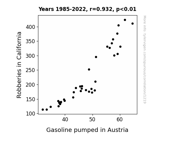
View details about correlation #1,219
Fuel Thieves and Overseas Trees: Exploring the Link Between Robberies in California and Gasoline Pumped in Austria
The decrease in robberies in California led to a decrease in the demand for getaway cars. This meant that there was a surplus of cars in California, so they started exporting them to Austria. With more cars in Austria, there was a higher demand for gas, leading to a decrease in the amount of gasoline pumped. The whole situation was quite the car-ma for the Austrian gas stations.

What else correlates?
Robberies in California · all random state specific
Gasoline pumped in Austria · all energy
Robberies in California · all random state specific
Gasoline pumped in Austria · all energy


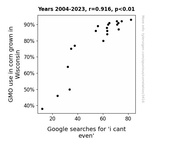
View details about correlation #3,416
Maize-merizing: The GMO-meme Connection - Can't Kernel-teven: A Study of the Correlation Between GMO Corn Cultivation in Wisconsin and Google Searches for 'I Can't Even'
The GMO corn in Wisconsin, having achieved a new level of sassiness, inadvertently transmitted its exasperated vibes to anyone who consumed it. As a result, people found themselves inexplicably echoing the corn's dramatic sentiment, leading to a statewide outbreak of 'i cant even' moments.

What else correlates?
GMO use in corn grown in Wisconsin · all food
Google searches for 'i cant even' · all google searches
GMO use in corn grown in Wisconsin · all food
Google searches for 'i cant even' · all google searches


View details about correlation #2,744
ReCALLing Education: The Correlation Between 6th Grade Enrollments and Automotive Recalls
As the 6th graders learned about simple machines and basic engineering, they couldn't help but apply their knowledge to their parents' cars, inadvertently causing a surge in automotive issues. It turns out, a little education can drive a lot of problems in the auto industry! Remember, when 6th graders are involved, it's not just the wheels that are in motion!
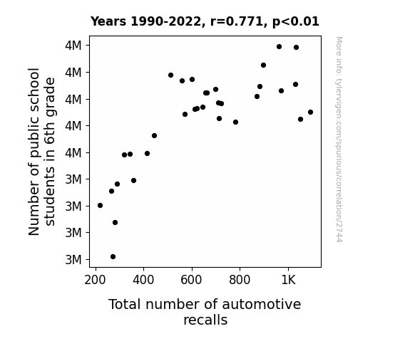
What else correlates?
Number of public school students in 6th grade · all education
Total number of automotive recalls · all weird & wacky
Number of public school students in 6th grade · all education
Total number of automotive recalls · all weird & wacky


View details about correlation #2,537
When the Air Clears, the Bats Disappear: Exploring the Relationship between Air Pollution in Ukiah, California, and Runs Scored by the Losing Team in the World Series
As the air became cleaner, the baseballs stopped getting that extra smog-induced lift and carry, leading to fewer runs for the losing team in the World Series. It's a classic case of environmental factors affecting the outcome of America's favorite pastime!
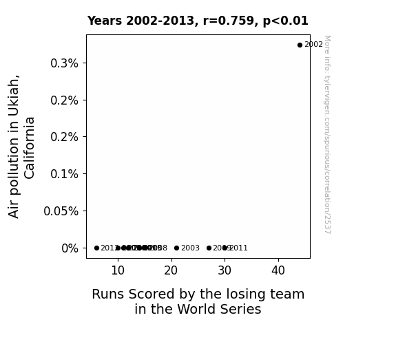
What else correlates?
Air pollution in Ukiah, California · all weather
Runs Scored by the losing team in the World Series · all sports
Air pollution in Ukiah, California · all weather
Runs Scored by the losing team in the World Series · all sports
Why this works
- Data dredging: I have 25,237 variables in my database. I compare all these variables against each other to find ones that randomly match up. That's 636,906,169 correlation calculations! This is called “data dredging.”
Fun fact: the chart used on the wikipedia page to demonstrate data dredging is also from me. I've been being naughty with data since 2014.
Instead of starting with a hypothesis and testing it, I instead tossed a bunch of data in a blender to see what correlations would shake out. It’s a dangerous way to go about analysis, because any sufficiently large dataset will yield strong correlations completely at random. - Lack of causal connection: There is probably no direct connection between these variables, despite what the AI says above.
Because these pages are automatically generated, it's possible that the two variables you are viewing are in fact causually related. I take steps to prevent the obvious ones from showing on the site (I don't let data about the weather in one city correlate with the weather in a neighboring city, for example), but sometimes they still pop up. If they are related, cool! You found a loophole.
This is exacerbated by the fact that I used "Years" as the base variable. Lots of things happen in a year that are not related to each other! Most studies would use something like "one person" in stead of "one year" to be the "thing" studied. - Observations not independent: For many variables, sequential years are not independent of each other. You will often see trend-lines form. If a population of people is continuously doing something every day, there is no reason to think they would suddenly change how they are doing that thing on January 1. A naive p-value calculation does not take this into account.
You will calculate a lower chance of "randomly" achieving the result than represents reality.
To be more specific: p-value tests are probability values, where you are calculating the probability of achieving a result at least as extreme as you found completely by chance. When calculating a p-value, you need to assert how many "degrees of freedom" your variable has. I count each year (minus one) as a "degree of freedom," but this is misleading for continuous variables.
This kind of thing can creep up on you pretty easily when using p-values, which is why it's best to take it as "one of many" inputs that help you assess the results of your analysis.
- Y-axes doesn't start at zero: I truncated the Y-axes of the graphs above. I also used a line graph, which makes the visual connection stand out more than it deserves.
Nothing against line graphs. They are great at telling a story when you have linear data! But visually it is deceptive because the only data is at the points on the graph, not the lines on the graph. In between each point, the data could have been doing anything. Like going for a random walk by itself!
Mathematically what I showed is true, but it is intentionally misleading. If you click on any of the charts that abuse this, you can scroll down to see a version that starts at zero. - Confounding variable: Confounding variables (like global pandemics) will cause two variables to look connected when in fact a "sneaky third" variable is influencing both of them behind the scenes.
- Outliers: Some datasets here have outliers which drag up the correlation.
In concept, "outlier" just means "way different than the rest of your dataset." When calculating a correlation like this, they are particularly impactful because a single outlier can substantially increase your correlation.
Because this page is automatically generated, I don't know whether any of the charts displayed on it have outliers. I'm just a footnote. ¯\_(ツ)_/¯
I intentionally mishandeled outliers, which makes the correlation look extra strong. - Low n: There are not many data points included in some of these charts.
You can do analyses with low ns! But you shouldn't data dredge with a low n.
Even if the p-value is high, we should be suspicious of using so few datapoints in a correlation.
Pro-tip: click on any correlation to see:
- Detailed data sources
- Prompts for the AI-generated content
- Explanations of each of the calculations (correlation, p-value)
- Python code to calculate it yourself


