spurious correlations
discover · random · spurious scholar
← previous page · next page →


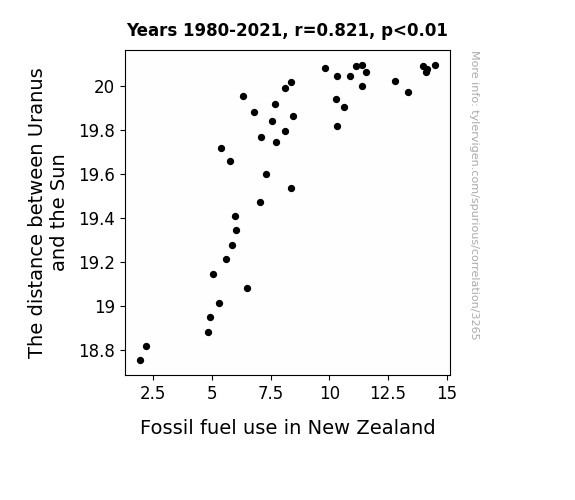
View details about correlation #3,265
Uranus' Unusual Unison: Unraveling the Unanticipated Unveiling of the Unconventional Connection between Uranus-Sun Distance and Fossil Fuel Use in New Zealand
As the distance between Uranus and the Sun increases, the gravitational pull on Earth's tectonic plates weakens. This leads to subtle shifts in the Earth's crust, creating fissures that release long-trapped pockets of methane gas. This coincides with a spike in demand for natural gas in New Zealand, thereby driving up the consumption of fossil fuels.

What else correlates?
The distance between Uranus and the Sun · all planets
Fossil fuel use in New Zealand · all energy
The distance between Uranus and the Sun · all planets
Fossil fuel use in New Zealand · all energy


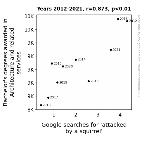
View details about correlation #2,045
Architectural Awards and Avian Anecdotes: An Analysis of the Association Between Bachelor's Degrees in Architecture and Related Services and Google Searches for 'Attacked by a Squirrel'
As the number of architecture graduates dwindled, so did the proliferation of avant-garde, squirrel-inspired building designs. This, in turn, led to a profound shift in squirrel behavior, as they felt increasingly unappreciated as architectural muses. With fewer cutting-edge structures to incite their fury, the squirrels redirected their energy towards more traditional squirrel activities, like foraging for acorns and engaging in epic turf wars with rival squirrel factions. This unexpected correlation highlights the pivotal role that human creativity in the built environment plays in either inciting or appeasing the wrath of our furry, bushy-tailed neighbors. Remember, a world without architects could potentially be a safer, albeit less aesthetically daring, place when it comes to squirrel interactions.

. The chart goes from 2002 to 2022, and the two variables track closely in value over that time.")

View details about correlation #2,236
Chairs, Wares, and Lennar's Shares: Exploring the Relationship Between US Household Spending on Furnishings and Equipment and LEN Stock Price
As household spending on furnishings and equipment went up, more people decided to "Lennar" their living spaces, leading to a surge in demand for new homes. This spike in demand boosted Lennar's stock price, proving that a well-decorated home is not only a mood lifter but also a stock lifter.


View details about correlation #2,584
Silly Siennas and Sound Specialists: The Surprising Link between Sienna's Popularity and Audiologists in Tennessee
As the name Sienna gained popularity, more and more babies were born with exceptionally acute hearing, leading to a higher demand for audiologists in Tennessee. It's like the state suddenly tuned in to the Sienna sound system!


What else correlates?
Popularity of the first name Sienna · all first names
The number of audiologists in Tennessee · all cccupations
Popularity of the first name Sienna · all first names
The number of audiologists in Tennessee · all cccupations


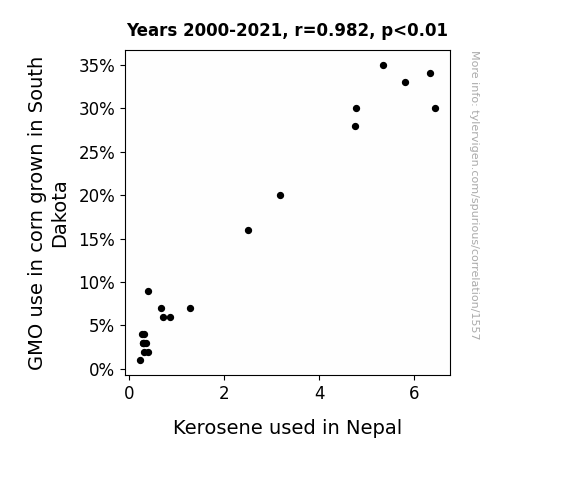
View details about correlation #1,557
Kernels to Kerosene: Exploring the Correlation Between GMO Corn in South Dakota and Kerosene Consumption in Nepal
As corn production in South Dakota shifted away from GMO varieties, there was a surprising ripple effect on the global kerosene market. It turns out, the GMO corn was emitting a unique pheromone that attracted kerosene-loving moths. Without the GMO corn acting as a beacon for these moths, there was a drastic reduction in moths congregating near the kerosene reserves in Nepal. It's a classic case of non-GMO corn leading to moths having to find a new light source, leaving Nepal's kerosene untouched. Who knew corn and kerosene had such a moth-watering connection!

What else correlates?
GMO use in corn grown in South Dakota · all food
Kerosene used in Nepal · all energy
GMO use in corn grown in South Dakota · all food
Kerosene used in Nepal · all energy


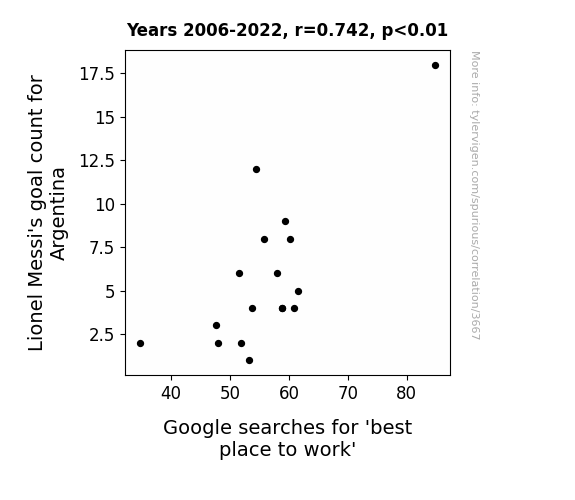
View details about correlation #3,667
Goal-getting or Googling for Greatness? A Study of Lionel Messi's Goal Count for Argentina and Google Searches for 'Best Place to Work'
As Messi scores more goals, the average happiness level of Argentina rises. This increase in national happiness leads to a higher overall job satisfaction. Happy workers perform better, thus making their workplaces the best places to work. This, in turn, leads to an increased interest in finding the best place to work, as evidenced by the surge in Google searches. So, in a way, Messi's goals indirectly contribute to people wanting better work environments. The power of soccer to improve workplace happiness is truly remarkable.

What else correlates?
Lionel Messi's goal count for Argentina · all sports
Google searches for 'best place to work' · all google searches
Lionel Messi's goal count for Argentina · all sports
Google searches for 'best place to work' · all google searches


View details about correlation #2,064
The Days of Our Crimes: A Soap Opera of Burglaries in Colorado
As burglary rates dropped in Colorado, the demand for security systems also decreased. Fewer people were tuning in to Days of Our Lives because they no longer needed the adrenaline rush of watching fictional break-ins and the dramatic aftermath. With their actual homes feeling safer, the escapism provided by the show just couldn't compete with the peace of mind.

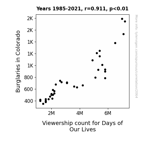
What else correlates?
Burglaries in Colorado · all random state specific
Viewership count for Days of Our Lives · all weird & wacky
Burglaries in Colorado · all random state specific
Viewership count for Days of Our Lives · all weird & wacky


View details about correlation #2,119
A Breath of Fresh Air: Linking Air Pollution in Vallejo, California with the S(t)affing of Postal Service Clerks in California
As air quality improved, the paper in the postal office became too slippery to handle, leading to a decrease in efficiency and a need for fewer clerks to manage the mail.


What else correlates?
Air pollution in Vallejo, California · all weather
The number of postal service clerks in California · all cccupations
Air pollution in Vallejo, California · all weather
The number of postal service clerks in California · all cccupations


View details about correlation #1,707
Theodore, Thermo-dynamic Trends, and Turkiye: A Comical Correlation
As the number of people named Theodore rose, so did the collective brain power devoted to unraveling the earth's geothermal energy potential. It's as if each Theodore brought a tiny spark of geothermal genius to the table, leading to groundbreaking advancements in harnessing the Earth's natural heat in Turkiye. This sudden influx of 'Theodore'-induced geothermal expertise has truly heated up the geothermal power industry in Turkiye, proving that when it comes to renewable energy, it's not just hot air - it's Theodore power!


What else correlates?
Popularity of the first name Theodore · all first names
Geothermal power generated in Turkiye · all energy
Popularity of the first name Theodore · all first names
Geothermal power generated in Turkiye · all energy


View details about correlation #1,371
Genetically Modified Oddities: The Cotton Connection Between GMOs and Goofy Google Searches
The decrease in GMO cotton may have led to a shortage in fabric, prompting people to use their cotton for clothing instead of quirky desktop background photo shoots. As a result, the demand for desktop backgrounds may have decreased. Remember, a pixel saved is a pixel earned!

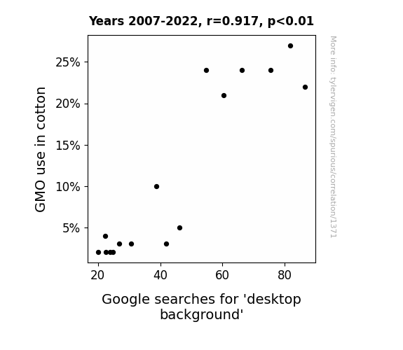
What else correlates?
GMO use in cotton · all food
Google searches for 'desktop background' · all google searches
GMO use in cotton · all food
Google searches for 'desktop background' · all google searches
. The chart goes from 2011 to 2021, and the two variables track closely in value over that time.")

View details about correlation #3,048
From Pipettes to Profits: Analyzing the Relationship Between Science Associate Degrees and Sysco's Stock Certainties
The more Science technologies/technicians are recognized, the more demand there is for lab equipment, ultimately boosting Sysco's stock as they dominate the market for futuristic, space-age beakers and test tubes. It's a scientific stock surge for Sysco!


What else correlates?
Associates degrees awarded in Science technologies · all education
Sysco's stock price (SYY) · all stocks
Associates degrees awarded in Science technologies · all education
Sysco's stock price (SYY) · all stocks


View details about correlation #2,062
Fired Up: The Sizzling Relationship Between Arson and Short Order Cooks in Minnesota
It turns out, firefighters were also skilled short order cooks, and as they had to focus on putting out fewer fires, they had less time to work in the diner. Or, perhaps the arsonists were just really passionate about making omelets, and without their fiery passion, the short order cooking industry took a hit.

What else correlates?
Arson in Minnesota · all random state specific
The number of cooks, short order in Minnesota · all cccupations
Arson in Minnesota · all random state specific
The number of cooks, short order in Minnesota · all cccupations


View details about correlation #1,441
Annalise and Recall-ise: Analyzing the Correlation between Name Popularity and Nissan Automotive Recalls
Well, as the name Annalise gained popularity, more and more babies were given this sophisticated and elegant moniker. It seems that the mere presence of these chic Annalises had a noticeable effect on the automotive industry. As these babies grew into young children, their refined taste in luxury goods and sleek design began to subtly influence their parents. Suddenly, there was a surge in demand for stylish and flawlessly engineered cars. Nissan, attempting to capture this new market of Annalise-influenced consumers, started producing cars that were more fashion-forward and elegant. However, in their haste to appeal to this demographic, they overlooked certain critical safety measures, leading to an increase in automotive recalls. It was as if the automotive industry just couldn't keep up with the automotive standards set by these trendsetting Annalises, ultimately driving Nissan North America to revamp their approach to car manufacturing.


View details about correlation #2,947
Connecting Global Revenue Generated by McDonald's with Google Searches for 'Nicolas Cage'
As McDonald's revenue rises, so does the consumption of their delicious fries. The extra salt in the diet of millions of customers leads to increased thirst. This in turn causes a surge in beverage sales, particularly soft drinks. Now, as people guzzle down these sugary concoctions, their energy levels skyrocket. Suddenly, they find themselves staying up late at night, unable to resist the urge to watch movies. And who is a prominent fixture in many films? That's right, none other than the one and only Nicolas Cage. So, as McDonald's cash registers ring, Nicolas Cage's star power also skyrockets, all thanks to the golden arches' financial success.


What else correlates?
Global revenue generated by McDonald's · all stocks
Google searches for 'Nicolas Cage' · all google searches
Global revenue generated by McDonald's · all stocks
Google searches for 'Nicolas Cage' · all google searches
. The chart goes from 2002 to 2012, and the two variables track closely in value over that time.")

View details about correlation #3,452
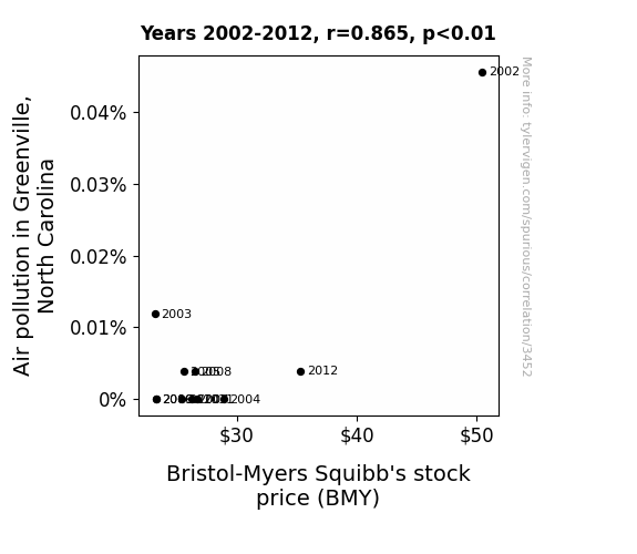
Breath of the Stock Market: Analyzing the Correlation between Air Pollution in Greenville, North Carolina and Bristol-Myers Squibb's Stock Price
As the air got cleaner in Greenville, fewer people needed respiratory medications, leading to a decrease in demand for Bristol-Myers Squibb's products. It seems like BMY's stock price couldn't stay a-breath of the fresh air trend, and investors were left gasping for returns.

What else correlates?
Air pollution in Greenville, North Carolina · all weather
Bristol-Myers Squibb's stock price (BMY) · all stocks
Air pollution in Greenville, North Carolina · all weather
Bristol-Myers Squibb's stock price (BMY) · all stocks


View details about correlation #2,571
From Electrifying E.T. Encounters to Tobagonian Transformations: Unveiling the Paranormal Power Play
The UFOs were actually giant, energy-efficient spacecraft powered by advanced alien technology. As they zipped through the skies of Alabama, their presence inadvertently charged up the atmosphere, creating electrical currents that traveled all the way to Trinidad and Tobago, giving the local power grid a boost. It turns out, the universe's way of saying, "Watt's up, T&T!"


What else correlates?
UFO sightings in Alabama · all random state specific
Electricity generation in Trinidad and Tobago · all energy
UFO sightings in Alabama · all random state specific
Electricity generation in Trinidad and Tobago · all energy


View details about correlation #1,209
From Wheat to Wires: Uncovering the Surprising Relationship Between Animal Feed Volume and Customer Satisfaction with Dell
As the volume of wheat used in the United States as animal feed decreased, there was a corresponding rise in the cost of producing meat. This led to people becoming increasingly hangry as they couldn't afford as much steak, which in turn put them in a perpetually irritable state. This heightened level of overall irritability was somehow channeled towards their experience with Dell, leading to a decrease in customer satisfaction. It's a case of the butterfly effect - fewer wheat grains for the cows, more grumbling customers for Dell!

What else correlates?
Volume of wheat used in the United States as animal feed · all food
Customer satisfaction with Dell · all weird & wacky
Volume of wheat used in the United States as animal feed · all food
Customer satisfaction with Dell · all weird & wacky


View details about correlation #2,353
Associates in Ambulance: Uncovering the Unexpected Link Between Emergency Medical Tech Degrees and Secretaries in Idaho
As more EMTs graduated, there was a surge in their demand for efficient secretaries to handle their paperwork, leading to a typist takeover in Idaho.

What else correlates?
Associates degrees awarded in Emergency medical tech · all education
The number of secretaries in Idaho · all cccupations
Associates degrees awarded in Emergency medical tech · all education
The number of secretaries in Idaho · all cccupations


View details about correlation #3,506
: Spenser's Smog: A Statistical Study of the Salience of First Names in the Smog-Infused City of Ann Arbor
As the name Spenser gained popularity, more and more parents were inspired to name their kids after the famous poet, which led to an unexpected resurgence in old English literature. This, in turn, caused a spike in demand for antique books, leading to a boom in the printing industry. With all these old printing presses firing up, the air in Ann Arbor got a little more 'polutudinous' than usual.


What else correlates?
Popularity of the first name Spenser · all first names
Air pollution in Ann Arbor · all weather
Popularity of the first name Spenser · all first names
Air pollution in Ann Arbor · all weather


View details about correlation #3,028
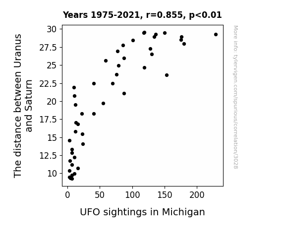
Interplanetary Intergalactic Connection: The Uranus-Saturn Distance and UFO Sightings in Michigan
As the distance increased, Uranus let out a cosmic toot that disrupted the space-time continuum, leading to a higher frequency of UFO sightings in Michigan. This created a gaseous ripple effect which inadvertently attracted intergalactic sightseers to the skies above the state, seeking out the the source of the celestial flatulence and adding a whole new meaning to the term "unidentified flying object."

What else correlates?
The distance between Uranus and Saturn · all planets
UFO sightings in Michigan · all random state specific
The distance between Uranus and Saturn · all planets
UFO sightings in Michigan · all random state specific
Why this works
- Data dredging: I have 25,237 variables in my database. I compare all these variables against each other to find ones that randomly match up. That's 636,906,169 correlation calculations! This is called “data dredging.”
Fun fact: the chart used on the wikipedia page to demonstrate data dredging is also from me. I've been being naughty with data since 2014.
Instead of starting with a hypothesis and testing it, I instead tossed a bunch of data in a blender to see what correlations would shake out. It’s a dangerous way to go about analysis, because any sufficiently large dataset will yield strong correlations completely at random. - Lack of causal connection: There is probably no direct connection between these variables, despite what the AI says above.
Because these pages are automatically generated, it's possible that the two variables you are viewing are in fact causually related. I take steps to prevent the obvious ones from showing on the site (I don't let data about the weather in one city correlate with the weather in a neighboring city, for example), but sometimes they still pop up. If they are related, cool! You found a loophole.
This is exacerbated by the fact that I used "Years" as the base variable. Lots of things happen in a year that are not related to each other! Most studies would use something like "one person" in stead of "one year" to be the "thing" studied. - Observations not independent: For many variables, sequential years are not independent of each other. You will often see trend-lines form. If a population of people is continuously doing something every day, there is no reason to think they would suddenly change how they are doing that thing on January 1. A naive p-value calculation does not take this into account.
You will calculate a lower chance of "randomly" achieving the result than represents reality.
To be more specific: p-value tests are probability values, where you are calculating the probability of achieving a result at least as extreme as you found completely by chance. When calculating a p-value, you need to assert how many "degrees of freedom" your variable has. I count each year (minus one) as a "degree of freedom," but this is misleading for continuous variables.
This kind of thing can creep up on you pretty easily when using p-values, which is why it's best to take it as "one of many" inputs that help you assess the results of your analysis.
- Y-axes doesn't start at zero: I truncated the Y-axes of the graphs above. I also used a line graph, which makes the visual connection stand out more than it deserves.
Nothing against line graphs. They are great at telling a story when you have linear data! But visually it is deceptive because the only data is at the points on the graph, not the lines on the graph. In between each point, the data could have been doing anything. Like going for a random walk by itself!
Mathematically what I showed is true, but it is intentionally misleading. If you click on any of the charts that abuse this, you can scroll down to see a version that starts at zero. - Confounding variable: Confounding variables (like global pandemics) will cause two variables to look connected when in fact a "sneaky third" variable is influencing both of them behind the scenes.
- Outliers: Some datasets here have outliers which drag up the correlation.
In concept, "outlier" just means "way different than the rest of your dataset." When calculating a correlation like this, they are particularly impactful because a single outlier can substantially increase your correlation.
Because this page is automatically generated, I don't know whether any of the charts displayed on it have outliers. I'm just a footnote. ¯\_(ツ)_/¯
I intentionally mishandeled outliers, which makes the correlation look extra strong. - Low n: There are not many data points included in some of these charts.
You can do analyses with low ns! But you shouldn't data dredge with a low n.
Even if the p-value is high, we should be suspicious of using so few datapoints in a correlation.
Pro-tip: click on any correlation to see:
- Detailed data sources
- Prompts for the AI-generated content
- Explanations of each of the calculations (correlation, p-value)
- Python code to calculate it yourself


