spurious correlations
discover · random · spurious scholar
← previous page · next page →


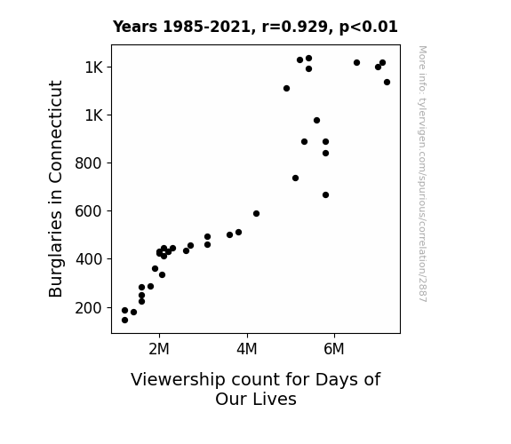
View details about correlation #2,887
The Days of Our Crimes: Unveiling the Intriguing Relationship Between Burglaries in Connecticut and Days of Our Lives Viewership
As burglaries decreased, more people felt safe staying home. This led to a decrease in viewership count for Days of Our Lives, as fewer individuals tuned in while cocooning in the comforting security of their own burglar-free homes.

What else correlates?
Burglaries in Connecticut · all random state specific
Viewership count for Days of Our Lives · all weird & wacky
Burglaries in Connecticut · all random state specific
Viewership count for Days of Our Lives · all weird & wacky


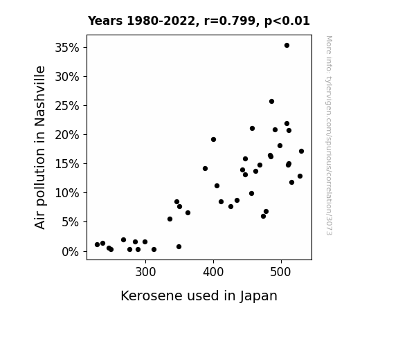
View details about correlation #3,073
The Gasp of the Rising Sun: Investigating the Relationship Between Air Pollution in Nashville and Kerosene Consumption in Japan
As air pollution in Nashville decreased, it led to a surprising rise in country music productivity. This, in turn, created a sudden decline in the demand for kerosene-fueled karaoke sessions in Japan, as the new upbeat Nashville tunes dominated the market, leaving traditional kerosene karaoke in the dust. It seems Nashville's cleaner air really struck the right chord across the Pacific! Yee-haw-kyo!

What else correlates?
Air pollution in Nashville · all weather
Kerosene used in Japan · all energy
Air pollution in Nashville · all weather
Kerosene used in Japan · all energy


View details about correlation #2,216
Melting Point: Analyzing the Relationship Between Butter Consumption and Google Searches for 'Ice Bath'
The extra butter consumption led to a rise in spontaneous kitchen dance parties, resulting in an urgent need for post-butter dance cooldowns. These dance enthusiasts were literally buttering themselves up to take the plunge into icy relaxation, making ice baths the coolest new way to shake, rattle, and roll. After all, it's a slippery slope from butter to boogie to below freezing bliss! So they say, if you can't stand the heat, grab the butter and disco on down to an ice bath near you. Just remember, it's all fun and games until someone shouts, "We're out of butter!" Keep calm and butter on!


What else correlates?
Butter consumption · all food
Google searches for 'ice bath' · all google searches
Butter consumption · all food
Google searches for 'ice bath' · all google searches


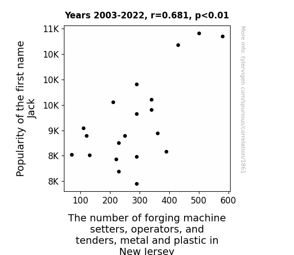
View details about correlation #1,861
Jack's Juxtaposition: The Jive between Jack's Popularity and Forge Operator Numbers in New Jersey
As the name Jack rose in popularity, more and more babies were being named after the infamous pirate Captain Jack Sparrow. These toddlers, with their tiny swashbuckling attitudes, unknowingly inspired a surge of interest in blacksmithing and metalwork across New Jersey. It was a golden age for pint-sized buccaneers yelling "Avast, ye landlubbers!" on playgrounds, and a strange but undeniable connection emerged between the call of adventure and the clanging of metal in the Garden State. It was as if the little Jacks were saying, "Aye, matey, let's shiver some timbers and forge me a hook hand worthy of a true pirate!" And thus, the number of forging machine setters, operators, and tenders, metal and plastic in New Jersey experienced a curious and inexplicable boost. The legend of Jack and the trade of all trades lives on! Yo ho ho and a bottle of...molten steel?


View details about correlation #2,572
Flying High: The UFO-niversal Connection Between Pennsylvania Sightings and US Patents
The influx of extraterrestrial technology ideas being beamed into the brains of Pennsylvanians is sparking a surge in innovative inventions. It seems our outer space friends are abducting their knowledge of cutting-edge creations, leading to a cosmic competition for patents here on Earth. It's like they say, the truth is out there... and so are some groundbreaking ideas!


What else correlates?
UFO sightings in Pennsylvania · all random state specific
Patents granted in the US · all weird & wacky
UFO sightings in Pennsylvania · all random state specific
Patents granted in the US · all weird & wacky


View details about correlation #1,711
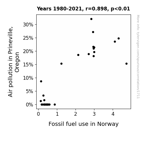
Fossil Fuel Foil: Prineville's Air Quality and Norway's Oil Royalty
The smog wafted all the way to Norway, providing a nostalgic scent of city life. This prompted the Norwegians to crank up their classic car collection for a taste of urban air without the high fuel costs.

What else correlates?
Air pollution in Prineville, Oregon · all weather
Fossil fuel use in Norway · all energy
Air pollution in Prineville, Oregon · all weather
Fossil fuel use in Norway · all energy
. The chart goes from 2002 to 2023, and the two variables track closely in value over that time.")

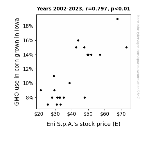
View details about correlation #2,847
Stalk-ing the Market: The Kernel Connection Between GMO Corn and Eni S.p.A.'s Stock Price
As the corn grew bigger and stronger, it started whispering stock tips to unsuspecting passersby, causing a surge in Eni S.p.A.'s stock price. Or perhaps the corn was just really good at photosynthesizing money for the company.

What else correlates?
GMO use in corn grown in Iowa · all food
Eni S.p.A.'s stock price (E) · all stocks
GMO use in corn grown in Iowa · all food
Eni S.p.A.'s stock price (E) · all stocks


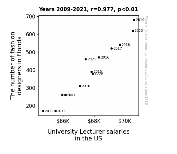
View details about correlation #1,780
Stitching up the Connection: How the Proliferation of Fashion Designers in Florida Affects University Lecturer Salaries Across the US
As more fashion designers flocked to Florida, it led to a surge in unique and flamboyant fashion trends. This created a sudden demand for expert fashion history and theory lecturers across the country. As universities scrambled to keep up with the latest haute couture curriculum, they had to offer higher salaries to attract and retain the most fashionable academic talent. So, in a twist no one saw coming, the Sunshine State's affinity for style inadvertently elevated the bank accounts of university lecturers nationwide. After all, it's not just the students who deserve a well-tailored education!

What else correlates?
The number of fashion designers in Florida · all cccupations
University Lecturer salaries in the US · all education
The number of fashion designers in Florida · all cccupations
University Lecturer salaries in the US · all education


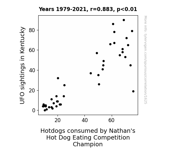
View details about correlation #1,625
The Unearthly Union: Unraveling the Unlikely Correlation between UFO Sightings in Kentucky and the Consumption of Nathan's Hot Dogs by Nathan's Hot Dog Eating Competition Champion
There's a direct link between Kentucky UFO sightings and the Nathan's Hot Dog Eating Competition Champion's intake. You see, the UFOs were beaming down some next-level condiments, giving the hotdogs an otherworldly flavor! It's like they say, when it comes to hotdog toppings, the sky's the limit!


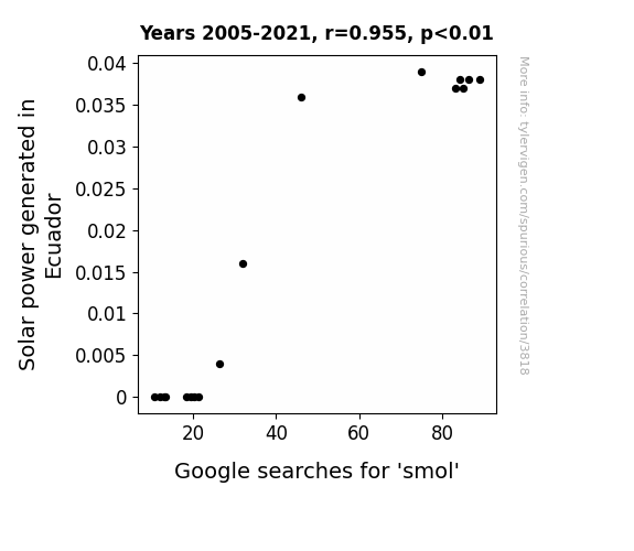
View details about correlation #3,818
Illuminating the Connection: Shedding Light on the Link Between Solar Power Generation in Ecuador and Google Searches for 'smol'
The increase in solar power generated in Ecuador is actually causing mini suns to form randomly, leading to an overall cuteness overload. As these smol suns bounce around, they inadvertently trigger feelings of adorableness in anyone nearby. This results in an inexplicable urge to search for and appreciate all things smol, from tiny animals to little trinkets. It’s like a sunny conspiracy to make the world a cuter place, one search at a time. Just imagine, all because Ecuador is shining bright, the internet is now collectively going “aww” at the smol wonders of the world. It’s a small, but positively charged, connection that’s truly bringing some light-hearted joy to our screens.

What else correlates?
Solar power generated in Ecuador · all energy
Google searches for 'smol' · all google searches
Solar power generated in Ecuador · all energy
Google searches for 'smol' · all google searches


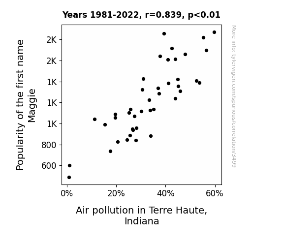
View details about correlation #3,499
Nitrogen Oxide, Nitrogen You: The Maggie-tude of Popularity in Relation to Air Quality in Terre Haute, Indiana
As the name Maggie gained popularity, so did the use of personalized car air fresheners, leading to a spike in demand for new cars. This influx of new car purchases in Terre Haute revved up the pollution levels, creating a smoggy situation. Looks like the road to popularity was paved with some unintended smog emissions!

What else correlates?
Popularity of the first name Maggie · all first names
Air pollution in Terre Haute, Indiana · all weather
Popularity of the first name Maggie · all first names
Air pollution in Terre Haute, Indiana · all weather


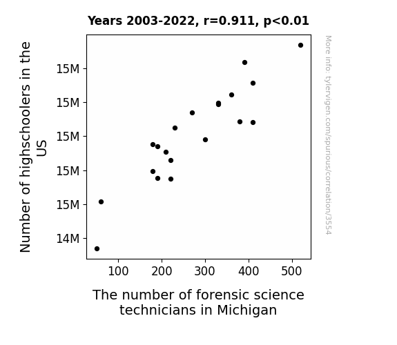
View details about correlation #3,554
Counting on Youth: The Forensic Science Technician-Filled Future of Michigan and the Influence of High Schoolers Across the US
As the number of highschoolers in the US increased, so did the demand for elaborate promposals. This led to a spike in the creation of crime scene reenactment promposals in Michigan, ultimately requiring more forensic science technicians to analyze the faux evidence. After all, nothing says "I'd be dying to go to prom with you" like a mock murder mystery.

What else correlates?
Number of highschoolers in the US · all education
The number of forensic science technicians in Michigan · all cccupations
Number of highschoolers in the US · all education
The number of forensic science technicians in Michigan · all cccupations


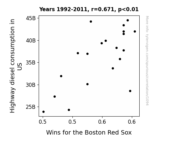
View details about correlation #1,094
Highway to Home Plate: A Correlational Analysis of Highway Diesel Consumption in the US and Wins for the Boston Red Sox
The fumes inspired a new wave of base stealing and home run hitting, propelling the Red Sox to victory. It's a classic case of 'driving' in those winning runs!

What else correlates?
Highway diesel consumption in US · all weird & wacky
Wins for the Boston Red Sox · all sports
Highway diesel consumption in US · all weird & wacky
Wins for the Boston Red Sox · all sports


View details about correlation #1,901
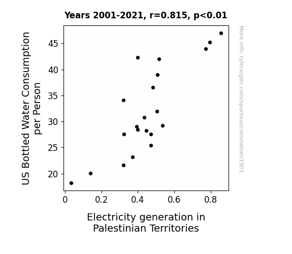
From Currents to Current: Exploring the Shocking Relationship Between Bottled Water Consumption and Electricity Generation
As Americans guzzled more bottled water, they unwittingly created a surge in the global demand for plastic. This led to an unexpected boom in the Palestinian Territories' plastic manufacturing industry, sparking a sparktacular rise in electricity generation to keep up with the production. It's a current situation that's truly electrifying, all thanks to the shocking connection between hydration habits and power production in a twist of fate!

What else correlates?
US Bottled Water Consumption per Person · all food
Electricity generation in Palestinian Territories · all energy
US Bottled Water Consumption per Person · all food
Electricity generation in Palestinian Territories · all energy
. The chart goes from 2004 to 2023, and the two variables track closely in value over that time.")

View details about correlation #2,276
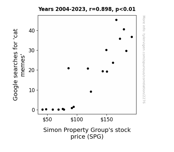
Cognitive Correlations: Cat Memes and Simon Property Group's Stock Sensitivity
As the nation collectively laughed at silly feline antics, the demand for retail therapy skyrocketed. Simon Property Group, being a major player in the shopping mall industry, saw a surge in foot traffic as people sought out purrfectly quirky cat-themed merchandise and impulsively decided to treat themselves. This unexpected economic paw-sitivity led to investors feeling bullish about SPG’s prospects, causing the stock price to climb higher than a cat scaling a curtain. Remember, when cat memes are on the rise, so are the profits – it’s a clawsome connection!

What else correlates?
Google searches for 'cat memes' · all google searches
Simon Property Group's stock price (SPG) · all stocks
Google searches for 'cat memes' · all google searches
Simon Property Group's stock price (SPG) · all stocks


View details about correlation #1,754
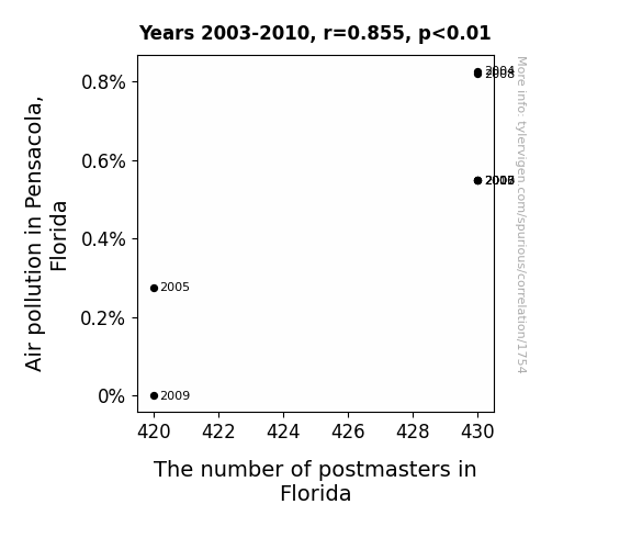
Postal Pollution: A Correlative Analysis of Air Quality in Pensacola, Florida and Postmaster Populations in Florida
The increased air pollution in Pensacola, Florida has led to a surge in the local pigeon population. These pollution-loving pigeons, seeking postal employment, have aced the delivery routes, impressing the authorities with their swift and accurate deliveries. As a result, there has been a demand for more postmasters in Florida to manage the pigeon postal service efficiently. This has inadvertently created job opportunities for humans in the postal industry. The pigeons, with their innate navigational skills, have revolutionized the delivery system, prompting the need for additional human oversight. This unexpected partnership between pollution, pigeons, and postal service has established Pensacola as a hub for avian-assisted mail delivery, ultimately boosting the employment of postmasters across the state.

What else correlates?
Air pollution in Pensacola, Florida · all weather
The number of postmasters in Florida · all cccupations
Air pollution in Pensacola, Florida · all weather
The number of postmasters in Florida · all cccupations


View details about correlation #1,624
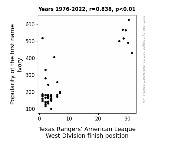
The Ivory Connection: A Study on the Interplay between the Popularity of the Name Ivory and the Texas Rangers' Performance in the American League West Division
As more babies were named Ivory, it led to a spike in pastel-colored baby outfits. This, in turn, caused a rise in demand for blue and red dyes. With the sudden need for more dyes, the prices shot up, making it more lucrative for farmers in Texas to switch from cattle ranching to growing dye plants. As a result, there was a shortage of cattle, leading to higher beef prices. The Texas Rangers, fueled by the most expensive beef in the league, were able to power their way to a higher division finish, proving once and for all that there's no steak-like motivation!


View details about correlation #2,711
Geothermal Heat and Hollywood Flop: A Extravaganza Budget Bonanza
As geothermal power in Portugal increased, it led to a surge in earth-shatteringly good ideas for movie plots. This in turn sparked a competitive bidding war among movie studios for the best scripts, ultimately driving up the budget for the largest movie production. It's a tale of heated competition in the film industry, where even the Earth's natural energy couldn't resist getting in on the action!


What else correlates?
Geothermal power generated in Portugal · all energy
Budget for largest movie production · all films & actors
Geothermal power generated in Portugal · all energy
Budget for largest movie production · all films & actors
. The chart goes from 2007 to 2021, and the two variables track closely in value over that time.")

View details about correlation #3,587
Say Cheese! The Cheddar Connection: Exploring the Relationship Between American Cheese Consumption and TransDigm's Stock Price
As American cheese consumption melted hearts across the nation, it created a ripple effect in the stock market. The ooey-gooey goodness of this cheese led to an increase in happiness levels, prompting people to invest in things that brought them joy - like TransDigm Group. It's a gouda thing they did, because the stock price rose as investors felt grate about the company's potential. This correlation is no accident; it's a cheesy twist of fate that's nacho average stock market story. Talk about a dairy tale ending for TransDigm Group! Remember, when it comes to stocks, it's all about the whey you cheddar your investments. But hey, that's just how the queso crumbles in the finance world!
What else correlates?
American cheese consumption · all food
TransDigm Group's stock price (TDG) · all stocks
American cheese consumption · all food
TransDigm Group's stock price (TDG) · all stocks


View details about correlation #2,042
The Para-Professor Paradox: A Correlation Study of Paralegal Numbers in Arizona and Assistant Professor Salaries in the US
As the number of paralegals in Arizona grew, so did the demand for legal assistance nationwide, leading to a rise in Assistant Processor salaries. This just goes to show, in the legal world, even the tiniest briefs can lead to major settlements!

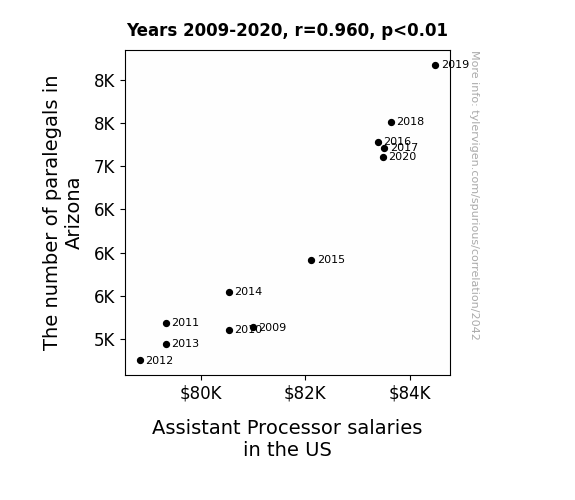
What else correlates?
The number of paralegals in Arizona · all cccupations
Assistant Processor salaries in the US · all education
The number of paralegals in Arizona · all cccupations
Assistant Processor salaries in the US · all education
Why this works
- Data dredging: I have 25,237 variables in my database. I compare all these variables against each other to find ones that randomly match up. That's 636,906,169 correlation calculations! This is called “data dredging.”
Fun fact: the chart used on the wikipedia page to demonstrate data dredging is also from me. I've been being naughty with data since 2014.
Instead of starting with a hypothesis and testing it, I instead tossed a bunch of data in a blender to see what correlations would shake out. It’s a dangerous way to go about analysis, because any sufficiently large dataset will yield strong correlations completely at random. - Lack of causal connection: There is probably no direct connection between these variables, despite what the AI says above.
Because these pages are automatically generated, it's possible that the two variables you are viewing are in fact causually related. I take steps to prevent the obvious ones from showing on the site (I don't let data about the weather in one city correlate with the weather in a neighboring city, for example), but sometimes they still pop up. If they are related, cool! You found a loophole.
This is exacerbated by the fact that I used "Years" as the base variable. Lots of things happen in a year that are not related to each other! Most studies would use something like "one person" in stead of "one year" to be the "thing" studied. - Observations not independent: For many variables, sequential years are not independent of each other. You will often see trend-lines form. If a population of people is continuously doing something every day, there is no reason to think they would suddenly change how they are doing that thing on January 1. A naive p-value calculation does not take this into account.
You will calculate a lower chance of "randomly" achieving the result than represents reality.
To be more specific: p-value tests are probability values, where you are calculating the probability of achieving a result at least as extreme as you found completely by chance. When calculating a p-value, you need to assert how many "degrees of freedom" your variable has. I count each year (minus one) as a "degree of freedom," but this is misleading for continuous variables.
This kind of thing can creep up on you pretty easily when using p-values, which is why it's best to take it as "one of many" inputs that help you assess the results of your analysis.
- Y-axes doesn't start at zero: I truncated the Y-axes of the graphs above. I also used a line graph, which makes the visual connection stand out more than it deserves.
Nothing against line graphs. They are great at telling a story when you have linear data! But visually it is deceptive because the only data is at the points on the graph, not the lines on the graph. In between each point, the data could have been doing anything. Like going for a random walk by itself!
Mathematically what I showed is true, but it is intentionally misleading. If you click on any of the charts that abuse this, you can scroll down to see a version that starts at zero. - Confounding variable: Confounding variables (like global pandemics) will cause two variables to look connected when in fact a "sneaky third" variable is influencing both of them behind the scenes.
- Outliers: Some datasets here have outliers which drag up the correlation.
In concept, "outlier" just means "way different than the rest of your dataset." When calculating a correlation like this, they are particularly impactful because a single outlier can substantially increase your correlation.
Because this page is automatically generated, I don't know whether any of the charts displayed on it have outliers. I'm just a footnote. ¯\_(ツ)_/¯
I intentionally mishandeled outliers, which makes the correlation look extra strong. - Low n: There are not many data points included in some of these charts.
You can do analyses with low ns! But you shouldn't data dredge with a low n.
Even if the p-value is high, we should be suspicious of using so few datapoints in a correlation.
Pro-tip: click on any correlation to see:
- Detailed data sources
- Prompts for the AI-generated content
- Explanations of each of the calculations (correlation, p-value)
- Python code to calculate it yourself


