spurious correlations
discover · random · spurious scholar
← previous page · next page →
. The chart goes from 2007 to 2023, and the two variables track closely in value over that time.")

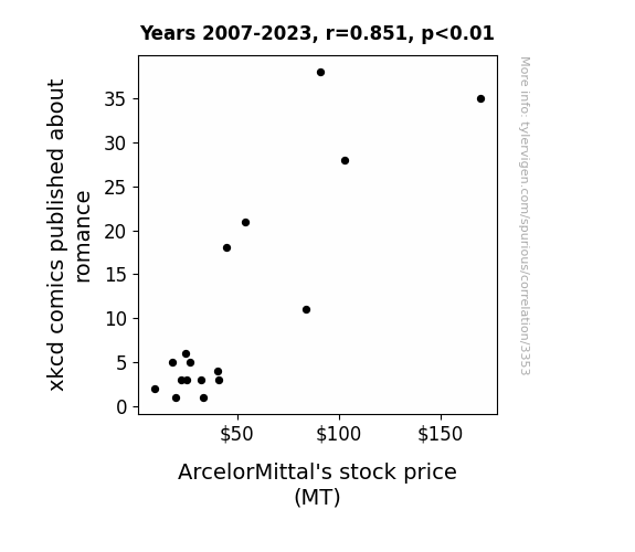
View details about correlation #3,353
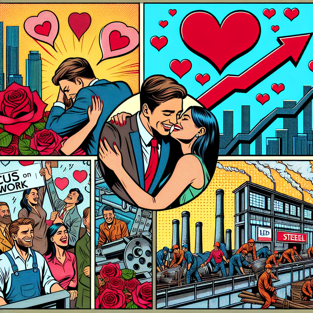
Rust and Romance: An Examination of the Correlation Between xkcd Comics on Love and ArcelorMittal's Stock Price
As the number of xkcd romance comics decreased, there was less love in the air. This led to a shortage of heart-shaped items being produced, including metallic love locks. With a reduced demand for these cheesy yet lucrative products, ArcelorMittal's stock took a steel plunge.
What else correlates?
xkcd comics published about romance · all weird & wacky
ArcelorMittal's stock price (MT) · all stocks
xkcd comics published about romance · all weird & wacky
ArcelorMittal's stock price (MT) · all stocks


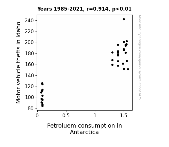
View details about correlation #3,475
The Great Steal-Antarctic Wheel Deal: Motor Vehicle Thefts in Idaho and Petroleum Consumption in Antarctica
As Motor vehicle thefts in Idaho decreased, there were fewer getaway cars available for criminals to use, leading to a decrease in demand for gasoline. This ultimately resulted in a drop in Petrol(eum) consumption in Antarctica, because even penguins were finding it harder to fuel up their ice-cars for joyrides.

What else correlates?
Motor vehicle thefts in Idaho · all random state specific
Petroluem consumption in Antarctica · all energy
Motor vehicle thefts in Idaho · all random state specific
Petroluem consumption in Antarctica · all energy


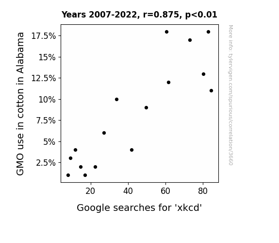
View details about correlation #3,660
The GMOxkcd Connection: A Cotton-Candy of Correlation
As the non-GMO cotton industry boomed, it created a ripple effect. Farmers were suddenly too busy cultivating organic, heirloom cotton to keep up with the latest webcomics. You could say they were really spinning a yarn, and it led to a whole thread of events. Plus, without GMOs, they just couldn't crop-doodle like they used to.

What else correlates?
GMO use in cotton in Alabama · all food
Google searches for 'xkcd' · all google searches
GMO use in cotton in Alabama · all food
Google searches for 'xkcd' · all google searches


View details about correlation #1,858
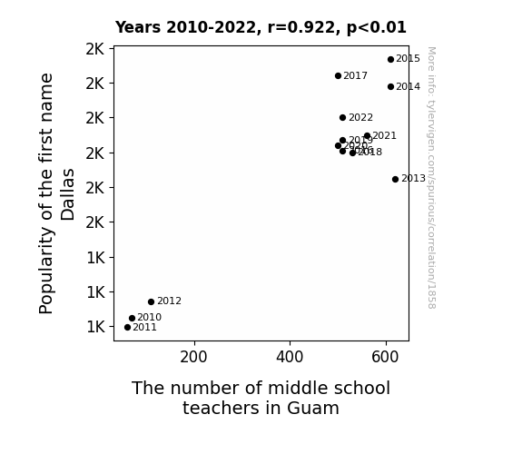
Delving into the Dallas Effect: The Dalliance Between Popularity of the First Name Dallas and the Demand for Middle School Teachers in Guam
As the name Dallas gained popularity, more parents subconsciously developed a heightened interest in the city of Dallas. This led to a surge in family vacations to Dallas, and as luck would have it, many of these families included middle school teachers. After experiencing the charm of Dallas, they felt a strong urge to move to an equally alluring and vibrant place, thus choosing to further their careers in Guam, ultimately increasing the number of middle school teachers in the region. It's like a domino effect, but with a Texan twist!

What else correlates?
Popularity of the first name Dallas · all first names
The number of middle school teachers in Guam · all cccupations
Popularity of the first name Dallas · all first names
The number of middle school teachers in Guam · all cccupations
. The chart goes from 2002 to 2022, and the two variables track closely in value over that time.")

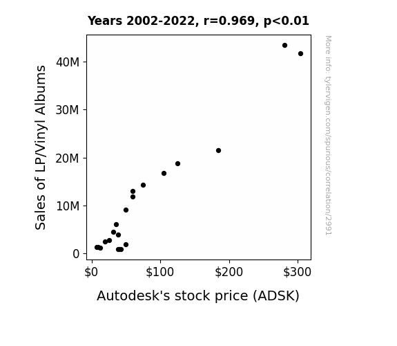
View details about correlation #2,991
Spinnin' and Winnin': The Groovy Correlation Between LP/Vinyl Album Sales and Autodesk's Stock Price
The surge in LP/vinyl album sales led to a higher demand for record players. This, in turn, boosted the need for stylish and innovative record player designs. Autodesk, being a leader in 3D design, engineering, and entertainment software, saw a spike in their stock price as they were the go-to choice for creating the latest groovy and revolutionary record player models. It's safe to say that Autodesk's stock was spinning right round like a record, baby!

What else correlates?
Sales of LP/Vinyl Albums · all weird & wacky
Autodesk's stock price (ADSK) · all stocks
Sales of LP/Vinyl Albums · all weird & wacky
Autodesk's stock price (ADSK) · all stocks


View details about correlation #2,338
Smoggy Connections: Uncovering the Correlation Between Atlanta Air Pollution and Norwegian Gasoline Consumption
The cleaner air in Atlanta led to a decrease in demand for gas, prompting Norwegian suppliers to cut back on production. After all, it's the latest twist in international air and fuel relations!


What else correlates?
Air pollution in Atlanta · all weather
Gasoline pumped in Norway · all energy
Air pollution in Atlanta · all weather
Gasoline pumped in Norway · all energy


View details about correlation #2,477
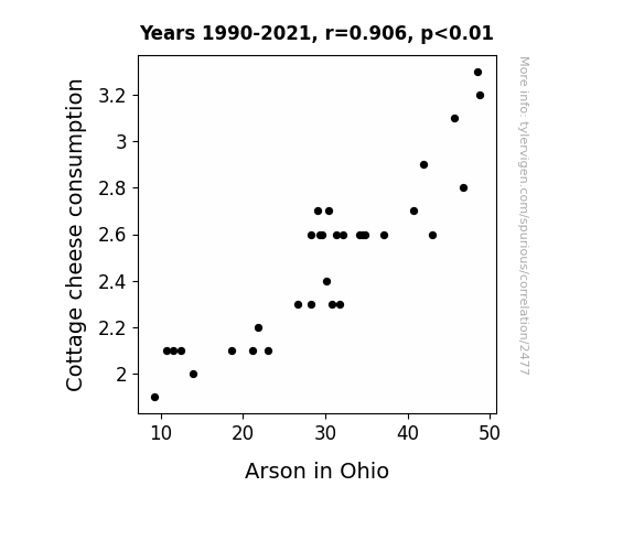
Cottage Cheese Capers: A Comparative Analysis of Consumption and Combustion in Ohio
As cottage cheese consumption decreased, there was a corresponding decrease in lactose intolerance-related stress. This led to an overall reduction in heated arguments. This reduction in heated arguments decreased the likelihood of domestic disputes escalating into arson incidents in Ohio. Remember, the curd may be the word, but it's also the un-burned.

What else correlates?
Cottage cheese consumption · all food
Arson in Ohio · all random state specific
Cottage cheese consumption · all food
Arson in Ohio · all random state specific


View details about correlation #3,329
A Sticky Situation: Exploring the Correlation Between Forestry Labor and S'mores-Related Google Searches in Louisiana
As more log graders and scalers were hired in Louisiana, there was a boom in the timber industry. This led to an abundance of high-quality, precisely cut wood pieces that were just perfect for crafting the ultimate, uniform s'mores sticks. With such top-notch roasting sticks readily available, people across the state were inspired to have more backyard bonfires and camping trips, inevitably fueling a surge in the demand for s'mores. It's like the universe was saying, "Let there be s'more delicious outdoor treats!"


What else correlates?
The number of log graders and scalers in Louisiana · all cccupations
Google searches for 'Smores' · all google searches
The number of log graders and scalers in Louisiana · all cccupations
Google searches for 'Smores' · all google searches
. The chart goes from 2002 to 2022, and the two variables track closely in value over that time.")

View details about correlation #2,825
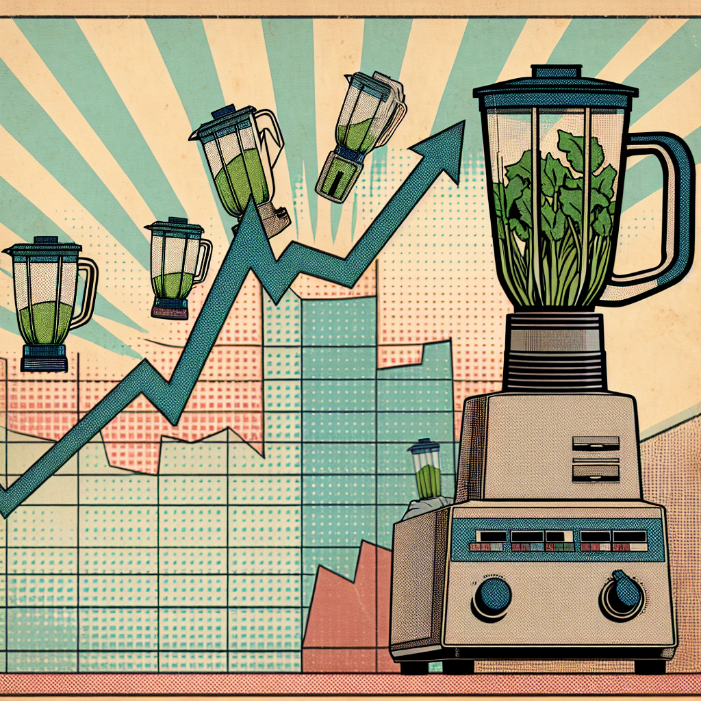
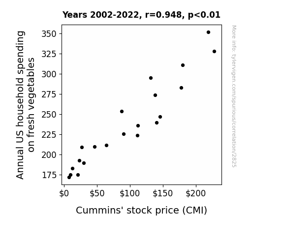
Stocked Up on Greens: Unearthing the Correlation Between Annual US Household Spending on Fresh Vegetables and Cummins' Stock Price
As households spent more on fresh veggies, they also bought more blenders to make green smoothies. This increased demand for electricity, leading to a surge in need for Cummins' power generation products. It's a real re-vegetable cycle, showing that when it comes to stocks, it all boils down to the power of produce!
What else correlates?
Annual US household spending on fresh vegetables · all weird & wacky
Cummins' stock price (CMI) · all stocks
Annual US household spending on fresh vegetables · all weird & wacky
Cummins' stock price (CMI) · all stocks


View details about correlation #3,348
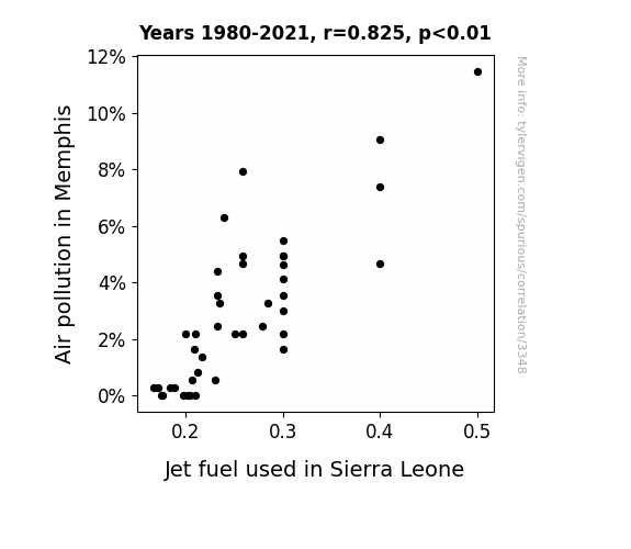
The Sky's the Limit: A Correlative Analysis of Air Pollution in Memphis and Jet Fuel Usage in Sierra Leone
When the air in Memphis became cleaner, it inadvertently led to a surge in the production of fresh, crisp dollar bills. These pristine dollars, known for their ability to fly, started migrating to Sierra Leone all on their own, creating a high demand for jet fuel to keep up with their airborne escapades. This unexpected connection between air quality and aero dollars has economists and environmentalists alike scratching their heads, but one thing's for sure - when it comes to monetary matters, the sky's the limit!

What else correlates?
Air pollution in Memphis · all weather
Jet fuel used in Sierra Leone · all energy
Air pollution in Memphis · all weather
Jet fuel used in Sierra Leone · all energy


View details about correlation #2,093
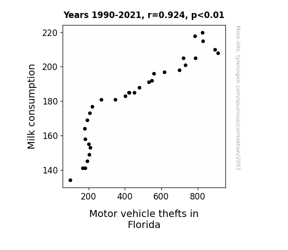
The Milky Whey: Investigating the Correlation Between Milk Consumption and Motor Vehicle Thefts in Florida
Fewer milk mustaches meant fewer dairy desperadoes on the loose, leading to a udderly unexpected drop in moo-tor vehicle thefts in the sunshine state. The lack of moo-vement in milk aisles left would-be thieves feeling utterly unmoo-tivated to engage in any criminal activity. Who knew that the road to safer streets in Florida was simply to mil-k it for all it's worth!

What else correlates?
Milk consumption · all food
Motor vehicle thefts in Florida · all random state specific
Milk consumption · all food
Motor vehicle thefts in Florida · all random state specific


View details about correlation #3,013
Nailing the Dario Effect: The Curious Correlation Between the Popularity of Dario and the Growth in Manicurists and Pedicurists in Nevada
As the name Dario gained popularity, more babies were born with an innate talent for nail art, leading to a surge in demand for manicurists and pedicurists in Nevada. It seems Dario's are just born to nail it!


What else correlates?
Popularity of the first name Dario · all first names
The number of manicurists and pedicurists in Nevada · all cccupations
Popularity of the first name Dario · all first names
The number of manicurists and pedicurists in Nevada · all cccupations


View details about correlation #2,975
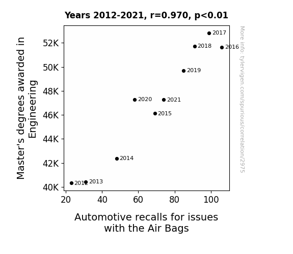
Masters of Engineering and Airbag Anomalies: An Amusing Association
As more engineers with Master's degrees entered the workforce, they couldn't resist the urge to over-engineer every aspect of the airbag system, leading to unexpected malfunctions. It was a case of too much education creating car tension!

What else correlates?
Master's degrees awarded in Engineering · all education
Automotive recalls for issues with the Air Bags · all weird & wacky
Master's degrees awarded in Engineering · all education
Automotive recalls for issues with the Air Bags · all weird & wacky


View details about correlation #2,480
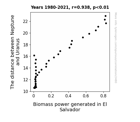
From Neptune to Bio-mass: Exploring the Celestial Link to Power Production in El Salvador
The gravitational pull created a stronger renewable energy field around the planet, leading to greater efficiency in biomass power generation on Earth. This also coincided with a spike in cosmic plant growth, contributing to the overall increase in biomass power in El Salvador.

What else correlates?
The distance between Neptune and Uranus · all planets
Biomass power generated in El Salvador · all energy
The distance between Neptune and Uranus · all planets
Biomass power generated in El Salvador · all energy
. The chart goes from 2002 to 2023, and the two variables track closely in value over that time.")

View details about correlation #2,900
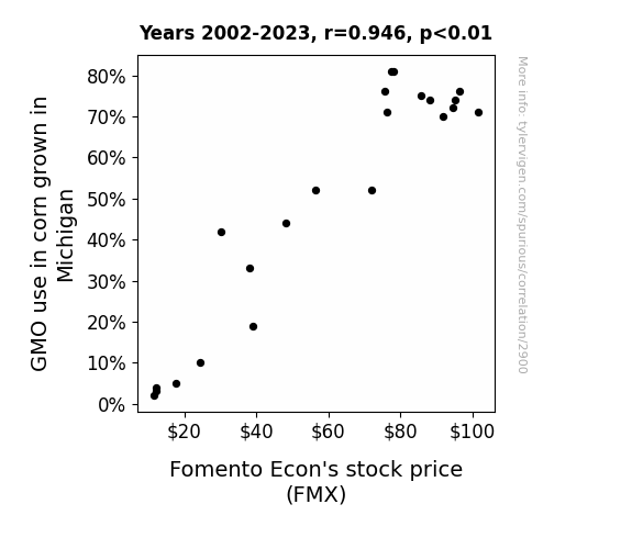
The CORN-EY Connection: Exploring the GMO Effect on Fomento Econ's Stock Price
As GMO corn grew taller, it provided better reception for positive stock market vibes, thus boosting investor confidence in Fomento Econ. As a result, the demand for Fomento Econ's stock increased, leading to a rise in stock price.

What else correlates?
GMO use in corn grown in Michigan · all food
Fomento Econ's stock price (FMX) · all stocks
GMO use in corn grown in Michigan · all food
Fomento Econ's stock price (FMX) · all stocks


View details about correlation #1,867
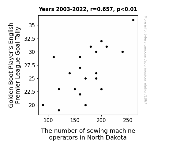
Stitching Together Success: The Thread Between EPL Golden Boot Player's Goal Tally and North Dakota Sewing Machine Operators
As the Golden Boot Player's goal tally rose, so did the spirits of the English fans. These fans, located all around the world, unknowingly emitted positive sewing energy that somehow made its way to North Dakota, inspiring more people to take up sewing as a hobby or profession. It's like a global wave of stitching enthusiasm sparked by the excitement of football goals!


View details about correlation #1,545
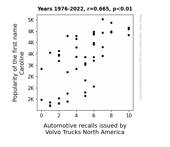
Recalling Caroline: A Correlation Between Name Popularity and Volvo Trucks North America Recalls
Every time someone named Caroline got behind the wheel, the sheer force of their popularity caused all the Volvo trucks to malfunction at once. It seems like the roads just couldn't handle that level of Caro-line love!


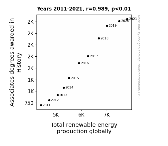
View details about correlation #1,793
A Historical Degree of Amped Up Energy: The Correlation Between Associates Degrees in History and Global Renewable Energy Production
As more people became knowledgeable about past energy sources, they realized that harnessing the power of dinosaur fossils wasn't a sustainable long-term plan. This led to a renewed focus on alternative energy sources like solar, wind, and hydroelectric power. After all, you can't just dig up a T-Rex to power your home (although that would be pretty epic). So, thank you, history buffs, for helping steer the world towards a greener, cleaner future! Keep studying those ancient civilizations, because who knows what other valuable lessons they might hold for our modern world.

What else correlates?
Associates degrees awarded in History · all education
Total renewable energy production globally · all energy
Associates degrees awarded in History · all education
Total renewable energy production globally · all energy


View details about correlation #3,204
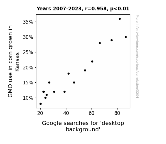
Corny Connections: Genetically Modified Corn in Kansas and the Curious Case of Google Searches for 'Desktop Background'
Turns out, the corn was developing an unexpected kernel pattern that looked exactly like a picturesque sunset, and people couldn't get enough of it for their computer wallpapers! It's the latest in agriculture-meets-aesthetics. Corny backgrounds are the new trend in digital decor!

What else correlates?
GMO use in corn grown in Kansas · all food
Google searches for 'desktop background' · all google searches
GMO use in corn grown in Kansas · all food
Google searches for 'desktop background' · all google searches
. The chart goes from 2003 to 2022, and the two variables track closely in value over that time.")

View details about correlation #3,456
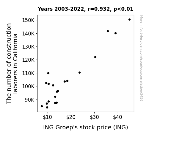
Building Blocks and Stock Shocks: Unraveling the Link Between Construction Labor in California and ING Groep's Stock Price
As the number of construction laborers in California grew, so did the demand for new housing and commercial spaces, leading to an expansion in construction projects. This surge in construction ultimately drove up the need for business loans, which put ING Groep in the spotlight as a leading provider of financial services to the construction industry. It's like they say, when it comes to ING Groep's stock, the construction industry really knows how to build up interest!

What else correlates?
The number of construction laborers in California · all cccupations
ING Groep's stock price (ING) · all stocks
The number of construction laborers in California · all cccupations
ING Groep's stock price (ING) · all stocks
Why this works
- Data dredging: I have 25,237 variables in my database. I compare all these variables against each other to find ones that randomly match up. That's 636,906,169 correlation calculations! This is called “data dredging.”
Fun fact: the chart used on the wikipedia page to demonstrate data dredging is also from me. I've been being naughty with data since 2014.
Instead of starting with a hypothesis and testing it, I instead tossed a bunch of data in a blender to see what correlations would shake out. It’s a dangerous way to go about analysis, because any sufficiently large dataset will yield strong correlations completely at random. - Lack of causal connection: There is probably no direct connection between these variables, despite what the AI says above.
Because these pages are automatically generated, it's possible that the two variables you are viewing are in fact causually related. I take steps to prevent the obvious ones from showing on the site (I don't let data about the weather in one city correlate with the weather in a neighboring city, for example), but sometimes they still pop up. If they are related, cool! You found a loophole.
This is exacerbated by the fact that I used "Years" as the base variable. Lots of things happen in a year that are not related to each other! Most studies would use something like "one person" in stead of "one year" to be the "thing" studied. - Observations not independent: For many variables, sequential years are not independent of each other. You will often see trend-lines form. If a population of people is continuously doing something every day, there is no reason to think they would suddenly change how they are doing that thing on January 1. A naive p-value calculation does not take this into account.
You will calculate a lower chance of "randomly" achieving the result than represents reality.
To be more specific: p-value tests are probability values, where you are calculating the probability of achieving a result at least as extreme as you found completely by chance. When calculating a p-value, you need to assert how many "degrees of freedom" your variable has. I count each year (minus one) as a "degree of freedom," but this is misleading for continuous variables.
This kind of thing can creep up on you pretty easily when using p-values, which is why it's best to take it as "one of many" inputs that help you assess the results of your analysis.
- Y-axes doesn't start at zero: I truncated the Y-axes of the graphs above. I also used a line graph, which makes the visual connection stand out more than it deserves.
Nothing against line graphs. They are great at telling a story when you have linear data! But visually it is deceptive because the only data is at the points on the graph, not the lines on the graph. In between each point, the data could have been doing anything. Like going for a random walk by itself!
Mathematically what I showed is true, but it is intentionally misleading. If you click on any of the charts that abuse this, you can scroll down to see a version that starts at zero. - Confounding variable: Confounding variables (like global pandemics) will cause two variables to look connected when in fact a "sneaky third" variable is influencing both of them behind the scenes.
- Outliers: Some datasets here have outliers which drag up the correlation.
In concept, "outlier" just means "way different than the rest of your dataset." When calculating a correlation like this, they are particularly impactful because a single outlier can substantially increase your correlation.
Because this page is automatically generated, I don't know whether any of the charts displayed on it have outliers. I'm just a footnote. ¯\_(ツ)_/¯
I intentionally mishandeled outliers, which makes the correlation look extra strong. - Low n: There are not many data points included in some of these charts.
You can do analyses with low ns! But you shouldn't data dredge with a low n.
Even if the p-value is high, we should be suspicious of using so few datapoints in a correlation.
Pro-tip: click on any correlation to see:
- Detailed data sources
- Prompts for the AI-generated content
- Explanations of each of the calculations (correlation, p-value)
- Python code to calculate it yourself


