spurious correlations
discover · random · spurious scholar
← previous page · next page →


View details about correlation #1,986
Unidentified Flying Correlations: The Strange Connection Between UFO Sightings in Vermont and Total Number of Successful Mount Everest Climbs
Well, it's simple really. The UFOs were just giving the climbers some otherworldly encouragement! Those aliens must have thought the view from the top was out of this world and wanted to summit up their support. The cosmic connection must have sparked a stellar performance in those climbers, propelling them to new heights. It's truly an 'ET-rifying' and 'intergalactically' amazing correlation! Who knew that the key to conquering Everest was written in the stars?


What else correlates?
UFO sightings in Vermont · all random state specific
Total Number of Successful Mount Everest Climbs · all weird & wacky
UFO sightings in Vermont · all random state specific
Total Number of Successful Mount Everest Climbs · all weird & wacky


View details about correlation #2,479
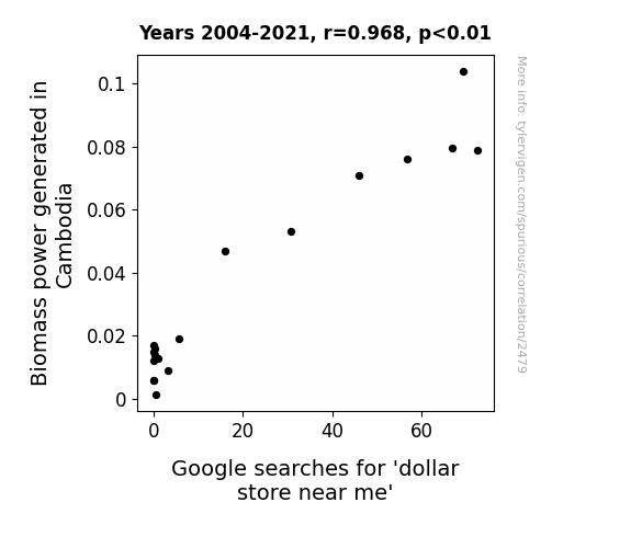
From Biomass to Bargains: Exploring the Correlation Between Biomass Power Generation in Cambodia and Searches for 'Dollar Store Near Me'
The energy from the Biomass power plant is so cheap that it's practically a steal. People are flocking to dollar stores, hoping to snag some bargain deals on household items and quirky knick-knacks, all thanks to the inexpensively powered air conditioning keeping the stores cool. It's a prime example of how renewable energy can really make a "cents" difference in our shopping habits!

What else correlates?
Biomass power generated in Cambodia · all energy
Google searches for 'dollar store near me' · all google searches
Biomass power generated in Cambodia · all energy
Google searches for 'dollar store near me' · all google searches
. The chart goes from 2002 to 2022, and the two variables track closely in value over that time.")

View details about correlation #2,610
Pour Decisions: The Hops and Lagers of Breweries in the United States and Their Frothy Impact on SBA Communications' Stock Price
As the number of breweries in the United States increased, so did the demand for quirky rooftop locations for hoppy, beer-themed events. SBA Communications, being the unsuspecting landlord of many of these prime rooftop spots, suddenly found themselves in a frothy situation of escalating rental requests. Who knew that their real business would be beer-y real estate! Cheers to unexpected stock market hopp-ortunities!


What else correlates?
The number of Breweries in the United States · all food
SBA Communications' stock price (SBAC) · all stocks
The number of Breweries in the United States · all food
SBA Communications' stock price (SBAC) · all stocks


View details about correlation #2,957
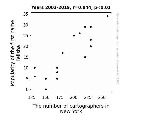
Map-py Name Connections: The Cartographic Correlation between Felisha's Fame and New York's Namericians
People just didn't want to ma--p it out anymore.

What else correlates?
Popularity of the first name Felisha · all first names
The number of cartographers in New York · all cccupations
Popularity of the first name Felisha · all first names
The number of cartographers in New York · all cccupations


View details about correlation #3,497
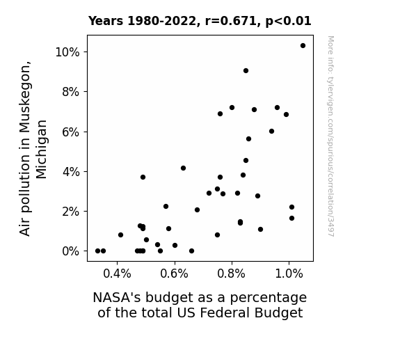
Breathing in the Data: A Correlational Examination of Air Pollution in Muskegon, Michigan and NASA's Budgetary Orbit
The cleaner air in Muskegon led to better visibility, allowing residents to see the stars and planets more clearly. This sparked a newfound interest in space and astronomy, leading to a nationwide movement demanding more funding for NASA. As a result, NASA's budget as a percentage of the total US Federal Budget decreased as other space-related programs and initiatives gained support. It's a classic case of environmental improvement leading to celestial competition for funding!


View details about correlation #1,985
Playing with Fire: A Flammable Connection Between Arson in Maine and Kerosene consumption in Turkiye
As the number of arson cases in Maine decreased, there was a proportional decrease in the demand for firefighters' services. With fewer fires to extinguish, the need for kerosene-fueled firefighting equipment decreased as well. This led to a reduction in the overall consumption of kerosene in Turkiye, as the firefighting industry had less need for this particular flammable liquid. This unexpected ripple effect highlights the interconnectedness of global kerosene usage and the surprising impact of arson trends in a seemingly unrelated location.


What else correlates?
Arson in Maine · all random state specific
Kerosene used in Turkiye · all energy
Arson in Maine · all random state specific
Kerosene used in Turkiye · all energy
. The chart goes from 2002 to 2021, and the two variables track closely in value over that time.")

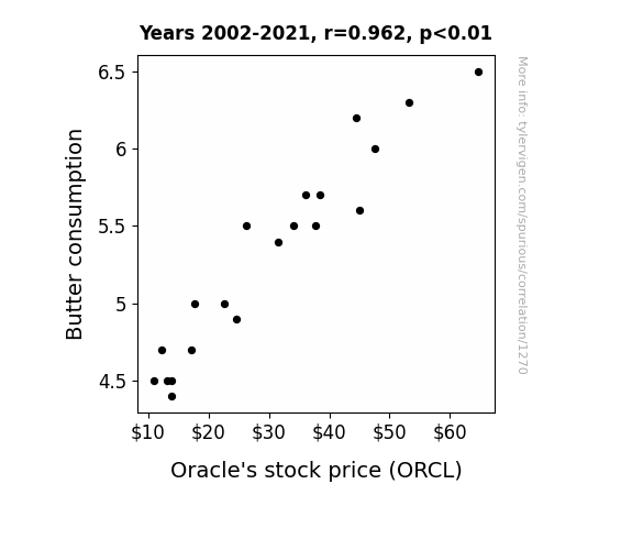
View details about correlation #1,270
Spreading Financial Wisdom: The Butter-Oracle Connection
As butter consumption increased, so did the demand for buttery popcorn. This led to higher movie theater attendance. With more people at the movies, there was a greater need for comfortable seating, prompting theaters to invest in luxury recliner chairs. Coincidentally, Oracle's subsidiary company provided the data management software for a leading luxury recliner manufacturer. As the chair sales boomed, so did Oracle's stock price, all thanks to the ripple effect of a buttery connection!

What else correlates?
Butter consumption · all food
Oracle's stock price (ORCL) · all stocks
Butter consumption · all food
Oracle's stock price (ORCL) · all stocks


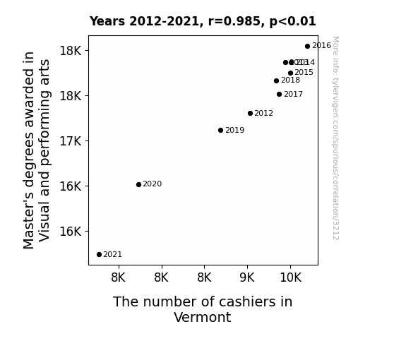
View details about correlation #3,212
The Art of Multiplication: Exploring the Relationship between Master's Degrees in Visual and Performing Arts and the Count of Cashiers in Vermont
As more artists pursued their passion, there was an un-artful decline in the number of cashiers. It seems like they just couldn't handle the Monet! It's as if they said, "Van Gogh bother working at a checkout when I could be creating masterpieces!" It's a renaissance of sorts, where the art world is drawing talent away from the register. Who knew that behind every successful artist, there's a decrease in the need for cashiers in Vermont?

What else correlates?
Master's degrees awarded in Visual and performing arts · all education
The number of cashiers in Vermont · all cccupations
Master's degrees awarded in Visual and performing arts · all education
The number of cashiers in Vermont · all cccupations


View details about correlation #3,565
Clearing the Air: An Empirical Study of Air Pollution in Champaign, Illinois and its Unlikely Relation to xkcd Comics on Engineering
As air pollution in Champaign, Illinois increased, the local engineering community unwittingly received a boost of comedic inspiration. The heightened levels of airborne particulate matter somehow led to an electrifying surge in pun production and witticisms, culminating in a chain reaction of hilariously on-point xkcd comics about engineering. It seems like when the air quality went down, the quality of engineering-related humor paradoxically went up, creating a tale of pollution leading to comic fusion, as the city found itself in a smoggy symphony of laughter and ingenuity.


What else correlates?
Air pollution in Champaign, Illinois · all weather
xkcd comics published about engineering · all weird & wacky
Air pollution in Champaign, Illinois · all weather
xkcd comics published about engineering · all weird & wacky


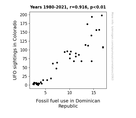
View details about correlation #2,063
Connecting Colorado UFOs and Dominican Republic's Dinosaurs: A Quirky Correlation
The extraterrestrial tourists were drawn to Colorado's green energy initiatives, leading to a spike in UFO-related technology charging stations. This in turn created a higher demand for electricity, prompting the Dominican Republic to ramp up their fossil fuel production to meet the unexpected intergalactic power needs. It's a close encounter of the absurd kind!

What else correlates?
UFO sightings in Colorado · all random state specific
Fossil fuel use in Dominican Republic · all energy
UFO sightings in Colorado · all random state specific
Fossil fuel use in Dominican Republic · all energy
. The chart goes from 2007 to 2023, and the two variables track closely in value over that time.")

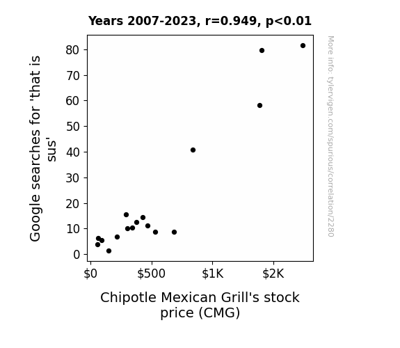
View details about correlation #2,280
Unmasking the Guac: A Suspicious Correlation Between Google Searches for That Is Sus and Chipotle Mexican Grill's Stock Price
As the Google searches for 'that is sus' increased, so did people's suspicion of their usual lunch choices. This led to a sudden decrease in the consumption of burritos and bowls at Chipotle. To counter this, Chipotle unveiled a new menu item called the 'Sus-erito' which piqued the interest of consumers. The unexpected popularity of the 'Sus-erito' boosted Chipotle's sales and ultimately caused a surge in their stock price.

What else correlates?
Google searches for 'that is sus' · all google searches
Chipotle Mexican Grill's stock price (CMG) · all stocks
Google searches for 'that is sus' · all google searches
Chipotle Mexican Grill's stock price (CMG) · all stocks


View details about correlation #1,936
Painting the Town Green: Exploring the Link Between Associates Degrees in Natural Resources and Conservation and the Number of Professional Painters in Minnesota
As more people pursued natural resources and conservation degrees, they became experts at *branching out* and finding new ways to paint a-MAIZE-ing landscapes. Essentially, they were able to *fir* up the imagination of Minnesotans and *oak*ay, that led to a higher demand for professional painters in the state. With their *tree-mendous* knowledge, they knew how to *spruce up* any environment and *leaf* a lasting impression, ultimately *pine*-ing for a more colorful and vibrant Minnesota. In the end, it seems these natural artists simply couldn't *bush* off the opportunity to make the world a *birch* better place with their painting skills!


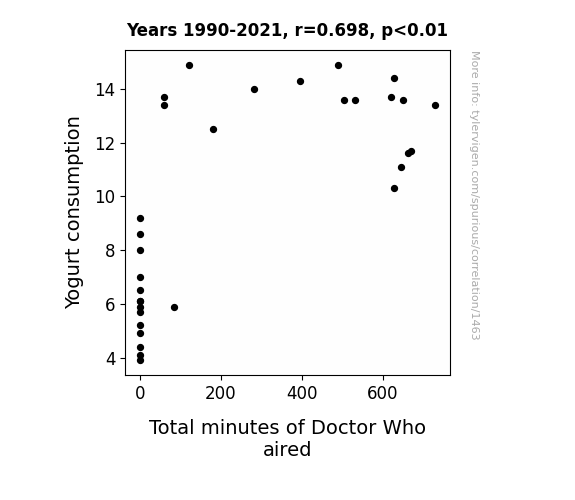
View details about correlation #1,463
The Yogurt-Who Connection: An Exploration of the Relationship between Yogurt Consumption and Total Minutes of Doctor Who Aired
Unbeknownst to many, there's a direct telepathic link between the bacteria in yogurt and the show's creators, leading to a surge in creative ideas for episodes. It's a case of T.A.R.D.I.S. (Time And Relative Digestive Influence in Yogurt Space) at work!

What else correlates?
Yogurt consumption · all food
Total minutes of Doctor Who aired · all weird & wacky
Yogurt consumption · all food
Total minutes of Doctor Who aired · all weird & wacky


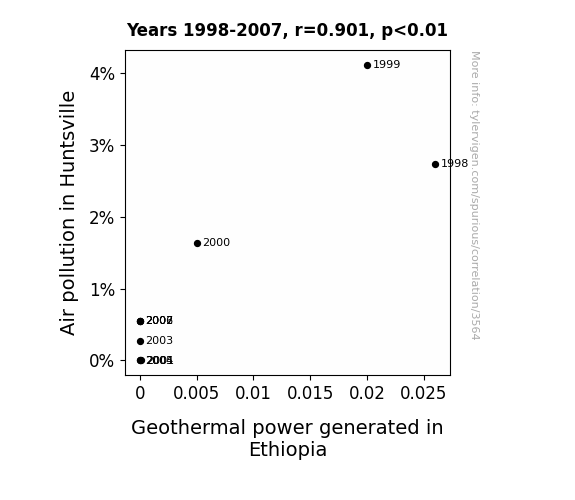
View details about correlation #3,564
Steamy Solutions: Unearthing the Vapor Link Between Air Pollution in Huntsville and Geothermal Electric Power in Ethiopia
As the air in Huntsville got cleaner, it became less buoyant and couldn't carry the geothermal power vibes to Ethiopia as effectively. Like, the pollution was low-key helping with long-distance energy transmission by creating this, like, cosmic wind tunnel for geothermal energy. With Huntsville's air quality improving, it's like the geothermal power in Ethiopia was stuck in energy traffic, unable to catch a ride on the now squeaky clean air currents.

What else correlates?
Air pollution in Huntsville · all weather
Geothermal power generated in Ethiopia · all energy
Air pollution in Huntsville · all weather
Geothermal power generated in Ethiopia · all energy
. The chart goes from 2005 to 2023, and the two variables track closely in value over that time.")

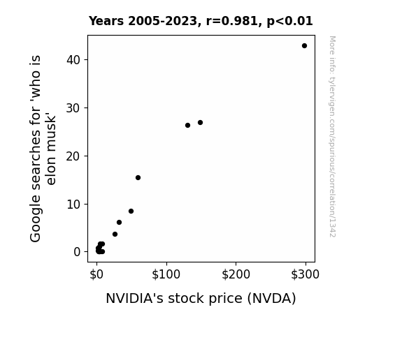
View details about correlation #1,342
Musk-Googlity: Exploring the Correlation between Google Searches for 'Who is Elon Musk' and NVIDIA's Stock Price
As people delved into the depths of the internet to uncover the enigmatic enigma that is Elon Musk, they stumbled upon electrifying revelations about his ties to the future of technology and space exploration. This sparked a surge of interest in innovative companies, sending a shockwave of demand for NVIDIA's stock, as investors charged up their portfolios in a bid to ride the same success rocket as the one and only 'Musk'eteer himself!

What else correlates?
Google searches for 'who is elon musk' · all google searches
NVIDIA's stock price (NVDA) · all stocks
Google searches for 'who is elon musk' · all google searches
NVIDIA's stock price (NVDA) · all stocks


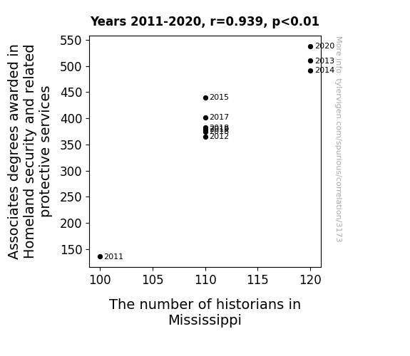
View details about correlation #3,173
The Link between Logistics of Learning and Lowdown on Legacies: A Look at Associates Degrees in Homeland Security and the Handful of Historians in Mississippi
As more people became experts in defending the homeland, they realized the importance of understanding Mississippi's history and how it shaped their current security dynamics. Because nothing safeguards the state like a good old-fashioned lesson in the Battle of Vicksburg!

What else correlates?
Associates degrees awarded in Homeland security · all education
The number of historians in Mississippi · all cccupations
Associates degrees awarded in Homeland security · all education
The number of historians in Mississippi · all cccupations


View details about correlation #1,894
UFO Uncertainties: Unraveling the Unexplained Relationship Between Wyoming's UFO Sightings and Automotive Power Train Recalls
The influx of UFO activity is inadvertently reprogramming the software in our vehicles, leading to a surge in power train malfunctions. It seems our alien friends have a need for speed, and they're revving up our engines in the process. Time to start a whole new Area 51-horsepower initiative to address this otherworldly automotive conundrum.


What else correlates?
UFO sightings in Wyoming · all random state specific
Automotive recalls for issues with the Power Train · all weird & wacky
UFO sightings in Wyoming · all random state specific
Automotive recalls for issues with the Power Train · all weird & wacky


View details about correlation #3,255
Stevie's Stirring Stats: The Surprising Relationship Between the Popularity of the Name Stevie and Wind Power in Argentina
As the number of babies named Stevie rose, so did the collective level of excitement and enthusiasm in the world. This led to an unexpected side effect - an uptick in high-fives being given across the globe. The sudden surge in air movement in Argentina was inadvertently harnessed by wind turbines, ultimately contributing to a boost in wind power generation. Remember, every time a baby is named Stevie, a gust of renewable energy is born!


What else correlates?
Popularity of the first name Stevie · all first names
Wind power generated in Argentina · all energy
Popularity of the first name Stevie · all first names
Wind power generated in Argentina · all energy
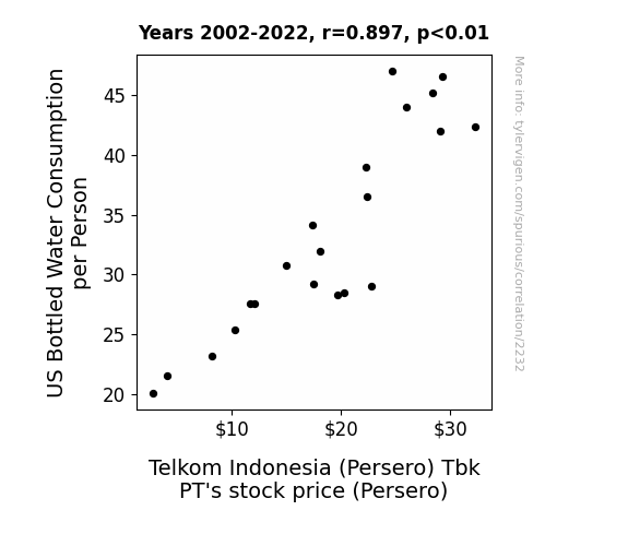
 Tbk PT's stock price (Persero). The chart goes from 2002 to 2022, and the two variables track closely in value over that time.")

View details about correlation #2,232
Bounteous Bottled Water and Bourse: A Bizarrely Buoyant Association
As US bottled water consumption per person increased, so did the global demand for plastic. This led to a shortage of plastic, causing the price of plastic to rise. Telkom Indonesia (Persero) Tbk PT, being in the telecommunications industry, uses plastic for packaging their products. The increase in plastic prices squeezed their profit margins, making their stock a hot commodity on the market! Looks like Telkom Indonesia had to make some 'connection' between their stock price and the rising cost of plastic!

What else correlates?
US Bottled Water Consumption per Person · all food
Telkom Indonesia (Persero) Tbk PT's stock price (Persero) · all stocks
US Bottled Water Consumption per Person · all food
Telkom Indonesia (Persero) Tbk PT's stock price (Persero) · all stocks


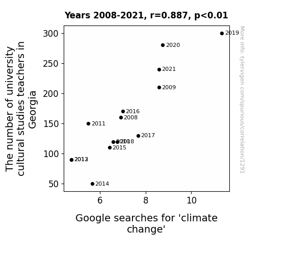
View details about correlation #1,291
The Climate Class Correlation: Unveiling the Impact of University Cultural Studies Teachers in Georgia on Google Searches for 'Climate Change'
The university cultural studies teachers in Georgia have been promoting a deep connection with nature, leading to a surge in students Googling 'climate change' in an effort to understand and combat the environmental crisis. It just goes to show, knowledge isn't the only thing these teachers are helping to heat up in the South!

Why this works
- Data dredging: I have 25,237 variables in my database. I compare all these variables against each other to find ones that randomly match up. That's 636,906,169 correlation calculations! This is called “data dredging.”
Fun fact: the chart used on the wikipedia page to demonstrate data dredging is also from me. I've been being naughty with data since 2014.
Instead of starting with a hypothesis and testing it, I instead tossed a bunch of data in a blender to see what correlations would shake out. It’s a dangerous way to go about analysis, because any sufficiently large dataset will yield strong correlations completely at random. - Lack of causal connection: There is probably no direct connection between these variables, despite what the AI says above.
Because these pages are automatically generated, it's possible that the two variables you are viewing are in fact causually related. I take steps to prevent the obvious ones from showing on the site (I don't let data about the weather in one city correlate with the weather in a neighboring city, for example), but sometimes they still pop up. If they are related, cool! You found a loophole.
This is exacerbated by the fact that I used "Years" as the base variable. Lots of things happen in a year that are not related to each other! Most studies would use something like "one person" in stead of "one year" to be the "thing" studied. - Observations not independent: For many variables, sequential years are not independent of each other. You will often see trend-lines form. If a population of people is continuously doing something every day, there is no reason to think they would suddenly change how they are doing that thing on January 1. A naive p-value calculation does not take this into account.
You will calculate a lower chance of "randomly" achieving the result than represents reality.
To be more specific: p-value tests are probability values, where you are calculating the probability of achieving a result at least as extreme as you found completely by chance. When calculating a p-value, you need to assert how many "degrees of freedom" your variable has. I count each year (minus one) as a "degree of freedom," but this is misleading for continuous variables.
This kind of thing can creep up on you pretty easily when using p-values, which is why it's best to take it as "one of many" inputs that help you assess the results of your analysis.
- Y-axes doesn't start at zero: I truncated the Y-axes of the graphs above. I also used a line graph, which makes the visual connection stand out more than it deserves.
Nothing against line graphs. They are great at telling a story when you have linear data! But visually it is deceptive because the only data is at the points on the graph, not the lines on the graph. In between each point, the data could have been doing anything. Like going for a random walk by itself!
Mathematically what I showed is true, but it is intentionally misleading. If you click on any of the charts that abuse this, you can scroll down to see a version that starts at zero. - Confounding variable: Confounding variables (like global pandemics) will cause two variables to look connected when in fact a "sneaky third" variable is influencing both of them behind the scenes.
- Outliers: Some datasets here have outliers which drag up the correlation.
In concept, "outlier" just means "way different than the rest of your dataset." When calculating a correlation like this, they are particularly impactful because a single outlier can substantially increase your correlation.
Because this page is automatically generated, I don't know whether any of the charts displayed on it have outliers. I'm just a footnote. ¯\_(ツ)_/¯
I intentionally mishandeled outliers, which makes the correlation look extra strong. - Low n: There are not many data points included in some of these charts.
You can do analyses with low ns! But you shouldn't data dredge with a low n.
Even if the p-value is high, we should be suspicious of using so few datapoints in a correlation.
Pro-tip: click on any correlation to see:
- Detailed data sources
- Prompts for the AI-generated content
- Explanations of each of the calculations (correlation, p-value)
- Python code to calculate it yourself


