spurious correlations
discover · random · spurious scholar
← previous page · next page →


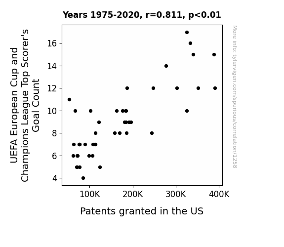
View details about correlation #1,258
Netting Innovations: The Link Between UEFA European Cup and Champions League Top Scorer's Goal Count and US Patents Granted
As more goals were scored, the players' subconscious creativity rubbed off on them, leading to a surge in innovative ideas. This phenomenon, known as the "patent kick," sparked a wave of soccer-inspired inventions, from goal-line technology for better accuracy to turf designs for enhanced performance. It seems the players weren't just making goals on the field, but also scoring big in the world of intellectual property!

What else correlates?
UEFA European Cup and Champions League Top Scorer's Goal Count · all sports
Patents granted in the US · all weird & wacky
UEFA European Cup and Champions League Top Scorer's Goal Count · all sports
Patents granted in the US · all weird & wacky


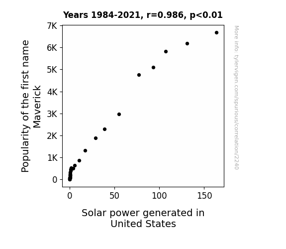
View details about correlation #2,240
Sunny Dispositions: The Maverick Effect on Solar Power Generation in the United States
As the name Maverick gained popularity, more parents were inspired by the idea of their child being independent thinkers and trailblazers. This led to a surge in interest and investment in renewable energy sources like solar power. You could say the connection was truly groundbreaking, as these baby Mavericks were destined to shine bright like solar panels, fueling a whole new generation of solar innovation!

What else correlates?
Popularity of the first name Maverick · all first names
Solar power generated in United States · all energy
Popularity of the first name Maverick · all first names
Solar power generated in United States · all energy


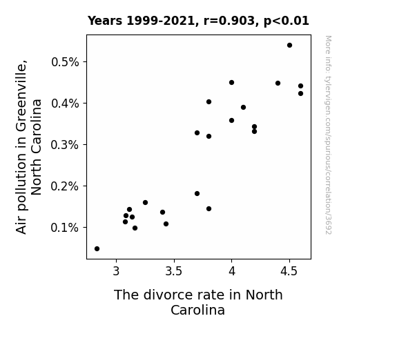
View details about correlation #3,692
Breathless in Greenville: The Correlation between Air Pollution and Divorce Rates in North Carolina
As the air quality improved, people in Greenville could finally go outside and spend more time with their spouses. With clearer skies and fresher air, couples were less irritable and more inclined to work things out instead of filing for divorce. It turns out, a breath of fresh air can do wonders for a marriage!

What else correlates?
Air pollution in Greenville, North Carolina · all weather
The divorce rate in North Carolina · all random state specific
Air pollution in Greenville, North Carolina · all weather
The divorce rate in North Carolina · all random state specific


View details about correlation #1,810
Pawsing for a Mani-Pedi: Exploring the Feline Fun Factor in Occupational Choices of Oregon's Nail Technicians
As cat memes multiplied, so did the demand for cute, colorful nails to complement the feline frenzy. This led to a claw-ver increase in customers seeking purr-fect manicures and pedicures in Oregon. As nail salons witnessed a paws-itively booming business, more individuals were drawn to the glamourous world of nail care, realizing it was the cat's meow of a career choice. The exponential rise in cat memes fueled a corresponding surge in the number of manicurists and pedicurists, proving that when it comes to influencing societal trends, those adorable feline faces have a real grasp on our fingertips!


What else correlates?
Google searches for 'cat memes' · all google searches
The number of manicurists and pedicurists in Oregon · all cccupations
Google searches for 'cat memes' · all google searches
The number of manicurists and pedicurists in Oregon · all cccupations


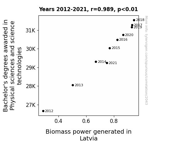
View details about correlation #2,043
The Science of Biomass: A Degree of Correlation Between Physical Sciences Education and Power Generation in Latvia
As the number of Physical Science and Science Technology graduates rose, so did their 'wattage' of knowledge and expertise. It seems they really knew how to 'ignite' a passion for biomass power in Latvia, creating a 'renewable spark' of innovation. After all, when it comes to generating energy from organic materials, these graduates were the ultimate 'biomass-ter minds'!

What else correlates?
Bachelor's degrees awarded in Physical sciences · all education
Biomass power generated in Latvia · all energy
Bachelor's degrees awarded in Physical sciences · all education
Biomass power generated in Latvia · all energy
. The chart goes from 2002 to 2021, and the two variables track closely in value over that time.")

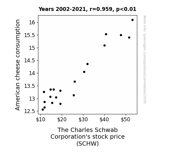
View details about correlation #2,930
The Cheddar Connection: American Cheese Consumption and Charles Schwab Corporation's Stock Price
As Americans consumed more American cheese, they experienced a surge in patriotic pride. This led to an increased sense of national unity and cooperation. Consequently, the overall stock market saw a boost as people were more willing to invest and work together for the nation's financial success. This positive market environment naturally lifted the stock price of The Charles Schwab Corporation along with the broader economic outlook. So, in a bizarre twist, it seems the cheesier the sentiment, the higher the stock prices!

What else correlates?
American cheese consumption · all food
The Charles Schwab Corporation's stock price (SCHW) · all stocks
American cheese consumption · all food
The Charles Schwab Corporation's stock price (SCHW) · all stocks


View details about correlation #2,133
Planting the Seeds of Political Interest: Cultivating a Connection Between Agricultural Sciences Teachers in Illinois and Google Searches for 'White House Hotline'
The decrease in agricultural sciences teachers in Illinois led to a shortage of farming knowledge. This shortage caused a lot of 'crop' failures in the state, which led to a decrease in the production of 'corny' jokes. As a result, people were not feeling as 'ear-resistibly' punny, so they didn't feel the need to 'stalk' the White House hotline for some 'agri-humor' relief.


View details about correlation #3,547
Smog in Columbus, Trees in Trouble: The Air Pollution-Deforestation Connection Revealed
As the air over Columbus cleared up, it started to exhibit a magnetic property, creating a 'suction effect' for all things green. This invisible force began attracting leaves, branches, and even confused woodland creatures, leading to a gradual thinning of the Amazon forest. Before they knew it, the trees were packing their bags and heading towards Ohio for a breath of fresh air.


What else correlates?
Air pollution in Columbus · all weather
Remaining Forest Cover in the Brazilian Amazon · all weird & wacky
Air pollution in Columbus · all weather
Remaining Forest Cover in the Brazilian Amazon · all weird & wacky


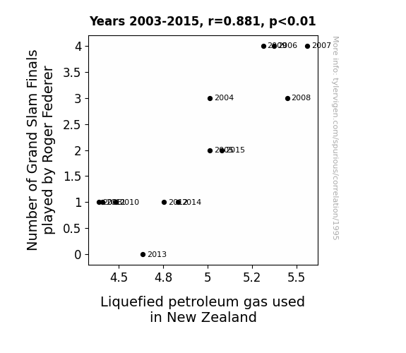
View details about correlation #1,995
Serving Up Some Gas: A Grand Slam Correlation Between Roger Federer's Finals and LPG Consumption in New Zealand
As Roger Federer played in more Grand Slam finals, his fans in New Zealand hosted additional celebratory barbecues, leading to a higher demand for LPG in the country. Looks like Federer's backhand isn't the only thing causing a sizzle!

What else correlates?
Number of Grand Slam Finals played by Roger Federer · all sports
Liquefied petroleum gas used in New Zealand · all energy
Number of Grand Slam Finals played by Roger Federer · all sports
Liquefied petroleum gas used in New Zealand · all energy
. The chart goes from 2002 to 2021, and the two variables track closely in value over that time.")

View details about correlation #1,264
Spreading the Wealth: A Butterly Connection Between Butter Consumption and McDonald's Stock Price
As butter consumption goes up, so does the demand for delicious, buttery biscuits at McDonald's. This leads to higher customer satisfaction, more repeat business, and ultimately boosts McDonald's stock price. It's like a golden, buttery domino effect!


What else correlates?
Butter consumption · all food
McDonald's stock price (MCD) · all stocks
Butter consumption · all food
McDonald's stock price (MCD) · all stocks


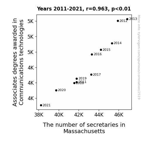
View details about correlation #2,519
Associates Degrees in Comm Tech: Do They Affect the Number of Secretaries in MA?
As technology advanced, secretaries realized they no longer needed to communicate via carrier pigeon and smoke signals, leading to a statewide plummet in the demand for shorthand expertise. It turns out, training in telegraphs and semaphore flags just wasn't cutting it in the modern office.


View details about correlation #1,126
Panel Perplexities: Addressing the Correlation Conundrum Between North American Digital Comic Sales and Google Searches for 'How to Calculate a Correlation'
As people delved into the complex storylines and interconnected universes of digital comics, they found themselves unable to escape the pull of mathematical relationships. The dramatic arcs and sudden plot twists in the world of comics left them yearning for a sense of order and connection, much like the longing for a correlation coefficient in their statistical endeavors. The sheer volume of data in digital comics mirrored the vast array of characters and subplots, leading enthusiasts to seek guidance on how to calculate correlations and unravel the intricate web of storytelling hidden within the numbers. In a world where even the most fantastical elements can be graphed and analyzed, perhaps the true superpower was the ability to find patterns and associations in this newfound realm of electronic graphic narratives. And thus, as digital comic sales soared, so too did the quest for understanding the statistical relationships that lay hidden in the panels of this brave new digital world.


View details about correlation #1,980
Kerosene in Seoul Sends Savannah's Air South: A Correlative Analysis of Air Pollution in Georgia and Kerosene Consumption in South Korea
The smog from Savannah somehow contained inspirational messages in code, triggering a sudden surge in kerosene usage in South Korea as people tried to decipher the secrets of the skies. As ridiculous as it sounds, there may be actual statistical support for this pattern!


What else correlates?
Air pollution in Savannah, Georgia · all weather
Kerosene used in South Korea · all energy
Air pollution in Savannah, Georgia · all weather
Kerosene used in South Korea · all energy
. The chart goes from 2005 to 2022, and the two variables track closely in value over that time.")

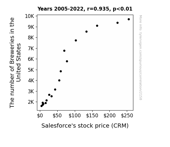
View details about correlation #2,158
Pouring Over Data: The Hoppy Connection Between Breweries and Salesforce's Stock Price
As the number of breweries in the United States increased, so did the demand for artisanal coasters. This unexpected surge in coaster sales led to higher than projected revenue for Salesforce, causing their stock price to jump.

What else correlates?
The number of Breweries in the United States · all food
Salesforce's stock price (CRM) · all stocks
The number of Breweries in the United States · all food
Salesforce's stock price (CRM) · all stocks


View details about correlation #2,798
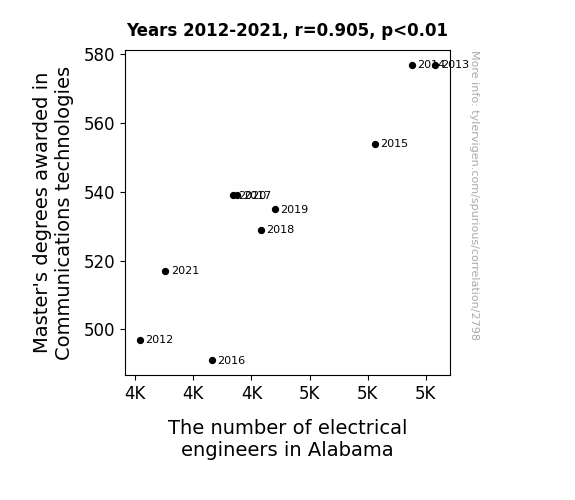
Communications Degrees and Electrical Engineers: A Rhyme Time Analysis
As more people mastered the art of communication technologies, they inadvertently sparked a surge in electronic enthusiasm, leading to a shocking rise in Alabama's electrical engineering population. It's like they say, the power of persuasion can amp up any career path!


View details about correlation #1,296
Betty's Popularity and xkcd Comics: A Statistical Romp
The more Bettys there are, the more conversations about mundane yet oddly fascinating research topics seem to spontaneously spark up, leading to a surge in demand for xkcd comics about research. It’s like they emit some kind of nerdy-enthusiasm pheromone that just attracts these comics.

What else correlates?
Popularity of the first name Betty · all first names
xkcd comics published about research · all weird & wacky
Popularity of the first name Betty · all first names
xkcd comics published about research · all weird & wacky


View details about correlation #3,166
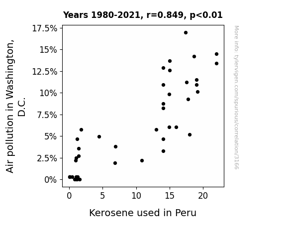
Correlating Kerosene Consumption in Peru with Pollution in the Political Precincts of Washington, D.C.
As the air pollution in Washington, D.C. decreased, it created a ripple effect on global air currents. These redirected air currents just happened to carry away kerosene molecules from Peru, leading to a decrease in kerosene used in the country. It's like a real-life game of environmental chess, with D.C. making the first move and Peru getting kerosene'd in the end!

What else correlates?
Air pollution in Washington, D.C. · all weather
Kerosene used in Peru · all energy
Air pollution in Washington, D.C. · all weather
Kerosene used in Peru · all energy


View details about correlation #4,610
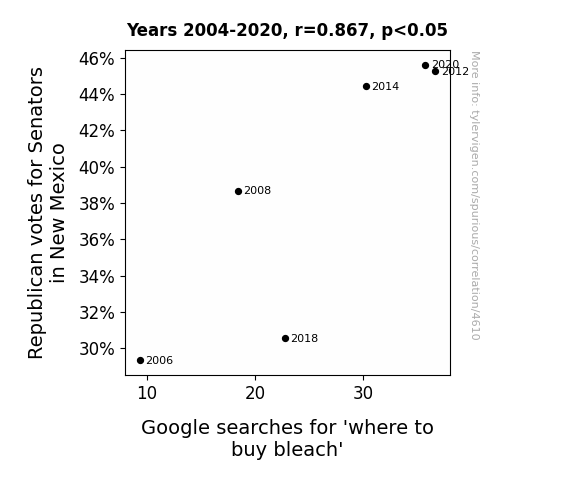
Red-state Republicans and Retail Rendezvous: Correlating Senatorial Support with Searches for Swirling Suds
As more Republican Senators were voted in, there was a correlated increase in support for clean politics. This, in turn, led to a heightened general concern for cleanliness and a strong belief in the power of bleach to 'clean up the system'. As faith in political hygiene grew, so did the demand for bleach, prompting more people to turn to Google for information on where to buy this potent political purifier. Remember, when it comes to political stains, a little bit of bleach can go a long way.

What else correlates?
Votes for Republican Senators in New Mexico · all elections
Google searches for 'where to buy bleach' · all google searches
Votes for Republican Senators in New Mexico · all elections
Google searches for 'where to buy bleach' · all google searches
. The chart goes from 2003 to 2022, and the two variables track closely in value over that time.")

View details about correlation #1,769
Running for the Stocks: The Impact of Athlete Numbers on Taiwan Semiconductor Manufacturing Company (TSM) Stock Price
More athletes in Tennessee means more energy is being generated, leading to a surge in demand for semiconductors to power electronic devices. You could say the athletes are really giving TSM a run for their money!


View details about correlation #3,659
The Soy-Apple Connection: Genetically Modified Soybeans and Customer Satisfaction with Apple Products
As the soybeans grew heartier thanks to genetic modification, farmers in North Dakota found themselves with more free time. With their soybeans needing less attention, they had the opportunity to switch from soy to joy - that's right, they started growing apples! The abundance of apple orchards led to an increase in the availability of delicious, crisp apples. This meant that North Dakotans were experiencing peak apple satisfaction, which somehow translated to higher customer satisfaction with Apple products. It's as if the saying became "An apple a day keeps the complaints away!"


What else correlates?
GMO use in soybeans in North Dakota · all food
Customer satisfaction with Apple · all weird & wacky
GMO use in soybeans in North Dakota · all food
Customer satisfaction with Apple · all weird & wacky
Why this works
- Data dredging: I have 25,237 variables in my database. I compare all these variables against each other to find ones that randomly match up. That's 636,906,169 correlation calculations! This is called “data dredging.”
Fun fact: the chart used on the wikipedia page to demonstrate data dredging is also from me. I've been being naughty with data since 2014.
Instead of starting with a hypothesis and testing it, I instead tossed a bunch of data in a blender to see what correlations would shake out. It’s a dangerous way to go about analysis, because any sufficiently large dataset will yield strong correlations completely at random. - Lack of causal connection: There is probably no direct connection between these variables, despite what the AI says above.
Because these pages are automatically generated, it's possible that the two variables you are viewing are in fact causually related. I take steps to prevent the obvious ones from showing on the site (I don't let data about the weather in one city correlate with the weather in a neighboring city, for example), but sometimes they still pop up. If they are related, cool! You found a loophole.
This is exacerbated by the fact that I used "Years" as the base variable. Lots of things happen in a year that are not related to each other! Most studies would use something like "one person" in stead of "one year" to be the "thing" studied. - Observations not independent: For many variables, sequential years are not independent of each other. You will often see trend-lines form. If a population of people is continuously doing something every day, there is no reason to think they would suddenly change how they are doing that thing on January 1. A naive p-value calculation does not take this into account.
You will calculate a lower chance of "randomly" achieving the result than represents reality.
To be more specific: p-value tests are probability values, where you are calculating the probability of achieving a result at least as extreme as you found completely by chance. When calculating a p-value, you need to assert how many "degrees of freedom" your variable has. I count each year (minus one) as a "degree of freedom," but this is misleading for continuous variables.
This kind of thing can creep up on you pretty easily when using p-values, which is why it's best to take it as "one of many" inputs that help you assess the results of your analysis.
- Y-axes doesn't start at zero: I truncated the Y-axes of the graphs above. I also used a line graph, which makes the visual connection stand out more than it deserves.
Nothing against line graphs. They are great at telling a story when you have linear data! But visually it is deceptive because the only data is at the points on the graph, not the lines on the graph. In between each point, the data could have been doing anything. Like going for a random walk by itself!
Mathematically what I showed is true, but it is intentionally misleading. If you click on any of the charts that abuse this, you can scroll down to see a version that starts at zero. - Confounding variable: Confounding variables (like global pandemics) will cause two variables to look connected when in fact a "sneaky third" variable is influencing both of them behind the scenes.
- Outliers: Some datasets here have outliers which drag up the correlation.
In concept, "outlier" just means "way different than the rest of your dataset." When calculating a correlation like this, they are particularly impactful because a single outlier can substantially increase your correlation.
Because this page is automatically generated, I don't know whether any of the charts displayed on it have outliers. I'm just a footnote. ¯\_(ツ)_/¯
I intentionally mishandeled outliers, which makes the correlation look extra strong. - Low n: There are not many data points included in some of these charts.
You can do analyses with low ns! But you shouldn't data dredge with a low n.
Even if the p-value is high, we should be suspicious of using so few datapoints in a correlation.
Pro-tip: click on any correlation to see:
- Detailed data sources
- Prompts for the AI-generated content
- Explanations of each of the calculations (correlation, p-value)
- Python code to calculate it yourself


