spurious correlations
discover · random · spurious scholar
← previous page · next page →


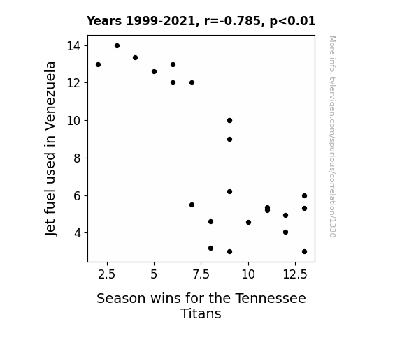
View details about correlation #1,330
Fueling the Fire: The Jet Fuel-Joy of Victory Connection in Tennessee's Titans
The fumes from the extra jet fuel created a haze over the Tennessee Titans' stadium, leading to decreased visibility and confusing the players. This ultimately resulted in a higher number of fumbles, incomplete passes, and overall poor performance on the field. Additionally, the strange scent of the jet fuel may have disrupted the Titans' ability to focus and coordinate their plays effectively. It seems like the Titans just couldn't soar to victory with all that extra jet fuel madness going on!

What else correlates?
Jet fuel used in Venezuela · all energy
Season wins for the Tennessee Titans · all sports
Jet fuel used in Venezuela · all energy
Season wins for the Tennessee Titans · all sports


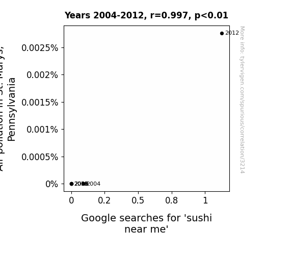
View details about correlation #3,214
Raw Data: Untangling the Tangled Tale of Sushi and Smog in St. Marys
The logic goes like this: As air pollution in St. Marys, Pennsylvania increased, it inadvertently led to the proliferation of a new species of mutant superfish in the local rivers. These superfish, lovingly dubbed 'smogrolls,' had a distinctly sushi-like flavor profile due to their exposure to airborne contaminants. As word spread about this unconventional, locally sourced sushi option, people couldn't resist the temptation to indulge in the freshest 'catch of the day.' Whether it's the allure of embracing the mutant future or just a newfound appreciation for avant-garde culinary experiences, one thing is clear – when it comes to sushi near St. Marys, Pennsylvania, the air pollution may have just sparked a bizarre yet strangely delectable trend. Remember, this is a purely fictional and utterly ludicrous explanation, but hey, stranger things have happened in the realm of culinary creativity!

What else correlates?
Air pollution in St. Marys, Pennsylvania · all weather
Google searches for 'sushi near me' · all google searches
Air pollution in St. Marys, Pennsylvania · all weather
Google searches for 'sushi near me' · all google searches


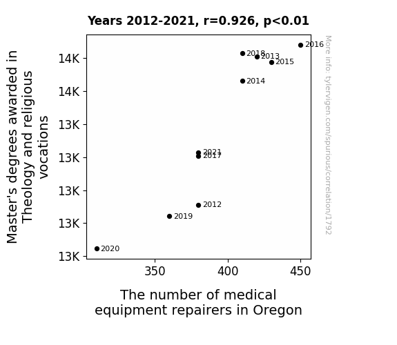
View details about correlation #1,792
Theology Degrees and Divine Diagnostics: Unveiling the Holy Correlation between Theological Studies and Medical Equipment Repairers in Oregon
As more theologians and religious experts achieved mastery in their field, they began to ponder the concept of divine maintenance. This sparked a theological renaissance in Oregon, leading to the widespread belief in the healing power of well-maintained medical equipment. Consequently, a new wave of medical equipment repairers emerged, who not only fixed machinery but also offered blessings for a swift recovery. This ultimately led to an unforeseen collaboration between the pious and the practical, as Oregon became the first state where both faith healing and technical troubleshooting were equally endorsed methods of healthcare, proving that in the land of interconnected circuits and sacred scriptures, the power of repair truly knows no bounds. And that's how an increase in Master's degrees awarded in Theology and religious vocations caused the number of medical equipment repairers in Oregon to increase!


View details about correlation #2,040
The GMO-Lawyer Connection: Sowing the Seeds of Legal Growth
As the cotton plants grew larger and more resilient thanks to genetic modifications, they began encroaching on neighboring properties. This led to a spike in property disputes and land use conflicts, ultimately creating a higher demand for lawyers across the country. Looks like these cotton crops really know how to sow the seeds of legal trouble!


What else correlates?
GMO use in cotton in Mississippi · all food
Number of Lawyers in the United States · all weird & wacky
GMO use in cotton in Mississippi · all food
Number of Lawyers in the United States · all weird & wacky


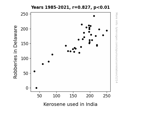
View details about correlation #1,214
Fuelling Crime: An Unexpected Link Between Robberies in Delaware and Kerosene Consumption in India
As robberies in Delaware decreased, it led to a surplus in security systems. This surplus was then exported to India where it sparked a flame of interest in better home security, leading to a sharp decrease in kerosene used for lighting. In other words, Delaware's drop in crime truly lit a fire in India to switch to alternative lighting sources, making it a shining example of unexpected global impact!

What else correlates?
Robberies in Delaware · all random state specific
Kerosene used in India · all energy
Robberies in Delaware · all random state specific
Kerosene used in India · all energy


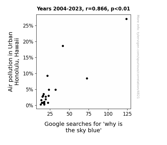
View details about correlation #4,821
Hazy Honolulu: How Air Pollution Affects Aloha State's Airheaded Queries
The air pollution in Urban Honolulu is creating a smoggy filter that actually enhances the scattering of sunlight, making the sky appear bluer than ever. It's like nature's way of saying, "I can work with this!"

What else correlates?
Air pollution in Urban Honolulu, Hawaii · all weather
Google searches for 'why is the sky blue' · all google searches
Air pollution in Urban Honolulu, Hawaii · all weather
Google searches for 'why is the sky blue' · all google searches
. The chart goes from 2012 to 2021, and the two variables track closely in value over that time.")

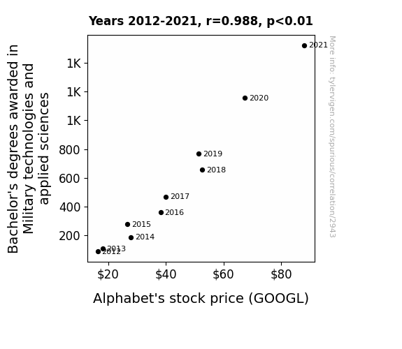
View details about correlation #2,943
The Alphabet Boot Camp: Analyzing the Impact of Bachelor's Degrees in Military Technologies and Applied Sciences on Alphabet's (GOOGL) Stock Price
As more military tech experts graduated, they formed an elite squad of algorithm-crunching, strategic masterminds who infiltrated the stock market, launching a full-on bullish assault on Alphabet's shares. It turns out, the best defense really is a good offense, especially when it comes to portfolio management. This just goes to show that in the battle of wits on Wall Street, sometimes the real winners are armed with diplomas!

What else correlates?
Bachelor's degrees awarded in Military technologies · all education
Alphabet's stock price (GOOGL) · all stocks
Bachelor's degrees awarded in Military technologies · all education
Alphabet's stock price (GOOGL) · all stocks


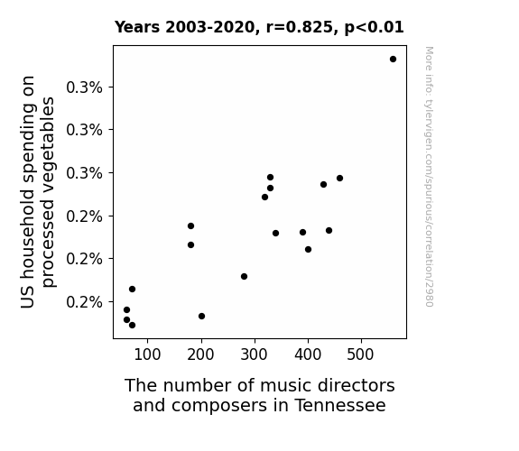
View details about correlation #2,980
Beet-ing to a New Tune: The Harmonious Relationship Between US Household Spending on Processed Vegetables and Tennessee's Music Directors and Composers
As US household spending on processed vegetables increased, it led to a surge in demand for vegetable-themed jingles and catchy musical ads. This, in turn, created more opportunities for music directors and composers in Tennessee to showcase their talent in this budding field of veggie music, ultimately leading to a notable increase in their numbers. It seems like the pathway to musical success in Tennessee was, quite unexpectedly, through a garden of processed vegetables!


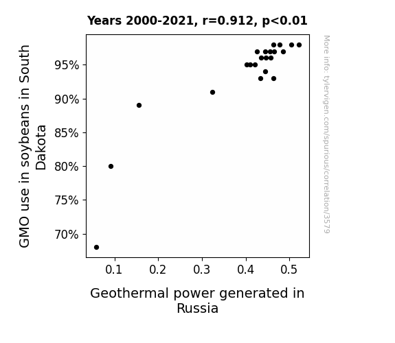
View details about correlation #3,579
Soylent Steam: Exploring the Unlikely Link Between GMO Soybeans and Russian Geothermal Power
As the soybeans in South Dakota became more genetically modified, their roots unknowingly started transmitting signals deep into the Earth. This inadvertently activated a network of interconnected geothermal power sources in Russia, leading to an unexpected surge in clean energy production. It's a classic case of soy-powered geothermal goodness, proving once again that nature and technology can create the most unexpected connections!

What else correlates?
GMO use in soybeans in South Dakota · all food
Geothermal power generated in Russia · all energy
GMO use in soybeans in South Dakota · all food
Geothermal power generated in Russia · all energy


View details about correlation #4,697
Gangnam Air: A Study on the Correlation between Air Pollution in Deming, New Mexico and Google Searches for 'Gangnam Style'
Breathable air led to a lack of interest in 'Gangnam Style' as people no longer needed a catchy, opp-air-ational tune to help them breathe easy! As the pollution cleared, so did the desire to saddle up and dance Gangnam Style. The correlation is as clear as fresh mountain air - when the skies are cleaner, the dance crazes leaner! It seems like in Deming, New Mexico, as the air quality improved, so did the musical taste - the Gangnam Style fad just couldn't air-take the change!


What else correlates?
Air pollution in Deming, New Mexico · all weather
Google searches for 'Gangnam Style' · all google searches
Air pollution in Deming, New Mexico · all weather
Google searches for 'Gangnam Style' · all google searches
. The chart goes from 2011 to 2021, and the two variables track closely in value over that time.")

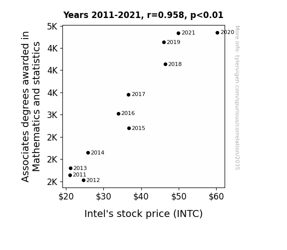
View details about correlation #2,035
Counting on Counts: The Calculated Connection Between Associates Degrees in Mathematics and Statistics and Intel's Stock Price
As more people became proficient in complex equations, they started calculating the true value of Intel's stock, leading to higher demand and driving up the stock price. It all adds up to success for Intel!

What else correlates?
Associates degrees awarded in Mathematics and statistics · all education
Intel's stock price (INTC) · all stocks
Associates degrees awarded in Mathematics and statistics · all education
Intel's stock price (INTC) · all stocks


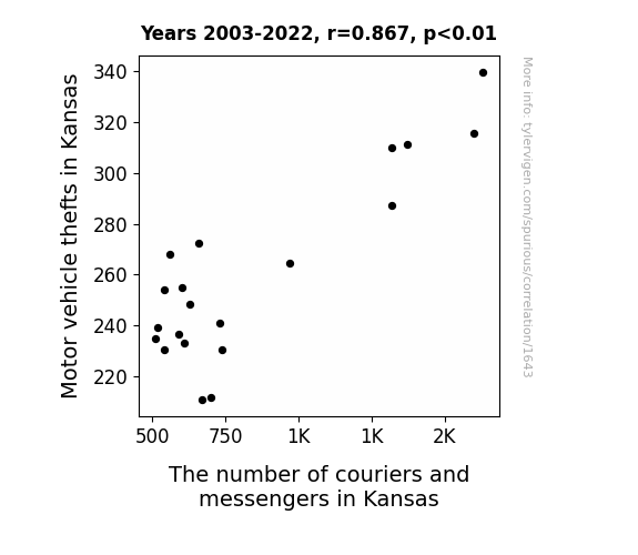
View details about correlation #1,643
Breaking and Delivering: A Wacky Correlation Between Motor Vehicle Thefts and Couriers in Kansas
The decrease in motor vehicle thefts in Kansas led to a decrease in the number of couriers and messengers because, without stolen cars to deliver, the demand for their speedy services hit a roadblock. It seems the thieves couldn't keep the engines running for this particular profession's growth, putting the brakes on their job opportunities! It's a case of 'car-ma' for the couriers, as the stolen vehicle shortage shifted their career paths in a different direction. Looks like in this comedy of errors, the auto thieves unintentionally drove the courier business to a screeching halt!


View details about correlation #1,997
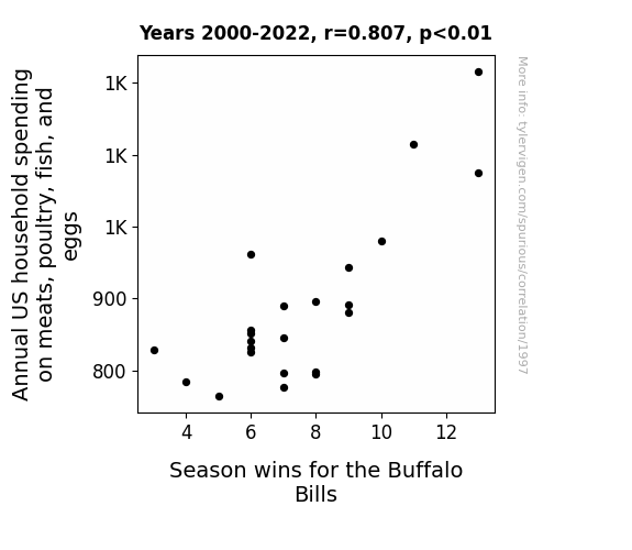
Meat Expenditure and Marvellous Matches: Mapping the Interplay between Annual US Household Spending on Meats, Poultry, Fish, and Eggs and Season Wins for the Buffalo Bills
As household spending on meats, poultry, fish, and eggs increased, the rise in consumption led to a surge in fans embracing their inner “Buffalo Wild Wings,” creating a cluckin' good game day atmosphere. This bolstered the team spirit and egg-cited the players, ultimately leading to a victorious season for the Buffalo Bills. It was truly a case of poultry in motion leading to pigskin success.


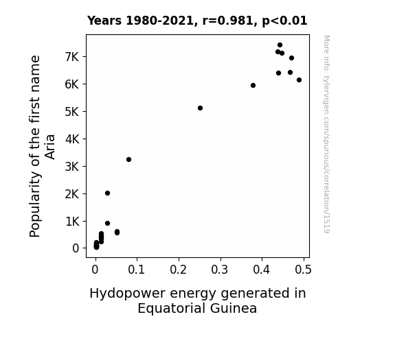
View details about correlation #1,519
Aria-gation: Unearthing the Hydropower Potential in Equatorial Guinea through the Popularity of the Name Aria
As more parents named their daughters Aria, there was a corresponding surge in the production of tiny but powerful water droplets around them whenever they spoke or sang. These microscopic airborne hydro-power generators were inexplicably drawn to Equatorial Guinea, leading to a surprising boost in hydropower energy production. It seems the country is now harmonizing with an unexpected source of renewable energy - talk about a name making waves!

What else correlates?
Popularity of the first name Aria · all first names
Hydopower energy generated in Equatorial Guinea · all energy
Popularity of the first name Aria · all first names
Hydopower energy generated in Equatorial Guinea · all energy
. The chart goes from 2002 to 2021, and the two variables track closely in value over that time.")

View details about correlation #2,995
Cheddar Economics: Uncovering the Quirky Link between American Cheese Consumption and Agilent Technologies' Stock Price
As American cheese consumption increased, so did the demand for cheese slicers. This led to higher-than-expected sales for Agilent Technologies, the leading manufacturer of precision cheese slicer components. With their newfound success in the dairy industry, investors couldn't help but pour more money into Agilent, causing their stock price to soar. It's a gouda day for Agilent indeed!

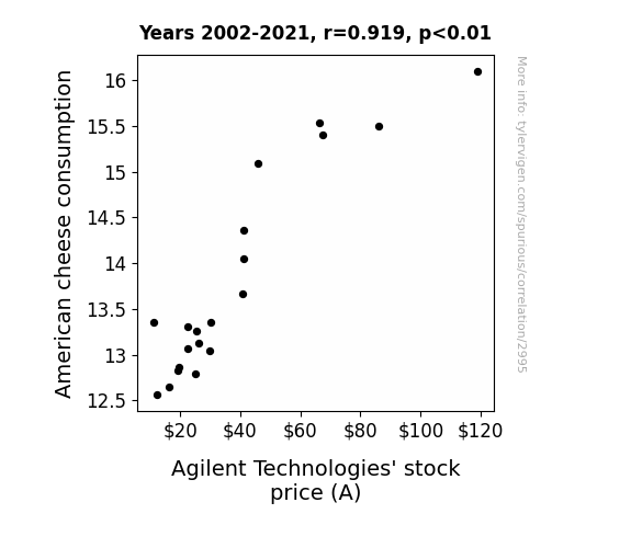
What else correlates?
American cheese consumption · all food
Agilent Technologies' stock price (A) · all stocks
American cheese consumption · all food
Agilent Technologies' stock price (A) · all stocks


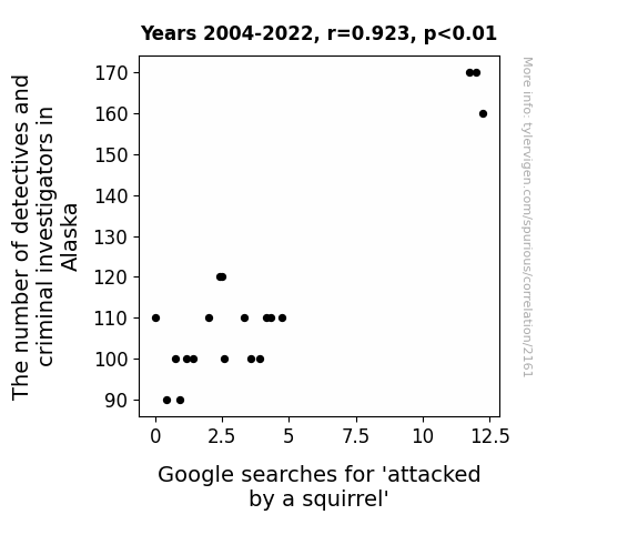
View details about correlation #2,161
Squirrel Sleuths and Truths: The Relationship Between Alaska's Gumshoes and 'Attacked by a Squirrel' Google Searches
With fewer detectives and criminal investigators available to solve cases, the squirrels in Alaska realized they could no longer get away with their bushy-tailed banditry. Faced with the possibility of being brought to justice, the squirrels decided to switch from a life of crime to a life of nut-gathering, leading to a decrease in attacks on unsuspecting individuals.


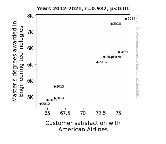
View details about correlation #2,351
Flying High: The Masterful Link Between Engineering Technologies Degrees and American Airlines Customer Satisfaction
As more engineers with advanced degrees entered the workforce, they couldn't resist the urge to redesign the entire layout of American Airlines planes. The extra legroom, personalized entertainment systems, and self-reclining seats made flying with American Airlines a truly delightful experience. Passengers were loving the innovative engineering solutions that were inadvertently taking their in-flight comfort to new heights.


View details about correlation #2,907
Shine a Light on the Storm: The Illuminating Connection Between Solar Power Output in Mozambique and Atlantic Hurricane Frequency
The solar panels were mistakenly programmed to emit hurricane-inducing sunbeams instead of clean energy. "Renewable energy is great, unless it's accidentally renewable hurricanes."


What else correlates?
Solar power generated in Mozambique · all energy
Number of Atlantic Hurricanes each year · all weather
Solar power generated in Mozambique · all energy
Number of Atlantic Hurricanes each year · all weather
. The chart goes from 2002 to 2010, and the two variables track closely in value over that time.")

View details about correlation #3,931
Shan-iqua tell ya 'bout the Stock: The Link between Shaniqua's Popularity and Ford's Fizzling or Fizzling Stock Price
There are fewer Shaniquas who would want to own a Ford Mustang, leading to a drop in demand for Ford vehicles. You could say the Shaniqua-Ford connection took a detour!


What else correlates?
Popularity of the first name Shaniqua · all first names
Ford Motor Company's stock price (F) · all stocks
Popularity of the first name Shaniqua · all first names
Ford Motor Company's stock price (F) · all stocks


View details about correlation #2,956
Tick Tock, Stock Clerks, and Home Runs: A Statistical Analysis of Production Clerks and Washington Nationals' Victories
As the number of production, planning, and expediting clerks in District of Columbia increased, there was a corresponding rise in the overall efficiency of snack and beverage production at the baseball games. This, in turn, led to better satisfaction among the fans, who were now receiving their hot dogs, popcorn, and drinks in record time. The fans, feeling the swift and smooth flow of refreshments, began to exhibit higher levels of enthusiasm and support for the team. This ultimately translated into a boost in morale for the Washington Nationals players, as they could feel the unwavering energy and excitement from the stands. As a result, the team experienced an uptick in wins, proving that behind every successful baseball game, there's a team of clerks expediting the path to victory!


Why this works
- Data dredging: I have 25,237 variables in my database. I compare all these variables against each other to find ones that randomly match up. That's 636,906,169 correlation calculations! This is called “data dredging.”
Fun fact: the chart used on the wikipedia page to demonstrate data dredging is also from me. I've been being naughty with data since 2014.
Instead of starting with a hypothesis and testing it, I instead tossed a bunch of data in a blender to see what correlations would shake out. It’s a dangerous way to go about analysis, because any sufficiently large dataset will yield strong correlations completely at random. - Lack of causal connection: There is probably no direct connection between these variables, despite what the AI says above.
Because these pages are automatically generated, it's possible that the two variables you are viewing are in fact causually related. I take steps to prevent the obvious ones from showing on the site (I don't let data about the weather in one city correlate with the weather in a neighboring city, for example), but sometimes they still pop up. If they are related, cool! You found a loophole.
This is exacerbated by the fact that I used "Years" as the base variable. Lots of things happen in a year that are not related to each other! Most studies would use something like "one person" in stead of "one year" to be the "thing" studied. - Observations not independent: For many variables, sequential years are not independent of each other. You will often see trend-lines form. If a population of people is continuously doing something every day, there is no reason to think they would suddenly change how they are doing that thing on January 1. A naive p-value calculation does not take this into account.
You will calculate a lower chance of "randomly" achieving the result than represents reality.
To be more specific: p-value tests are probability values, where you are calculating the probability of achieving a result at least as extreme as you found completely by chance. When calculating a p-value, you need to assert how many "degrees of freedom" your variable has. I count each year (minus one) as a "degree of freedom," but this is misleading for continuous variables.
This kind of thing can creep up on you pretty easily when using p-values, which is why it's best to take it as "one of many" inputs that help you assess the results of your analysis.
- Y-axes doesn't start at zero: I truncated the Y-axes of the graphs above. I also used a line graph, which makes the visual connection stand out more than it deserves.
Nothing against line graphs. They are great at telling a story when you have linear data! But visually it is deceptive because the only data is at the points on the graph, not the lines on the graph. In between each point, the data could have been doing anything. Like going for a random walk by itself!
Mathematically what I showed is true, but it is intentionally misleading. If you click on any of the charts that abuse this, you can scroll down to see a version that starts at zero. - Confounding variable: Confounding variables (like global pandemics) will cause two variables to look connected when in fact a "sneaky third" variable is influencing both of them behind the scenes.
- Outliers: Some datasets here have outliers which drag up the correlation.
In concept, "outlier" just means "way different than the rest of your dataset." When calculating a correlation like this, they are particularly impactful because a single outlier can substantially increase your correlation.
Because this page is automatically generated, I don't know whether any of the charts displayed on it have outliers. I'm just a footnote. ¯\_(ツ)_/¯
I intentionally mishandeled outliers, which makes the correlation look extra strong. - Low n: There are not many data points included in some of these charts.
You can do analyses with low ns! But you shouldn't data dredge with a low n.
Even if the p-value is high, we should be suspicious of using so few datapoints in a correlation.
Pro-tip: click on any correlation to see:
- Detailed data sources
- Prompts for the AI-generated content
- Explanations of each of the calculations (correlation, p-value)
- Python code to calculate it yourself


