spurious correlations
discover · random · spurious scholar
← previous page · next page →


View details about correlation #3,638
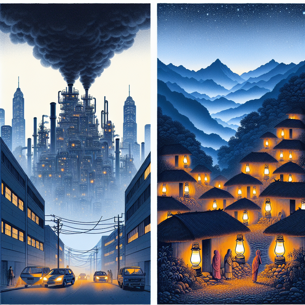
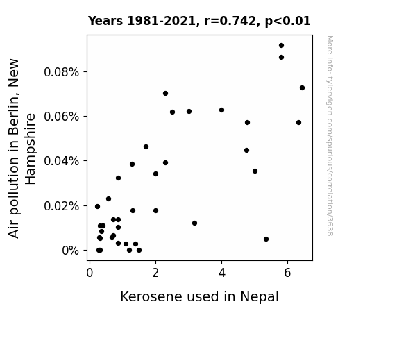
From Berlin to Nepal: The Unexpected Connection Between Air Pollution and Kerosene
Perhaps the smog particles formed a telepathic connection with the kerosene molecules, convincing them to burn brighter. "It's like the pollution was the wingman for the kerosene, creating a fiery love connection!"
What else correlates?
Air pollution in Berlin, New Hampshire · all weather
Kerosene used in Nepal · all energy
Air pollution in Berlin, New Hampshire · all weather
Kerosene used in Nepal · all energy


View details about correlation #1,633
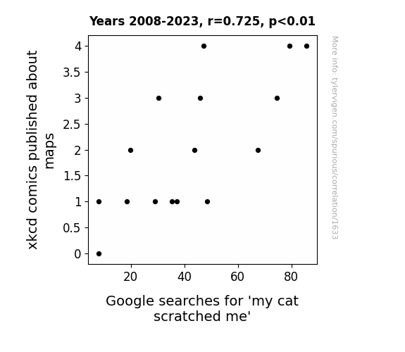
Cartographic Art May Spark a Feline Scratch: xkcd Maps and 'My Cat Scratched Me' Google Searches
The xkcd comics about maps became so intricate that they formed a purrfectly irresistible cartographic maze, luring in cats from all around. As feline fans pounced on the maps, they couldn't help but unleash their inner cartographer, marking their territory with a fury of scratched lines. It seems like these comics really put the "cat" in cartography! A-meow-zing, isn't it?

What else correlates?
xkcd comics published about maps · all weird & wacky
Google searches for 'my cat scratched me' · all google searches
xkcd comics published about maps · all weird & wacky
Google searches for 'my cat scratched me' · all google searches


View details about correlation #3,483
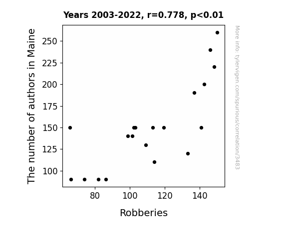
Maine Authors and Robberies: An Authoritative Analysis of a Novel Association
It's simple: with fewer authors in Maine, there were less "break-in" the writing scene, leading to a reduction in literary heists and plot thievery. It seems the main story here is that as the author population dwindled, so did the criminal "prose." Looks like the pen really is mightier than the sword, especially when it comes to keeping crime endings from becoming too predictable!

What else correlates?
The number of authors in Maine · all cccupations
Robberies in the US · all random state specific
The number of authors in Maine · all cccupations
Robberies in the US · all random state specific
. The chart goes from 2002 to 2022, and the two variables track closely in value over that time.")

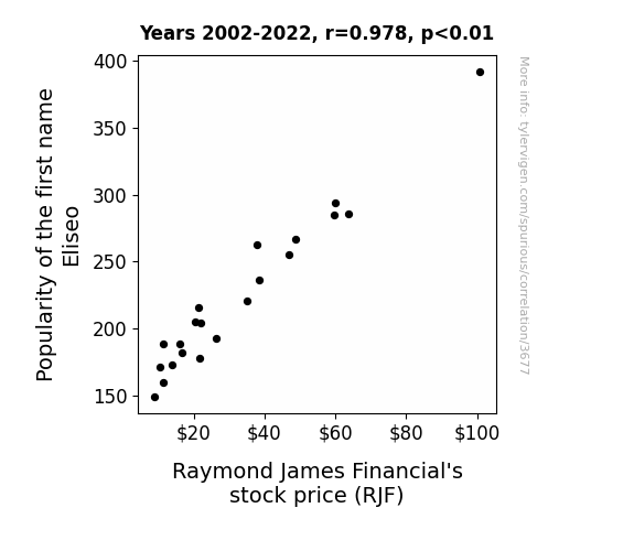
View details about correlation #3,677
The Eliseo Effect: A Correlation Between First Name Popularity and Raymond James Financial's Stock Price
Parents naming their children Eliseo were unknowingly influencing the stock market. It turns out, every time someone called out "Eliseo, watch your tone!" a new financial trend was sparked. It was a bull market for both Eliseo and RJF, as their fortunes became intricately entwined. It seems the name Eliseo was truly 'e-lee-sewn' into the success of Raymond James Financial!

What else correlates?
Popularity of the first name Eliseo · all first names
Raymond James Financial's stock price (RJF) · all stocks
Popularity of the first name Eliseo · all first names
Raymond James Financial's stock price (RJF) · all stocks


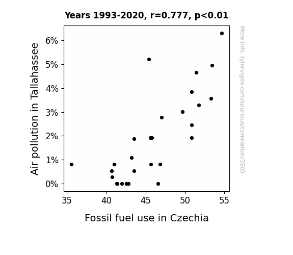
View details about correlation #3,505
Tangled Threads: The Tenuous Ties between Tallahassee Air Pollution and Czechia's Fossil Fuel Folly
As the air quality in Tallahassee worsened, it sent a demand for fresher air all the way to Czechia. This led to a surge in the consumption of fossil fuels, as Czechia attempted to package and export their pristine air to the smoggy city, inadvertently creating a breath of fresh heir! How's that for a gasp of unexpected influence?

What else correlates?
Air pollution in Tallahassee · all weather
Fossil fuel use in Czechia · all energy
Air pollution in Tallahassee · all weather
Fossil fuel use in Czechia · all energy


View details about correlation #1,684
Mastering the Gut Feeling: The Correlation Between Master's Degrees in Biological and Biomedical Sciences and Google Searches for 'Tummy Ache'
As more people became experts in the inner workings of the human body, they couldn't help but overanalyze their own digestive systems, leading to a surge in self-diagnosed tummy aches. It's like the saying goes, "a Master's in Biological and Biomedical Sciences a day, keeps the doctor away, but might bring on a tummy ache in a quirky way!" Remember, too much knowledge can be a real gut buster!


View details about correlation #1,627
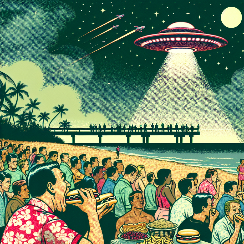
The Unidentified Feasting Object: A Link Between UFO Sightings in Hawaii and Hotdogs Eaten by Nathan's Hot Dog Eating Competition Champion
The surge in UFO sightings in Hawaii created a unique gravitational pull, leading to an increase in bun availability and condiment distribution, ultimately boosting the hotdog consumption at Nathan's Hot Dog Eating Competition. "It seems even aliens can't resist a good wiener!"

. The chart goes from 2002 to 2022, and the two variables track closely in value over that time.")

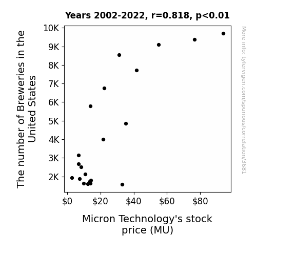
View details about correlation #3,681
A Hoppy Medium of Exchange: Exploring the Sudsy Relationship Between Brewery Counts and Micron Technology's Stock Price
As the number of breweries in the United States continues to rise, there has been a surge in demand for quirky artisanal beer names. This, in turn, has led to a shortage of creative individuals available to brainstorm these punny and hoppy monikers. Enter Micron Technology, whose stock price has soared as they corner the market on memory chips - the essential tool for all those beer label printers! It's a frothy competition for memory dominance, and as long as breweries keep hopping up, Micron's stock price is lager than life!

What else correlates?
The number of Breweries in the United States · all food
Micron Technology's stock price (MU) · all stocks
The number of Breweries in the United States · all food
Micron Technology's stock price (MU) · all stocks


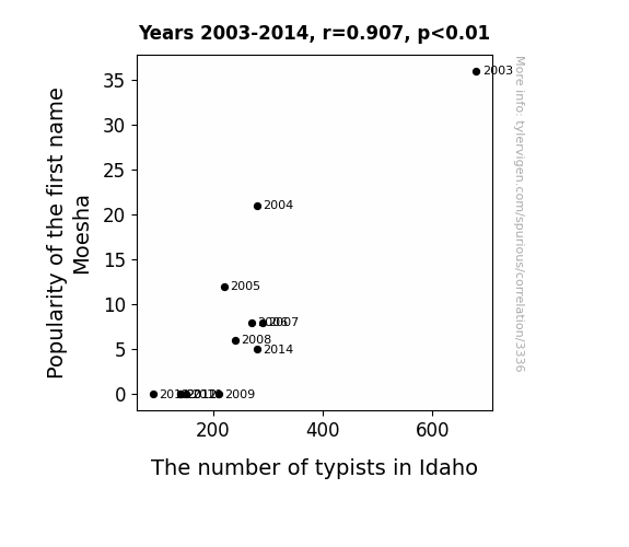
View details about correlation #3,336
The Moesha Mania and Typist Triumph: A Statistical Study of Name Popularity and Office Occupations in Idaho
As the name Moesha fell out of favor, it led to a decline in the overall coolness of the state. This, in turn, resulted in a shortage of typists who could no longer handle the decreasing levels of hipness. It seems the 'Moesha' effect had a type-writerrible impact on Idaho's typing pool!
What else correlates?
Popularity of the first name Moesha · all first names
The number of typists in Idaho · all cccupations
Popularity of the first name Moesha · all first names
The number of typists in Idaho · all cccupations


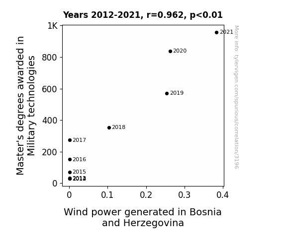
View details about correlation #3,196
Marching Towards Renewable Energy: Exploring the Link Between Military Technology Master's Degrees and Wind Power in Bosnia and Herzegovina
As more people mastered military technologies, they also became experts in tactics and maneuvers, leading to a surge in using wind power for strategic advantage. They really learned to *blow away* the competition in the field of renewable energy! It seems their knowledge just keeps *propelling* them forward.


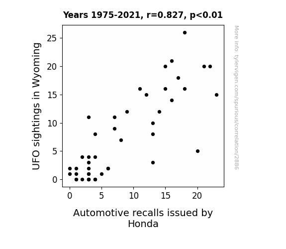
View details about correlation #2,886
Flying High and Recalling Wheels: The Rhyme and Reason of UFO Sightings in Wyoming and Honda Automotive Recalls
The high altitude UFO activity was giving the Honda cars a real shock, leading to electrical malfunctions and prompting a recall. It seems the UFOs were revving up some otherworldly interference with the car's systems.

What else correlates?
UFO sightings in Wyoming · all random state specific
Automotive recalls issued by Honda · all weird & wacky
UFO sightings in Wyoming · all random state specific
Automotive recalls issued by Honda · all weird & wacky


View details about correlation #3,272
Kernel Confusion: Exploring the GMO-Cant Even Correlation in Minnesota Corn
The GMO corn started expressing its kernel of emotions, leading to a-maize-ing confusion among internet users. It seems like the corn's cob-fusing behavior was causing people to really ear-responsibly lose their kernels of thought. The situation just kept popping up, leaving everyone in a real cornumdrum. The whole thing was just unbe-corn-able!


What else correlates?
GMO use in corn grown in Minnesota · all food
Google searches for 'i cant even' · all google searches
GMO use in corn grown in Minnesota · all food
Google searches for 'i cant even' · all google searches


View details about correlation #3,294
From Corbin to Carbon: An Analysis of the Correlation Between the Popularity of the Name 'Corbin' and the Number of Gas Plant Operators in Michigan
As more and more babies were named Corbin, their collective energy and enthusiasm unknowingly revved up the state's interest in all things gas-related, leading to a surge in the number of gas plant operators in Michigan. It seems the correlation was not just hot air after all!


What else correlates?
Popularity of the first name Corbin · all first names
The number of gas plant operators in Michigan · all cccupations
Popularity of the first name Corbin · all first names
The number of gas plant operators in Michigan · all cccupations
. The chart goes from 2010 to 2021, and the two variables track closely in value over that time.")

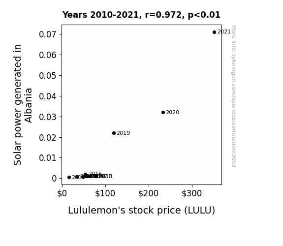
View details about correlation #3,003
Shining a Light on Solar Power: Illuminating the Relationship Between Albanian Solar Energy Generation and Lululemon's Stock Price
As solar power production in Albania increased, it created a positive energy field around the world. This field coincidentally boosted the motivation and energy levels of Lululemon customers, leading to higher demand for their products. As a result, Lululemon's stock price (LULU) experienced an unexpected sun-sational surge.

What else correlates?
Solar power generated in Albania · all energy
Lululemon's stock price (LULU) · all stocks
Solar power generated in Albania · all energy
Lululemon's stock price (LULU) · all stocks


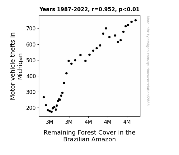
View details about correlation #2,888
From Motor City to the Amazon: A Cross-Continental Study on the Relationship between Motor Vehicle Thefts in Michigan and Remaining Forest Cover in the Brazilian Amazon
As motor vehicle thefts in Michigan decreased, there was a corresponding decrease in the demand for car parts. This led to a reduction in the illegal harvesting of trees in the Brazilian Amazon to make counterfeit car parts. Therefore, the remaining forest cover in the Brazilian Amazon decreased as a result of this unexpected connection. However, it's important to note that this explanation is purely fictional and not based on any actual evidence.


View details about correlation #1,924
Cultured Connections: An Examination of Yogurt Consumption and Washington Nationals Ticket Sales
There's something about those live cultures that really rallied the fans! Maybe it's because yogurt has whey of bringing people together, or perhaps it's just a case of pro-biotic enthusiasm spreading like wild-pitch fire.


What else correlates?
Yogurt consumption · all food
Ticket sales for Washington Nationals games · all sports
Yogurt consumption · all food
Ticket sales for Washington Nationals games · all sports


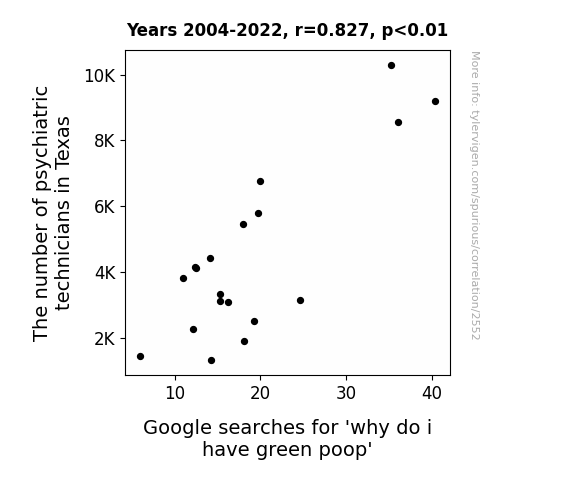
View details about correlation #2,552
Psych Techs in Texas and the Quest for Green Poop: A Statistical Connection
The more psychiatric technicians there are, the more they're able to help people work through their shit, leading to a lighter, greener outlook on life, or in this case, in the toilet. It's all about the power of green-therapy!


View details about correlation #2,767
Up in Smoke: The Curious Connection Between Air Pollution in Fort Wayne and Kerosene Consumption in Norway
The cleaner air in Fort Wayne led to a decrease in the production of anti-air pollution technology. This technology was actually being shipped to Norway, but as air quality improved in Fort Wayne, there was less of a market for the devices in the US, leading to a surplus. To clear out this surplus, the manufacturers decided to switch to producing kerosene lamps instead, leading to a decrease in the demand for kerosene in Norway. It's an unexpected domino effect of clean air leading to a dimmer situation in Norway!


What else correlates?
Air pollution in Fort Wayne · all weather
Kerosene used in Norway · all energy
Air pollution in Fort Wayne · all weather
Kerosene used in Norway · all energy
. The chart goes from 2002 to 2022, and the two variables track closely in value over that time.")

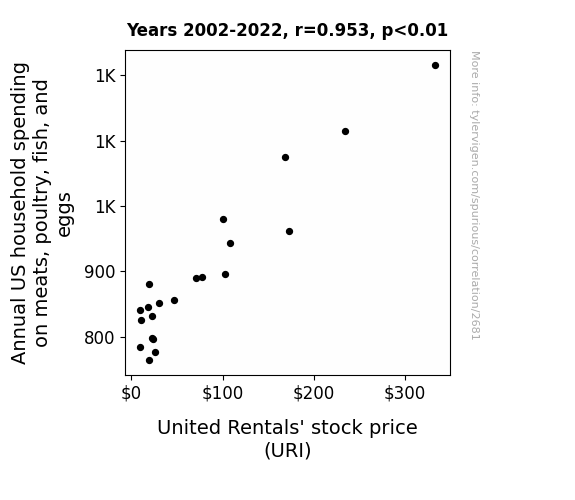
View details about correlation #2,681
The Meats Market: A Poultry Tale of Household Spending and Stock Prices
As household spending on meat and poultry rises, more backyard barbecues are happening. This increase in outdoor grilling is leading to a surge in demand for rental equipment, including United Rentals' products. So, the sizzle of steaks is actually firing up the stock price of United Rentals!


View details about correlation #1,250
Cornspiracy Theory: Investigating the GMO-UFO Connection in Minnesota Maize
As GMO use in Minnesota corn decreased, the corn stalks grew taller and more maze-like, creating the perfect landing spot for confused alien pilots. With fewer GMO corn fields, the aliens couldn't find their way to the UFO sighting hotspots, leading to a decrease in reported UFO sightings. Maybe the truth really is out there, but it's just lost in a corn maze!


What else correlates?
GMO use in corn grown in Minnesota · all food
Google searches for 'report UFO sighting' · all random state specific
GMO use in corn grown in Minnesota · all food
Google searches for 'report UFO sighting' · all random state specific
Why this works
- Data dredging: I have 25,237 variables in my database. I compare all these variables against each other to find ones that randomly match up. That's 636,906,169 correlation calculations! This is called “data dredging.”
Fun fact: the chart used on the wikipedia page to demonstrate data dredging is also from me. I've been being naughty with data since 2014.
Instead of starting with a hypothesis and testing it, I instead tossed a bunch of data in a blender to see what correlations would shake out. It’s a dangerous way to go about analysis, because any sufficiently large dataset will yield strong correlations completely at random. - Lack of causal connection: There is probably no direct connection between these variables, despite what the AI says above.
Because these pages are automatically generated, it's possible that the two variables you are viewing are in fact causually related. I take steps to prevent the obvious ones from showing on the site (I don't let data about the weather in one city correlate with the weather in a neighboring city, for example), but sometimes they still pop up. If they are related, cool! You found a loophole.
This is exacerbated by the fact that I used "Years" as the base variable. Lots of things happen in a year that are not related to each other! Most studies would use something like "one person" in stead of "one year" to be the "thing" studied. - Observations not independent: For many variables, sequential years are not independent of each other. You will often see trend-lines form. If a population of people is continuously doing something every day, there is no reason to think they would suddenly change how they are doing that thing on January 1. A naive p-value calculation does not take this into account.
You will calculate a lower chance of "randomly" achieving the result than represents reality.
To be more specific: p-value tests are probability values, where you are calculating the probability of achieving a result at least as extreme as you found completely by chance. When calculating a p-value, you need to assert how many "degrees of freedom" your variable has. I count each year (minus one) as a "degree of freedom," but this is misleading for continuous variables.
This kind of thing can creep up on you pretty easily when using p-values, which is why it's best to take it as "one of many" inputs that help you assess the results of your analysis.
- Y-axes doesn't start at zero: I truncated the Y-axes of the graphs above. I also used a line graph, which makes the visual connection stand out more than it deserves.
Nothing against line graphs. They are great at telling a story when you have linear data! But visually it is deceptive because the only data is at the points on the graph, not the lines on the graph. In between each point, the data could have been doing anything. Like going for a random walk by itself!
Mathematically what I showed is true, but it is intentionally misleading. If you click on any of the charts that abuse this, you can scroll down to see a version that starts at zero. - Confounding variable: Confounding variables (like global pandemics) will cause two variables to look connected when in fact a "sneaky third" variable is influencing both of them behind the scenes.
- Outliers: Some datasets here have outliers which drag up the correlation.
In concept, "outlier" just means "way different than the rest of your dataset." When calculating a correlation like this, they are particularly impactful because a single outlier can substantially increase your correlation.
Because this page is automatically generated, I don't know whether any of the charts displayed on it have outliers. I'm just a footnote. ¯\_(ツ)_/¯
I intentionally mishandeled outliers, which makes the correlation look extra strong. - Low n: There are not many data points included in some of these charts.
You can do analyses with low ns! But you shouldn't data dredge with a low n.
Even if the p-value is high, we should be suspicious of using so few datapoints in a correlation.
Pro-tip: click on any correlation to see:
- Detailed data sources
- Prompts for the AI-generated content
- Explanations of each of the calculations (correlation, p-value)
- Python code to calculate it yourself


