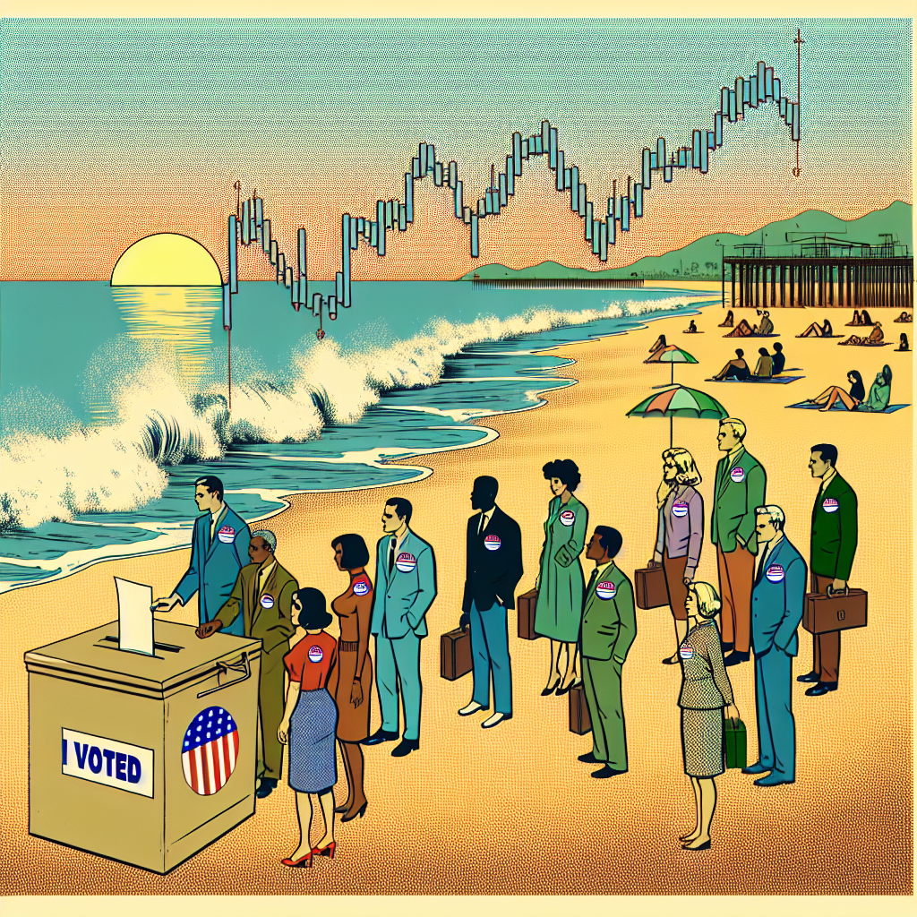
spurious correlations
discover · random · spurious scholar
← previous page · next page →


View details about correlation #3,844
Airborne Afflictions: An Assessment of the Correlation Between Air Pollution in Tuscaloosa, Alabama and the Divorce Rate in Alabama
As the air quality improved in Tuscaloosa, so did everyone's mood. With clearer skies and fresher air, couples found it easier to see the beauty in their relationships. It's amazing how a little smog-free sunshine can reignite the spark in a marriage. Who knew that all it took to save a relationship was a couple of fewer car emissions and a breath of clean, crisp air? Remember folks, love may not always be in the air, but at least now in Tuscaloosa, it's not competing with pollutants!


What else correlates?
Air pollution in Tuscaloosa, Alabama · all weather
The divorce rate in Alabama · all random state specific
Air pollution in Tuscaloosa, Alabama · all weather
The divorce rate in Alabama · all random state specific


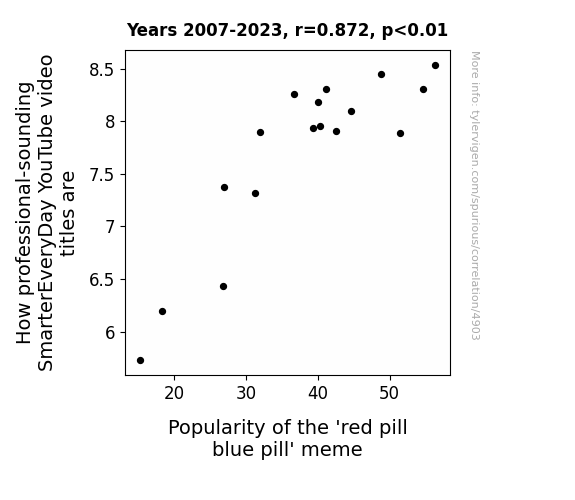
View details about correlation #4,903
Blue Pill, Red Pill, Do Tell: Delving into the Smartness of SmarterEveryDay Video Titles and Their Influence on the Popularity of the 'Red Pill Blue Pill' Meme
As the SmarterEveryDay titles became more professional-sounding, they unknowingly activated the meme's desire to be taken seriously, leading to its skyrocketing popularity. It's like Neo trying to act all business casual in The Matrix staff meetings.


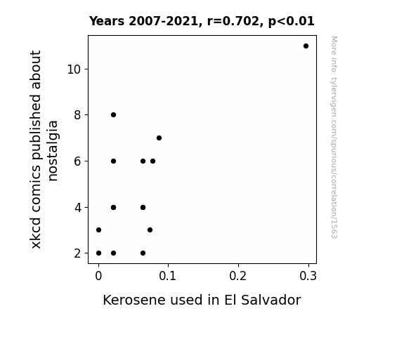
View details about correlation #1,563
Fueling the Nostalgia: The Link Between xkcd Comics and Kerosene Consumption in El Salvador
As the wistful readership yearned for the simplicity of the past, they turned to vintage kerosene lamps for a nostalgic evening glow, creating an unexpected surge in demand and subsequent shortage of kerosene in El Salvador.

What else correlates?
xkcd comics published about nostalgia · all weird & wacky
Kerosene used in El Salvador · all energy
xkcd comics published about nostalgia · all weird & wacky
Kerosene used in El Salvador · all energy
. The chart goes from 2003 to 2022, and the two variables track closely in value over that time.")

View details about correlation #4,079
Divine Intervention or Market Miracle? The Holy Connection Between Clergy Numbers in Kansas and State Street's Stock Price
As the number of clergy in Kansas increased, so did the frequency of prayers for financial prosperity. These concentrated efforts led to a divine intervention in the stock market, specifically favoring State Street. Turns out, the true bull in the stock market was a holy one!


What else correlates?
The number of clergy in Kansas · all cccupations
State Street's stock price (STT) · all stocks
The number of clergy in Kansas · all cccupations
State Street's stock price (STT) · all stocks


View details about correlation #3,697
Scoring Galore: Exploring the Correlation between Kompany Goals and Top Movie Show
As Vincent Kompany's goals in domestic matches decreased, fans became increasingly disinterested in traditional forms of entertainment. This led to a decrease in movie ticket sales as people opted to watch reruns of old football matches instead of going to the theaters.


View details about correlation #4,686
The Bertha Effect: Unearthing the Connection Between Name Popularity and Air Quality in Fort Collins
Fewer people naming their children Bertha means there are fewer cars with those old-fashioned "Bertha" bumper stickers on the road, leading to a slight decrease in air quality in Fort Collins, Colorado. After all, those vintage cars tend to be real gas guzzlers, and their fumes are no joke!


What else correlates?
Popularity of the first name Bertha · all first names
Air quality in Fort Collins, Colorado · all weather
Popularity of the first name Bertha · all first names
Air quality in Fort Collins, Colorado · all weather


View details about correlation #3,559
Evaluating the Electrifying Effects: Equatorial Guinea's Electricity Generation and US Annual Tax Revenue
The influx of power sparked a surge in productivity and economic activity in Equatorial Guinea, leading to an unexpected current of financial gain for the US. It seems their electricity boom truly energized the US tax revenue, proving once and for all that when it comes to power, it's all about the volts and taxes.


What else correlates?
Electricity generation in Equatorial Guinea · all energy
US Annual Tax Revenue · all weird & wacky
Electricity generation in Equatorial Guinea · all energy
US Annual Tax Revenue · all weird & wacky


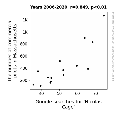
View details about correlation #3,834
Cage Match: The Aviatrix Dilemma - A Statistical Analysis of Commercial Pilots in Massachusetts and Google Searches for Nicolas Cage
As more commercial pilots flew over Massachusetts, their collective love for con-air tributes in the sky engaged Cage's spirit animal, inspiring more people to appreciate his eclectic filmography. This led to an uptick in Nicolas Cage Google searches as the pilots' admiration for high-flying acting skills reached new altitudes. It's almost like the pilot's passion created a... national treasure hunt for all things Nicolas Cage. And as they say, the sky's the limit when it comes to influencing Cage's cult following!
What else correlates?
The number of commercial pilots in Massachusetts · all cccupations
Google searches for 'Nicolas Cage' · all google searches
The number of commercial pilots in Massachusetts · all cccupations
Google searches for 'Nicolas Cage' · all google searches


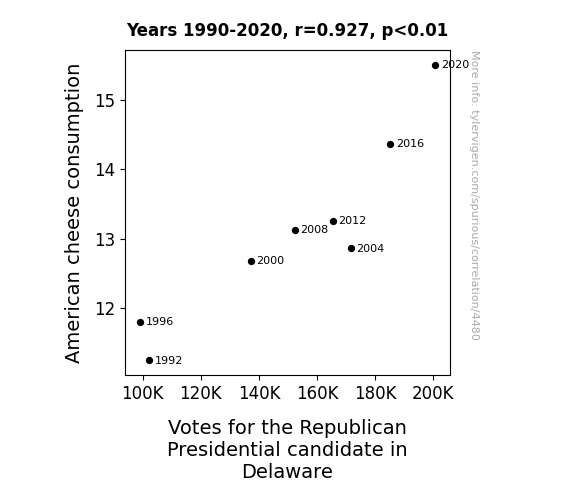
View details about correlation #4,480
Cheese and Elections: A Cheddar Connection in Delaware
As American cheese consumption melted minds, it curdled voters' perceptions, leading them to cast their ballots for the Gouda old Republican candidate in Delaware. It's a dairy strange correlation, but it seems there's no havarti in understanding the power of cheese in swaying political preferences!

What else correlates?
American cheese consumption · all food
Votes for the Republican Presidential candidate in Delaware · all elections
American cheese consumption · all food
Votes for the Republican Presidential candidate in Delaware · all elections


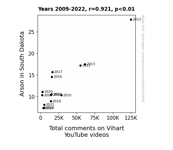
View details about correlation #4,845
Playing with Fire: Exploring the Fiery Connection Between Arson in South Dakota and Total Comments on Vihart YouTube Videos
The rise in arson in South Dakota led to an unexpected surplus in burnt out trees, which in turn sparked a renewed interest in fractal patterns and mathematical beauty, consequently prompting people to engage more with ViHart's thought-provoking content, thus leading to the increase in total comments on her YouTube videos.

What else correlates?
Arson in South Dakota · all random state specific
Total comments on Vihart's YouTube videos · all YouTube
Arson in South Dakota · all random state specific
Total comments on Vihart's YouTube videos · all YouTube


View details about correlation #3,557
Breezing Through the Web: Uncovering the Winds of Change in Norway's Wind Power and Internet Growth
As the majestic windmills in Norway spun gracefully, they inadvertently created a mesmerizing and rhythmic pattern. This pattern was accidentally synced with the subconscious minds of people around the world, inspiring an unprecedented surge in creativity and technological innovation. It's as if the winds of change from Norway were whispering to coders and content creators, fueling the expansion of the digital realm. So, in a truly uplifting turn of events, the Norwegian wind power literally blew new websites into existence, proving that when it comes to internet growth, it's all about riding the winds of opportunity!


What else correlates?
Wind power generated in Norway · all energy
Number of websites on the internet · all weird & wacky
Wind power generated in Norway · all energy
Number of websites on the internet · all weird & wacky
. The chart goes from 2002 to 2023, and the two variables track closely in value over that time.")

View details about correlation #3,915
Astro-Nomic Effects: Exploring the Galactic Influence on AEM Stock Price
As Jupiter crept closer, its gravitational pull inadvertently tugged on the financial markets, leading to a spike in demand for precious metals like gold. This, in turn, boosted Agnico Eagle Mines' stock price as investors scrambled to get their hands on the shiny golden jackpot. It's like a cosmic game of economic dominoes, with Jupiter unknowingly holding the power to influence earthly riches.


What else correlates?
The distance between Jupiter and Earth · all planets
Agnico Eagle Mines' stock price (AEM) · all stocks
The distance between Jupiter and Earth · all planets
Agnico Eagle Mines' stock price (AEM) · all stocks


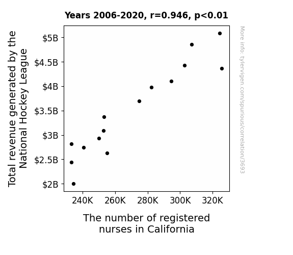
View details about correlation #3,693
Skate Blades and Scales: An Examination of the Relationship Between NHL Revenue and Registered Nurses in California
The success of the NHL led to a spike in hockey-related injuries, requiring more nurses to be on hand for first aid and band-aid application at local rinks. Looks like the real MVPs are the ones with the stethoscopes now!


View details about correlation #4,760
The Smol Connection: An Evaluation of Air Quality in New Orleans, Louisiana and Google Searches for Smol
The fresher air in New Orleans led to an increase in overall happiness and contentment. This, in turn, made people more inclined to affectionately describe small and cute things as "smol." It's amazing what a deep breath of clean air can do for one's appreciation of adorableness!


What else correlates?
Air quality in New Orleans, Louisiana · all weather
Google searches for 'smol' · all google searches
Air quality in New Orleans, Louisiana · all weather
Google searches for 'smol' · all google searches


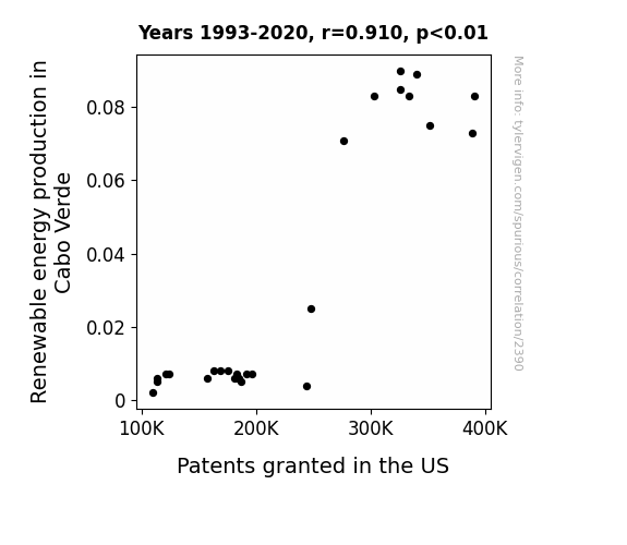
View details about correlation #2,390
Powering Up Innovation: A Current-C Alternating Between Renewable Energy Production in Cabo Verde and Patents Granted in the US
As the turbines spun, they created a ripple effect of innovative ideas, sparking a surge in patent applications. It's as if the winds of change carried the seeds of creativity all the way to the shores of invention in the US. The sun-drenched landscape of renewable energy in Cabo Verde simply became a hotbed for bright ideas, illuminating the path to technological advancement. In a shocking twist, it seems the power generated wasn't just electrical, but also spawned a whole new wave of intellectual energy.

What else correlates?
Renewable energy production in Cabo Verde · all energy
Patents granted in the US · all weird & wacky
Renewable energy production in Cabo Verde · all energy
Patents granted in the US · all weird & wacky
. The chart goes from 2002 to 2020, and the two variables track closely in value over that time.")

View details about correlation #4,817
The DEMocrat Effect: An Analysis of the Connection between Arizona Senatorial Democrat Votes and Conoco Phillips' Stock Price
As more Democrats voted, the demand for blue wave energy surged, leading to a spike in Conoco Phillips' stock price. It's a shore thing!

What else correlates?
Votes for Democratic Senators in Arizona · all elections
Conoco Phillips' stock price (COP) · all stocks
Votes for Democratic Senators in Arizona · all elections
Conoco Phillips' stock price (COP) · all stocks


View details about correlation #4,917
The Unimpressed Kentucky: Exploring the Correlation between McKayla Maroney Memes and Orderly Employment Trends
As the McKayla Maroney meme lost its luster, a dethroned internet persona, if you will, it led to a lack of interest in unimpressed expressions, causing a statewide shortage of individuals capable of feigning shock and maintaining a straight face, thus indirectly impacting the need for orderlies in Kentucky's medical facilities. I guess even memes have the power to affect healthcare staffing in unexpected ways!


What else correlates?
Popularity of the 'McKayla Maroney' meme · all memes
The number of orderlies in Kentucky · all cccupations
Popularity of the 'McKayla Maroney' meme · all memes
The number of orderlies in Kentucky · all cccupations


View details about correlation #4,150
Maze and Amaze: Unearthing the Corny Connection Between GMO Corn and Spanish Language Learning
As Iowa corn lost its genetically modified immunity, it became more susceptible to human influence. Without the ability to resist, the corn started to feel self-conscious about accidentally revealing the true meaning of 'maíz' - thus leading to a statewide agreement to keep the Spanish lesson off the cob.

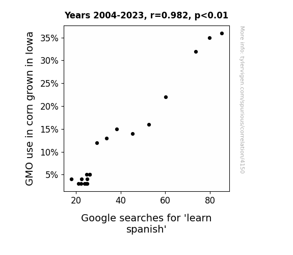
What else correlates?
GMO use in corn grown in Iowa · all food
Google searches for 'learn spanish' · all google searches
GMO use in corn grown in Iowa · all food
Google searches for 'learn spanish' · all google searches


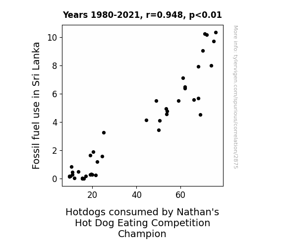
View details about correlation #2,875
Fuel Fossil Frenzy in Sri Lanka: A Wiener of a Connection to the Consumption of Nathan's Hot Dog Eating Competition Champion
The fossil fuel use in Sri Lanka caused a surge in ancient, buried hot dog cravings, leading to a spike in hot dog consumption by competitive eaters. It's a case of fueling not just cars, but also the reigning champions with an insatiable appetite for victory sausages!


View details about correlation #3,703
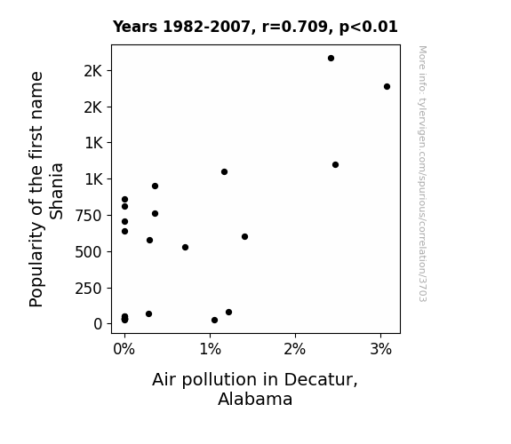
Shania's Smog: A Statistical Study of Air Pollution and the Popularity of the Name Shania in Decatur, Alabama
As more and more babies were named Shania, they all grew up to be die-hard fans of country music, particularly Shania Twain. This led to a sudden surge in the use of pickup trucks and large vehicles, as they wanted to embody the country lifestyle. These trucks, in turn, spewed out way more emissions, contributing to the air pollution in Decatur, Alabama. Remember, this is just a joke and not a real causative explanation.
What else correlates?
Popularity of the first name Shania · all first names
Air pollution in Decatur, Alabama · all weather
Popularity of the first name Shania · all first names
Air pollution in Decatur, Alabama · all weather
Why this works
- Data dredging: I have 25,237 variables in my database. I compare all these variables against each other to find ones that randomly match up. That's 636,906,169 correlation calculations! This is called “data dredging.”
Fun fact: the chart used on the wikipedia page to demonstrate data dredging is also from me. I've been being naughty with data since 2014.
Instead of starting with a hypothesis and testing it, I instead tossed a bunch of data in a blender to see what correlations would shake out. It’s a dangerous way to go about analysis, because any sufficiently large dataset will yield strong correlations completely at random. - Lack of causal connection: There is probably no direct connection between these variables, despite what the AI says above.
Because these pages are automatically generated, it's possible that the two variables you are viewing are in fact causually related. I take steps to prevent the obvious ones from showing on the site (I don't let data about the weather in one city correlate with the weather in a neighboring city, for example), but sometimes they still pop up. If they are related, cool! You found a loophole.
This is exacerbated by the fact that I used "Years" as the base variable. Lots of things happen in a year that are not related to each other! Most studies would use something like "one person" in stead of "one year" to be the "thing" studied. - Observations not independent: For many variables, sequential years are not independent of each other. You will often see trend-lines form. If a population of people is continuously doing something every day, there is no reason to think they would suddenly change how they are doing that thing on January 1. A naive p-value calculation does not take this into account.
You will calculate a lower chance of "randomly" achieving the result than represents reality.
To be more specific: p-value tests are probability values, where you are calculating the probability of achieving a result at least as extreme as you found completely by chance. When calculating a p-value, you need to assert how many "degrees of freedom" your variable has. I count each year (minus one) as a "degree of freedom," but this is misleading for continuous variables.
This kind of thing can creep up on you pretty easily when using p-values, which is why it's best to take it as "one of many" inputs that help you assess the results of your analysis.
- Y-axes doesn't start at zero: I truncated the Y-axes of the graphs above. I also used a line graph, which makes the visual connection stand out more than it deserves.
Nothing against line graphs. They are great at telling a story when you have linear data! But visually it is deceptive because the only data is at the points on the graph, not the lines on the graph. In between each point, the data could have been doing anything. Like going for a random walk by itself!
Mathematically what I showed is true, but it is intentionally misleading. If you click on any of the charts that abuse this, you can scroll down to see a version that starts at zero. - Confounding variable: Confounding variables (like global pandemics) will cause two variables to look connected when in fact a "sneaky third" variable is influencing both of them behind the scenes.
- Outliers: Some datasets here have outliers which drag up the correlation.
In concept, "outlier" just means "way different than the rest of your dataset." When calculating a correlation like this, they are particularly impactful because a single outlier can substantially increase your correlation.
Because this page is automatically generated, I don't know whether any of the charts displayed on it have outliers. I'm just a footnote. ¯\_(ツ)_/¯
I intentionally mishandeled outliers, which makes the correlation look extra strong. - Low n: There are not many data points included in some of these charts.
You can do analyses with low ns! But you shouldn't data dredge with a low n.
Even if the p-value is high, we should be suspicious of using so few datapoints in a correlation.
Pro-tip: click on any correlation to see:
- Detailed data sources
- Prompts for the AI-generated content
- Explanations of each of the calculations (correlation, p-value)
- Python code to calculate it yourself


